Chapter 4: Sensation and Perception
Illusions
Learning Objectives
- Explain how and why psychologists use illusions
Why Illusions?
Psychologists have analyzed perceptual systems for more than a century. Vision and hearing have received the most attention by far, but other perceptual systems, like those for smell taste movement, balance, touch, and pain, have also been studied extensively. Perception scientists use a variety of approaches to study these systems—they design experiments, study neurological patients with damaged brain regions, and create perceptual illusions that toy with the brain’s efforts to interpret the sensory world.

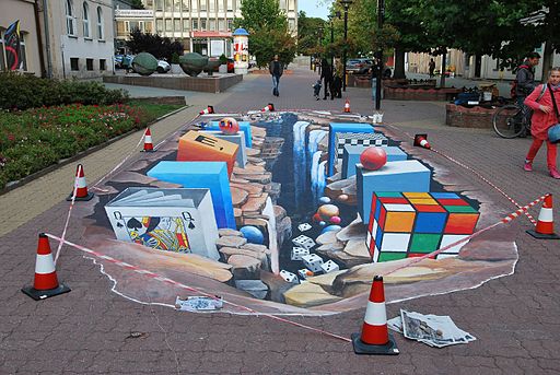
Creation and testing of perceptual illusions has been a fruitful approach to the study of perception—particularly visual perception—since the early days of psychology. People often think that visual illusions are simply amusing tricks that provide us with entertainment. Many illusions are fun to experience, but perception scientists create illusions based on their understanding of the perceptual system. Once they have created a successful illusion, the scientist can explore what people experience, what parts of the brain are involved in interpretation of the illusion, and what variables increase or diminish the strength of the illusion. Scientists are not alone in this interest. Visual artists have discovered and used many illusion-producing principles for centuries, allowing them to create the experience of depth, movement, light and shadow, and relative size on two-dimensional canvases.
Depth Illusions
When we look at the world, we are not very good at detecting the absolute qualities of things—their exact size or color or shape. What we are very good at is judging objects in the context of other objects and conditions. Let’s take a look at a few illusions to see how they are based on insights about our perception. Look at Figure 2 below. Which of the two horizontal yellow lines looks wider, the top one or the bottom one?

Most people experience the top line as wider. They are both exactly the same length. This experience is called the Ponzo illusion. Even though you know that the lines are the same length, it is difficult to see them as identical. Our perceptual system takes the context into account, here using the converging “railroad tracks” to produce an experience of depth. Then, using some impressive mental geometry, our brain adjusts the experienced length of the top line to be consistent with the size it would have if it were that far away: if two lines are the same length on my retina, but different distances from me, the more distant line must be in reality longer. You experience a world that “makes sense” rather than a world that reflects the actual objects in front of you.
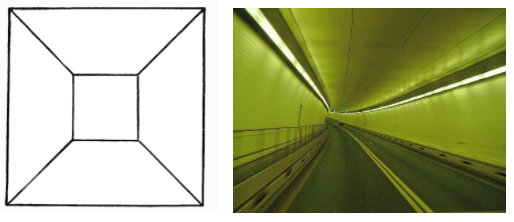
There are many depth illusions. It is difficult to see the drawing on the left below as a two-dimensional figure. The converging lines and smaller square at the center seem to coax our perceptual systems into seeing depth, even though we know that the drawing is flat. This urge to see depth is probably so strong because our ability to use two-dimensional information to infer a three dimensional world is essential for allowing us to operate in the world. The picture on the right below is a driving tunnel, something you would need to process at high speed if you were in a car going through it. Your quick and detailed use of converging lines and other cues allows you to make sense of this 3-D world.

Light and Size Illusions
Depth is not the only quality in the world that shows how we adjust what we experience to fit the surrounding world. Look at the two gray squares in the figure below. Which one looks darker?

Most people experience the square on the right as the darker of the two gray squares. You’ve probably already guessed that the squares are actually identical in shade, but the surrounding area—black on the left and white on the right—influence how our perceptual systems interpret the gray area. In this case, the greater difference in shading between the white surrounding area and the gray square on the right results in the experience of a darker square.
Here is another example below. The two triangular figures are identical in shade, but the triangle on the left looks lighter against the dark background of the cross when compared to the triangle in the white area on the right.

Our visual systems work with more than simple contrast. They also use our knowledge of how the world works to adjust our perceptual experience. Look at the checkerboard below. There are two squares with letters in them, one marked “A” and the other “B”. Which one of those two squares is darker?

This seems like an easy comparison, but the truth is that squares A and B are identical in shade. Our perceptual system adjusts our experience by taking some visual information into account. First, “A” is one of the “dark squares” and “B” is a “light square” if we take the checkerboard pattern into account. Perhaps even more impressive, our visual systems notice that “B” is in a shadow. Object in a shadow appear darker, so our experience is adjusted to take account of effect of the shadow, resulting in perceiving square B as being lighter than square A, which sits in the bright light. And if you really don’t believe your eyes, take a look at a video showing the same color tiles here.
Here is another example of the Ebbinghaus illusion:
In this version of the illusion, most people see the circle on the right as larger than the one on the left. The two orange circles are exactly the same size. The Ebbinghaus illusion again illustrates the tendency of our perceptual systems to adjust our experience of the world to the surrounding context.
Link to Learning
If you want to explore more visual illusions, visit this website with dozens of interesting illusions created by Michael Bach.

