To understand many of the problems surrounding building information, we first need to examine the analogue representations that still dominate AECO. The chapter presents some of the key characteristics that have made these representations so successful, although they do not necessarily agree with digital environments. Effective computerization relies on replacing the human abilities that enable analogue representations with capacities for information processing by machines.
Pictorial representations and geometry
Familiar building representations tend to be drawings on paper, such as orthographic projections like floor plans and sections, and projective ones, including isometrics and axonometrics: two-dimensional depictions of three-dimensional scenes, through which one tries to describe the spatial arrangement, construction or appearance of a building. What these drawings have in common is:
- They are pictorial representations (not symbolic)
- They rely heavily on geometry
Even though drawings were used in building design already in antiquity, it was in the Renaissance that applied geometry revolutionized the way Europeans represented and conceptualized space, in many cases raising the importance of the graphic image over the written text. Geometry was not merely a handy foundation for descriptive purposes, i.e. formalizing pictorial representations of buildings, but also a means of ordering space, i.e. organizing people’s experiences and thoughts to reveal some inherent order (including that of the cosmos). Consequently, building drawings evolved from schematic to precise and detailed representations that matched the perception of actual buildings, as well as most levels of decision making and communication about building design and construction.
Such empowerment gave geometry a central position in building design, with many architects and engineers becoming absorbed in geometric explorations closely linked to some presumed essence or ambition of their profession. With geometry forming both an overlay and underlay to reality, a complex relation developed between building design and geometry, involving not only the shape of the building but also the shape of its drawings. In turn, this caused building drawings to become semantically and syntactically dense pictorial representations, where any pictorial element, however small, can be significant for interpretation. By the same token, in comparison to more diagrammatic representations, the interpretation of building drawings involves a larger number of pictorial elements, properties and aspects, such as colour, thickness, intensity and contrast. As representations, building drawings were therefore considered a mixed and transitional case.[1]
The computerization of such complex, highly conventional analogue representations was initially superficial, aiming at faithful reproduction of their appearance. To many, the primary function of digital building representations, including not only CAD but also BIM, is the production of conventional analogue drawings either on paper (prints) or as identical computer files (e.g. a PDF of a floor plan). This makes computerization merely an efficiency improvement, especially concerning ease of drawing modification, compactness of storage and speed of dissemination. This is a testimony to the power and success of analogue building drawings but at the same time a major limitation to a fuller utilization of the information-processing capacities of computers. Analogue drawings work well in conjunction with human abilities for visual recognition, allowing us to develop efficient and effective means of specification and communication: most people recognize the same number of spaces in a floor plan on paper; scanning the floor plan transforms it into a computer file but computers generally only recognize it as an array of pixels. Recognizing the rooms and counting them by computer requires explicit representation of spaces.
Visual perception and recognition
Building drawings are surprisingly parsimonious: they manage to achieve quite a lot with a limited repertory of graphic primitives. With just a few kinds of lines, they produce floor plans, sections, perspectives etc., as well as depict a wide variety of shapes and materials in all these projections. To a large degree this is due to the ingenious ways they trigger the human visual system and allow us to see things. For example, we tend to associate similar elements if they are proximal. Therefore, closely parallel lines become depictions of walls but if the distance between the lines increases (beyond what might be plausible for a thick wall), they become just parallel lines. Seeing two lines as a wall does not necessarily mean they have to be strictly parallel or straight (Figure 1).

It is similarly easy to identify columns in a floor plan. Even more significantly, the arrangement (repetition, collinearity, proximity etc.) and similarity of columns allow us to recognize colonnades: groups of objects with a specific character (Figure 2). The colonnade may be recognizable even if the columns are not identical and their arrangement not completely regular (Figure 3). However, if the arrangement is truly irregular, proximity or similarity do not suffice for the recognition of a colonnade (Figure 4).


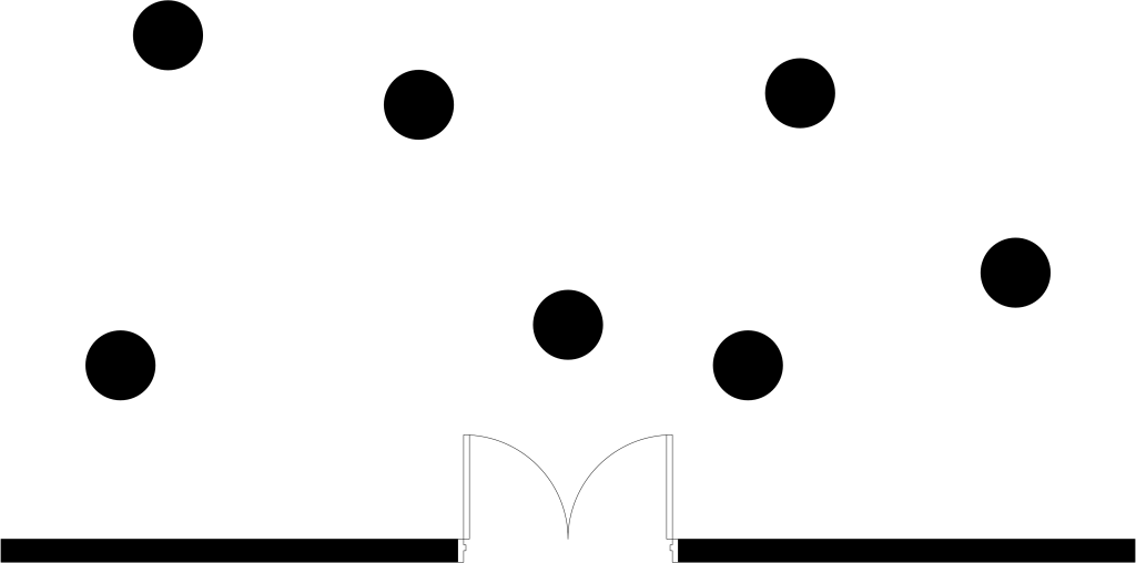
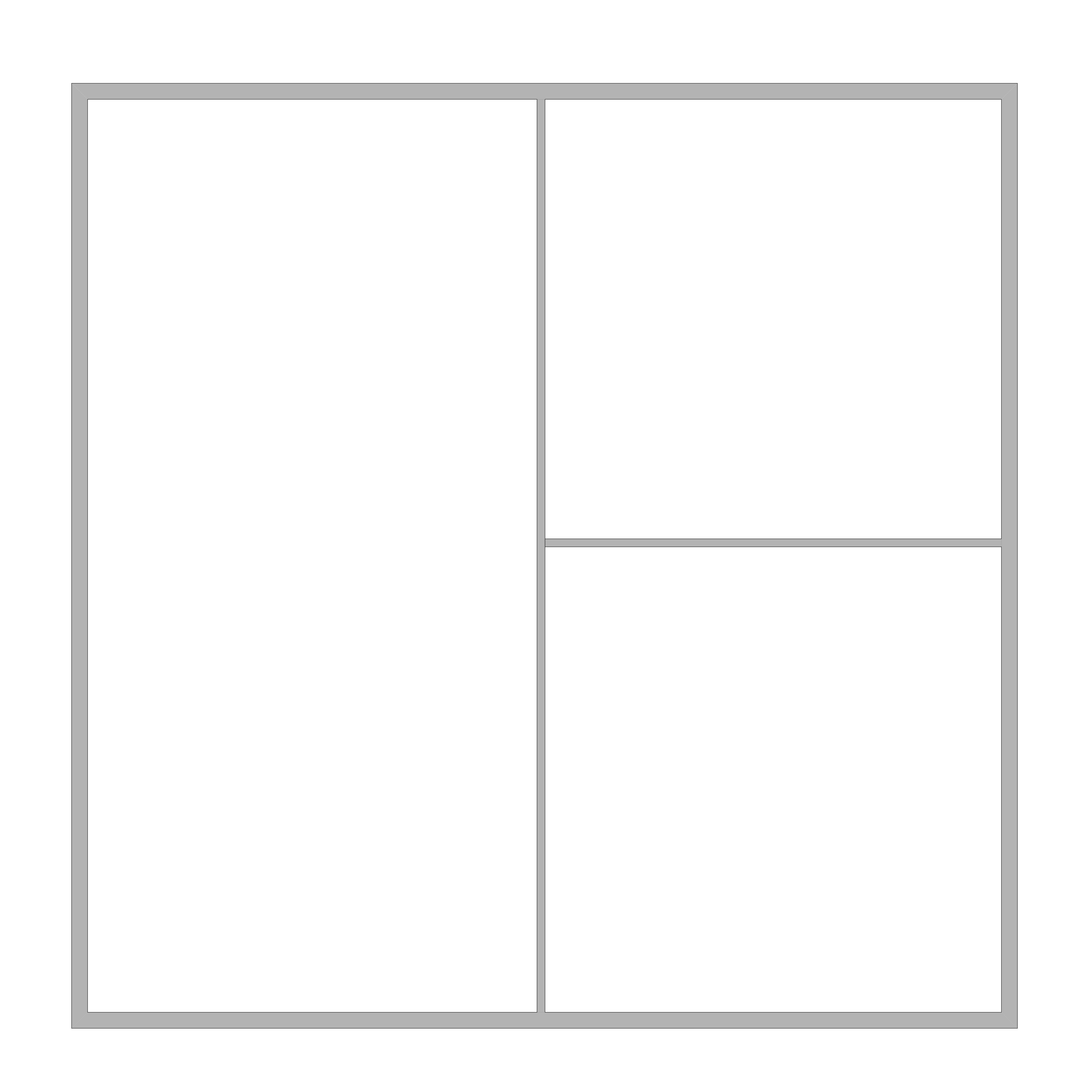
Probably the most unnoticed and yet striking part of reading a drawing concerns the recognition of spaces: in a floor plan, one enters graphic elements that develop into depictions of building elements and components, like walls, doors and windows. Spaces are what is left over on paper, essentially background coming through the drawing. Yet most people with a basic understanding of building drawings are capable of recognizing the spaces in a floor plan (inferring them from the bounding building elements) with precision, accuracy and reliability (Figure 5).
Abstraction and incompleteness
Pictorial representations are characterized by a high potential for abstraction, which is evident in the different scales of building drawings: a wall at a scale like 1:20 is depicted by a large number of lines indicating various layers and materials; at 1:100 the wall may be reduced to just two parallel lines; at 1:500 it may even become a single, relatively thick line. Similarly, a door in a floor plan at 1:20 is quite detailed (Figure 6), at 1:100 it is abstracted into a depiction that primarily indicates the door type (Figure 7) and at 1:500 it becomes just a hole in a wall (Figure 8). At all three scales both the wall and the door are clearly recognizable, albeit at different scales of specificity and detail. Such abstraction is largely visual: it mimics the perception of a drawing (or, for that matter, any object) from various distances. It also corresponds to the design priorities in different stages: in early, conceptual design, one tends to focus on general issues, zooming out of the drawing to study larger parts, while deferring details to later stages. Therefore, the precise type, function and construction of a door may be relatively insignificant, making abstraction at the scale of 1:500 suitable. However, that abstraction level is inappropriate for the final technical design, when one has to specify not just the function and construction of a door but also its interfacing with the wall. To do so, one has to zoom in and use a scale like 1:20 to view and settle all details.


In addition to visual abstraction, one may also reduce common or pertinent configurations, however complex, into a single, named entity, e.g. an Ionic or Corinthian column or a colonnade (Figure 2) or “third floor” and “north wing”. Such mnemonic or conceptual abstraction is constrained by visual recognition, as outlined above, but also relies on cultural convention: it is clearly not insignificant that we have a term for a colonnade. As such, mnemonic abstraction plays a more important role in symbolic representations than purely visual abstraction.
Pictorial representations are also relatively immune to incompleteness: a hastily drawn line on paper, with bits missing, is still perceived as a line (Figure 9). A house partially occluded by an obstacle is similarly perceived as a single, complete and coherent entity (Figure 10).
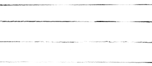
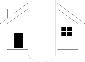
Dealing with incomplete descriptions is generally possible because not all parts are critical for understanding their meaning, even if they are not redundant. In English, for example, keeping only the consonants in a text may suffice for recognizing most words:
TH QCK BRWN FX JMPS VR TH LZY DG
(THE QUICK BROWN FOX JUMPS OVER THE LAZY DOG)
This practice, currently known as disenvoweling, is widely applied in digital short messages. In the past, it was used to similar effect by telegraph operators, note takers and others who wanted to economize on message length and the time and effort required for writing or transmitting a message. Identifying the missing vowels is often a matter of context: ‘DG’ in a farmyard setting probably means ‘DOG’ but in an archaeological one it may stand for ‘DIG’. If a word contains many vowels, it may be hard even then: ‘JMPS’ is highly probably ‘JUMPS’ in most contexts but ‘DT’ as a shorthand of ‘IDIOT’ may be far from effective in any context.
Likewise in images, some parts are more critical than others for recognition. A basic example is dashed lines: even with half of the line missing, the human visual system invariably recognizes the complete lines and the shapes they form (Figure 11).

Interestingly, a shape drawn with dashed lines is recognized more easily if the line junctions are present. This relates to a general tendency of the human visual system to rely on points of maximum curvature in the outline of shapes.[2] Corners, in particular, are quite important in this respect: the presence of corners makes it possible to perceive illusory figures (Figure 12). The form of a corner gives perceivers quite specific expectations concerning the position and form of other corners connected to it, regardless of rectilinear or curvilinear geometry (Figure 13). The presence of compatible corners in the image leads to perception of an illusory figure occluding other forms. Perception of the illusory figure weakens if occlusion occurs at non-critical parts of the figure, such as the middle of its sides (Figure 14).



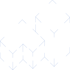
The importance of corners underlay one of the early successes in artificial intelligence: using a typology of edge junctions (Figure 15) and expectations about the connectivity of these types and the orientation of surfaces that met there, researchers were able to use constraint propagation to recognize the composition of scenes with trihedral geometric forms: faces, volumes and their relative positions (Figure 16).[3]

The above examples illustrate how analogue representations can be parsimonious and simultaneously effective but only if complemented with quite advanced and expensive recognition capacities. Empowering computers with such capacities is an emerging future but for the moment at least symbolic representations that contain explicit information are clearly preferable.
Implementation mechanisms
Another problem with analogue building representations is the overemphasis on geometry and the resulting dominance of implementation mechanisms over symbols. As symbols have to be implemented in various environments, one has to use means appropriate to each environment. A letter of the alphabet can be handwritten on paper with ink or graphite particles, depending on the writing implement (although one might claim that the strokes that comprise the letter are the real implementation mechanisms with respect to both the paradigmatic and the syntagmatic dimensions). In the computer, the same letter is implemented as an ASCII character in a text processing, spreadsheet and similar programs. In a drawing program, it may comprise pixels or vectors corresponding to the strokes (depending on the type of the program). In all cases, the symbol (the letter) is the same; what changes is the mechanisms used for its implementation.
With geometric primitives forming the graphic implementation mechanisms in pictorial building representations (underlay) and the ordering influence of geometry on building design (overlay), it has been easy to sidetrack attention to the geometric implementation mechanism of building representations, not only in the analogue but also in the digital versions. This geometric fixation meant lack of progress in CAD and also many misunderstandings in BIM.
To understand the true significance of geometric implementation mechanisms for the symbols in a building representation, consider the differences between alternative depictions of the same door in a floor plan (Figure 17). Despite differences between the graphic elements and their arrangement, they all carry the same information and are therefore equivalent and interchangeable. Many people reading the floor plan are unlikely to even notice such differences in notation, even in the same drawing, if the doors are not placed close to each other.

Using different door depictions for the same door type in the same drawing makes little sense. Differences in notation normally indicate different types of doors (Figure 18): they trigger comparisons that allow us to identify that there are different door types in the design and facilitate recognition of the precise differences between these types, so as to be able to judge the utility of each door in the design.

In conclusion, one of the key advantages of symbolic representations is the preeminence of symbols and the attenuation of confusion between symbols and implementation mechanisms relative to pictorial representations. In computerized texts, letters are not formed by handwritten strokes that produce the required appearance; the appearance of letters is added to the letter symbols through properties like their font and size. Analogue building representations are similar to handwritten texts in that they may put too much emphasis on graphic elements because it is only through the interpretation of these that one can know e.g. the materials and layers that comprise a wall. In a symbolic representation, the materials and composition of the wall are explicit properties of an explicit symbol, which can also be described alphanumerically. This removes ambiguity and makes visual displays one of the possible views of building information.
Key Takeaways
- Analogue building representations are mostly pictorial and rely heavily on geometry
- Visual perception and recognition are essential for the success of pictorial representations
- The reliance of analogue building representations on geometry leads to overemphasis on implementation mechanisms like graphic elements, even in digital environments
Exercises
- Identify the building elements and components in Figure 6 and list the properties described graphically and geometrically in the drawing
- List and explain the differences between the above and what appears in Figure 7 and Figure 8
- There are many treatises on building drawings, their history, significance and relation to geometry. The summary presented here draws in particular from: Cosgrove, D., 2003. Ptolemy and Vitruvius: spatial representation in the sixteenth-century texts and commentaries. A. Picon & A. Ponte (eds) Architecture and the sciences: exchanging metaphors. Princeton NJ: Princeton University Press; Evans, R., 1995. The Projective Cast: Architecture and Its Three Geometries. Cambridge MA: MIT Press; Goodman, N., 1976. Languages of art; an approach to a theory of symbols (2nd ed.). Indianapolis IN: Hackett. ↵
- The significance of points of maximum curvature, corners and other critical parts of an image is described among others in: Attneave, F., 1959. Applications of information theory to psychology; a summary of basic concepts, methods, and results. New York: Holt; Kanizsa, G., 1979. Organization in vision: essays on Gestalt perception. New York: Praeger. ↵
- The algorithmically and conceptually elegant recognition of scenes with trihedral objects was finalized in: Waltz, D., 1975. Understanding line drawings of scenes with shadows. P.H. Winston (ed) The psychology of computer vision. New York: McGraw-Hill. ↵
