Chapter 3: Presentations and Multimodals
“The whole purpose is to enable people to learn. Your mission is not to transmit information but to transform learners.”
– Harold D. Stolovitch and Erica J. Keeps
Rhetoric of Presentations
As discussed in Chapter 2, rhetoric is something we use every day. In both academic and professional settings, you may be asked to engage in rhetoric to explain information, persuade an audience to buy a product or idea, or describe a situation. There are many ways to deliver information to others: formal or informal, written or spoken or even sung, in motion or still, just to name a few.
Figure 3.1 Various Presentation Formats


Presentations may be done in a variety of formats, including traditional presentations, such as through speeches and slideshows, as well as multimodals. You may be assigned a presentation or multimodal or you may find including images in an essay or speech is an effective persuasive tool.
Oral (Spoken) Presentations
Even though we spend quite a bit of our time communicating online via keyboard, the truth is, you are going to have to talk to people. Many employers desire strong communication skills, and many of your classes, even the non-public speaking ones, will require oral presentations. You may be expected to teach a concept from a textbook or research something on your own and present the results. Just like a written argument, a spoken argument may take different forms: traditional (nonvisual) or multimedia.
Traditional (nonvisual) Spoken Presentation
Watch the below video from Emma Watson (2014) called “Gender Equality Is Your Issue Too”
In a traditional (nonvisual) spoken presentation, you should consider several specific elements in the creation of an effective presentation. These elements are the argument, the audience, the tone, and the presenter’s body language, eye contact, and appearance. Consider Watson’s presentation as it relates to these elements:
- Her argument: gender equality is important and necessary and should be pursued by men and women
- Her audience: the U.N.
- Her tone: passionate and insistent but not uncontrolled
- Her body language and eye contact: she stands straight and looks around at her audience
- The way she is dressed: professionally
A presentation’s success may often hinge on how well the presenter addresses each of these elements. For instance, failing to make eye contact or dressing inappropriately for the occasion can make the audience distrust you or suspect you are not knowledgeable.
Exercise 3.1
Analyze the presentation:
- What is Manabat’s argument?
- Who is his audience?
- Explain his tone.
- Explain his body language and eye contact.
- Explain how he is dressed and why he chose to be dressed that way.
- Is Manabat’s presentation effective for his audience?
Modern
Most presentations that you give in college and your career will be formal or semi-formal and include visuals.

For example, in a speech-communication class, you may be asked to dress and stand a certain way on the day you give your speech. You may be graded on movement and use of “filler words” (“like,” “um,” etc.). Most likely, you will also be asked to incorporate a PowerPoint or Prezi to enhance your speech.
In an English class, you may be asked to do a less formal presentation where you teach a lesson or a chapter or share a project. Again, some sort of visual will probably be expected in order to engage the audience.
At your place of employment, your boss may ask you to present reports on the financial nuances over the previous quarter. You will be expected to have the results organized in both print and visual format to help your colleagues understand the information.
Slideshow Presentations
There are various ways to create a modern, visual presentation. Some of the most popular:
- Adobe
- Canva
- Google Slides
- PowerPoint
- Prezi
- Sway
Table 1.1 Do’s and Don’ts of Slideshow Presentations
| Do | Don’t |
| Summarize the key message. | Put too many words on the slide. |
| Offer examples and details beyond the words in slideshow | Read only from the PowerPoint.* Slides are meant to reinforce what you are saying, not act as a teleprompter or as notecards. |
| Use meaningful graphics that reinforce your point. | Use the PowerPoint as a list of speaker notes to remind you what to cover.
|
| Point out the important part of the graphic to the audience. | Include distracting and unnecessary graphics, including too many colors or clip art. |
| Use the presentation to structure your discussion. | Overuse slide transitions/animations. |
| Present material in short phrases rather than full paragraph. |
Presentation Tips
Visual Appearance
- Choose a creative, non-distracting background.
- Choose easy-to-read and easy-to-see fonts and colors.
- Choose an easy-to-follow structure (such as bullet points).
- Choose images that support/enhance your presentation. For example, if you are presenting an argument about the dangers of smoking, an image of a child being affected by smoking is an incredibly effective appeal to pathos
- Make sure the slides are balanced; do not include too much information on one slide as it may distract your audience from the ideas. If audience members are confused or distracted, they are not thinking about your argument.
- If you are presenting material from a book or essay, be sure to include direct quotes; pick and choose the main ideas and offer examples.
Performance
- Make sure you are familiar with the software you choose.
- Practice. Practice. Practice. Whether you are alone or working in a group, it is important to your credibility that you are prepared for your speaking part.
- Make eye contact, move around, speak loudly and slowly, have organized notes, and get a good night’s sleep.
- Do not turn your back to the audience, hide behind a podium or monitor, or mumble or speak to the floor. Your audience is in front of you.
- Remember, even if you do not feel confident, it is all right to fake it. The audience may never know, and sounding confident makes your argument more persuasive and convincing.
- For more presentation tips, visit these websites: www.skillsyouneed.com and “Top Tips for Effective Presentations.”
- Also, view Cameron Russell’s TED Talk,“Looks aren’t everything. Believe me, I’m a model,” for an effective PowerPoint presentation.
Exercise 3.2
Analyze a Modern Speech
Choose a speech and analyze the effectiveness of the elements discussed in this chapter so far. A list of speeches is below, but if you would like to analyze a different speech, ask your instructor.
- Consider the rhetorical situation of the speech (See Ch. 2).
- Who is the audience? Consider who the presenter expects to view this presentation. For instance, if you are analyzing a TED Talk, then think beyond just “TED audience members.” To what specific demographics do TED Talks appeal? Who might be expected to watch the video online?
- What is the main idea/argument of the speech?
- Does the speaker use visuals? How well are they integrated into the presentation?
- Do the speaker’s tone, dress, eye contact, and movement (if any) contribute to or detract from the speech?
- Is the presentation effective for the audience?
Speeches
- Admiral William H. McRaven: U of Texas at Austin Commencement Address (2014)
- Amy Cuddy: Your Body Language May Shape Who You Are (2012)
- Amy Tan: Where Does Creativity Hide? (2008)
- Barack Obama Inaugural Speech (2008)
- Beyonce: Commencement Speech – Dear Class of 2020 (2020)
- Bono Prayer Breakfast Speech (2006)
- Chimimanda Adichie: The Danger of a Single Story (2009)
- Denzel Washington: Stick with God (2020)
- Donald Trump Inaugural Speech (2017)
- Emma Gonzalez: We Call BS (2018)
- LoVina Louie: Native Americans, We Shall Remain (2019)
- Megan Phelps-Roper: I Grew Up in the Westboro Baptist Church. Here’s Why I Left (2017)
- Sir Ken Robinson: Do Schools Kill Creativity (2011)
- Tim Urban: Inside the Mind of a Master Procrastinator (2016)
Multimodals and Visual Arguments
In today’s visually oriented culture, arguments increasingly use photographs, drawings, graphics, and innovative page and text design for persuasive effect. This is referred to as multimodals, which are works that go beyond conventional print and alphabetic writing to include other modes of communication, like images, video, and sound. Multimodality is the use of more than one type of literacy within a single work. Multimodals combine modes of communication, and visuals may be used to complement an essay; however, this section will also address how a visual—like an infographic or flier—may be an effective visual argument by itself.
As we shall see, visuals and audio can enhance the effectiveness of an argument by supporting or clarifying an argument’s logical core, moving audiences imaginatively and emotionally, or enhancing the writer’s credibility and authority. They can also substantially enliven a writer’s argument, keeping readers hooked and engaged.
There is enormous rhetorical potential in the use of visual and audio elements in arguments, particularly the way visual and audio elements can collaborate to achieve persuasive effects.
Using visuals and audio in arguments also poses challenges. It places on arguers an even greater burden to understand their audience, to think through the effect visuals will have on that audience, and to make sure that all parts of an argument work together.
Guidelines for Creating Multimodals and Visual Arguments
1. Genre: Determine where this visual argument is going to appear (bulletin board, passed out as a flyer, imagined as a one-page magazine or newspaper spread, or as a Web page).
2. Audience-based appeals: Determine your target audience. Consider the demographics of your intended audience: age, location, economic status, political affiliation, gender, ethnicity, language(s), disabilities, employment status, home ownership, level of education, etc.
a. What values and background knowledge of your issue can you assume that your audience has?
b. What specifically do you want your audience to think or do after reading your visual argument?
c. If you are promoting a specific course of action (sign a petition, send money, vote for or against a bill, attend a meeting), how can you make that request clear and direct?
3. Core of your argument: Determine what clear claim and reasons will form the core of your argument; decide if this claim and these reasons will be explicitly stated or implicit in your visuals and slogans.
a. How much verbal text will you use?
b. If the core of your argument will be largely implicit, how can you still make it readily apparent and clear for your audience?
4. Visual design: What visual design and layout will grab your audience’s attention and be persuasive? See the Design Considerations above for guidelines in visual design.
a. How can font sizes and styles, layout, and color be used in this argument to create a strong impression?
b. What balance and harmony can you create between the visual and verbal elements of your argument? Will your verbal elements be a slogan, express the core of the argument, or summarize and comment on the image(s)?
5. Use of images: If your argument lends itself to images, what photo or drawing would support your claim or have emotional appeal? (If you want to use more than one image, be careful that you don’t clutter your page and confuse your message. Simplicity and clarity are important.)
a. What image would be memorable and meaningful to your audience? Would a photo image or a drawing be most effective?
b. Will your image(s) be used to provide evidence for your claim or illustrate a main idea, evoke emotions, or enhance your credibility and authority?
c. Remember to cite your images in the format assigned if required by your instructor (MLA, APA, etc.).
The Genres of Visual Arguments and Multimodals
Essay with visuals
Table 1.2 Do’s and Don’ts of Using Visuals
| Do | Don’t |
| Include appropriate visuals: choose visuals that support your argument. | Overwhelm the essay with visuals. The shorter the essay, the fewer the visuals. |
| Arrange the visuals logically throughout the essay (learn how to use text wrapping). | Dump all the visuals at the end; the visuals should be presented with the text they are intended to support. |
| Ask your instructor about citing visuals (may not be required for 101- and 102-level coursework). | Use visuals to increase the length of the essay. Most instructors have a word or page count you must meet, and the visuals are not included in that count. |
Infographics
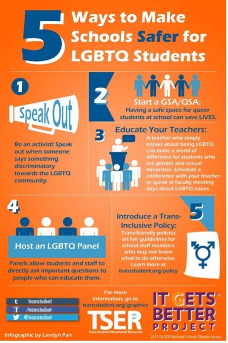
Infographics have become a common genre online to visually communicate information and ideas. Infographics work well in digital environments due to their multimodal designs that combine images, text, charts, and graphs. Infographics are used for all kinds of purposes and take on many shapes, but they often are used to show a process, to show visual relationships, and to communicate facts and data about a particular topic of concern
Q: What is an infographic?
A: An infographic (information graphic) is a representation of information in a graphic format designed to make the data easily understandable at a glance.
People use infographics to quickly communicate a message, simplify the presentation of large amounts of data, see data patterns and relationships, and monitor changes in variables. Infographics have become increasingly popular because of their ability to quickly convey large amounts of information in an appealing package.
Table 1.3 Do’s and Don’ts of Infographics
| Do | Don’t |
| Tell a story | Show data without giving it context. |
| Keep it simple | Try to tell too much at once. |
| Show information in a way that makes sense. | Confuse the reader with design choices. |
| Use appropriate metaphors. | Misrepresent the information. |
| Create graphics and data visualizations that are stimulating. | Just use bar and pie charts. |
| Give some background information. | Assume the reader is familiar with your topic. |
| Create unique graphics that fit the content. | Clutter the space. |
| Leave plenty of breathing room. | |
| Craft your content according to your argument and context (remember the rhetorical situation!). |
To persuade audiences, an arguer might create a poster designed for placement on walls or kiosks or a flyer to be passed out on street corners. Posters dramatically attract and direct viewers’ attention toward one subject or issue. They often seek to rally supporters, promote a strong stance on an issue, and call people to action. For example, during World War II, posters asked Americans to invest in war bonds and urged women to join the workforce to free men for active combat.
Figure 3.2 World War II Poster
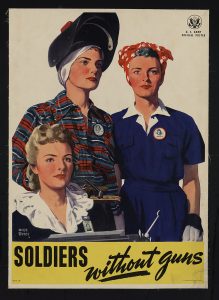
The hallmark of an effective poster is the way it focuses and encodes a complex meaning in a verbal-visual text, often with one or more striking images. These images are often symbolic—for example, using children to symbolize family and home, a soaring bird to symbolize freedom, or three firefighters raising the American flag over the World Trade Center rubble on September 11, 2001, to symbolize American heroism, patriotism, and resistance to terrorism. These symbols derive potency from the values they share with their target audience. Posters tend to use words sparingly, either as slogans or as short, memorable directives. This terse verbal text augments the message encoded in an eye-catching, dominant image.
Flyers and brochures often use visual elements similar to those in posters. An image might be the top and center attraction of a flyer or the main focus of the front cover of a brochure. However, unlike posters, flyers and brochures offer additional space for verbal arguments, which often present the writer’s claim supported with bulleted lists of reasons. Sometimes pertinent data and statistics, along with testimony from supporters, are placed in boxes or sidebars.
Public Service Announcements
Public service announcements (PSAs) share with posters an emphasis on visual elements, but they are designed specifically for publication in newspapers and magazines and, in their persuasive strategies, are directly analogous to product advertisements. Public service announcements are usually sponsored by a corporation or an advocacy organization and often have a more time-sensitive message than do posters and a more immediate and defined target audience.
Designed as condensed arguments aimed at influencing public opinion on civic issues, these ads are characterized by their brevity, audience-based appeals, and succinct, “sound bite” style. Often, in order to sketch out their claim and reasons clearly and concisely, they employ headings and subheadings, bulleted lists, different sizes and styles of type, and a clever, pleasing layout on the page. They usually have some attention-getting slogan or headline like “MORE KIDS ARE GETTING BRAIN CANCER. WHY?” or “STOP THE TAX REVOLT JUGGERNAUT!” The Ad Council offers a library of PSAs on their website.
Figure 3.3 Public Service Announcement Example

The balance between verbal and visual elements in a PSA varies. Some PSAs are verbal only with visual concerns focused on document design (for example, an “open letter” from the president of a corporation appearing as a full-page newspaper ad). Others are primarily visual, using images and other design elements with the same shrewdness as advertisements
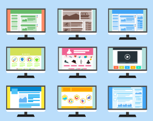
Websites
Because reproducing high-quality images (especially color images) is expensive in a print medium, writers of argument prior to the Web often relied mainly on verbal text. But the Web has now made it possible to publish arguments incorporating powerful color images. The hypertext design of Web pages, along with its complex intermixture of text and image, has changed the way many writers think of argument. The home page of an advocacy site, for example, often has many features of a poster argument with hypertext links to galleries of images on the one hand, and to verbal arguments on the other. These verbal arguments themselves often contain videos, photographs, drawings, and graphics. The strategies discussed in this textbook for analyzing and interpreting visual texts also apply to Web pages.
When designing a website or evaluating one, you should consider the following details (see “How to Set up a Website in 2020: An Updated Beginner’s Guide“):
- Decide on a platform.
- Before you start worrying about [color] schemes and domain names, you’ve got to decide what platform you’re going to build your website with.
- Find a domain name and host.
- To get a new website online, you’re going to need two things:
- a domain name (a web address like yoursitename.com); and
- hosting (a service that connects your site to the Internet).
- Set up and tweak your website.
- Once you’ve bought your domain name and set up your hosting, you’re well on your way!
- Now it’s time to get your website up and running. There are numerous free (WordPress, Joomla) and pay (Wix, Squarespace) website builders.
- Keep in mind a website is a reflection of a company, a school, or you. It should be easy to locate (so never have a very complicated title/search term), use appealing colors and images, and include helpful easy-to-use links.
Exercise 3.3
Consider a work from a multimodal perspective. If you are interested in the connections of art and culture, consider choosing a piece of historic or contemporary Native American art.
You can find information and view images at the websites for the National Museum of the American Indian and the Hearts of Our People: Native Women Artists exhibition at the Smithsonian American Art Museum. Create an infographic or a short video assessing the chosen artwork. An infographic incorporates multiple images and texts into a single image that can be read and understood quickly. A short video could work in a similar way, but the images would be presented sequentially with narration, either spoken or written.
Your multimodal work should consider the elements of visual rhetoric discussed throughout this chapter and combine reflection with analysis and persuasion.
Kaylee Licano Media Project Posters (Linked here)
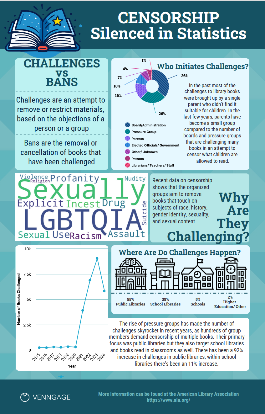
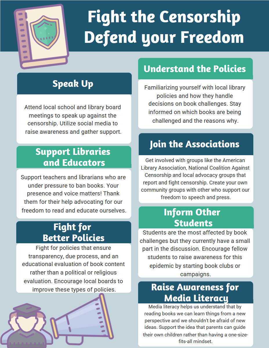
Below are three posters to address book banning. These were created by Leilani Brumfield.
Key Takeaways
- Consider these main elements in creation of a presentation: the argument, the audience, the tone, and the presenter’s body language, eye contact, and appearance.
- Many modern presentations combine spoken word with visuals, such as slideshow presentations.
- Multimodal arguments use photographs, drawings, graphics, and innovative page and text design for persuasive effect.
- Visuals can be used alone to make an argument in things like infographics, public service announcements, and websites.
Infographics by Christian Huber is licensed under Creative Commons 4.0 International Licence [CC BY 4.0]
Image Credits
“you’ll die of old age. We’ll die of climate change. Global climate change strike protest demonstration” by Markus Spiske on Unsplash
“Jasmine performed well tonight at the SEMO District Fair.” by Taylor on Unsplash
“5 Ways to Make Schools Safer for LGBTQ Students” Infographic by Trans Student Educational Resources is free to use according to their terms of service
“Woman giving a speech” by Anita Jankovic on Unsplash
“Working from WeWork in a post Coronavirus environment” Photo by airfocus on Unsplash
“World War II poster” Photo by Adolph Treidler in Library of Congress and is licensed in the public domain
“PSA Poster – Meth Awareness” by stuckwithpins and is licensed under

