While color is an integral variable when choosing how to represent spatial data best, making informed decisions on the size, shape, and type of symbols is equally essential. Although raster data are restricted to symbolizing features as a single cell or as cell groupings, vector data allows for a vast array of options to symbolize points, lines, and polygons in a map. Like color, cartographers must take care to use symbols judiciously in order to most effectively communicate the meaning and purpose of the map to the viewer.
Basic Symbol Guidelines
Vector points, lines, and polygons can be symbolized in a myriad of ways. The guidelines laid out in this section will help GIS users make informed decisions on how best to represent the features on the map. The primary visual variables associated with symbolization include size, texture, pattern, and shape. Changes to symbol size and texture are most effectively used in conjunction with ordinal, interval, and ratio data. Changes to symbol pattern and shape are preferred in conjunction with nominal data.
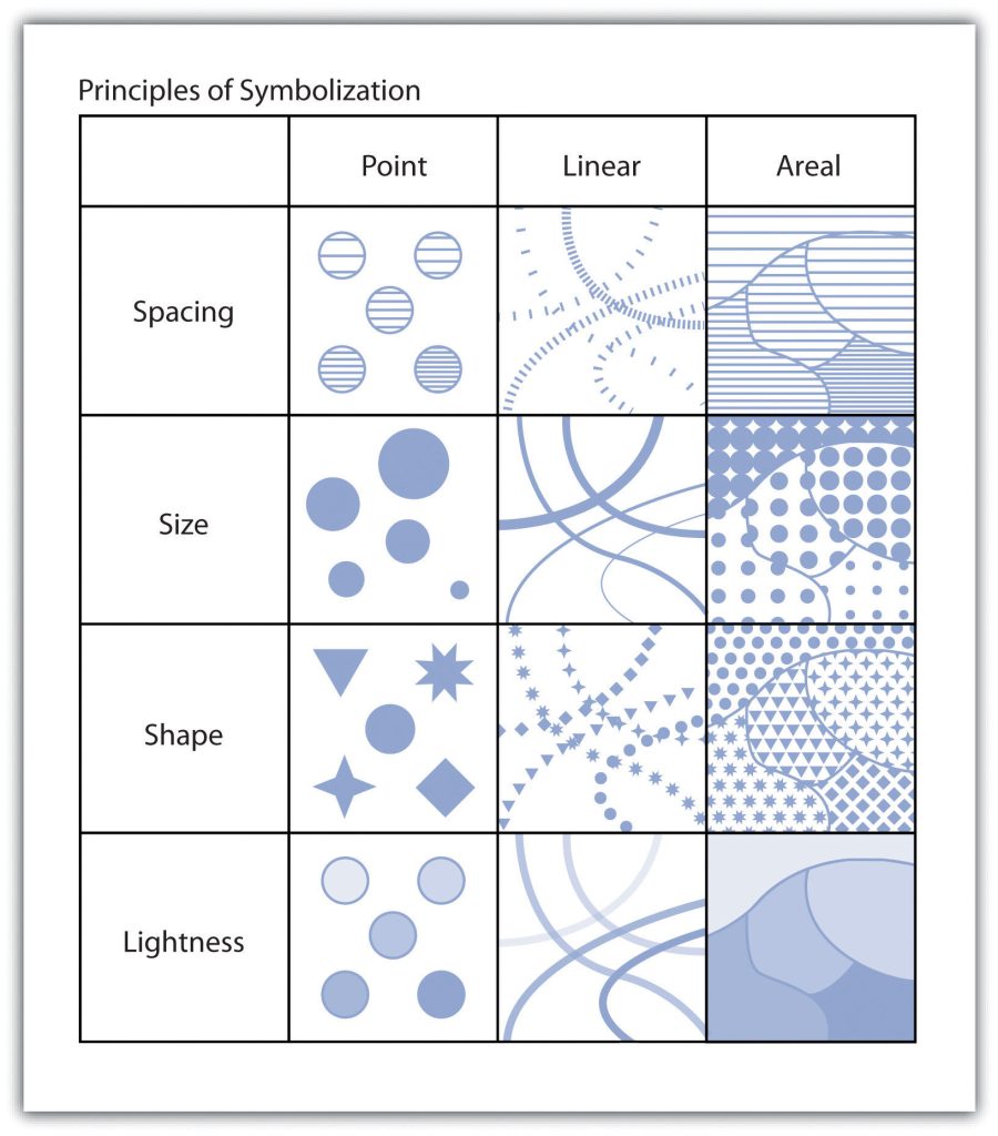
Variations in the size of symbols are reliable indicators of feature importance. Intuitively, larger symbols are assumed to be more important than smaller symbols. Although symbol size is most commonly associated with point features, linear symbols can effectively be altered in size by adjusting line width. Polygon features can also benefit from resizing. Even though the area of the polygon cannot be changed, a point representing the centroid of the polygon can be included in the map. These polygon centroids can be resized and symbolized as desired, just like any other point feature. Varying symbol size is moderately effective when applied to ordinal or numerical data but is ineffective with nominal data.
Symbol texture, also referred to as spacing, refers to the compactness of the marks that make up the symbol. Points, lines, and polygons can be filled with horizontal hash marks, for instance. The closer these hash marks are spaced within the feature symbol, the more hierarchically relevant the feature will appear. Varying symbol texture is most effective when applied to ordinal or numerical data but is ineffective with nominal data.
Much like texture, symbols can be filled with different patterns. These patterns are typically some artistic abstractions that may or may not attempt to visualize real-world phenomena. For example, a land-use map may change the observed fill patterns of various land types to try to depict the dominant plants associated with each vegetation community. Changes to symbol patterns are most often associated with polygon features, although there is some limited utility in changing the fill patterns of points and lines. Varying symbol size is moderately effective when applied to ordinal or numerical data and is ineffective when applied to nominal data.
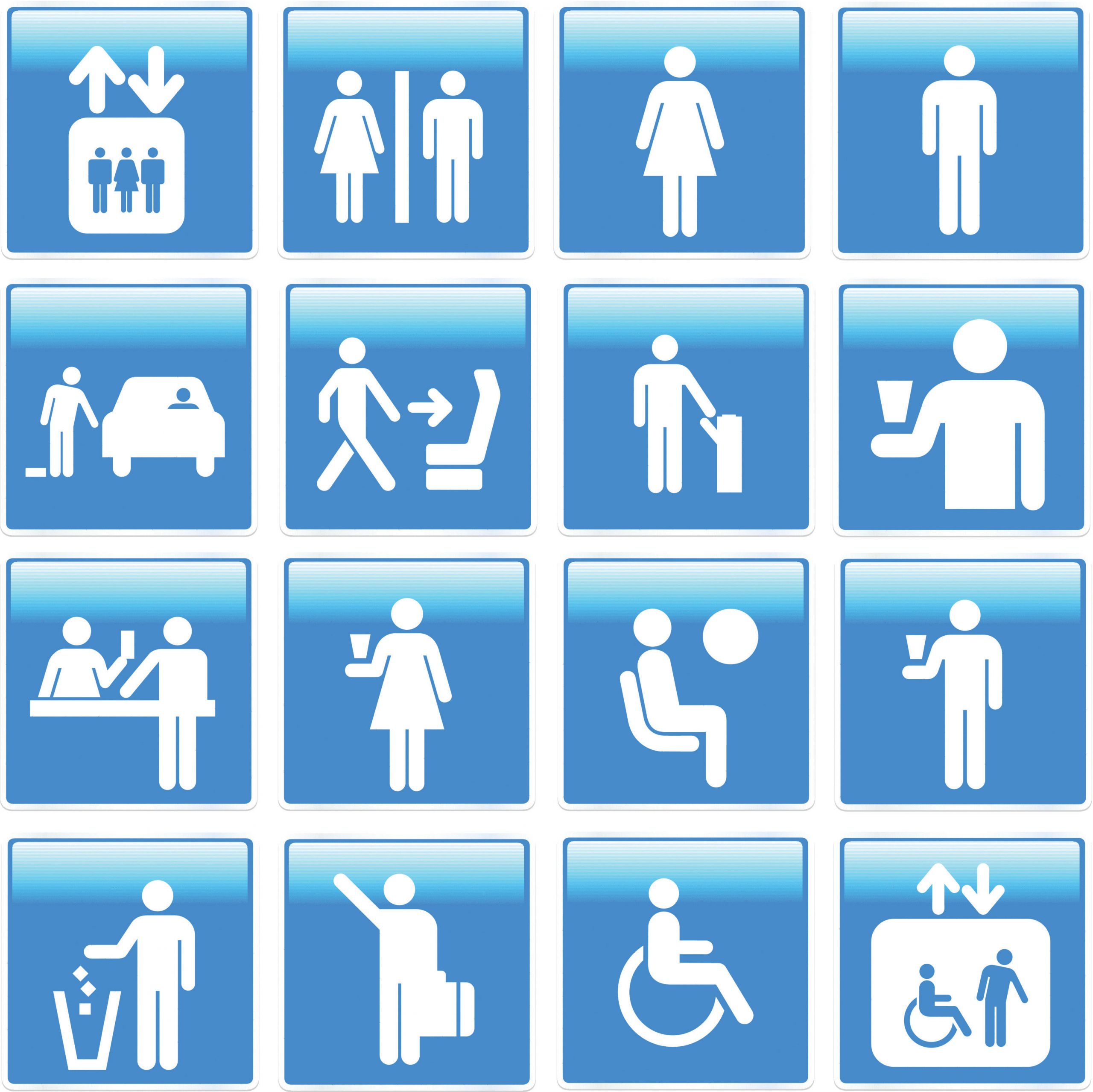
Altering symbol shape can have dramatic effects on the appearance of map features. Point symbols are most commonly symbolized with circles, which tend to be the default point symbol due to their unchanging orientation, compact shape, and viewer preference. Other geometric shapes can also constitute effective symbols due to their visual stability and conservation of map space. Unless specific conditions allow, volumetric symbols (e.g., spheres or cubes) should be used sparingly as they rarely contribute more than simple, two-dimensional symbols. In addition to geometric symbols, pictograms are useful representations of point features and can help to add artistic flair to a map. Pictograms should denote features of interest and should not require interpretation by the viewer. Locales that frequently employ pictograms include picnic areas, camping sites, road signs, bathrooms, and airports. Varying symbol shape is most effective when applied to nominal data and is moderately effective with ordinal and nominal data.
Finally, applying variations in lightness and darkness will affect the hierarchical value of a symbol. The darker the symbol, the more it stands out among lighter features. Variations in the lightness/darkness of a symbol are most effective when applied to ordinal data, are moderately effective when applied to numerical data, and are ineffective when applied to nominal data.
Keep in mind that many other visual variables can be employed in a map, depending on the cartographic software used. Regardless of the chosen symbology, it is essential to maintain a logical relationship between the symbol and the data. Also, the visual contrast between different mapped variables must be preserved. Indeed, the efficacy of a map will be significantly diminished if the symbols are readily identifiable and look markedly different from each other.
Proportional Symbolization
In addition to the uniform symbols presented in the previous section, symbols for a single, quantitative variable can be sized proportionally to match the data values. These proportional symbols are useful for presenting a relatively accurate understanding of the differences in magnitude within a dataset. As the numeric values for each class increases, so too do the size of the symbol representing that class. This allows the symbol size of features to be directly related to the attribute values they represent, whereby small points denote small data values, and large points denote large data values.
Similar to proportional symbols, range graded symbols group raw data into classes with each class represented by a differently sized symbol. Both proportional and range graded symbols are most frequently used with point data, but lines and polygons can benefit from proportional symbolization as well. In the case of linear datasets, the line width is most frequently used as the proportional visual variable. Polygon datasets typically summarize a quantitative variable within each polygon, place a centroid within that polygon, and proportion that centroid point symbol. Range grading should not be used if the data range for a given variable is small. In these cases, range grading will suggest more significant differences in the data values than is merited.
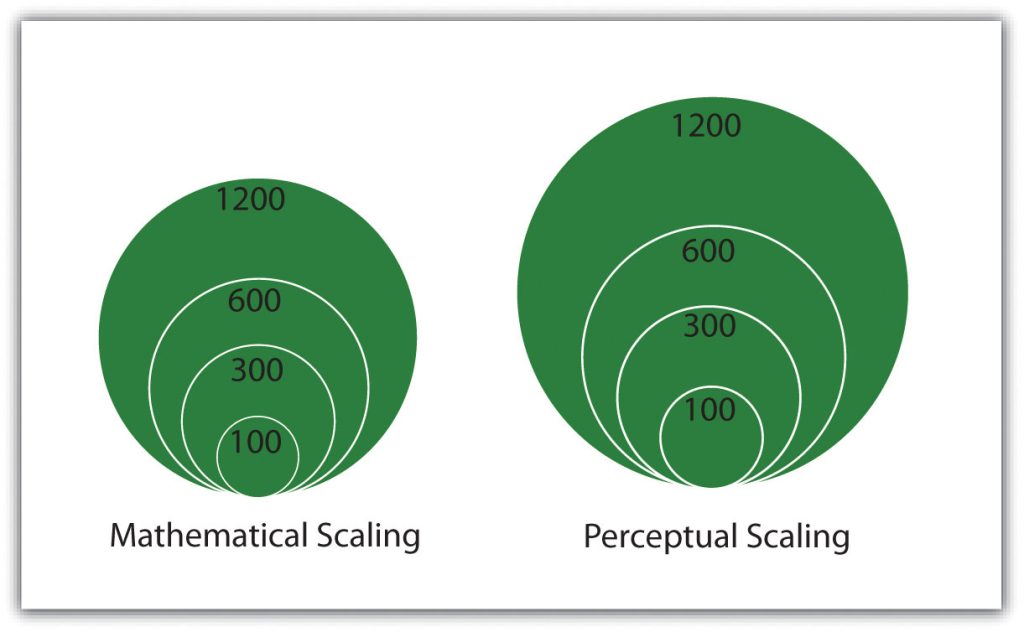
The advantage of proportional symbolization is the ease with which the viewer can discriminate symbol size and thus understand variations in the data values over a given map extent. On the other hand, viewers may misjudge the magnitude of the proportional symbols if they do not pay close attention to the legend. Besides, the human eye does not see and interpret symbol size in absolute terms. When proportional circles are used in maps, it is typical that the viewer will underestimate the larger circles relative to the smaller circles. To address this potential pitfall, graduated symbols can be based on either mathematical or perceptual scaling. Mathematical scaling directly relates symbol size with the data value for that locale. If one value is twice as significant as another, it will be represented with a symbol twice as significant as the other. Perceptual scaling overcomes the underestimation of large symbols by making these symbols much larger than their actual value would indicate.
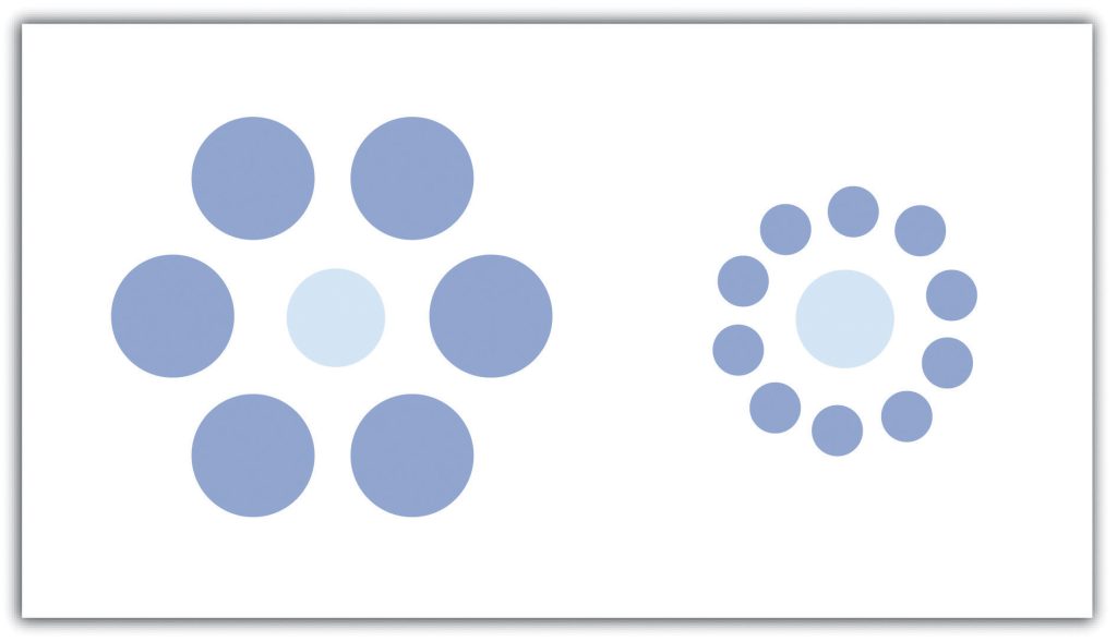
A disadvantage of proportional symbolization is that the symbol size can appear variable depending on the surrounding symbols. This is best shown via the Ebbinghaus illusion (also known as Titchener circles). The central circles are both the same size but appear different due to the visual influence of the surrounding circles. If creating a graphic with many different symbols, this illusion can wreak havoc on the interpretability of a map.