Building the Design and Visuals
You have many choices for the design and visuals in this project. Relax: the goal is to play with some tools and push your design thinking (I know most of you don’t plan on being graphic designers). I do expect all of your to apply CRAP and make a readable and usable document, though.
Review CRAP
C.R.A.P are the four foundations of designing content in technical writing. As long as you intentionally apply these strategies to your work, the content will be more visually engaging while giving meaning to your choices.
Review your Required Materials from Week 6 on Document Design if you don’t know what CRAP I’m talking about….you have notes and materials on this topic.
Sketch the Layout
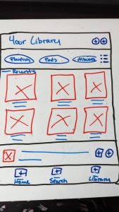
To craft an impactful design and seamlessly incorporate visuals into your tutorial, it is essential to begin by sketching out a rough layout that outlines the overall structure. In actual design contexts, we call this a low-fidelity wireframe.
A low-fidelity (lo-fi) wireframe is a basic blueprint of a website or app’s layout that’s used in the early stages of designing. It’s not about the looks (as in specific color, font, and image choices), it’s about how it works and visually flows. These blueprints are quick to make and easy to change, so they’re great for brainstorming and testing. Think of them like a rough sketch of your ideas before you start on the actual visual design.
- Start with a Sketch: Before you even touch any digital tools, brainstorm your layout ideas on paper. This allows you to quickly iterate on your ideas and get a rough sense of your design’s structure.
- Use Basic Shapes and Lines: Rectangles can represent images, horizontal lines can signify text, and boxes can stand in for buttons or interactive elements.
- Label Everything Clearly: Since you’re not using detailed components, it’s crucial to label your elements clearly so that others can understand your design.

Remember, the goal of a lo-fi wireframe is to lay the foundation for your design, not to create a finished product. Keeping your design basic allows you to focus on the user experience and iterate quickly based on feedback.
Choose the Visual Theme
Consistency is key to maintaining a professional appearance throughout your tutorial when it comes to colors, fonts, and formatting choices. The next step is deciding on the book’s colors, fonts, and aesthetics (are you going photo-realistic? sketchy? or cartoony?). Every visual element you include should follow your visual theme. Here are some tips and a checklist of questions to consider when creating a visual theme.
- What is the purpose of your design? The purpose should guide your theme choice. In this project, the Microsoft App that you chose has a visual theme associated with it. It might make sense to go with the colors, fonts, and vibe of that app.
- Who is your target audience? The visual theme should be appealing and relatable to your audience. In this project, you are creating for first-year and transfer UCCS students at orientation. You can build your visual theme based on your personal experiences and interests (to an extent) since you are close to the target audience for the document.
- What feelings do you want to evoke? Choose colors and styles that evoke these emotions. We want the audience to feel supported and excited. We don’t want them to feel talked down on or overwhelmed.
Checklist
- Color Palette: Read Amy Balliett. Chapter 6 Color. In Killer Visual Strategies. John Wiley & Sons. 2020.
- Have you chosen a color palette that aligns with your topic’s identity?
- Is the color palette visually appealing, and does it evoke the right emotions?
- Is the color palette used consistently throughout your design?
- Is the color palette a good base for contrast? Use the Adobe Color Tools to pick out options and check your contrast/readability settings.
- Typography: Watch Understanding Typography
- Do the fonts align with your brand’s identity and the overall visual theme?
- Are the fonts used consistently throughout your design?
- Did you limit yourself to a 3-5 strategy? I find it helpful to think of it this way: FONTS are like dogs (or cats if you prefer). Select three different dog breeds (different typefaces) and try to stay under five total dogs (variations in the breed) in your kennel. More than five dogs get a bit chaotic and messy to maintain. For example, your kennel has corgis, pointers, and labs.
- Dog 1 (Corgi): A decorative typeface for the good vibes and emphasis. We love corgis, but their main function is cuteness.
- Dog 2 (Pointer): A strong typeface for headings and key points. We use pointers to get work done and lead the way.
- Dog 3 (Yellow Lab): A simple typeface for reading the bulk of the content. We can rely on labs as the standard goodboy most people know.
- Dog 4 (Chocolate Lab): A bold version of your simple typeface for emphasis when reading the paragraphs. Why not have two goodboys? One is more memorable and stands out in a room than the other, though.
- Dog 5 (Black Lab): An italics version of your simple typeface for notes or side points when reading the paragraphs. We might not notice the black lab right away, but when we do see it, we are drawn to pet ’em.
- Imagery: Read How to Create Screenshots.
- Does your imagery style (illustrations, photos, etc.) align with your brand and visual theme?
- Is the imagery appropriate and appealing to your target audience?
- Icons & UI Elements: Use The NounProject for quality stock images and icons with ethical sourcing
- Do your icons match the visual theme?
- Are they intuitive and easy to understand?
Follow the Company Visual Theme
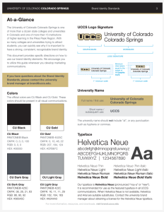
Since you are creating a tutorial for a product, you could follow the visual theme of that company. As an example, you can also follow the UCCS brand standards and visual theme for practice with the brand kit.

The brand.uccs.edu folks provide assets, guidelines, and tips for following our Brand Voice. You can also access the UCCS Photo Database for high-quality images from around campus. These are free to use for any UCCS-related content (including student projects). The photos might not make sense for your project: do what is logical and appropriate.
