6 Intro to Document Design
Week 6
Hey associates, this lecture is an introduction to document design as part of your larger visual strategy when presenting technical information to the reader. The emphasis on the design–the overall layout, color, and font choices on a document–is one of the key qualities of “information design.” However, our concepts for document design do not make us graphic designers, as that is a different field and job. Also, other forms of writing, like a magazine article, use document design principles even though that style isn’t necessarily technical communication. It is like a square to a rectangle: all technical writing and information design uses these document design principles, but not every use of document design is a form of technical writing. These principles are just infinitely useful when creating more useable and enjoyable content.
You can also listen to the podcast version of this lecture.
The lecture is divided into three core sections.
- First, I will explain the key theory and foundational concepts that inform and document design is built on.
- Second, I will introduce the fundamental aspects of layout and tools for your projects.
- The last section, I will introduce the fundamental choices and tools for font, color, and style you will need for your work.
Notes
The note-taking guide can help you organize your thoughts and concepts. This lecture covers many technical steps for the core platforms (Word and Docs), so develop a note-taking strategy that will help you practice and capture the available tools.
Section 1: Reasons and Theory in Design
This first section is an introduction to background theory–the framework for understanding and discussing a phenomenon or thing–and the reasons why and how design works. This is the introductory level, and if you are more interested in information design, we have upper-division courses dedicated just to this topic. I also encourage students to take at least one art appreciation, color theory, composition, or graphic design course from the visual arts department for a deeper and wider background on the visual processing of content.
And note: as technical writers–and especially the engineering and back-end programming careers you are likely considering–no one expects you to be an artist and have a strong grasp of design. That is the role of the graphic designers working with the UX folks and front-end programmers to develop.
So, instead, I want you to focus more on appreciating the reasons and driving factors of design so that you can be a better collaborator in your future teams. On the documents you need to create for your jobs and the projects in this class, you will apply a visual strategy and design to the text-based content because design isn’t just about aesthetic qualities. Document design is about making information easier to process.
1.1 Information Processing
First, a bit of background on information processing, a cognitive theory for how neurotypical brains take in sensory data and turn it into meaning. Information processing is a cool field that combines psychology, biology, and social sciences to explore how and why we interact with content in the ways we do. Search for more if this interests you! Otherwise, let’s get the core and simplified foundations related to technical writing choices.
In many ways, our brain is a computer, or rather, we often model computing infrastructure and processes after the ways our brain operates. Because of that, we can think of our cognitive processes like a computer’s operations—we achieve understanding and knowledge through input (sensing information), processing (interpreting and storing information), and output (applying information).
We are able to quickly complete that base process because of a few key concepts:
✨Schema: These are mental concepts or frameworks we form from our experiences, bridging new information with existing knowledge. Think of it like folders on your computer–when a new file is downloaded, you can sort it into the right folder to exist with similar files. This is a key reason why you go through school with 100, 200, 300, and 400-level courses because all the general and introductory experiences create a schema of knowledge that will make the upper-division information easier to process.
✨Information Overload and Memory: our schemas do rely on how well we manage and store the inputs we receive. It is pretty easy to overload that system, which is when our readers start just looking at the words instead of actually reading and processing them. We can overload the reader with too many topics crammed into one paragraph–use Topic. Details. Next with active sentence structure (including periods to end your unit of content) to manage that potential overload. As long as the reader has clarity on where one small chunk of information begins and ends, we get into the memory aspect of processing.
- Sensory Memory is the first point of contact for incoming information and relies on preattentive processing (so before we are really even aware we are doing it). It holds information for a very short time–think 1 second–and recognizes basic sensory characteristics such as shape, size, color, and pitch. This sensory memory is way clear patterns in our writing are so important because our readers start to recognize the pattern of heading styles, command voice, and certain icons and rely on sensory memory to scan for the content they need.
- Short-term/Working Memory is how we actively process and manipulate information. But it is still just a few seconds with pretty limited ‘space’ in our processing. The general rule for technical writing is that short-term memory can handle about 5-9 items at a time, so when you write your Topics. Details. Next, limit the details to 5 points before ending the chunk and moving on to the Next. And if you have ever listened to a lecture with the same slide on the screen for a while…and realized you can’t remember what they JUST said? That is because your working memory was overloaded and basically stopped really processing. That can also happen when we start thinking about other things, focus too much on writing notes, and start “multi-tasking” because our working memory can only handle so much input to output transfer at once. But for those of you who like the podcast version, while walking or cleaning, that tends not to overload our working memory because those other tasks–walking or cleaning–are so routine that our brains automate many parts of it and allow our information processing to continue.
- This automation is why I want you to be very careful if listening to the podcast in the car. While we tend to “automate” driving–if you have gone down your street and realized you weren’t thinking about driving–it is important to maintain attention on the road. Be careful out there.
- Finally, long-term memory is when we really store information to retrieve later. Having real connections to your past experiences…the schemas or file folders in your brain… helps the long-term memory process. This is why I encourage you to take notes with examples related to your life, career, or major so that you can store this technical writing information alongside existing memories and established connections.
✨Attention: The final thing is the concept of attention because we need to capture the focus to start the sensory memory to short-term and long-term memory processes. If the reader never notices the information, they can’t process it. Visual hierarchy–those are the headings that stand out– contrasting colors, fonts, and images can all guide attention around the page. Remember that a key goal as writers of technical and workplace content is to increase the likelihood that the reader will skip, scan, and skim to the answers they need. Directing their attention helps improve our odds that they will find the content and not need to ask as many follow-up questions.
Effective document design means intentionally helping people kickstart and move through the information-processing stages of attention and memory.
1.2 Gestalt Principles
The last bit of theory is called the Gestalt Principles of Design. These theoretical principles help us make intentional and effective choices in layout, color, fonts, and style techniques. They are grounded in psychology and provide foundational insights into human perception, guiding designers in creating layouts that optimize clarity and engagement. There are numerous principles, but I will introduce the 7 that relate most to working as a general technical writer. If you decide to go into UX or any front-end design field, I would expect advanced theory and applied courses to get into the full range of principles. You can look at the examples in the notetaking guide slide deck to experience each principle while you listen.
- Emergence states that the whole is greater than the sum of its parts and that our brains look for the larger whole first. Think about mosaic art: the more familiar and recognizable outcome emerges from the smaller components first. It is also why we can read quickly; we recognize the whole word before or even without actively processing each letter. The word emerges from all the individual letter shapes quickly in our brains.
- Common Region is how we understand objects that are within the same closed area as related. This is critical to intuitive app design: if a group of buttons is within a rectangle or shaded region, users will see them as a group. The same is true for the nav bar on a website or a textbox in a document. We recognize that the common region must signal a connection between the elements.
- Continuity is how our eyes follow established lines, even when they curve or temporarily block. Continuity allows graphs, especially line graphs, to visualize data and help us process trends faster than reading numbers alone.
- Proximity is both a principle and a design strategy in the layout. It states that objects that are close together are seen as related. For instance, if a graph and its caption are close together, readers will understand that they are related. So proximity is an active choice we must make as readers to leverage this processing principle.
- Invariance is why we can recognize objects even if they are rotated, scaled, or translated. For example, we can still recognize a triangle even if it is upside down. That is very helpful when creating a parts list or an assembly diagram for consumers…even if the screw is rotated in their perspective, we can recognize the similarity in the shapes.
- Similarity explains how we understand objects with superficial characteristics in common as a group. Again, it is the patterns we establish as writers to show the organization and structure of a document. For example, if all the science figures in a textbook are the same color, readers will easily identify them as science figures. Or why buttons need to be consistent across a web page so we recognize that clicking the bold, blue rectangle is an action.
- Symmetry and Order state how our brain prefers order over chaos when processing information. Even if an order doesn’t exist, we try to find what the order could be…and feel more anxious or frustrated when that doesn’t exist. This will come up again to help explain our strategy of alignment and how it makes documents more usable and enjoyable.
1.3 Applying Theory
The first set of choices when planning a layout is how to chunk, queue, and filter the information based on the theory and principles for processing. Once you have that plan in order, we can make choices in the specific layout, color, and font strategies.
✨Chunking involves breaking down information into smaller, more manageable units or “chunks.” As it sounds. Remember, we are a literal bunch in technical communication. This method is a core component of a more useful, useable, and enjoyable design as it helps readers process the related units and reduces that cognitive load–the amount of content in the working memory to worry about. While using paragraphs helps, we don’t rely on just that small white space between your lines of text. Instead, for document design, think about the chunking in even larger terms for the whole document.
We typically use three tools for better chunking across the page:
- Headings and Subheadings: These serve as navigational tools for readers and provide a visual hierarchy that makes scanning easier. The headings also represent the chunks by building on the common region principle because readers understand that everything contained in that heading must relate to that core topic as a group.
- Bulleted and Numbered Lists: Bulleted lists are useful for highlighting key points or features without overwhelming the reader with excessive text. Numbered lists can guide readers through steps or processes sequentially, reinforcing understanding through organization. The most common error I see is making too many lists. So, every time you use a bullet point or a number, it loses some impact. Nothing is emphasized if everything on your page is a list item. And reading an entire page as a list makes it harder to understand the chunks of information and the bigger picture. Save the lists for components and elements that truly make up parts of the whole and benefit from scanning down the lines.
- Borders: Use boxes, shading, lines, and white space to show the literal distinction between chunks of information. Don’t let the reader wonder whether it is the end of a chunk.
Once the chunks are figured out, you need to plan their order.
✨Queuing refers to the use of visual and typographical (font stuff) cues to indicate the hierarchy and importance of information. The queue basically shows the reader the level of importance, what to read first, and how the content is structured. It is like giving them a pathway or a map to follow in your writing while also providing checkpoints along the way. We can create these check points with a few tools, all of which we will dive into deeper in this lecture.
Font Styles and Sizes: The font’s size, shape, and weight draw our attention and signal the queue. In psychology, we tend to read or pay attention to the big, bold things first and conditionally, as we’ve learned through the years of reading that font size tells us the content queue.
Color: Color plays a pivotal role in enhancing document readability as well as aesthetic appeal. But we do need to maintain consistency in color usage and follow accessibility standards so that all readers can benefit from color-coded cues. Typically that means not using ONLY color to show the queue.
Indentation and Spacing: Indentation serves multiple purposes: it visually separates paragraphs while also indicating relationships between sections and subsections within a document. Adequate spacing not only prevents clutter but also allows for queueing. In technical writing, the use of indentation in paragraphs is mixed, as we tend to use single-spaced work. With single spacing, the indentation is redundant because the white space between paragraphs serves the purpose.
✨The last one is filtering, where we allow the reader to be selective in what they read. Filtering is the main thing driving the “skip and scan” in our Skip, Scan, Skim motto of the course. We can encourage filtering by offering introductions with clear purpose statements to every new section, highlighting key points at the beginning or end, and using the same tools for layout, color, and font to establish the pattern. Then, the reader filters by the pattern you created.
All that psychology, principles, and applications still come down to and require our planning strategies. So, let’s review that planning application yet again. We will never get enough.
First, consider the document’s CONTEXT. We ask questions like, “Is this a very conventional genre with set expectations, or is it something more flexible?” That context will immediately impact our design choices since we may not have that much choice anyway.
Then, unpack the AUDIENCE by figuring out their deal, where they will use the document, and why they need it. The level of motivation, for example, can change the amount of chunking and filtering we would need to include, with less motivated readers tending to need more of each.
The MESSAGE is figuring out what you need to convey with the important parts and types of information. Instructive writing will need extra clear queuing, while a technical report is more important to filter for skipping key sections.
Last, the PRODUCT determines the choices available, too. Video or podcast content doesn’t have the same ability or need to queue information because it is a more linear medium–yes, people can skip forward. Still, they generally don’t scan around the pages and go back and forth like a text-based reader might. We still need to provide signals for chunks, such as setting up chapters and time stamps on YouTube, to help people filter within the video.
Recap
And speaking of filtering and chunking techniques. It is time to recap the key points from section 1. Check your notes for the following topics.
- The three main stages of information processing
- The three forms of memory that we need to engage and consider with the document design
- The 7 Gestalt Principles and how they relate to document or writing choices
- What chunking means for information processing
- What queuing means for processing
- What filtering means for processing

Take a break. When you are ready, we will discuss the layout choices and tools you should use to design your documents.
Section 2: Layout Choices and Tools
In this section, we will build on the theories of information processing and use the strategic options and tools we have as writers to design better content. The layout is the place where queuing and chunking are modeled because the location and size of our content areas show the reader where we expect them to look and process first.
A layout is a design term that refers to the visual arrangement and organization of elements on a page or screen. It encompasses how text, images, tables, charts, and other components are positioned and presented to the reader. Every document you have ever created has a layout: you probably just didn’t think about or actively choose what that layout might be. Moving forward on all your work, please take time in the project development stage to consider different layout options before CHOOSING the best combination of elements to serve the CAMP site.
2.1 Design Principles
So, the framework and concepts you’ve already taken notes on (like organizational patterns, parallel structure, and technical graphics) and what you’ve been analyzing in the documents were all part of preparing you for document and information design as a specific visual strategy. And it all comes down to CRAP…yes, CRAP. I didn’t make that up.
CRAP stands for contrast, repetition, alignment, and proximity. These four aspects of layout are happening on your page no matter what. This isn’t an issue of IF CRAP exists: it is a matter of you taking control of the CRAP to design a layout and make your document easier and more enjoyable to interact with and read.
✨Contrast is a principle that says the human eye is drawn to differences in appearance or sound (if working with media) between two items. It is used to differentiate elements on the page and signal meaning in the layout. This is why a bolded font screams importance or emphasis: because it looks different from the surrounding text.
Contrast allows readers to scan down a page and recognize different elements in the content. Classic examples are the bold, red, symbols for DANGER that we include in instructive writing. The color, line thickness, and symbol stands out from the text and other graphics because of contrast. Contrast also relates to the color and font choices that we make because it explains the extent that something is readable–meaning it stands out from the background enough–or not.
✨Repetition is about developing patterns and cohesion across a document. It happens when we reiterate certain elements in the font, color, shapes, structure, and layout. Remember how people like organized information and tend to seek out patterns from the theory section: give the reader that sense of pattern. Also, Contrast can get a little out of control without the consistency and chill from repetition.
A common example of effective repetition is making every H1 visually the same so that every time the reader sees a size 18 font in bold centered on the page they know this is a new main section. Contrast works with repetition when we make every H2 a size 16 font that is bold and right justified because readers see the distinction from the H1 look while recognizing the pattern of subsection labels. Repetition can also be used in the layout if we decide that keywords and definitions will always appear as a footnote, so readers get a pattern of looking at the bottom of the page for unknown terms. Don’t overthink this. Just leverage repetition to make the design easier to skip and scan.
✨Alignment is about the arrangement of chunks along your page grid, both the vertical and horizontal edges. That placement builds the flow of your hierarchy and content. Alignment is also heavily related to enjoyment and overall “making things look nice” because documents look nicer when the alignment is balanced and meaningful.
A quick example is a list with subcategories– let’s say a shopping list. When we write down “Fruit” and then indent “Apples, Frozen Blueberries, and Avocado” the change in alignment signals that the type of fruit is structured under the store area we might be shopping. On the larger scale of the layout, aligning elements consistently provide visual cues that help readers navigate your document, distinguish between different types of information, and grasp the relationships between them.
✨Proximity is about the closeness of elements and allows chunking and queuing to happen. Proximity is simple yet powerful because when you place things near each other, readers perceive them as related. When things are far away, they aren’t considered part of that chunk or group.
The distance in proximity can be a subtle change for readers to perceive connections differently, for example, the distance between two paragraphs. It is a single line of empty space, and sometimes an indentation (alignment), that tells readers this is a new and separate chunk.
Alignment and proximity come together to show the overall organization of your layout because the alignment, or arrangement on the page, and the distance between items is what builds a grouping and, ultimately, your layout. They are best friends, working even more closely than contrast needing repetition. But all four elements operate and rely on each other. All four elements influence your layout’s readability: skip, scan, and skim. Contrast is still there even when you don’t apply “contrast” to the page–like you have everything the same weight, size, and color. It is just there as a “lack” of contrast, making things harder for the reader. Same with alignment. Even if you don’t actually “align” your images down the left vertical axis of the page, they exist in AN alignment…just a chaotic one.
2.2 White Space, Passive Space, or Negative Space
White space, often called passive or negative space, is an area with no content in the layout. It allows the other principles to function properly and enables reading altogether. White space around the individual characters within a word allows us to distinguish and recognize that shape. Then, slightly more white space between words or symbols lets us recognize the word itself. Without that negative space, there would be no written form of language. Audio has negative space, too. There is passive time when we speak to each other; as we pause slightly between sounds, words become language we process.
White or passive space doesn’t have to be white on your page. It is called that because traditionally, we print with black or dark ink on lighter paper, so anything in the negative area without the ink looks white. That is why I like to refer to it as negative or passive space to reduce that confusion in more graphic designs. Think about it like the area without active content–words, technical graphics, and core content.
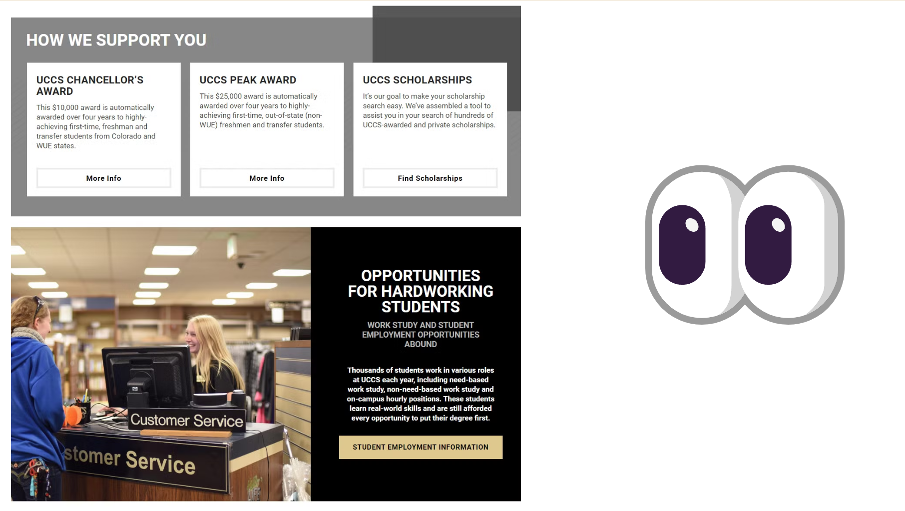
I have an example from the university to help explain these layout principles. This example starts with no document design strategies applied. It is a single paragraph without indicators for chunking, filtering, or queuing. My brain is working way harder than I want to locate and process the different forms of information presented. As you read the first passage, write down where you think the chunks of content exist.
“How we support you. UCCS Chancellor’s Award. This $10,000 award is automatically awarded over four years to highly achieving first-time, freshman, and transfer students from Colorado and WUE states. More info. UCCS peak award. This $25,000 award is automatically awarded to highly achieving first-time, out-of-state (non-WUE) freshmen and transfer students over four years. More info. UCCS scholarships. It’s our goal to make your scholarship search easy. We’ve assembled a tool to assist you in your search for hundreds of UCCS-awarded and private scholarships. Find scholarships. Opportunities for hardworking students. Work-study and student employment opportunities abound. Thousands of students work in various roles at UCCS each year, including need-based work-study, non-need-based work studies, and don-campus hourly positions. These students learn real-world skills and are still afforded every opportunity to put their degree first. Student employment information.”
The paragraph’s content has a lot of useful information for the audience. But without document design intentionally applied, the lack of CRAP and passive space means that readers can only rely on skimming to locate and reference financial aid types. It becomes a lot of re-reading and low usability vibes.
We can improve the paragraph by just fixing the contrast. Can you guess how?
🤔🤔🤔
🤔🤔🤔
🤔🤔🤔
Bolding the start of the new award-type segments. With some bolding applied, names like the UCCS Chancellor’s Award and UCCS Peak Award. UCCS Scholarships. Opportunities for hardworking students. Stand out from the rest of the content. I am drawn to those areas, and I can now SCAN and skim. We can also add repetition intentionally by adding ALL CAPS to the MORE INFORMATION statement that signals the end of a chunk.
“How we support you. UCCS Chancellor’s Award. This $10,000 award is automatically awarded to highly achieving first-time, freshman, and transfer students from Colorado and WUE states over four years. MORE INFO. UCCS peak award. This $25,000 award automatically rewards highly achieving first-time, out-of-state (non-WUE) freshmen and transfer students over four years. MORE INFO. UCCS scholarships. It’s our goal to make your scholarship search easy. We’ve assembled a tool to assist you in your search for hundreds of UCCS-awarded and private scholarships. FIND SCHOLARHSHIPS. Opportunities for hardworking students. Work-study and student employment opportunities abound. Thousands of students work in various roles at UCCS each year, including need-based work-study, non-need-based work studies, and on-campus hourly positions. These students learn real-world skills and are still afforded every opportunity to put their degree first. MORE INFO.”
But we can do even better using the rest of the design principles. 🤔🤔🤔🤔🤔🤔🤔🤔🤔
By adding more white space between the chunks of information for each financial aid type, we harness the proximity power by showing where one award chunk begins and ends at a glance. I can now use SKIP for all sections, SCAN for the info I want, and SKIM for the details.
“How we support you.
UCCS Chancellor’s Award. This $10,000 award is automatically awarded over four years to highly achieving first-time, freshman, and transfer students from Colorado and WUE states. MORE INFO.
UCCS peak award. This $25,000 award is automatically awarded to highly achieving first-time, out-of-state (non-WUE) freshmen and transfer students over four years. MORE INFO.
UCCS scholarships. It’s our goal to make your scholarship search easy. We’ve assembled a tool to assist you in your search for hundreds of UCCS-awarded and private scholarships. FIND SCHOLARHSHIPS.
Opportunities for hardworking students. Work-study and student employment opportunities abound. Thousands of students work in various roles at UCCS each year, including need-based work-study, non-need-based work studies, and on-campus hourly positions. These students learn real-world skills and are still afforded every opportunity to put their degree first. MORE INFO.”
In the final iteration, bordered boxes for the scholarship content are aligned within a grey-shaded region labeled “How We Support You” to further distinguish that chunk from the “Opportunities for Work Study” content. An image is added to the website with a student working at the library customer service desk to balance the text while offering a pathway for my eyes to scan. Applying the full range of the design tools enables chunking on a few levels, queuing between the names of scholarships, the details, and the “More Info” button, and filtering to skip right to the scholarship or work-study information needed.
✨Even though some people might scoff at information design as being less “serious” since we do care about making things enjoyable to look over, the point of leveraging CRAP and considering the skip, scan, skim is grounded in helping people get the information they want and need for an overall more positive experience.
2.3 Layout Tools
We have many specific tools in our technical writing toolbox to manipulate the CRAP and passive space for skip, scan, and skim. As I explain the tools in Microsoft Word, note that I am talking about the DESKTOP version because layout options are best created in the full app. The online version is suited for adding content and making small changes, but it is not equipped and even is missing key features for the more advanced and customized tools.
The first general tool and decision here is the page grid. It is the graph paper-like overlay that helps you visualize the alignment, proximity, and overall layout. You can literally turn on grid lines in programs like Canva, Adobe, and Word. Most of the time, the ruler, which is available in all those programs plus Google Docs, is on by default and more commonly used. I find the full gridlines distracting unless I struggle to align a very small or exact element in the layout.
| Platform | Path (Tool Location) | Visual Reference |
| Microsoft Word | Select the “View” tab and select the checkbox for “Gridlines” and “Ruler” to toggle the settings on and off. | 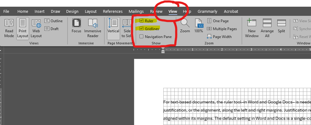 |
| Microsoft PowerPoint | Select the “View” tab and select the checkbox for “Gridlines” and “Ruler” to toggle the settings on and off. | 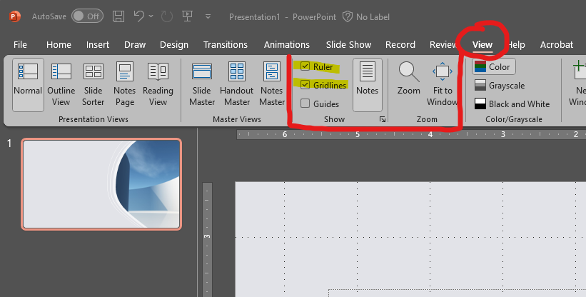 |
| Google Docs | Select the “View” tab and click “Show Ruler.” There isn’t a full gridline option. | 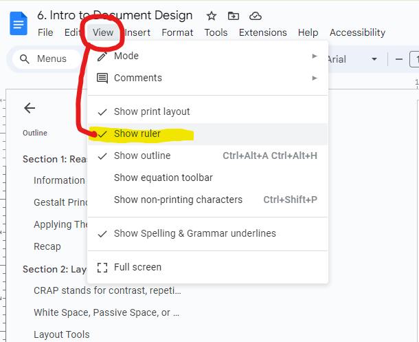 |
| Canva | “File” and open the “Settings,” there is the option to “Add Guides.” You can select from standard grids like a 3×3 or create a custom system from there. | 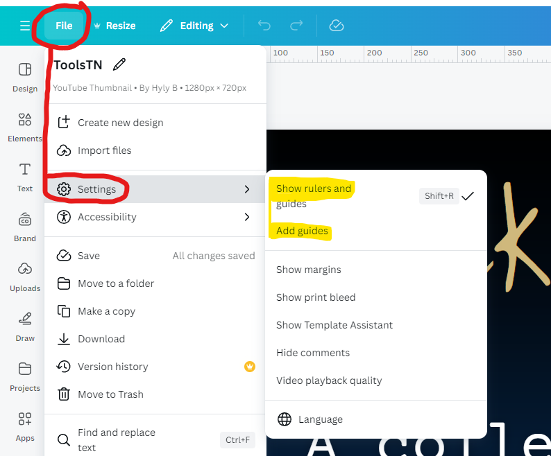 |
These are helpful when you start, and those who create a lot of content will develop a stronger eye or sense of where the grids exist (where the second-third right edge hits) on any document without the actual guides.
✨Justification
For text-based documents, the ruler tool–in Word and Google Docs– is needed to adjust the justification, or the alignment, of the words along the left and right margins. Justification refers to how the text is aligned within its margins. The default setting in Word and Docs is a single-column layout with “left justification” that creates a straight verticle line along the left side of the page. In the US, we read from left to right, so the justification setting lets our eyes track back to the consistent edge and let us always know where to look. The other side is the ragged edge that ends the line at the last completed word.
The other justification options are “right justified,”
which created the vertical edge on the right side of the page;
“center justified,” which is ragged on both sides
because the line length is focused on the middle;
and “full justified.” Full justification can create a clean, formal look because both edges are straight. That makes it useful in multi-column layouts like a technical journal or a newspaper since it creates neat vertical columns for you. And remember from the instructive writing lecture how to create columns in Word and Docs. But it can also lead to awkward spacing between words, making reading a bit harder. Left justification is generally considered easier on the eyes for longer pieces of text, as the spacing remains consistent.
We can use the Ruler Tool within the justification settings to adjust where the lines begin. Both programs function the same: dragging the ruler marker changes the edge of the margin or the location where lines start. Highlighting portions of text allows you to drag just that area for more advanced layout customization.
For example, if I have a chunk that is an anecdote, I highlight just that paragraph and use the ruler tool to bring the edge towards the right (indent) it a specific amount. That new alignment would signal to the reader that this is a special piece of information related to but “under” or less of a priority to read than the rest of the content. It helps it stand out while signaling it is a different type of content that can be skipped over more easily.
In Word, they have a slightly more advanced ruler that breaks up the first line’s margin from the rest of the content using an upper and lower triangle.
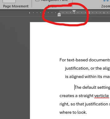
- The upper triangle controls the indentation of the first line in the passage.
- The lower triangle controls the remaining lines in the passage.
- A final small rectangle under the two triangles controls the general margin on the page.
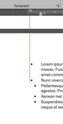
I find that level of control helpful with listed items because I can control exactly where the bullet points land, especially if copying/pasting bullets from another source. Usually, the automatic formatting is too far left or right, and those tools are a quick way to correct the issue. Word and Docs also have a triangle on the right edge that controls the right margin similarly.
If you don’t want to use the Ruler Tools to adjust things by “eye,” both programs allow you to enter specific numbers that control the indentations.
- In Word, use the “Layout” tab and select the small arrow for the advanced paragraph tools. That opens a box to adjust the indents and spacing directly, add special preformatted options like a “Hanging Indent,” typically used for references where the first line is on the default, the second lines are indented, and other tools.
- In Docs, it is under the “Format” tab, along with the Aling and Indent options. The advanced settings have fewer choices, but the same visual effects and goals can be achieved as in Word.
These tools are also better if you are responding to an RFP or writing to a style guide that has specific expectations for the indentations. It happens. Read the instructions for the organization, grant proposal, or application you are creating.
✨Margins
I used the word “margin” quite a bit when explaining the justifications. A margin is a blank space around the edge of your page. Margins serve a few crucial purposes. First, they prevent text and images from getting too close to the edge of the page, which could make them hard to read or even get cut off when printing (mostly) and potentially as screen sizes change in digital viewing. Second, margins provide visual balance, making your document look less cramped and more aesthetically pleasing. Still, that look also serves information processing purposes because our justifications don’t work without marginal padding. We can’t see the start of new lines as easily without a clear area from the edge. Finally, they can also serve functional purposes, like providing space for binding or leaving room for notes in academic or technical papers.
Both Word and Google Docs have pre-formatted margins, so most of the time, we don’t have to mess with the ruler tools (again, I find them needed when combining sources where the format is merged poorly). In both programs, the default margin is 1 inch on all sides. There aren’t main industry standards or expectations of when to change the margins; it depends on the organization and content. I often like adjusting the margin slightly narrower because I can fit more words on the page when I need to print a document since it will use fewer pages. But 90% of all the work I produce keeps the default.
- The margin settings in Word are located in the Layout tab. Under the Page Set Up section, there is a drop-down for “Margins” where you can select various presets or create a custom version.
- The settings in Google Docs are under File and Page Set Up. You have the same choices on both platforms.
Now that the overall page has margins and justifications, we have more specific choices and tools. If you need a little break, take 5 minutes to stretch and get a snack now because I have 5 topics to explain before this section ends.
✨Headings
We will start with the most obvious one you already have experience with. When readers are skipping and scanning around, they need the headings. The headings build on the Gestalt Principles of grouping and, in a way, common region because readers process all the content within a heading section as a related chunk of information. We have a few best practices to help the headings be more effective:
- Make phrasing self-explanatory: instead of Background or Technical Information, be more specific, like Physics of Fiber Optics. The exception to that rule is in lab reports and highly formal technical reports because terms like “Literature Review,” “Methods,” and “Discussion” are common to that genre. It can actually confuse readers if you vary too far from those norms in that specific CAMP site. However, your subheadings under the Methods or in the Lit Review should have self-explanatory phrasing.
- Indicate the range of topics covered in the section: if the section covers the design and operation of a pressurized water reactor, the heading Pressurized Water Reactor Design would need to include the entire second half of the content. And it risks the reader scanning around for the operation information.
- Do not use stacked headings (consecutive headings without text between). This is super common and misses the opportunity to explain the expectations of that section. A double-heading can also indicate you don’t have a strong enough hierarchy or enough content to serve the chunk. This is super easy to fix: write at least one sentence…usually a purpose statement… after every single main heading in your work. That tells people who skipped to that section what it is about and always keeps you from stacking a core and a support heading.
- Avoid widowed headings: widowing occurs when a heading is placed at the bottom of one page, and the text starts at the top of the next page. Keep at least two lines of body text with the heading, or place all the information on a new page. Depending on the genre and style guide for your company, they may want you to start every new core topic- the H1 headings- on a new page, like a chapter in a book. Otherwise, continuing the page with the new heading is standard practice as long as you have at least ⅓ of the layout left.
Headings are a key tool in guiding the reader through the work. Make them useful.
✨Boxes and Screens
Boxes and screens enclose elements on the layout with borders, such as graphics or just a special section.
- A box only uses the border tools with a background that matches your document’s default (probably white).
- If you add a background color to the area, you have created a screen.
You don’t have to worry about the naming differences here. The important part is that both service as containers for your content. They help group related information together, making it easier for the reader to understand and navigate your document. Think of a textbook page with sections outlined by subtle lines or lightly shaded regions.
In Word, I usually create a textbox or a “new drawing canvas” to create the container for the content. Once you’ve inserted the container, find the shape format tools through the Insert tab options. It is available in the tabs along the top, but I find the side panel view easier to customize because the layout shows all the options more clearly. So, instead of using the navigation tabs, you will right-click on your container and open the format shape at the bottom of the list of options. A side panel should open. The paint bucket has your fill and line options to customize. First is the “Fill” to create a background color for the screen. Adjust the transparency to around 60-85% (depending on how dark the color you selected) to ensure your text is still legible while providing subtle emphasis. The second set of options is the “Line” to create a border on the box. I usually leave the color as black or a very dark accent that goes with the document’s color palette, and I like the width or weight to be at least .75 to ensure it can be seen.
In Google Docs, you will use the “Drawing” tool in the insert options to do everything. Once you create your textbox inside the drawing canvas, the paint can be used again as the fill option. The pencil represents the line formatting tools. To get the transparency on the background, you will need to enter the “Custom” background tools where the transparency slider appears. I tend to find Google Docs a bit more annoying to create these boxes and screens within–but you will have your preferences–so I recommend and personally gravitate to Microsoft Word when I know the product I’m creating will need many of these elements, such as a technical report.
You can use boxes and screens to highlight important text, separate different steps in a procedure, or showcase visual elements like charts or graphs.
✨Pull Quotes
They are fun because they provide a statement or key point that stands out on the page and pulls attention to that information. They add visual variety to the layout while emphasizing or summarizing the surrounding content.
Some more traditional readers may say that pull quotes are too informal looking for technical reports, and only belong in newsletters, blog posts, or magazines. I disagree because they help readers scanning a page recognize a key theme or point, and I see them appearing more and more in reporting settings.
Know your audience and just be aware.
Word has a pre-formatted style tag for “quotes” that handles the pull quote design for you. Alternatively, you can create a textbox or use the ruler tools with other font formatting options to manually customize and manipulate the visual look of your quoted section.
✨Rules and Dividers
A rule is just a straight line. We use them to divide segments of the layout visually by literally placing a visible line divider on the page. Horizontal rules usually separate headers and footers from the body of the page to make it clear, while vertical rules are more typical with columns.
You could draw lines using the shape tools in both Microsoft Word and Docs. But that is way more time-consuming and annoying. Instead, I like to use this process:
In Word, set your cursor to the end of the line where you want the horizontal rule to exist (under). For example, after my “subject,” if I’m writing a memo. Look for the Paragraph tools section in the home ribbon tab and locate the “Borders” options. The symbol resembles a small 2×2 grid with a dark line along the bottom edge. Hit the dropdown carrot for more options and click “Horizontal Line.” Boom. A crisp rule is inserted for you. Vertical rules don’t have that shortcut, so you must insert a line from the shapes options. I don’t find many use cases for a vertical rule…just in my experience.
In Google Docs, it is actually easier. The “Horizontal Line” shortcut is an option directly in the “Insert” drop-down.
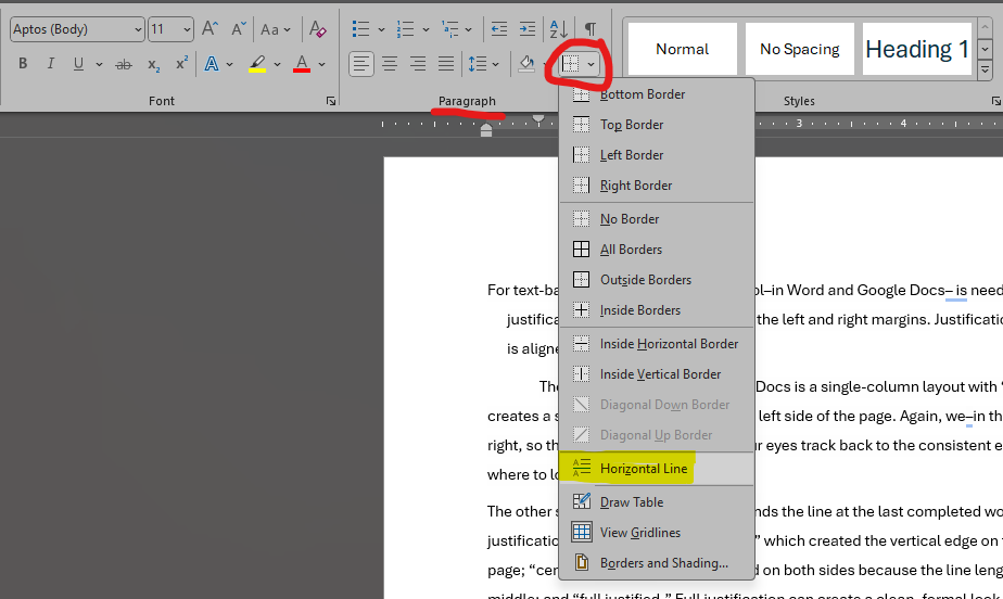
The most common use case you will encounter for a rule is in your formal memos to separate the To, From, Date, and Subject information from the start of the content.
✨Headers and Footers
The final layout type and choice are the headers and footers. Imagine headers and footers as the bookends of your page. They sit at the top and bottom, offering consistent information throughout your document. Think of them as the quiet, helpful assistants that keep everything organized and easy to navigate.
Headers are like signposts at the top of each page. They often include things like the document title in a shortened format, chapter name, or even the author’s name, subtly reminding the reader where they are in the grand scheme of your work. Imagine you’re reading a long technical manual, and the header on each page tells you which section you’re in, which makes scrolling or physically flipping through pages faster. I can look at the top of the pages as I go.
Footers, meanwhile, anchor the bottom of your page. They might include the page numbers, dates, versioning, or footnotes, providing additional context. Think of a research paper with citations tucked neatly into the footer, keeping the main text clean and focused.
Both headers and footers add a touch of professionalism and consistency. They make your documents, especially those long, complex ones, easier to navigate. In the technical reports lecture, we will return to the specific customization tools for headers and footers. For now, just know that Word and Docs have tools inside of the “Insert” menus labeled as Headers and Footers to add those container sections to the layout.
Recap
Okay, here we are, ready to recap this section! You should have notes on these key points and tools.
- What CRAP stands for, with examples of Contrast, Repetition, Alignment, and Proximity
- Why white or passive space is essential in the function of any layout
- How to turn on gridlines and why the ruler tool is used in layout designs
- What do the types of justification mean in text documents
- And then notes on how to add these different layout tools in both Microsoft and Word
- Margins
- Headings
- Boxes and Screens
- Pull Quotes
- Rules
- Headers and Footers

Take a break. That was a long section of technical steps and notes for the software—not the most exciting. However, knowing the options in the platform you are using is a key part of creating more usable and customized layouts. When you are ready, we will discuss color, font, and style–which is more fun.
Section 3: Font, Color, and Style Choices
We are starting the final section of the lecture and will focus on the font, color, style choices, and tools for your fundamentals of document design. We always make these choices, whether we give it a lot of intention and thought or not. I want you to practice making choices rather than leaving elements to the default to build up the skill, eye, and consideration of font, color, and overall style.
3.1 Font Choices
First, let’s talk about typography, which is where we make font decisions. Selecting and designing font can be easy to go too far, too cheeky, too fun, and lose the CAMP site. While font is the fun part of making designs enjoyable, decisions always rely on context, audience, message, and product to produce a functional, useful, and useable thing. Within typography, there are a few key terms that are often interchanged but have distinct meanings in technical writing design.
Font and typeface are not the same thing. Often, when someone says that they chose this “font,” they refer to the typeface.
✨A typeface is the visual design of the characters within a writing system. So, every letter or symbol has a look that makes it distinct from other typeface designs.
✨Within a typeface, we have a type family. That is the variations on the visual designs such as bold, narrow, slant, and such. It isn’t quite the same as applying bolding or italics from the formatting bar but that is a topic for your graphic design class to cover. Some typefaces have many families to choose from, while others maintain the single core variation.
✨The font combines typeface, type family, formatting, and size. So, font is the total visual impact of the choices. Now you know. But in most of your careers and conversations, font is fine. Even the “Google Fonts” library refers to them as a font to download since they are 1) more relatable and easier for the audience to understand and 2) you are selecting from typefaces and type families in the new overall font you select.
The overall legibility–the ease of reading– in a font comes from the distinction between characters. A highly legible font makes it clear to see an “A” from an “O,” while a less legible font blurs those distinctions. The legibility is impacted by size, with some typefaces being easy to read while big but suddenly difficult when small, as well as variations such as bold letters suddenly making letters blend together.
We do have typeface categories to choose from to meet your design CAMP site. Some categories tend to be more legible than others.
✨Serif typefaces are the classics, with their little “feet” or extensions at the ends of strokes. They are known for their high legibility and are a standard in many documents. Serifs tend to be easier to read because of their “feet” and distinctiveness, which is why Times New Roman was the standard for newspapers and literature. Sans Serifs like Times New Roman are the suggested or required font typeface for assignments, article submissions, grant applications, etc.
✨Sans serif, without those “feet,” is the sleek, modern evolution of the serif font. They grew in prominence with the .com era because the clean lines and minimal accents work well on digital interfaces. They have become so popular that the default typefaces in Microsoft Word and Google Docs are sans serifs… Aptos in Word (as of 2024) and Arial in Docs.
✨Monospace or fixed-pitch are highly standardized, with each character having the same footprint on the page; they are all the same width on the line. Programmers use monotypes in all their terminals, and I use them when drafting for markdown editors. They are also used in media scripts because when set to Courier 12, a page of script equals about one minute of screen time. Monotypes like Courier are useful in those contexts because every line will hold about the same number of characters since they each take up the same “square” unit.
✨As the name implies, decorative typefaces are all about making a visual statement. They can be playful, elegant, or downright quirky. They are great, but use them just for that impact statement and with recognizable words because they can be hard to read. I limit my decorative fonts to phrases of 10 words or fewer…so just enough for a title, heading, or block quote.
✨Script typefaces mimic handwriting, adding a personal, expressive touch. They range from flowing calligraphy to casual, handwritten styles. Since script typefaces can also be difficult to read, use the same usage principles as decorative fonts.
Now, all this matters because your font choices–the combination of the typeface, typefamily, and sizing–impact the layout. Each will take up different space allotments on the page, impact readability, and influence the line lengths or alignment.
For example, I’ve written 7 typefaces and set them all to 80pts, the unit of measurement for type size. 72 points are in an inch for the display…though the typeface you choose can get a + or – on that inch mark.
In a text-based document, we typically read paragraphs between 10 and 13 points, headings between 14 and 18 points, and titles between 18 and 24 points. Content on a slide deck or poster, meant to be read at a distance, should be at least 28 (at the smallest content) up to 80+ points to ensure it is seen.
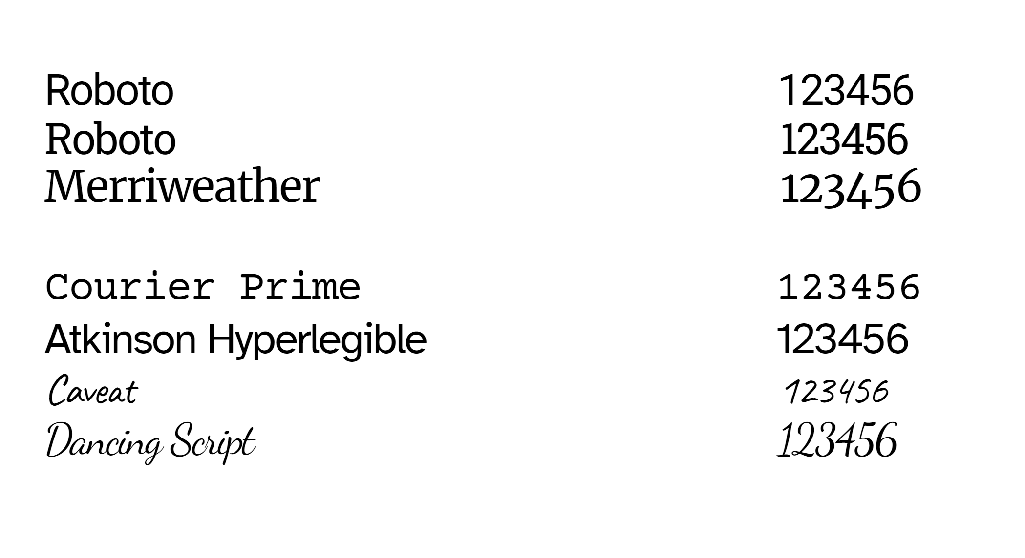
Roboto has a serif and a sans serif version. Merriweather is a serif type. Courier Prime is monospaced and looks like a typewriter. Atkinson Hyper legible is a special font developed by the Braille Institute to maximize letterform distinction for more accessibility and legibility needs. Then, Caveat is decorative, and Dancing Script is the handwriting. Despite being the same point size, the scripts are visually much smaller on the page. They don’t extend as tall vertically, and the passive space between the letters is tighter, meaning a line of Caveat would fit more words and take up less horizontal space than a line of Courier Prime. That is all important because you need to make the typeface choices at the beginning of your document rather than selecting and changing things near the end. If you adjust the typeface on the whole document after everything is written, visuals are in place, and your page breaks are set up…it will change the entire layout of your work as potentially words are bumped on every single line of the text.
✨The other thing that is even more pressing for your STEM fields is to check the numerals on the typeface before committing to a choice. I recommend using a sans serif or a monospaced for any heavy work, such as your tables or data visuals, to help with consistency and alignment. Roboto, Courier Prime, and Atkinson Hyperlegible numbers are consistent heights, widths, and forms to make neat rectangles…perfect to fit in your cells and graphs. The numbers on a serif font like Merriweather or Times New Roman tend to vary in height and width, with a “2” being significantly smaller than a “5.” And don’t even think about using decorative or scripts for the numbers because they tend to have flourishes and unexpected forms to mimic that handwritten, funky vibe.
As a last note about font choice, research suggests that emotional reactions are tied to the font on a document, meaning readers project personality, feelings, and vibes from the font on a page. That is less true with color. So generally, a “Bold” font gets a projection of loud, important, and authoritative by readers. Rounded fonts are viewed as more friendly and youthful. The bonus resources will get into this psychology and more examples if you want to explore that. But in an application for your work, stop and think about how the font makes you feel. If it seems “shouty,” “creepy,” or “sophisticated,” or you feel happy looking at it, chances are very high that is what your audience will also project onto the choice.
Trust your instincts, and some of you will have a stronger sense of this–maybe you should look into design and writing careers. If you are worried, stick to the classic serifs and sans-serifs, which are seen as timeless and neutral, respectively.
✨Font Kits
In terms of tools, we have access to font kits to download new options that better suit the CAMP site. A font kit is essentially a toolbox for designers and developers. It’s a collection of related fonts within a specific typeface family bundled together for ease of use. Typically, a font kit includes various weights (like regular, bold, light) and styles (italic, condensed, extended) of a particular typeface. This variety allows for flexibility in design, enabling you to create a visual hierarchy and emphasis within your text.
Adobe, Google, and Microsoft all have font libraries where you can download these kits. The only big issue with downloading non-standard font is when you share editable document versions with others. If they do not have the font kit installed on their machines, the platform will substitute the closest match or a default. As we just discussed, changing the typeface after a document is finished can wreck the layout you created. So, as long as you print your document or save it as a PDF with no expectation to edit, download it away. If someone or you tries to edit the PDF in Acrobat, the text they are changing will use a default font if the kit isn’t available.
To download a font, you can select it directly from within the application to load that respective font library. You can also go to the websites directly, such as fonts.google.com or fonts.adobe.com. When you find one you want to download,
- Select a button like “Get Font” or “Download”–it will be standard.
- Download the files. They should be in a zipped folder that goes right into your downloads with the font name you chose.
- There should be multiple “TrueType font” or .ttf extension in that zipped folder. You should also see, essentially, a README file, though it is usually a .txt or text document extension instead of a .md markdown in this case.
- Extract the files and place them in the appropriate program.
- For example, extract them to the Windows/fonts folder to use with your Microsoft products. Then, when you open Word or PowerPoint, it will be on your list.
- Don’t upload a font to Google Docs–instead, use the built-in Google Font Store/library.
You can upload fonts to many web-building platforms and information design tools. Look through their tutorials, guides, documentation, and old-fashioned Googling/YouTubing to figure out how to get the new fonts on your specific site.
3.2 Color Choices
Color is another area in which you should take a full-on color theory, art, graphic design, or document design course because it has deeper layers. Technical writers usually work with a trained graphic designer to develop color palettes, and we are typically given the color range for the work (or most of our technical content is in greyscale or limited color anyway).

We use colors to draw attention, such as on screens (the shaded textboxes), on icons like the color-coding on notices, cautions, warnings, and danger tags, and to show contrast on headings (but we don’t need color to do that).
As technical writers, our use of color is deeply tied to digital accessibility. We actively design content to support users with disabilities and typical or diverse experiences. Because of that, color should never be used as the ONLY signifier of information. Instead, use a color and a symbol or color and underlining to indicate the meaning.
The same principle applies to data visualizations, such as a bar chart. Make sure to label the bars of the chart or aspects of the pie alongside the color instead of only the legend to support readers who can’t distinguish your shades and assume it will be printed in grey.
When trying to figure out what colors might work well together in your chart, including having enough contrast for accessibility, we use tools like color.adobe.com, which has a palette builder and color-blind checker. In future lectures, we will discuss all these specific color choices and tools in more detail as they relate more closely.
3.3 Style Guides
For now, we will turn to the style guide, which technical writers use to determine their color and font choices. A style guide is a reference document that provides a set of standards for grammar, punctuation, word usage, and other stylistic elements. It’s like a rulebook for writers, ensuring consistency across all company documents. Beyond mere mechanics, style guides often delve into deeper aspects of communication, offering tone, audience focus, and overall writing style guidelines.
They are cornerstones of STEM fields, and it is so important that our majors take a whole class on editing to match different style guides. This isn’t a matter of learning and remembering one specific guide–instead, the skill is to care and pay attention enough to learn, reference, and follow whatever style guide your company has in place or industry uses. Think of it like the instructions on a project when you have a professor who cares about formatting: when they say it has to be in 12-point Times New Roman, Double-Spaced, and so on. In those classes, you are following a style guide for the essay.
Style guides such as the American Psychological Association (APA) and the IEEE for Engineering and Electronics can be industry-level. We use APA and IEEE in this course when we get to the technical report and referencing sources. That is the most common association of a style guide while in school because it dictates how to organize your citations. APA and IEEE get into even deeper content for writing, but those guidelines are built for publication standards, not necessarily general work. Suppose you write a white paper for your company that they want to be published in the IEEE. In that case, you will need to look at the style guide and ensure you meet the formatting and writing standards–it is something most helpful to do when you are actually in the project and not something to expect recall or memory to help achieve.
Nearly all organizations in the technical and government spheres have style guides. Again–this is something you find and follow when you get to whatever company or organization you work for. There isn’t just a standard to teach.
For example, the Colorado Springs City Web Team has a style guide for all their content. They outline the naming conventions meaning documents and employees should refer to it as ColoradoSprings.gov, COSprings.gov, or The City of Colorado Springs on official work. It also outlines how to style text with correct and incorrect usage examples. https://coloradosprings.gov/document/style-guide-9-5-14-om.pdf
Style guides are an organization’s rulebook. They also tell you what to do regarding justification, margins, headings, font, and color choices. If you are starting your own company, you need to write your style guide in the early stages of your business planning to stay consistent and clear with every official document you create.
3.4 Style Managers
The final subject today is a style manager, which is the key tool for keeping fonts and headings tidy. Do not use the paint-roller “format copy” tool. That is some elementary school business to make headings match. Instead, you will use the Style Managers in Word and Google Docs to automatically update the visual look of your text.

✨In Microsoft Word, the “Design” tab is a magical place that automates document design. This tab allows you to make global changes across the whole document at once instead of “ctrl+ a” to highlight all or go section by section to update things manually. Save yourself time and effort. This tab is not confused with the “Designer” button, which is a bad feature for text documents. It is a good feature for PowerPoint, though, and we will explore that in future lectures when creating slide decks.
Inside the “Design” tab, we have pre-formatted themes (a bit mid) and the ability to customize the colors, fonts, and paragraph spacing. There are also preformatted “Style Sets” for the headings and such based on the themes or colors you select. Those are the best shortcuts to enhance your document with little effort.

The colors drop-down menu has themes, or you can customize your own theme. This is where you would add the specific colors of your company’s style guide for the Text, Background, and Accents. Then, you give it a name and save. That new theme is saved to your Microsoft Account and should be available on every new document you start.
The fonts drop-down has the same workflow and features, but instead of colors, you select the Heading and Body styles.
The paragraph drop-down gives you the most control if you select the “Customize.” That dialog box opens up the more detailed font editor, including font size selection, indentation spacing, and a lot of the things we discussed in the layout choices.
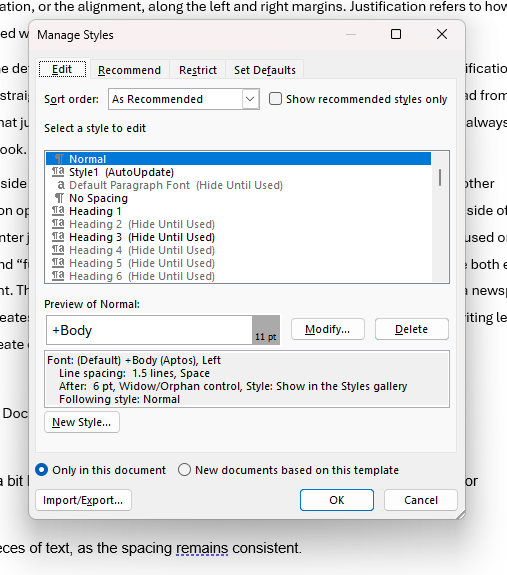
The first tab in the “Manage Styles” box–that you opened with the Customize Paragraph drop-down–is where you control the look of all your font styles in the document. They are labeled as Normal for your standard paragraphs, Heading 1– however many for headings and subheadings, Title, Subtitle, Emphasis, and Quotes. When you select, for example, “Intense Quote,” it provides the current details of the style for font, justification, and color. Click modify to make changes. Once you save those changes, anything in your document tagged as an “Intense Quote” will automatically update to reflect your adjustments. This is especially helpful for headings when you have a 10+ page document to scroll through.
Google Docs does not have this magic tool. It does have “Styles,” and you can push changes to the whole document but with fewer controls. In Docs, you will need to design the heading the way you want, and then from the Styles drop-down, select “Update titles to match.” You go through and do that for every Title through Heading 4. Docs doesn’t apply styles to emphasis, quotes, and the other layout options that Word has. Google Docs is made for simpler documents that don’t require or need detailed layout customization tools.
We will return to style managers for additional uses in digital accessibility and formal report lectures because they are key for future considerations.
Recap
Check back over your notes and make sure you have details on the following areas from this section:
- The difference between typeface and font
- The range of choices you have to make when selecting the font in your document design
- The choices for color and general rules for technical writing
- The uses of a style guide
- The location and customization features of Style Managers in Word and Docs
Final Summary
As we wrap up the lecture on an introduction to document design, you should have learned or considered examples and applications on the information processing, layout, and style choices. We covered how
- Document design is a crucial aspect of technical communication, as it enhances the clarity and accessibility of information.
- Key concepts in document design include information processing, Gestalt principles, chunking, queuing, and filtering.
- CRAP (Contrast, Repetition, Alignment, and Proximity) are fundamental principles of layout design, and white space enhances readability.
- Layout tools like justification, margins, headings, boxes, pull quotes, rules, and headers/footers can be used strategically to structure content effectively.
- Font choices, including typeface, type family, and size, influence readability and visual hierarchy. Color choices should be made with accessibility in mind.
- Style guides ensure consistency in document design, and style managers automate formatting tasks for efficiency and accuracy.
Design is one of the reasons I like technical writing. Even when it is a straightforward technical manual in black and white, design exists on the page to help us navigate. Everything we make uses document design and is a puzzle or little challenge to find the best layout and style choices for the audience.
Thanks, associates.
Vibes.
Credits and Sourcing
Information and content in this lecture are derived from a combination of the following sources and the creator–my–personal experiences in education, technical environments, and professional roles. This content is licensed under the Creative Commons Attribution-NonCommercial-Share Alike. You are free and encouraged to distribute and remix any part in any new medium for your goals. Please ensure your creations are available under the same license to keep the information spreading.
Chapter 5: Document Design Copyright © 2019 by Katrina Peterson is licensed under a Creative Commons Attribution-NonCommercial-ShareAlike 4.0 International License.
IxDF Design Compendium, curated and managed by the Interaction Design Foundation.
https://www.interaction-design.org/literature/topics/gestalt-principles
Additional brainstorming, outlining, recap summaries, and examples were generated using Google Gemini with a “Gem” trained to the general prompt: Act as a technical writing mentor helping new students. Every prompt should provide examples and explanations for STEM, medicine, and business contexts.
