Domain 3: Accessible Wayfinding
42 Wayfinding through Symbols and Signage
The history of innovations in wayfinding for people with disabilities can be traced back to the 19th century, when the first raised-letter signs and braille were introduced to help people with visual impairments navigate public spaces. In the mid-20th century, the development of new materials, such as photoluminescent and tactile signs, allowed for better wayfinding solutions in low-light conditions and for people with both visual and physical impairments. The 1990 ADA established specific guidelines for accessible signage, including requirements for typeface, size, contrast, and the use of braille. In recent years, technology-based innovations, such as audio-enabled and GPS-based navigation systems, have been developed to enhance the wayfinding experience.
Braille, a tactile writing system that is widely used by those with vision loss to read and write, can also be used in wayfinding in the built environment, particularly in public and private buildings or spaces. Braille most frequently appears on elevator buttons and signage, as well as restroom signs, but it can also be used on menus in restaurants, to demarcate room names and numbers, to provide museum and art gallery interpretation, and for wayfinding in airports and transit stations. In general, Braille is most commonly used in public buildings, such as schools, government buildings, museums, and transportation hubs. The US ADA requires Braille to be used in certain public spaces, such as elevators, restrooms, and exit signs. Some state and local building codes may also require Braille to be used in additional locations or for other purposes.
A number of universal, or near-universal, graphic design icons have been developed that assist with transportation, wayfinding, or identification of specific accessibility requirements. The original International Symbol of Access, designed in the 1960s by Susanne Koefoed, is one of the most widely used and recognized icons in the world. While the ubiquitous presence of the symbol has contributed to accessibility being part of the visual language of navigating our day-to-day world, it is also a fairly static symbol. The Accessible Icon Project is a work of design activism encouraging businesses and other organizations to adopt a more active icon appropriate to the 21st century.
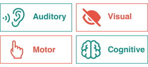
The following icons are increasingly used in the context of digital assistive technology, but also increasingly in the built environment.
While there have been tremendous strides in transportation, from accessible taxi services and wheelchair-accesible buses to adaptations in subway and light rail car and station design, there is much work to be done. A 2021 study by Accessible Transportation Canada (ATRACAN), for example, notes that in order for Ontario to reach its nation-leading 2025 accessibility targets, it will have to take the following measures:[1]
- “Greatly increase standardization across municipalities and regions for on-demand transportation with respect to licensing, regulations, training, technology, and customer & driver rights
- Broaden travel borders for both public and private accessible transportation providers
- Support development and implementation of technologies that are public- and industry-facing
- Create incentives to make on-demand taxicabs more economically viable
- Developing measures of success tied to industry success and user experience”
SPOTLIGHT: Krooshl
Krooshl is a Calgary-based start-up that uses the international accessibility standards to identify businesses and community venues accessible, highlighting these through geolocation. It also operates in Edmonton.[2]
- Raymond Dell’Aera. (2021). Outlook on Accessible Transportation in Ontario. Canadian Disability Foundation. https://disabilityfoundation.ca/atracan/ ↵
- Krooshl. About Krooshl [website]. https://www.krooshl.com/m/calgary ↵
