18 Identifying and Mapping Assets and Needs
Social workers and other ‘helping’ professionals are taught to work from a strengths-based perspective, meaning that we should always start with helping the client recognize their strengths, instead of focusing only on deficits or areas of need. This is just as applicable to community work as it is when working with individuals. One of the ways in which we integrate a strengths-based approach into our work is by identifying the assets of a community. These are the services or resources existing in a community that have a positive impact on the well-being of community members—whether it be a geographic or identity-based community.
So, we will begin by examining what to look for in community assets and then look at the variety of ways we are able to display both assets and needs as we analyze the information.
Identifying Assets
Multiple types of assets could be important to a community, including people, physical assets, services, history, traditions, events, and services. An asset could be a person who is known to be someone who steps up in times of need and will make things happen (i.e. quickly getting face masks to people during the early stages of COVID-19). Or, an asset could be the laundromat or a taxi service. It depends on the problem that you are focused on.
So, if you are focused on the isolation of older adults in your community, your asset list may include the following:
- Senior dining program
- Aging social service programs
- Home care agency
- Taxi company known to be elder-friendly
- Aging Resource Officer for the county
- Meals-on-wheels
- VA services
- Friendly visitor program
- Churches and parish nurses
- Park where many older adults walk during good weather
- YMCA
- Social media page dedicated to support for elders
It is important that you engage stakeholders in the identification of assets rather than generating the list in isolation. It is inevitable that the list you would generate as the change maker would not include some specific assets that the members of the community would see as critical. That is especially the case if you are not a member of that community. You would be viewing the assets through your own lens of what would likely be helpful to you and not based on first-hand experience.
Mapping Assets
Once the asset list is generated, the next step is to map the assets as a way to create a visual representation of the information and see if there are gaps. In many types of communities, the assets are not accessible to everyone who needs them, so the solution may not be in needing more assets but in making the ones that exist more accessible.
There are multiple ways to display the mapped assets. Two common ways include:
- organizing the data and listing the assets
- overlaying the information on a map of a community
If your community has a geographic boundary, I suggest overlaying the asset information on the map so that you can identify if access to the assets may be an issue for some parts of the community.
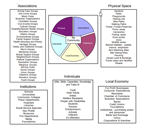
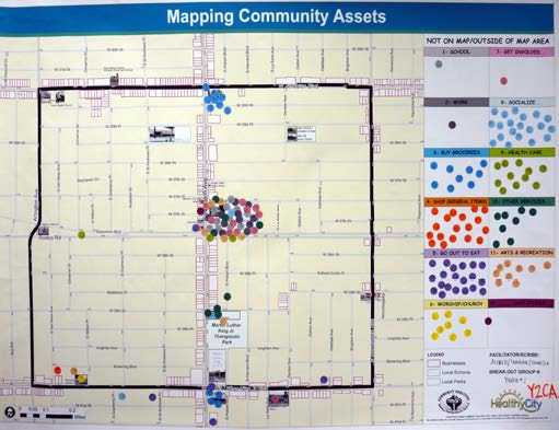
Below you will find two sample maps that have been made available online from generous organizations engaged in community change work. The first one is from the Asset Based Community Development Institute, which published the tool Discovering Community Power: A Guide to Mobilizing Local Assets and Your Organization’s Capacity. The second is from the Asset Mapping Toolkit which is a project of the Advancement Project- Healthy City Community Research Lab. You will find additional information about steps to facilitate asset maps on their website.
Sample A: Organized data and listing of assets
Sample B: Overlaying information on map using color-coded dots
Identifying Needs
Similar to assets, when identifying needs you are looking for evidence of the community situation that points to a gap or a problem that needs to be addressed. The need is identified through close examination of secondary and primary data. These types of questions can guide your examination:
-
- What evidence do we see that tells us a problem exists?
- Are some people or groups more likely to be impacted by the problem? Who are they?
- What is their experience like? What are some of the stories?
Mapping Needs
Similar to assets, it is important to organize the needs in a way that makes sense and ideally presents some context or comparison. This is usually used when displaying the evidence for a situation.
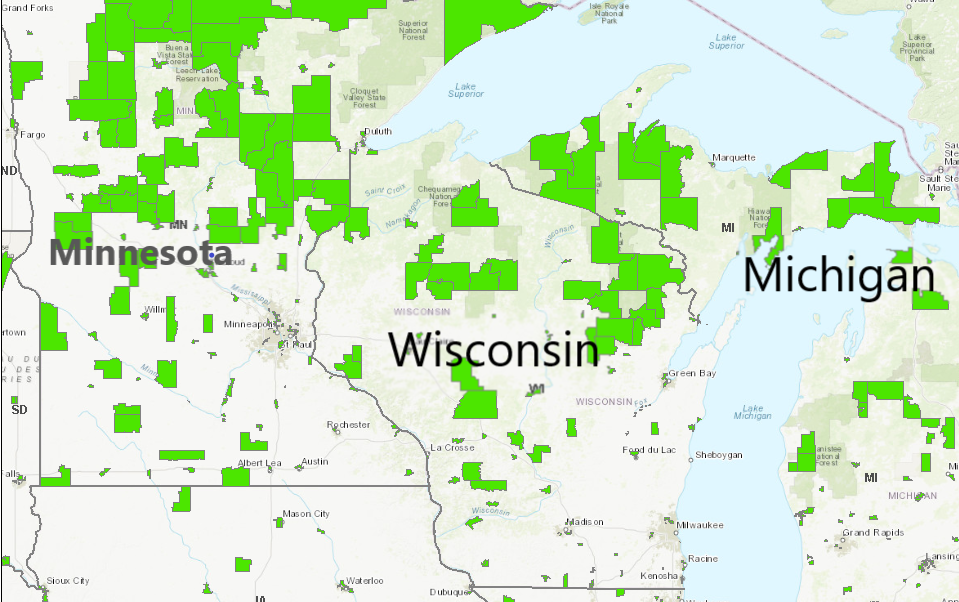
Some of the sources of secondary data, like the US Census, provide mapping capabilities for the data we are examining. This is a common way for people working in community change to create maps of data for analysis purposes. Here is an example of mapping the need for food access.
Example: Mapping Food Access in the US
Access to stores that provide affordable, healthy food options is often an issue in high-density and urban areas. To help develop a visual representation of the issue of food access, the US Department of Agriculture created the Food Access Research Atlas using data from the US Census. The atlas creates a visual map of locations in the US with census tracts that have low access to affordable and healthy foods. A census tract is a geographic unit that represents a segment of the population (between 1,200-8,000 people). The graphic below shows a map of the majority of the continental US generated in March 2022, showing “Low-income census tracts where a significant number or share of residents is more than 1 mile (urban) or 10 miles (rural) from the nearest supermarket.” Here is an example of a map using the Food Access Research Atlas for portions of Minnesota, Wisconsin, and Michigan.