27 Chapter 18.2 Design Principles for Print and Digital Media
With multimodal composition, creators have the opportunity to use multiple modalities to present information. Once you have chosen an audience for your text, it is time to choose a genre and begin creating using modalities including audio, visual, linguistic, and spatial, among others! In this chapter, we share some popular multimodal texts with tips on how to create them.
There are three principles to keep in mind when you are creating any multimodal text:
- Keep it simple.
- Make it accessible
- Follow CRAP design principles
Academic and Professional Papers
Just because academic writing is often text-based, that doesn’t mean that there are no options for multimodality! One of the principles of multimodality is visual presentation. You can absolutely present your work visually using a variety of tools found in a word processor like Microsoft Word or Google Docs to create a multimodal document that is appropriate for any academic or professional setting. The following tips will help you design a document that is aesthetically pleasing while sharing information that is more accessible to your reader.
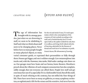
Example of Multimodality: Scholarly Text
Here is in an example of a standard scholarly book in a print edition. This text relies primarily on the linguistic mode. In other words, it is made up primarily of letters and words. However, because most texts are multimodal in some sense, there are at least three modes at work in this example.

- The linguistic mode operates in the printed, written text.
- The visual mode operates in the formatting of the text (such as the use of fully justified margins) and in the choice of typography (such as the different fonts used for the chapter title and the use of brackets around the chapter title).
- The spatial mode can be seen in the text’s arrangement (such as the placement of the epigraph from Francis Bacon’s Advancement of Learning at the top right and wrapping of the paragraph around it).
Font Choices
If a font isn’t specified in the assignment, you can choose one yourself! If your final work will be printed, you would typically choose a serif font—or one that has decorative edges called “feet.” If you are writing for a digital space, a sans-serif font will do nicely and is easier to read on a screen.

