5 Basic Widgets I

Overview
Application is all about human interactions and tkinter provides some basic widgets play a very important role, allow users to interact with an application in various ways such as submitting forms, making user inputs etc. Each widget is equipped with attributes and methods that facilitate customization and functionality tailored to meet the needs of both the application and its users.
Content Objectives:
- Studenst will learn how Tkinter variables work and methods for input validation.
- Students will be introduced to commonly used widgets like Label, Entry Box, ScrolledText, and Button.
Language Objectives: Students will be able to Integrate descriptive comments within sample code to explain functionalities.
Basic Widgets
Label
A label is a widget used to display text or images on a Tkinter window. Labels are commonly used to provide instructions, titles, or captions for other widgets.
| Attribute | Importance | Possible Values |
| master | Signifies the parent widget which could be the main window, a frame or label frame | |
| justify | Determines how the text in label will be aligned | left, right, center. |
| style | Determines the styling of the label | TLabel, Inverse.TLabel, primary.TLabel, danger.TLabel etc. |
| text | Sets the text to be displayed on the label. | |
| bootstyle | Allows you to apply predefined style to a widget | allows you to easily apply predefined styles to widgets |
| relief | Sets the border style | flat, raised, sunken, groove, ridge. |
| compound | compound parameter determines how to display both text and image, this attribute also used with button widget |
Other attribute to take note of includes padding, bootstyle, textvariable. To learn more on labels checkout this link LABELS
An entry box is similar to a text or scrolltext box but is typically used for single-line input. Entry boxes also allows users to enter and edit text.
| Attribute | Importance | Possible Values |
| master | Signifies the parent widget which could be the main window, a frame or label frame | |
| justify | Determines how the text in label will be aligned | left, right, center. |
| style | Determines the styling of the label | TLabel, Inverse.TLabel, primary.TLabel, danger.TLabel etc. |
| textvariable | Helps to associate a widgets that accepts and / or displays text such as labels, entry, textbox with a StringVar().
It allows for auto updating entry values or using them for further processing. |
———- |
| show | This attribute can be used to hide the content been entered into an input field.
Useful for field where confidential inputs are expected like passwords |
Any character |
| relief | Sets the border style | flat, raised, sunken, groove, ridge. |
| state | Controls the interactivity and appearance of the widget. By default the state is set to normal.
After creating the widget we can also change its state using the .configure(state=value) method |
normal (fully interactive),
readonly (Displays text but doesn’t allow editing) , disabled (Grayed out and non interactive) |
Other attributes include padding, bootstyle, relief, font, and compound.
ScrolledText and Text Widget
A scroll text box, also referred to as a text input field is a tool that enables users to input and modify text. Text boxes are frequently utilized for activities, like entering multi-line text such as composing messages or completing forms. Now we’ll construct a Tkinter window featuring a text box;
| Attribute | Importance | Possible Values |
| master | Signifies the parent widget which could be the main window, a frame or label frame | |
| height & width | The height value determines how tall the text box appears, measured in pixels and the width value controls its size in pixels. | |
| bootstyle | Provide predefined styling for the text box | |
| textvariable | Helps to associate a widgets that accepts and / or displays text such as labels, entry, textbox with a StringVar().
It allows for auto updating entry values or using them for further processing. |
———- |
| vbar |
An attribute with a boolean value, True allows the vertical scrollbar to be shown. |
True, False |
| hbar | An attribute with a boolean value, True allows the horizontal scrollbar to be shown. | True, False |
| autohide | When set to True, hides the scrollbars when the mouse is not within the frame boundaries. | True, False |
| wrap | Ensures that when jumps to the next line when it reaches the edge of the widget | “word”, “char” |
| state | Controls the interactivity and appearance of the widget. By default the state is set to normal.
After creating the widget we can also change its state using the .configure(state=value) method |
normal (fully interactive),
readonly (Displays text but doesn’t allow editing) , disabled (Grayed out and non interactive) |
Other attributes include padding, bootstyle, relief, font, and cursor.
Important Scroll Text Methods
Here are some essential methods for working with scroll text widgets:
- get(“1.0”, “end-1c”): This method gets the information, from the scroll text box. The parameters “1.0” and “end 1c” indicate where to start and end reading the content. “1.0”marks the beginning of the text while “end 1c” indicates one character before the end (excluding the newline character at the end).
- insert(“1.0”, “New content to add”): Explained earlier in the chapter
- delete(“1.0”, “end”): Explained earlier in the chapter
Sample Project 5
Write a program that asks the user for their name and then generates an email based on a template like the one
below. Get user input for first and last names, and description of problem. Use the same offer message as below
Hi [First Name] [Last Name],
Thanks for contacting us! We appreciate your input and are here to help.
Your Email: [Email]
Issue: [Description of Problem]
We're reviewing your inquiry and will respond soon. If you have any questions in the meantime, feel free to reply to this email.
Thank you for your patience!
Best,
Buttons
Buttons, are interactive and clickable widgets that make things happen when you press them. For example, clicking a “Play” button might start a video, Submit button will submit a form, buttons can also perform any other customised action. They usually have words or icons on them telling you what they do when you engage with them by tapping, clicking, or hitting the Enter key.
Important Button Attributes
Tkinter buttons have some attributes to make your buttons more interactive, and they are listed below:
| Attribute | Purpose | Possible values |
| command | A function or method that runs when you interact with the button. root.destroy is a special function used to close the application | A function that performs an action |
| textvariable | Associates a Tkinter variable such as IntVar with the button’s text, not used that often. | A tkinter variable |
| text | Sets the text displayed on the button. | A string |
| style | Associates a custom widget style with the button. | custom styles |
| width | Sets the height of the button, takes in a number as a value. | An integer |
| height | Sets the height of the button, takes in anumber as a value. | An integer |
| state | Sets the state of the button . | “normal”, “active”, “disabled” |
| image | Specifies an image to display on the button. | image object |
| compound | Determines how to combine text and image on the button. | “center”, “bottom”, “top”, “right”, “left”, or “none”. |
Exercise
Attempt the following challenges, be creative and use your own designs or sketches
- Basic User Information Display: Create a GUI that asks the user for their name, age, and city, and then displays, “I am [Name], and I am [Age] years old, currently living in [City].”
- Travel Destination Description: Develop a GUI prompting the user to enter their dream travel destination and the reason. The program should display a sentence like “I want to visit Japan because I am fascinated by its culture and technology.”
- Word Counter: Design a simple application that allows the user to input a paragraph. On clicking a button, the application counts and displays the number of words in the text.
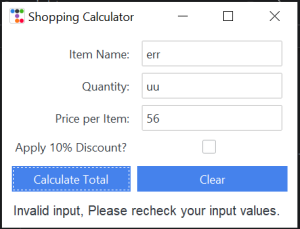
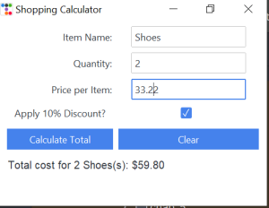
- Store Calculator: Create a GUI for a cashier to calculate the total cost of items, factoring in item names, quantities, and prices, with an optional fixed discount.
- Email Template Generator: Build a program that gathers user information and generates an email based on a template.
- Temperature Converter: Create a GUI that allows the user to input a temperature in Celsius and convert it to Fahrenheit (or vice versa). The user should be able to choose which conversion to perform and click a button to see the result.
- Simple Calculator: Design a basic calculator that supports addition, subtraction, multiplication, and division. The GUI should have an entry field for input and buttons for each operation, along with a “Calculate” button to display the result.
- Unit Converter: Develop a unit conversion tool that can convert between different units of length (e.g., meters to feet), weight (e.g., kilograms to pounds), or volume (e.g., liters to gallons). The GUI should provide options for choosing the conversion type.
Conclusion
For this chapter, we covered the basic widgets and the importance of mastering these basic widgets for building interactive applications.
