6 Layout Management
Organizing GUI Screen layout using pack, grid, and place
Overview

Arranging the various widgets, and controlling the design of user interfaces (GUIs) is very important, as effective organization and layout control plays a vital role, in developing applications that are easy to use and aesthetically pleasing.
Content Objective: Students will use Tkinter winfo methods and layout managers (pack, grid, place) to arrange widgets in a GUI by applying the right key attributes.
Language Objective: Students will explain and write about how layout managers control widget placement, using terms like “layout manager,” “widget,” and “grid.”
Keywords (Phrases): Widget, Layout Manager, Pack Manager, Grid Manager, Place Manager, Anchor, Sticky, Winfo Methods, Responsive Layout,
Understanding Layout Managers
Layout managers are needed to ensure that the widgets are well placed within the application window, and tkinter provides three main layout managers for organizing GUI elements: pack, grid, and place.
Pack Manager
This layout manager arranges widgets in a line either horizontally or vertically within their parent container placing them one, after the other.
The pack manager supports several attributes to control the placement and behavior of widgets:
| Attribute | Importance | Other Possible Values |
| side | Specifies the side of the parent container to pack the widget | “bottom”, “left”, or “right” |
| fill | Decides if the widget should stretch to occupy all the space, in its container. Default value is “none” | “x”: Widget takes up all the horizontal space allotted to it
“y”: Widget takes up the vertical space. “both”: Allows the widget to take up all space allotted to it (horizontally and vertically) |
| expand |
Specifies whether the widget should expand to fill any extra space in the parent container. Default value is False |
True, False. |
| anchor |
The widgets placement, in the given area is determined by specifying directions, like. Default value is “nw” (widget orients itself to the north west corner of its allocated space) |
“n”, “s”, “e”, “w”, “ne”, “nw”, “se”, “sw”
|
| padx & pady |
These attributes specify horizontal and vertical external padding (margins) , respectively.
|
Single integer: For example, padx=5 indicates that both left and right sides should have a padding of 5
Tuple of two integers: For example, padx=(4,6) signifies a left padding of 4 and a right padding of 6. |
| ipadx & ipady |
This is very simillar to padx and pady however it controls internal padding between the content of widget and its borders |
 Code showing use of side attribute, change the values of the side attribute and observe
import ttkbootstrap as tb
root = tb.Window ()
root.minsize ( width =200 , height =200)
root.maxsize ( width =400 , height =400)
root.title (" Side Attribute ")

# Create a label 1 on the left side
label1 = tb.Label ( root , text =" Label 1! " , bootstyle =" inverse - primary ")
label1.pack ( side ="left" , padx =5)

# Create a label 2 on the left side
label2 = tb.Label ( root , text ="Label 2!" , bootstyle ="inverse - primary")
label2 . pack ( side ="right" , padx =5)

root.mainloop ()
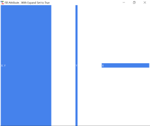
Code showing use of fill and expand attribute
import ttkbootstrap as tb

root = tb.Window()

root.minsize( width =200 , height =200)
root.maxsize( width =1000 , height =800)
root.title("Fill Attribute , With Expand Set to True")

# Create a label 4 on the left side
label4 = tb . Label ( root , text ="X" , bootstyle = "inverse - primary")
label4 . pack ( side ="right" , padx =5 , fill ="x", expand=True)

# Create a label 4 on the left side
label5 = tb . Label ( root , text ="Y" , bootstyle ="inverse - primary")
label5 . pack ( side ="right" , padx =5 , fill ="y", expand=True)

# Create a label 5 on the left side
label6 = tb . Label ( root , text ="X. Y" , bootstyle ="inverse - primary")
label6 . pack ( side ="right" , padx =5 , fill ="both", expand=True)

root.mainloop ()
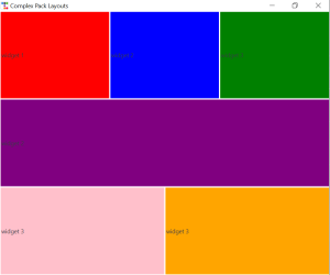
Complex Layouts with Pack
While simple to use its flexibility is somewhat restricted, so in this book I would avoid using pack layout manager. However, if you want to use pack its a good idea to combine the use of Frames with the pack layout for creating complex layouts.
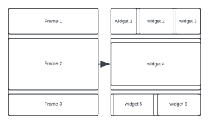
Code showing use of complex pack layouts with frames
Grid Manager
The grid manager arranges widgets in a grid-like structure of rows and columns. In addition, widgets can also span multiple rows and columns, allowing for more complex layouts offering greater control over widget placement, size ratios, and alignment
.
| Attributes | Importance | Possible Values |
| row | Specifies the row index in which the widget should be placed. | Integer |
| column | Specifies the column index in which the widget should be placed. | Integer |
| rowspan | Specifies the number of rows that the widget should span. | Integer |
| columnspan | Specifies the number of columns that the widget should span. | Integer |
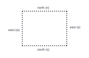
| sticky | sticky attribute in tkinter is used with the grid geometry manager to control how a widget is positioned (glued) and stretched within its grid cell
|
Single cardinal directions: N, S, E, W
Combinations of cardinal directions: Multiple directions: any 3 combinations, and NSEW |
| padx, pady | Refer to previous section for an explanation |
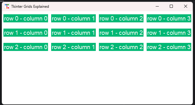
Code showing the structure of grids layout managers
import ttkbootstrap as tb
root = tb.Window()
root.minsize(width=300, height=300)
root.maxsize(width=650, height=500)
root.title("Tkinter Grids Explained")

# Automatically create widgets in grids using for loops
for row in range(3):
    for col in range(4):

        # Set column configure once the first row is been printed
        if row == 0:
            root.columnconfigure(col, weight=1)

        label = tb.Label(root,
                          text="row {} - column {}".format(str(row), str(col)),
                          bootstyle="inverse-success",
                          font=("Helvetica", 14))

        label.grid(row=row, column=col, padx=5, pady=10)

root.mainloop()
Row and Column configure
Row and Column configure are methods used to configure the width of each column and height of each row in a layout respectively and how each column shares the remaining free vertical space. Similarly, the rowconfigure() or grid_rowconfigure() method can be used determine how the rows shares the remaining horizontal space. This function has four possible attribute, index and weigth is mandatory.
| Attribute | importance | Values |
| index | Specifies the index of the row or column number that needs to be configured | Integer |
| weight | Determines how much extra space a column or a row should get when the window is resized.
By default it is equal to zero, thus all row or columns have equal length or width |
root.columnconfigure(0, weight=1) root.columnconfigure(1, weight=2)
The second column above is two times wider |
Link to sample usage of row and column configure to create complex layouts
import ttkbootstrap as tb

root = tb.Window()
root.geometry("500x500")

# Configure columns
root.columnconfigure(0, weight=1)
root.columnconfigure(1, weight=3)

# Configure rows
root.rowconfigure(0, weight=1)
root.rowconfigure(1, weight=2)

# Adding widgets
btn1 = tb.Button(root, text="Button 1", bootstyle="danger")
btn1.grid(row=0, column=0, sticky="nsew")

btn2 = tb.Button(root, text="Button 2", bootstyle="success")
btn2.grid(row=0, column=1, sticky="nsew")

btn3 = tb.Button(root, text="Button 3", bootstyle="primary")
btn3.grid(row=1, column=0, columnspan=2, sticky="nsew")

root.mainloop()
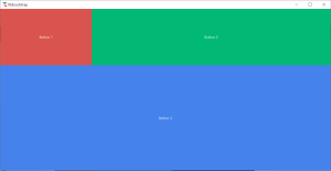
In above example:
- The first column has a weight of 1, second column has a weight of 3. Thus, the second column will be three times wider than the first column.
- The first row has a weight of 1, and the second row has a weight of 2. This means that the second row will be twice the height of the first row.
- The sticky=”nsew” parameter makes the buttons expand ew – horizontally (eastward and westward) and ns – vertically (southward and northward) to completely fill the space allocated to their respective grid cells.
Using columnconfigure, and rowconfigure you can create responsive grid layouts that adjust the size of their rows and columns based on the available space, improving the flexibility and appearance of your user interface.
Place Manager
The place manager allows precise positioning of widgets placed at specific x and y coordinates within their parent container. While it offers maximum control over layout, it’s less flexible and can be harder to maintain.
The place manager supports the following attributes:
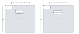
- x and y: Specifies the absolute x and y coordinates starting from the root widget’s (GUI screen) top-left corner.
- relx and rely: Specifies the relative x and y coordinates of the parent widget’s top-left corner within the parent container. Values range from 0.0 to 1.0 (top left corner of the widget relative to the width and height of the parent widget).
- anchor: Controls the alignment of the widget relative to its specified coordinates. Values include “n’” “s”, “e”, “w”, “ne”, “nw”, “se”, and “sw”. For example, the default value is nw means that the x, y, rely, or relx given will top left corner (north – west) of the widget
- width and Height: Sets the width and height of the widget respectively. Value is in px. Best to use when x and y is used to set the position.
- relwidth and relheight: Sets the width and height of the widget respectively (relative to the width and height of its parent widget). Value ranges from 0 – 1. Best to use this when using relx or rely
Although the place manager provides absolute control over widget placement it is not frequently used as it may get difficult to manage as the GUI complexity increase. Instead, use pack or grid manager.
Forget and Destroy Functionalities
Forget Functionality: Use this method if you need a functionality that makes a widget to be hidden when a particular event occurs, and it provides two methods that are applicable to both the pack and grid geometry managers.
- pack_forget(): Temporarily hides a widget from the screen without destroying it. The widget can be made visible again by calling the pack() method on it.
- grid_forget() Similar to pack_forget(), but for widgets managed by the grid geometry manager, can be made visible again by calling grid() on it.
Destroy Functionality: The destroy() method is used to completely remove a widget and all its children from memory. Once destroyed, the widget cannot be made visible again without recreating it from scratch.
Note: If you call the destroy method is called on the root Window, the entire GUI shuts down. Thus root.destroy() can practically be used to create a close app button.
Winfo Methods in Tkinter
In Tkinter the winfo methods offer ways to check widget states and properties which can be useful, for writing code. Here are some key ones that I think you should be aware of.
- winfo_children: Returns a list of all child widgets in a container widget such as main window, frames and notebook. This has many uses such adding a style or a method to all the widgets present within the containing widget.
children = widget.winfo_children() - winfo_exists: This method returns True if the widget exists and False if it doesn’t exist or as been destroyed has been destroyed.
exists = widget.winfo_exists()
- winfo_height and winfo_width: Returns the height and width of the widget, respectively.
height = widget.winfo_height()
width = widget.winfo_width()
- winfo_ismapped: Returns True if the widget is currently visible (mapped) on the GUI and False otherwise.
is_mapped = widget.winfo_ismapped()
- winfo_rootx and winfo_rooty: Returns the x and y coordinates of a widget relative to the root window.
root_x = widget.winfo_rootx()
root_y = widget.winfo_rooty()
- winfo_screenheight and winfo_screenwidth: Returns the height and width of the GUI screen, respectively
screen_height = root.winfo_screenheight()
screen_width = root.winfo_screenwidth()
Sample Project
Create a GUI with 3 buttons SHOW (reveals a given text), HIDE (hides a given text but can be unhidden again), DELETE (completely deletes a text, and can never be recovered). This code will be written in two programming style (Procedural and Object Oriented).
Link to show password project procedural style
import ttkbootstrap as tb

root = tb. Window ()
root.minsize ( width =200 , height =200)
root.maxsize ( width =400 , height =400)
root.title ("Forget and Destroy ")

root. columnconfigure (0, weight =1)

container = tb. Frame (root)
container.grid(row = 0, column = 0, sticky="nsew")

container.columnconfigure (0, weight =1)
container.columnconfigure (1, weight =1)
container.columnconfigure (2, weight =1)

label1 = tb. Label (container , text=" PASSWORD : \" LEARNTTK \"", anchor ="center")
label1.grid( column =0, columnspan =3, row =1, pady =10 , sticky = "ew")

label2 = tb.Label(container, text="OOPS!!!, password deleted permanently", anchor="center")

def hide ():
    # winfo_exists check if the label exists before hiding it,
    # winfo_exists also prevents errors incase the target widget does not exist
    # winfo_ismapped checks if the widget is visible
    if label1.winfo_exists() and label1.winfo_ismapped():
        label1.grid_forget()

def show ():
    # Check if the label exists before showing it
    # winfo_exists also prevents errors incase the target widget does not exist
    if label1.winfo_exists() and not label1.winfo_ismapped():
        label1.grid(column=0, columnspan=3, row=1, pady=10, sticky="ew")


def delete ():
    # Check if the label exists before destroying it
    # winfo_exists also prevents errors incase the target widget does not exist
    if label1.winfo_exists():
        label1.destroy()
        label2.grid(column=0, columnspan=3, row=1, pady=10, sticky="ew")


button_show = tb. Button (container, text="Show", bootstyle ="success", command =show)
button_show.grid( column =0, row =0, padx =(10 , 5) , pady =10 , sticky ="ew")

button_hide = tb. Button (container, text="Hide", bootstyle ="warning", command =hide)
button_hide.grid( column =1, row =0, padx =(5 , 10) , pady =10 , sticky ="ew")

button_delete = tb. Button (container, text=" Delete ", bootstyle ="danger", command = delete )
button_delete.grid( column =2, row =0, padx =(5 , 10) , pady =10 , sticky ="ew")

root. mainloop ()
Link to show password project object oriented style
import ttkbootstrap as tb

class ShowPassword(tb.Window):
    def __init__(self):
        super().__init__()
        self.minsize(width=200, height=200)
        self.maxsize(width=400, height=400)
        self.title("Forget and Destroy")

        self.columnconfigure(0, weight=1)

        self.container = tb.Frame(self)
        self.container.grid(column=0, row=0, sticky="nsew")

        self.container.columnconfigure(0, weight=1)
        self.container.columnconfigure(1, weight=1)
        self.container.columnconfigure(2, weight=1)

        self.label1 = tb.Label(self.container, text='PASSWORD: "LEARNTTK"', anchor="center")
        self.label1.grid(column=0, columnspan=3, row=1, pady=10, sticky="ew")

        self.label2 = tb.Label(self.container, text="OOPS!!!, password deleted permanently", anchor="center")

        button_show = tb.Button(self.container, text="Show", bootstyle="success", command=self.show)
        button_show.grid(column=0, row=0, padx=(10, 5), pady=10, sticky="ew")

        button_hide = tb.Button(self.container, text="Hide", bootstyle="warning", command=self.hide)
        button_hide.grid(column=1, row=0, padx=(5, 10), pady=10, sticky="ew")

        button_delete = tb.Button(self.container, text="Delete", bootstyle="danger", command=self.delete)
        button_delete.grid(column=2, row=0, padx=(5, 10), pady=10, sticky="ew")

    def hide(self):
        # winfo_exists check if the label exists before hiding it,
        # winfo_exists also prevents errors incase the target widget does not exist
        # winfo_ismapped checks if the widget is visible
        if self.label1.winfo_exists() and self.label1.winfo_ismapped():
            self.label1.grid_forget()

    def show(self):
        # Check if the label exists before showing it
        # winfo_exists also prevents errors incase the target widget does not exist
        if self.label1.winfo_exists() and not self.label1.winfo_ismapped():
            self.label1.grid(column=0, columnspan=3, row=1, pady=10, sticky="ew")

    def delete(self):
        # Check if the label exists before destroying it
        # winfo_exists also prevents errors incase the target widget does not exist
        if self.label1.winfo_exists():
            self.label1.destroy()
            self.label2.grid(column=0, columnspan=3, row=1, pady=10, sticky="ew")

if __name__ == "__main__":
    root = ShowPassword()
    root.mainloop()
Best Practices for GUI Organization
When organizing GUIs, consider the following best practices:
- Group related widgets together using frames or label frames.
- Use consistent spacing and alignment to create a visually appealing layout.
- Prioritize user experience by arranging widgets logically and intuitively.
- Test your layout on different screen sizes and resolutions to ensure compatibility.
Responsive Layout
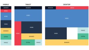
Tkinter does not provide a way to create a responsive layout, thus we need to create a separate layout for every window sizes, the winfo method will come in handy here. We will use object oriented programming to implement the responsive layout.
When implementing a responsive layout, two things come to mind
-
-
- Screen sizes: The size of the screen pertains to the window of the application that users can adjust in size themselves The design should adapt to these modifications to uphold user friendliness and appeal.
-
- Break points: Breakpoints refer to widths that trigger adjustments when the window size surpasses or falls below those thresholds.
Conclusion
Effective organization and layout management are essential skills in GUI development. By understanding the different layout managers provided by Tkinter, you can create intuitive and visually appealing applications.
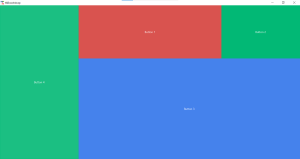
Exercise 3
- What are the differences between the pack(), grid(), and place() layout managers.
- What is the difference between the forget() and destroy() methods in Tkinter? Provide a scenario where you would use each method.
- Write a Python program that creates a label and two buttons: one to hide the label and another to show it again. Use the grid_forget() method to hide the label, and restore it when the show button is clicked.
- Create a Python program that prints the current screen width and height using the winfo_screenwidth() and winfo_screenheight() methods. Also, print the root window’s current coordinates (rootx, rooty) when a button is clicked.
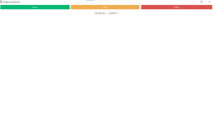
- Create a GUI screen that looks like that found in the picture below using grid layout