4 Container Widgets
Container Widgets that Serves as Parent for Other Widgets
Overview
This chapter introduces various widgets that can be used for organizing and structuring your user interface. It covers top-level widgets for creating multiple windows, essential attributes shared by many widgets, and container widgets like frames and label frames for organizing content within a single window. Additionally, it explores advanced container widgets such as the Notebook and PanedWindow, which enable more dynamic layouts.
Content Objectives:
- Identify Top-Level Widgets: Students will be able to explain the purpose of top-level widgets in Tkinter, and how they differ from other widgets.
- Use Frame and LabelFrame Widgets: Students will learn how to create and customize Frame and LabelFrame widgets to organize content within a Tkinter application.
- Implement the Notebook Widget: Students will be able to create a tabbed interface using the Notebook widget and add multiple tabs, each with unique content.
Language Objective: Students will be able to describe in their own words the role and functionality of different container widgets used in Tkinter
Keywords: Tree structure, Toplevel, NoteBook, LabelFrame, Frames, PanedFrame

Top Level Widgets
Top-level widgets in Tkinter act as the root containers for other widgets, as they allow the creation of multiple windows in an application. The primary top-level widgets are:
• Window: The main application window, also known as the root window. All other widgets are added as children of this window, every application must have at least on Window widget.
• Toplevel: A secondary window that can be opened independently of the main window. Toplevel windows are often used for displaying settings, pop-up dialogs, alerts, or additional forms. This widgets can only has a root window or another top level as its parent or master.
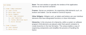
Tree Structure of Widget Hierarchy
In app designs a tree like arrangement illustrates how the user interface (UI)s elements are organized in a graphical user interface (GUI). The main container or window is depicted as the root, in this structure while other UI components such, as buttons labels panels and nested containers are represented by the branches and leaves respectively.
The picture below shows the hierarchical layout of a simple app. Keep this in mind when creating your applications as your application hierarchical tree structure may look different.
Other Secondary Container Widgets
Commonly Used Attributes
This section is to familiarize you with the commonly used attributes for various kinds of widgets such as frames, labelled frames, label, button, entry, text and scroll text widgets, so you do have full understanding when you see them later on
| Attribute | Importance | Possible Values |
| command |
Specifies the action or function to be executed when a widget is triggered. |
|
| justify |
Determines text alignment within a widget. |
left, right, center |
| borderwidth | Sets the width of the border around an element. | |
| fonts |
Specifies the font style and size. |
|
| relief |
Determines the 3 dimensional appearance of a widget borders, default value is “raised”, other possible values are |
flat, raised, sunken, groove, ridge |
| padding |
Adds space between a widget content and its borders. |
|
| state | Commonly used on buttons, scrolltext, and entrybox etc., and it determines the state of the widget. | “normal”, “disabled”, “active” |
| width & height | Sets the width and height of a widget, it unit is in characters. For example “width=3”: in an entry box means it can only accept 3 characters, note that using this attribute may make widget less responsive to changing screen sizes. | |
| cursor | Sets the shape of the cursor when hovering over a widget, default value is arrow, other possible values are | circle, clock, cross, dotbox, exchange, fleur, heart, man, mouse, pirate, plus, shuttle, sizing, spider, spraycan, star, target, tcross, trek |
| highlightcolor: |
Determines the color of the highlight when a wdget is in focus. |
|
| highlightthickness |
Specifies how thick the highlight border should be. |
|
| takefocus | Determines if a widget can receive focus during keyboard navigation. |
Frame
Frames allow you to organize the layout of your Tkinter application and create visually appealing interfaces, we can place other widget within each frames.
Important Frame Attributes
Here are some attribute that can be used alongside Frames
1. master: This signifies which widget you want the frame to be placed in, usually the main window.
2. height: The height of a frame is determined by its parent container, however with this attribute the default height can be changed.
3. Other attributes include relief, cursor, borderwidth, height, width, takefocus, padding, state
Label Frame
A label frame serves as a holder, for widgets providing a bordered label around its content. It is often used to group related widgets and separate sections of a graphical user interface (GUI). This widget is essentially a Frame with a label
For example you can use a label frame to gather radio buttons that represent options or settings. This functionality helps organize and visually differentiate these options from other components, in the GUI. In Tkinter you can create a label frame using the the LabelFrame widget. Lets delve into how this can be done.
Notebook
The Notebook tab tool is utilized for showcasing a layout with each tab representing a content page, usually the tabs content are related. Its main function is to enable users to navigate through content pages by clicking on tabs located at the section. These tabs are basically frames within which you can add other non – container widgets
The Notebook widget in ttkbootstrap has the following key attributes:
- cursor: The cursor that will appear when the mouse is over the notebook.
- height: The height in pixels to be allocated to the widget.
- width: The width in pixels to be allocated to the widget.
- padding: Adds extra space around the outside of the widget.
- style: The style to be used in rendering the Notebook.
- bootstyle: To use predefined styling
- takefocus: Determines whether the Notebook will be included in focus traversal.
The Notebook widget also has several methods, including
- .add: to add a new tab,
- .enable_traversal: to enable keyboard navigation between tabs, and others described in the ttkbootstrap documentation.
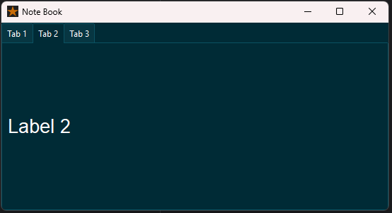
Figure 8.3: Creating a Notebook with 3 tabs
PanedWindow
Split windows, also referred to as paned windows are a feature found in applications. It enables users to manually resize sections of the application allowing for customization of the layout to meet their preferences.
In essence paned window are resizeable frames. Specify the parent widget as an argument. Subsequently you can include child widgets ( Frame widgets) within the PanedWindow using the.add() method. The PanedWindow widget in ttkbootstrap has the following key attributes: master, width, height, relief, orient.
Conclusion
In this section of the book we looked at widgets used to arrange user interfaces in Tkinter programming language discussion started with widgets, like Window and Toplevel that act as key structures, for apps then we delved into Frame, LabelFrame, Notebook, and PanedWindow widgets which assist in grouping related elements and improving visual layout.
