4
Meghan Damour
LibGuides, the popular content management/web publishing platform developed by SpringShare, tends to be somewhat polarizing in the academic library world; it seems that most librarians either despise them or tout them as the best thing since sliced bread. Regardless of how we feel about them personally, however, we are often asked to create, maintain, and teach with them. Academic librarians in particular tend to rely on LibGuides, as they are often their only potential point of contact with some very time- crunched groups on campus—this results in a large number of guides covering a lot of topics, which means that there are a lot of places that guides can go wrong. This paper aims to provide a quick and dirty briefing on ways to improve your academic library’s LibGuides.
There is a lot of information available on general “best practices” for LibGuides. Most of this information is written by and for individual academic institutions, though there are a few pages written by larger communities of librarians (bestof.libguides.com) and SpringShare itself (the web platform company that created the LibGuides and LibAnswers apps). Best practices for LibGuides seem to be fairly consistent across institutions and disciplines and tend to be focused on the platform itself, but the flexibility of the platform (and the diverse needs and skills of the librarians creating the guides) means that it’s very easy to create hugely varying pages: “Layout, design, visual interest, user-friendliness, and a sense of the responsible librarian’s approachability seem to be largely under the creative control of each LibGuides author, regardless of institutional type” (Stankus & Parker 2012, p. 254). However, simply agreeing upon some standards and best practices for your own institution can help ensure that a user’s experience is efficient and consistent across library webpages and guides, which helps to create a more positive, successful search experience for the user. So let’s look at some generalized best practices that seem to crop up a lot throughout the web, and zoom in on how those might be applicable in the average academic library:
DESIGN
Standardize look and feel across your library’s guides: And, ideally, mimic the look and feel of your library’s other webpages. This one is pretty straightforward, but not consistently done.
- Colors and fonts should be the same across guides
- Guide/page/tab names should summarize all of the content they cover (for example, if a page has 80% content on Spanish literature and 20% on Catalan literature, the title of the guide should not be just “Spanish Literature)
- … And guide/page/tab names should be formulated to mirror each other across guides (i.e. the title of the landing page of every guide shouldn’t flip-flop between “getting started” and “start here”)
- The way links behave (do they open in a new window, a new tab, or the same tab?) should be agreed upon across and within guides
- Major content items like librarian contact information and chat widgets should occur the same number of times and be in the same place on each guide
- Style and grammar choices (i.e. formality, use of the Oxford comma) should remain consistent across guides.
My subject guide for undergraduate nursing students should look and feel very much the same as my colleague’s subject guide for doctorate students in religious studies, and those two guides should look and feel very much the same as our colleague’s topic guide on searching JSTOR. Content, of course, will vary dramatically, but users should essentially feel as though all the guides were created by the same person all at once.
Use clean and simple design (i.e. make your guides really really ridiculously good- looking): Across many of the usability studies that were reviewed for this paper, this is the number one thing that came up. Students prioritized simple page design when asked about what qualities they wanted in a guide before even seeing one, and they commented on it or wished for it in a page that they were shown (Wood, n.d.). And this makes sense—in an age when we’re working with Google and Wikipedia as everyday household resources (the homepages of which are literally search boxes on white pages), most guide users likely don’t see a reason to tolerate visual clutter and difficult navigation. And while a visually appealing webpage doesn’t necessarily contain the best information, studies do indicate that attractiveness—essentially, good design—does confer some degree of authority (Nielsen Norman Group, n.d.). Google and Wikipedia are simple, familiar, and consistent. And we should be striving to be the same.
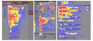
What specific principles does a “clean and simple design” include? The first is the F- pattern. Based on the Nielsen Norman Group’s 2006 eye tracking study, this idea basically says that readers “often read webpages in an F-shaped pattern: two horizontal stripes followed by a vertical stripe” (see Fig. 1). We know that users will not read the entire page, so acknowledging this and giving your readers “visual signposts” is key.
Fig 1. https://www.nngroup.com/articles/f-shaped-pattern-reading-web-content/
 Essentially, you should be using a visual hierarchy to enhance and reinforce content focal points within your page.
- The entry points of your page—where readers’ eyes will land immediately (usually the top left corner)—are a good place to help direct readers using heavier elements such as bold text or images
- Consider this popular page structure: navigational tools on the far left, main content on the mid-left, and the very most important things a third of the way to halfway across the page
- Use caution with mega-menus—their effectiveness is widely debated among librarians and web designers
Studies also show that readers read virtually none of the text below the fold (the parts of the page that can’t be seen without scrolling down): they’ll spend 80% of their time above the fold, and then will scroll below the fold and spend the other 20% of their time on a page (but overall they only read 20-28% of the text on the page!) (Nielsen Norman Group, 2010).
- Do your very best to keep at least all of the headings on a page above the fold
- Avoid large blocks of text, primarily by cutting back on content, but also by using lots of paragraph breaks and subheadings
The key with all of this is to accept and relish open space—give your readers’ eyes a place to rest. It is easy to want to compile a huge list of all the resources you think anybody might ever use for your engineering topic guide, but this can be overwhelming. Select the most important resources (more about that in a minute) and arrange them on the page with the other widgets and items in a way that is nice to look at and ‘tells’ your readers what their eyes should do.
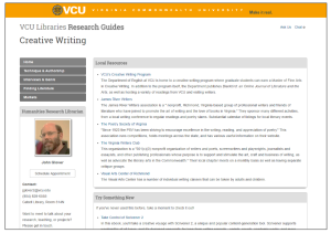
The screenshot of a Virginia Commonwealth University LibGuide (Figure 2) provides a good demonstration of the key points here—plenty of restful space for readers’ eyes; not too much content; all headings and boxes are visible above the fold; design is consistent between all pages and all of the university’s guides; F-shaped reading pattern is accommodated, with heavy design elements guiding the eyes toward content.
Fig. 2 http://guides.library.vcu.edu/c.php?g=47588&p=297801
CONTENT
Write for the web: “Writing for the web” means a lot of things, but the gist is simple: by writing and structuring your guides appropriately for the web environment— acknowledging the ways that reading on the web and on paper are different—you are actively helping your users accomplish whatever it is that they came to your guide to do. Users read webpages very differently than they read most printed material; readers on the web tend to scan pages for information, rather than read the entire page word by word. This means we can’t write or structure our guides like printed books and expect that to work for our users. Fortunately, there are many simple ways to make your LibGuides web-appropriate.
- Structure the textual content of guides in the inverted pyramid or front-load format, used widely in journalism: the most important information at the top, and more detail further down the page
- Keep all of your text concise, both linguistically and visually:
- Include only one idea per paragraph
- Use natural language and avoid library jargon (i.e. a link that says “borrow from other libraries” instead of “interlibrary loan”)
- Use the types of words your readers use (which, depending upon the guide and
discipline, may include some of their jargon) - Use readability tests to determine what grade level your content reads at—one of them is embedded right in Microsoft Word
- Paragraphs themselves should be quite short—around 20 words per sentence and five or fewer sentences per paragraph
- Don’t let your lines of text span across the entire webpage—this is very hard to read! The default column widths in LibGuides are a good size
- Create ‘friendly’ URLs or use link text—use the LibGuides link boxes (this provides a lot of functionality) or create short URLs using a service like Google’s link shortener or bit.ly.
- Keep link descriptions short. Give your readers a general idea of what’s going on
behind the link, and let them click through to explore it themselves. No need to
provide a detailed overview of everything the database or website does.
- Keep link descriptions short. Give your readers a general idea of what’s going on
- Use a sans serif font that conveys the same voice or persona that your writing
conveys (i.e. Arial or Calibri; no Comic Sans) - Make your guides accessible to differently-abled people, such as blind, colorblind, or deaf users (see the ARL’s tech standards resource listed below).
- Photos and videos should have descriptive alt-text (text that a screen reading software could read to a blind user). LibGuides has a place for this in its photo tools
- Videos should have captions for deaf users
- Avoid relying solely on color to convey meaning (i.e. green for good and red for bad, but also √ for good and X for bad)
- Your guides should also be discoverable—use natural language keywords and tagging functions to make it easy for users to find your guides from the library homepage as well as Google or other search engines
Similarly to our design best practices, the key with writing content for the web is simply to keep it simple.
Organize the content logically: When creating or restructuring a LibGuide or a set of LibGuides, it is important to decide (hopefully with the help of your colleagues) what types of LibGuides you will be creating. Many libraries have their guides divided into categories such as subject guides (for example, guides on public health, or linguistics), topic guides (a mobile app guide, or a “how to search EBSCO” guide), and course guides (intended for use by students in specific courses, such as ENGL3080). Deciding what types of guides your campus needs and having a clear, directed, fairly narrow vision in mind when creating each and every guide can help to ensure that you’re not making a lot of overlap or being willy-nilly about the content in your guides.
- Decide how each type of guide should be structured internally—by media type (i.e. by journals, databases, e-books, etc.), by sub-category (i.e. bibliographic databases, content databases, etc.), or by some other strategy?
- Consider creating a table-of-contents “splash page” as the first page the users land on to give them an idea of everything within the guide and how to proceed
- Use meaningful headings and sub-headings to help your readers find the most appropriate information for their needs
- Organize content and resource links by importance, not by alphabetical order (Frankly, if you have enough content items in your guide that an alphabetical order would be apparent, you have too many content items in your guide)
In order to create a simple and clean LibGuide, you will likely be forced to evaluate which resources are the most important for your users to know about—but that’s part of what’s helpful about LibGuides for your users! How to determine what resources are most important will vary by discipline and is a challenge best approached collaboratively with the help of your fellow librarians and involved department members.
Make your own life easier: This will be a short section, but I did want to bring it up— LibGuides, particularly the recent 2.0 version, offers a lot of functionality, much of which can make your life very easy if you and your colleagues let it. But there are also a few things you can do independently of the platform to make your guides easy to create and maintain. An out-of-date LibGuide is basically useless, so it’s important to keep long- term upkeep in mind when creating content for your guides.
- Explore the reusable boxes function within LibGuides. This essentially lets you create content and reuse it across multiple guides, while only having to edit it in one place— works well for widgets and items that will be consistent across guides, such as chat boxes, library hours, etc.
- The fewer links in your guides, the less work you’ll have to do to make sure those links still work in one month, five months, one year…
- Use the link box creator in LibGuides as opposed to creating links in the HTML editor—this allows you to track statistics on the link and reuse the link and its description on other pages and guides when appropriate
- Remember to link through your institution’s proxy when you create links so that students can access full text or will be prompted to log in when they click through
Think proactively about things that might be a lot of work in the future and how you can include that information without creating extra work for yourself (for example, don’t create elaborate tables to put a list of Journal Impact Factors in, because these change somewhat frequently, and it’s a good bit of work to try to edit these tables later on)
The goal is a user-centered guide, but if your guide is so involved that you can’t keep it up to date, it doesn’t do the user any good. Consider workflows and strategies to help you and your colleagues minimize the amount of work that LibGuides create. This helps both you and your users in the long run.
Make it user-centered: This is the final, and perhaps the most important practice of all. “User-centeredness” encompasses a lot of things, just as “writing for the web” and “good design” do. But this is the whole point—why make LibGuides if you’re not going to make the effort to make them radically, wholly, one thousand percent user-centered? Most LibGuides aren’t for us; they’re for the users. Let’s shift the focus to the users and their information needs. It is of vital importance to keep user-centeredness at the forefront at every stage of LibGuide creation and maintenance, but library-centered structure and content is sneaky, and will try to leak into your guides. Step outside of yourself and be your user.
- Consider performing some usability tests for your LibGuides, such as card sort activities or link naming tests
- Provide links to electronic resources and related tutorials, not print materials
- Use high-quality graphics (pay attention to copyright, though!)
- Provide citation help
- Minimize text descriptions
I think we often have a fear that we will under-explain something, that our users will leave the guides because they are confused, but what ends up happening is that our users leave the guides because they can’t find what they need among all the clutter. Keep it simple—in design and in content.
I hope these tips can provide a good foundation for your library to either begin creating or rennovating your LibGuides. As the web becomes more and more our primary contact point with users, we are doing ourselves and our users a disservice if we don’t put in the effort to make our guides the best they can be.
LibGuide Design Resources
Ahmed, N., & Luedke, J. (2010). Best Practices for Libguides and Online Pathfinders. Retrieved from https://drive.google.com/file/d/0B5WnEFuCnqc7YzI3ODA5ZTUtODFhZS00MjhhLThkYzgtOWI4NDkyMzJkOGIx/view
Handout that accompanied a conference presentation—brief and very helpful design tips with lots of outside resources listed.
BestOf LibGuides Community. (n.d.). Best Practices for Librarians by Librarians Retrieved from http://bestof.libguides.com/bestpractices?hs=a
Compilation of LibGuide-community-nominated guides that relay their best practices, tips, and tricks for using the LibGuides platform.
Butler University. (n.d.). Butler LibGuides: Standards & Best Practices. Retrieved from http://libguides.butler.edu/c.php?g=2411
An institution-specific internal LibGuide detailing their selected standards and practices for creating LibGuides.
Dobbs, A. W., Sittler, R., & Cook, D. (2013). Using LibGuides to Enhance Library Services. Chicago: American Library Association.
Excellent book detailing all aspects of LibGuides, from their history to best practices to pedagogy. Contains a chapter on technologically and pedagogically excellent LibGuides across the web.
Marshall University Libraries. (n.d.). Best Practices – LibGuides v.2 Toolkit – LibGuides at Marshall University. Retrieved from http://libguides.marshall.edu/libguides_v2_toolkit An institution-specific internal LibGuide detailing their selected standards and practices for creating LibGuides.
Morales, A. (n.d.). Purdue Subject Guides (LibGuides) Standards. Retrieved from http://guides.lib.purdue.edu/ld.php?content_id=14409529
Another institution-specific internal document detailing their selected standards and practices for LibGuides.
Nielsen Norman Group. (2006). F-Shaped Pattern For Reading Web Content. Retrieved from https://www.nngroup.com/articles/f-shaped-pattern-reading-web-content/
Very helpful! This links to the eye tracking study, but the NN Group provides a variety of short blog posts on web content and design. Highly recommended.
Nielsen Norman Group. (2010). Scrolling and Attention. Retrieved from https://www.nngroup.com/articles/scrolling-and-attention/
Again, only one of the many invaluable articles on the NN/g site.
Wood, E. (n.d.). LibGuides Best Practices Summary. Retrieved from https://docs.google.com/document/d/1PhX6dwCKnCJdjQgjE2kHJeyY56RXAZ4b8QiiTkq49Go/edit?hl=en
Compilation of responses to listserv queries by an academic librarian about other universities’ LibGuide best practices & guidelines. Many links to examples of other LibGuides.
LibGuide Content Resources
Association of Research Libraries. (n.d.). Web Accessibility Toolkit. Retrieved from http://accessibility.arl.org/standards-best-practices/#technical-standards
Discusses accessibility, universal design, and technical standards for accessibility.
Kupersmith, J. (n.d.). Library Terms That Users Understand. Retrieved from http://escholarship.org/uc/item/3qq499w7#page-1
A very helpful document containing a summary of findings from 51 usability studies, laid out both in a quick list and by each study.
Orcutt, D. (2010). Library data: Empowering practice and persuasion. Santa Barbara, CA: Libraries Unlimited.
Contains some helpful chapters on user-centered design and content, and focuses on curating and using data to support assessment and improvement.
Ouellette, D. (n.d.). Subject Guides in Academic Libraries: A User-centered study of Uses and Perceptions. Retrieved from https://drive.google.com/file/d/0Bx6JhFDkmSU5ODU4ZDA0ZWQtODA0ZS00NGU1LThiYzAtNjk4NTNkZjc2Zjhi/
An interesting perspective on LibGuides’ usefulness for students to keep in mind.
The Readability Test Tool. (n.d.). Retrieved from http://read-able.com/
Provides a quick and easy way to test the readability of your work.
Sonsteby, A., DeJonghe, J., Desilets, M., & Finlkins, M. (n.d.). Usability Testing In the Academic Library: A LibGuides Case Study. Retrieved from http://digitalcommons.macalester.edu/cgi/viewcontent.cgi?article=1216&context=libtech_conf
A brief and accessible Powerpoint presentation compiled by librarians at Metropolitan State University detailing how to go about usability testing. Geared towards librarians with little to no UX experience.
Tony Stankus & Martha A. Parker (2012) The Anatomy of Nursing LibGuides, Science & Technology Libraries, 31:2, 242-255, DOI: 10.1080/0194262X.2012.678222
Focuses on common content and design across nursing LibGuides. Helpful findings for other disciplines as well.
Usability.gov. (n.d.). Writing for the Web. http://www.usability.gov/how-to-and-tools/methods/writing-for-the-web.html
Provides details on writing for the web and instructions for using the readability statistics feature in Microsoft Word.
Western Illinois University. (n.d.). LibGuides: Best Practice guide. Retrieved from http://wiu.libguides.com/c.php?g=295611
An institution-specific internal LibGuide that details their guidelines for both design and content. Has some helpful ideas about content creation
