1
Learning Objectives
- Understand the principles of geographic study
- Describe the ways to map and analyze spatial patterns
- Distinguish between the different types of regions
- Explain the process of globalization
- Analyze the ways humans interact with the earth
1.1 What is Geography?
What brings you to this Human Geography textbook? Are you looking forward to a career in geography and this is your first step? Are you enrolled in an Advanced Placement® course and excitedly looking ahead to college? Are you interested in knowing more about the world around you? Whatever the reason, I’m glad you’re here. Geography is an exciting and dynamic discipline that has never been more relevant than in today’s increasingly interconnected world.
But, what exactly is “geography”? It’s a simple question that seems like it should have a clear answer, but despite geography’s long existence as an academic discipline, no universally agreed upon definitions exist. (There sadly wasn’t a multi-national geography conference where we all sat down and decided what the best definition should be.) If you’ve taken a geography course previously or learned about geography in your early years of school, you likely focused on the “where” of geography, exploring where particular countries or physical features were located, for example. While this aspect of geography is undoubtedly important, it only tells half of the story. The other half is the “why” – why is a particular country located where it is? Why does its borders look a particular way? Why do the people of that country eat a particular food or practice a particular religion? Why are certain industries important to that region’s economy? These types of questions start to get at the heart of geographic inquiry and are central to the study of Human Geography.
Fundamentally, the word geography comes from the root words geo and graphos meaning “to write about the world.” And early on, that’s pretty much what geographers did. We wrote about the world around us – and sometimes we may have embellished a bit when we didn’t actually go somewhere or understand the cultures we encountered, so historical geographic texts should certainly be read with a critical eye. So what do modern geographers do? Well, we might have a bit more sophisticated equipment, but in the end, we’re still doing that basic task – writing about the world around us.
Geography is divided into two main branches: human geography and physical geography. Physical geography refers to the study of Earth’s natural environment, to include the hydrosphere, biosphere, atmosphere, and lithosphere. Physical geographers might study glacial formations, hazardous weather, coral bleaching, or many other topics related to the physical world. Human geography, on the other hand, refers to the study of humans and their interaction with the earth. This branch of geography includes the study of cultures, politics, economics, and urbanization – essentially how humans organize themselves and utilize Earth’s resources. While physical geography and human geography represent two main branches of geographic study, they are not exclusive and there is much overlap. For example, a physical geographer might research how people perceive hurricane risk using a qualitative study, and a human geographer might investigate food waste using a quantitative survey. There is much to learn and explore in our world and a variety of tools, techniques, and perspectives to utilize. What unites all geographers is an emphasis on the spatial perspective. For human geographers, then, it is a focus on the spatial aspects of human activities and an interest in how people interact and impact the environment around them.
But why learn about human geography? If we look around us, we find that the world is more interconnected than ever before. The clothes you’re wearing might have been made thousands of miles away. The food you eat may have been grown by a farmer you’ll never meet and shipped a long distance. As the world has become more interconnected, it’s important for us to understand the causes and consequences of these connections, and to learn more about who we’re connected to. When we look at the problems facing our world today, whether it’s political conflicts, economic crises, or environmental concerns, we find that understanding the geographic context is critical to understanding, and hopefully solving, these larger issues. Human geography helps us to understand our own story and the interconnected web that we are a part of.
1.2 Site and Situation
If geography seeks to answer the “where” and the “why,” how do we frame that answer? How do we actually talk about the location and basic features of a place? When we discuss where places are located, we can talk about both site and situation. Site refers to the actual, physical location of a place. It might be its latitude or longitude, which we’ll get to in a moment, and it might also be its unique features, such as elevation above sea level, average climate, and so on.
Often, though, when we talk about where something is located, we refer to its situation. Situation is the location of a place relative to other places and geographic features. For instance, if someone asked where you were from, what would you say? You often instinctively give the situation of that location, especially if you’re from a lesser known city or town. I’m from St. Petersburg, Florida, for example, and if someone didn’t know where that was, I would say, “It’s outside of Tampa,” which is a larger nearby city in Florida. Where are you from? How would you describe the location of your hometown to someone who was unfamiliar with the area? How would you describe both its site (where it is actually located and its physical characteristics) and its situation (where it is located relative to other things)? What physical features of your hometown are you proud of or do you find distinctive? Very often, we use site and situation together when we describe a place. If someone was meeting you for lunch, for example, you might give the address of the place along with some general directions (i.e. “It’s on the left past the park.”)
1.3 Maps and Map-making
If you were meeting a friend from lunch, you certainly could describe the site and situation of place, but it might be easier to provide them with a map. Maps have been used for centuries and encompass both a hand-drawn mental map you could scribble on the back of a napkin a sophisticated map created with advanced software and satellite imagery.
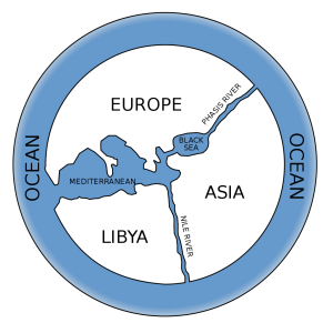
Early maps were created for a variety of reasons, quite often for navigation or to display the location of a place relative to the world around it (essentially, its site and situation.) Anaximander is credited with creating one of the first ever maps of the world, a possible reconstruction of which is shown in Figure 1.1. While this might not seem all that impressive in modern times, consider that this map was created around the 6th century BCE. You’ll notice that the map displays Greece and Turkey at its center (Anaximander was Greek and lived in a city in modern-day Turkey), as well as the region’s location relative to other places in the world – both site and situation. By the 17th century, cartography (the science of map making) became much more scientific, leading to the academic discipline of geography today.
Cartography refers to the art and science of map-making, and there are a variety of tools and techniques modern cartographers have at their disposal to create maps. Very often, modern cartographers utilize computer software. A geographic information system, or GIS, is a computer system that can capture, store, query, analyze, and display geographic data and this software allows us to layer information on maps and analyze them in complex and dynamic ways. With GIS technology, we have the ability to put a tremendous amount of data on the map, and make them look very professional. So, in many ways, they’re seen as more accurate than the old, hand-drawn maps we used to have. Anyone can make an excellent looking map with fairly little effort.
We’ve mentioned that maps have been used for centuries and continue to be used today, but what exactly is a map? Maps are simply scale models of the real world. They serve as reference tools to help us find our way, and as communication tools to convey the human activities or physical features found in an area. One problem with maps, however, is that they depict a round earth on a flat page. Imagine if I asked you to take the peel off an orange and make it flat. How would you do it? Would you cut little slits into it to try to flatten it out? Good idea, but then the distance between the areas on the peel might be further apart than they actually are. You could squash it down, but then some areas would be a bit squished. The same challenges arise when we try and make a globe conform to a flat surface. There are a variety of ways to transfer this sphere onto a flat surface, and these types of transfers are known as projections. It is important to note that no reproduction of the world on a flat surface is perfect. Something must be distorted, just like in our orange peel example. And this isn’t due to errors or oversights in map-making, but in simply the impossibility of taking something round and representing it exactly the same on a flat surface.
There are four basic features that can be distorted on a map: shape, distance, relative size, or direction. When we distort the shape of something, an area might appear more elongated or more squatty than it actually is. With distorted distance, the distance between two places on a map and their distance in real life may be increased or decreased. A distortion of relative size might result in one area appearing larger than another on the map, when it is actually smaller. Finally, distorted direction simply means that the direction between two places might be distorted.
There are all kinds of different map projections and what is distorted is generally related to what the map will be used for. Let’s take one of the most common maps, the Mercator projection (see Figure 1.2). In this image of the Mercator Projection, there are red circles known as Tissot’s indicatrices, an idea presented by the French mathematician Nicolas Auguste Tissot to show distortion at a single point on a map. On a globe, these circles would all be exactly the same size and shape, as would the land underneath them. What do you notice about the circles on this map? Do you see how they get much larger away from the equator? This means that the landmasses in these areas are also much larger than they actually are in real life. On this map, Greenland for instance looks to be the size of Africa, when in reality, Greenland is only around 1/14th the size of Africa.
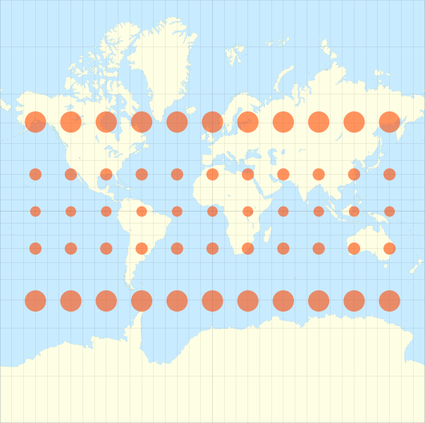
The Mercator projection distorts size, and you might be thinking, “What a terrible projection. Why would it be so distorted?” Again, you have to distort something and the intention of what the map will be used for can be helpful in deciding what not to distort. For the Mercator projection, its primary use was for navigation, which at the time would have been sailing long distances. Thus, being able to set a course between two places and keeping a constant bearing was critical, and so not distorting direction was key, but this meant that the size of areas is significantly distorted.
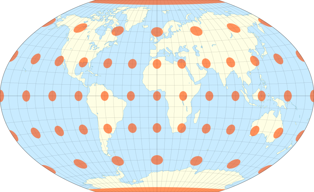
Today, a more commonly used map to display the world is the Winkel tripel projection, named after the German cartographer Oswald Winkel. This map is so-named because Winkel sought to minimize three types of distortion (hence “tripel,” the German word for “triple”): area, direction, and distance. Comparing this world map to the Mercator projection, it is clear that while there is some distortion, the circles appear to be roughly similar sizes, directions, and distances apart. You can also compare the size of Greenland with the size of Africa. While there is still distortion, again as is the case for all maps, if the intention is to provide students with a fairly accurate idea of what the world looks like, the Winkel tripel projection excels, and as a result, has been used by the National Geographic Society as the standard projection for world maps since 1998. There are numerous other types of projections and ways to project maps.
When many people see a map, they often forget that it’s a representation. It’s not a photograph, and even a photograph can be incomplete. Rather, a map is a representative figure of what the world looks like. The important point is to think critically. What story is the map trying to tell? Why did the mapmaker design it the way they did (consider the projection, the colors, the extent – they’re all decisions that need to be made.)
Once a map-maker decides on a projection, they must determine the scale at which to work, and scale can greatly affect the message conveyed by the map. Scale refers to the relationship of a feature’s size on a map to its actual size on Earth. Scale can sometimes be a bit confusing for students. First, it is important to remember that scale is a ratio. Did you ever play with toy cars as a kid? These small cars are often 1:64 scale. What does that mean? That means that the little toy car is 1/64th the size of that same type of car in real life. So 1 centimeter on the car would be equal to 64 centimeters on a real car. Map scale works the exact same way.
If you had a 1:1 scale map, what would it look like? It would be HUGE and would have everything on it. In fact, it would be as big as the area you’re mapping! (Not very easy to fold up into a glove compartment, that’s for sure.) 1:2 scale is a bit more manageable, but only slightly, because then it would be half the size, so we often use relatively small scales when mapping. “Large scale” or “small scale” doesn’t refer to the landmass or to the physical size of the map. Rather, it refers to the measure of scale. If we have a scale of 1:2 and convert it to a fraction, we would get 1/2, right? As a decimal, that number is 0.5. What if we had a scale of 1:10? As a fraction, it would be 1/10 and as a decimal, 0.1. So what is a larger number, 0.5 or 0.1? 0.5 is a larger number and thus we would say that the larger scale is 1/2. Another way to remember is that typically the larger the scale, the greater the detail.
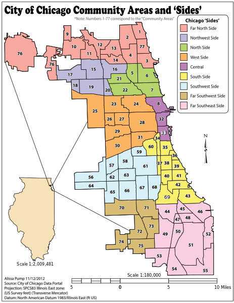
A small scale map, such as 1:50,000,000, might be used to display the entire world, or a scale of 1:24,000,000 to show a particular region of the world. A larger scale map, on the other hand, might be used for a walking tour of a historic city, perhaps using 1:5,000 scale. As shown in Figure 1.4, a scale of 1:2,009,481 could be used to display the entire state of Illinois, while a scale of 1:180,000 could be used to illustrate particular community areas within the city of Chicago. Which one has the larger scale? The map of Chicago has much more detail and also the scale ratio as a fraction is a larger number, so the map of Chicago is a relatively large scale map while the map of Illinois is a smaller scale.
Now here’s a follow-up question: which map scale is most useful? It depends. If I was traveling from my house to a neighborhood park, a larger scale map would be useful because I would need to know a lot of details and local roads. If I were traveling across the country, however, I would need a small scale map that only showed major interstates and larger cities. Map makers need to understand the intended use of the map, or the ideas the map is trying to convey, in order to select an appropriate scale. The scale of the data being mapped matters as well. A map of political affiliation by county in the United States looks very different from a map of political affiliation by state. As with projections, it is important to remember that all maps tell a story, so think critically about the decisions made by the map-maker.
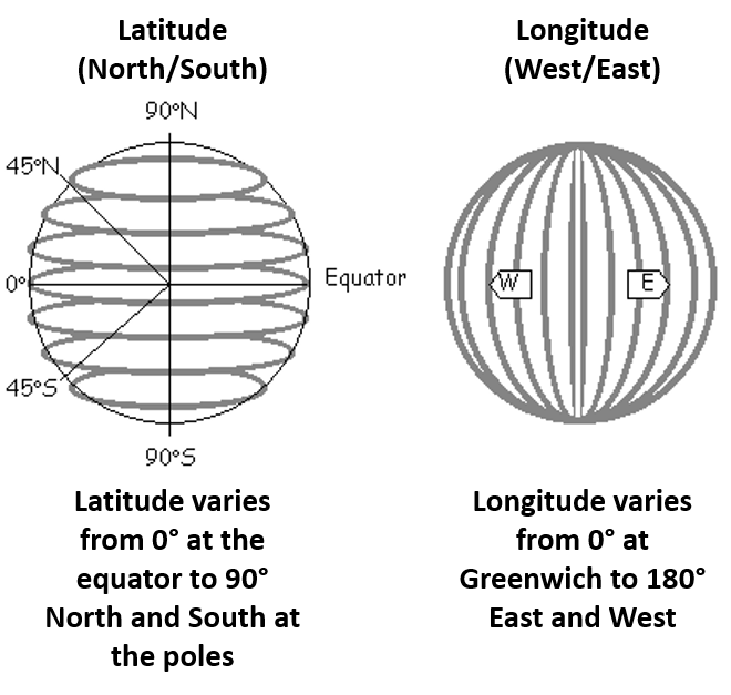
Finally, two additional key terms that are important to understanding maps are latitude and longitude and these refer to the horizontal and vertical lines drawn on a map. But which is which? One way might be to think of lines of latitude running laterally. Thus, latitude are the horizontal, evenly spaced lines running laterally around the globe while lines of longitude are vertical and meet at the poles (see Figure 1.5). All locations on Earth have specific latitude and longitude coordinates. Lagos, Nigeria, for example, the most populous city in Africa, is located at 6.5244° N, 3.3792° E, so it’s just north of the equator and just east of the prime meridian. Anchorage, Alaska, on the other hand, is located at 61.2181° N, 149.9003° W, quite close to the North Pole and far from the prime meridian. A simple web search for a city name and latitude and longitude will provide you with the coordinates of a particular place, or you can use Google Maps, right click on a place, and then click “What’s here?” You could try it for your home and see what the exact coordinates are!
If maps are commonly used tools by geographers, how do we actually gather and analyze the data they illustrate? There are a wide variety of ways to gather spatial data. In general, data can either be classified as quantitative (such as population data, climate data, etc.) or qualitative (which might include interview transcripts, photographs, etc.) Maps generally display quantitative data, and with GIS, this data can be layered in order to use spatial analysis techniques. If you wanted to build a new school, for example, what kinds of data might you need to determine the best location? It would be helpful to have population data for the neighborhoods within a region. It might also be helpful to layer road networks, to determine where bus routes might be located. You could also include real estate information to identify vacant land. How would you collect this information? You could use census data, perhaps county records, satellite imagery, or publicly-available data on local roads. You could also collect your own data, perhaps by interviewing local residents about where they would most like a new school to help identify some possible locations. Maps help give us the information needed to make critical decisions.
1.4 Understanding Spatial Patterns
As we’ve discussed, maps tell a story, but they can also be powerful analytical tools. The patterns displayed on a map can help answer deeper questions. Here’s a simple example: imagine you’re a geographic researcher working alongside archaeologists on an excavation in South America. You find evidence of fruit trees in an area and are wondering whether those trees were intentionally planted by an ancient indigenous group who used to live there. If you mapped the tree locations and analyzed them, you could see whether they were evenly spaced, which would indicate that they were domesticated and planted.
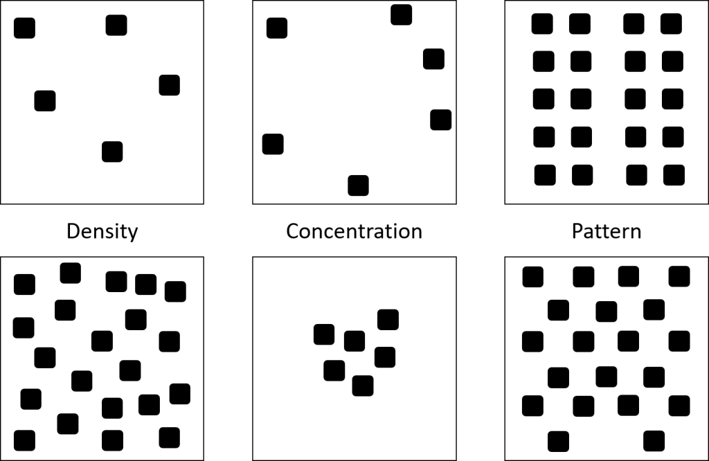
When we analyze a map, we can look for three key measures of the spatial distribution of features: density, concentration, and pattern (see Figure 1.6). Density refers to the frequency of a particular feature within a given area. If we look at the density of people within a city, for example, we might find that there are relatively few people or quite a lot. But where are those people within a city? This question is best answered by the concepts of concentration and pattern. Concentration refers to how clustered or dispersed a particular feature is within an area. People living in a city, for example, might be heavily clustered around a downtown area. Or they might be relatively dispersed around the entire town. Finally, pattern refers to how those features are arranged, perhaps in a random arrangement or spaced evenly or predictably. In a planned neighborhood, for example, houses might be evenly spaced along roads, whereas in another area, houses might be fairly randomly spaced.
What spatial patterns do you notice in your daily life? What is the road network like in your area? Is it laid out like a grid or more like nodes? How are the houses or apartments spaced in your neighborhood? Where are the major stores located? As we consider spatial patterns, we can also add the element of time. Distance decay refers to the idea that the likelihood of interaction between two things decreases as their distance apart increases. For instance, how likely would you be to go to a grocery store located 5 minutes away? What about a grocery store located an hour away? How likely are you to know someone on your hall within your dorm? What about a fellow student who lives on the other side of campus?
In today’s society, though, the relative distance between people and places has decreased. Just think about it – could you video chat with someone on the other side of the world? Could you hop on a plane in the morning and be in another country by the end of the day? Places might still be the same distance apart on a map, but due to technological advances in transportation and communication, the space between us is shrinking. This concept is known as time-space compression. Understanding these relationships – between places, between time and space, between locations and the larger area where they are located – and how these relationships change and evolve is critical to analyzing spatial patterns.
1.5 Regions
As we begin to understand and analyze maps and the world around us, we notice that certain places seem quite similar to other places in terms of their physical and/or cultural characteristics. These are known as regions, global areas that are broadly divided based on their physical or human characteristics. What regions are there within your state or province? Perhaps your city is part of a larger metro area, or perhaps you are in a region characterized by a distinct physical characteristic. There are three main types of regions: formal, functional, and vernacular.
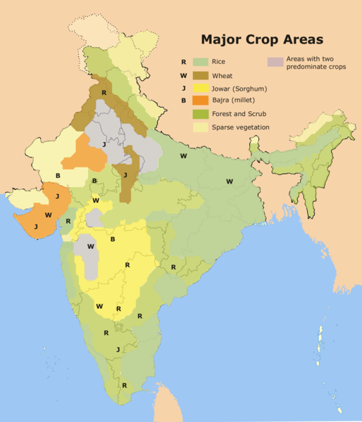
Formal regions are perhaps the easiest to identify. These are sometimes also called a uniform region or a homogeneous region. Formal regions are areas where there is one or more characteristic shared in common. What are some examples of formal regions? Again, we’re looking for ways to divide an area based on shared characteristics. What about major religious groups? Political affiliation? If you’re a gardener, you have likely checked out the plant hardiness zone map to see what plants grow well in your region. Why would a map of major crop areas be considered a formal region, as in Figure 1.7? These regions are formal because they are created based on a shared characteristic; in this case, the dominant crop found in the area. Does this mean that only rice is grown in northern India? No, simply that it is the dominant crop found in this region.
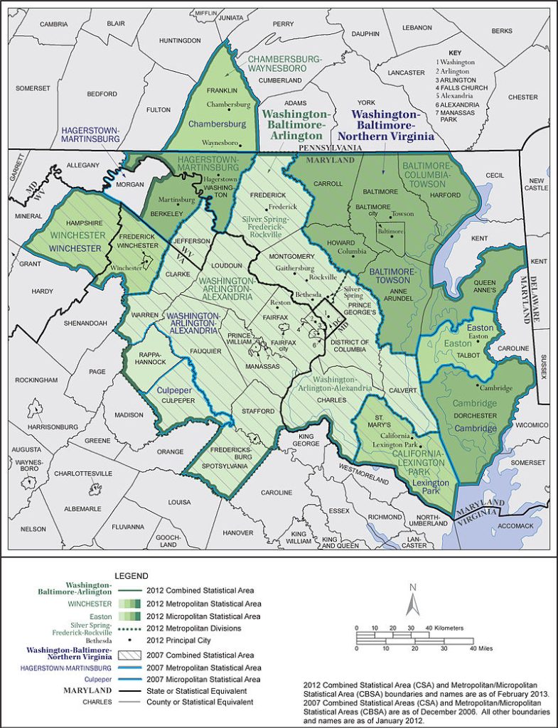
Functional regions are a bit more tricky. These are regions that are organized around a particular node, or focal point, and are often sometimes called nodal regions. Imagine you have a network, with a central node and other smaller nodes connected to it, and even smaller nodes connected to those. If this describes a region, what would be at the center node? What about a big city, with medium sized and smaller cities connected to it? What about a radio station, with the broadcast tower in the center and nearby cities surrounding it? What about an area serviced by a subway system, with a few central nodes and then surrounding stations? These are all examples of functional regions. Functional regions are united more by their function than by shared features. Most commonly, this function is economic. Take a metropolitan area like Washington, DC, for example (see Figure 1.8). Does the region of Washington, DC only correspond to the actual boundaries of the District of Columbia? Or does it include the surrounding area? If anyone has traveled along the Interstate 95 corridor in this region, particularly on a weekday morning, you’ll notice that traffic is incredibly thick heading into the city and the surrounding counties. In the afternoon, it’s the reverse. Thus, this is a region not because it has a common political affiliation, physical landscape, or ethnic identity, as would be the case with formal regions. Rather, it is united by its economic function.
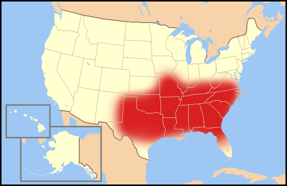
Vernacular regions are different. Whereas formal and functional regions have fairly well-defined boundaries, vernacular regions do not. These are regions that are perceived to exist. That’s not to say that they aren’t “real” in the sense that the region can’t be identified at all or that the region has no impact, but that because it is merely perceived to exist, the boundaries are a bit fuzzy. Think about the United States a moment: where is “the south”? Where would you shade it in on a map? Would your regional boundaries exactly match your classmates’? What features would you use to determine where “the south” is? (Perhaps the accent, religion, etc.) There might be some areas where most of us would agree constitute “the south,” while other areas like South Florida or northern West Virginia, would be up for debate (see Figure 1.9).
Many times, vernacular regions are related to the compass location, such as the “Midwest,” but what other vernacular regions might exist? Are there any vernacular regions in your hometown? Do you have a “downtown”? Is there an “arts district,” or what about a “riverfront” area? Often, vernacular regions are used as marketing tools, so there might be signs and symbols that signal that you’re in a particular area, and yet the boundaries remain unclear.
As we examine the boundaries on a map, especially those between two regions, countries, or continents, what seems like a stark line separating two areas is generally actually marked by an area of transition. These areas are known as transition zones. Transition zones are areas marked by gradual spatial change. Take the border between Europe and Asia, for example. Typically, the Ural Mountains form the dividing line, but is Eastern Europe that different from Western Asia? What about the border between the United States and Mexico? In southern Texas, is the physical and cultural landscape that different from northern Mexico? Just as we’re learning to read maps with a critical eye, look at regions with a critical eye as well. Consider whether there is indeed a clear boundary. Consider why the boundaries have been drawn the way they have, especially in the case of vernacular regions. In the case of the continents, for example, why are there seven? Why isn’t Europe and Asia just a single continent called Eurasia? Why isn’t South Asia it’s own continent considering that it is on its own tectonic plate? Why does North America typically include Panama even though the country is more similar to its southern neighbors than it is to Canada? Why do we even divide the world based on chunks of land when really, it is the sea that often unites us, as in the case of the Mediterranean. Regions are certainly useful ways to divide and analyze the earth, but they are generalizations and it is important to consider them critically.
1.6 Globalization
Before we dive right in to the details of globalization, take a few moments to consider the term. How would you define globalization? Do you think globalization is good for everyone? What’s an example of globalization? Students often have strong ideas about globalization, but just as in the case of our ideas about regions and borders, it is important to think critically about our understanding and identify where our knowledge might be incomplete.
Put simply, globalization is the notion that the world is becoming increasingly interconnected. It relates to the notion of time-space compression in that our relative locations are shrinking. Think about how easy it is to connect with the world around us, either virtually or physically. Globalization, in many ways, is an amazing phenomenon. Through globalization, I can eat at my favorite Indian restaurant just down the street. I can connect with my nephew in the Philippines. I can enjoy advances in medicine made possible by a research partnership across two countries. In globalization, however, it is important to remember that there are winners and losers. Here in the United States, I enjoy significant benefits as a result of globalization, from cheaper food and clothing to lightning fast communication technologies. For poorer countries deep in debt, however, the world might not feel so flat.
Furthermore, at the same time globalization is occurring, there are also struggles for local preservation. As American fast food chains have made their way overseas, they have often replaced locally-owned and operated restaurants. As goods and services are increasingly manufactured by large, multi-national firms, they have often put family-owned companies out of business. Globalization is thus creating a more uniform and interdependent world, for better or for worse, and thus the process of globalization has numerous pros and cons.
1.7 Human-Environment Interaction
Although human geography is fundamentally focused on the human experience, as humans we interact with and reshape the environment around us. The relationship between humans and the environment is complex. Humans can be destructive toward the environment, and natural forces in turn can be destructive against humans and the built environment. Humans can attempt to control nature, improve nature, or live within it. If this interaction is so complex, how can we begin to analyze and make sense of it?
Historical geographers viewed the relationship between humans and the environment as deterministic. The term environmental determinism characterizes this notion that human activities are determined by our environmental conditions. And what’s wrong with that? After all, we find that cultures who live in cold climates often wear thick fur, while those in an arid environment typically wear loose, flowing garments. While the environment certainly has an impact on the range of our activities, to say that the environment determines cultural traits leaves out the possibility of human adaptation and innovation. In addition, many environmental determinists held racist views, believing that certain cultures were superior or harder working as a result of an advantageous climate and physical environment (ignoring indigenous cultural development and legitimizing a history of colonization and imperialism.)
Setting aside the problematic notion of environmental determinism, how can we acknowledge the environment’s impact on human society while also leaving space for human ingenuity. Possibilism is the theory that the physical environment may limit some human actions, but people have the ability to adjust to the environment. Thus, the environment gives us a range of possibilities rather than determining our actions.
Now more than ever, humans have reshaped our physical environment, sometimes with catastrophic consequences. But does the way we use the land always have to be so destructive? One model for human-environment interaction is known as sustainability. Environmental sustainability refers to the ability of a natural system to be productive indefinitely, meaning that humans could make use of the resources within an environment now and infinitely into the future. Sustainable development more broadly refers to the ability to develop today without compromising the economic, social, or environmental well-being of future generations. When we think about using the environment sustainably, what does that mean? When we think about human geography, we’ve discussed that in many ways, it is a telling of our collective story, and so you might think of environmental sustainability as an acknowledgement that it is indeed a collective story, of which we are only a small part, and that we intend for that story to continue in the future. And thus, rather than farm in a way that destroys topsoil, we might use alternative methods that reduce or eliminate large-scale plowing. Rather than degrade the physical environment of another country in order to produce our goods more cheaply, we might use alternative resources that have only a minimal environmental impact. Rather that burn non-renewable fossil fuels, we might invest in renewable forms of energy that can sustain us indefinitely in the future. Finding solutions to environmental problems or development concerns can be a challenge, but by approaching these challenges from the point-of-view of sustainability, we work to ensure that our solutions will still be effective long into the future.
the study of Earth's natural environment
the study of humans and their interaction with the earth
the location of a settlement on Earth and its physical characteristics
the location of a place relative to other places and geographic features
the art and science of map-making
a computer system that can capture, store, query, analyze, and display geographic data, also known as GIS and sometimes referred to a geographic information science
a way to flatten the globe's surface onto a flat surface to create a map
the ratio of the distance on a map to the corresponding distance on Earth's surface
lines that circle the globe running east-west parallel to the equator
lines that run vertically north-south around the globe intersecting at the poles
the frequency of a particular feature within a given area
the spread of a particular feature over space
the arrangement of a particular feature within an area
the notion that the likelihood of interaction between two things decreases as their distance apart increases
the idea that the relative distance between spaces has been reduced due to advances in transportation and communication technologies
areas that are broadly divided based on their physical or human characteristics
an area that has one or more common characteristics
an area organized around a particular node or focal point
a region that is perceived to exist
an area marked by a gradual spatial change
the increasing interconnectedness and integration of the countries of the world resulting from advances in communication and transportation technology
the view that cultural features and societal developments are determined by environmental conditions
the idea that the physical environment places some limits on human activity, but that people can adapt and adjust to their environment
the ability of a natural system to be productive indefinitely
