7
Infographics can be a useful means of displaying information to key audiences. Although they do not capture the depth of research, they can be a concise way of getting across key findings, particularly to audiences who might not read a full journal article.
If you have the budget to employ a designer, great. If not, it’s easy to create infographics using online tools; free versions of these tend to be basic and limited but they work perfectly fine. At the OER Hub we used Piktochart (piktochart.com) but there is also Canva (canva.com) or Easel.ly (www.easel.ly), for instance.
When creating an infographic, keep it simple; don’t pack too much in. Highlight interesting data, key findings, important messages, then add a link to the full report (if there’s one) for those who want to learn about the research in more detail.
Use a meaningful headline; make it clear to your audience what the infographic is about.
Trust your colleagues to cast their eyes over your first draft and comment on improvements, i.e. is everything sufficiently clear?
Make sure your data is accurate; cite your sources.
If you can, create your infographic in different formats, give it a Creative Commons license and allow others to share it via their social networks.
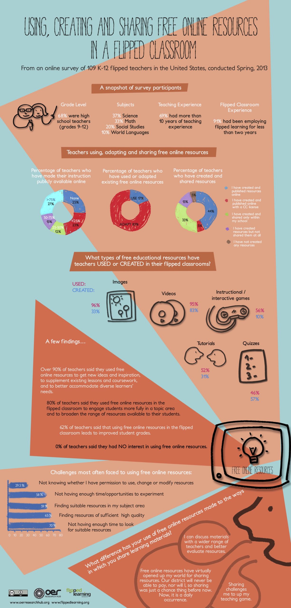
Here is an example:
All the Infographics the OER Hub created can be found on the website: http://oerhub.net/research-outputs/infographics/

