9
Introduction
Technical writers integrate graphics, also referred to as visuals, to complement text in a report. Visuals can take a number of forms— tables, charts, photographs, drawings, to name a few— but their purpose rarely varies: graphics should help to clarify information presented in the report. They also provide an additional benefit: they help to break up a text-heavy report, thereby making the report more visually appealing.
Deciding which graphics to include
As you review your research and begin to think about possible visuals to include in your report, the first step is to consider which graphics are most appropriate given the data you wish to convey. The table below provides some general guidelines on the kind of graphic most suitable given the type of information.
| Information to Convey | Visual Type |
| Numbers, percentages, categories | Tables, charts |
| Processes | Flow charts |
| Geographic data | Maps |
| Chronological or prioritized lists | Numbered lists |
| Non-chronological lists | Bulleted lists |
Other considerations: audience
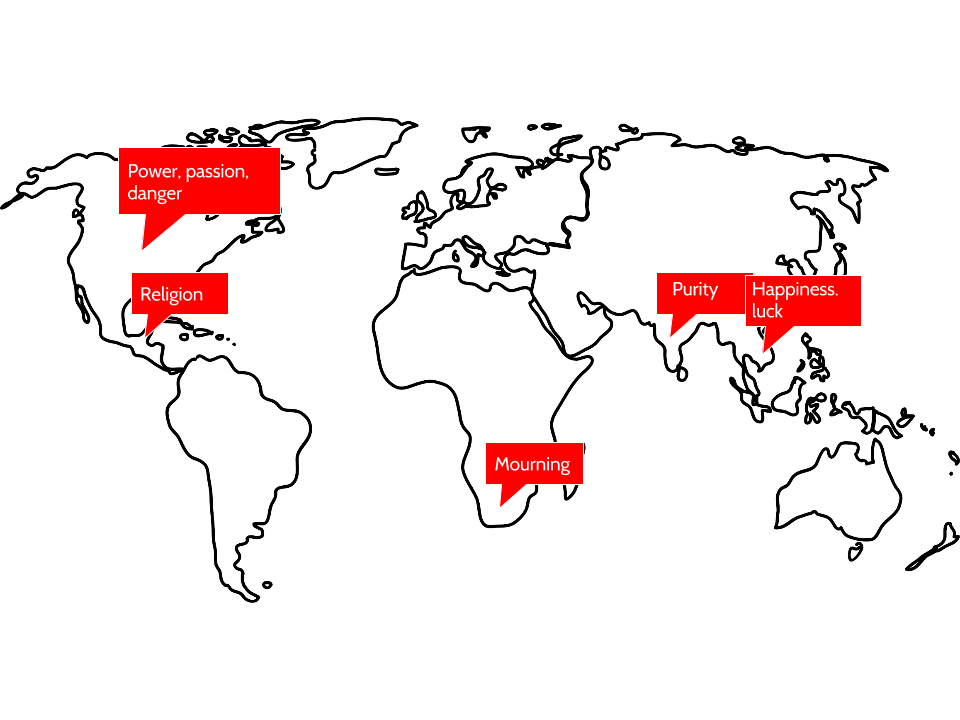
When creating graphics, it is very important to keep your audience in mind. This relates not just to the content you share but also how that content appears on the page. Are you aware, for instance, that the same color has different meanings across various cultures? Take a look at the graphic below and notice how the color red means something very different across culture. Similar differences exist across cultures with other colors, as well, so be aware that the choices you make in colors for your graphics may communicate ideas you do not actually intend.
Figure 1: Meanings of the color red around the world
Other considerations: placement and context
As you develop visuals for your report, you will want to also consider where they should be placed and what information you will need to provide in the body of your report to adequately prepare your readers for the message within that graphic. Minimally, consider the following:
- Introduce the information appearing in a graphic in clear sentences in the paragraph preceding the visual. That is also a good place to provide the source material for the information in the graphic, if applicable.
- Give the visual a name, even if that is simply “Table 1” or “Figure 1” for easy reference.
- Make sure the information within the graphic is clear and easy to understand.
- Provide source information at the bottom of the graphic.
- Write some follow-up text after the graphic. This might be an interpetation or a final comment about the implications of the information in the visual.
Samples
Let’s take a look at some samples.
The first example below is a pie chart created with information the writer obtained from an interview. Notice that the writer provides a name for the visual, includes introductory sentences to provide context for the graphic, lists source information at the bottom of the chart, and finally, includes some closing remarks to tie it all together.
Not all gardeners will experience success with growing vegetables in Central Oregon, and the town of Sisters is especially challenging because of the varied temperatures all year long and the chance of frost or even freezing temperatures during any month of the year. Central Oregon and Sisters resident, Jane Doe, had the greatest success with the following vegetables in the year 2015 as noted in the pie chart below.
Table 1: Vegetables grown in 2015
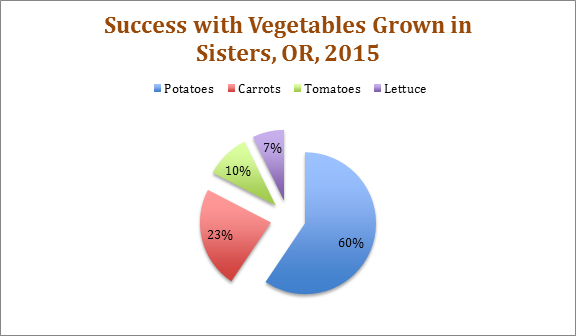
Source: Interview with Master Gardener, Jane Doe, 2 May 2016.
It is important to note that depending on the hardiness zone of the city, some vegetables may do better than others. Doe also commented that she protected her tomatoes either inside a green house or under a hoop house.
Below you will find another visual of the same information from the pie chart. It is provided to give you another way of visualizing the same information.
Figure 1: Vegetables grown in 2015
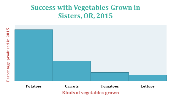
Source: Interview with Master Gardener, Jane Doe, 2 May 2016.
Finally, here is a simple table conveying information about plant hardiness zones for growers in Central Oregon. Notice again that the table isn’t simply inserted and left on its own for readers to interpret; the writer introduces the table with prefatory remarks and also provides follow-up commentary after the table.
The U.S. Department of Agriculture publishes a Plant Hardiness Zone Map which growers and gardeners use to help determine which plants, including vegetables and trees, will be most successful at a particular location. The table below shows the hardiness zone for four cities in Central Oregon and includes the annual minimum winter temperature—important information to keep in mind when determining not only which vegetables to plant but how long the growing season may be.
Table 1: Hardiness Zones in Central Oregon
| Central Oregon City | Hardiness Zone | Winter Temperature Range |
| Sisters | 6a | -10 to -5 (Fahrenheit) |
| Bend | 6b | -5 to 0 (Fahrenheit) |
| Redmond | 6b | -5 to 0 (Fahrenheit) |
| Tumalo | 6b | -5 to 0 (Fahrenheit) |
Source information: “United States Department of Agriculture.” USDA Plant Hardiness Zone Map. 2012. Web. 05 May 2016.
Before purchasing any plants or vegetables for your own garden, make sure you look at the hardiness number on the label to be sure that item will grow successfully in your climate zone.
Now that you have had a chance to learn about strategies for creating effective graphics and have examined some strong examples, let’s look at a few that could use some revision. As you look at the following visuals, note the possible strengths and weaknesses of each one. Consider what advice you might give the writer on how to improve these graphics.
Examples of visuals that could use revision.
Guidelines for graphics: a final review
Keep the following in mind as you consider possible visual enhancements to your report:
- Use graphics to supplement or clarify information provided within the body of your report.
- Make sure your graphics are appropriate to your audience, subject matter, and purpose.
- Discuss graphics in nearby text preceding the graphic. Don’t just insert a graphic in your report unexplained. Orient readers to the graphic; explain its basic meaning, easily done in introductory and follow-up sentences before and after your graphic.
- Intersperse graphics and text on the same page. Don’t put graphics on pages by themselves; ideally, no visual should take up more than one-third of any page in your report.
- Use figure numbers and titles for graphics. Additionally, include identifying detail within the graphics such as illustration labels, axis labels, keys, and so on.
- Make sure graphics fit within normal margins. Leave at least one blank line above and below graphics.
- Place graphics as near to the point in the text where they are relevant as is reasonable. However, if a graphic does not fit properly on one page, indicate that it appears on the next page and put it at the top of the next, continuing with regular text on the preceding page. Don’t leave half a page blank just to keep a graphic near the text it is associated with.
- Cite all images that you create from any source material. You should do this in your introductory sentences before the visual as well as include a citation, if relevant, at the bottom of the visual. See samples above.
- Cite any images you use as is which you include in your report. While it is perfectly legal to borrow graphics—to trace, photocopy, scan, or extract subsets of data from them, you are obligated to accurately cite your sources for graphics just as you are for the words you borrow.
Chapter Attribution Information
This chapter was derived from the following sources.
- Online Technical Writing by David McMurrey – CC: BY 4.0
