12
Dr David Roberts
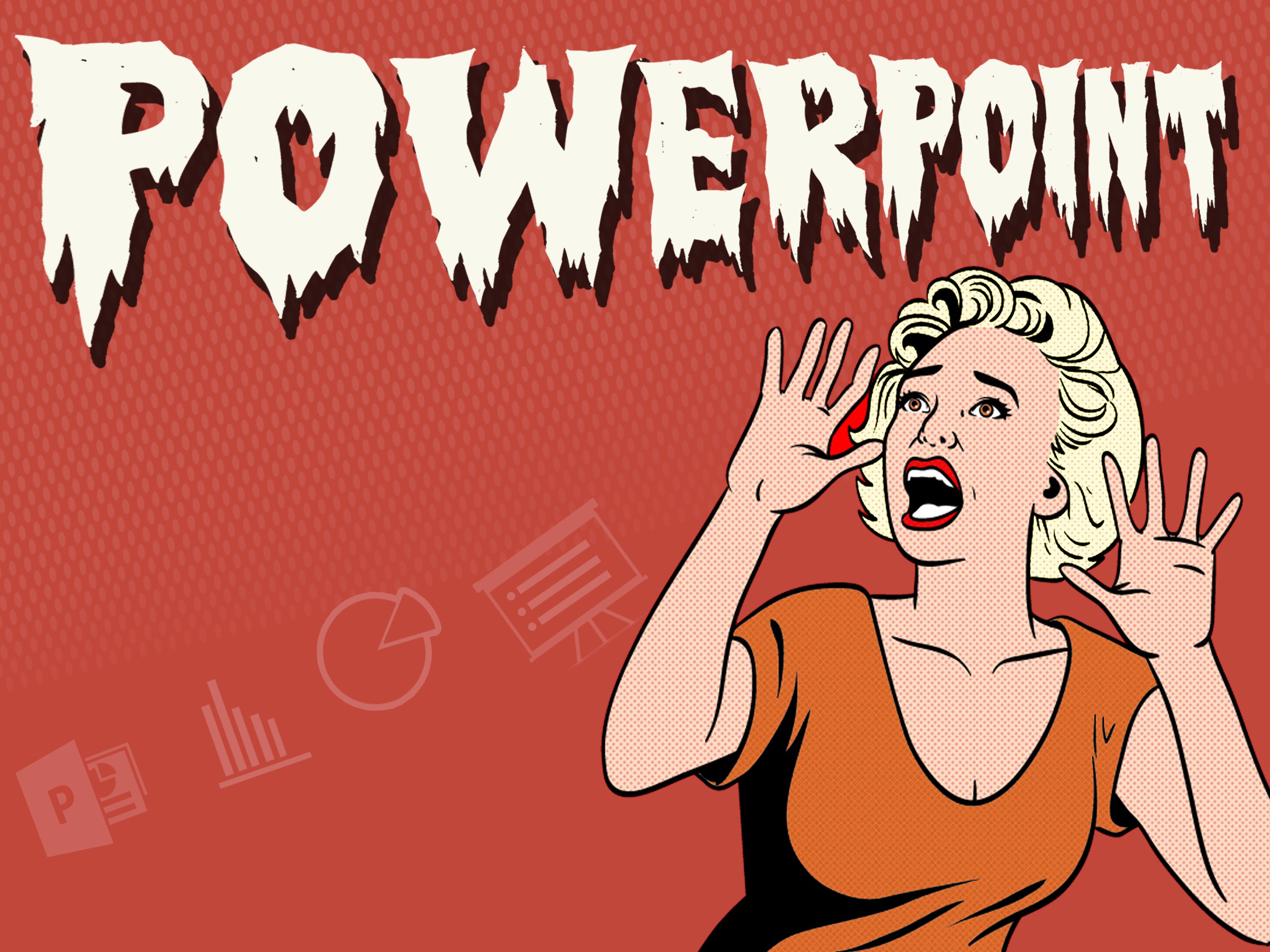
Image copyright David Roberts 2015, all rights reserved
Probably everyone’s experienced at some time ‘Death by PowerPoint’: a presentation that, rather than engaging your attention, makes you want to run away. Slides packed full of bullet points ‘organizing’ text that appears as a wall of words, and to add insult to injury, the speaker is often duplicating the text. PowerPoint has become a source of ridicule, with Google’s former Research Director, Peter Norvig, declaring it to be more dangerous that a loaded AK47, because it harms more people.

Image copyright David Roberts 2015, all rights reserved
He isn’t alone: a distinguished Professor Emeritus famously declared that ‘power corrupts, and PowerPoint corrupts absolutely’. But behind the satire there’s a serious point: according to recent and ongoing Multimedia Learning (MML) scholarship, we’re pedagogically problematic in at least two ways: we’re overloading lecture slides with text and we’re not using images effectively, if at all. Most of us probably recognize the first issue, but the second is paramount. We seem to have forgotten that a picture paints a thousand words, and that images help us see what people mean. They can be of inestimable value in teaching social sciences.
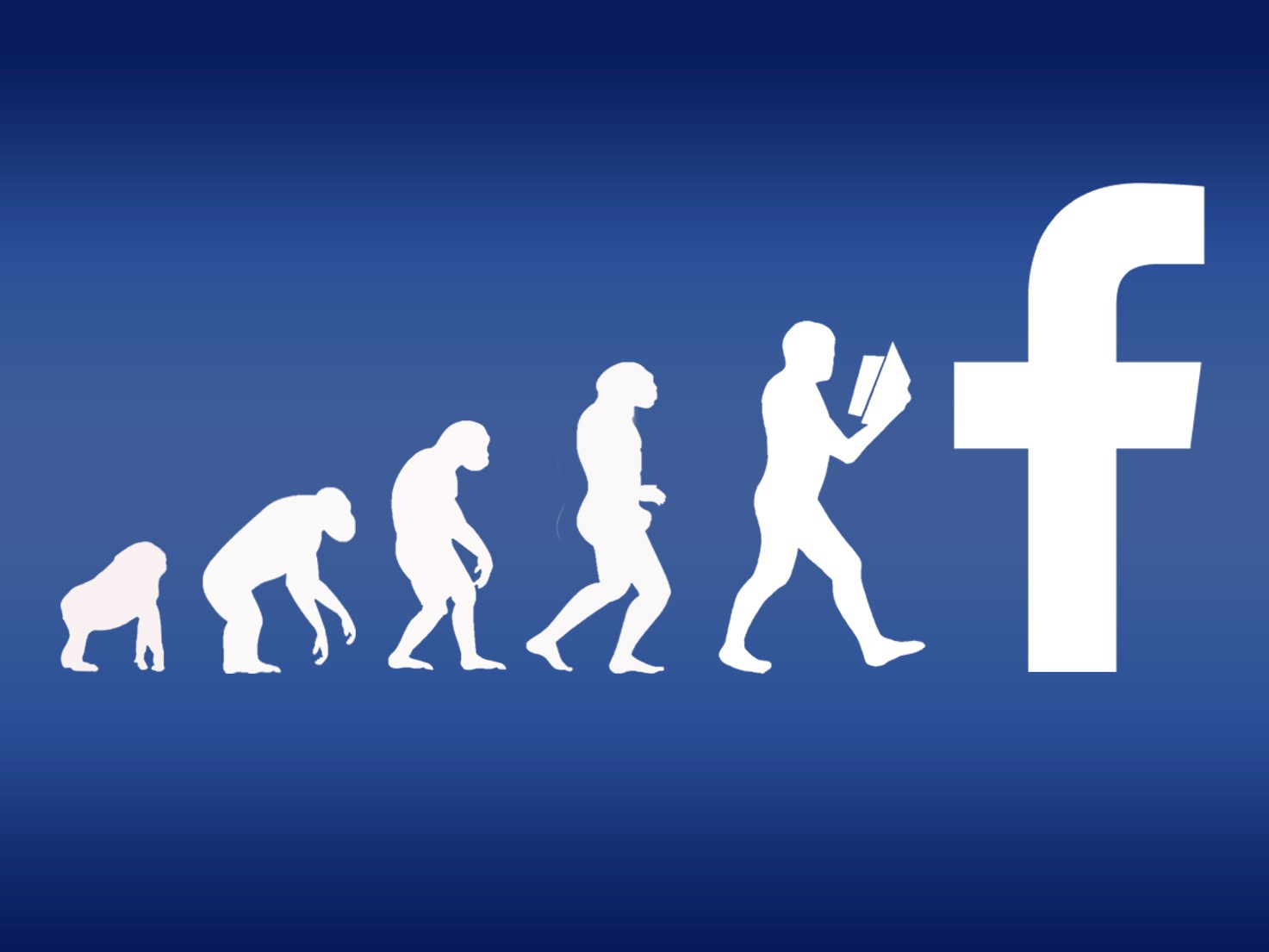
Image copyright David Roberts 2015, all rights reserved
We live in a visual era. Hundreds of millions of images are daily uploaded to the web through an ever-expanding range of visual platforms. People get knowledge and understanding from images long before coming to University. They communicate with images from very early childhood; babies learn from seeing before reading. This generation of students expects imagery when they enter Higher Education. Marc Prensky calls this generation ‘digital natives’, representative of a visual turn enabled by digital photography and dissemination across the Internet. Tietje and Cresap argue that academia is ‘marketed overwhelmingly to… young adults [for whom] visual media dominate’ (2005), and that was 10 years ago. But we’re still eccentrically text-centric, digitally dated and pedagogically pauce. Fortunately, it doesn’t take a great deal to transform how we use PowerPoint; indeed, it is almost perfectly suited for substantially improved large group lecturing. We know this from Multimedia Learning (MML) research.
MML, defined as ‘building mental representations from words and pictures’ (Mayer, 2014, p. 2), revolves around the idea that ‘people can learn more deeply from words and pictures than from words alone’ (2014, p. 1). This MML research tells us to balance the flow: images for eyes, words for ears. It often instinctively feels right.
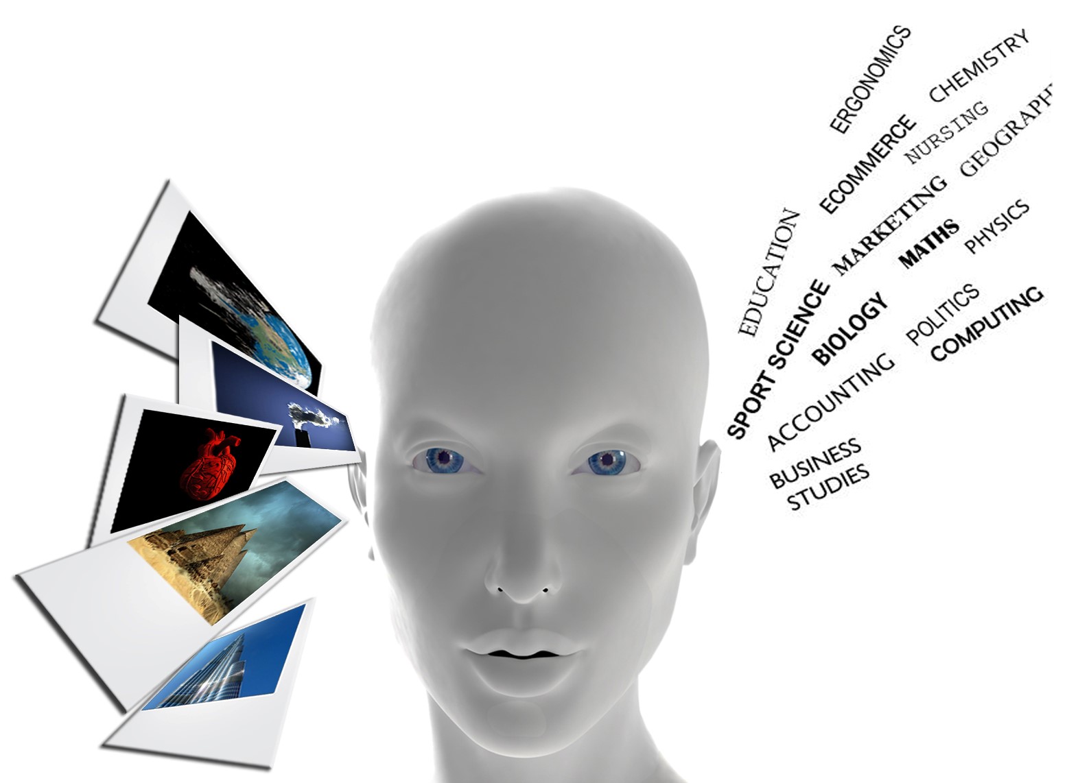
Image copyright David Roberts 2015 all rights reserved
It doesn’t mean doing away with text. It means not overloading ears and under-utilizing eyes. We can keep as much text as we want in the ‘notes’ view, which students will access via the slides uploaded to their Visual Learning Platform. As a general rule, we should use text on slides only as prompts for us and contextualizers for students. We should make that text around 30 point font and we should not have more than one line of it, unless we’re putting in quotes. It’s too much to absorb, it’s overpowering and it’s counter-productive.
The formula is simple, the intellectual context solid. Mayer’s work, underscored by decades of research into cognition and memory, is widely-recognized and published by Cambridge University Press. And beyond the Ivory Silo, others like Nancy Duarte, Garr Reynolds and Guy Kawasaki are are making leaps and bounds in improving audience engagement with presentations. So what’s it look like in practice? Here’s a website that helps see it, and there’s a video there as well. Below are a few examples; they’re not discipline-specific. Images can be applied to most social sciences subjects quite easily, and with substantial impact on engagement. After these examples, I’ll discuss the results of testing this method on undergraduates at Loughborough University over two years.

Image copyright David Roberts 2015 all rights reserved
I have used this image to visualize the concerns of environmentalists with heavy industry and legal regulation of pollution. In one session, it prompted a discussion of the degree to which Corporate Social Responsibility was a new ‘means’ to the old ‘end’ of profit.

Image copyright David Roberts 2015 all rights reserved
This image serves as a starting point for discussion of Realism and Liberalism in International Relations by connecting conflict in resource-rich places with the hegemony of neoliberal capitalism. There are many ways such an image can be used, but its key value seems to be in forcing mental reconciliation of a paradox: beauty and violence. It presents a puzzle, instinctive interrogation of which engages the mind. Students say this image stays with them and helps them recall the debates and theories.

Image copyright David Roberts 2015 all rights reserved
I use this image, ‘peace in a time of perpetual war’, when talking about the concept of peace in a world that uncritically normalizes and legitimates the use of violence for social transformation. It helps show the asymmetrical nature of the debate, and hints at the courage, humility and audacity often required to mount a minority and unpopular dissenting opinion.

Image copyright David Roberts 2015 all rights reserved
This image has been well-received when discussing liberal ‘choice’ feminism. Critics point to its role in perpetuating phallocentrism through adiaphoric denial of the structural context of female choices, which makes males the main beneficiaries of ‘choice’ feminism.

Image copyright David Roberts 2015 all rights reserved
This image can be used to describe how people create themselves from and around their environments; that they are not necessarily abstract biological entities devoid of social context. I use it with the following image, suggesting how our beliefs and values are socially learned. I can then discuss key proponents of constructivist ideas and claims, whilst images are interrogated by my students and absorbed into their learning

Image copyright David Roberts 2015 all rights reserved
We’ve tested the method scientifically and the outcomes are worth noting. We delivered the same academic lecture content to three groups of volunteer students, using three different delivery methods. The first used slides with text and bullet points only, as per many lectures. The second used small images, less text and fewer bullet points. The third used full-slide, high quality literal and figurative images, like the ones in this blog.
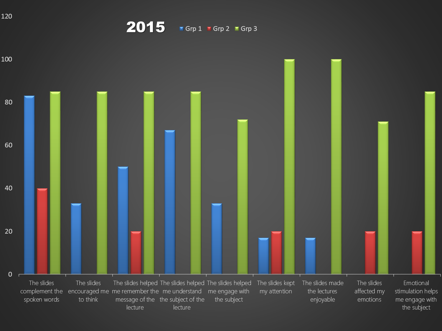
Image and data copyright David Roberts 2015 all rights reserved
Students in the third group declared that the image-based slides were between 50% and 60% more engaging than slides with text only. Among students exposed to this method of presenting for a semester, the percentage of coursework ‘firsts’ rose by 33%-50%. Dyslexic students surveyed, unanimously declared a preference for image-based slides over text-centric slides, and we’re doing more focused research on students with Specific Learning Difficulties (SpLD). We will submit all the data to peer-review this Spring, when a third tranche of empirical data has been gathered from students.
Conclusion
It’s clear that we use lecture slides in ways that haven’t kept pace with the world from which our students come. But we also use them in ways that are counter-pedagogical. The good news is that it’s easy to fix: reduce visible text, increase use of apposite images. It isn’t PowerPoint; it’s how we use it. After all, you wouldn’t blame Microsoft Word for the production of a bad article.
Dr David Roberts, Loughborough University