Appendix B: Document Design Basics
Chapter Basic Design and Readability in Publications
The way a text looks matters to a reader, so it should matter to a writer. Letters, reports, and blogs are more than just words on a page or a screen. How ideas are arranged and delivered in physical form, whether electronically or on paper, can make reading seem intimidating, confusing, or downright unfriendly, even if the content itself is perfect. Your text is like a room for your ideas. Sometimes you want readers to get in and get out quickly, but often, you want them to sit down and make themselves comfortable, to put their feet up and stay awhile. Whatever the case, you should be in control of the reader’s experience.
And most readers are a lot like TV viewers with remote controls. In a moment, their attention is diverted to another channel if something about your content puts them off. It’s important to get their attention and hold it. Good content is a key part of this, of course, but the visual presentation of your content matters too. Reading is a difficult, cognitively demanding task, so if your design helps make your readers’ journey through the text easier, you will hold their attention longer. Give readers reasons to linger, and they will.
|
|
|
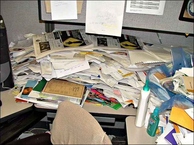

Figure 1: Where do you want to spend the next two hours? Image Credit: “World’s Messiest Office Cubicle Discovered in Colorado” by Jeffrey Beall is licensed under CC BY-ND 2.0; “laptop iphone” is in the Public Domain, CC0.
Good document design is both science and art. The particular design of a document—what it contains, what color scheme it follows, what alignment strategy it reflects, and so on—is the result of a series of choices made by the designer. It takes a long time to master the finer points of design, and this chapter won’t turn you into a designer, but it will offer some simple ways of thinking that will help you strategize about how to make your document intuitive and reader friendly—easy to scan, search, and read.
This is not a chapter on design per se; rather, it will familiarize you with a few basic truths and a way of thinking that all designers know well. Whether you’re typing up a memo on new safety policies at work, producing a newsletter for your community group, or putting together a booklet describing the new app you just finished and wish to market, you need to think about a few basic elements of document design.
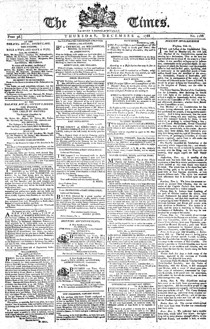
Figure 2: “Times 1788.12.04” by London Times is in the Public Domain. Just looking at the front page makes me tired.
ACTIVITY: Discuss texts that you have found intimidating or hard to read because of their layout or appearance. What exactly made the text difficult to read?
You already engage in some basic document design practices. For instance, when you format an academic essay, you center your title and regularly break to a new paragraph, which signals to the reader that it’s time for a breather, the content is shifting slightly, or you are moving on to a completely new topic. You illustrate blogs, Web pages, and PowerPoint slides with photos and graphics, animations, or videos. Even small elements of your writing help guide readers: indentation, changes in type style (bold, italics, underline), or the punctuation at the end of a sentence.
Professional writers, especially those who work for well-funded web sites and mass-market print publications (like newspapers and magazines) are lucky enough to have the services of artists, graphic designers, skilled photographers, and layout experts. But most of us just want to have a cooler-looking blog, a more professional-looking report, or an eBay listing that doesn’t make buyers suspect our credibility.
This chapter briefly summarizes some fundamental concepts that you should consider as you revise and shape your text, whether it is in print or electronic form. Then, you will read about and see examples of some basic principles of document design that allow writers to combine graphic elements and text to convey a message to an audience.
On Style Conventions
Academic papers, cover letters and resumes, business plans, and other documents tend to follow certain conventions. For example, MLA (Modern Language Association) and APA (American Psychological Association) style dictate, among other things, exactly what academic papers should look like. AP (Associated Press) style shapes the look of newspaper text, and IEEE (Institute for Electrical and Electronics Engineers) style governs engineering articles and documents. For every field in which you write, you’ll discover that field-specific style guides shape the appearance of a text, the way language is used, the preferred terminology and vocabulary, and the way sources are cited.
In business and commerce, established firms like Panasonic, IKEA, eBay, Sears, and Trader Joe’s have a style too. To preserve their brand identity, firms create recognizable, memorable logos and make sure their documents follow a certain agreed-upon style. Government and civic organizations have logos and letterhead too, and government and military documents are also the product of style conventions.
When you are in school, you’ll be told to respect style, citation, and formatting conventions, like MLA or APA. When you go into the professional world, you’ll need to find out what the field-specific or company-specific style and citation conventions are. If you publish online, you should consult style and formatting guides recommended by the World Wide Web Consortium (W3C).
ACTIVITY: Find a document or a Web page whose design makes it difficult for you to read and browse the content. Try to identify what makes this particular page difficult to navigate.
Style conventions are important. When you are designing a document, you’ll need to know if a particular style applies to it; for example, a cover letter should generally follow traditional business letter format. Memos and emails might look slightly different; for example, we don’t expect to see an address block for the letter recipient on an email because you don’t need to know someone’s street address to reply to an email.
Many bemoan the lack of a consistent style on web pages; sometimes the way they look detracts from their readability. And we often don’t know who wrote the text, where it comes from, or when it was produced. Many people hesitate to assign real credibility to an undated, unsourced blog written by a stranger—and rightly so. This is why sites like Wikipedia demand sources and format all entries exactly the same. The “look and feel” of Wikipedia is now familiar to people around the world, and it is used as a source in certain writing contexts, for good or for ill, precisely because there is some predictable, reliable regularity to its content, and its easy-to-navigate entries are popular with readers.
However, producing good publications goes way beyond just observing style conventions; there are a number of different concepts to consider and many important choices to make as you plan how best to communicate your message, whether you do it on paper or onscreen.
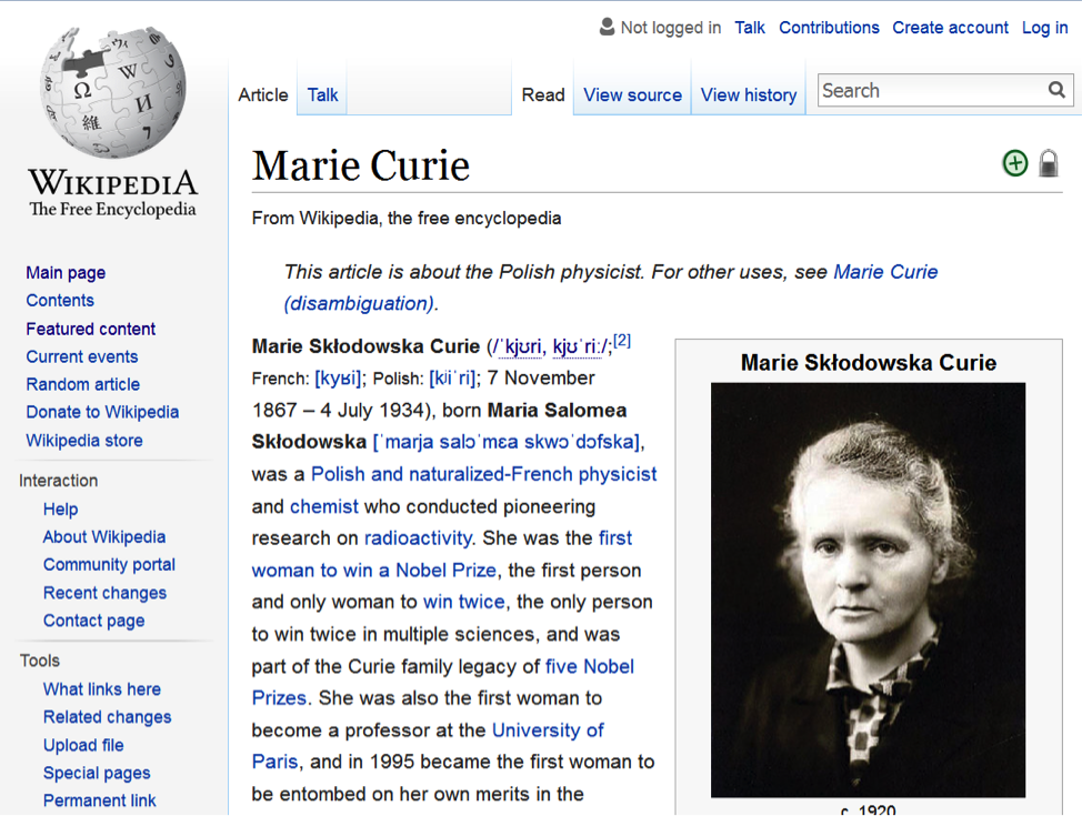
Figure 3: Most readers know exactly what to do with a Wikipedia page. “Marie Curie” by Wikipedia is licensed under CC BY-SA 3.0
Concept 1: Know Your Audience
To some extent, you already know ways in which the nature of your audience can affect your text. In a class setting, other students and instructors will already be familiar with the assignment and the subject matter about which you are writing. You already adjust vocabulary and tone to suit your audience. Thinking about your audience’s potential needs, biases, knowledge, attitudes, and preferences helps you present your text suitably.
To help you reach your audience, first consider the formats open to you. In some cases, the context in which you’re writing and the audience for which you’re writing will determine the format(s) you can use. You wouldn’t send a booklet full of images to a teacher to inquire about your child’s progress. You can’t hand out copies of your blog at a music festival and expect it to get read right away.
ACTIVITY: Think of other audiences and writing contexts that require a particular format.
Second, consider the strengths and weaknesses of different formats for your particular audience. Are they already familiar with the ideas you are conveying? Do they already know something about the subject matter? What do they still need to know about it? Are there ideas that are likely to confuse them?
How will your audience be interacting with the text? Will they be glancing at your poster as they pass, or will they need to sit down and study your business plan? How much information do you expect them to take in? How much time do they have to devote to reading? Do they agree with you? How open to your message are they: Are they on your side, or do you need to persuade them of something? Do you need to take their age, education level, language background, condition, and cultural or social background into account? Knowing things about your audience can help you communicate effectively with them.

Figure 4: Consider what your audience knows. To some audiences, he’s a meme. To others, he’s an actor. Some don’t know who he is. “Kevin Bacon” by Gage Skidmore is licensed under CC BY-SA 2.0
You even need to consider readers’ familiarity with the format itself. Would your grandfather know what to do when he sees a blue hyperlink on your blog? Would a third grader know how to unfold and read a topographical map? Will differences in physical ability affect how your audience interacts with your text? Does your audience need illustrations? Is a short video better than a text-only writeup for your audience? Which formats allow you to provide the information your readers need?
Most Western readers expect text to flow from left to right. But readers of Arabic, Urdu, Farsi, and Hebrew, for example, are accustomed to reading text from right to left. Twitter had to consider this when they adapted their product for an Arabic-speaking audience. Other forms of information are designed for different audiences with different preferences, background knowledge, cultural concerns, and language backgrounds. Chapter 13 offers more information about communicating with audiences whose backgrounds, language use, and cultural expectations are different from your own.
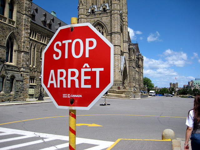
Figure 5: A Canadian stop sign in English and French. “Information board, Beltany Stone Circle” by Kenneth Allen is licensed under CC BY-SA 2.0
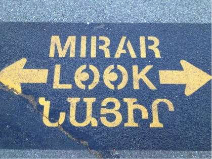
Figure 6: Multilingual road sign, Glendale, CA. Communities accommodate the needs of diverse audiences when they communicate. “Mirar, Look, and whatever that says in Armenian” by Eli Carrico is licensed under CC BY-SA 2.0
You have a lot of formats to choose from: letters, papers and other printed pages, flyers (double and single-sided), posters, booklets, a wide variety of multi-fold brochures or pamphlets, PowerPoint presentations, blogs, apps, tweets, web pages, vlogs, videos, audio files, and so on. All of these formats have strengths and weaknesses as delivery mechanisms for information.
ACTIVITY: Discuss the format(s) of the texts you are currently producing in class. Identify some features of your text format might present challenges for your audience?
ACTIVITY: Discuss the benefits and drawbacks of different formats for conveying your information. For example, what is helpful—and limiting—about using a trifold brochure to convey a message? A poster? A short video?
Consider which audiences would be receptive to receiving this information in this format:
Figure 7: Some formats and some messages are not suitable for every audience. (Public Domain image)
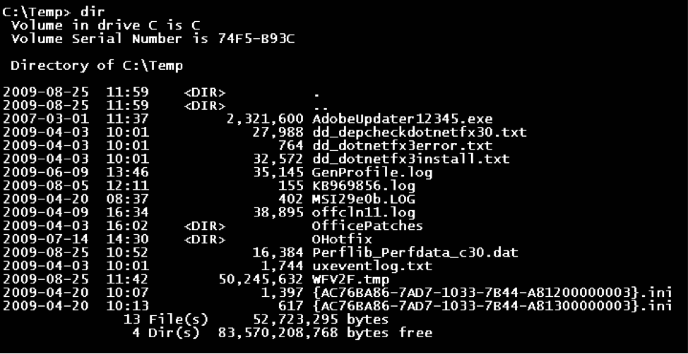
Figure 8: The Windows command line interface. FUN! Public Domain image.
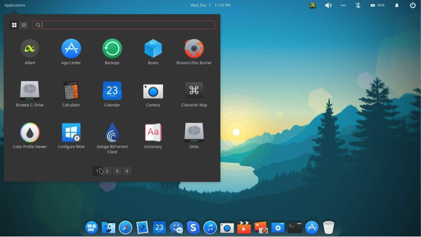
Figure 9: A graphical user interface for an open-source Linux operating system. Image Credit: KumarPriyansh, BackSlash Linux Elsa, CC BY-SA 4.0
Think of what it meant to go from the interface above to the one below. Designers at PARC, Apple, Atari, and later Microsoft realized that most people needed an easier way to interact with software and hardware. Attention to the preference and experience of its users has consistently won Apple Computer legions of loyal fans.
Concept 2: Know your Purpose
It’s impossible to think of a piece of written communication without a purpose. Even if you are just scribbling down whatever thoughts enter your head, you have a purpose: to express your own ideas. Self-expression is a common purpose for written texts, but it’s not quite as important in academic and professional settings. In fact, you may have to sublimate your personal feelings if the situation calls for it. For instance, no matter how strongly you feel about being billed incorrectly for your internet service, abusive language or profanity in business correspondence to your service provider is generally not effective and may undermine your purpose entirely.
You should be clear about what you want to achieve with a piece of written communication or a publication before you can think about design or the nature of your content. Unfocused publications don’t communicate effectively, just as unclear, disorganized, or poorly supported arguments are far less likely to persuade a reader. Before you fire up the software and start creating off the top of your head, spend some time articulating your purpose. Are you trying to inform? Persuade? Instruct? What is the best format for achieving your purpose? For example, trying to explain how to shoot a free throw in prose only, with no visuals, is incredibly difficult no matter how skilled you are as a writer. Your purpose may require diagrams, graphics, or even video. Some things are very difficult to express in writing. The best way to teach people how to shoot free throws is to take them to the basketball court and let them try it. Consider if your purpose can even be achieved in writing at all.
Also consider how many purposes you can manage at once, especially if your text needs to be brief. A single short brochure that attempts to advertise the services at a community center, encourage healthy eating habits, and persuade the audience of the benefits of a municipal bond measure will probably fail on one or all counts. That’s a lot to cover in a short publication. A brief booklet that explains the ins and outs of kitesurfing in Kailua will accomplish a lot more than a general “Travel in Hawaii” brochure, which is likely to be pretty but not terribly informative. More specific, focused content is nearly always more helpful and interesting to a reader. Don’t try to do too much in a short format.
Sometimes your purpose is set for you. Readers of a business plan, for example, will expect certain information: an executive summary, a rundown of marketing strategies, financial requirements and assets, and a description of how the business will function. Know your audience, and make sure you cover all the required or conventional elements that they will expect.
Failing to understand your purpose (and your audience’s needs, which drive your purpose) can cause you to produce a publication that readers can’t use. Think of a garage sale sign with no dates and no address. Readers of the sign won’t be able to use it, and they’ll just ignore it. Similarly, a flyer for a kids’ soccer camp that doesn’t tell parents what they need to bring or doesn’t contain a schedule of the daily program will get you a lot of annoying phone calls and emailed questions.
Most professional publishers plan scrupulously, then they produce many drafts and get tons of feedback to ensure that their purpose is being achieved. Publications like brochures, booklets, and posters are “mocked up,” or sketched out in advance, to determine what can be covered in the available space, how many images or photos are needed, and how much text the writer needs to produce. Those who produce Web sites or publications know what they want to achieve before they ever write a word, and you should too. As Abe Lincoln once supposedly said, “If I had eight hours to chop down a tree, I’d spend six hours sharpening my axe.” Creating a publication requires you to think in advance about your purpose, your concept, your audience, your goals, your format, and your material needs (images, graphics, text, headlines, color schemes, etc.). Do your due diligence so your final product will have been worth the time you spent on it.
ACTIVITY: Imagine that you are producing a brochure to advertise a new gym/workout space that you plan to open in your town or city. What goals (purposes) will you set for this publication? What types of information will you want to convey? Who is your audience? What graphics or images will be most important?
Concept 3: Make Your Publication More Inviting Using Basic Principles of Readability: CRAP
Despite the unfortunate acronym, CRAP is familiar to any graphic designer, and it should be familiar to writers as well. It originated with the influential designer and writer Robin Williams; she now regrets the acronym but not the ideas behind it.
I. C is for Contrast: Use difference to draw readers’ eyes to and through your text or publication
You can see evidence of the most basic aspects of contrast in any Web page or magazine. The headline text is always different from the body text. It’s often bigger and bolder; it can also be in a different typeface. Headlines make it easy to skip from one story to the next and get a cursory understanding of the news; news writers make it easy for people to read only the headlines in a newspaper or Web site.
Applying strong contrasting elements to your text is important because the human eye is drawn to difference, not necessarily size. When everything looks the same, it’s difficult to focus on anything. When things are different, they are more noticeable.

Figure 10: What stands out here? Don’t make your reader play a tough game just to get something out of your document. “Where’s Wally World Record (where you there?)” by William Murphy is licensed under CC BY-SA 2.0

Figure 11: Not as hard as Where’s Waldo?, but that’s the point. “Cadets” by skeeze is in the Public Domain, CC0
When a document has few or no contrasting elements, nothing stands out. The document isn’t easy to scan, and it doesn’t invite the reader to jump in and read. It’s harder to parse, and therefore it’s difficult for readers to glean information from the text easily and quickly, if that is their aim.
Figure 12: What stands out on this resume?
Tarr Nation
123 Fake Street
Beaverton, OR 97007
(123) 456-7890
tarrnation@fake.comObjective: The position of Front Desk Receptionist at Global Warranty GroupSkills and Abilities:Computer skills. Skilled with general applications like Internet Explorer, and Microsoft’s Office Suite,
and also with less-ubiquitous applications like Intuit QuickBooks and Sage Timeslips. Can learn to use
new programs quickly. Maintain hardware, for example printers and scanners.
Communication skills. Write numerous emails and letters to clients, insurers, and other Attorneys.
Comfortable making and receiving phone calls.
Education:
Portland Community College, Portland, OR
AA in General Studies
Grad: June 2013
Related Course Work:
Writing 121, 122, and 227
Employment History:
September 2009-present
Fake Law Office, LLC, Beaverton, OR
Legal Assistant, Secretary, Office Manager, and Paralegal
November 2012-February2012
Fake Faker Fakest & Imaginary LLP, Portland, OR
Freelance Billing Assistant
Summer 2009 (June-August)
Camp Freedom, Cody, WY
Camp Councilor, Windsurfing Instructor
References:
Available upon request.
Some documents, like business letters or academic papers, have fewer contrasting elements, but even line spacing and paragraph breaks help indicate where a related chunk of information begins and ends.
Contrast helps draw the reader’s eyes to certain elements in your text, and it also helps the reader follow the flow of the information and assess which items are most important and require immediate attention. Contrast creates readability, so you must pay attention to contrast in your documents. The following elements of a text can help you create a friendly, appealing sense of contrast:
Contrast Element I: Size
Your eye moves toward things because they’re different, not because they’re large or small. Your eye is impressed by novelty more than sheer size or color or any other visual characteristic.
There are all sorts of scientific theories about why this is so, but in short, it’s not so much that making something bigger makes it more noticeable. A person’s height, for example, isn’t so noticeable until the principle of contrast comes into effect.
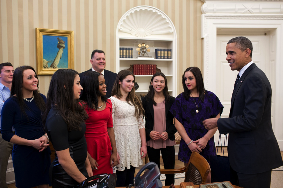
Figure 13: The Fierce Five, the US gold medalists in team artistic gymnastics at the 2012 London Olympics, meet President Obama at the White House. They look fierce, but not so small. Starting third from left: Aly Raisman, Gabby Douglas, McKayla Maroney, Kyla Ross, and Jordyn Wieber. “P111512PS-0165” by Obama White House is in the Public Domain
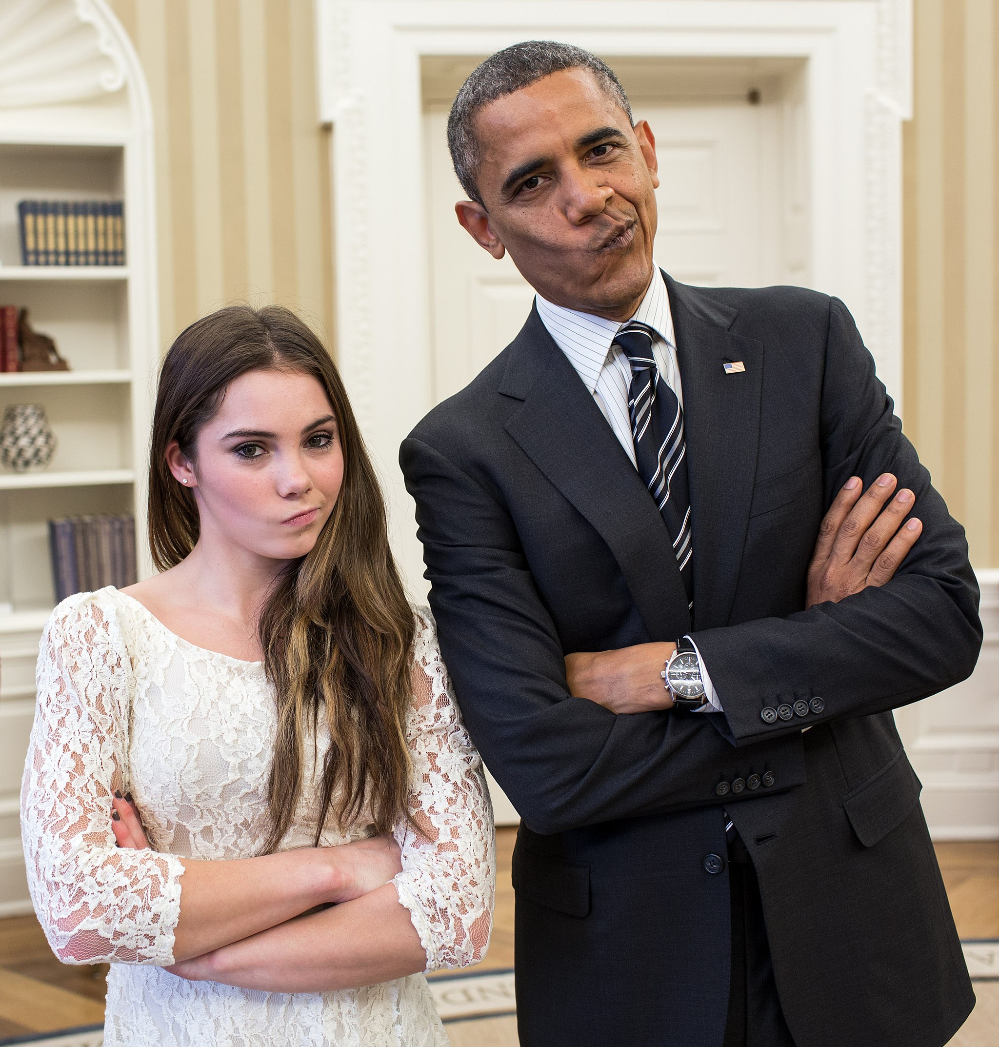
Figure 14: “Barack Obama with artistic gymnastic McKayla Maroney 2” by Pete Souza is in the Public Domain Both are fierce, but one is dramatically smaller. The contrast in size provides the visual drama, and pictures like these are favorite memes online.
There is such a thing as too much size contrast: think of those web sites with huge type or an overly enthusiastic use of the CAPS LOCK key. Less is more, but some size contrast is essential to draw the reader’s eye.
Contrast II: Font size/style/weight
A typeface is a collection of fonts. The distinction between the terms typeface and font stretches back to the days of typesetting: hand-placing individual letters made of wood or metal, inking them, and rolling paper over them. In the digital age, most people use the words typeface and font interchangeably, though the distinction still matters to experts like designers and typographers.
What’s important to most people is that we all have a huge variety of typefaces, or font families, to choose from: Times New Roman, Arial, Bookman, Georgia, and Garamond are familiar to many of us. It’s important to choose a font (a particular size, style, and weight within a typeface) that fits our purpose. Some, like script and handwriting typefaces, are too hard to read and so aren’t appropriate for body text, for example. Some typefaces work well as headlines: Franklin Gothic Condensed and Caslon are two typefaces often used for newspaper headlines. The “font” chosen (size, weight, style—italic, bold, etc.) will be the designer’s choice.
It’s also important to distinguish between serif and sans-serif fonts. Sans serif fonts, like Helvetica or Futura, are simple and smooth; the letters don’t display the “feet” and ornamentation (serifs) that serif fonts do. Sans serif fonts are often used for headlines, but serif fonts are more likely to be used for body text. Many typographers think serif fonts (also called Roman fonts) make large blocks of body text easier to read. Some of the preference is really just about tradition.
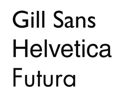
Figure 15: Three common sans serif typefaces (font families). Image Credit: Roger Koslowski, Typefaces-sansserif, CC BY-SA 3.0

Figure 16: Baskerville, a nice serif typeface. (Public Domain image)
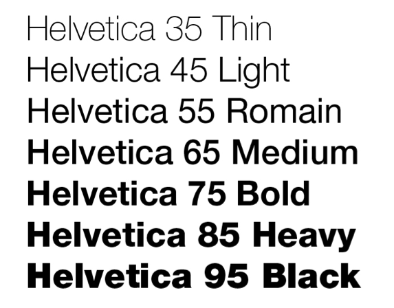
Figure 17: Each typeface family (like Helvetica) contains many sizes and many styles—light, regular, bold, italic, condensed, lower case letters, upper case letters, small caps, schoolbook, old style, and so on. (Public Domain image)
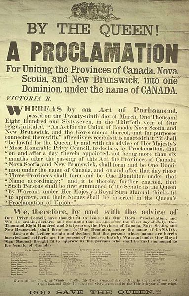
Figure 18: Canada is born! Note the large sans serif headlines and smaller serif fonts used as body text. “Proclamation of Canadian Confederation” is in the Public Domain
Contrast III: Direction (vertical, horizontal, circular, etc.) or position (top, bottom, side)
Changing the direction or orientation of text, graphic elements like lines, banners, or screens (smaller transparent or opaque boxes, often in a color that contrasts with the background)
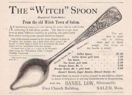
Figure 19: Use interesting orientations to attract your readers’ attention. “Advertisement from 1891 for the first “Witch Spoon”” is in the Public Domain
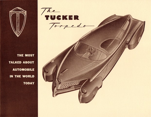
Figure 20: Note the image oriented on the diagonal and the opaque screen against which the text and logo are set. Sharp! “Tucker Torpedo Brochure” by Alden Jewell is licensed under CC BY-SA 2.0
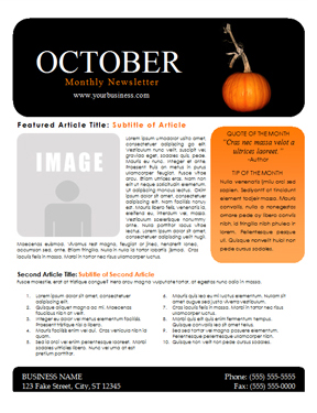
Figure 21: Templates for flyers, newsletters, web pages, and PowerPoint slides can help you provide visual interest if you’re short on ideas. Image Credit: October Newsletter Template, Word Draw, CC BY-2.0
Contrast IV: Alignment (center, left, right, justified)
Most students are familiar with how to align type. MLA and APA style, for example, mandate left-aligned body text and a centered headline. MLA Works Cited pages call for a hanging indent of ½ inch. A change in alignment can create visual interest. For example, headlines are often centered to make them noticeable.
Images are often placed in a particular location on a page (or slide) to draw readers’ attention in one direction or another. Consistent alignment with slight variations to provide interest is particularly important in PowerPoint presentations. You will be flipping from one slide to another, and if the text blocks and headlines are not aligned identically, your text and headlines will appear to “jump around” the screen in a distracting way.

Figure 22: Templates for Publisher, PowerPoint, or other software packages help you keep track of every element of your publication. (Public Domain image)
Contrast V: Graphic elements like photos, banners/bands, pull quotes, or logos
Remember, we’re trying to create contrast, or difference—breaking up huge blocks of text with a variety of graphic elements can really add visual appeal and interest.
Just remember—as with the examples below, less is more. Think of all the publications and web sites you’ve seen whose designers thought it was awesome to make text bold AND underlined AND multicolored AND flashing. With a bright yellow background. And too many animated GIFs. It repels readers rather than attracting them. I know you know what I mean.
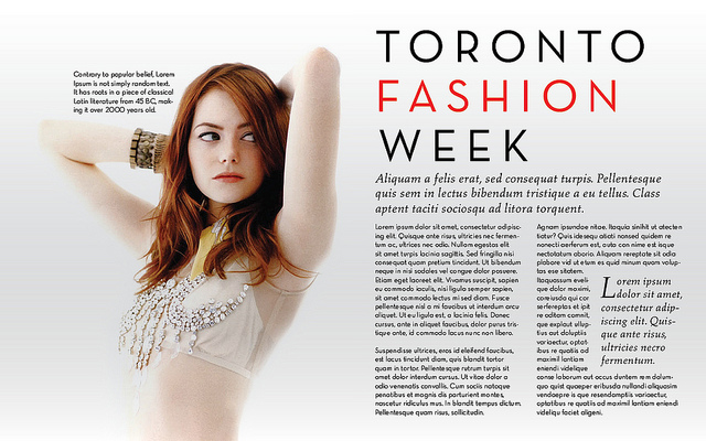
Figure 23: Striking images and pull quotes contrast with less-distinctive elements, like text and background. “Fashion Magazine Layout” by Aamir Raza is licensed under CC BY 2.0
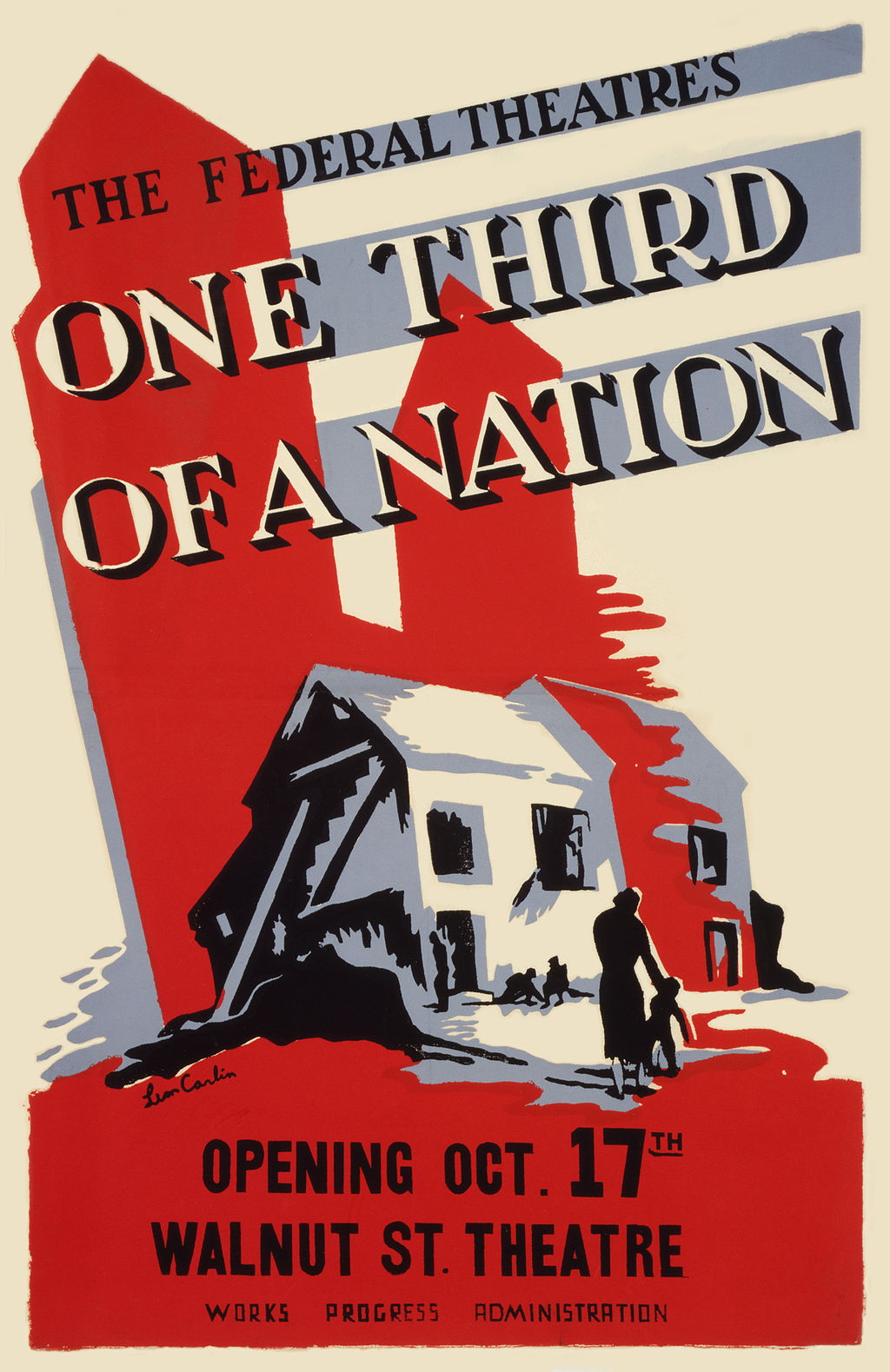
Figure 24: This poster uses contrasting alignment, contrast in text, and simple color contrast
to create a dramatic effect. Less really can be more. “One-Third of a Nation, a Living Newspaper play by the Federal Theatre Project” by https://commons.wikimedia.org/wiki/File:One-Third-of-a-Nation-Poster-2.jpg is in the Public Domain
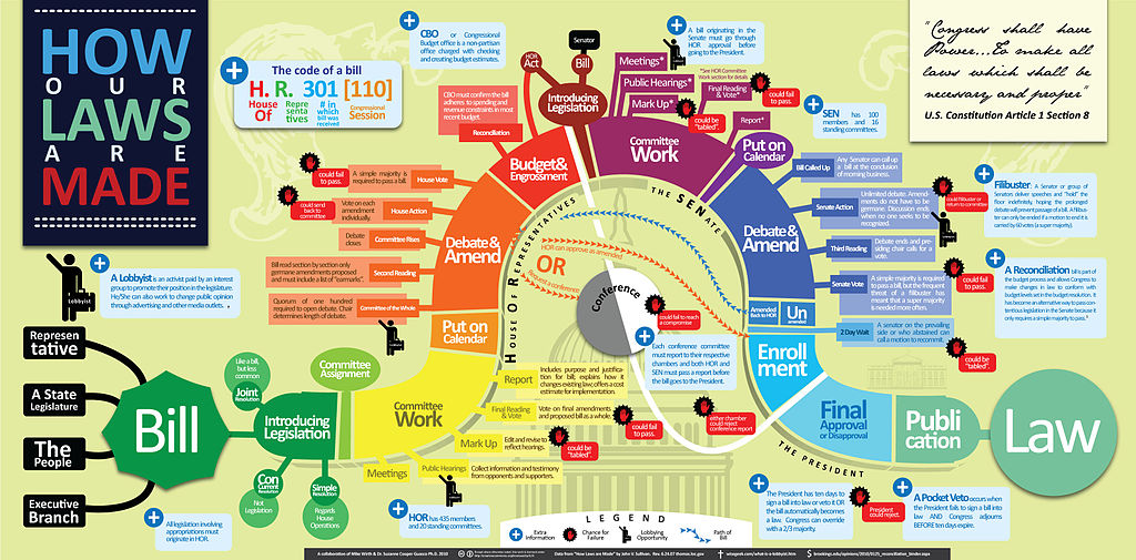
Figure 25: Complicated issues are sometimes hard to express visually. “How Our Laws Are Made” by Mike Wirth and Dr. Suzanne Cooper-Guasco is licensed under CC BY 3.0
Contrast VI: Color (of background, text, graphic elements, etc.)
Use color to make certain elements stand out. Create a sense of drama when you contrast one color with another. Make sure you don’t use too many colors and your color combinations are easy to read.
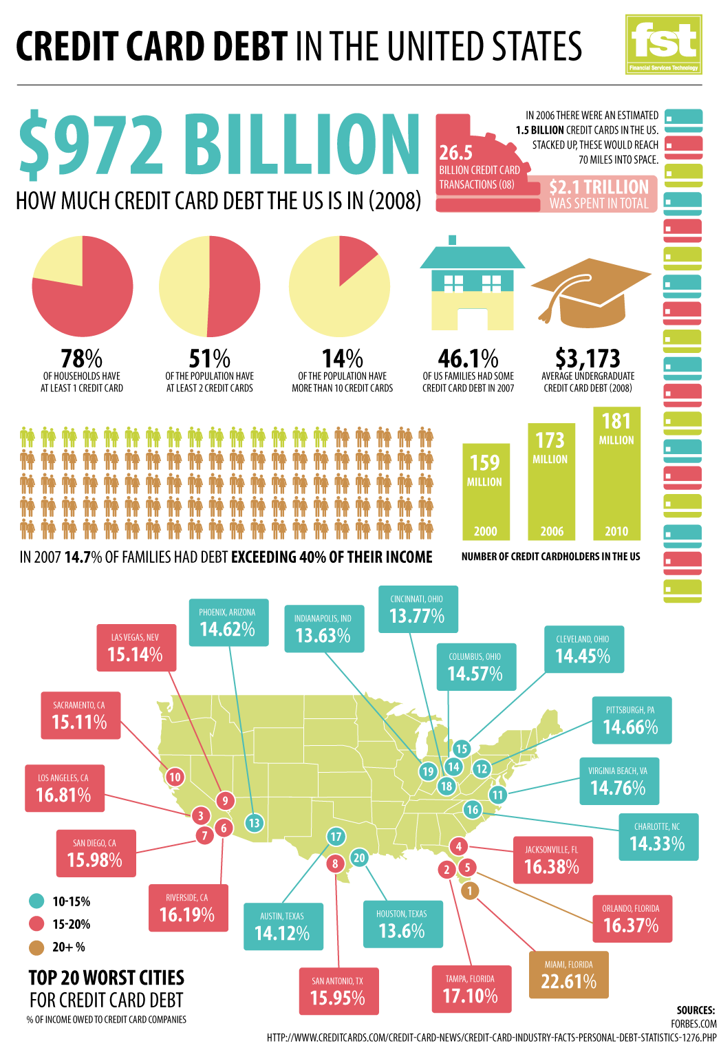
Figure 26: Contrasting color in text, images, and design elements. Image Credit: “Credit Card Debt in the US” by GDS Infographics is licensed under CC BY 2.0
Contrast VII: Use of negative or “white” space
Sometimes, the best way to attract a reader’s attention to a contrast is to “go negative.” The absence of content provides air and space and draws the reader’s attention to the content itself. Negative space, or white space, is the space around text, images, and other elements in a document. It makes documents of all kinds (digital and print) more readable, more restful-looking, more inviting to the reader, simpler, and more elegant. It is associated with that “high-end” restaurant or salon menu look.
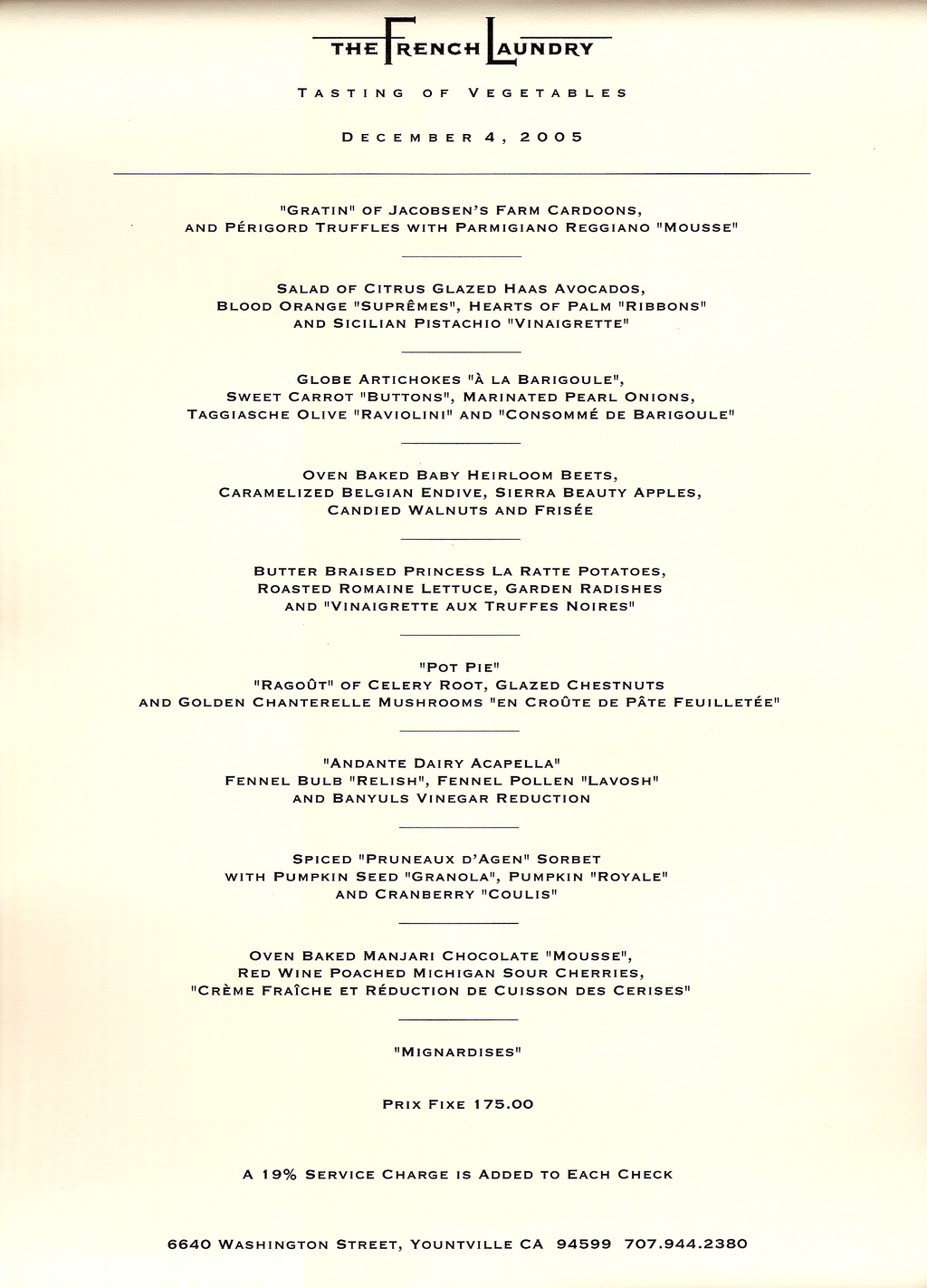
Figure 27: Case in point. High-end. “French laundry carte” by EncMstr is in the Public Domain
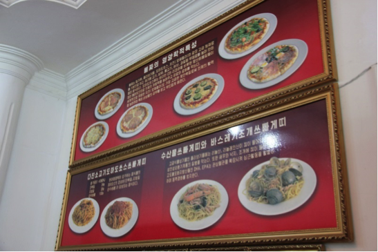
Figure 28: Not so high-end, but probably still delicious. Image Credit: Laika ac, Laika ac Pizza Restaurant Menu (7953649854), CC BY-SA 2.0
Concept 3: Make Your Publication More Inviting Using Basic Principles of Readability: CRAP, continued
II. R is for Repetition: Repeat design strategies throughout your document to provide a sense of connection
The basic rule of repetition means that in any text, visual or textual elements that have similar functions should be formatted similarly in order to create continuity and show close relationships between the elements.
For example, newspapers have consistent ways of labeling different sections, like Sports, but there is also design consistency throughout the entire paper so you can tell that the section you just picked up belongs to a particular newspaper. USA Today in particular is notorious for its consistent repeated color coding and design.
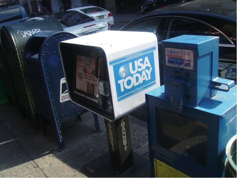
Figure 29: USA Today’s mastery of repetition has made it instantly recognizable. Image Credit: truetrue, WSTM Mossmen0051, CC BY-SA 3.0
On a smaller scale, in a resume, most applicants use bullet-pointed sections to list their job duties. “Repetition” in this context means that all these bullet points should be formatted identically: the same font, size, line spacing, and indentation. Each group of bullet-pointed items should be the same distance from the text above and below. The bullet points themselves should be exactly the same shape and size. This can be a lot of things to keep track of!
Repetition also applies to styles like MLA or APA. All titles are centered. All page numbers are in the upper right-hand corner, after your last name and a single blank character space. The same typeface is used throughout the paper. All paragraphs have exactly one empty line space between them. And so on.
Repetition means that every line classified as a “headline” should look like a headline, and headlines formatted to look alike can be identified as headlines with a similar function in the text. The same principle applies to body text. Fonts should not change without a reason. Lines, logos, and other graphic/visual elements should be formatted consistently. This repetition provides a sense of order and continuity that makes your document more readable and professional looking.
Since managing the formatting of multiple elements by hand can be difficult, many software programs provide templates—ready-made layouts into which you can plug your text and photos and thereby produce a variety of documents with a consistent look and feel. Microsoft Word, for example, also allows you to set Styles that will keep formatting choices like size, font, and style (bold, italic, etc.) the same for blocks of text with the same functions (body text, headlines, bullet points, subheadings).
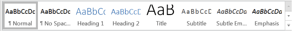
Figure 30: The Microsoft Word “Styles” menu.
Templates for newsletters, resumes, and PowerPoint presentations ensure that basic design elements like font size/style, color, image size and alignment are consistent from page to page. Templates provide a quick, easy way to solve repetition issues. Look at the difference repetition makes in even the most basic of resumes, for example. Contrast the two below.
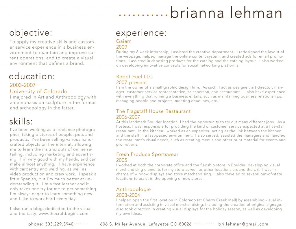
Figure 31: Whatever else you think about the design of this resume, choices made for typefaces,
size, position, and indentation are consistent. Each section is laid out identically.
Image Credit: brianna.lehman, resume, CC BY 2.0
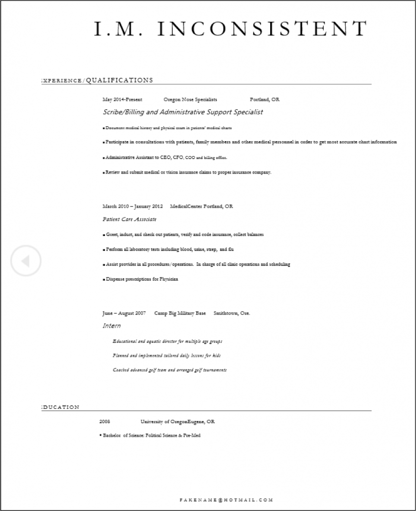
Figure 32: This applicant has made inconsistent line spacing, typeface, alignment and indentation, and type size choices.
Image Credit: Author.
Concept 3: Make Your Publication More Inviting Using Basic Principles of Readability: CRAP, continued
III. A is for Alignment: There should be a clear, deliberate arrangement of items on a page
Alignment can refer to text, as in the left-aligned body text required in MLA style. But in document design, it means much more; it refers to how the entire document is arranged. Most designers align all their content to some sort of a grid or pattern, creating a distinct, intentional arrangement of items on a page or screen. They use plenty of white space to cushion the items, which makes higher-contrast items “pop.”
Imagine you’re hanging 20 pictures on a wall. You probably should not just throw them up there randomly. You might measure and equalize distances between items, put unusual items in certain places (like in the center), or put similarly shaped or sized items together. This will provide a sense of order to your arrangement of the items.
Figure 33: Even though the arrangement of these items could seem random, there is some regularity, and there is an overall shape or grid governing the position of each picture. Image Credit: “homestilo gallery wall” by homestilo is licensed under CC BY 2.0
Software packages often allow you to draw lines or use an existing invisible grid to which you can “snap” items like images, blocks of text, or graphics. Templates do the hard work of arranging items on a page (or screen) for you. That’s why so many people use tools like WordPress, Illustrator, Publisher, Word, and PowerPoint—they allow you to arrange items easily, without the hard work of lining everything up by hand.
Newspaper and magazine layout artists once used various kinds of tape, contact cement (rubber cement), or wax adhesives to stick cut-out headlines, text blocks, photos, and ads to a page, just to produce a daily or weekly newspaper. To line up text and image blocks, they used wooden or metal rulers, graph paper, and T-squares. It was slow, tedious work. And rubber cement smells. The digital publishing revolution did away with all that. Most people who’ve spent half the night squinting over a yearbook layout that just won’t line up are glad about the changes.
Figure 34: Thank heaven for desktop publishing and digital layout tools. (Public Domain image)
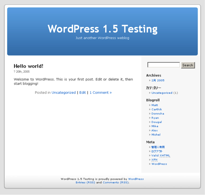
Figure 35: Much easier to put together, but some would argue that it lacks soul. But it’s readable, simple, clear, and accessible to anyone. Image Credit: “WordPress main theme” by D135-1r43~commonswiki is released under GNU GPLv3.
Still, alignment problems have not all been solved in the digital era. See for yourself some of the results of less deliberate alignment vs. controlled, arranged items on a screen, for example by visiting What are some examples of bad web design?
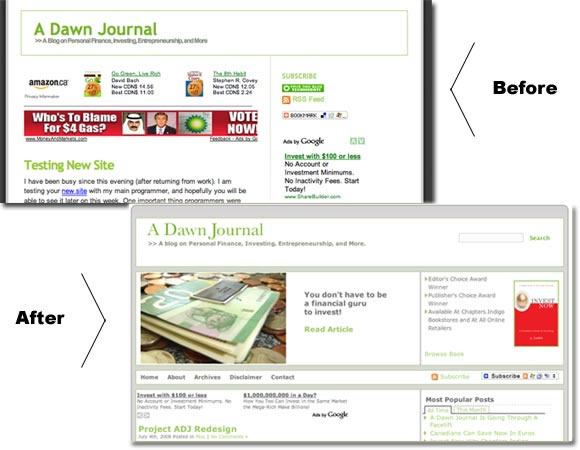
Figure 36: Before and after images show how alignment affects the usability of this website. Image credit: “Welcome To The New A. Dawn Journal” by Ahmed Dawn is licensed under CC BY 2.0
Learning how to arrange text and images artfully on a page takes tons of time, not to mention a whole email inbox full of user feedback, collaboration, thought, and hard work. This chapter will only acquaint you with some of the most basic elements of design. Perhaps after reading this chapter, you’ll start seeing CRAP wherever you look.
Concept 3: Make Your Publication More Inviting Using Basic Principles of Readability: CRAP, continued
IV. P is for Proximity: Items that have similar functions or purposes should be grouped together
Is this a rock formation or just a random collection of boulders?

Figure 37: Is there any purpose to this grouping? Image Credit: “Small Tree In Field Of Rocks” by Linnaea Mallette is in the Public Domain, CC0

Figure 38: There is purpose to this grouping. This is the Ham Hill Stone Circle in Somerset, England. It’s a deliberate
product of modern England, it was constructed in the year 2000 to commemorate local stonemasons and
the long history of quarrying local hamstone. “Ham Hill Stone Circle” by Gaius Cornelius is licensed under CC BY-SA 3.0
The second photo depicts a deliberate grouping, though it probably wasn’t hard to figure that out. When we work with pictures and blocks of text and not stones, think of this: when design or text elements are placed next to each other in certain ways, readers or viewers can see that they are meant to be considered together and have some sort of relationship. For example, photos and figures have captions that explain their contents. Nearby images often illustrate the content found in body text. Headlines are placed above body text whose content and focus they describe in briefer form.
Proximity can be especially critical in booklets, newsletters, and brochures, in which certain pages or panels might be grouped together under a subheading. Individual pages can be designed to reflect a larger relationship with the overall theme or subject matter. For example, the themes provided by blogging platforms like WordPress take care of this for you—every page will have a recognizable layout and though individual pages might be slightly different, they’ll be recognizably related to the blog’s main page. Web sites work the same way, as do book chapters.
The principle of proximity even affects white space: equal amounts of white space and equal line spacing indicate that items are related or should be considered as parts of a whole. If headlines, captions, or body text blocks aren’t close enough to the image or text to which they are related, the reader could be confused about what is—and is not—related.
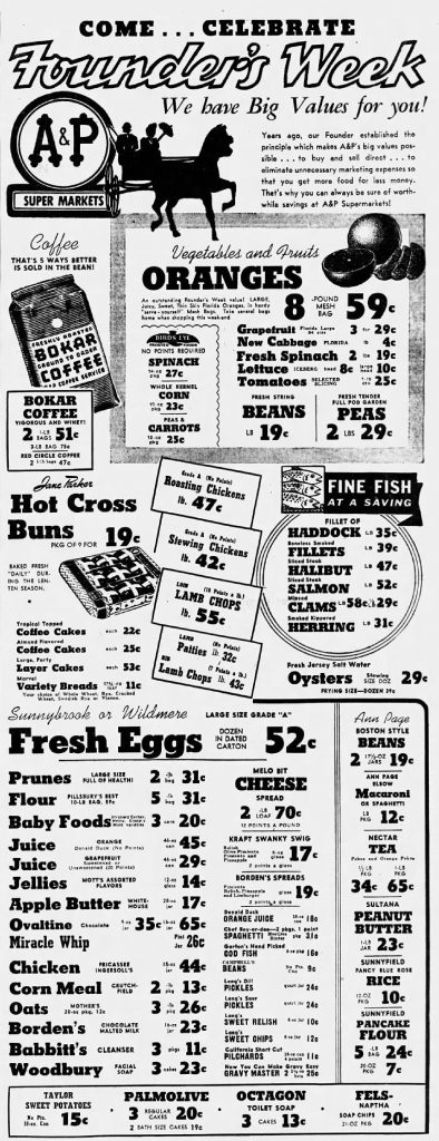
Figure 39: What does emphasis indicate in this ad? Are prunes and flour different types of eggs on offer? “1945 – Atlantic & Pacific Tea Company – 16 Feb MC – Allentown PA” by Allentown Morning Call Newspaper is in the Public Domain
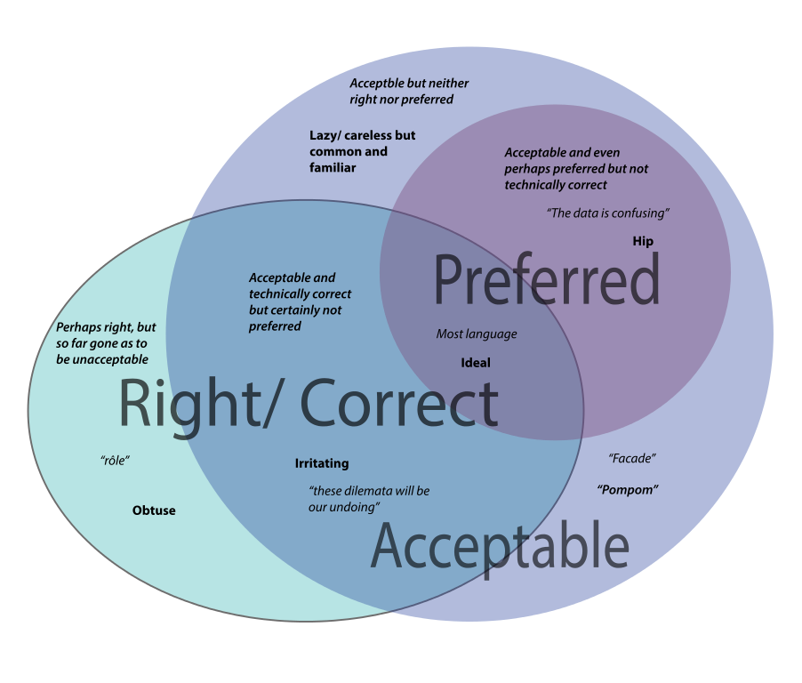
Figure 40: What’s going on here? Image credit: Venn Diagram of language issue space by KDS4444 is CC0, Public Domain
The Venn diagram above is very confusing. Why are there different font weights, sizes, and quotation marks setting off the words? Note that entries for the “Acceptable” lavender category are in both the top left and bottom right of the circle. Their relatively distant position (proximity) makes the relationship of these terms unclear. There are no headlines or labels here to help us understand, and the design strategy isn’t doing readers any favors.
Planning and adjusting how items are grouped on a page helps you design your text, graphics, and images so that readers can see what’s related, what goes together, what’s different, and what is similar. Relationships between items will be clear.
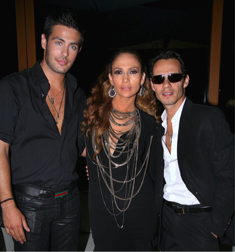
Figure 41: Who’s together here? Martakis jennifer lopez by Universal Music Greece is in the public domain.
It’s clear which two are the couple in the illustration above. Same with headlines and body text, groups of bullet points, images and captions, and a whole lot more. What is close together will be seen to have a relationship. Moving items further away decreases the strength of that relationship in the minds of your readers.
ACTIVITY: Go online or out into the world. Try to find examples of publications (print or electronic) that convey messages clearly. Critique them according to the principles in this chapter: Purpose, Audience, and CRAP. Also, find an example of one that does not achieve its goal. See if you can identify and describe which of these principles are not being followed in less-effective publications.
Slides and PowerPoint presentations
To PowerPoint or not to PowerPoint?
Microsoft introduced PowerPoint in 1990, and the conference room has never been the same. Millions were amazed by the speed with which a marketing professional or an academic could put together a consistent, professional-looking slide presentation. And then…
At some point, somebody with critical thinking skills asked a great question: “Do we really need all these slide shows?” The stock images of arrows, businesspeople in suits, stick figures scratching their heads, and the glowing, jewel-toned backgrounds eventually looked tired and failed to evoke the “wow” reaction presenters desired.
Microsoft is attempting to refresh the design options for PowerPoint, and there are dozens of good alternatives, some of them free (Keynote, Slide Bureau, Prezi, SlideRocket, Easel.ly, Emaze, Slidedog). But the fundamental problem remains—text-heavy, unfocused, overlong presentations are the problem, not the software. If you are sure that a visual presentation will provide something necessary to your audience, keep the number of slides and the amount of text on each slide to a bare minimum. Think of a slide presentation as a way of supporting or augmenting the content in your talk; don’t let the slides replace your content.
If you had planned to read your slides to the audience, don’t. It’s considered one of the single most annoying things a presenter can do. Excessively small text and complex visuals (including distracting animations) are frequently cited as annoyances.
Try to design your slides so that they contain information that your viewers might want to write down; for example, good presentations often contain data points that speakers can’t just rattle off or quick summaries of key concepts that viewers won’t be able to make up on the fly. If you can’t explain how the slides add value to your presentation, don’t use them.
To get a feel for what may annoy your audience, try Googling “annoying PowerPoint presentations.” You’ll get a million hits containing helpful feedback and good examples of what not to do. And finally, consider designing your presentation to allow for audience participation instead of passive viewing of a slideshow—a good group activity or a two-way discussion is a far better way to keep an audience engaged than a stale, repetitive set of slides.
Tips for good slides
All of the design guidelines in this chapter—CRAP in particular—will help you design consistent, helpful, and visually appealing slides. But all the design skill in the world won’t help you if your content is not tightly focused, smoothly delivered, and visible. Slides overloaded with text and/or images will strain your audience’s capacity to identify important information. Complex, distracting transitions or confusing (or boring) graphics that aren’t consistent with your content are worse than no graphics at all. Here are some general tips:
Simplicity is best: use a small number of high-quality graphics and limit bullet points and text. Don’t think of a slide as a page that your audience should read.
Break your information up into small bites for your audience, and make sure your presentation flows well. Think of a slide as a way of reminding you and the audience of the topic at hand.
Slides should have a consistent visual theme; some pros advise that you avoid using the stock PowerPoint templates, but the Repetition and Alignment aspects of CRAP are so important that if you don’t have considerable design skill, templates are your best bet. You can even buy more original-looking templates online if you don’t like the ones provided with the software.
Choose your fonts carefully. Make sure the text is readable from a distance in a darkened room. Practice good Repetition (the “R” in CRAP) and keep fonts consistent.
Practice your presentation as often as you can. Software is only a tool, and the slide projector is not presenting—you Realizing this is half the battle.
Conclusion
Texts are forms of nonverbal (or not exclusively verbal) communication aimed at a particular audience. They are always expressions of some set of goals or purposes. They can contain visual elements, sound, textual elements, graphic elements, and even textures (think of a book of fabric samples). There is a vast array of tools to help you communicate whatever you wish to any audience you choose. Reaching a large audience has never been easier, but the very fact that you may be communicating with many different kinds of people creates new challenges for you as a communicator. Providing clear, easy-to-access texts is critical. Being clear about your message is vitally important. Just as there’s never before been an audience as vast and diverse as the global internet, there’s never been a greater chance that you will be ignored, misinterpreted, misunderstood, criticized, or even trolled. If you adhere to basic design principles, at least you will be safe from the most basic kinds of criticism aimed at confusing PowerPoint presentations, distractingly busy web sites, or cheesy-looking brochures.
Content is like water—it takes on the shape of whatever you pour it into. Therefore, the container that holds your text does matter. However, content is also like water in another sense. If it’s no good, no one will want to drink it down. It won’t quench anyone’s thirst for knowledge, for instructions, for information. Good content, a focused, clear purpose, and careful attention to the needs of the audience will ensure that if your container is appealing, your message will shine through, and you will achieve your goal as a writer.
CHAPTER ATTRIBUTION INFORMATION
This chapter was written by Jodi Naas, Portland Community College, and is licensed CC-BY 4.0.
