6
Emily Bongiovanni
This chapter will help you:
- Recognize characteristics of bad and good visualizations
- Understand best practices in data visualization
- Identify different types of visualization types
Introduction
Data visualization is the representation of information or data through graphics, charts, graphs, or diagrams. We see examples of data visualization everyday and everywhere – in the news, social media, advertisements, reports, and elsewhere. Data visualization is a powerful way to demonstrate comparisons, significance, and relationships in an easily digestible format. They provide interpretations of data or information, so viewers are able to quickly understand the trends, patterns, outliers, or relationships the visualization is made to represent.
Data visualizations can range from simple to complex. The relatively simple pie chart below is used to represent one categorical variable, which is divided into proportional slices.
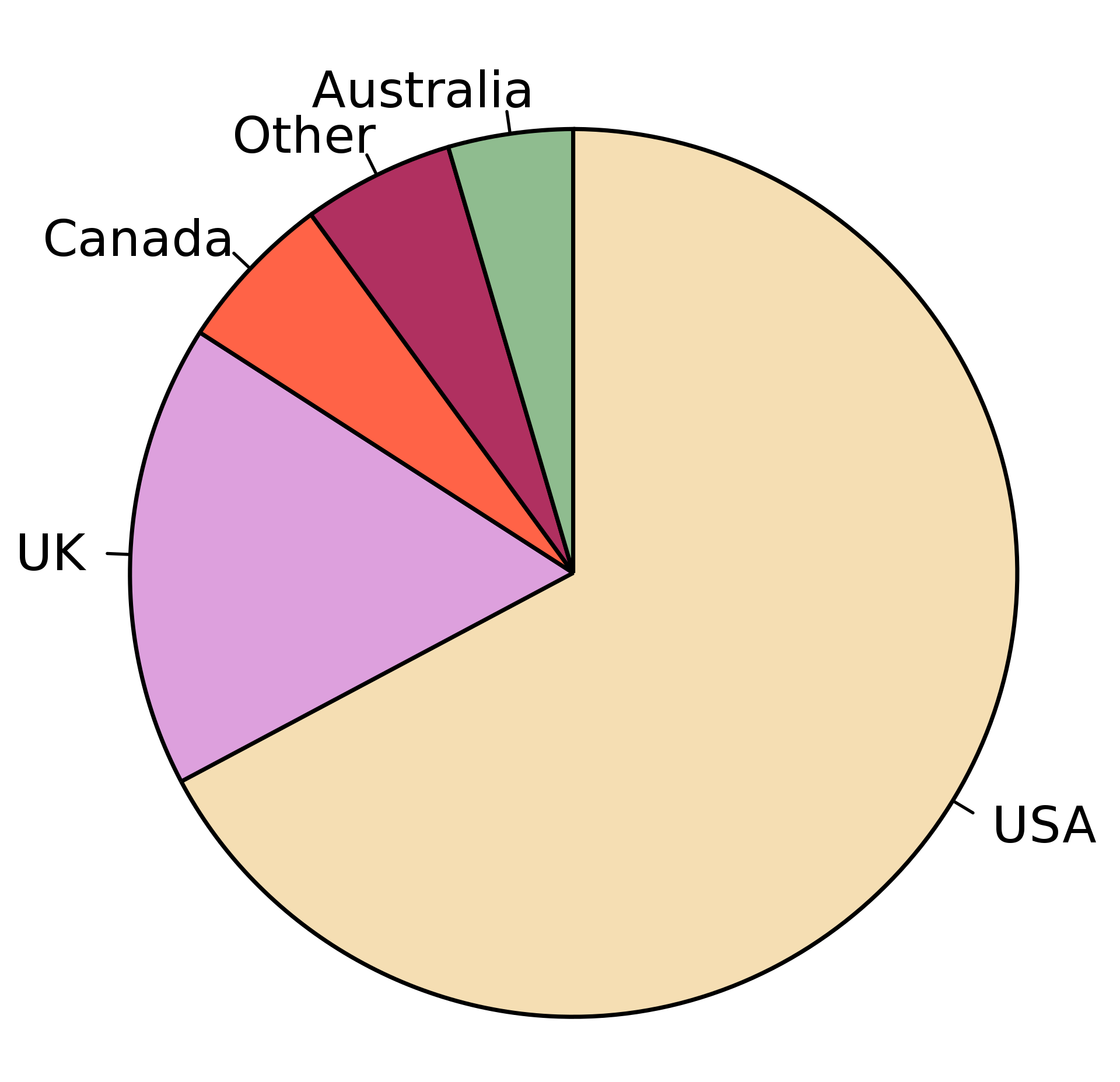
“Pie Chart” by M. W. Toews is licensed under CC BY-SA 4.0
Data visualizations can simultaneously represent multiple different categories of data as well. For example, the bar chart below helps viewers understand the different rates of population growth and forest decline in the different continents. Viewers are able to quickly interpret the chart and see various points of information. For example, this visualization demonstrates that Europe is the only continent to experience forest growth. It also demonstrates that Latin America and Africa have experienced a high percentage of both forest and population growth and that North America and Asia saw little forest loss with their population increase.
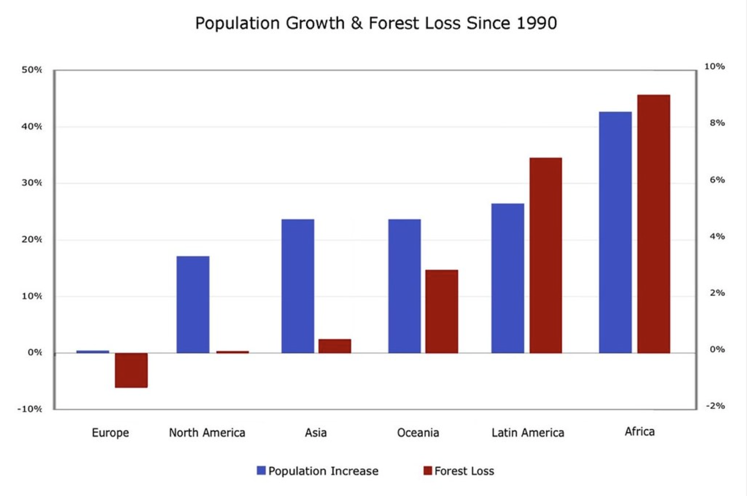
“Population Growth and Deforestation Rates by Continent Chart” by mattlemmon is licensed under CC BY-SA 2.0.
Visualizations can represent large amounts of data and with various visual dimensions. For example, the famous visualization of Napoleon’s 1812 March by Charles Minard successfully demonstrates six types of data: the number of Napoleon’s troops; the distance traveled; temperature; the latitude and longitude; direction of travel; and location relative to specific dates. This graphic demonstrates the decline of Napoleon troops at various points on the 1812 March. The visualization demonstrates the army beginning with 422,000 troops in June 1812, to 100,000 when they turned around in Moscow, and returning with only 10,000 troops. Various other variables illustrated provide context to this decline of troops. For example, when the troops crossed a river or experienced very cold temperatures.
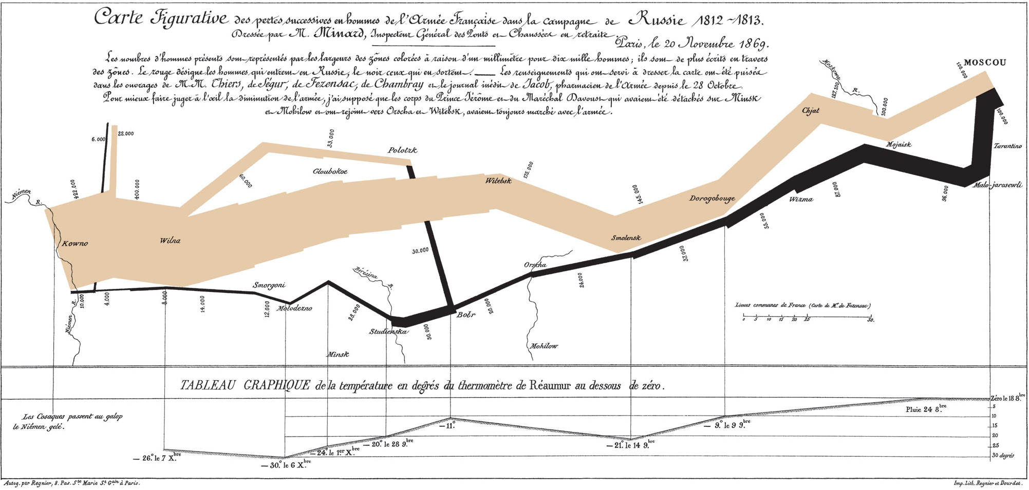
Charles Joseph Minard’s 1869 diagram of Napoleonic France’s invasion of Russia, an early example of an information graphic, is shared in Public Domain.
However, not all data visualizations are good data visualizations. Poorly designed visualizations can cause confusion or misinterpretation. Some data visualization may even be made to purposely mislead viewers. It is important to understand and follow best practices with data visualization to avoid creating misleading graphs or distorted messages. This chapter will discuss data visualization principles, types, and various tools and software available to create good data visualizations.
Types of Visualizations
There are many types of visualizations that can be used, including bar charts, histograms, heat maps, and pie charts. When choosing the right visualization, consider the purpose, audience, and context. For example, is the goal to demonstrate amounts (or comparisons), compositions (or proportions), distributions, or relationships? Also consider the type of data: numeric, categorical, mixed numeric and categorical, maps, network, time series, or text.
The examples below from Principles of Effective Data Visualization by Stephen R. Midway illustrate how types of visualizations can be used for variables and data types.
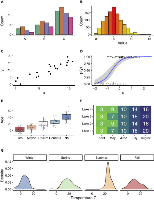
Examples of Visual Designs, from Midway, Stephen R. “Principles of effective data visualization.” Patterns 1.9 (2020): https://doi.org/10.1016/j.patter.2020.10014, shared under CC BY-NC-ND 4.0
A. Clustered bar plots are effective at showing units within a group (A–C) when the data are amounts.
B. Histograms are effective at showing the distribution of data, which in this case is a random draw of values from a Poisson distribution and which use a sequential color scheme that emphasizes the mean as red and values farther from the mean as yellow.
C. Scatterplot where the black circles represent the data.
D. Logistic regression where the blue line represents the fitted model, the gray shaded region represents the confidence interval for the fitted model, and the dark-gray dots represent the jittered data.
E. Box plot showing (simulated) ages of respondents grouped by their answer to a question, with gray dots representing the raw data used in the box plot. The divergent colors emphasize the differences in values. For each box plot, the box represents the interquartile range (IQR), the thick black line represents the median value, and the whiskers extend to 1.5 times the IQR. Outliers are represented by the data.
F. Heatmap of simulated visibility readings in four lakes over 5 months. The green colors represent lower visibility and the blue colors represent greater visibility. The white numbers in the cells are the average visibility measures (in meters).
G. Density plot of simulated temperatures by season, where each season is presented as a small multiple within the larger figure.
For all figures the data were simulated, and any examples are fictitious.
Guides to Data Visualization Types
The Data Visualisation Catalogue – The Data Visualisation Catalogue, by Severino Ribecca, provides a comprehensive and interactive catalog for types of charts, tables, diagrams, and maps by name and by function. Each entry in the catalog includes a description of the type of visualization, benefits and downfalls to the type, and various tools that can be used to generate that type of visualizations.
The Periodic Table of Visualization Methods – The Periodic Table of Visualization Methods organizes a broad variety of visual representations by specific information problems. This interactive tool includes definitions and models of data, information, concept, strategy, metaphor, compound, process and structure visualization.
Steps to Creating a Visualization
“Steps to Creating a Visualization” section is adopted and slightly modified from the Data Visualization research guide created by UB Libraries’ 2018-2020 CLIR Postdoctoral Fellow, Rachel Starry. It is currently maintained by Carolyn Klotzbach-Russell. Guide content is licensed CC BY 4.0.
The following steps represent the general process you might take in order to create a visualization.
- Know your data. It is helpful to start with data that is clean (read more about what it means for data to be “clean” in the article “Tidy Data” by Hadley Wickham, 2014). If you are not the original creator of the dataset you want to visualize, you should also start by making sure you understand what the variables in the dataset mean and ensure that the data has secure provenance (i.e. you know where it came from and how it was created).
- Determine your purpose. Decide whether you are in the exploratory or explanatory stage of visualizing your data. Are you trying to find patterns, or are you trying to tell a story or support an argument with your visualization? Understanding your purpose can help you decide what data to include in your final visualization.
- Choose a chart type. Different charts are useful for different kinds of data, representing different numbers of variables, or showing different patterns and relationships among those variables. See the Types of Visualizations section.
- Decide on a visualization tool. There are many options available to help you create your visualization, from point-and-click online tools to desktop software or programming solutions using R, Python, or JavaScript. The Tools and Software section provides an introduction to some of the options based on the type of data you are visualizing, noting which platforms are free/open-source and which are available online.
- Refine your visualization. Once you have selected a tool and input your data, you can adjust some of the textual and visual aspects of your chart to make it more readable, by tweaking the chart axes, labels, or color palette. You should consider how your visualization will appear to people who have visual impairment or different kinds of colorblindness and try to make your visualization as understandable and accessible as possible, whether it will appear in print or on a screen.
Accessible Design
“Accessible Design “ subsection adopted from Data Visualization was created by UB Libraries’ 2018-2020 CLIR Postdoctoral Fellow, Rachel Starry. It is currently maintained by Carolyn Klotzbach-Russell. Guide content is licensed CC BY 4.0.
When designing a data visualization, the primary goal is to communicate information using visual means, and whether you share your visualizations in print or digital form, designing for accessibility is important. Although color is most frequently mentioned in this context, accessible design goes beyond avoiding color palettes that make charts difficult to read by individuals with color vision deficiencies like red-green colorblindness, or protanopia. There are many ways to make your graphs easier to understand for people with visual impairments or other disabilities, and designing for accessibility can make your data visualizations more readable for all users.
The following articles offer good overviews of the issues involved in designing for accessibility.
- Cesal, Amy. June 26, 2018. “Accessible data viz is better data viz.“
- Grosser, Zach. January 10, 2018. “Accessible Colors for Data Visualization.“
- Tableau Desktop and Web Authoring Help. Version 2018.3. “Best Practices for Designing Accessible Views.“
Read more about the Web Accessibility Initiative at w3.org.
Color & Contrast
The following tools can help you get started with choosing accessible color palettes and contrast ratios in your visualization.
- ColorBrewer and Viz Palette are two tools for creating colorblind-safe color palettes.
- Contrast-Ratio and Color Safe can help you test whether your color palette and contrast ratios are WCAG 2.0-compliant.
- Colblindor can simulate color vision deficiencies on sample images or uploaded files.
General Accessibility Best Practices
In addition to color, there are other aspects of visualizations to consider when designing for accessibility. For additional guidelines, consult the CFPB Design Manual for Data Visualization.
- Image “alt” tags: Always add descriptive text in an “alt tag” when embedding your visualizations in a webpage. Screen readers read alt text out loud for users with visual impairment, so it is important to include a concise but accurate description of a graph.
- Font and descriptive labels: Use a sans-serif font for chart titles and descriptive labels, and consider labeling data directly whenever possible rather than putting values or other information only in a chart legend.
Tools and Software
- Excel – A robust, proprietary software that can be used to create visualizations from spreadsheet data.
- Google Sheets – Free with a Google account. A basic tool that can be used to create similar visualizations like bar charts and scatterplots.
- Tableau – A proprietary software program that works with numeric and categorical data to create data visualizations and advanced data dashboards.
- Rawgraphs – A free and open source tool for data visualization. The interface allows users to select graph type (i.e., scatterplot, bar chart, dendrogram, etc.) based on type of input data (i.e., numeric, categorical).
- Voyant – Is a free, web-based reading and analysis environment for digital texts.
- Coding – scripting languages can be used for from data analysis, data cleaning to data visualization for both numeric and text data. Both R and Python have libraries of packages to help make visualizations.
Tips and tricks
Be sure to clean and understand your data before you begin creating visualizations.
Clean your data
Be sure to clean and understand your data before you begin creating visualizations. Use tools such as Excel or OpenRefine, or do this programmatically using R or Python.
Consider the goal
Consider your goals before deciding on the type of visualization and variables to highlight. This will help you understand the types of visualizations that best suit your needs.
Make it easy to understand
Viewers should be able to easily understand what the visualization represents without needing to do “visual math” to interpret the information. There should be a balance with aesthetic elements and readability.
Use color carefully
Proper use of color can help viewers more efficiently understand data visualizations. Color choice is very important to consider. Try to use colors that could still be effective if converted into a grayscale (black-and-white) and consider accessibility concerns.
Make visualizations accessible
Follow best practices, including use of alt-text and appropriate color usage, to create visualizations that are accessible to the broadest possible audiences.
Activity
This activity will help you begin to consider different visualization types and design.
Part A
Consider the best data visualization options for the data provided below.
|
Day of the week |
Monday |
Tuesday |
Wednesday |
Thursday |
Friday |
Saturday |
Sunday |
|
Average tips |
$60 |
$64 |
$65 |
$64 |
$81 |
$125 |
$120 |
Reflect
Why would a pie chart not display the comparison between days of the week well?
Would a bar chart help to demonstrate the comparison between days of the week better?
Part B
Consider how additional data or variables might change your decision on visualization type or design.
|
Day of the week |
Monday |
Tuesday |
Wednesday |
Thursday |
Friday |
Saturday |
Sunday |
|
Average tips Location A |
$60 |
$64 |
$65 |
$64 |
$81 |
$125 |
$120 |
|
Average tips Location B |
Closed |
$58 |
$66 |
$94 |
$144 |
$156 |
$134 |
|
Average tips Location C |
$72 |
$75 |
$70 |
$78 |
$82 |
$91 |
$80 |
Reflect
What data clean up might need to be done? Will Location B need a value of $0 for Monday?
Imagine the different possible goals for visualizing this data and the best types of visualizations suited for those goals.
How will the viewers be able to easily understand from the visualization that Location B is closed on Mondays, rather than receiving $0 of tips?
Additional Resources
A 5-step guide to data visualization by Georgin Lau and Lei Pan (2015)
The Data Visualization Design Process: A Step-by-Step Guide for Beginners by Ann K. Emery (2014)
