9
Chapter Learning Outcomes
- Explain global stratification and outline the ways in which the world’s countries are stratified and the strata are geographically concentrated.
- Define absolute poverty, map the world regions where absolute poverty is most prevalent and explain the consequences of global stratification and absolute poverty for countries and individuals.
- Outline the major theories on global stratification and understand the connections to the major theoretical perspectives.
- Define demography and outline the key demographic indicators used to predict changes in population.
- Provide an overview of global population growth from a historical perspective and analyze and assess the projections for future global population growth.
- Understand how and why key demographic indicators vary between countries, and explain the implications of demographic trends.
- Outline and assess the validity of theories on population growth.
- Draw and interpret population pyramids and understand the connection to the demographic transition model.
Social Issues in the News
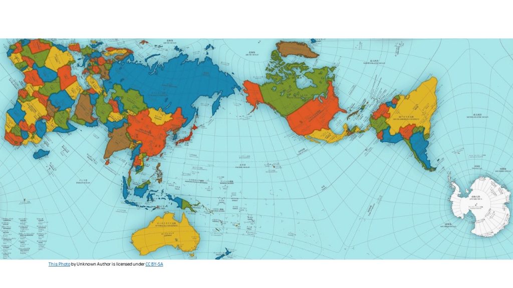
“Award Winning Map Shows a More Accurate World: A new mapping method corrects not only for visual distortions but also for cultural ones.” the headline said. Many were surprised to see that a world map won Japan’s most prestigious design award, The Good Design Award. The map is called the AuthaGraph World Map (Figure 9.1) and it was created by Hajime Narakuwa, a Japanese architect and artist. The new and improved map was created “by equally dividing a spherical surface into 96 triangles, transferring it to a tetrahedron while maintaining areas proportions and unfolding it to be a rectangle.” (Zareva, 2016).
Figure 9.1 AuthaGraph World Map
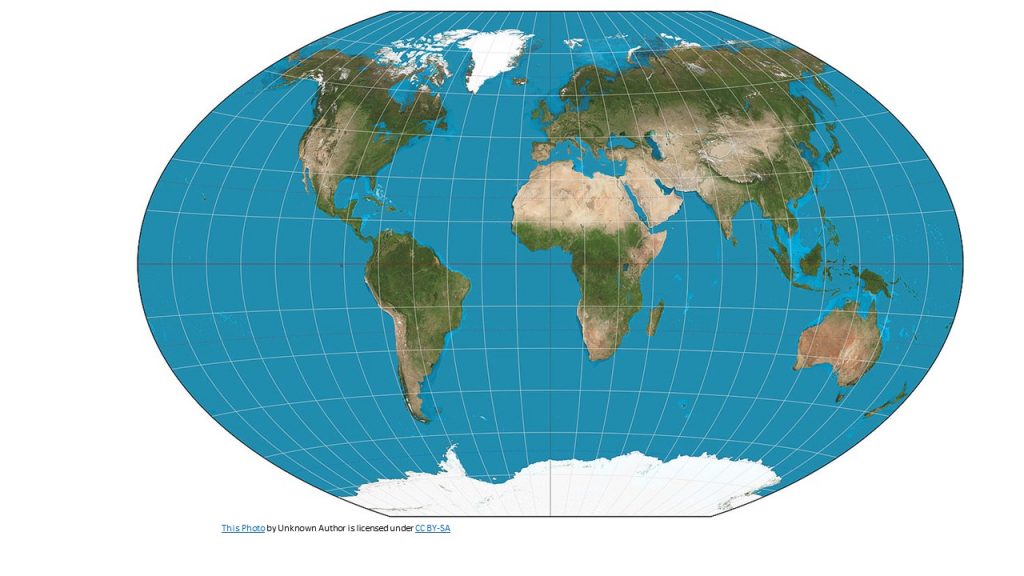
Map making is tricky business as the earth is roughly a sphere while maps are generally flat. This cannot be done without some degree of distortion in at least one of four properties: area, shape, distance, or direction. Some maps preserve three of these properties, while significantly distorting another, while other maps seek to minimize overall distortion but distort each property somewhat. So which map projection is best? That depends on the purpose of the map. The Mercator projection , while significantly distorting the size of places near the poles, preserves angles and shapes, making it ideal for navigation (See Figure 9.2). The Winkel tripel projection is so-named because its creator, Oswald Winkel, sought to minimize three kinds of distortion: area, direction, and distance (see Figure 9.3). It has been used by the National Geographic Society since 1998 as the standard projection of world maps.
All maps have a purpose, whether it’s to guide sailing ships, help students create a more accurate mental map of the world, or tell a story. The map projection, color scheme, scale, and labels are all decisions made by the mapmaker. Some argued that the widespread use of the Mercator projection, which made Africa look smaller relative to North America and Eurasia, led people to minimize the importance of Africa’s political and economic issues. Just as texts can be critiqued for their style, message, and purpose, so too can maps be critiqued for the information and message they present.
(World Regional Geography by Caitlin Finlayson is licensed under a Creative Commons Attribution-NonCommercial-ShareAlike 4.0 International License, except where otherwise noted. Access for free at https://worldgeo.pressbooks.com/chapter/chapter-1/).
Figure 9.2 The Mercator Projection
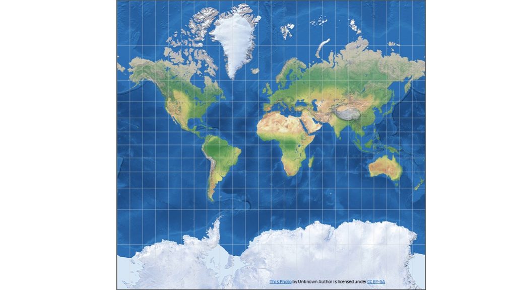
Figure 9.3 The Winkel Tripel Projection
Salvatore Natoli, a key leader in geography education stated “In our society we unconsciously equate size with importance and even power.” According to geographer, Seth Dixon (2012), “This is one reason why many people have underestimated the true size of Africa relative to places that they view as more important or more powerful.”
9.1 The Nature and Extent of Global Stratification
Stratification within the United States was discussed in Chapter 9 “Social Stratification and Social Class”. As we saw then, there is a vast difference between the richest and poorest segments of American society. Stratification also exists across the world. Global stratification refers to the unequal distribution of wealth, power, prestige, resources, and influence among the world’s nations. Put more simply, there is an extreme difference between the richest and poorest nations. A few nations are very wealthy, while many more nations are poor. Reflecting this latter fact, 15% of the world’s population, or about 1.1 billion people, lives on less than $2 per day and are considered poor. In addition, 56% of the global population (4.1 billion people) are considered low income, living on $2.01 – 10 per day. This is in comparison to the 7% which are high-income, with incomes of $50 per day or more at their disposal (Alberti, 2015).
The world’s poor are concentrated regionally in sub-Saharan Africa and South Asia. For instance, several countries in Southeast Africa, such as Madagascar, Burundi and Tanzania, have more than 70% of their total population classified as poor, living on $2 per day or less. Conversely, in Northern Europe and North America, few experience this level of poverty, and the majority of these populations are considered high-income on the global income scale discussed above. The country of Norway has the highest percentage of its population considered high-income, with 77.2% of Norwegians in this category (Alberti, 2015).
Classifying Global Stratification
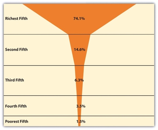
One way to visualize these disparities is to examine how income is distributed by quintiles. The richest fifth of the world’s population controls approximately three-fourths of the world’s income, while the poorest fifth of the world’s population have only 1.5% of the world’s income, and the poorest two-fifths have only 5.0% of the world’s total income (Dikhanov, 2005). As Figure 9.3 “Global Income Distribution (Percentage of World Income Held by Each Fifth of World Population)” illustrates, this distribution of income resembles a champagne glass.
Figure 9.3 Global Income Distribution (% of World Income Held by Each Fifth of World Population)
As these figures make clear, the world is indeed stratified. To understand global stratification, it is helpful to classify nations into three or four categories based on their degree of wealth or poverty, their level of industrialization and economic development, and related factors. Over the decades, scholars and international organizations such as the United Nations and the World Bank have used various classification systems, or typologies.
One of the first typologies came into use after World War II and classified nations as falling into the First World, Second World, and Third World. The First World was generally the Western capitalist democracies of North America and of Europe and certain other nations (e.g., Australia, New Zealand, and Japan). The Second World was the communist nations belonging to the Soviet Union, while the Third World was all the remaining nations, almost all of them from Central and South America, Africa, and Asia. This classification was useful in distinguishing capitalist and community countries and in calling attention to the many nations composing the Third World. However, it was primarily a political classification rather than a stratification classification. This problem, along with the demise of the Soviet Union by the end of 1991, caused this typology to fall out of favor.
Today a popular typology simply ranks nations by their level of economic strength into groups called high- income nations, middle-income nations, and low-income nations. These categories are based on measures such as gross domestic product (GDP) per capita (the total value of a nation’s goods and services divided by its population). This typology has the advantage of emphasizing the most important variable in global stratification: how much wealth a nation has. At the risk of being somewhat simplistic, the other important differences among the world’s nations all stem from their degree of wealth or poverty.
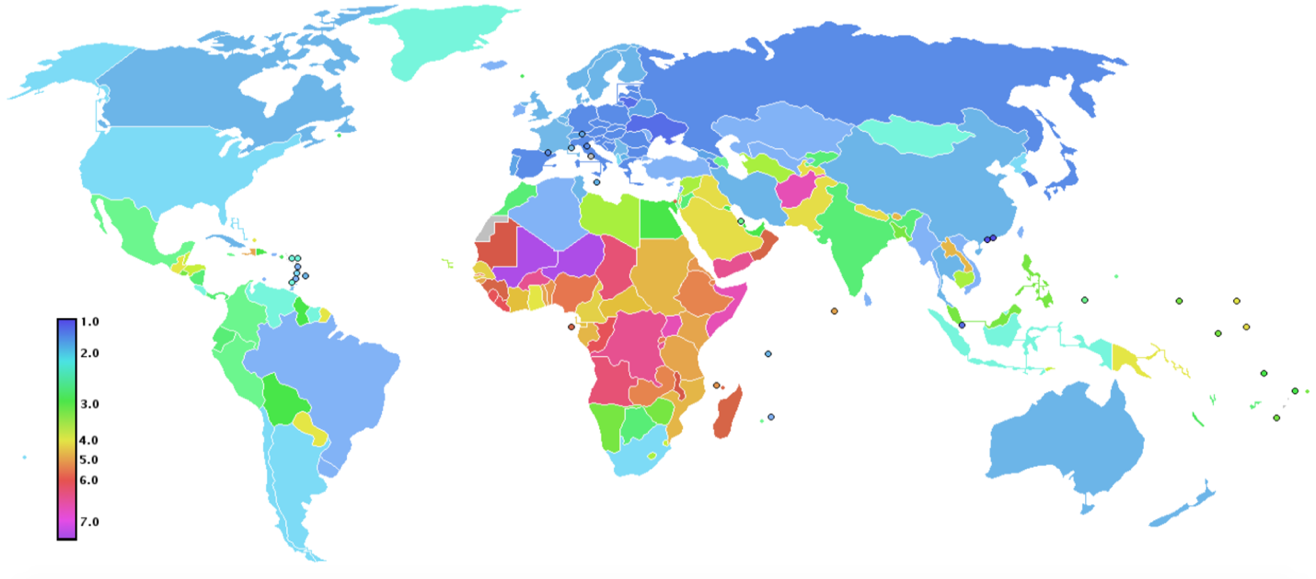
Typologies based on GDP per capita or similar economic measures are very useful, but they also have a significant limitation. Nations can rank similarly on GDP per capita (or another economic measure) but still differ in other respects. One nation might have lower infant mortality, another might have higher life expectancy, and a third might have better sanitation. Recognizing this limitation, organizations such as the United Nations Development Programme (UNDP) use typologies based on a broader range of measures than GDP per capita. A very popular typology is the UNDP’s Human Development Index (HDI), which is a composite measure of a nation’s income, health, and education. This index is based on a formula that combines a nation’s GDP per capita as a measure of income; life expectancy at birth as a measure of health; and the adult literacy rate and enrollment in primary, secondary, and higher education as measures of education. Figure 9.4 “Human Development Index Map” shows how nations rank according to their HDI values. The closer the HDI number is to 1.0, the greater the well-being, and closer the HDI number is to 0.0, the lower the level of well-being.
Figure 9.4 Human Development Index Map
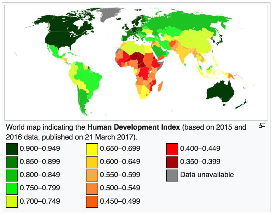
As demonstrated above, countries with similar HDI scores tend to be geographically concentrated. For instance, in 2016, the countries ranked in the top 10 were all found in Europe, with the exceptions of Singapore (#5), Canada and the U.S. (tied at #10), while all countries ranked in the bottom 10 were found in sub-Saharan Africa. Table 8.1 “Human Development Index Data” shows the countries with the highest and lowest HDI values and some of the variables used to determine these values.
The HDI has been widely used since the 1990s and reminds us that nations differ dramatically not only in their economic well-being but also in their social well-being. However, because health, education, and other social indicators do depend so heavily on wealth, our discussion of global stratification for the remainder of this chapter will use the familiar classification of high-income, middle-income, and low-income nations. We now highlight the basic differences among these three categories of nations.
Table 9.1: Human Development Index Data
|
Country/Rank |
HDI Value |
Life Expectancy at Birth |
Expected Years of Schooling |
Gross National Income Per Capita |
|
Countries with the Highest HDI Values |
||||
|
Norway (1) |
.949 |
81.7 |
17.7 |
$67,614 |
|
Australia (2) |
.939 |
82.5 |
20.4 |
$42,822 |
|
Switzerland (2) |
.939 |
83.1 |
16.6 |
$45,000 |
|
Germany (4) |
.926 |
81.1 |
17.2 |
$45,000 |
|
Denmark (5) |
.923 |
80.4 |
19.2 |
$44,519 |
|
Singapore (5) |
.925 |
83.2 |
15.4 |
$78,162 |
|
Countries with the Lowest HDI Values |
||||
|
Burundi (184) |
.404 |
57.1 |
10.6 |
$691 |
|
Burkina Faso (185) |
.402 |
59.0 |
7.7 |
$1537 |
|
Chad (186) |
.396 |
51.9 |
7.3 |
$1991 |
|
Niger (187) |
.353 |
61.9 |
5.4 |
$889 |
|
Central African Republic (188) |
.352 |
51.5 |
7.1 |
$587 |
Source: data from “Human Development Reports.” | Human Development Reports, hdr.undp.org/en/composite/HDI. Retrieved from http://hdr.undp.org/en/composite/HDI
High-Income Nations
High-Income nations are typically post-industrial, and they consist primarily of the nations of North America and Western Europe; Australia, Japan, and New Zealand; and certain other nations in the Middle East (e.g., Kuwait, Qatar and the United Arab Emirates) and Asia (e.g., Japan and Singapore). Many of them were the first nations to become industrialized starting in the 19th century, when the Industrial Revolution began, and their early industrialization certainly contributed to the great wealth they enjoy today. Yet it is also true that many Western European nations were also wealthy before the Industrial Revolution, thanks in part to the fact that they had been colonial powers and acquired wealth from the resources of the lands and people they colonized. Due to this fact, one of the explanations for the establishment of global stratification is the fact of colonization (discussed further in 8.3 Explaining Global Stratification).
Although high-income nations constitute only about one-sixth of the world’s population, they hold about four-fifths of the world’s entire wealth. They are the leading nations in industry, high finance, and information technology and exercise political, economic, and cultural influence across the planet. As the global economic crisis that began in 2007 illustrates, when the economies of just a few wealthy nations suffer, the economies of other nations and indeed of the entire world can suffer. Although each of the world’s wealthy nations is internally stratified to a greater or lesser degree, these nations as a group live a much more comfortable existence than middle-income nations and, especially, low-income nations. People in high-income nations are healthier and more educated, and they enjoy longer lives. At the same time, high-income nations use up more than their fair share of the world’s natural resources, and their high level of industrialization causes them to pollute and otherwise contribute to climate change to a far greater degree than is true of nations in the other two categories.

Middle-Income Nations
Middle-income nations are generally industrialized, although the level of industrialization ranges significantly. They consist primarily of nations in Central and South America, Eastern Europe, and parts of Africa and Asia, and constitute about one-third of the world’s population. Many of these nations have abundant natural resources but still have high levels of poverty, partly because leaders sell the resources to wealthy nations and keep much of the income from these sales for themselves.
There is much variation in income and wealth within the middle-income category, even within the same continent. In Central America, for example, the gross national income per capita of the middle-income neighboring countries of Costa Rica and Nicaragua in 2017 were $15,750 and $5,390, respectively (Population Reference Bureau, 2017). Many international organizations and scholars thus find it useful to further divide middle-income nations into upper-middle-income nations and lower-middle-income nations. Not surprisingly, many more people in the latter nations live in dire economic circumstances than those in the former nations. In Nicaragua, for example, 86.1 % of the population are poor or low-income, compared to 43.5% in Costa Rica.
Low-Income Nations
Low-income nations are the least industrialized and most agricultural of all the world’s countries. This category consists primarily of nations in Africa and parts of Asia and constitutes roughly half of the world’s population. They have some natural resources that political leaders again sell to wealthier nations while keeping much of the income they gain from these sales. Many of these nations rely heavily on one or two crops, and if weather conditions render a crop unproductive in a particular season, the nations’ hungry may experience famine. By the same token, if economic conditions reduce the price of a crop or other natural resource, the income from exports of these commodities plummets, and these already poor nations become even poorer. An example of this latter problem occurred in Vietnam, a leading exporter of coffee. As coffee prices rose during the 1990s, Vietnam expanded its coffee production by greatly increasing the amount of acreage devoted to growing coffee beans. When the price of coffee plummeted in the early 2000s, Vietnam’s coffee industry, including the farmers who grow coffee, suffered huge losses. Many farmers destroyed their coffee plants to be able to grow other crops they thought would be more profitable (Huy, 2010). Because farmers in poor nations often change their crops in this manner for economic reasons, it is difficult for these nations to sustain a stable agricultural industry.
By any standard, many people in these nations face grave challenges. They may suffer from AIDS, malaria and other deadly diseases, are often malnourished, and lack indoor plumbing, electricity, and other modern conveniences that most of us take for granted.
Global Poverty
In addition to classifying nations according to their ranking on a stratification typology, scholars and international organizations also determine the level of poverty in each nation. This determination provides valuable information beyond a nation’s GDP per capita or similar measure of wealth. Wealth and poverty are, of course, highly correlated: generally speaking, the wealthier a nation, the lower its level of poverty. However, this correlation is not perfect, and considering nations only in terms of their wealth may obscure important differences in their levels of poverty. For example, two nations, which we will call Nation A and Nation B, may have similar GDP per capita. In Nation A, wealth from its GDP is fairly evenly distributed, and relatively few people are poor. In Nation B, almost all wealth is held by a small number of incredibly rich people, and many people are poor. A nation’s level of poverty thus tells us what proportion of the population is living in impoverished conditions, regardless of the nation’s level of wealth.
Although it is important, then, to measure the poverty level of the nations of the world, it is rather difficult to do so. One problem is that the different nations have different standards of living. If an American woman who has a family to feed earns $10 per day, or about $3,650 per year, she and her family are very poor by American standards. However, a woman who earns the equivalent of $10 per day in many poor nations may be well off by those nations’ standards, and she would be able to afford many more goods and services than her American counterpart.
Another problem was first encountered in Chapter 8 “Social Stratification and Social Class” in the discussion of poverty in the United States. No matter what income level might be used as an “official” poverty line for the nations of the world, this level is inevitably an arbitrary number. An individual or family whose income is just a bit above the official poverty line is not counted as being officially poor, even though they are still poor for all practical purposes. Moreover, the most common measures of official global poverty ignore episodic poverty. Individuals and families may move into and out of poverty within a given year or two, often more than once. Measures of global poverty (as well as measures of U.S. poverty) determine the number of poor people at one point in time and thus provide an underestimate of the number of people who are poor at least once in a given year.
A third problem concerns exactly what is meant by poverty. Although poverty is usually thought of in monetary terms, some analysts emphasize that poverty involves things in addition to money, such as inadequate nutrition and illiteracy. These analysts favor using measures such as calorie consumption or level of malnutrition as indicators of poverty.
How, then, is global poverty measured? A very common and popular measure is one used by the World Bank, an international institution, funded by wealthy nations, that provides loans, grants, and other aid to help poor and middle-income nations develop their infrastructure and thus reduce their poverty. The World Bank puts the official global poverty line (which is considered a measure of absolute poverty) at income under $1.90 per person per day (updated in 2015), which amounts to about $694 yearly per person or $2,774 for a family of four. Absolute poverty is the level of poverty at which an individual is struggling to meet basic needs, such as having adequate nutrition and shelter. According to the World Bank, in 2013, 10.7% of the world’s population were in absolute poverty, which equated to 766 million people. Eighty-percent of people in absolute poverty live in rural communities, they are disproportionately young (44% are 14 years old or younger), poorly educated and employed in agriculture (2016).
Poverty Indexes
In addition to the Human Development Index discussed earlier in this chapter, the United Nations Development Programme (UNDP) also developed a similar measure to measure global poverty called the Multidimensional Poverty Index (MPI). This measure reflects the UNDP’s belief that poverty means more than a lack of money and that measures of poverty must include nonmonetary components of social well-being. Accordingly, the MPI incorporates a range of deprivation measures applied to each nation’s households. Households are considered poor according to their composite score on three categories of indicators of deprivation:
Health
- Child mortality (any child in the household has died)
- Nutrition (anyone in the family is malnourished)
Education
- Schooling (no household member has completed 5 years of schooling)
- Enrollment (any child in the family is not in school before grade 9)
Standard of living
- Electricity (the household does not have electricity)
- Drinking water (the household does not have access to clean drinking water)
- Sanitation (the household does not have adequate disposal of human waste)
- Flooring (the floor is made out of dirt, sand, or manure [dung])
- Cooking fuel (the household cooks with charcoal, dung, or wood)
- Assets (the household does not own more than one of the following: bicycle, motorbike, radio, telephone, or television)
A person is considered poor if he or she experiences deprivation in any of the following combinations of indicators:
- any two health and/or education indicators, or
- all six standard of living indicators, or
- one health/education indicator plus three standard of living indicators.
When the MPI is used to measure poverty, of the 102 countries examined, almost 1/3 of the population of these nations live in multidimensional poverty. Half of the poor people on the planet according to the MPI live in South Asia, and one-fourth live in Africa (Alkire & Santos, 2010). The five poorest nations according to the MPI are all African: Niger, South Sudan, Ethiopia, Chad and Burkina Faso. In these nations, at least 82% of the population lives in poverty.
Global Inequality
As first discussed in Chapter 7 “Social Stratification”, another dimension of stratification is economic inequality, which refers to the gap between the richest and poorest segments of society. We saw then that the United States has more economic inequality than other Western democracies, as the income and wealth difference between the richest and poorest people in the United States is greater than that in these other nations.
As this discussion suggested, to understand stratification it is important to understand economic inequality. Global economic inequality (hereafter global inequality) has two dimensions. The first dimension involves the large economic gap between the high- and low-income nations of the world, as discussed earlier in this chapter. The second form of global inequality involves comparisons of the degree of economic inequality found within each nation. This type of information adds a valuable complement to measures of wealth (e.g., GDP per capita) and measures of poverty (e.g., the World Bank’s $1.90 per person per day). For example, Nation A and Nation B may have similar levels of poverty. In Nation A, however, poverty is evenly distributed throughout the population, and almost everyone is poor. In Nation B, a small segment of the population is very rich, while a much larger segment is very poor. Nation B would thus have more economic inequality than Nation A.
Around the world, inequality is generally higher in agricultural nations (or those that are low- or middle-income) and lower in high-income nations. In agricultural societies, a small elite usually owns most of the land and is very wealthy, and the masses of people either work for the elite or on their own small, poor farms. Industrial societies have lower inequality because they have higher literacy rates and more political rights and because they generally provide more opportunity for people to move up the socioeconomic ladder (Nolan & Lenski, 2009).
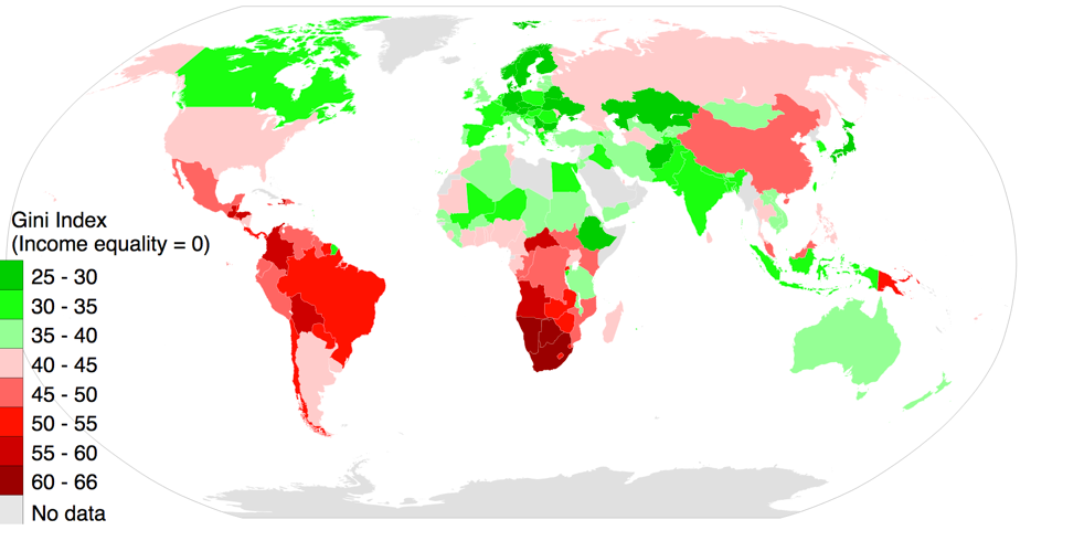
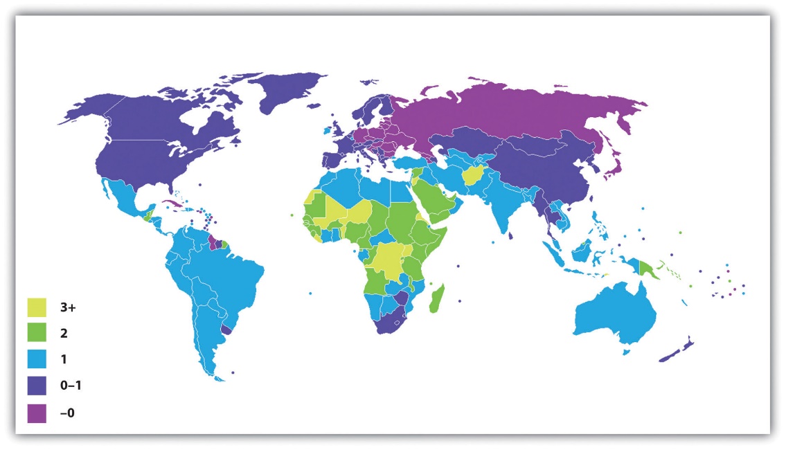
The most popular measure of economic inequality, and one used by the World Bank, is the Gini coefficient. Its calculation need not concern us, but it ranges from 0 to 1, where 0 means that income is the same for everyone (no economic inequality at all, or perfect equality), and 1 means that one person has all the income (perfect inequality). Thus, the nearer the Gini coefficient is to 1, the higher the degree of a nation’s economic inequality. Figure 9.5 “Gini Coefficients, 2014” shows Gini coefficients around the world; economic inequality is indeed higher in the agricultural regions of Latin America and the Caribbean, Africa and South Asia than in the industrial and post-industrial regions.
Figure 9.5 Gini Coefficients, 2014
9.2 The Impact of Global Poverty
Behind all the numbers for poverty and inequality presented in the preceding pages are the lives of nearly 1 billion desperately poor people across the world who live in some of the worst conditions possible. AIDS, malaria, malnutrition, and other deadly diseases are common. Many children die before reaching adolescence, and many adults die before reaching what in the richest nations would be considered middle-age. Many people in the poorest nations are illiterate, and a college education remains unattainable. Millions of people on our planet die every year because they do not have enough to eat, because they lack access to clean water or adequate sanitation, or because they lack access to medicine and/or medical care.
As noted earlier, the United Nations Development Programme, the World Bank, and other international agencies issue annual reports on human development indicators that show the impact of living in a low-income nation. This section begins with a look at some of the most important of these indicators.
Human Development
The status of a nation’s health is commonly considered perhaps the most important indicator of human development. When we look around the world, we see that global poverty is literally a matter of life and death. The clearest evidence of this fact comes from data on life expectancy, the average number of years that a nation’s citizens can be expected to live. Life expectancy certainly differs within each nation, but poverty and related conditions affect a nation’s overall life expectancy to a startling degree.
Figure 9.6 Average Life Expectancy Across the Globe (Years)
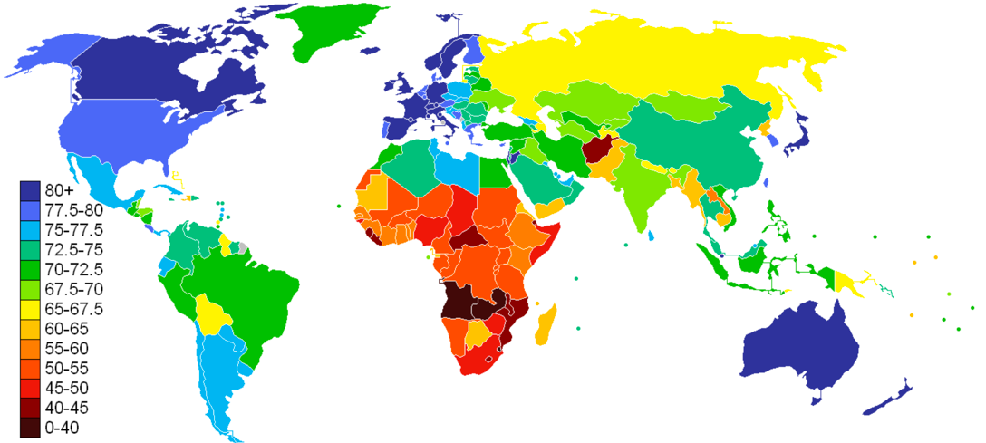
A map of global life expectancy appears above in Figure 9.6 “Average Life Expectancy Across the Globe (Years)”. Life expectancy is highest in Western Europe, North America and certain other regions of the world and lowest in Africa and a few countries of South Asia. The gap in life expectancy when comparing high-income and low-income nations can be some 30 years shorter.
Child Mortality
A key contributor to life expectancy and also a significant indicator of human development in its own right is child mortality, the number of children who die before age 5 per 1,000 children born. As Table 9.2 “Human Development Index and Child Mortality, 2013” shows, the average rate of child mortality in the five nations with the lowest human development is 120, meaning that 12% of all children who are born in these nations will die before age 5. In contrast, the average child mortality rate in six nations with the highest HDI values is only 4. Children in these low-income nations are 30 times more likely to die before age 5 than children in the high-income nations.
Table 9.2 Human Development Index and Child Mortality, 2013
|
Country/Rank |
HDI Value |
Child Mortality Rate |
|
Countries with the Highest HDI Values |
||
|
Norway (1) |
.949 |
3 |
|
Australia (2) |
.939 |
5 |
|
Switzerland (2) |
.939 |
4 |
|
Germany (4) |
.926 |
4 |
|
Denmark (5) |
.923 |
4 |
|
Singapore (5) |
.925 |
3 |
|
Countries with the Lowest HDI Values |
||
|
Burundi (184) |
.404 |
104 |
|
Burkina Faso (185) |
.402 |
102 |
|
Chad (186) |
.396 |
150 |
|
Niger (187) |
.353 |
114 |
|
Central African Republic (188) |
.352 |
129 |
|
Burundi (184) |
.404 |
104 |
Source: data from “Human Development Reports.” | Human Development Reports, hdr.undp.org/en/composite/HDI. Retrieved from http://hdr.undp.org/en/composite/HDI
Two other important indicators of a nation’s health are access to adequate sanitation (disposal of human waste) and access to clean water. When people lack adequate sanitation and clean water, they are at much greater risk from life-threatening diarrhea, from serious infectious diseases such as cholera and typhoid, and from parasitic diseases such as schistosomiasis (World Health Organization, 2010). About 2.4 billion people around the world, almost all of them in low- and middle-income nations, do not have adequate sanitation, and more than 2 million, most of them children, die annually from diarrhea. More than 40 million people worldwide, almost all of them again in low- and middle-income nations, suffer from a parasitic infection caused by flatworms.
Access to adequate sanitation and clean water is strongly related to national wealth. Adequate sanitation is virtually universal in wealthy nations but is available to only 38% of people in low-income nations. Similarly, clean water is also nearly universal in wealthy nations but is available to only 67% of people in poor nations (World Health Organization, 2010).
Malnutrition
Another health indicator is malnutrition. This problem is caused by a lack of good food combined with infections and diseases such as diarrhea that sap the body of essential nutrients. About one-fifth of the population of low-income nations, or about 800 million individuals, are malnourished; looking at children in low-income nations, more than one-fourth of children under age 5 or about 150 million altogether, are underweight. Half of these children live in only three nations: Bangladesh, India and Pakistan; almost half the children in these and other South Asian nations are underweight.
Children who are malnourished are at a much greater risk for fat and muscle loss, brain damage, blindness and death. Not surprisingly, child malnutrition contributes heavily to the high rates of child mortality that we just examined and is estimated to be responsible for more than 5 million deaths of children annually (UNICEF, 2006; World Health Organization, 2010).
Adult Literacy
Moving from the area of health, a final indicator of human development is adult literacy, the percentage of people 15 and older who can read and write a simple sentence. The global rate of adult literacy is 86%, with higher rates of literacy for young people compared to the elderly, as indicated in Table 8.3 “Global Rates of Literacy.” This difference reflects increased access to schooling among the youth population in comparison to the access had by their parents and grandparents. The United Nations Educational, Scientific and Cultural Organization (UNESCO) reported in 2016 that 750 million adults worldwide are illiterate, 2/3 of whom are women (2016).
Table 9.3 Global Rates of Literacy
|
|
Adults aged 15 and older |
Youth aged 15 – 24 years |
Adults aged 25-64 years |
Elderly aged 65 years and older |
|
Global literacy, both sexes |
86% |
91% |
86% |
78% |
|
Global literacy, males |
90% |
93% |
90% |
83% |
|
Global literacy, females |
83% |
90% |
82% |
73% |
|
Global number of illiterate people |
750,000,000 |
102,000,000 |
507,000,000 |
67,000,000 |
Source: data from Literacy Rates Continue to Rise from One Generation to the Next. UNESCO Institute for Statistics, Sept. 2017. Retrieved from http://uis.unesco.org/sites/default/files/documents/fs45-literacy-rates-continue-rise-generation-to-next-en-2017_0.pdf
Global Illiteracy is concentrated in low- and middle-income nations, specifically in the regions of South Asia, where 49% of the global illiterate population live, and sub-Saharan Africa, which houses 27% of world’s illiterate population (UNESCO, 2016). There are 20 countries where rates of literacy fall below 50%. Two of these are countries in South Asia (Afghanistan and Iraq), while the remainder are all low-income nations found in sub-Saharan Africa (UNESCO, 2016). The high rate of illiteracy in poor nations not only reflects their poverty but also contributes to it, as people who cannot read and write are obviously at a huge disadvantage in the labor market.
Gender Disparities
In discussing illiteracy above, it was noted that women are disproportionately likely to be illiterate. This reflects the status of females in general, where it is estimated that females make up 70% of the world’s poor. Because females tend to be poorer than males worldwide, they are more likely than males to experience all the problems that poverty causes, including malnutrition and disease. But they also suffer additional problems. Some of these problems derive from women’s physiological role of childbearing, and some arise from how they are treated simply because they are female.
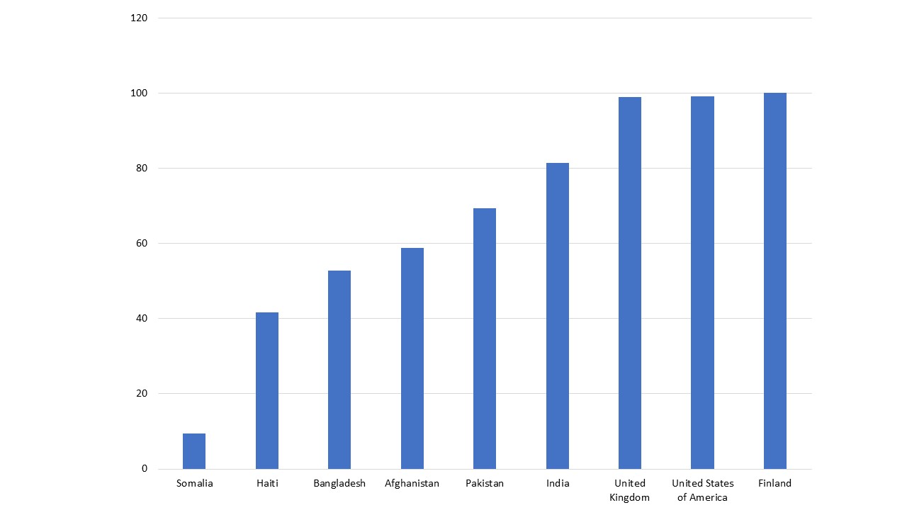
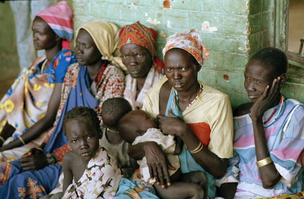
Let’s first look at childbearing. One of the most depressing examples of how global poverty affects women is maternal mortality, or the number of women who die during childbirth for every 100,000 live births. More than 500,000 women die worldwide each year from complications during pregnancy or childbirth. Maternal mortality usually results from one or more of the following: inadequate prenatal nutrition, disease and illness, and inferior obstetrical care, all of which are much more common in low-income nations than in high-income nations. In high-income nations, the rate of maternal mortality is a minuscule 10 per 100,000 births, but in low-income nations the rate is a distressingly high 790 per 100,000 births, equivalent to almost 1 death for every 100 births. Women in low-income nations are thus 79 times more likely than those in high-income nations to die from complications during pregnancy or childbirth. Figure 9.7 “Percentage of Births Assisted by a Skilled Birth Attendant, 2014-2019” suggests a reason for this difference, as it shows that births in poor nations such as Somalia and Haiti are less than half as likely as those in wealthy nations such as the U.S., the U.K., and Finland, to be attended by skilled medical staff.
Figure 9.7 Percentage of Births Assisted by a Skilled Birth Attendant, 2014-2019
In addition to these issues, women in poor nations fare worse than men in other ways because of how they are treated as women. One manifestation of this fact is the violence they experience. About one-third of women worldwide have been raped or beaten, and Amnesty International (2004) calls violence against women “the greatest human rights scandal of our times.” Although violence against women certainly occurs in wealthy nations, it is more common and extreme in low- and middle-income nations.
Beyond violence, women in low-income nations are less likely than their male counterparts to get a higher education, and girls are less likely than boys to attend primary school. Women are also less likely than men to work in jobs that pay a decent wage and to hold political office. In many low-income nations, girls are less likely than boys to receive adequate medical care when they become ill and are more likely than boys to die before age 5. In all these ways, women and girls in low-income nations especially suffer.
Two sets of international statistics cited by writers Nicholas D. Kristof and Sheryl WuDunn (2009) are especially troubling. Because women outlive men, ordinarily there should be more females than males in a country. Yet China has 115 males for every 100 females, and India has 112 males for every 100 females. In these nations, girls and women have died at far greater numbers than men because of infanticide, abuse and lack of health care, and the number of females born is lower due to sex-selected abortion.
A second set of statistics concerns sexual slavery. Kristof and WuDunn (2009, p. MM28) summarize this problem,
In the developing world, …millions of women and girls are actually enslaved. While a precise number is hard to pin down, the International Labor Organization, a U.N. agency, estimates that at any one time there are 12.3 million people engaged in forced labor of all kinds, including sexual servitude. In Asia alone about one million children working in the sex trade are held in conditions indistinguishable from slavery, according to a U.N. report. Girls and women are locked in brothels and beaten if they resist, fed just enough to be kept alive and often sedated with drugs—to pacify them and often to cultivate addiction.
This situation is so horrid that Kristof and WuDunn (2009, p. MM28) call for a moral crusade to save women’s lives. “In the 19th century,” they write, “the paramount moral challenge was slavery. In the 20th century, it was totalitarianism. In this century, it is the brutality inflicted on so many women and girls around the globe: sex trafficking, acid attacks, bride burnings and mass rape.” They add that an important reason for global poverty is that women in poor nations are uneducated, victimized by violence, and generally oppressed. For this reason, they say, international organizations are increasingly recognizing that “focusing on women and girls is the most effective way to fight global poverty.”
Status of Children
Because of their size, immaturity, and lack of resources, children are considered the most vulnerable members of any society. We have already seen evidence of this vulnerability in this chapter’s earlier discussion of childhood disease, malnutrition, and mortality. International agencies estimate that 5.6 million children under age 5 died in 2016 across the world. This equates to more than 15,000 children dying each day. The two world regions with the highest rates of child mortality are sub-Saharan Africa, with a rate of 78 children dying per 1000 live births, and South Asia, whose rate is child mortality rate is 48 (Suzuki, 2017). More than 80% of deaths of children under the age of 5 occur in these two regions. Typically, conflict-ridden nations see the most extreme rates of child mortality, Somalia being a good example, with a rate of 133 children dying by the age of 5 per every 1000 children born. This equates to 1 in every 8 children dying before their 5th birthday.
As disturbing as these statistics might be, there is also good news, as much progress has been made during the past few decades in helping the world’s children, thanks to the focus placed on women and children by agencies of the United Nations. For example, child mortality worldwide declined from 142 to 41 deaths per 1,000 live births in from 1970 to 2016. International efforts have saved millions of children’s lives during the past four decades. Similarly, literacy rates have improved within this timeframe.
Before we leave the issue of children’s welfare, it is worth noting one additional problem they face in certain parts of the world. In some low- and middle-income countries, children are taken by force to join the armed forces or armed groups, or they join out of economic necessity or to escape abuse. These “child soldiers” may bear arms and engage in combat, serve as cooks and messengers, or be sexual slaves. Approximately 300,000 children (under age 18) worldwide are thought to be child soldiers. Beyond the dangers of being involved in armed conflict, these children are not in school and are often sexually abused.
9.3 Explaining Global Stratification
Explanations of global stratification parallel those of U.S. stratification (see Chapter 8 “Social Stratification”) in their focus on individual versus structural problems. One type of explanation takes an individual approach by in effect blaming the people in the poorest nations for their own poverty, while a second explanation takes a structural approach in blaming the plight of poor nations on their treatment by the richest ones. Again, there is evidence to support both types of explanations, but many sociologists favor the structural explanation. Table 9.4 “Theory Snapshot” summarizes the two sets of explanations.
Table 9.4 Theory Snapshot
| Theory | Major Assumptions |
| Modernization Theory |
Wealthy nations became wealthy because early on they were able to develop the necessary beliefs, values, and practices for trade, industrialization, and rapid economic growth to occur. Poor nations remained poor because they failed to develop these beliefs, values, and practices; instead, they continued to follow traditional beliefs and practices that stymied industrial development. |
| Dependency Theory | The poverty of poor nations stems from their colonization by European nations, which exploited the poor nations’ resources and either enslaved their populations or used them as cheap labor. The colonized nations were thus unable to develop a professional and business class that would have enabled them to enter the industrial age and to otherwise develop their economies. |
| World Systems Theory | Core countries are dominant capitalist countries that exploit peripheral countries for labor and raw materials. Peripheral countries are dependent on core countries for capital and have underdeveloped industry. Semi-peripheral countries share characteristics of both core and peripheral countries. |
| Galtung’s Theory | Poor nations, Periphery nations, and Peripheral countries are all the same thing, and they all have richer and poorer people in them. Rich nations, Center nations, and Core countries all are the same thing, and they all have richer and poorer people in them. But this all comes down to the traditional relationship to resources. You are either rich/elite/owner of the means of production or you are poor and do not own any means of production. Consequently, the only way poor have to earn money is to sell their labor to the rich. |
Modernization Theory
The individual explanation is called modernization theory (McClelland, 1967; Rostow, 1990). According to this theory, rich nations became wealthy because early on they were able to develop the “correct” beliefs, values, and practices—in short, the correct culture—for trade, industrialization, and rapid economic growth to occur. These cultural traits include a willingness to work hard, to abandon tradition in favor of new ways of thinking and doing things, to take risks and to adopt a future orientation rather than one focused on maintaining present conditions.
Modernization theory has direct relevance for the industrialization of Western Europe. According to the theory, Western European nations began to emerge several centuries ago as economic powers because their populations adopted the kinds of values and practices just listed. Max Weber (1904/1958), one of the founders of sociology, wrote that Western Europe was able to do this because the Protestant Reformation diminished the traditional distrust of the Catholic Church for material success and social and economic change. The new Protestant ethic that Western Europeans adopted stressed the importance of hard work and material success in one’s lifetime rather than the Church’s traditional emphasis on rewards in an afterlife.
According to modernization theory, nations in other parts of the world never became wealthy and remain poor today because they never developed the appropriate values and practices and lag behind technologically. Instead, they continued to follow traditional beliefs and practices that stymied industrial development and modernization.
Modernization theory has much in common with the culture of poverty theory discussed in Chapter 7 “Social Stratification”. It attributes the poverty of poor nations to their failure to develop the “proper” beliefs, values, and practices necessary for economic success both at the beginning of industrialization during the 19th century and in the two centuries that have since transpired. Because modernization theory implies that the adoption of these cultural attributes and new technologies serves to aid nations in economic development, thus leading to growth and stability, it falls into the functionalist explanation of stratification.
As should be clear, modernization theory has direct implications for strategies to reduce global poverty. The theory implies that people in poor nations must adopt beliefs, values, and practices in common with western nations to succeed economically. If they do not do so, they will prevent themselves from profiting as fully as possible from economic opportunities.
Dependency Theory
The structural explanation for global stratification is called dependency theory. Not surprisingly, this theory’s views sharply challenge modernization theory’s assumptions (Packenham, 1992). Whereas modernization theory attributes global stratification to the “wrong” cultural values and practices in poor nations, dependency theory blames global stratification on the exploitation of these nations by high-income nations. According to this view, low-income nations never got the chance to pursue economic growth because early on they were conquered and colonized by European ones. The European nations stole the poor nations’ resources and either enslaved their populations or used them as cheap labor. They installed their own governments and often prevented the local populace from getting a good education. As a result, the colonized nations were unable to develop a professional and business class that would have enabled them to enter the industrial age and to otherwise develop their economies. Along the way, wealthy nations sold their own goods to colonized nations and forced them to run up enormous debt that continues to amount today. All of these factors created a dependent relationship between colonizing and colonized countries. Because dependency theory implies that poor nations remain poor because of lack of opportunity owing to exploitation by wealthy nations, it falls into the conflict perspective on stratification.
Despite decolonization, dependency continues. Huge multinational corporations continue to exploit the labor and resources of the poorest nations, say dependency theorists. These corporations run sweatshops in many nations, in which workers toil in inhumane conditions at extremely low wages (Sluiter, 2009). Often the corporations work hand-in-hand with corrupt officials in the poor nations to strengthen their economic stake in the countries. An example of this dynamic occurred during the 1990s in the West African country of Nigeria, where the Royal Dutch/Shell oil company at the time was pumping half of that nation’s oil. Activists in southern Nigeria began to claim that Shell’s oil drilling was destroying their land and that Shell was paying them too little for their oil. In response to their protests, the government sent in police at Shell’s request, with Shell paying some of the police costs. The police put down the activists’ dissent by destroying several villages and killing 2,000 people (Lewis, 1996).
Dependency theory also has direct implications for strategies to reduce global poverty. Very simply, the theory implies that wealthy nations and multinational corporations must stop exploiting the resources of poor nations. Until that happens, poor nations will be unable to develop their natural resources and to enter the industrial age.
Which makes more sense, modernization theory or dependency theory? As with many theories, both make sense to some degree, but both have their faults. Modernization theory places too much blame on poor nations for their own poverty and ignores the long history of exploitation of poor nations by rich nations and multinational corporations alike. For its part, dependency theory cannot explain why some of the poorest countries are poor even though they were never colonies; neither can it explain why some former colonies such as Hong Kong have been able to attain enough economic growth to leave the rank of the poorest nations. Together, both theories help us understand the reasons for global stratification, but most sociologists would probably favor dependency theory because of its emphasis on structural factors in the world’s historic and current economy. The following case study helps to exemplify this debate.
World Systems Theory
World systems theory, like dependency theory, suggests that wealthy countries benefit from other countries and exploit those countries’ citizens. In contrast to dependency theory, however, this model recognizes the minimal benefits that are enjoyed by low status countries in the world system. The theory originated with sociologist Immanuel Wallerstein, who suggests that the way a country is integrated into the capitalist world system determines how economic development takes place in that country.
According to Immanuel Wallerstein, the world economic system is divided into a hierarchy of three types of countries: core, semiperipheral, and peripheral. Core countries (e.g., U.S., Japan, Germany) are dominant, capitalist countries characterized by high levels of industrialization and urbanization. Core countries are capital intensive, have high wages and high technology production patterns and lower amounts of labor exploitation and coercion. Peripheral countries (e.g., most African countries and low income countries in South America) are dependent on core countries for capital and are less industrialized and urbanized. Peripheral countries are usually agrarian, have low literacy rates and lack consistent Internet access. Semi-peripheral countries (e.g., South Korea, Taiwan, Mexico, Brazil, India, Nigeria, South Africa) are less developed than core nations but more developed than peripheral nations. They are the buffer between core and peripheral countries.
Core countries own most of the world’s capital and technology and have great control over world trade and economic agreements. They are also the cultural centers which attract artists and intellectuals. Peripheral countries generally provide labor and materials to core countries. Semiperipheral countries exploit peripheral countries, just as core countries exploit both semiperipheral and peripheral countries. Core countries extract raw materials with little cost. They can also set the prices for the agricultural products that peripheral countries export regardless of market prices, forcing small farmers to abandon their fields because they can’t afford to pay for labor and fertilizer. The wealthy in peripheral countries benefit from the labor of poor workers and from their own economic relations with core country capitalists.
Galtung’s Theory
Galtung’s thesis is a world systems analysis like world system’s theory, but it expands the analysis beyond the relationship between core, which Galtung calls center, and periphery nations, but also on the center and periphery within nations. It also differs from world systems theory as it does not include a semi-periphery. Galtung’s theory looks at both center and periphery between nations and within nations, and furthermore includes analysis of the relationship between the center of center and periphery of the periphery, so the poorest of the poor nations in relation to the richest of the rich nations (the elites). The elites take advantage of those with less access to power. They drain them of their resources and put the poor in a situation where they have to allow themselves to be exploited to survive, this is structural violence.
Imperialism comes in because rich nations have more resources and power than poor nations, and they can take the poor nation’s resources. If they are sneaky, it is Imperialism. If they are not sneaky, it is conquest or military occupation. If we are going with sneaky, then rich countries can convince everyone that cooperation is of mutual benefit and that there is harmony of interest. This is selling poor nations a trojan horse that creates weakness in the poor nation but looks like a good deal. In order to do this it is crucial to note that:
The wealthy in rich nations and the wealthy in poor nations are on the same team -they have harmony of interests. Ideally, the poor nation is more unstable than the rich nation because there is a bigger gap between the periphery nation’s rich and poor than in the center nation’s (but the US is pushing that general rule with our explosive inequality). As the rich nation begins exploiting the resources of the poor nation (with the help of the poor nation’s elite), there is a trickle down effect and everyone in the wealthy nation benefits (the rich the most). If the gap between have and have nots grows in the Center nation instead of just in the poor nations, then the poor in both countries could band together, requiring more obvious violence to exploit the poor in both countries.
The wealthy in rich nations and the wealthy in poor nations are on the same team -they have harmony of interests. Ideally, the poor nation is more unstable than the rich nation because there is a bigger gap between the periphery nation’s rich and poor than in the center nation’s (but the US is pushing that general rule with our explosive inequality). As the rich nation begins exploiting the resources of the poor nation (with the help of the poor nation’s elite), there is a trickledown effect and everyone in the wealthy nation benefits (the rich the most). If the gap between have and have nots grows in the center nation instead of just in the poor nations, then the poor in both countries could band together, requiring more obvious violence to exploit the poor in both countries.
Case Study: Haiti
In January 2010, an earthquake with a magnitude of 7.0 devastated Haiti, and island nation in the Caribbean and one of the poorest countries in the world. The quake reportedly killed more than 200,000 people, about 2.5% of Haiti’s population, injured 300,000, and left 1 million homeless. Because Haiti had ramshackle buildings, a weak infrastructure, and inadequate public services, many more people died or otherwise suffered from this earthquake than from earthquakes of similar magnitude in wealthier countries.
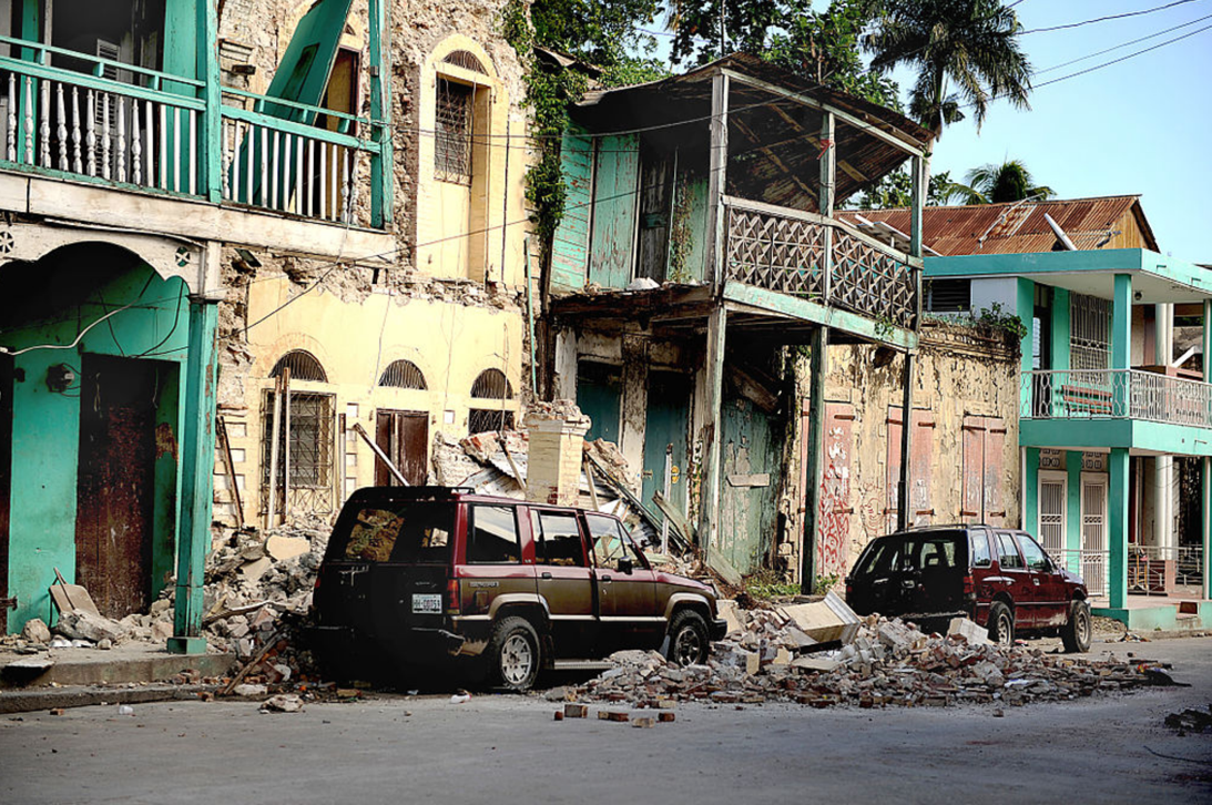
In the aftermath of this natural disaster, a flurry of news articles and op-ed columns discussed why Haiti had been so poor before the earthquake despite efforts by thousands of international agencies during the past few decades. The contrasting positions presented in these articles reflected the views of the modernization and dependency theories presented in the text, and they illustrate the complexity of understanding global poverty.
Reflecting the views of modernization theory, some observers attributed Haiti’s situation to a culture of poverty. They noted that Haiti shares an island with the Dominican Republic, which is not nearly as poor as Haiti. Beyond sharing a general location and climate, the two nations also have similar histories of colonialism and governmental corruption. Given these similarities, why, then, was Haiti much poorer than the Dominican Republic?
To answer this question, Jonah Goldberg, a Los Angeles Times columnist, reasoned, “Haiti’s problems in large part boil down to a culture of poverty. Haitians do not lack the desire to make their lives better, nor do they reject hard work. But what they sorely lack is a legal, social and intellectual culture that favors economic growth and entrepreneurialism” (Goldberg, 2010, p. 9A). Western nations, he continued, must do more than provide aid to Haiti and other poor nations, as they must also teach them “how to stop being poor.” People in these nations, he said, must learn the concept of entrepreneurialism (the development and practice of a business), and they must also learn how to be entrepreneurs.
Reflecting the views of dependency theory, other observers attributed Haiti’s deep poverty to its history of colonialism, which puts it at a severe disadvantage even compared to other formerly colonized nations. Michele Wucker, executive director of the World Policy Institute, and Ben Macintyre, a columnist for The Times of London, both wrote that Haiti was a rich slave colony of France before a bloody revolution won Haitians their independence in 1804. The new nation’s economy then suffered for two reasons. First, the revolution destroyed much of the country’s agriculture and infrastructure. Second, France used ships to block Haitian trade and required Haiti to pay a huge indemnity, equal to about $13 billion in today’s dollars, to restore normal trade and diplomatic relations. Haiti had to take out huge loans from Western nations’ banks at very high interest rates to do so. The consequence for Haiti was devastating, wrote Macintyre (2010, p. 30):
Weighed down by this financial burden, Haiti was born almost bankrupt. In 1900 some 80 percent of the national budget was still being swallowed up by debt repayments. Money that might have been spent on building a stable economy went to foreign bankers….The debt was not finally paid off until 1947. By then, Haiti’s economy was hopelessly distorted, its land deforested, mired in poverty, politically and economically unstable, prey equally to the caprice of nature and the depredations of autocrats.
Where does the truth lie? Is Haiti’s poverty today due more to its culture or more to its history of colonialism and imperialism? People who favor modernization theory would answer culture, and those who favor dependency theory would answer colonialism and imperialism. In the end, both sets of factors probably matter. The debate over Haiti’s poverty shows that the experience of other societies can illuminate theories of global stratification and, in turn, help us understand which types of strategies hold the most potential for helping poor nations.
9.4 Population
The study of population goes hand-in-hand with the examination of global stratification and social stratification, as population traits can be both a cause and reflection of the position of a group or society within a stratification system. Take for instance the state of Michigan. Michigan’s population is shrinking. This reality stems from the fact that the birth rate today is 21% lower than its 1990 rate, and we now have 22,500 fewer fifth graders than ninth graders. Another reason for the population decline is that for the past several decades many more people had been moving out of Michigan than moving in. Because many of those moving out are young, college-educated adults, they were taking with them hundreds of millions of dollars in paychecks that would have bolstered Michigan’s economy and tax revenue base. They were also leaving behind empty houses and apartments that are further depressing the state’s real estate market. The population decline has already forced many schools to close, with additional closings likely, and it is also increasing the percentage of Michigan residents in their older years who would need additional state services. The population decline has been especially severe in Detroit but has also been occurring in smaller cities and towns. (French & Wilkinson, 2009; Dzwonkowski, 2010)

As this data from Michigan reminds us, population decline can have weighty consequences throughout a region. Among other consequences, Michigan’s population decline has affected its economy, educational system, and services for its older residents. The opposite is true in many low- and middle-income nations, where population growth is the dominant pattern, resulting in large child populations which stretch inadequate resources even further. At the global level, population decline occurring in one world region may coincide with population growth in another region, sparking previously unseen patterns of migration across international boundary lines. These few examples and all of the associated issues demonstrate the importance of the study of population in relation to stratification. The study of population is so significant that it occupies a special subfield within sociology called demography. To be more precise, demography is the study of changes in the size and composition of population. It encompasses several concepts: fertility and birth rates, mortality and death rates, and migration (Weeks, 2012). Let’s look at each of these briefly.
Fertility and Birth Rates
Fertility refers to the number of live births. Demographers use several measures of fertility. One measure is the crude birth rate, or the number of live births for every 1,000 people in a population in a given year. To determine the crude birth rate, the number of live births in a year is divided by the population size, and this result is then multiplied by 1,000. For example, in 2015 the United States had a population of about 321 million and 3,978,497 births. Dividing the latter figure by the former figure gives us 0.0124 rounded off. We then multiply this quotient by 1,000 to yield a crude birth rate of 12.4 births per 1,000 in the population (Center for Disease Control and Prevention, 2018). We call this a “crude” birth rate because the denominator, population size, consists of the total population, not just the number of women or even the number of women of childbearing age (commonly considered 15–44 years).
Looking globally, what is typically found is that the crude birth rate is higher in low-income nations, in comparison to most middle- and high-income nations. For instance, the crude birth rate average for those five low-income nations with the lowest HDI values shown in Table 8.1 “Human Development Index Data” earlier in this chapter is 42.6, in comparison to the high-income high HDI value nations, which have an average crude birth rate of 10.7 (Population Reference Bureau, 2017).
A second measure is the general fertility rate, or the number of live births per 1,000 women aged 15–44 (i.e., of childbearing age). This is calculated in a manner similar to that for the crude birth rate, but in this case the number of births is divided by the number of women aged 15–44 before multiplying by 1,000. The U.S. general fertility rate for 2015 was about 62.5 (i.e., 62.5 births per 1,000 women aged 15–44; Center for Disease Control and Prevention, 2018).
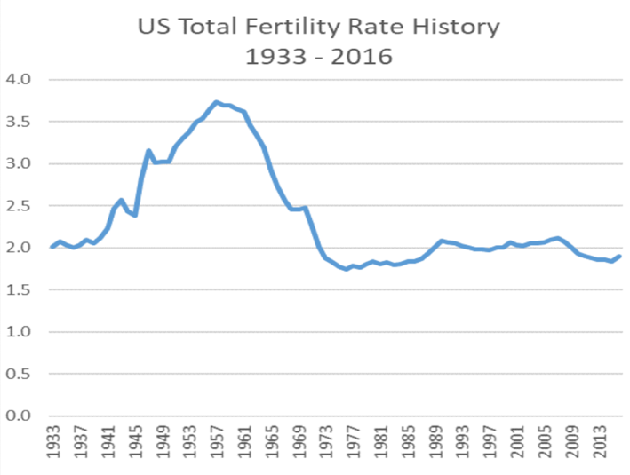
A third measure is the total fertility rate, or the average number of children a woman is expected to have in her lifetime. This measure often appears in the news media and is more easily understood by the public than either of the first two measures. In 2017, the estimated U.S. total fertility rate was about 1.87, meaning that currently the average woman in the U.S. is expected to have 1.87 children in her lifetime (Central Intelligence Agency). When a country’s total fertility rate is 2.1 children per woman, it is said to have reached replacement level fertility. A replacement level fertility is the level of fertility at which a population exactly replaces itself from one generation to the next (e.g., 2 parents have 2 children, when the parents die, the children replace them, resulting on zero population growth). While there are other factors to consider (such as mortality and migration rates) when total fertility rates rise above 2.1, a population will naturally grow, and a total fertility rate below 2.1 indicates that a population overall will shrink.

As Figure 9.8 “U.S. Total Fertility Rate, 1933–2016” indicates, the U.S. total fertility rate has changed a lot over time. The rate in the early 1930’s during the height of the Great Depression was similar to today’s rates. However, in the early years of WWII (1940’s), the rate started to climb, reaching roughly 3.7 in the 1950’s post-war era, before it began to decline in the mid-1960’s. While there has been minor fluctuation, the U.S. total fertility rate has remained fairly steady since the 1970’s.
Figure 9.8 U.S. Total Fertility Rate, 1933 – 2016
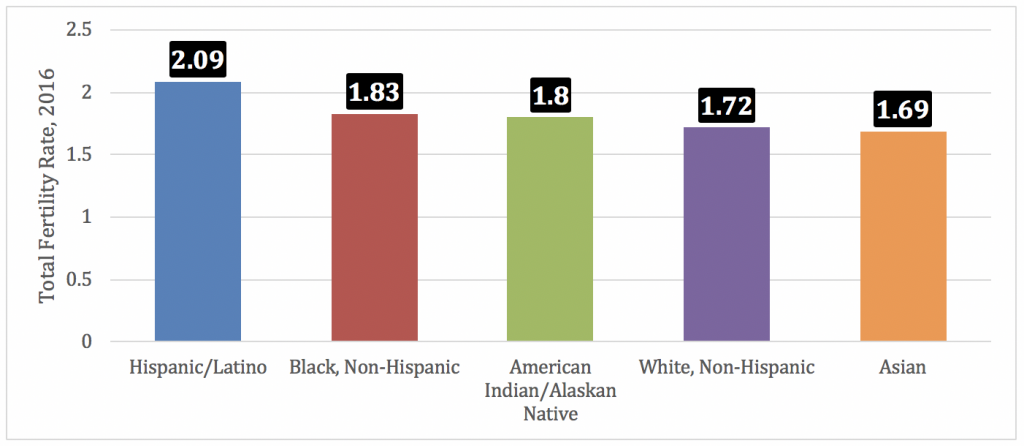
In addition to the fertility rate varying across time within a nation, it can also vary across groups. The variance reflects many different factors, including such things as the economic, educational and employment status of a group, in addition to other factors such as recency of immigration and subcultural attributes, such as the norm associated with age of marriage for women. As evidenced below in Figure 9.9 “Race, Ethnicity and U.S. Total Fertility rates, 2016,” there are some slight differences between total fertility rates for different racial-ethnic groups in the U.S., however, all the rates are currently below replacement level fertility.
Figure 9.9 Race, Ethnicity and U.S. Total Fertility rates, 2016
Fertility rates also differ around the world and are especially high in low-income nations (see Figure 9.10 “Countries by Total Fertility Rate”). Demographers identify several reasons for these high rates (Weeks, 2012).
First, low-income nations usually have large agricultural sectors. In agricultural societies, children are an important economic resource, as a family will be more productive if it has more children. This means that families will ordinarily try to have as many children as possible. Second, infant and child mortality rates are high in these nations. Because parents realize that one or more of their children may die before adulthood, they have more children to compensate for the anticipated deaths. A third reason is that many parents in low-income nations prefer sons to daughters, and, if a daughter is born, they may “try again” for a son. Fourth, traditional gender roles are often very strong in poor nations, and these roles include the belief that women should be wives and mothers above all, thus status for women is associated with childbearing. Finally, contraception is often less accessible in low-income nations. Without contraception, many more pregnancies and births certainly occur. For all of these reasons, then, fertility is much higher in low-income than in high-income nations.
Figure 9.10 Countries by Total Fertility Rate
Mortality and Death Rates
Mortality is the flip side of fertility and refers to the number of deaths. Demographers measure it with the crude death rate, the number of deaths for every 1,000 people in a population in a given year. To determine the crude death rate, the number of deaths is divided by the population size, and this result is then multiplied by 1,000. In 2017 the United States had an estimated crude death rate of 8.2 deaths for every 1,000 persons (approximately 2.7 million deaths in 2017). We call this a “crude” death rate because the denominator, population size, consists of the total population and does not take its age distribution into account. All things equal, a society with a higher proportion of older people should have a higher crude death rate, however, because low-income nations have large child populations coupled with high infant and child mortality, the crude death rates of nations today fall within a narrow range. For instance, some countries in Western and Eastern Europe, such as Bulgaria, Romania and German which have crude death rates of 15, 13 and 11, respectively, are similar statistically the low-income countries in sub-Saharan Africa. For instance, Sierra Leone, the Central African Republic, Chad and Lesotho each have a crude death rate of 13 (Population Reference Bureau, 2017).
Migration
Another demographic concept is migration, the movement of people into and out of specific regions. Since the dawn of human history, people have migrated in search of a better life, and many have been forced to migrate by ethnic conflict or the slave trade.
Several classifications of migration exist. When people move into a region, we call it immigration; when they move out of a region, we call it emigration. The immigration rate is the number of people moving into a region for every 1,000 people in the region, while the emigration rate is the number of people moving from the region for every 1,000 people. The difference between the two is the net migration rate (immigration minus emigration). Recalling the news story about Michigan earlier in this section, Michigan has had a net migration of less than zero, as its emigration has been greater than its immigration.
Migration can also be either domestic or international in scope. Domestic migration happens within a country’s national borders, as when the great migration of Black people from the South into northern cities occurred during the first half of the 20th century. International migration happens across national borders. When international immigration is heavy, as it has been into the United States and Western Europe in the last few decades, the effect on population growth and other aspects of national life can be significant. Domestic migration can also have a large impact.
9.5 Population Growth and Decline
Now that you are familiar with some basic demographic concepts, we can discuss population growth and decline in more detail. Three of the factors just discussed determine changes in population size: fertility (crude birth rate), mortality (crude death rate), and net migration. The natural growth rate is simply the difference between the crude birth rate and the crude death rate. The U.S. natural growth rate is about 0.4% (or 4 per 1,000 people) per year (Rosenberg, 2009). When immigration is also considered, the total population growth rate has been almost .7% per year (Population Reference Bureau, 2017).
Population Growth
Figure 9.11 “International Annual Population Growth Rates (%), 2005–2010” depicts the annual population growth rate (including both natural growth and net migration) of all the nations in the world. Note that several African nations are growing by at least 3% per year or more, while most European nations are growing by much less than 1% or are even losing population, as discussed earlier. Overall, the world population is growing by over 80 million people annually.
Figure 9.11 International Annual Population Growth Rates (%), 2005–2010
To determine how long it takes for a nation to double its population size, divide the number 70 by its population growth rate. For example, if a nation has an annual growth rate of 3%, it takes about 23.3 years (70 ÷ 3) for that nation’s population size to double. As you can see from the map Figure 8.9 above, several nations will see their population size double in this time span if their annual growth continues at its present rate. For these nations, population growth will be a serious problem if food and other resources are not adequate or adequately distributed.
Demographers use their knowledge of fertility, mortality, and migration trends to make projections about population growth and decline several decades into the future. Coupled with our knowledge of past population sizes, these projections allow us to understand population trends over many generations. One clear pattern emerges from the study of population growth. In the earliest forms of society, when societies were small, population growth was slow because there were relatively few adults to procreate. Additionally, death rates were high, which helped to neutralize high fertility rates within these societies. But as the number of people grows over time, so does the number of adults. More and more procreation thus occurs every single generation, and population growth then soars.
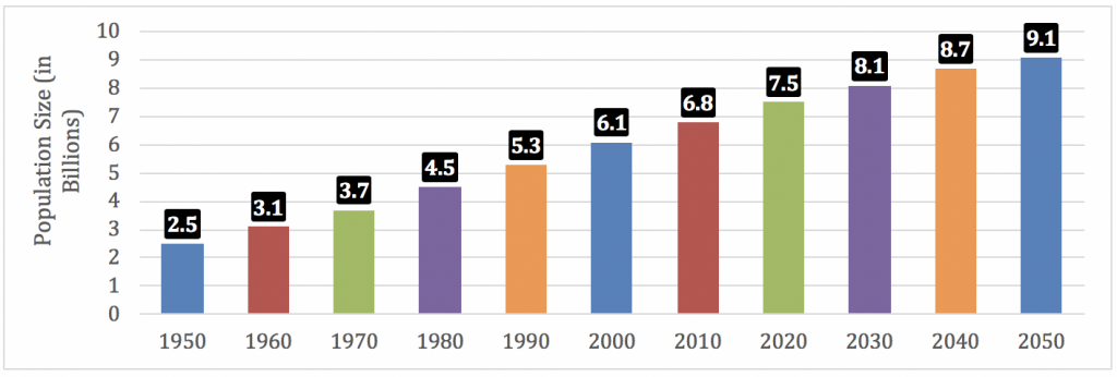
We see evidence of this pattern when we look at world population growth. When agricultural societies developed some 12,000 years ago, only about 8 million people occupied the planet. This number had reached about 300 million about 2,100 years ago, and by the 15th century it was still only about 500 million. It finally reached 1 billion by about 1850 and by 1950, only a century later, had doubled to 2 billion. Just 70 years later, it more than tripled to 7.6 billion, and it is projected to reach more than 9 billion by 2050 (U.S. Census Bureau, 2010) (see Figure 9.12 “Total World Population, 1950–2050”).
Figure 9.12 Total World Population, 1950–2050
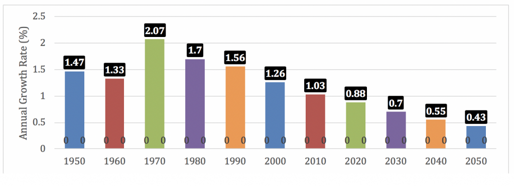
Eventually, however, population growth begins to level off after increasing rapidly, as explained by demographic transition theory, discussed later. We see this in the bottom half of Figure 9.10 “Total World Population, 1950–2050,” which shows the average annual growth rate for the world’s population. This rate has declined over the last few decades and is projected to further decline over the next four decades. This means that while the world’s population will continue to grow during the foreseeable future, it will grow by a smaller rate as time goes by, and may eventually reach a peak, after which it may stabilize and then start to decline. The growth that does occur will be concentrated in the poor nations in Africa and some other parts of the world. Still, even there the average number of children a woman has in her lifetime dropped from six a generation ago to about three today (a very rapid decrease within one generation).
Theories of Population Growth
The numbers just discussed show that the size of the world population has increased tremendously in just a few centuries. Not surprisingly, people have worried about population growth and specifically overpopulation at least since the 18th century. One of the first to warn about population growth was Thomas Malthus (1766–1834), an English economist, who said that population increases geometrically (2, 4, 8, 16, 32, 64, 128, 256, 512, 1024…). If you expand this list of numbers, you will see that they soon become overwhelmingly large in just a few more generations. In contrast, Malthus (1798/1926) said that food production increases only arithmetically (1, 2, 3, 4, 5, 6…) and thus could not hope to keep up with the population increase, and he predicted that mass starvation would be the dire result. This theory is referred to as the Malthusian Theory.
During the 1970s, concern about population growth increased again, leading to a call by some activists for zero population growth (ZPG). There was much concern over the rapidly growing population in the United States and around the world, and there was fear that our “small planet” could not support massive increases in the number of people (Ehrlich, 1969). Some of the direst predictions of the time warned of serious food shortages by the end of the century.
Fortunately, Malthus and ZPG advocates were wrong to some degree. Although population levels have certainly increased, the projections in Figure 8.10 “Total World Population, 1950–2050” show that the rate of increase is slowing. Among other factors, the development of more effective contraception, especially the birth control pill, has limited population growth in the industrial and post-industrial nations and, increasingly, in lower-income nations. Food production has also increased by a much greater amount than Malthus and ZPG advocates predicted. Concern about overpopulation has weakened, as the world’s resources seem to be standing up to population growth. Widespread hunger in Africa and other regions does exist, with hundreds of millions of people suffering from hunger and malnutrition, but many experts attribute this problem not to overpopulation and lack of food but rather to problems in distributing the sufficient amount of food that exists.
Another factor might have played a role in weakening advocacy for ZPG: criticism by people of color that ZPG was directed largely at their ranks and smacked of racism. The call for population control, they said, was a disguised call for controlling the growth of their own populations and thus reducing their influence (Kuumba, 1993).
Demographic Transition Theory
An alternative theory on population growth subscribed to by most sociologists is the demographic transition theory. This theory links population growth to the level of technological development across 5 stages of social evolution. As seen below in Figure 9.13 “Demographic Transition Model,” In the first stage, coinciding with preindustrial societies, birth rate and death rate are both high. The birth rate is high because of the lack of contraception and the several other reasons cited earlier for high fertility rates, and the death rate is high because of disease, poor nutrition, lack of modern medicine, and other problems. These two high rates cancel each other out, and little population growth occurs.
In the second stage, coinciding with the development of early industrial societies, the birth rate remains fairly high, owing to the lack of contraception and a continuing belief in the value of large families, but the death rate drops because of several factors, including increased food production, better sanitation, and improved medicine. Because the birth rate remains high but the death rate drops, population growth takes off dramatically.
Figure 9.13 Demographic Transition Model
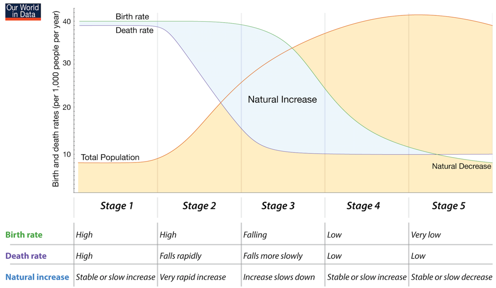
In the third stage, as industrial societies mature, the death rate remains low and the birth rate finally drops as families begin to realize that large numbers of children in an industrial economy are more of a burden than an asset. Another reason for the drop is the availability of effective contraception. As a result, population growth slows, and, as we saw earlier, it has become quite low or even gone into a decline in numerous mature industrial middle-income nations.
Stages 4 and 5 demonstrate the demographic trends in post-industrial societies, where the birth rate falls to low levels on the same par as death rates, and in some cases, as shown in Stage 5, nations begin to experience natural decrease in their populations as birth rates fall below death rates. Demographic transition theory, then, gives us more reason to be cautiously optimistic regarding the concerns associated with overpopulation: as poor nations industrialize, their population growth rates should start to decline.
Population Decline and Pronatalism
Still another reason for the reduced concern over population growth is that birth rates in many post-industrial nations have slowed considerably. Some nations are even experiencing population declines, while many more are projected to have population declines by 2050 (Goldstein, Sobotka, & Jasilioniene, 2009). As discussed, for a country to maintain its population, the average woman needs to have 2.1 children (not accounting for immigration). Post-industrial and some industrial nations are far below this level. Increased birth control is one reason for their lower fertility rates but so are decisions by women to stay in school longer, to go to work right after their schooling ends, and to not have their first child until somewhat later.
Ironically, these nations’ population declines have begun to concern demographers and policymakers (Shorto, 2008). Because people in many industrial nations are living longer while the birth rate drops, these nations are increasingly having a greater proportion of older people and a smaller proportion of younger people. As this trend continues, it will become increasingly difficult to take care of the health and income needs of so many older persons, and there may be too few younger people to fill the many jobs and provide the many services that post-industrial society demands. The smaller labor force may also mean that governments will have fewer income tax dollars to provide these services.
To deal with these problems, some governments have initiated pronatalist policies aimed at encouraging women to have more children. In particular, they provide generous child-care subsidies, tax incentives, and flexible work schedules designed to make it easier to bear and raise children, and some even provide couples cash payments when they have an additional child. For example, Russia in some cases provides the equivalent of about $9,000 for each child beyond the first, while Spain provides 2500 Euros (equivalent to about $3,400) for each child (Haub, 2009).

Population Pyramids
As discussed, fertility, mortality, and migration rates are used to examine the current state and future projections for a given population. In addition to these figures, the study of population also includes review of the age and sex composition of societies. In fact, the demographic changes outlined in the demographic transition theory are also reflected in the age and sex composition of societies. Parallel to Figure 8.11 “Demographic Transition Model” we can lay out and compare age-sex graphs (known as population pyramids) to better understand the demographic transitions that societies undergo. As demonstrated below in Figure 9.14 “Population Pyramid, Vietnam, 2016,” population pyramids graphically represent the population of a society by sex, in 5-year age increments.
Figure 9.14 Population Pyramid, Vietnam, 2016
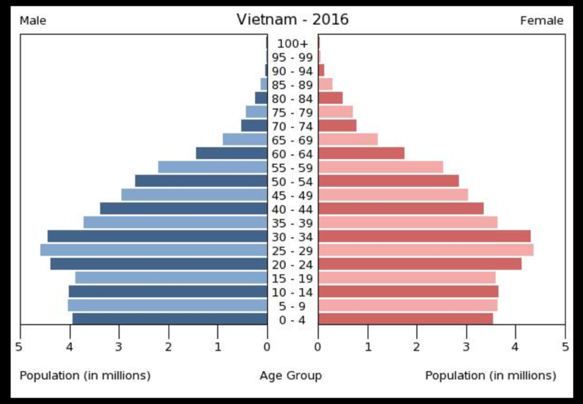
Population pyramids depict the male portion of a society on the left (in blue) and the female portion of a society on the right (in pink). Each horizontal bar represents a 5-year age group. At the base are people ages 0-4, the next horizontal bar are people ages 5-9 and so on up the chart until you get to people who are 100+ years old. Looking at the example of Vietnam, this means that there are just under 4 million boys aged 0 – 4, while there are roughly 3.5 million girls in this same age group. While it is natural for more boys to be born than girls (about 105 boys per every 100 girls), the gap of 500,000 million more boys than girls in the 0-4 age group in Vietnam is significant and demonstrates a preference for boy babies. Technologies such as amniocentesis and ultrasound can be used to determine fetal sex, prompting the decision to terminate a pregnancy if the fetus is found to be female. Another factor that stands out in Vietnam’s population pyramid is that in the last 20 years, Vietnam’s population growth seems to have stabilized, with very similar numbers of males and females aged 0-4, 5-9, 10-14 and 15-19. As we will discuss below, this may reflect Vietnam undergoing rapid industrialization.
The shape of population pyramids reflects the stage of a country’s demographic transition, as shown below in Figure 9.15 “Population Pyramids and the Demographic Transition Model.” A country in the first stage of the demographic transition, as discussed, will have both high birth and death rates, evidenced by a population pyramid with a wide base (lots of children due to a high birth rate) and concave sides, reflecting high rates of death in each age group. Such a shape would typically show that a country, having high birth and death rates, is pre-industrial. There are exceptions, though. Some countries that have been war-torn for prolonged periods of time may take on this shape as well, providing that they have a high birth rate.
Figure 9.15 Population Pyramids and the Demographic Transition Model
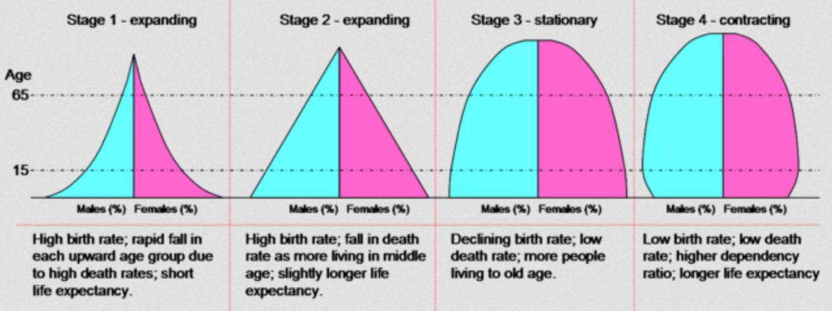
As a society starts to industrialize and transition to Stage 2 of the demographic transition, its population pyramid begins to change shape. It retains its wide base due to continued high fertility, but the shape becomes more an equilateral triangle, reflecting a declining death rate. Today, mostly low-income nations and some low-middle-income nations take this shape. Figure 9.16 “Population Pyramid, Papua New Guinea, 2017” below nicely demonstrates this shape.
Figure 9.16: Population Pyramid, Papua New Guinea, 2017
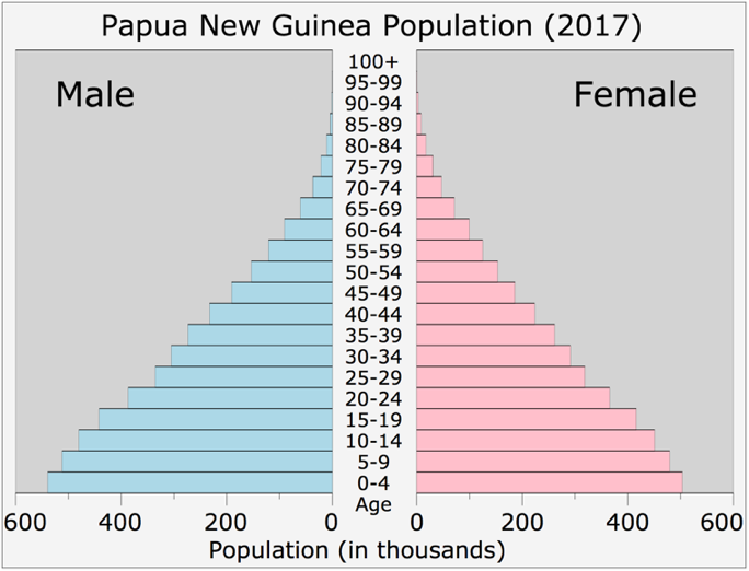
As illustrated in Figure 9.15, “Population Pyramids and the Demographic Transition Model,” population pyramids reflecting the third stage of the demographic transition begin to take on a haystack shape, reflecting low mortality and falling birth rates. This haystack shape shows fertility is reaching replacement level, and that more people are living to old age, as demonstrated by Iceland’s population pyramid below in Figure 8.15 “Population Pyramid, Iceland, 2016.”.
Figure 9.17: Population Pyramid, Iceland, 2016
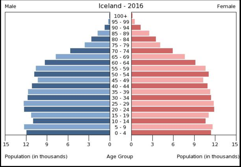
Finally, the population pyramid for stage 4 of the demographic transition is depicted in Figure 9.15 “Population Pyramids and the Demographic Transition Model” above, and shows the similar haystack shape of stage 3, however, the pyramid narrows at the base indicating that birth and death rates are both low and that birth rate is starting to dip below death rate. This shape characterizes most high-income nations.
Population pyramids contain other information beyond the stage of the demographic transition of a nation. As noted earlier in our discussion of Vietnam’s population pyramid, we can see sex imbalances demonstrated, reflecting preference for male offspring. It is more common to see a sex imbalance at the top of a population pyramid, since women almost universally live longer than men, however, a sex imbalance favoring females at other points in a population pyramid may demonstrate that there was a war in which many men died or a prolonged period of mass emigration of males. Similarly, it is not unusual for societies to have periods of baby booms, which will show as a bulge in a population pyramid. Similarly, if a society experiences a severe natural disaster or health crisis, such as the high rate of HIV and AIDS found in a number of southern African nations, the resultant increase in the mortality rate this will be visible in their population pyramid.
9.6 Urbanization
An important aspect of population growth over the centuries has been urbanization, or the rise and growth of cities. Urbanization has had important consequences for many aspects of social, political, and economic life (Kleniewski & Thomas, 2011).
The earliest cities developed in ancient times after the rise of horticultural and pastoral societies made it possible for people to stay in one place instead of having to move around to find food. Because ancient cities had no sanitation facilities, people typically left their garbage and human waste in the city streets or just outside the city wall (which most cities had for protection from possible enemies); this poor sanitation led to rampant disease and high death rates. Some cities eventually developed better sanitation procedures, including, in Rome, a sewer system (Smith, 2003).
Cities became more numerous and much larger during industrialization, as people moved to be near factories and other sites of industrial production. First in Europe and then in the United States, people crowded together as never before. Lack of sanitation continued to cause rampant disease, and death rates from cholera, typhoid, and other illnesses were high. In addition, crime rates soared, and mob violence became quite common (Feldberg, 1998).
Global Urbanization
Urbanization varies around the world. In general, high and middle-income nations are more urban than low-income nations (see Figure 9.18 “Percentage of Urbanization per Country, 2015”), thanks in large part to the latter’s rural economies. This variation, however, obscures the fact that the world is becoming increasingly urban overall. In 1950, less than one-third of the world’s population lived in cities or towns; in 2008, more than half the population lived in cities or towns, representing the first time in history that a majority of people were not living in rural areas (United Nations Population Fund, 2007). By 2030, almost two-thirds of the world’s population is projected to live in urban areas.
Figure 9.18 Percentage of Urbanization per Country in 2015
The number of urban residents will increase rapidly in the years ahead, especially in Africa and Asia as people in these continents’ nations move to urban areas and as their populations continue to grow through natural fertility. Table 9.5 “City Population Projections for 2050” demonstrates that the largest cities in the world in 2050, with the exception of Tokyo and New York, will all be located in countries currently classified as middle- or low-income.
Table 9.5 City Population Projections for 2050
|
Rank |
City |
2050 Projected Population |
|
1 |
Mumbai (Bombay), India |
42,403,631 |
|
2 |
Delhi, India |
36,156,789 |
|
3 |
Dhaka, Bangladesh |
35,193,184 |
|
4 |
Kinshasa, Democratic Republic of the Congo |
35,000,361 |
|
5 |
Kolkata (Calcutta), India |
33,042,208 |
|
6 |
Lagos, Nigeria |
32,629,709 |
|
7 |
Tokyo, Japan |
32,629,709 |
|
8 |
Karachi, Pakistan |
31,696,042 |
|
9 |
New York City-Newark, USA |
24,768,743 |
|
10 |
Mexico City, Mexico |
24,328,738 |
|
11 |
Cairo, Egypt |
24,034,957 |
|
12 |
Manila, Philippines |
23,545,397 |
|
13 |
Sao Paulo, Brazil |
22,824,800 |
|
14 |
Shanghai, China |
21,316,752 |
|
15 |
Lahore, Pakistan |
17,449,007 |
Source: Data from “City Population 2050.” Paris, France | Sustainability Today. Retrieved from https://sites.uoit.ca/ sustainabilitytoday/urban-and-energy-systems/Worlds-largest-cities/population-projections/city-population-2050.php
This trend poses both opportunities and challenges for poorer nations. The opportunities are many. Jobs are more plentiful in cities than in rural areas and incomes are higher, and services such as health care and schooling are easier to deliver because people are living more closely together. In another advantage, women in poorer nations generally fare better in cities than in rural areas in terms of education and employment possibilities (United Nations Population Fund, 2007).
But there are also many challenges. In the major cities of poor nations, homeless children live on the streets and many people lack necessities and conveniences that urban dwellers in industrial nations take for granted. As the United Nations Population Fund (2007) warns, “One billion people live in urban slums, which are typically overcrowded, polluted and dangerous, and lack basic services such as clean water and sanitation.” The rapid urbanization of poor nations will compound the many problems these nations already have, just as the rapid urbanization in the industrial world more than a century ago led to the disease and other problems discussed earlier. As cities grow rapidly in poor nations, moreover, these nations’ poverty makes them ill equipped to meet the challenges of urbanization. Helping these nations meet the needs of their cities remains a major challenge for the world community in the years ahead.
9.7 End-of-Chapter Material
- The nations of the world differ dramatically in wealth and other resources, with the poorest nations being found in Africa and parts of Asia.
- To understand global stratification, it is useful to classify the world’s nations into three categories: wealthy nations, middle-income nations, and poor nations. The middle category is often subdivided into upper-middle-income nations and lower-middle-income nations.
- Several measures of global poverty and global inequality help us to understand the nature and extent of global stratification and identify the nations most in need of help.
- Global poverty has a devastating impact on the lives of hundreds of millions of people throughout the world. Poor nations have much higher rates of mortality and disease and lower rates of literacy.
- Global poverty especially affects women and children, who suffer in many ways from the effects of poverty in poor nations.
- Modernization theory attributes global poverty to the failure of poor nations to develop the necessary beliefs, values, and practices to achieve economic growth.
- Dependency theory attributes global poverty to the colonization and exploitation by European nations of nations in other parts of the world.
- A sociological perspective suggests that efforts to reduce global poverty need to address continuing exploitation of poor nations by wealthy nations and multinational corporations, and that these efforts will succeed to the extent that they also reduce ethnic and gender inequality.
- Demography is the study of population. It encompasses three central concepts: fertility, morality, and migration, which together determine population growth. Fertility and mortality vary by race and ethnicity, and they also vary around the world, with low-income nations having both higher fertility and higher mortality than high-income nations.
- The world’s population is growing by about 80 million people annually. Population growth is greatest in the low-income nations of Africa and other regions, while in several industrial nations it’s actually on the decline because birth rates have become so low. The world’s population reached 6.8 billion by the beginning of the 21st century and is projected to grow to more than 9 billion by 2050, with most of this occurring in low-income nations. The annual rate of population growth will decline in the years ahead.
- Thomas Malthus predicted that the earth’s population would greatly exceed the world’s food supply. Although his prediction did not come true, hunger remains a serious problem around the world. Although food supply is generally ample thanks to improved technology, the distribution of food is inadequate in low-income nations. Fresh water in these regions is also lacking. Demographic transition theory helps explain why population growth did not continue to rise as much as Malthus predicted. As societies become more technologically advanced, first death rates and then birth rates decline, leading eventually to little population growth.
- Urbanization is a consequence of population growth. Cities first developed in ancient times after the rise of horticultural and pastoral societies and “took off” during the Industrial Revolution as people moved to be near factories. Urbanization led to many social changes then and continues today to affect society.
