5
Dr. Juliana Kreinik; Dr. Rebecca Jeffrey Easby; Dr. Beth Harris; Dr. Steven Zucker; Dr. Claire Black McCoy; Dr. Beth Gersh-Nesic; and Dr. Tom Folland
In this chapter
An Introduction to Photography in the Early 20th Century

Photography undergoes extraordinary changes in the early part of the twentieth century. This can be said of every other type of visual representation, but unique to photography is the transformed perception of the medium. In order to understand this change in perception and use—why photography appealed to artists by the early 1900s, and how it was incorporated into artistic practices by the 1920s—we need to start by looking back.
In the later nineteenth century, photography spread in its popularity, and inventions like the Kodak #1 camera (1888) made it accessible to the upper-middle class consumer; the Kodak Brownie camera, which cost far less, reached the middle class by 1900.
In the sciences (and pseudo-sciences), photographs gained credibility as objective evidence because they could document people, places, and events. Photographers like Eadweard Muybridge created portfolios of photographs to measure human and animal locomotion. His celebrated images recorded incremental stages of movement too rapid for the human eye to observe, and his work fulfilled the camera’s promise to enhance, or even create new forms of, scientific study.

In the arts, the medium was valued for its replication of exact details, and for its reproduction of artworks for publication. But photographers struggled for artistic recognition throughout the century. It was not until in Paris’s Universal Exposition of 1859, twenty years after the invention of the medium, that photography and “art” (painting, engraving, and sculpture) were displayed next to one another for the first time; separate entrances to each exhibition space, however, preserved a physical and symbolic distinction between the two groups. After all, photographs are mechanically reproduced images: Kodak’s marketing strategy (“You press the button, we do the rest,”) points directly to the “effortlessness” of the medium.

Since art was deemed the product of imagination, skill, and craft, how could a photograph (made with an instrument and light-sensitive chemicals instead of brush and paint) ever be considered its equivalent? And if its purpose was to reproduce details precisely, and from nature, how could photographs be acceptable if negatives were “manipulated,” or if photographs were retouched? Because of these questions, amateur photographers formed casual groups and official societies to challenge such conceptions of the medium. They—along with elite art world figures like Alfred Stieglitz—promoted the late nineteenth-century style of “art photography,” and produced low-contrast, warm-toned images like The Terminal that highlighted the medium’s potential for originality.

So what transforms the perception of photography in the early twentieth century? Social and cultural change—on a massive, unprecedented scale. Like everyone else, artists were radically affected by industrialization, political revolution, trench warfare, airplanes, talking motion pictures, radios, automobiles, and much more—and they wanted to create art that was as radical and “new” as modern life itself.
If we consider the work of the Cubists and Futurists (Chapters 10 and 12), we often think of their works in terms of simultaneity and speed, destruction and reconstruction. Dadaists, too, challenged the boundaries of traditional art with performances, poetry, installations, and photomontage that use the materials of everyday culture instead of paint, ink, canvas, or bronze.

By the early 1920s, technology becomes a vehicle of progress and change, and instills hope in many after the devastations of World War I. For avant-garde (“ahead of the crowd”) artists, photography becomes incredibly appealing for its associations with technology, the everyday, and science—precisely the reasons it was denigrated a half-century earlier. The camera’s technology of mechanical reproduction made it the fastest, most modern, and arguably, the most relevant form of visual representation in the post-WWI era. Photography, then, seemed to offer more than a new method of image-making—it offered the chance to change paradigms of vision and representation.
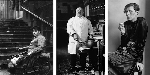
With August Sander’s portraits such as Disabled Man, Pastry Chef, or Secretary at a Radio Station, Cologne, we see an artist attempting to document—systematically—modern types of people, as a means to understand changing notions of class, race, profession, ethnicity, and other constructs of identity. Sander transforms the practice of portraiture with these sensational, arresting images. These figures reveal as much about the German professions as they do about self-image.

Cartier-Bresson’s leaping figure in Behind the Gare St. Lazare reflects the potential for photography to capture individual moments in time—to freeze them, hold them, and recreate them. Because of his approach, Cartier-Bresson is often considered a pioneer of photojournalism. This sense of spontaneity, of accuracy, and of the ephemeral corresponded to the racing tempo of modern culture (think of factories, cars, trains, and the rapid pace of people in growing urban centers).

Umbo’s photomontage The Roving Reporter shows how modern technologies transform our perception of the world—and our ability to communicate within it. His camera-eyed, colossal observer (a real-life journalist named Egon Erwin Kisch) demonstrates photography’s ability to alter and enhance the senses. In the early twentieth-century, this medium offered a potentially transformative vision for artists, who sought new ways to see, represent, and understand the rapidly changing world around them.
Early Photography: Niépce, Talbot and Muybridge
By modern standards, nineteenth-century photography can appear rather primitive. While the stark black and white landscapes and unsmiling people have their own austere beauty, these images also challenge our notions of what defines a work of art.
Photography is a controversial fine art medium, simply because it is difficult to classify—is it an art or a science? Nineteenth century photographers struggled with this distinction, trying to reconcile aesthetics with improvements in technology.
The birth of photography

Although the principle of the camera was known in antiquity, the actual chemistry needed to register an image was not available until the nineteenth century.
Artists from the Renaissance onwards used a camera obscura (Latin for dark chamber), or a small hole in the wall of a darkened box that would pass light through the hole and project an upside down image of whatever was outside the box. However, it was not until the invention of a light sensitive surface by Frenchman Joseph Nicéphore Niépce that the basic principle of photography was born.
From this point the development of photography largely related to technological improvements in three areas: speed, resolution and permanence. The first photographs, such as Niépce’s famous View from the Window at Gras (1826) required a very slow speed (a long exposure period)—in this case about eights hours—obviously making many subjects difficult, if not impossible, to photograph. Taken using a camera obscura to expose a copper plate coated in silver and pewter, Niépce’s image looks out of an upstairs window, and part of the blurry quality is due to changing conditions during the long exposure time, causing the resolution, or clarity of the image, to be grainy and hard to read. An additional challenge was the issue of permanence, or how to successfully stop any further reaction of the light sensitive surface once the desired exposure had been achieved. Many of Niépce’s early images simply turned black over time due to continued exposure to light. This problem was largely solved in 1839 by the invention of “hypo” (hyposulphite of soda), a chemical that reversed the light sensitivity of paper.

Technological improvements
Photographers after Niépce experimented with a variety of techniques. Louis Daguerre invented a new process he dubbed a daguerreotype in 1839, which significantly reduced exposure time and created a lasting result, but only produced a single image.

At the same time, Englishman William Henry Fox Talbot was experimenting with his what would eventually become his calotype method, patented in February 1841. Talbot’s innovations included the creation of a paper negative, and new technology that involved the transformation of the negative to a positive image, allowing for more that one copy of the picture. The remarkable detail of Talbot’s method can be seen in his famous photograph, The Open Door (1844) which captures the view through a medieval-looking entrance. The texture of the rough stones surrounding the door, the vines growing up the walls and the rustic broom that leans in the doorway demonstrate the minute details captured by Talbot’s photographic improvements.
The collodion method was introduced in 1851. This process involved fixing a substance known as gun cotton onto a glass plate, allowing for an even shorter exposure time (3-5 minutes), as well as a clearer image.

The big disadvantage of the collodion process was that it needed to be exposed and developed while the chemical coating was still wet, meaning that photographers had to carry portable darkrooms to develop images immediately after exposure. Both the difficulties of the method and uncertain but growing status of photography were lampooned by Honoré Daumier in his Nadar Elevating Photography to the Height of Art (1862). Nadar, one of the most prominent photographers in Paris at the time, was known for capturing the first aerial photographs from the basket of a hot air balloon. Obviously, the difficulties in developing a glass negative under these circumstances must have been considerable.
Further advances in technology continued to make photography less labor intensive. By 1867 a dry glass plate was invented, reducing the inconvenience of the wet collodion method.
Prepared glass plates could be purchased, eliminating the need to fool with chemicals. In 1878, new advances decreased the exposure time to 1/25th of a second, allowing moving objects to be photographed and lessening the need for a tripod. This new development is celebrated in Eadweard Muybridge’s sequence of photographs [pictured earlier in the chapter] called Galloping Horse (1878). Designed to settle the question of whether or not a horse ever takes all four legs completely off the ground during a gallop, the series of photographs also demonstrated the new photographic methods that were capable of nearly instantaneous exposure.
Finally in 1888 George Eastman developed the dry gelatin roll film, making it easier for film to be carried. Eastman also produced the first small inexpensive cameras, allowing more people access to the technology.
Photographers in the 19th century were pioneers in a new artistic endeavor, blurring the lines between art and technology. Frequently using traditional methods of composition and marrying these with innovative techniques, photographers created a new vision of the material world. Despite the struggles early photographers must have had with the limitations of their technology, their artistry is also obvious.
Louis Daguerre, Paris Boulevard

The daguerreotype
An early example of a “daguerreotype,” Paris Boulevard is a significant step in the development of photography. Taken in 1839 by Louis-Jacques Mande Daguerre, the photograph depicts a seemingly empty street in Paris. The elevated viewpoint emphasizes the wide avenues, tree-lined sidewalks, and charming buildings of the French capital. However, the obvious day light of the photograph begs the question – where are all the people in this normally busy city?
The answer to this question lies in the daguerreotype technique. The first photographs, such as Joseph Nicephore Niépce’s famous View from the Window at Gras, took about eight hours to expose, creating indistinct, grainy images. Daguerre was intrigued by these experiments and formed a partnership with Niépce from 1828 until the latter’s death in 1833. Daguerre continued to refine the photographic method until he developed his new process.
Chemistry
His technique consisted of exposing a copper plate coated in silver and sensitized with iodine to light in a camera, and then developed it in darkness by holding it over a pan of heated vaporizing mercury. He also developed a method of creating a permanent image by using a solution of ordinary table salt. Daguerre’s technique significantly reduced exposure time and created a lasting result that would not dim with further exposure to light, but only produced a single image. It would be up to others to produce the negatives that allowed for the production of multiple copies of an image.
A shoe shine

Daguerre’s Paris Boulevard shows the advantages of the new technique. There is far more detail than in earlier photographs. We can clearly see the panes in the windows and the sharp corners of the building in the front of the image. The objects are no longer blurry masses of light and dark, but defined and separate structures. In fact, the only thing missing are the people, except for the small figure of a man having his shoes shined at a sidewalk stand.
The remaining problem of the daguerreotype, at least by modern standards, was the long exposure time, between 10 and 15 minutes. This meant that the people hurrying along those spacious sidewalks did not register on the photograph. The man having his shoes shined, possibly the first photographic image of a person, obviously stayed still long enough to register on the image. The haunting empty, yet evocative, image of Paris Boulevard shows both how far photography had come in a short time and how much farther the technology still had to advance.
Julia Margaret Cameron, Mrs. Herbert Duckworth

The artist’s niece
Staring out over her left shoulder, neck muscles strained by the severity of her pose, Julia Margaret Cameron’s photograph Mrs. Herbert Duckworth is a striking portrait of the artist’s niece. The deep shadows emphasize the curves of her cheek and neck, throwing a large portion of the photograph into semi-darkness, while the light that shines down from the left side of the picture emphasizes the sitter’s downcast eyes, nose and mouth.
Mrs. Herbert Duckworth, one of Cameron’s most famous images, is an enduring portrait of a Victorian woman.
Only 21 at the time of the photograph, Julia Prinsep Jackson had just recently become Mrs. Duckworth when the picture was taken. A scant three years later, Mrs. Duckworth was a widow with two young children and a third on the way. Later, in 1878 she married Sir Leslie Stephen, a prominent Victorian journalist and mountaineer. Four more children were born, including daughters Vanessa Bell and Virginia Woolf who would become famous as members of the Edwardian artistic circle known as the Bloomsbury Group.
A severe portrait
The close-up focus on the face is typical of Cameron’s portrait style and can be seen in many images of the sitter by her aunt. The strong contrast of dark background and dark dress against the pale face is similarly common in Cameron’s photographs. Mrs. Duckworth’s severe, unsmiling features are also typical of the Victorian era since the exposure time then required for a photograph was several minutes, much too long to hold a smile.
Julia Margaret Pattle Cameron was born in India and married Charles Cameron in 1838. The couple returned to England in 1848 and became actively involved with an intellectual group of artists and writers that included Alfred Lord Tennyson and George Frederick Watts.
Wet collodion photography
At the age of 48, Cameron began to experiment with the collodion method of photography after receiving her first camera as a present from her daughter. Creating a collodion print was an extremely difficult and hazardous process that required working with combustible materials in almost total darkness. The collodion process involved pouring chemicals onto a glass plate negative. The plate was then inserted into the camera, and the plate exposed for three to eight minutes. After exposure, the plate was removed and immediately developed in a darkroom. It was important for the plate to remain “wet” throughout the entire process.
Cameron recorded in her memoir Annals of My Glass House (1874) that she ruined many household items running through the house carrying dripping photographic plates. Nevetheless, the collodion process was a great improvement over previous photographic methods due to the sharper images and the fact that multiple prints could be made from a single plate.
Victorian womanhood
Cameron’s artistry, skill and knowledge of the science of photography is obvious in a portrait like Mrs. Herbert Duckworth. The clear focus and dramatic pose combine with the manipulation of light and dark to create an image that is at once strong and feminine. It is a photograph that not only captures a moment in time, but also provides the viewer with an evocative image of Victorian womanhood.
A beginner’s guide to Realism
Realism and the painting of modern life

The Royal Academy supported the age-old belief that art should be instructive, morally uplifting, refined, inspired by the classical tradition, a good reflection of the national culture, and, above all, about beauty.
But trying to keep young nineteenth-century artists’ eyes on the past became an issue!
The world was changing rapidly and some artists wanted their work to be about their contemporary environment—about themselves and their own perceptions of life. In short, they believed that the modern era deserved to have a modern art.
The Modern Era begins with the Industrial Revolution in the late eighteenth century. Clothing, food, heat, light and sanitation are a few of the basic areas that “modernized” the nineteenth century. Transportation was faster, getting things done got easier, shopping in the new department stores became an adventure, and people developed a sense of “leisure time”—thus the entertainment businesses grew.
Paris transformed
In Paris, the city was transformed from a medieval warren of streets to a grand urban center with wide boulevards, parks, shopping districts and multi-class dwellings (so that the division of class might be from floor to floor—the rich on the lower floors and the poor on the upper floors in one building—instead by neighborhood).
Therefore, modern life was about social mixing, social mobility, frequent journeys from the city to the country and back, and a generally faster pace which has accelerated ever since.

How could paintings and sculptures about classical gods and biblical stories relate to a population enchanted with this progress?
In the middle of the nineteenth century, the young artists decided that it couldn’t and shouldn’t. In 1863 the poet and art critic Charles Baudelaire published an essay entitled “The Painter of Modern Life,” which declared that the artist must be of his/her own time.
Courbet

Gustave Courbet, a young fellow from the Franche-Comté, a province outside of Paris, came to the “big city” with a large ego and a sense of mission. He met Baudelaire and other progressive thinkers within the first years of making Paris his home. Then, he set himself up as the leader for a new art: Realism—“history painting” about real life. He believed that if he could not see something, he should not paint it. He also decided that his art should have a social consciousness that would awaken the self-involved Parisian to contemporary concerns: the good, the bad and the ugly.
Gustave Courbet, The Stonebreakers

Realism and reality
If we look closely at Courbet’s painting The Stonebreakers of 1849 (painted only one year after Karl Marx and Friedrich Engels wrote their influential pamphlet, The Communist Manifesto) the artist’s concern for the plight of the poor is evident. Here, two figures labor to break and remove stone from a road that is being built. In our age of powerful jackhammers and bulldozers, such work is reserved as punishment for chain-gangs.
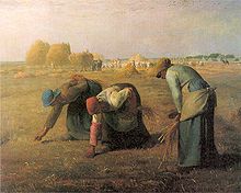
Unlike Millet, who, in paintings like The Gleaners, was known for depicting hard-working, but idealized peasants, Courbet depicts figures who wear ripped and tattered clothing. And unlike the aerial perspective Millet used in The Gleaners to bring our eye deep into the French countryside during the harvest, the two stone breakers in Courbet’s painting are set against a low hill of the sort common in the rural French town of Ornans, where the artist had been raised and continued to spend a much of his time. The hill reaches to the top of the canvas everywhere but the upper right corner, where a tiny patch of bright blue sky appears. The effect is to isolate these laborers, and to suggest that they are physically and economically trapped. In Millet’s painting, the gleaners’ rounded backs echo one another, creating a composition that feels unified, where Courbet’s figures seem disjointed. Millet’s painting, for all its sympathy for these poor figures, could still be read as “art” by viewers at an exhibition in Paris.
Courbet wants to show what is “real,” and so he has depicted a man that seems too old and a boy that seems still too young for such back-breaking labor. This is not meant to be heroic: it is meant to be an accurate account of the abuse and deprivation that was a common feature of mid-century French rural life. And as with so many great works of art, there is a close affiliation between the narrative and the formal choices made by the painter, meaning elements such as brushwork, composition, line, and color.
Like the stones themselves, Courbet’s brushwork is rough—more so than might be expected during the mid-nineteenth century. This suggests that the way the artist painted his canvas was in part a conscious rejection of the highly polished, refined Neoclassicist style that still dominated French art in 1848.
Perhaps most characteristic of Courbet’s style is his refusal to focus on the parts of the image that would usually receive the most attention. Traditionally, an artist would spend the most time on the hands, faces, and foregrounds. Not Courbet. If you look carefully, you will notice that he attempts to be even-handed, attending to faces and rock equally. In these ways, The Stonebreakers seems to lack the basics of art (things like a composition that selects and organizes, aerial perspective and finish) and as a result, it feels more “real.”
Gustave Courbet, A Burial at Ornans
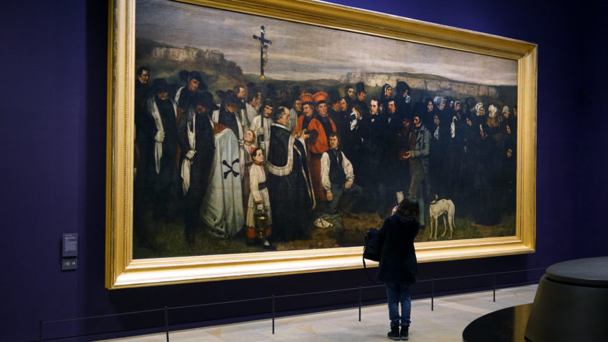
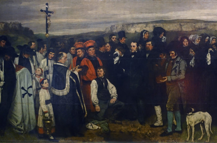
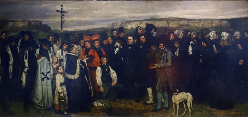
The massive canvas of Courbet’s A Burial at Ornans still surprises viewers in the Musée d’Orsay in Paris. A little over ten feet high and twenty feet across, we confront a line of over forty life-sized figures mostly dressed in black. It is a funeral, and the grave itself—a painted hole in the ground at the bottom of the canvas—lies at our feet. It is as if we have just stumbled upon these people on our way through the galleries.
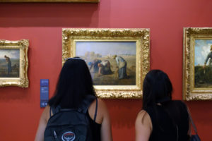
The Parisian public who attended the annual exhibitions expected to see paintings that affirmed their taste and were morally uplifting, like Thomas Couture’s enormous The Romans of the Decadence, a moralizing painting of ancient Romans luxuriating on epic scale. Images of peasants were also acceptable if they were small and in the style of the quiet laborers of Jean-François Millet’s The Gleaners. No, instead of these, Gustave Courbet shows us the middle-class citizens of a provincial town standing around a grave at a funeral.
Just a funeral
In A Burial at Ornans , Courbet defies expectations—there is no transcendence, no moment of grief and beauty as we envision the soul of the departed ascending to the heavens. Instead, we have a box (the coffin) borne by the pall-bearers on the left-hand side of the canvas with a crucifix carried beside them. A priest utters blessings over the grave, as a dog and two men in breeches stand nearby, and the mourners look about themselves while paying little attention to his words. In the background, the chalky cliffs of Franche-Comté (a region in eastern France) frame the scene with a grey sky overhead. The painter, Gustave Courbet, has shown a funeral as it really was; after all, he was the man who later said that painting “can only consist in the representation of real and existing things.”[1]
Taking a risk
In 1849, Gustave Courbet had left Paris and went home to the provincial town of Ornans, as he did every summer. This time was a little different because his maternal grandfather (a veteran of the French Revolution), had recently died. In his grandfather’s house that summer, Courbet set up a studio and began his first major work, A Burial at Ornans, painting his family and neighbors, and challenging everything about French artistic tradition.
Before A Burial at Ornans, paintings on this scale typically depicted the great and the divine. Courbet could have seen many such history paintings, such as Peter Paul Rubens’s Medici Cycle in the Louvre Museum [see Chapter 1], and he knew the rules of French art. History painting (the most noble form of art, according to this reasoning) had to show queens, gods, saints, and heroes, and these paintings never showed everyday people as the subject. Courbet did something entirely new, acknowledging the dignity of everyday citizens by depicting them on the scale (20 feet wide!) previously reserved for those who held power. When he submitted his painting of common people from the French provinces to the Paris Salon, he expected controversy.
What did he have to lose? He was thirty years old and had not yet achieved the success he craved. Up until then, most of his work had been a series of portraits and self-portraits in a more or less Romantic style that reflected the influence of earlier artists from Rembrandt van Rijn to Francisco de Zurbarán. While he had moderate success, no one would call him an important artist in Paris. Courbet, who would later call himself “the most arrogant man in France,” took a risk with A Burial at Ornans and created the work that helps to define Realism in French painting.
Who came to the funeral?
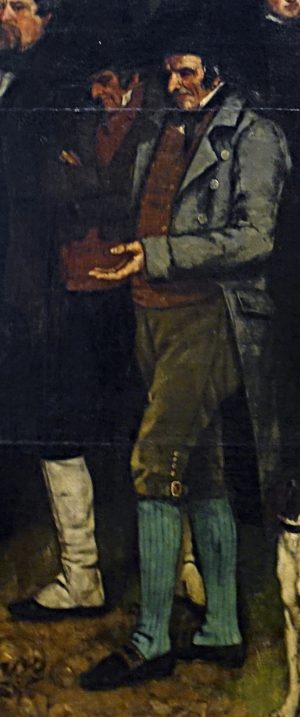
Courbet showed the mourners gathered in a new cemetery just outside of Ornans. The priest (in black, just to the left of the kneeling gravedigger) led the procession into the cemetery followed by the crucifix, the coffin, and three generations of mourners who have stopped at the graveside before the final interment. Courbet pushed all of the figures to the foreground, creating a frieze of bodies in black. A gravedigger in shirtsleeves kneels in front along with a dog that seems to have just wandered into the scene on the other side of the grave, enhancing the sense that Courbet has depicted exactly what occurred. While the painting was carefully composed and painted over time, he worked hard to make it seem as if we are witnessing life as it happened.
Who were these people attending a country funeral? The oldest generation stands closest to the grave. Those men in old-fashioned breeches represent the generation of the deceased man, Courbet’s great-uncle, who had all lived through the French Revolution of 1789.
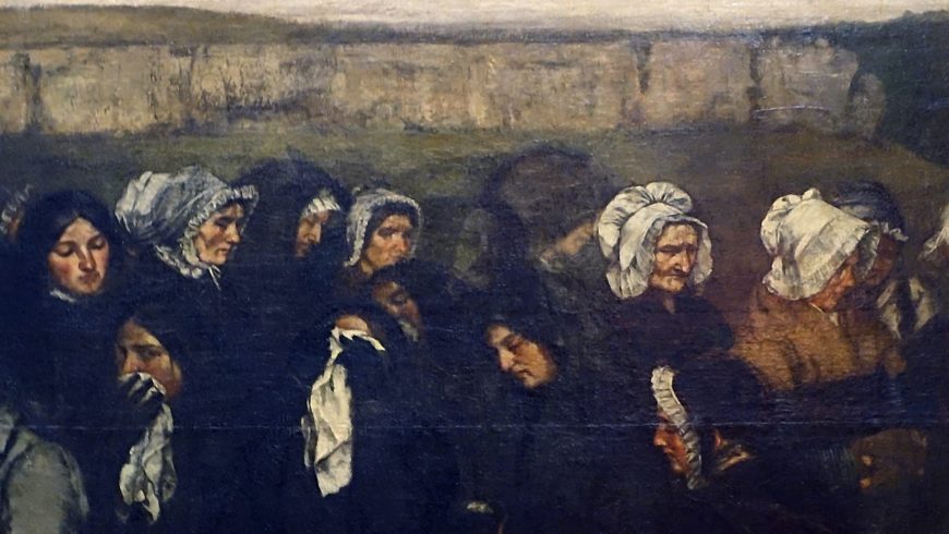
It’s possible that one of the pall-bearers at the far left represents Courbet’s maternal grandfather, M. Oudot, who had died just before Courbet began the painting. Courbet’s parents and their friends are found throughout the grouping, with his father in the top hat at the center of the group, and his mother comforting the deceased’s daughter at the far right. Among the younger generation are Courbet’s three sisters, shown with their handkerchiefs to the right. These are mostly middle-class provincial people, but kneeling near the grave is Antoine Joseph Cassard, the gravedigger. He was a skilled craftsman but he did this work at the cemetery to make extra money—like any regular citizen, a man who might be found anywhere in France.
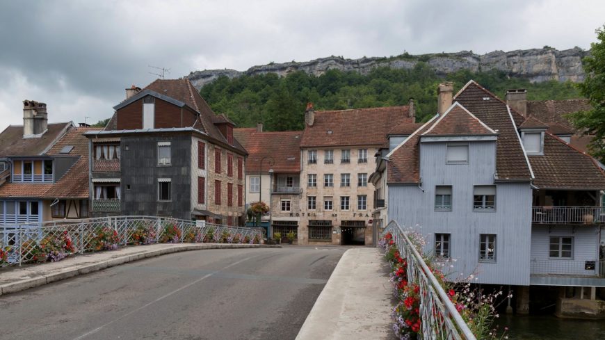
The landscape of Ornans
That striking horizontal line of figures dominating the foreground takes our attention away from the landscape in the background. Two Ornans landmarks, the cliffs of the Chateau d’Ornans and Roche du Mont, rise up on either side of the canvas. These sites and other places well-known to Courbet frequently appear in his work. The Painter’s Studio: A Real Allegory Summing Up Seven Years of My Life as an Artist serves as a reminder of the importance of landscape painting in the career of Courbet, who painted the sites around Ornans again and again, developing an excellent reputation and success as a landscape painter.
Courbet breaks the rules
When he submitted the painting to the Paris Salon of 1850–51, Courbet called it: “Painting of human figures, historical account of a burial at Ornans.” When the Parisian viewers saw it, few knew what to make of a painting that broke so many rules. Today, the work is often thought of as Courbet’s response to the Revolution of 1848 when workers rose up in Paris and other cities to insist upon the right to vote and greater access to economic power. With that in mind, A Burial at Ornans functions as a painting that raises the status of the everyday citizen to that of a monarch or god—leveling social class. For those viewers in 1850, it was a bit more complicated. Some focused on the appearance of the mourners, calling them ugly caricatures, revolting, and comical. The portraits reminded them of group caricatures of Parisian celebrities or other composite images similar to class photographs. Why, they wondered, have such specific portraits of common people in what should be a painting of a serious occasion?
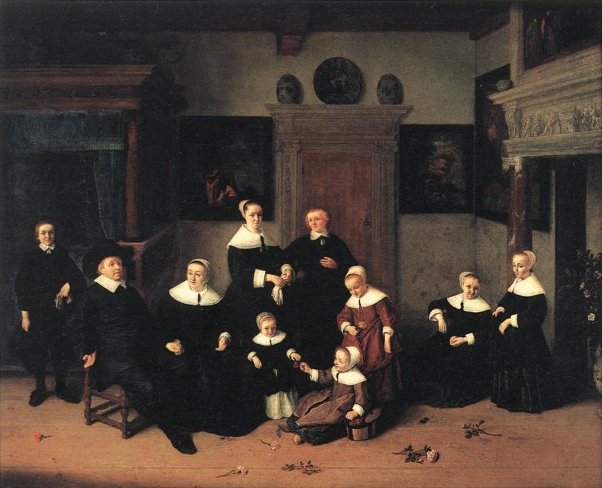
Courbet’s friends and supporters saw it differently. They understood that the painter had spent hours in galleries at the Louvre filled with Dutch and Spanish paintings from the seventeenth century, so his painting recalled the dark costumes and even the compositions of group portraits and other images by artists like Rembrandt and Frans Hals. Later writers even compared it to the lower half of El Greco’s Burial of Count Orgaz where the figures are similarly arrayed across the bottom of the canvas.
Painting reality
The impact of A Burial at Ornans was remarkable. While many artists (such as Daumier and Millet) can be considered Realists, A Burial at Ornans defined the term for most of the public and opened up new subject matter for painters. In the painting, Courbet asserted that everyone—be they the poor, the middle-class, the provincial laborer or landowner, or even the most powerful person in Paris—was a subject for the art as long as everything the artist painted reflected the realities of modern life.
Édouard Manet, Olympia
“They are raining insults upon me!”
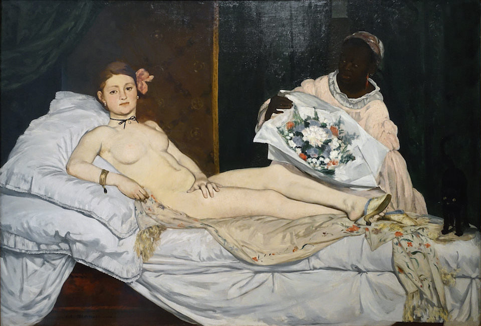
Manet’s complaint—”They are raining insults upon me!” to his friend Charles Baudelaire pointed to the overwhelming negative response his painting Olympia received from critics in 1865. Baudelaire (an art critic and poet) had advocated for an art that could capture the “gait, glance, and gesture” of modern life, and, although Manet’s painting had perhaps done just that, its debut at the salon only served to bewilder and scandalize the Parisian public.
Mocking the classical past
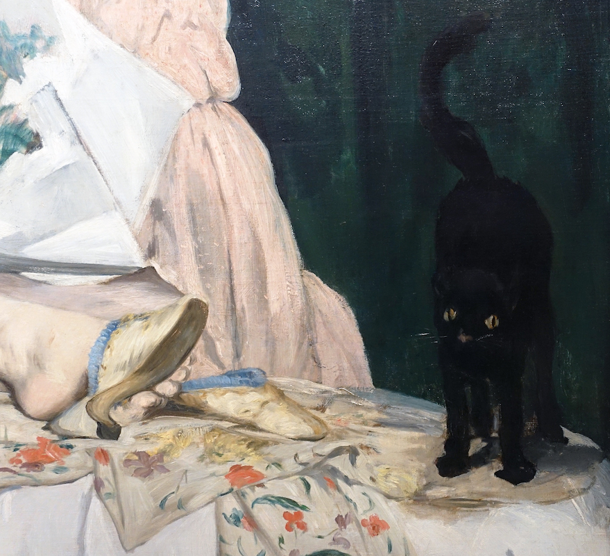
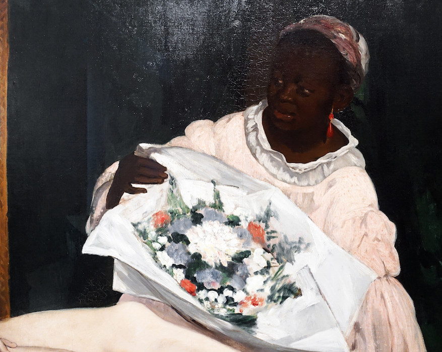
Olympia features a nude woman reclining upon a chaise longue, with a small black cat at her feet (image above), and a black female servant behind her brandishing a bouquet of flowers (image below). It struck viewers—who flocked to see the painting—as a great insult to the academic tradition. And of course it was. One could say that the artist had thrown down a gauntlet. The subject was modern—maybe too modern, since it failed to properly elevate the woman’s nakedness to the lofty ideals of nudity found in art of antiquity —she was no goddess or mythological figure. As the art historian Eunice Lipton described it, Manet had “robbed,” the art historical genre of nudes of “their mythic scaffolding…”[2] Nineteenth-century French salon painting (sometimes also called academic painting—the art advocated by the Royal Academy) was supposed to perpetually return to the classical past to retrieve and reinvent its forms and ideals, making them relevant for the present moment. In using a contemporary subject (and not Venus), Manet mocked that tradition and, moreover, dared to suggest that the classical past held no relevance for the modern industrial present.

As if to underscore his rejection of the past, Manet used as his source a well-known painting in the collection of the Louvre—Venus of Urbino, a 1538 painting by the Venetian Renaissance artist Titian (image above)—and he then stripped it of meaning. To an eye trained in the classical style, Olympia was clearly no respectful homage to Titian’s masterpiece; the artist offered instead an impoverished copy. In place of the seamlessly contoured voluptuous figure of Venus, set within a richly atmospheric and imaginary world, Olympia was flatly painted, poorly contoured, lacked depth, and seemed to inhabit the seamy, contemporary world of Parisian prostitution.
Why, critics asked, was the figure so flat and washed out, the background so dark? Why had the artist abandoned the centuries-old practice of leading the eye towards an imagined vanishing point that would establish the fiction of a believable space for the figures to inhabit? For Manet’s artistic contemporaries, however, the loose, fluid brushwork and the seeming rapidity of execution were much more than a hoax. In one stroke, the artist had dissolved classical illusionism and re-invented painting as something that spoke to its own condition of being a painted representation.

The birth of modernist painting
It was for this reason Manet is often referred to as the father of Impressionism. The Impressionists, who formed as a group around 1871, took on the mantle of Manet’s rebel status (going so far as to arrange their own exhibitions instead of submitting to the Salon juries), and they pushed his expressive brushwork to the point where everything dissolved into the shimmering movement of light and formlessness. The 20th century art critic Clement Greenberg would later declare Manet’s paintings to be the first truly modernist works because of the “frankness with which they declared the flat surfaces on which they were painted.”[3]
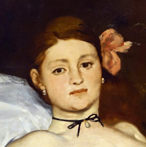
Manet had an immediate predecessor in the Realist paintings of Gustave Courbet, who had himself scandalized the Salons during the 1840s and ‘50s with roughly worked images of the rural French countryside and its inhabitants. In rejecting a tightly controlled application of paint and seamless illusionism—what the Impressionists called the “licked surfaces” of the paintings of the French Academy—Manet also drew inspiration from Spanish artists Velasquez and Goya, as well as 17th century Dutch painters like Frans Hals, whose loosely executed portraits seem as equally frank about the medium as Manet’s some 200 years later. But Manet’s modernity is not just a function of how he painted, but also what he painted. His paintings were pictures of modernity, of the often-marginalized figures that existed on the outskirts of bourgeois normalcy. Many viewers believed the woman at the center of Olympia to be an actual prostitute, coldly staring at them while receiving a gift of flowers from an assumed client, who hovers just out of sight (Manet here puns on the way French prostitutes often borrowed names of classical goddesses). The model for the painting was actually a salon painter in her own right, a certain Victorine Meurent, who appears again in Manet’s The Railway (1873) and Auguste Renoir’s Moulin de la Galette (1876).
Disturbingly familiar but startlingly new
Manet had created an artistic revolution: a contemporary subject depicted in a modern manner. It is hard from a present-day perspective to see what all the fuss was about. Nevertheless, the painting elicited much unease and it is important to remember—in the absence of the profusion of media imagery that exists today—that painting and sculpture in nineteenth-century France served to consolidate identity on both a national and individual level. And here is where Olympia’s subversive role resides. Manet chose not to mollify anxiety about this new modern world of which Paris had become a symbol. For those anxious about class status (many had recently moved to Paris from the countryside), the naked woman in Olympia coldly stared back at the new urban bourgeoisie looking to art to solidify their own sense of identity. Aside from the reference to prostitution—itself a dangerous sign of the emerging margins in the modern city—the painting’s inclusion of a black woman tapped into the French colonialist mindset while providing a stark contrast for the whiteness of Olympia. The black woman also served as a powerful emblem of “primitive” sexuality, one of many fictions that aimed to justify colonial views of non-Western societies.
If Manet rejected an established approach to painting that valued the timeless and eternal, Olympia served to further embody, for his scandalized viewers, a sense of the modern world as one brimming with uncertainty and newness. Olympia occupies a pivotal moment in art history. Situated on the threshold of the shift from the classical tradition to an industrialized modernity, it is a perfect metaphor of an irretrievably disappearing past and an as yet unknowable future.
Édouard Manet, Le déjeuner sur l’herbe (Luncheon on the Grass): A Conversation
by DR. BETH HARRIS and DR. STEVEN ZUCKER
This is the transcript of a conversation conducted at the Musée d’Orsay in Paris. To watch the video: youtube.com/watch?v=Uwpdiq9mYME.

Steven: We’re in the Musée d’Orsay, looking at Déjeuner sur l’herbe, Luncheon on the grass.
Beth: By Manet, although it didn’t originally have that title. Its first title was The Bath.
Steven: And there is really neither bathing—
Beth: (laughs)
Steven: —nor a luncheon going on. There is a woman in the distance in the water. There is some fruit and a brioche, a roll, in the foreground, so perhaps a remnant of a lunch, but that’s not what this painting is about.
Beth: But, it’s very difficult to determine precisely what this painting is about and I think that’s part of the point. The painting was exhibited, not at the official salon, sanctioned by the Royal Academy of Fine Arts, the authority for art. Instead this was exhibited at the The Salon des Refusés.
Steven: was set up by Emperor Napoleon III, because so many works of art had been excluded from the official salon. But even though this painting was in the exhibition of rejected artwork, it still caused a storm of controversy, based both on what was being portrayed, but also its painting technique, how it was portrayed.
Beth: These figures are clearly modern, Parisian figures.
Steven: And that’s the problem.
Beth: They’re not set far away in ancient Greek and Roman mythology, or set back in time. These are figures clearly wearing fashionable Parisian clothing, except of course the nude woman, which is the other part of the problem.
Steven: By placing a woman who is nude in this context, and because she’s not veiled or distanced by mythology, she’s not a nymph in a classical grove, she is actually a recognizable figure. This is Manet’s model, Victorine Meurent, and because the two men are also recognizable figures, there is an immediacy here, that creates a degree of discomfort for the viewer.
Beth: These figures don’t look idealized, they don’t look timeless, they look like actual people you would see on the streets of Paris. The other significant problem with these three figures, is that no one seems to be truly interacting. The nude female figure looks directly out at us in a gaze that is very nonchalant, and yet very direct.
Steven: Which is also breaking with tradition. In the rare instances where a nude female figure would look out toward the audience, it might be with a coy look. But here there is a figure that’s returning the viewer’s gaze.
Beth: And then we have the two male figures, the figure on the right gestures toward the figure in the center, but the figure in the center seems to gaze absently out of the painting and doesn’t seem to return the figure on the right’s gesture and conversation. And then we have this odd figure in the background, who’s spatially too large for where she should be in the middle ground.
Steven: There are all kinds of spatial problems here that Manet has built in. These are not happenstance, these are purposeful. For example, the woman in the background seems to reach down to scoop something out of the water, but in fact she seems to be reaching down to the thumb of the man in the foreground collapsing the last traces of the illusion of depth.
Beth: We also have figures who are rendered very flatly, so for example the nude female figure is not modeled with that lovely movement from light to dark that would give her a sense of three-dimensionality that is typical of representations of the female nude historically. Critics noted that she seemed to have a kind of studio lighting about her instead of the natural outdoor light of where she’s located.
Steven: There is some minor modeling around the breast, under the thigh, but for the most part she looks like she’s a flat cutout.
Beth: And even those shadows are very dark, there’s almost a sense of her being outlined in dark grays and blacks instead of the lovely, soft modeling. Overall the handling of paint, whether we’re looking at the grass in the foreground, or the meadow in the distance, it’s incredibly loosely brushed. There’s no sense of finish, and for paintings that were approved by the jury for the Royal Academy, having a painting that was really worked on, where there was no sense left of the hand of the artist, that was the priority, and Manet’s just flagrantly disregarding that.
We also have a figure who seems naked, and not nude, and that’s because we have her discarded clothing, including her hat in the foreground, and the fact that she’s wearing a kind of ribbon. So, we feel as though she’s a modern Parisian woman who has discarded her clothing, and not Venus, born nude naturally from the sea.
Steven: She’s not an allegorical figure, she’s not a mythological figure, she’s somebody who has taken off her dress.
Beth: Manet is very consciously drawing on the tradition of art history here. Steven: He understood traditional art, he had copied paintings at the Louvre.
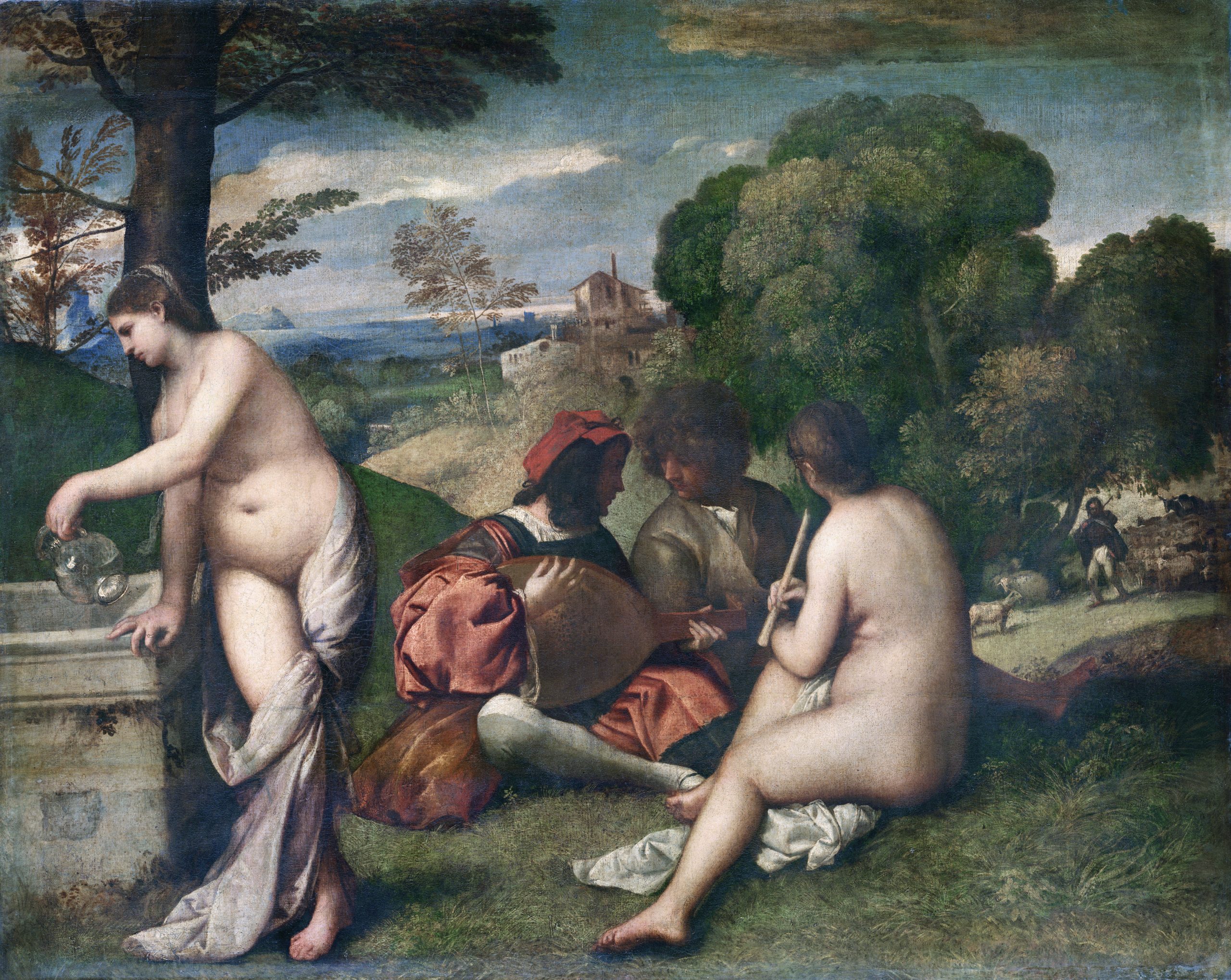
Giorgione and/or Titian, Fete Champetre (Pastoral Concert). Oil on canvas, 1509. The Louvre, Paris. Public domain.Beth: And so, this painting is based directly on at least two sources, a painting that was thought to be by Giorgione, now understood to be by Titian in the Louvre, which similarly shows two clothed male figures and two nude female figures in a beautiful landscape.
Steven: Le Déjeuner sur l’herbe is also inspired by a work by Raphael that Manet had seen through an engraved copy, showing the Judgment of Paris, and in the lower right corner of that engraving were two river gods and a nymph, and it was that composition that Manet has borrowed.

Beth: So, we can easily understand the reactions of the French public in 1863 when they went to the . In fact, Manet was cultivating their confusion. This refusal to tell a story, is a refusal to do precisely what the Academy and especially the art-going public wanted from a painting.
Steven: Manet’s teasing his viewers. He’s giving all of the indications that there’s a narrative, and yet not including that narrative, and so the subject is no longer what is being enacted but rather the act of creating a work of art itself. The choices that he’s making as an artist, to his brushwork, to his composition.
Beth: He is making a challenge to the authorities that controlled art in France, and making a strong declaration, “I am the one who “makes these decisions for my art.”
Steven: And that forceful declaration will have a tremendous impact on the development of modernism in the late 19th century, and into the 20th century.
Édouard Manet, Émile Zola: A Conversation
by DR. BETH HARRIS and DR. STEVEN ZUCKER
This is the transcript of a conversation conducted at the Musée d’Orsay in Paris. To watch the video: youtube.com/watch?v=Uwpdiq9mYME.
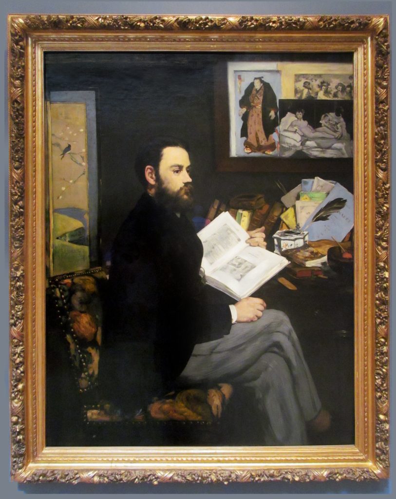
Steven: We’re at the Musée d’Orsay and we’re looking at Édouard Manet’s, portrait of Émile Zola, who is a very important 19th century novelist.
Beth: And art critic. Behind Zola is an image of Manet’s Olympia, and Olympia seems to look down at Zola. And Zola was also a friend of Cézanne’s, so Zola is an important figure in this circle. This is a really new kind of portrait, something very different than a viewer would have expected. It doesn’t give us very much information in the way that a portrait usually gives us information, that is through the face.
Steven: Well, he’s actually turned away from us.
Beth: Right.
Steven: I mean, you get a sense that he’s at his desk, at his studies and in some way. He’s turned towards us just for a moment, almost in a pause of reflection—not to look at us as if we were the camera, for instance, but we’ve sort of caught him in this odd, three-quarters view, that’s really almost a profile.
Beth: There is something that doesn’t really register emotion there. It’s not that he looks like he’s been absorbed in thought and looked up from his reading. There’s a kind of illegibility in his face. And I think that quality of not being able to read a narrative, something we see frequently in Manet’s work, we have it here in a portrait, where it’s incredibly frustrating. Especially frustrating because we want to have a sense of the person.
Steven: So we can’t read his emotions or his interior life through his face. In a sense, there’s a kind of flatness to the way the face is rendered, but look also at the book that is turned towards us. It is similarly illegible. We can’t read the text there. So the artist is forcing us away from the reading of the particular to a broader kind of reading.

Beth: It’s like the objects themselves have become more important than the figure. We have the Japanese screen behind him, so we can see that interest in the art of Japan that’s coming so much into Europe now that Japan’s been opened. We see another Japanese print in the background. We see a Velázquez print.
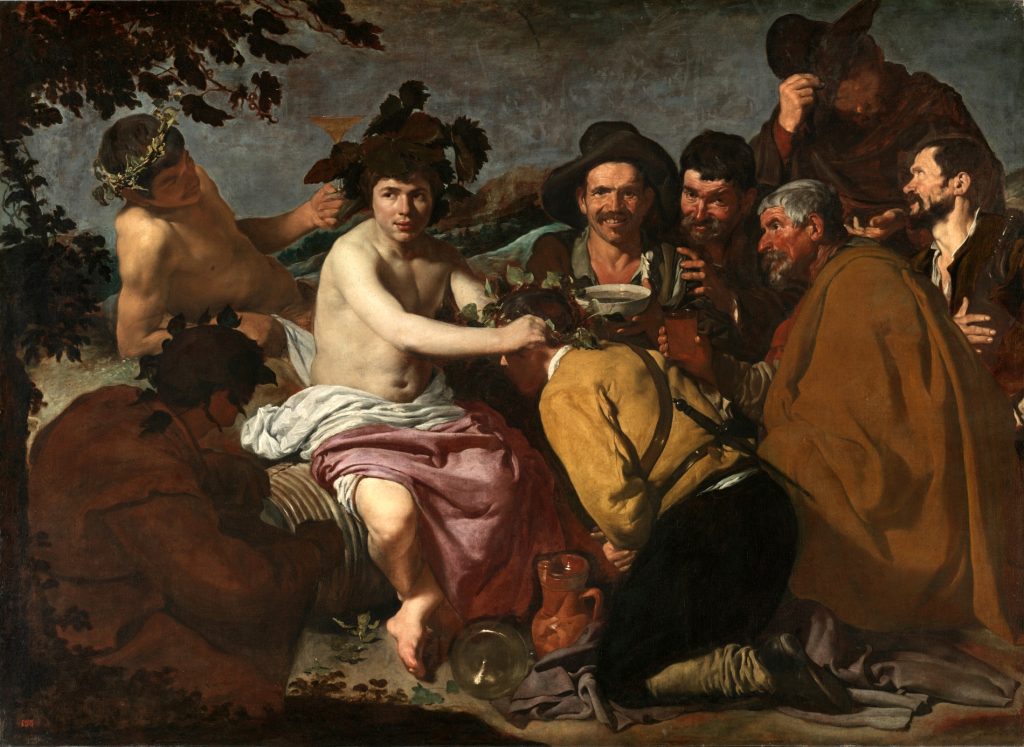
Steven: That’s right, The Drinkers, up at the top. We have a little pamphlet on Manet that Zola has written, which is also Manet’s signature. And then a lovely inkwell, which is also east Asian. I want to look at this composition for just a sec.
Beth: It’s a very, very complicated composition.
Steven: The figure is fit into a series of geometric shapes. There’s the right angle that is created by the frame. Then you have a skewed right angle from the book, which almost functions as an arrow pointing towards Zola himself. And then Zola’s body is an echoing right angle, which is echoed again by the chair, and so you have this sort of this cascade of these right angles that are moving from upper right down to lower left.
Beth: And then you get it again in the upper left, with the edge of the Japanese screen.
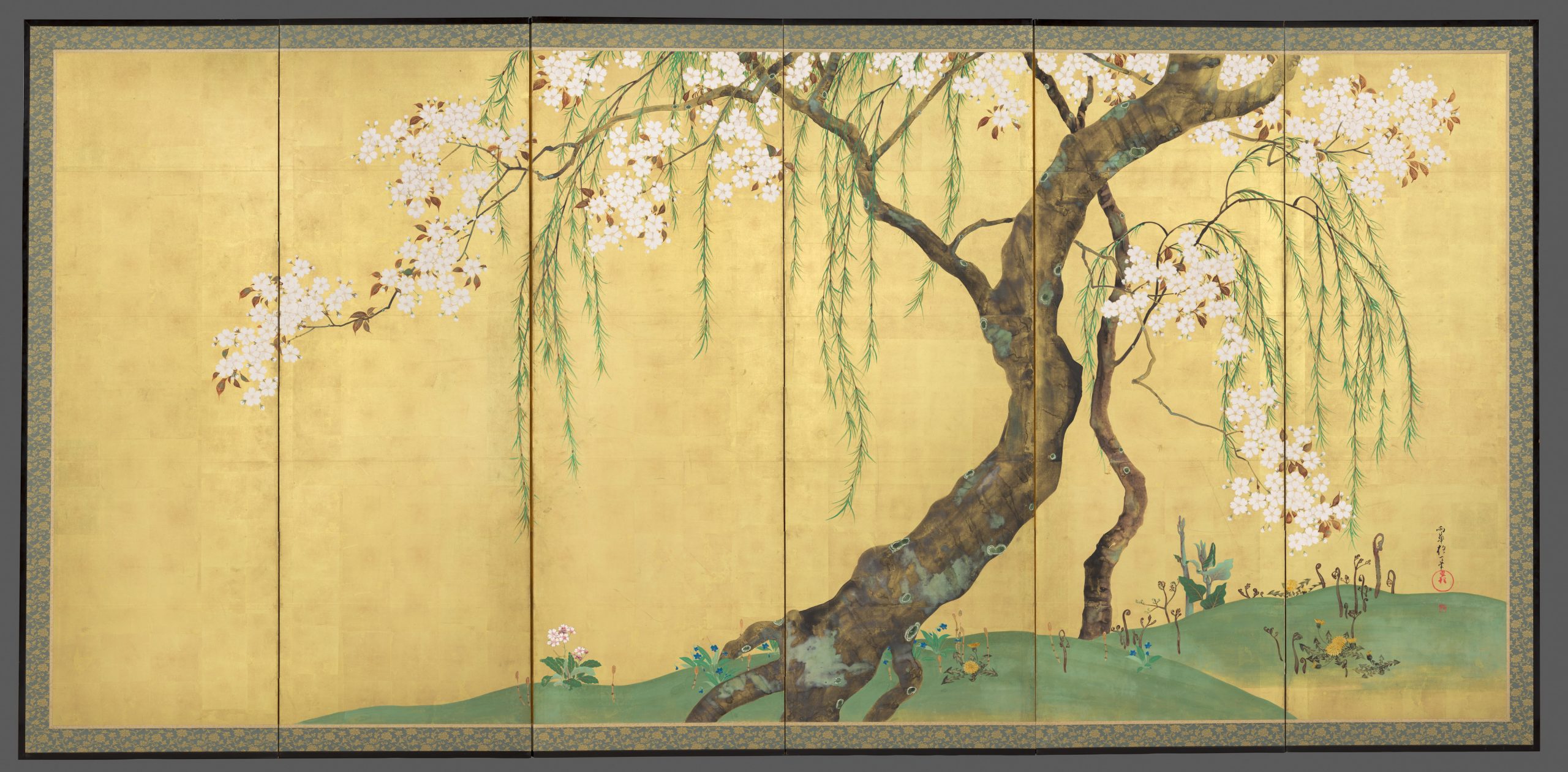
Steven: That’s right, although in the opposite direction. But yes, there is a kind of interest in the two-dimensionality, which is a reference, again, to eastern art. But that comes across also in the flattening of the face and the ways in which the jacket is so dark that you lose all of spatial definition there.
Beth: Yeah, it is very little modeling in the face. There’s little modeling in the clothing, so there is a real flatness and in fact, the space itself is very, very shallow so everything is very close to us and as you guess, there’s a kind of irony there because despite its closeness, I feel no closer to Zola.
Steven: You know, all of that paint remains paint. All of that paint is almost like a Velázquez.
Beth: Yeah, I mean look at the chair.
Steven: And if you look at the books as well. If you look at the inkwell. If you look at the feather, the quill that comes out, the tools of Zola’s trade.
Beth: There’s very much a focus on reminding us that this is paint on canvas and refusing, in a way, to do the things that paint is supposed to do. I do get a feeling of this image of a modern literary man, a portrait of a man in his age in Paris at the end of the 1860s.
Steven: In a sense, the lack of focus of Zola—and it’s such a curious thing to say, because this is a portrait of Zola—but the lack of focus on Zola, in a sense, he is leveled with the things that he finds important. The things that influence him, the things that make up his art. And so this very modern notion of Paris being a place where the world can come together, you know, where the influence of the east Asian, where the visual, the literary, where all those things mix and that art is born.
Édouard Manet, A Bar at the Folies-Bergère
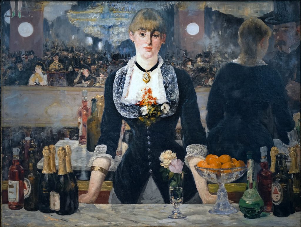
Beth: We’re in the Courtauld Gallery, looking at Manet’s Bar at the Folies-Bergère.
Steven: This is a painting that takes place in a cafe-concert, a bar with entertainment. But the entertainment was a little more circus-like than we’re used to.
Beth: You can get a sense of that in the top left corner, where we see the calves and feet of an acrobat. This was a place for middle-class entertainment that was a little grittier.
Steven: The painting at first seems very straightforward, we seem to be looking at a woman who’s looking back at us, and there’s the entertainment just behind her. But when we look a little bit more closely, you notice that what we’re seeing, in fact, is a reflection. She stands in front of a mirror.
Beth: And one of the ways I can see that most easily is by looking at the gold frame of the mirror.
Steven: The mirror is a reminder that a canvas has for so long been seen as a way of reflecting the world in a true sense. Manet’s project is to undermine that very old conceit.
Beth: And I’m reminded that we’re looking at a Manet immediately because of the gaze of the woman in the painting, which is so forthright and so direct, but at the same time so unreadable. And that reminds me of earlier paintings by Manet, like Olympia or Le dejeuner sur l’herbe. Unlike his impressionist colleagues, Manet is interested in the human figure in modern life.
Steven: And Manet, who had been such an inspiration for the Impressionists, is here also responding to the advances that they made. The openness of the brushwork in the chandelier
might remind us of Renoir’s painting of the Moulin de la Galette, for example.
Steven: At the extreme right we see the reflection of the back of the woman that we’re facing, but we also see that she is facing a male figure, who wears a top-hat, clearly a patron of this cafe-concert.
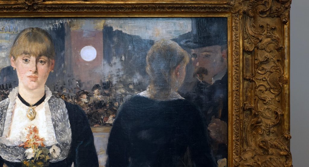
Beth: And he seems to be close to her, as though he is engaged in conversation, or asking for a drink.
Steven: And so that must be us, and at the same time, it can’t be us, because we’re looking directly at her, and the reflection is off at the side. So clearly there is some willful distortion
on the part of the artist.
Beth: We know that there is willful distortion because we also have sketches that Manet made that we can compare it to.
Steven: Manet is deliberately transforming his initial sketch in such a way as to upend our expectations of what this painting should be showing us.
Beth: This was in The Salon of 1882, and people who went to The Salon had expectations of paintings, and one of those expectations was that you could read the painting, it was legible,
you could understand your relationship as the viewer to the figures in the painting, and the relationship of the figures to one another. And Manet is confounding both of those.
Steven: Which itself can be read as an aspect of modernity. This is all taking place within a newer urban context, a new Paris that had recently been reconstructed. Where people of different classes come into contact with each other.
Beth: In the modern world, we tend to want to categorize people, it helps us to sort out the world that we live in when we’re in an urban environment. And Manet is insistently refusing to give us a type of person that we can categorize with certainty. There was already an uncertainty and a danger around women in the city. So a woman at bar would have been understood as being somewhat sexually available.
Steven: If she was alone, and certainly if she was working there. So when we take on the physical manifestation of the man with the top-hat and we look directly at her, we put ourselves in the position of the patron in this bar. The question of her availability to us is put front and center.
Beth: Is she flirting with us? Is she keeping a kind of distant reserve?
Steven: Manet has placed her firmly on the other side of a marble slab, that seems impenetrable.
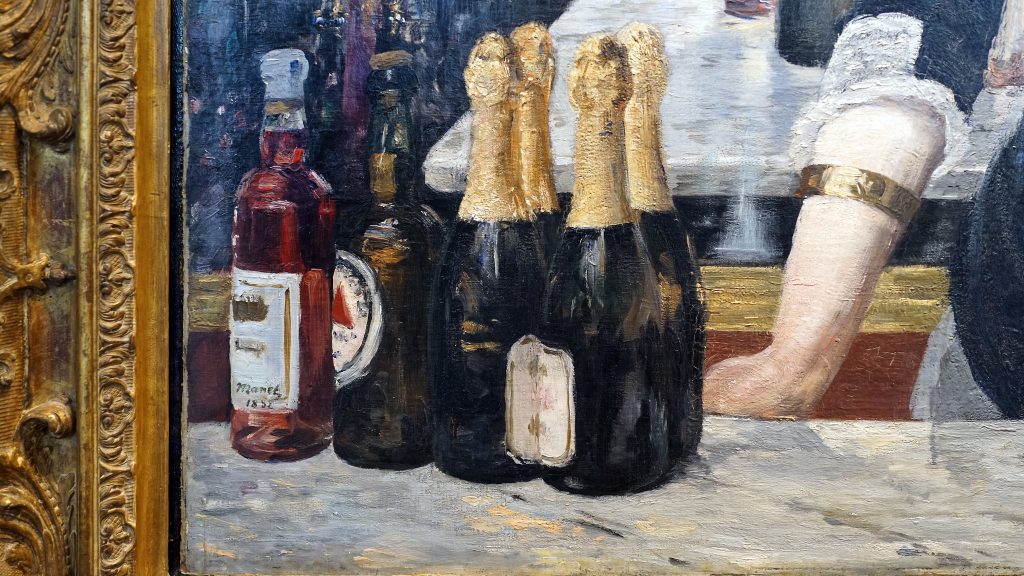
Beth: And yet, if we look at the reflection, there is a closeness there, that seems very at odds with the distance that we feel in front of the painting.
Steven: The marble bar that separates us from this woman has almost vanished in the reflection at the extreme right.
Beth: She’s unavailable to us in that sensual way, but the bottles, and the fruit, and the glasses, they’re painted in an incredibly sensual way.
Steven: So Manet is denying us a closeness that we see in the reflection behind us all across the cafe, where we see couples mingling.
Beth: It makes us uncomfortable. What is our relationship? What will this interaction be like when we approach her and ask for a drink?
Steven: Look at her eyes; they seem to be at odds with the representation of the mouth. The mouth seems to have a little bit of sneer to it, where the eyes feel sadder.
Beth: In the sketch, she stands with her hands clasped in front of her torso, but in the final painting Manet made her lean forward slightly by placing her hands on that bar. And although that makes us expect her to be a little bit closer to us, there still seems to be a distance in her torso. So again that tension between distance and closeness.
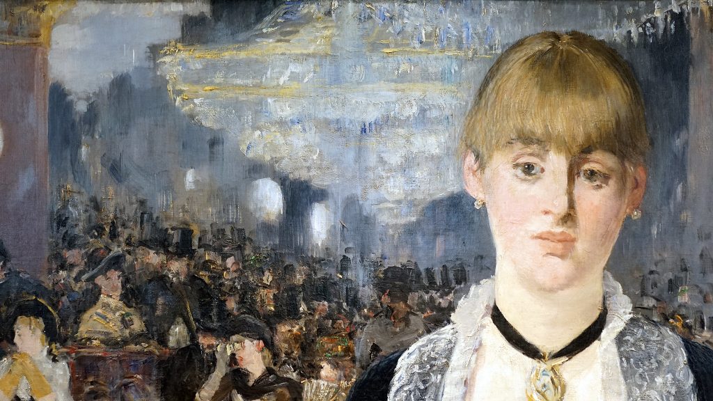
Steven: Manet shows his virtuosity, not only in the face, but also in the two blossoms right before us. Or, for instance, in the cut glass which has the fruit.
Beth: Manet, as usual, is drawing our attention to the fact that this is paint on a canvas, an image which is flat. He’s denying that desire for an illusion of reality that was also such an important expectation of The Salon goer. There is some passages, especially in the reflection, where all we are seeing is just touches of blacks, and grays, and browns, and beiges, a quick loose handling of paint that is a metaphor, I think, for the dynamism and the sense of movement and energy in the new modern city of Paris.
Articles in this chapter:
- Dr. Juliana Kreinik, “An Introduction to Photography in the Early 20th Century,” in Smarthistory, August 9, 2015
- Rebecca Jeffrey Easby, “Early Photography: Niépce, Talbot and Muybridge,” in Smarthistory, August 9, 2015
- Dr. Rebecca Jeffrey Easby, “Louis Daguerre, Paris Boulevard,” in Smarthistory,” in Smarthistory, August 9, 2015
- Dr. Beth Gersh-Nesic, “A beginner’s guide to Realism,” in Smarthistory, August 9, 2015
- Dr. Beth Harris and Dr. Steven Zucker, “Gustave Courbet, The Stonebreakers,” in Smarthistory, August 9, 2015
- Dr. Claire Black McCoy, “Gustave Courbet, A Burial at Ornans,” in Smarthistory, October 1, 2017
- Dr. Tom Folland, “Édouard Manet, Olympia,” in Smarthistory, December 9, 2015
- Dr. Beth Harris and Dr. Steven Zucker, “Édouard Manet, Le déjeuner sur l’herbe (Luncheon on the Grass),” in Smarthistory, November 21, 2015
- Dr. Beth Harris and Dr. Steven Zucker, “Édouard Manet, Émile Zola,” in Smarthistory, November 23, 2015
- Dr. Beth Harris and Dr. Steven Zucker, “Édouard Manet, A Bar at the Folies-Bergère,” in Smarthistory, October 1, 2017
- Gustave Courbet, letter of December 25, 1861, as quoted in Linda Nochlin, Realism and Tradition in Art, 1848–1900: Sources and Documents (New Jersey: Prentice Hall, 1966, p, 35) ↵
- Eunice Lipton, “Manet: A Radicalized Female Imagery,” Artforum (March, 1975) ↵
- Clement Greenberg, “Modernist Painting,” in The Collected Essays and Criticism, Volume 4: Modernism with a Vengeance, 1957-1969 (University of Chicago Press, 1995), p. 86. ↵
the material(s) from which a work of art is made
a photographic image (on paper, glass, or later synthetic materials) with inverted values and and from which a positive photograph could be printed
from the French, forward guard, a term borrowed from the military to describe risk-takers, those leading the charge culturally
visually beautiful; also (usually plural) referring to the branch of philosophy concerned with beauty, especially absent of personal meaning or usefulness
from the Latin for dark chamber, a small hole in the wall of a darkened box that would project an upside-down image of the outside world
clarity of an image
an early positive photographic technology named for its inventor, Frenchman Louis Daguerre
a style of representation that perfects or makes "ideal" the subject's features, proportions, etc., in accordance with prevailing beauty standards
a technique of representing distance that replicates the eye's perception of farther objects as hazier and bluer
actual, three-dimensional shape (or the illusion of three-dimensionality)
the organization of elements within a work of art
artwork whose subject matter focuses on scenes from the real or mythological past, often with a moral message and dramatic staging
a representation that exaggerates physical features or scenarios, often for comedic or political effect
lines that define the borders of a shape
in linear perspective, the point at which the orthogonals converge
the control and occupation of one nation by another
an impressive display of skill
