First class
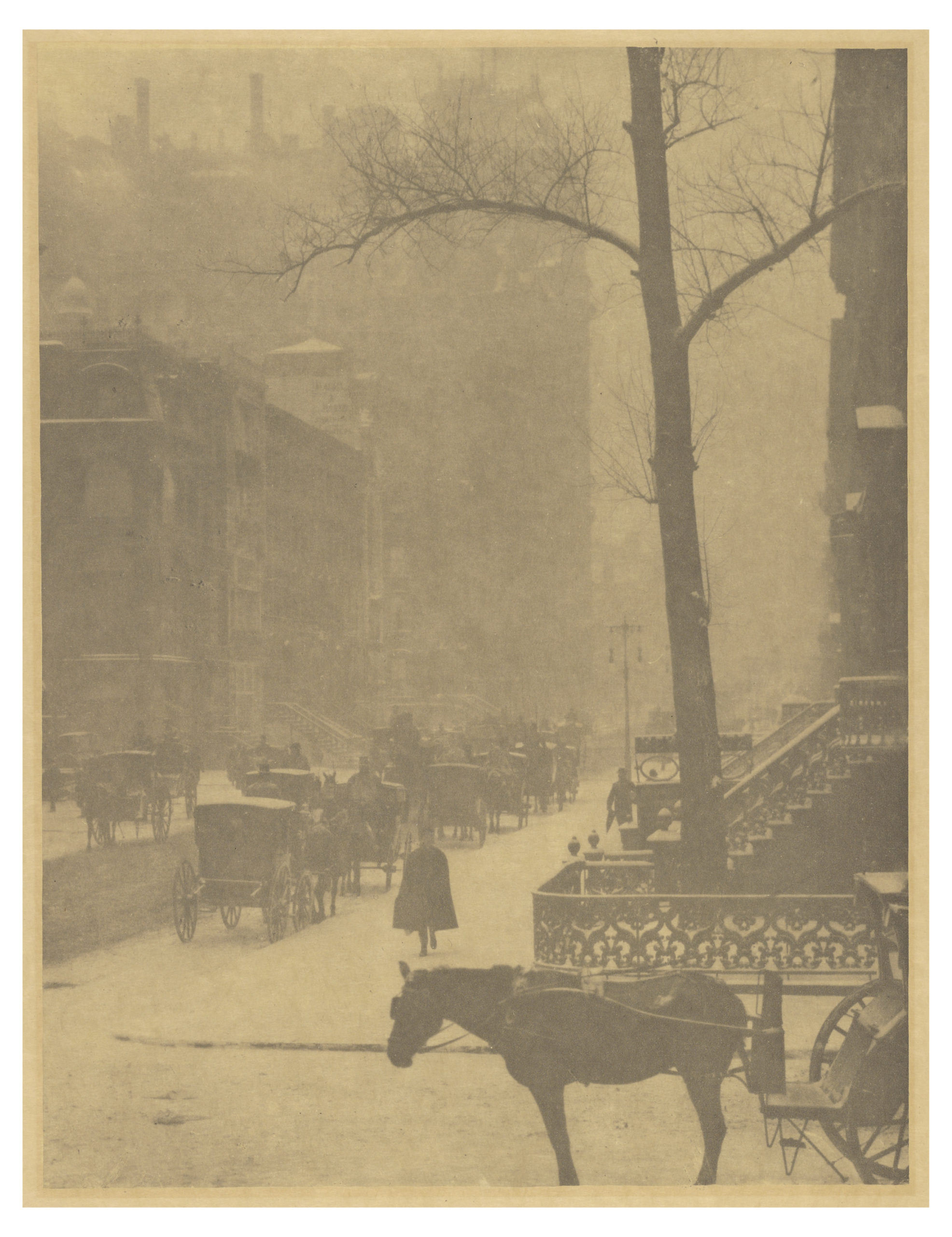
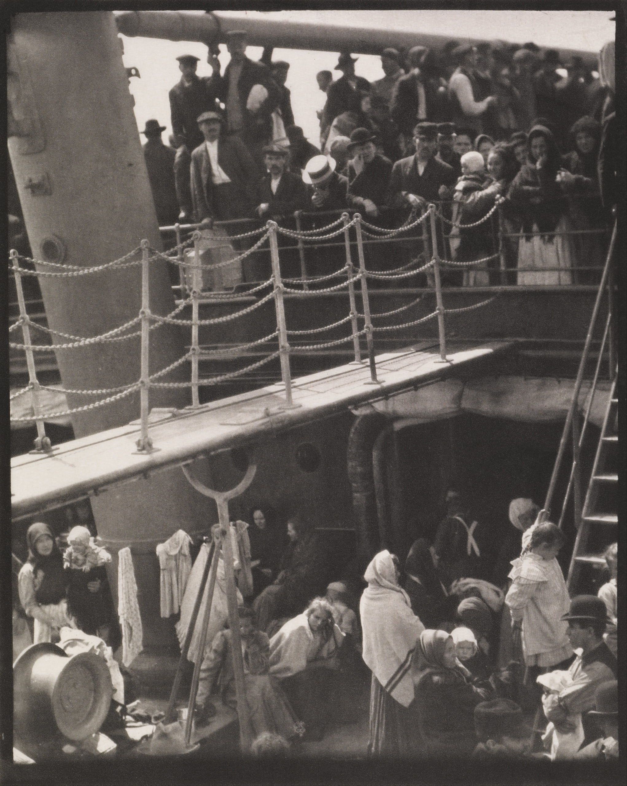
After his 8-year-old daughter Kitty finished the school year and he closed his Fifth Avenue art gallery for the summer, Alfred Stieglitz gathered her, his wife Emmeline, and Kitty’s governess for their second excursion to Europe as a family. The Stieglitzes departed for Paris on May 14, 1907, aboard the first-class quarters of the fashionable ship Kaiser Wilhelm II.
Although Emmeline looked forward to shopping in Paris and to visiting her relatives in Germany, Stieglitz was anything but enthusiastic about the trip. His marriage to status-conscious Emmeline had become particularly stressful amid rumors about his possible affair with the tarot-card illustrator/artist Pamela Coleman Smith. In addition, Stieglitz felt out of place in the company of his fellow upper-class passengers. But it was precisely this discomfort among his peers that prompted him to take a photograph that would become one of the most important in the history of photography. In his 1942 account “How The Steerage Happened,” Stieglitz recalls:
How I hated the atmosphere of the first class on that ship. One couldn’t escape the ‘nouveau riches.’ […]
On the third day out I finally couldn’t stand it any longer. I had to get away from that company. I went as far forward on the deck as I could […]
As I came to the end of the desk [sic] I stood alone, looking down. There were men and women and children on the lower deck of the steerage. There was a narrow stairway leading up to the upper deck of the steerage, a small deck at the bow of the steamer.
To the left was an inclining funnel and from the upper steerage deck there was fastened a gangway bridge which was glistening in its freshly painted state. It was rather long, white, and during the trip remained untouched by anyone.
On the upper deck, looking over the railing, there was a young man with a straw hat. The shape of the hat was round. He was watching the men and women and children on the lower steerage deck. Only men were on the upper deck. The whole scene fascinated me. I longed to escape from my surroundings and join these people.
In this essay, written 35 years after he took the photograph, Stieglitz describes how The Steerage encapsulated his career’s mission to elevate photography to the status of fine art by engaging the same dialogues around abstraction that preoccupied European avant-garde painters:
A round straw hat, the funnel leading out, the stairway leaning right, the white drawbridge with its railings made of circular chains—white suspenders crossing on the back of a man in the steerage below, round shapes of iron machinery, a mast cutting into the sky, making a triangular shape. I stood spellbound for a while, looking and looking. Could I photograph what I felt, looking and looking and still looking? I saw shapes related to each other. I saw a picture of shapes and underlying that the feeling I had about life. […] Spontaneously I raced to the main stairway of the steamer, chased down to my cabin, got my Graflex, raced back again all out of breath, wondering whether the man with the straw hat had moved or not. If he had, the picture I had seen would no longer be. The relationship of shapes as I wanted them would have been disturbed and the picture lost.
But there was the man with the straw hat. He hadn’t moved. The man with the crossed white suspenders showing his back, he too, talking to a man, hadn’t moved. And the woman with a child on her lap, sitting on the floor, hadn’t moved. Seemingly, no one had changed position.
[…It] would be a picture based on related shapes and on the deepest human feeling, a step in my own evolution, a spontaneous discovery.
Hindsight
With this account, Stieglitz argues with the benefit of more than three decades of hindsight that The Steerage suggests that photographs have more than just a “documentary” voice that speaks to the truth-to-appearance of subjects in a field of space within narrowly defined slice of time. Rather, The Steerage calls for a more complex, layered view of photography’s essence that can accommodate and convey abstraction. (Indeed, later photographers Minor White and Aaron Siskind would engage this project further in direct dialogue with the Abstract Expressionist painting.)
Stieglitz is often criticized for overlooking the subjects of his photograph in this essay, which has become the account by which the photograph is discussed in our histories. But in his account for The Steerage, Stieglitz also calls attention to one of the contradictions of photography: its ability to provide more than just an abstract interpretation, too. The Steerage is not only about the “significant form” of shapes, forms and textures, but it also conveys a message about its subjects, immigrants who were rejected at Ellis Island, or who were returning to their old country to see relatives and perhaps to encourage others to return to the United States with them.
Ghastly conditions
As a reader of mass-marketed magazines, Stieglitz would have been familiar with the debates about immigration reform and the ghastly conditions to which passengers in steerage were subjected. Stieglitz’s father had come to America in 1849, during a historic migration of 1,120,000 Germans to the United States between 1845 and 1855. His father became a wool trader and was so successful that he retired by age 48. By all accounts, Stieglitz’s father exemplified the “American dream” that was just beyond the grasp of many of the subjects of The Steerage.
Moreover, investigative reporter Kellogg Durland traveled undercover as steerage in 1906 and wrote of it: “I can, and did, more than once, eat my plate of macaroni after I had picked out the worms, the water bugs, and on one occasion, a hairpin. But why should these things ever be found in the food served to passengers who are paying $36.00[1] for their passage?”
Still, Stieglitz was conflicted about the issue of immigration. While he was sympathetic to the plight of aspiring new arrivals, Stieglitz was opposed to admitting the uneducated and marginal to the United States of America—despite his claims of sentiment for the downtrodden. Perhaps this may explain his preference to avoid addressing the subject of The Steerage, and to see in this photograph not a political statement, but a place for arguing the value of photography as a fine art.
Charles Demuth, I Saw the Figure 5 in Gold
Precisionism

Charles Demuth is known as a Precisionist, and many of his paintings apply the fractured visual language of cubism and the dynamism of futurism to distinctive American places like cities and factories. In the 1920s, Precisionists like Demuth, Charles Sheeler, and others were called the “Immaculates” because of the smooth surfaces, clean lines, and meticulous geometry of their images. In this vein, Demuth painted the church tower and rooftops of Provincetown, Massachusetts in After Sir Christopher Wren, 1920, the brand new grain elevators in his hometown of Lancaster, Pennsylvania in My Egypt, 1927, and New York City in I Saw the Figure 5 in Gold, 1928.
From poem to painting
I Saw the Figure 5 in Gold was inspired by the poem, “The Great Figure,” written by Demuth’s friend, William Carlos Williams:
Among the rain
and lights
I saw the figure 5
in gold
on a red
firetruck
moving
tense
unheeded
to gong clangs
siren howls
and wheels rumbling
through the dark city.
Williams’ poem recalls a night when he was walking down Ninth Avenue in New York City on his way to painter Marsden Hartley’s studio. He heard the noises of a fire truck, only to turn around just as it was passing by. All he saw was the number of the truck, a five painted in gold, on a red background speeding past. At this moment in his career Williams was trying to create poems that were precise and concrete representations of original experiences, so he avoided symbolism and metaphor in favor of simple language that evokes the speed (“moving tense unheeded”), the sounds (“gong clangs siren howls and wheels rumbling”), and the images (rain, lights, firetruck, dark city) he witnessed. Reportedly, Williams wrote this one-sentence poem right there on the street that night.

Williams’ poetry is deliberately straightforward, but Demuth’s painting is complicated. You really must know the poem to decode the painting. The setting is a tunnel-like street, which is flanked by sidewalks and buildings. Much of this backdrop is gray and black, but for the illuminated shop windows and globular streetlamps on both sides. The fire engine dominates the middle of the composition and although its form is abstracted we can recognize it by its red color. We can see the truck’s ladder on the right, and a long bar stretches across the bottom of the truck, which resembles an axle with two wheels or roaring sirens. The little curved lines that radiate from those sirens or wheels can indicate sound, motion, or both.

Picturing motion
Demuth divided the picture plane into rectangles and triangles, which refract light and change the color of space and shapes. The diagonal lines force your eyes to race around as you try to understand the image. That identifying number five repeats very clearly three times in the center of the composition. The fives get larger as they surge into the foreground (or smaller as they recede into the background), and in the upper right corner you can glimpse the curve of a fourth five as it leaves the surface of the picture and enters your space. The echoing numbers evoke the fire truck as it races toward you and past. Demuth’s painting, with its prismatic chards of space and color and the recurring number five, visualizes the motion and mystery of Williams’ experience in a futurist way. It collapses an extended period of time onto one still canvas.

Poster portraits: symbolic and witty
In addition to representing Williams’ poem, Demuth designed I Saw the Figure 5 in Gold as a portrait of Williams. It is one of at least eight “poster portraits” that Demuth completed during the 1920s. All are abstract or symbolic representations of Demuth’s friends, which contain oblique references to their subjects’ identity instead of depicting them in bodily form. In I Saw the Figure 5 in Gold, Demuth included Williams’ initials, W.C.W., at the bottom of the composition. His nickname Bill is cropped at the top, and his middle name Carlos emanates from a skyscraper in the distance (with the “s” on the end hidden behind another structure). These references to Williams are not terribly obvious, though, and they only make sense if you already know to associate Williams with this painting.
The poster portraits function as graphic advertisements for their sitters, but they also included puns or inside jokes that encode Demuth’s friendship with his subjects in more subtle ways. Carlos, which is how Demuth addressed Williams, consists of yellow dots like the light bulbs on an illuminated theater sign, making Williams into a Broadway star. Bill is high in the sky, as if on a billboard above a building, and is a pun on the word “bill,” which can mean poster or ad. Like I Saw the Figure 5 in Gold, the poster portraits that Demuth made of his friends and fellow artists Georgia O’Keeffe and Arthur Dove incorporate their signature subject matter—fruits, plants, and landscapes—and their names, written in popular 1920s commercial fonts and bold colors.

O’Keeffe’s portrait practically shouts the letters of her last name, which people were always misspelling. Here Demuth is telling her (and us) that he knows her well enough to remember how many Es and Fs to include. In his poster portrait, Dove’s scythe has a red ribbon tied around it, a reference to his partner, the painter Helen Torr, who was known to friends as “Reds.” These witty details personalize the images, but only make sense if you know a bit about Demuth and his friends, which is perhaps why critics were slow to appreciate the cleverness of the poster portraits.
Symbolic portraiture as a modernist tactic

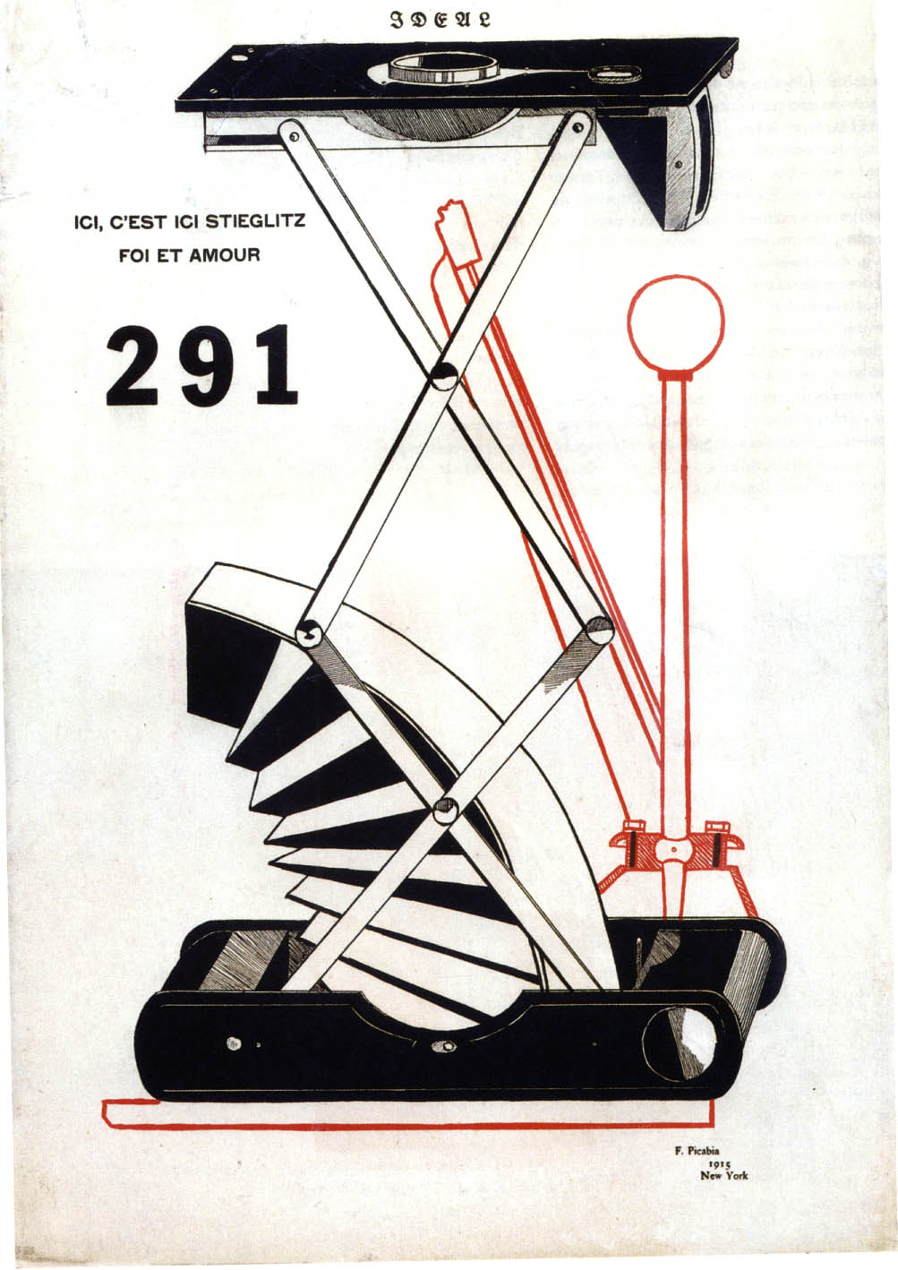
Symbolic or abstract portraiture was in vogue in Demuth’s day. Writer Gertrude Stein made word portraits of her friends, and Francis Picabia and Arthur Dove caricatured photographer and dealer Alfred Stieglitz as parts of a camera. Images like Marsden Hartley’s Portrait of a German Officer, 1914, a painted collage of symbols like flags, chessboards, and parts of a military uniform, are also important precedents for Demuth’s project. As modernists, all of these artists made works that are conceptually complicated, visually abstract, and exciting responses to the challenge of being innovative in the early twentieth century.
Georgia O’Keeffe (1887–1986): Heilbrunn Timeline of Art History Essay
By LISA MESSINGER, Department of Modern and Contemporary Art, The Metropolitan Museum of Art
For seven decades, Georgia O’Keeffe (1887–1986) was a major figure in American art. Remarkably, she remained independent from shifting art trends and stayed true to her own vision, which was based on finding the essential, abstract forms in nature. With exceptionally keen powers of observation and great finesse with a paintbrush, she recorded subtle nuances of color, shape, and light that enlivened her paintings and attracted a wide audience. Her primary subjects were landscapes, flowers, and bones, explored in series over several years and even decades. The images were drawn from her life experience and related either generally or specifically to places where she lived.
Born in 1887 near Sun Prairie, Wisconsin, O’Keeffe received art training at the Art Institute of Chicago school (1905), the Art Students League of New York (1907–8), the University of Virginia (1912), and Columbia University’s Teachers College, New York (1914–16). She became an art teacher and taught in various elementary schools, high schools, and colleges in Virginia, Texas, and South Carolina from 1911 to 1918. During this period, she produced a remarkable series of charcoal drawings that led her art—and her career—in a new direction. These daring works of 1915–16 (50.236.2) orchestrated line, shape, and tone into abstract compositions. It was through these drawings that O’Keeffe came to the attention of the prominent photographer and New York gallery owner Alfred Stieglitz in January 1916. After supposedly exclaiming, “At last, a woman on paper!” he exhibited her drawings at the 291 gallery, where the works of many avant-garde European and American artists and photographers were introduced to the American public.
With his encouragement and promise of financial support, O’Keeffe abandoned teaching and arrived in New York in June 1918, to begin a career as an artist. From then until his death in 1946, Stieglitz vigorously promoted her work in twenty-two solo exhibitions and numerous group installations. The two lived together almost immediately, and were married in 1924. The ups and downs of their personal and professional relationship were recorded in Stieglitz’s celebrated photographs of O’Keeffe (1997.61.12), taken over the course of twenty years (1917–37). As a new member of the Stieglitz circle, she associated with some of America’s most distinguished early modernists—painters such as Arthur Dove, John Marin, Marsden Hartley, and Charles Demuth, and photographers such as Paul Strand and Edward J. Steichen, as well as influential art critics and writers. Their discussions about art, and the example of their work, both validated and influenced O’Keeffe’s own work.
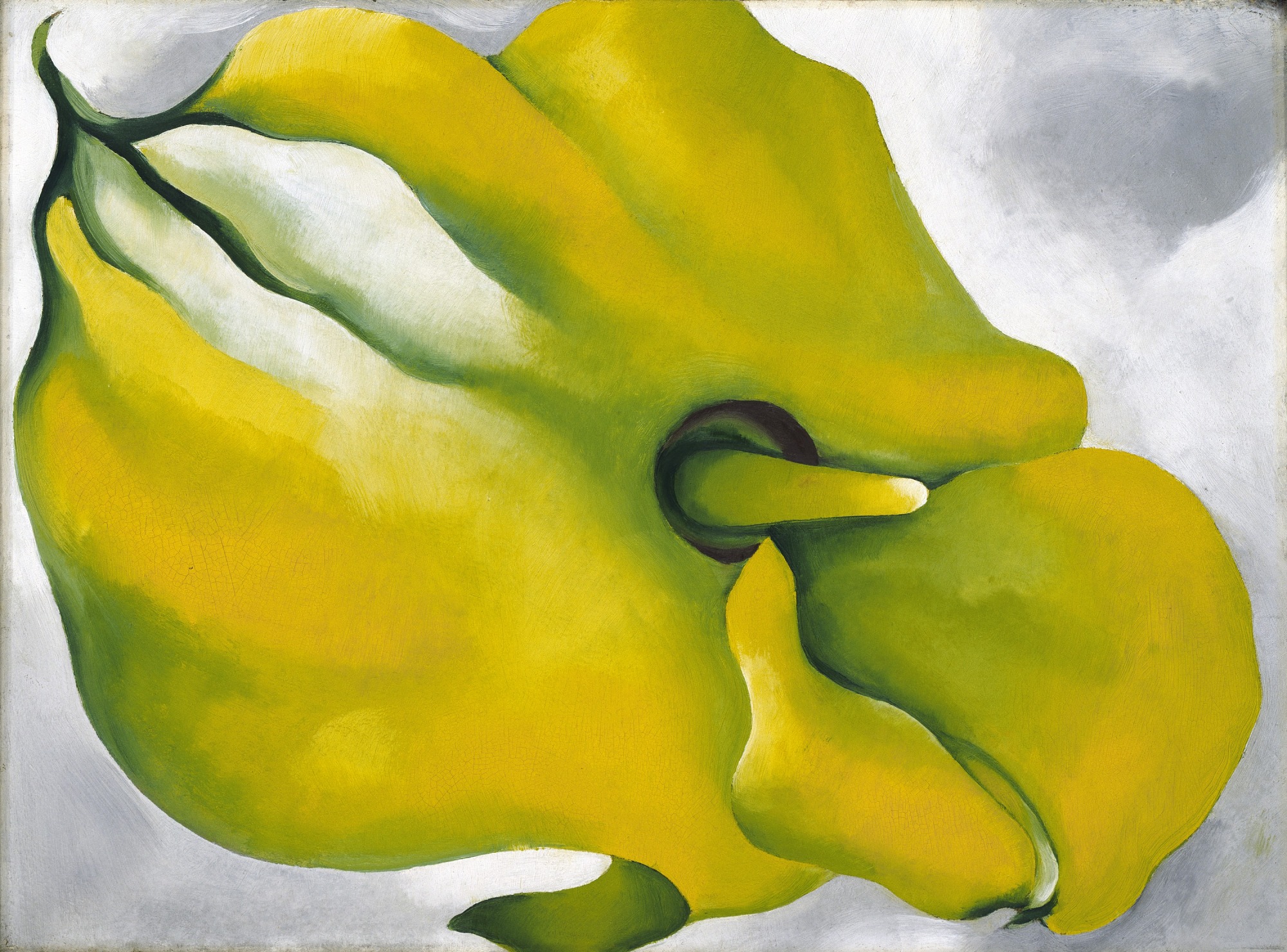
During the 1920s, O’Keeffe painted a series of architectural pictures that dramatically depict the soaring skyscrapers and aerial views of New York City. But most often, she painted landscapes and botanical studies that were inspired by annual trips to the Stieglitz family summer home in Lake George, New York. In her magnified close-ups of flowers (69.278.1), begun in 1924, O’Keeffe brings the viewer right into the picture. Enlarging the tiniest petals to fill an entire 30 x 40 inch canvas emphasized their shapes and lines and made them appear abstract, when in fact they were based on her observations of nature. Such daring compositions helped establish O’Keeffe’s reputation as an innovative modernist.
Toward the end of the decade, the strains of dealing with the New York art world, her growing boredom with Lake George, and her deteriorating relationship with Stieglitz took their toll on her physical and emotional health. In response, she made her first extended trip to New Mexico in 1929. It was a visit that had a lasting impact on her life, and an immediate effect on her work. Over the next twenty years, from 1929 to 1949, she made almost annual trips to New Mexico, staying up to six months there, painting in relative solitude, then returning to New York each winter to exhibit the new work at Stieglitz’s gallery. This pattern continued until she moved permanently to New Mexico in 1949.
There, O’Keeffe found new subjects to paint in the sun-bleached animal bones and the rugged mountains that dominate the terrain. Two of her earliest and most celebrated Southwestern paintings—Cow’s Skull: Red, White, and Blue (52.203) and Cow’s Skull with Calico Roses (Art Institute of Chicago) from 1931—exquisitely reproduce a skull’s weathered surfaces, jagged edges, and irregular openings. Rather than signifying death, O’Keeffe said that the bones symbolized the eternal beauty of the desert. Later, she painted fanciful canvases that combined skeletal objects and landscape imagery in the same composition (59.204.2). The results were provocative and unsettling, and the odd juxtapositions and discrepancies in size and scale led some to call these works surreal. Between 1943 and 1945, she also explored another variation on the bone theme in her large series of Pelvis pictures, which focused on the contrasts between convex and concave surfaces, and solid and open spaces (61.565.36).
Although the desert bones of New Mexico had initially sparked O’Keeffe’s imagination, it was the region’s majestic landscape, with its unusual geological formations, vivid colors, clarity of light, and exotic vegetation, that held her attention for more than four decades. Often she painted the rocks, cliffs, and mountains in dramatic close-up, just as she had done with her flower subjects. One of her favorite settings was a site she nicknamed the “Black Place” (59.204.1), which she interpreted both panoramically and in tight views emphasizing the ragged juncture of two hills.
O’Keeffe eventually owned two homes north of Santa Fe—the first, her summer retreat at Ghost Ranch, was nestled beneath 700-foot cliffs and looked out to the flat-topped Pedernal in the distance, while the second, used as her winter residence, was in the small town of Abiquiú. While both locales provided a wealth of imagery for her paintings, one feature of the Abiquiú house—the large walled patio with its black door—was particularly inspirational. In more than thirty pictures between 1946 and 1960 (Black Door with Red, Chrysler Museum of Art, Norfolk, Virginia), she reinvented the patio into an abstract arrangement of geometric shapes.
From the 1950s into the 1970s, O’Keeffe traveled widely around the world, making trips to the Far East, Southeast Asia, India, the Middle East, and Europe. Flying in airplanes inspired her last two major series—aerial views of rivers (It Was Blue and Green, Whitney Museum of American Art, New York), and expansive paintings of the sky viewed from just above the clouds (Sky Above Clouds IV, Art Institute of Chicago). In both series, as well as in the later patio door pictures, O’Keeffe increased the size of her canvases, sometimes to mural proportions, reflecting perhaps her newly expanded view of the world. The seven works in her Sky Above Clouds series (1962–65) are the most dramatic of her later years. When in 1965 she successfully translated this motif to a monumental canvas measuring 24 feet in length (with the help of assistants), it was an enormous challenge and a special feat for an artist nearing eighty years of age.
The last two decades of the artist’s life were relatively unproductive as ill health and blindness hindered her ability to work. When she died in 1986 at age ninety-eight, her ashes were scattered over the New Mexico landscape she had loved for more than half a century. Her rich legacy of some 900 paintings has continued to attract subsequent generations of artists and art lovers who derive inspiration from these very American images.
Jacob Lawrence, The Migration Series: A Conversation
Click to watch the video: https://www.youtube.com/watch?v=ZLC8xRNcJvE
[Dr. Zucker] We’re in The Phillips Collection in Washington, D.C., and we’re looking at a series of small paintings by Jacob Lawrence.
[Dr. Harris] This is actually a series of paintings. There are 60 of them. Half are here in The Phillips Collection. The other half are in the Museum of Modern Art.
[Dr. Zucker] Actually, MoMA has the even numbers and The Phillips has the odd numbers. And that was an arrangement that the artist agreed to because these were so sought after.
[Dr. Harris] He was young when he painted these, and so it’s a remarkable achievement for a very young artist.
[Dr. Zucker] And they document one of the most important historical events in American history, the migration of African Americans from the agricultural South into the industrial North at the end of the 19th and especially in the first half of the 20th century. So what precipitated this was not only the extreme racism and Jim Crow Laws in the South, but also a dearth of labor in the North. That is, northern industrial companies had jobs to fill.
[Dr. Harris] Six million people are estimated to have moved during these waves of migrations. And Lawrence’s family is one of them.
[Dr. Zucker] So people moved to New York just like Lawrence’s family did, but people also moved to Chicago, to St. Louis, to Pittsburgh, to all these industrial centers.
[Dr. Harris] You have to imagine that life was really bad in the South for people to pick up, take all their belongings, move their families, and there must have been the hope of a much better life in the North. And I think there was in many cases, but there was also significant hardship—
[Dr. Zucker] And racism in the North, as well.
[Dr. Harris] And the great thing about this series is that Lawrence captures the complexity of what happened to people’s lives when they moves.
[Dr. Zucker] And he does that not only by this brilliant use of color and very stark composition using tempera on hard board, but he also does it through his titling, which is almost a kind of poem that weaves its way throughout these images.
[Dr. Harris] When we look at the paintings, we see geometric shapes, we see flat areas of color. And there’s something spare about both the words and the images that’s a big part of their power.
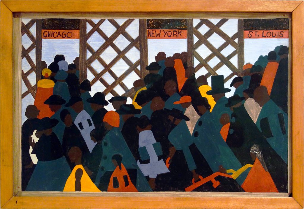
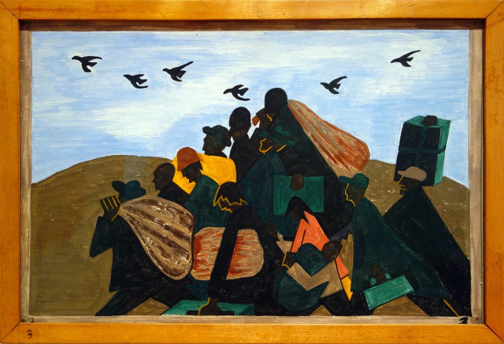
[Dr. Zucker] Well he was weirdly careful when he produced this. He had done a tremendous amount of research at the Schomburg Center in Harlem. This entire series really is about movement, it really is about change. The very first panel and the very last panel have to do with train stations and the movement of people. Let’s take a look at this image.
[Dr. Harris] This is one of my favorites, because one really has a palpable sense of the effects of racism and discrimination.
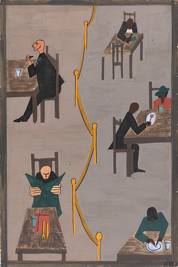
[Dr. Zucker] We have this gold barrier. You have this rope that separates the people on the right from the people on the left in a spare field, which is upended. We’re fusing linear perspective, giving us this exterior bird’s eye view.
[Dr. Harris] That gray background is entirely flattened. The figures are silhouetted in these dark colors. There’s a real sense of isolation between the figures.
[Dr. Zucker] Well the figures on the left, the whites, are really separate. The figure at the top left is facing away from the people on the other side of the barrier.
[Dr. Harris] And he looks rather haughty to me, in the way that he looks up and out.
[Dr. Zucker] And the man below him is clutching his newspaper, ignoring the place setting before him, and he seems to be completely lost in his own thoughts. But more than that, because of the size of his hands, he seems to be almost clutching that newspaper, defiantly refusing to acknowledge anybody else in his environment.
[Dr. Harris] There’s a real economy to everything here in terms of the shapes and the lines, and yet there’s so much expressiveness.
[Dr. Zucker] And because Lawrence makes the figure on the upper right so small, we get a real sense of distance and a sense of the isolation of that figure. Look at the way that the artist leads our eye from top to bottom. Our eye falls down with a kind of increasing momentum. And he brings us almost like a pinball machine back and forth, zigzagging, following the line of the barrier, but also alternating between the figures on either side of that barrier.
[Dr. Harris] And if we follow that barrier down all the way to the lower right, look how much we can tell about that figure from such economy of form. We can tell that this is a female figure,
that she’s older. Lawrence has painted her head lower than her shoulders, so she seems stooped over the table as she eats her food.
[Dr. Zucker] And the hat that she wears covers her so completely, her head is almost that of a bell. It’s interesting that the white figures are the only people who have their facial features depicted. The African Americans are given form and personality really by the contours of their bodies.
[Dr. Harris] I feel so much more sympathy for the figures on the right, for the African American figures. Those figures on the left really do seem aloof and almost menacing.
[Dr. Zucker] What’s fascinating is that Lawrence is bringing a visual vocabulary that is clearly well-versed in modernism to a subject that in the United States really is an expression of the modern condition of this modern migration of industrialization, of real upheaval.
[Dr. Harris] And by the vocabulary of modernism, you’re referring to the flatness of the forms, the reductiveness that we see here. But we normally think about modernism as dispensing the subject matter with narrative.
[Dr. Zucker] And yet here, subject matter is beautifully woven into these stark images.
Ben Shahn, The Passion of Sacco and Vanzetti
Ben Shahn: activist and artist

Ben Shahn said, “I hate injustice. I guess that’s about the only thing I really do hate.” Born in Lithuania (then part of the Russian Empire) in 1898, Shahn grew up in a family of leftist political activists. When Shahn was only four years old, his socialist father was exiled to Siberia because the Russian government suspected he was a revolutionary. Shahn remembered launching his own sort of protest as a child when he would shout “Down with the Czar!” at anyone wearing a uniform. As he recalled, “the air [in Russia] was filled with this whole revolutionary idea.”[2]
In 1906, the whole family immigrated to New York and, like many fellow Eastern European Jews, settled in Brooklyn. As an adult, Shahn called himself “the most American of all American painters” because he “came to America and its culture and was sort of swallowing it by the cupful.”[3] Apart from his love of baseball and chewing gum, Shahn’s Americanism lies in his Social Realist style. In that vein, he made paintings, prints, photographs, and drawings that address problems like racism, poverty, and oppression. His works are often critical of American life, but by exposing social problems, Shahn hoped to inspire reform.
The Sacco and Vanzetti case

One of Shahn’s most enduring subjects was prompted by the arrest, trial, and execution of Nicola Sacco and Bartolomeo Vanzetti. Sacco, a shoemaker, and Vanzetti, a fish seller, were accused of murdering two men during an armed robbery at a factory in Braintree, Massachusetts in 1920. After seven years of legal battles, Sacco and Vanzetti were executed just after midnight on August 23, 1927. Sacco and Vanzetti’s plight was a cause célèbre—a sensational case that captured the attention of millions of people around the world, many of whom protested against the convictions.

The case against Sacco and Vanzetti was troubled from the start by ethnic bigotry and political intolerance. Both men were Italian immigrants, drawn to the United States by the promise of freedom and democracy. But upon arrival, poverty and poor working conditions propelled them toward the radical communist and anarchist thinking of Luigi Galleani. The Galleanisti, as his followers were called, believed that capitalism was an evil economic system that disadvantaged workers to the point of desperation and that violence would be the most effective revolutionary strategy. Sacco and Vanzetti’s association with such a militant political group, along with their participation in labor strikes and evasion of the World War I military draft in 1917, placed them on the federal government’s watch list of dangerous subversives.
The trail of evidence that led police to arrest Sacco and Vanzetti for the Braintree murders was extraordinarily weak. Their fingerprints did not match those collected at the crime scene and the stolen money (over $15,000) was never found. Though both men owned guns, ballistic analysis never connected the bullets found at the crime scene with Sacco and Vanzetti’s weapons. Eyewitnesses to the murders did not credibly identify either suspect; in some cases, witnesses were coerced into giving false testimony. The prosecutor built on a general perception that Italians—especially Italian anarchists—were ruthless, murderous criminals bent on overthrowing the United States government. He argued that Sacco and Vanzetti appeared suspicious when arrested, that they lied during questioning, and the jury agreed and convicted them for the murders. Two men imprisoned for other offenses, Joe Morelli and Celestino Madeiros, later confessed to the Braintree crimes, but Sacco and Vanzetti’s prosecutors never followed up on their claims.
Outrage and irony in The Passion of Sacco and Vanzetti

Shahn followed Sacco and Vanzetti’s case closely and believed, like many people around the world, that the two men were not given a fair trial. Shahn participated in protests in support of their release in the 1920s and made twenty-three images about the Sacco and Vanzetti affair in 1931 and 1932. Many of these, including the gouache Bartolomeo Vanzetti and Nicola Sacco (1931-32) were based on photographs that appeared in newspapers. He returned to the Sacco and Vanzetti case in drawings and prints in the 1950s and used The Passion of Sacco and Vanzetti as part of the composition for a large mosaic at Syracuse University in 1967.
In Shahn’s early and iconic tempera-on-canvas painting, Sacco and Vanzetti lie in coffins in the foreground in front of a colonnaded neoclassical courthouse (image left). On the porch behind them hangs a portrait of the trial judge, Webster Thayer. Towering over Sacco and Vanzetti are the members of the committee that reviewed their convictions: Samuel Stratton, the president of MIT; Lawrence Lowell, Harvard’s president; and Robert Grant, a retired judge. These four men represent the wealthy, intellectual Massachusetts establishment, which was openly hostile to the radical ideals that Sacco and Vanzetti embodied.
Shahn used irony in this painting as a way of indicting Thayer, Stratton, Lowell, and Grant for the roles they played in Sacco and Vanzetti’s execution. In the background, Thayer raises his right hand as if he is taking an oath to uphold justice, but he faces a lamppost that resembles the bundle of sticks known as a fasces (image below). Once known as a symbol of judicial power, the fasces became a symbol for Italian fascism and oppression in the 1920s. Indeed, Thayer’s bias against immigrants and political radicals was widely known. He presided over Sacco and Vanzetti’s initial conviction and denied all motions for retrial. In response to public outcry, Lowell and his two cohorts were tasked with reviewing the proceedings and summarily upheld Sacco and Vanzetti’s convictions and death sentences after only ten days of deliberation.

Shahn explained in a 1944 interview, “Ever since I could remember I’d wished that I’d been lucky enough to be alive at a great time—when something big was going on, like the Crucifixion. And suddenly realized I was! Here I was living through another crucifixion. Here was something to paint!”[4] The term “passion” in his title connects Sacco and Vanzetti’s deaths with Jesus’s martyrdom (the “Passion of Christ” refers to the period at the end of his life leading to the crucifixion). Shahn also painted in tempera, a matte medium that was used by Italian Renaissance artists for Christian panel paintings, but rarely by modernists in the twentieth century. His composition hearkens back to images of the Lamentation of Christ, but his mourning scene lacks the emotional force that typically accompanies Jesus’ death and burial. The three men in the foreground, Stratton, Lowell, and Grant, wear expressions that communicate placid resolve rather than sorrow. They seem uncomfortable and awkwardly crowded together in Shahn’s painting as they half-heartedly offer white lilies, symbols of goodness and purity, to the deceased. Here Shahn forces these men to bear witness to the injustice that they refused to prevent.
That Shahn’s The Passion of Sacco and Vanzetti is eerily devoid of any kind of genuine, heartfelt anguish or grief amplifies the tragedy of the men’s deaths.
Shahn’s long career


Shahn’s career took off in the 1930s as his brand of realism resonated during the Great Depression when American audiences demanded that art communicate directly and serve a social purpose. Works like his photograph and painting of striking miners from Scotts Run, West Virginia (1935 and 1937) chronicled that decade’s challenges and contributed to President Franklin D. Roosevelt’s New Deal efforts to use art to help the nation weather the crisis.
From the 1940s until his death in 1969, as Abstract Expressionism came to the fore in the United States, Shahn’s style evolved and his works became more symbolic, expressionistic, and even surreal. But he continually strove to portray dramatic, but universal human experiences like tragedy and survival in Liberation (1945), Age of Anxiety (1953), and the Lucky Dragon series (1960-62) with empathy and sincerity. The commitment to social justice that he established so clearly in The Passion of Sacco and Vanzetti persisted throughout his career.
Dorothea Lange, Migrant Mother: A Conversation
Dr. Steven Zucker and, Assistant Curator, Los Angeles County Museum of Art (LACMA)
Watch the video here: https://www.youtube.com/watch?v=Ae1n1JQ0wKc
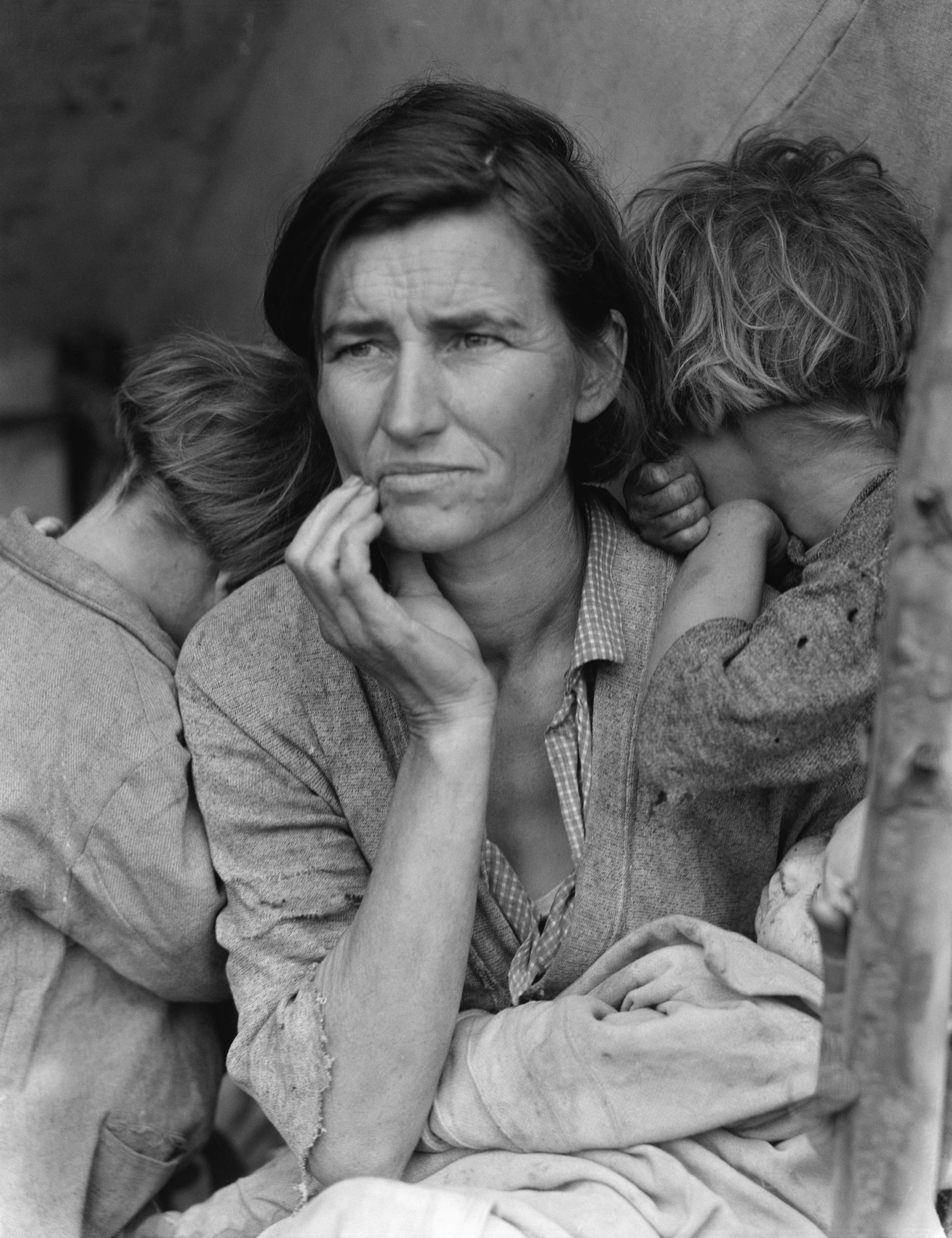
[Steven Zucker] We’re in the LACMA Study Center for Photography and Works on Paper, looking at one of the most famous images in American history, Migrant Mother. This is a photograph that was taken by Dorothea Lange during the Dust Bowl, during the Depression.
[Eve Schillo] And the Great Depression was instigated by a financial crisis, but there was also an agricultural crisis, which was the overplanting that happened in the Midwest, and those fields became nonfertile, and dust bowls were created. So that entire farming community was at risk, simultaneous to the rest of the United States seriously spiraling because of the stock market crash. Florence Owens Thompson was a migrant worker, which meant, as it does today, that she moved to areas where the picking was. In this case, in Northern California, when Dorothea Lange was visiting a pea picker camp.
[Steven] It’s hard to overstate the drama of this moment at its height in 1932, just four years before this photograph was taken, 25% of Americans were unemployed, 1/4 of the work force.
[Eve] Many of the migrant workers that came to California were those that had to leave the Dust Bowl, famously referred to as Okies, because most of them were from Oklahoma and surrounding regions.
[Steven] And that was a derogatory term that was applied to these migrant workers by people who already lived in California.
[Eve] They were nearly destitute, making a trek west, but Florence Owens Thompson came west with her husband prior to the Dust Bowl. So when Dorothea and Florence cross paths, Dorothea Lange is on assignment by the Resettlement Administration, which eventually became what is known as the Farm Security Administration. Both of those entities were run by the US government, and it was the Roosevelt New Deal that put forth many of these new policies.
[Steven] So we’re seeing an overlay of two stories. A larger economic and political story, but also a very deeply personal biographical story.
[Eve] We have available to us through the Farm Security Administration records all the iterations of the photo shoot she had on the fly, on the road, just outside this pea picker camp. She was lucky to find Florence there, because there was a freeze overnight, and Florence was there because she was not working. But you can see the options that she had to tell an empathetic tale, a realistic tale. Any photographic image inherently carries a wealth of truth to the viewer that is not necessarily an actual fact. It’s a creation of the photographer’s. So she has waited for that moment, for Florence to be gazing rather forlornly into the distance, and the two children huddled by her side.
[Steven] And if you look closely, you can just make out a third child, a baby at her breast. And so she is literally framed by these children who depend on her.
[Eve] During the Depression, in the cities, it was very obvious with the food lines and the worker’s strikes that there was a lot of strife, and everyone was suffering. What wasn’t really known was the migrant worker and small farming endeavors, and so the object was to paint a picture and make sure that they were also taken care of during this time.
[Steven] So this raises an issue which is central to the identity of photography. Does photography document? And can photography be fine art as well?
[Eve] I think both. She obviously could have chosen to have distance. That would be more of a document, because you have more context. What she’s chosen to do is create her own narrative, the story of the caring mother who is carrying the weight of the world, her many children.
[Steven] And that close lens, that creates an intimacy that makes me even more empathetic. And it’s important to remember that the 1930s, in the first years of the New Deal, was a moment when people could starve in the United States, where social programs were just now being put into place as a kind of social safety net.
[Eve] So Dorothea Lange is on assignment. She’s been given a directive by Roy Stryker. He assigned her very broad topics. Cooking, sleeping, praying, and socializing, and then you see what she produced. And that goes to your point about a document versus a fine art photograph, and one can be both.
[Steven] But this is art that was meant to move us emotionally. It was meant to rally support for the work that the government was doing. And this photograph did have immediate impact. It was reproduced almost immediately in newspapers in San Francisco and Sacramento, and the pea pickers who were on the edge of starvation were given aid
[Eve] And then it just became an image that was everywhere. We had someone to be empathetic about that allowed us to feel emotional about the situation, but yet hopeful.
[Steven] Dorothea Lange really succeeded. She was trying to produce an image that would capture this particular woman, but would also create a universal symbol, and she was so successful that it has become the image that comes to mind first when we think of the Dust Bowl, when we think of the Great Depression, when we think of migrant labor.
[Eve] When we think of America pulling itself out of troubles, too. It reminds me also of Dorothea’s background, which is a third generation American. She was able to go to Columbia in New York and study photography, but she also had a lot of personal problems, she suffered from polio. She has a great quote, when she refers to her ailment, which left her with a pretty serious limp. “It formed me, guided me, instructed me, “helped me, and humiliated me. I never have gotten over it, and I’m aware of the force and power of it.”
[Steven] It does seem to me that somebody who’ve suffered polio might have a kind of highly developed empathy, and that empathy seems to have informed photographs like this. This image has come to represent migratory labor in the United States during the Depression, but the story is actually a little more complicated than that. The subject of this photograph was at the heart of a larger story of migration. She was Cherokee. And the reason that she had been born in Oklahoma is most likely because of the forced migration of Cherokees from the Southeastern United States early in the 19th century into what was then known as Indian Territory, this we call the Trail of Tears. And so, although this photograph is understood to represent the migrations of the 1930s, it also represents the migrations of the 1830s.
[Eve] It’s to be questioned how this would have been perceived if the title of this image was not as anonymous as Migrant Mother.
Grant Wood, American Gothic: A Conversation
By Dr. Steven Zucker and Dr. Beth Harris
Click to watch the video: https://www.youtube.com/watch?v=vk2GvyNmYD0

Dr. Steven Zucker: So how do you approach a painting that is so famous, that has become an icon of a nation?
Dr. Beth Harris: We’re looking at Grant Wood’s American Gothic from 1930, which more than any other painting has come to represent America and Middle America and small-town America for many people. Wood said that this was a father and a daughter, but we know that the models were his dentist and his sister.
Dr. Steven Zucker: It’s as contested as our nation is. It has as many readings as we have ideas about what our country is.
Dr. Beth Harris: So in some ways it depends on which side of the political spectrum you’re on. If you’re a city person, you think that he’s mocking the people who live in the Midwest, and if you’re a Midwesterner, you think, oh, he’s one of us, and he captured who we are.
Dr. Steven Zucker: Although the opposite could also be true. The Easterners, perhaps, looked at these Iowans represented in this painting, and said, “Ah, that’s what they’re like.” And the Iowans sometimes looked at this and we’re worried they were being mocked.
Dr. Beth Harris: There’s a lot of meaning in this painting.
Dr. Steven Zucker: Okay, so we can look at it at face value at its most simplified and see this farmer, see, perhaps, as the artist said, his daughter, standing before their simple farmhouse.
Dr. Beth Harris: So there’s a sense of hard-working, practical people, a kind of conservative aspect of America. There’s something archaic here.
Dr. Steven Zucker: Everything in this painting does seem homemade. The carpenter Gothic house in back of them, the apron that the woman wears, his overalls, everything seems as if it could have been made by these people. This is 1930, and the United States is an intensely industrial culture. And even by Iowa standards, this painting is a very archaic image. But the quality that is most present here for me is the confrontation with these figures. They stand right up in front of us. We’re not sure what he’s going to say. But I do get the sense that his face is about to change, and he’s either going to open up with a smile, or there is going to be something fairly stern coming from him.
Dr. Beth Harris: It’s hard to read him, actually. And I’m not sure that he’s looking directly at us. But whether he is stern or kind seems to really be indeterminate. And she looks off at something we can’t see, something outside of the space of the painting.
Dr. Steven Zucker: In fact, that ambiguity, I think, is pervasive throughout this painting. I think it’s one of the reasons this painting is, in fact, so powerful, and has become such a symbol of the American heartland because people can see in it what they want.
Dr. Beth Harris: I think it helps to know something about Grant Wood himself. He grew up on a really remote farm in a remote part of Iowa with his two brothers and sister and his parents. He was really isolated. His father was very strict. He didn’t really fit in with his family. He had a kind of softer, more artistic side to him than the masculine side of his brothers and his father, and he was very close to his mother. His father died young. So a complicated biography that I think does make its way into this painting.
Dr. Steven Zucker: Well, he is a complex figure. Sometimes we think of him as a kind of two-dimensional figure, an Americanist, a Regionalist, the American scene, that is, somebody who painted from the heartland. These were his people. Grant Wood, along with Thomas Hart Benton, and a number of other artists, are establishing what they’re calling Regionalism, what others call American scene painting. That is, a figurative tradition of the Middle West that speaks to American values. But he was a much more complex figure.
Dr. Beth Harris: He spent a lot of time in Paris as did most artists of his generation, painting in a semi-impressionist style. He also spent time in Munich. So he wasn’t quite as American as our idea of him, or the idea that this painting gives us.
Dr. Steven Zucker: In fact, art historians link the kind of hard-edged style and the change from Impressionism to his having absorbed the influence of early Northern Renaissance painters like Van Eyck and Memling, and perhaps also the Neue Sachlichkeit of contemporary German painting.
Dr. Beth Harris: Right, on his visit to Munich, in the 1920s.
Dr. Steven Zucker: And so this is a painter who is influenced by European traditions, although he’s turning those lessons on his own people, on the American landscape, on the American psyche.
Dr. Beth Harris: We certainly see that influence of the Northern Renaissance, I think, especially in the face of the male figure where we have almost a map of this man’s face with every wrinkle and crease.
Dr. Steven Zucker: We can see the individual lines of his eyebrows, for example. You can almost see where the pores will allow the beard to emerge ultimately. I mean, there is a kind of specificity here that is almost terrifying.
Dr. Beth Harris: And I think that specificity is in his face and not so much in the rest of the picture. If you look at the trees in the background, they’ve become rounded, geometric shapes that are generalized.
Dr. Steven Zucker: And so the rest of the painting has a sense of geometry, of lines and circles and zigzags. And there’s a way that the artist takes the specific and creates a kind of more universal form out of it. I think the trees are a perfect example of that.
Dr. Beth Harris: Right, this is both real and symbolic.
Dr. Steven Zucker: But I think it is important not to ignore the broader context in which this work was made. This is 1930. The United States had recently gone through one of its most prosperous moments, but just the year before, 1929, the stock market crashed, and the economy stalled. If you think about the broader political situation, you have in Europe the fascists just beginning to take power, and there is an important political ideology that goes with that, which is often speaking of going back to a kind of rural, primitive experience. And so some art historians have looked at this American scene painting and seen a kind of echo of anti-internationalism that was seen as very dangerous, and in a sense the root of European fascism. I suppose as patriotism itself, this painting has been read in a whole bunch of different ways. It’s had psychoanalytic readings. It’s had political readings. And it’s had kind of historical readings. And I think it is important to embed this painting in not only the artist’s biography but also the historical moment in which it was made.
Edward Hopper, Nighthawks

Near misses
In place of meaningful interactions, the four characters inside the diner of Edward Hopper’s Nighthawks are involved in a series of near misses. The man and woman might be touching hands, but they aren’t. The waiter and smoking man might be conversing, but they’re not. The couple might strike up a conversation with the man facing them, but somehow, we know they won’t. And then we realize that Hopper has placed us, the viewer, on the city street, with no door to enter the diner, and yet in a position to evaluate each of the people inside. We see the row of empty counter stools nearest us. We notice that no one is making eye contact with any one else. Up close, the waiter’s face appears to have an expression of horror or pain. And then there is a chilling revelation: each of us is completely alone in the world.
The slickness of the paint, which makes the canvas read almost like an advertisement, and immediate accessibility of the subject matter draws the viewer into Hopper’s painting. But he does not tell us a story. Rather than a narrative about men and women out for a festive night on the town, we are invited to ask questions about the characters’ ambiguous lives. Are the man and woman a couple? Where are they coming from? Where are they going? Who is the man with his back to us? How did he end up in the diner? What is the waiter’s life like? What is causing his distress?
The light
By setting the scene on one of New York City’s oblique corners and surrounding the diner with glass, Hopper was able to exploit stark pictorial devices. First, the fluorescent light flooding the diner is the only light that illuminates the painting; in the absence of a streetlamp, it spills into the night through both windows onto both sides of the street corner. It throws a series of cast shadows onto the sidewalk and apartment buildings, but ultimately draws our attention back to the men and woman inside the diner. The angle also allows him to show the people in a mix of frontal and profile views, heightening the sense that no figure is really communicating with another.

This feeling can be understood by comparing Nighthawks to Hopper’s earlier painting Early Sunday Morning. Both paintings are set in front of the red brick apartments of New York’s Greenwich Village and show us an hour of the day when people are typically not awake. Like Nighthawks, which was created at the beginning of America’s involvement in World War II, Early Sunday Morning was also painted at a historically important moment, the beginning of the Great Depression. But despite their similarities, Early Sunday Morning produces a sense of ease in the viewer, not anxiety.
Partially, this is because of the flooding light of dawn. But Early Sunday Morning, with its frilly awnings, brightly colored barber’s pole, squat fire hydrant, and windows opening to meet the morning sun, presents a world that is about to bustle with life. Nighthawks shows the opposite. The windows of the shops and apartments are empty and dark. The only remnants of human activity outside the diner are a cash register in a shop window and a cigar advertisement above the glass pane. There is no clock in the restaurant, but the empty coffee tureens on the back counter betray the indecent hour of night. This is a world shut down. Because our characters are awake, they are alienated—not only from each other, but also from civilization itself.
A timeless feel
Nighthawks is one of Hopper’s New York City paintings, and the artist said that it was based on a real café. Many people have tried to find the exact setting of the painting, but have failed. In his wife’s diaries, she wrote that she and Hopper himself both served as models for the people in the painting. Despite these real-life details, the empty composition and flat, abstracting planes of color give the canvas a timeless feel, making it an object onto which one can project one’s own reality. Perhaps this is why it has lent itself to so well to many parodies, even appearing as a motif on an episode of The Simpsons.
When it was completed the canvas was bought almost immediately by the Art Institute of Chicago where it remains, and has been wildly popular ever since. The painting’s modern-day appeal can also be understood because of its ability to evoke a sense of nostalgia for an America of a time gone-by. Despite its inherent universality, the dress of the four people—the woman evoking a pin-up doll, the men in their well-tailored suits and hats, the worker in his soda jerk costume—as well as the “Phillies” advertisement, firmly plant the painting in a simpler past, making it a piece of Americana.
A subtle critique
But perhaps Nighthawks’ enduring popularity can be explained because of its subtle critique of the modern world, the world in which we all live. Despite its surface beauty, this world is one measured in cups of coffee, imbued with an overwhelming sense of loneliness, and a deep desire, but ultimate inability, to connect with those around us.
Frank Lloyd Wright, Fallingwater

Perched above a mountain cataract on a rocky hillside deep in the rugged forest of Southwestern Pennsylvania, some 90 minutes from Pittsburgh, is America’s most famous house. The commission for Fallingwater was a personal milestone for the American architect Frank Lloyd Wright, since it clearly marked a turning point in his career. After this late-career triumph, the sixty-seven year old would go on to create a series of highly original designs that would validate his claim as “The world’s greatest architect.”
“The greatest architect of the nineteenth-century” —Philip Johnson
The mid-1930s were among the darkest years for architecture and architects in American history; the country’s financial system had collapsed with the failure of hundreds of banks. Almost no private homes were built. Many of the architectural projects started during the boom of the late 1920s were halted for lack of funds. Now in his sixties, Wright and his new wife Olgivanna were struggling to keep Taliesin, his Wisconsin home and studio, out of foreclosure. Worse still, his peers were beginning to regard Wright as an irrelevant anachronism whose time had passed.
In 1932 Henry-Russell Hitchcock and Philip Johnson opened the “Modern Architecture: International Exhibition” at the newly founded Museum of Modern Art in New York and simultaneously published the book International Style. This was, perhaps, the most influential architectural exhibit ever mounted in the United States and the book became a manifesto for modern architecture and would profoundly affect almost every major architectural project worldwide for the next 30 years. It focused on the work of four great “European functionalists” Walter Gropius, Ludwig Mies van der Rohe, Le Corbusier and J.J.P. Oud. Wright was largely snubbed.
Hitchcock had praise for his early work, for its “many innovations,” but he condemned Wright for a “[l]ack of continuity in his development and his unwillingness to absorb the innovations of his contemporaries and his juniors in Europe.” Hitchcock insulted Wright further by characterizing him as “a rebel by temperament… [who] refused even the discipline of his own theories.” The catalogue calls Wright a “half-modern” throwback, one of the “last representatives of Romanticism.” Wright responded by denigrating European Modernism as an “evil crusade,” a manifestation of “totalitarianism.”
A fellowship and a commission
The Wrights devised an architectural apprenticeship program that came to be known as the “fellowship.” And among the first candidates was Edgar Kaufmann Jr. who became enamored with Wright after reading his biography. Kaufmann was the son of Pittsburgh department store tycoon Edgar Kaufmann Sr.; whose thirteen story downtown Pittsburgh emporium was reported to be the largest in the world. Kaufmann senior was no stranger to architectural pursuits—he was involved in numerous public projects and built several stores and homes. Kaufmann let Wright know that he had several civic architectural projects in mind for him. He and his wife Liliane were invited to Taliesin and were duly impressed.


There are varying accounts regarding the circumstances that brought Kaufmann to offer Wright a chance to design a “weekend home” in the country; but we know that Wright made his first trip to the site on Bear Run, Pennsylvania in December, 1934. Wright’s apprentice Donald Hoppen has spoken of Wright’s “uncanny sense of…genius loci”[5] (Latin for “spirit of the place”) and from the very beginning, the architect rejected a site that presented a conventional view of the waterfall; instead, he audaciously offered to make the house part of it, stating that the “visit to the waterfall in the woods stays with me and a domicile takes shape in my mind to the music of the stream.” The South-southeast orientation gives the illusion that the stream flows, not alongside the house, but through it.
Fastest draw in the Midwest
Perhaps the most famous tale to come out of the lore of Fallingwater is the improbable story that Wright, after receiving the commission procrastinated for nine months until he was forced to draw up the complete plans while his patron was driving the 140 miles from Milwaukee to Taliesin. However, the essential story is validated by several witnesses. Apprentice Edgar Taffel recalled that after talking with Kaufmann on the phone, Wright “briskly emerged from his office…sat down at the table set with the plot plan and started to draw…The design just poured out of him. ‘Liliane and E.J. will have tea on the balcony…they’ll cross the bridge to walk in the woods…’ Pencils being used up as fast as we could sharpen them….Erasures, overdrawing, modifying. Flipping sheets back and forth. Then, the bold title across the bottom ‘Fallingwater.’ A house has to have a name.”[6] There seems to be agreement that the whole process took about two hours.

Organic architecture
Edgar Kaufmann Jr. pointed out that Wright’s famous concept of “Organic Architecture” stems from his Transcendentalist background. The belief that human life is part of nature. Wright even incorporated a rock outcropping that projected above the living room floor into his massive central hearth, further uniting the house with the earth. “Can you say” Wright challenged his apprentices “when your building is complete, that the landscape is more beautiful than it was before?”[7]
In his book, Fallingwater Rising: Frank Lloyd Wright, E. J. Kaufmann, and America’s Most Extraordinary House, Franklin Toker wrote that,
this delicate synthesis of nature and the built environment probably counts as the main reason why Fallingwater is such a well-loved work. The contouring of the house into cantilevered ledges responds so sympathetically to the rock strata of the stream banks that it does make Bear Run a more wondrous landscape than it had been before.[8]
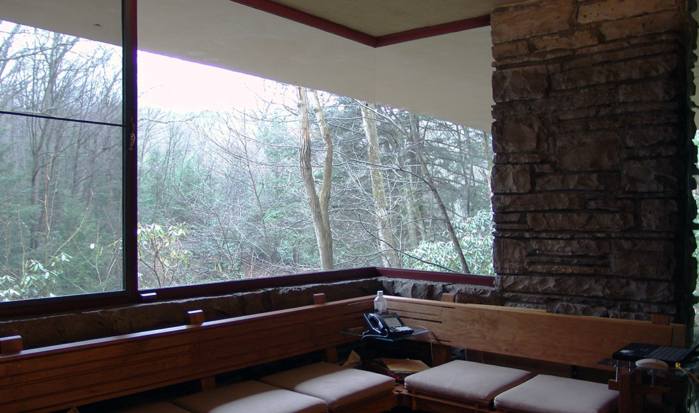
Wright further emphasizes the connection with nature by liberal use of glass; the house has no walls facing the falls, only a central stone core for the fireplaces and stone columns. This provides elongated vistas leading the eye out to the horizon and the woods. Vincent Scully has pointed out that this reflects “an image of Modern man caught up in constant change and flow, holding on…to whatever seems solid but no longer regarding himself as the center of the world.”[9] The architect’s creative use of “corner turning windows” without mullions causes corners to vanish. Wright even bows to nature by bending a trellis beam to accommodate a pre-existing tree.

Influences
Although he denied it, Wright was influenced by every conceivable architectural style, but Fallingwater owes little to his previous designs (the only exceptions being perhaps the use of irregular stones that are also found on Taliesin and his interest in strong horizontal lines). At Fallingwater, he appears to be more concerned with responding to the European Modernist design that he had in part inspired—but that had since eclipsed him. In effect, he set out to beat the Europeans at their own game, using elements of their idiom. We see, for example, inspiration drawn from the balconies of Gropius’ design for the Chicago Tribune Tower competition, though instead of the stark white of the International Style, he paints his balconies a warmer, earthen tone in deference to nature and perhaps the Adobe dwellings of the American Southwest.
Fallingwater falling down?
The Kaufmanns loved Wright’s radical proposal to literally suspend the house over the waterfall. But Edgar Kaufmann Sr., ever the pragmatic business man (who had also studied engineering for a year at Yale) prudently sent a copy of Wright’s blueprints to his engineer; who found the ground unstable and did not recommend that he proceed with the house. Wright was not happy with his client’s lack of faith, but permitted an increase in the number and diameter of the structure’s steel reinforcements—Kaufmann agreed to proceed. Its worth noting that the engineer’s warnings later proved valid, an issue that “haunted” Wright for the rest of his life.

Wright is famous for pushing the architectural envelope for dramatic effect. We see this is in the vast cantilevered wooden roof of Robie House in Chicago. In Fallingwater he chose ferro-concrete for his cantilevers, this use of reinforced concrete for the long suspended balconies was revolutionary. He boldly extended the balcony of the second floor master bedroom soaring six feet beyond the living room below.

However, due to the lack of proper support, cracks began appearing in the balcony floors soon after they were poured. Over the years since, cracks have been repeatedly repaired as the cantilevers continued to sag. By 2001 some of the 15 foot cantilevers had fallen more than 7 inches. To avoid a complete collapse, an ingenious system was devised using tensioned cables to correct the problem and stabilize Wright’s masterwork.
Almost from the day of its completion, Fallingwater was celebrated around the world. The house and its architect were featured in major publications including the cover of Time Magazine. Over the years its fame has only increased. According to Franklin Toker, Fallingwater’s most important contribution to Modern Architecture is surely the “acceptance of Modern architecture itself.”
