8
Dr. Kristen M. Harkness; Monica Obnisk; Dr. Charles Cramer; Dr. Kim Grant; Dr. Beth Harris; Dr. Steven Zucker; Dr. Noelle Paulson; and Dr. Vasile-Ovidiu Prejmerean
In this chapter
Arts & Crafts
Art Nouveau
Toward Expressionism
William Morris and Philip Webb, Red House

Cult of domesticity
By the mid-nineteenth century, many people were troubled by the effects that the Industrial Revolution was having on the environment, society at large, and workers employed in factories, concerns that are echoed in today’s environmental movement. The English art critic John Ruskin argued that the inexpensive, factory-made goods flooding the markets had a negative effect on both those who made them and those who consumed them.
Ruskin and others believed that mechanized factory production deprived workers of the personal satisfaction and creativity involved in designing and making an object entirely with one’s own hands. They also believed that people who bought these goods were surrounding themselves with soulless objects that lacked aesthetic value. Thus, their domestic environments were missing the elements of spirituality and refinement that produce healthy, well-rounded citizens.
This was a particular concern in the age of the Victorian “cult of domesticity,” which emphasized the home as a morally uplifting respite from the negative influences of city life. Ruskin and his followers advocated a return to the medieval guild model in which artisans were responsible for handcrafting their works from beginning to end. This produced a sense of pride in the worker and guaranteed quality products for the consumer. William Morris was strongly influenced by Ruskin’s writing and also dedicated to social reform.

Craftsmanship and community
Red House was the home he designed in Bexleyheath, a southeastern suburb of London, England, for his family with the assistance of Philip Webb. Webb and Morris met while working in London for the architect G. E. Street. Webb would go on to be one of the major architects of the Gothic Revival movement in England.
Morris wanted the house to be a place that reflected his ideals and celebrated art, craftsmanship, and community. Morris and Webb collaborated to make the house’s architecture and interior design merge into a unified whole. This would provide the appropriate atmosphere to foster domestic harmony and instill creative energy in its inhabitants and visitors. It was the first home built according to the principles of fine artistry and utility that became the hallmark of the design firm Morris founded with Webb in 1861, as well as the emerging Arts and Crafts movement.

Morris and Webb designed the house in a simplified Tudor Gothic style. The features of this style include historicizing elements such as steep roofs, prominent chimneys, cross gables, and exposed-beam ceilings, all present in Red House. Morris was influenced by Ruskin and other theorists who saw the Gothic as a time of perfection in the craft and building trades, as well as a period of great faith and belief in human dignity. They also viewed the Gothic as a more suitable style for Northern Europe because it originated in France, a northern country, as opposed to the classical forms of ancient Greece and Rome. For Morris and Webb, the adoption of a specifically English form of Gothic architecture seemed natural and appropriate to the site.
A medieval ideal
The use of exposed red brick for the exterior both gave the house its name and reveals the innate beauty of the construction materials. Morris and Webb valued the specific beauty of natural materials, which they saw as far superior to and healthier than industrially produced materials. Red House is L-shaped, with the rooms laid out for maximum efficiency and clarity. The L-shaped plan also allows the house to embrace the gardens as a part of the domestic sphere, as well as creates an asymmetry that is typical of traditional Gothic structures that were built over long periods of time. The concept of an integral whole extended to the interior design as well. Webb, Morris, his wife, Jane, and the painter Edward Burne-Jones all worked together to design everything in the home, from the wallpaper to the stained-glass windows to the built-in cabinets and furniture, so that all celebrated the beauty of nature and the medieval guild ideal.
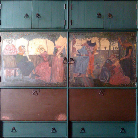
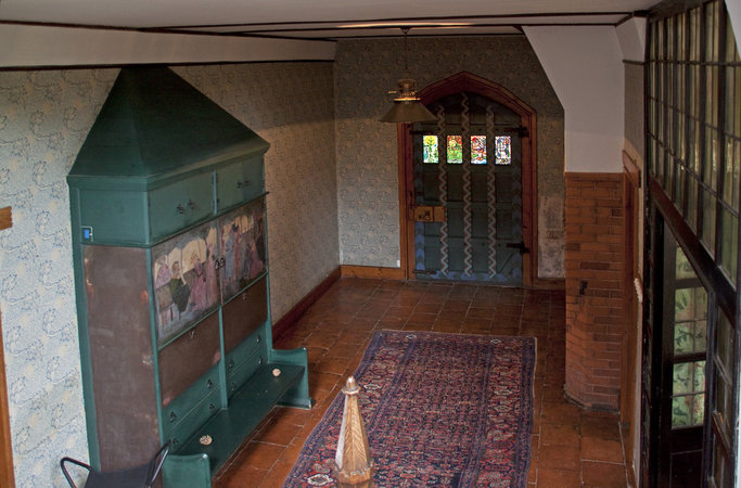
The house is entered through a large wooden door that leads to a rectangular hallway. A settle Morris decorated with illustrations from the medieval German epic Niebelungenlied is to the right. The hallway is filled with light from the stained-glass windows. The dining room to the right contains the original hutch designed by Philip Webb, which has Gothic trefoil motifs and is painted in “dragon’s blood” (a deep red-brown favored by Arts and Crafts practitioners). The original rustic dining room table remains, along with the decorative arch in the brickwork around the fireplace.


Other original built-in furniture is present in the main living room on the second floor, notably a fireplace painted with Morris’s motto: “Ars Longa, Vita Brevis” (Life is short, art is forever). This room also has paintings by Edward Burne-Jones. Stained glass decorated by Morris, his family and their friends is found throughout the house.
Unfortunately Morris had to sell Red House in 1865 due to financial difficulties. It remained a private residence until 2003, when it was acquired by the National Trust of Great Britain. The architecture of Red House has not been significantly altered, but most of the original furniture is gone and some of the original wall paintings have been covered with modern reproductions of wallpaper Morris produced after he established his design company with Webb and like-minded colleagues. Red House now functions as a museum and is open to the public.
The Arts and Crafts Movement in America
By Monica Obniski, Heilbrunn Timeline of Art History
The Arts and Crafts movement emerged during the late Victorian period in England, the most industrialized country in the world at that time. Anxieties about industrial life fueled a positive revaluation of handcraftsmanship and precapitalist forms of culture and society. Arts and Crafts designers sought to improve standards of decorative design, believed to have been debased by mechanization, and to create environments in which beautiful and fine workmanship governed. The Arts and Crafts movement did not promote a particular style, but it did advocate reform as part of its philosophy and instigated a critique of industrial labor; as modern machines replaced workers, Arts and Crafts proponents called for an end to the division of labor and advanced the designer as craftsman.
The British Movement
The British movement derived its philosophical underpinnings from two important sources: first, the designer A. W. N. Pugin (1812–1852), whose early writings promoting the Gothic Revival presaged English apprehension about industrialization, and second, theorist and art critic John Ruskin (1819–1900), who advocated medieval architecture as a model for honest craftsmanship and quality materials. Ruskin’s persuasive rhetoric influenced the movement’s figurehead (and ardent socialist) William Morris (1834–1896), who believed that industrialization alienated labor and created a dehumanizing distance between the designer and manufacturer. Morris strove to unite all the arts within the decoration of the home, emphasizing nature and simplicity of form.
The American Arts and Crafts movement was inextricably linked to the British movement and closely aligned with the work of William Morris and the second generation of architect-designers, including Charles Robert Ashbee (1863–1942), who toured the United States, and Charles Francis Annesley Voysey (1857–1941), whose work was known through important publications such as The Studio. British ideals were disseminated in America through journal and newspaper writing, as well as through societies that sponsored lectures and programs. The U.S. movement was multicentered, with societies forming nationwide. Boston, historically linked to English culture, was the first city to feature a Society of Arts and Crafts, founded in June 1897. Chicago’s Arts and Crafts Society began at Hull House, one of the first American settlement houses for social reform, in October 1897. Numerous societies followed in cities such as Minneapolis and New York, as well as rural towns, including Deerfield, Massachusetts.
Utopianism, Socialism, & a Variety of Media
Unlike in England, the undercurrent of socialism of the Arts and Crafts movement in the United States did not spread much beyond the formation of a few Utopian communities. Rose Valley was one of these artistic and social experiments. William Lightfoot Price (1861–1916), a Philadelphia architect, founded Rose Valley in 1901 near Moylan, Pennsylvania. The Rose Valley shops, like other Arts and Crafts communities, were committed to producing artistic handicraft, which included furnishings (1991.145), pottery, metalwork, and bookbinding. The Byrdcliffe Arts and Crafts Colony was another Utopian Arts and Crafts community. Outside of Woodstock, New York, Englishman Ralph Radcliffe Whitehead (1854–1929) and his wife Jane Byrd McCall Whitehead (1861–1955) founded Byrdcliffe, which was completed and operating by 1903. There craftspeople worked in various media, including woodwork, pottery, textiles, and metalwork. In harmony with the principles of the Arts and Crafts movement, Byrdcliffe furniture (1991.311.1) is a study in rectilinearity, simply treated materials, and minimal decoration.
In urban centers, socialist experiments were undertaken on a community level, frequently in the form of educating young women. Ideas of craftwork and simplicity manifested themselves in decorative work, including the metalwork and pottery of the Arts and Crafts movement. Schools and training programs taught quality design, a cornerstone of the Arts and Crafts movement. In Boston, the Saturday Evening Girls Club, established in 1899 as a reading group for immigrant girls, founded the Paul Revere Pottery, which began producing pottery (2000.31) in 1908 and offered the girls the ability to earn good wages within the community. Newcomb Pottery was formed in New Orleans in the winter of 1894–95 under the auspices of the H. Sophie Newcomb Memorial College, an educational institution for women. Using local Southern flora and fauna as inspiration, the female designers at Newcomb made pottery (1983.26) and later also produced metalwork and textiles (2004.334).
In addition to pottery, women fashioned jewelry in the Arts and Crafts mode. Stones were chosen for their inherent artistic qualities, resulting in jewelry that promoted truth to materials. Florence Koehler (1861–1944), a charter member of the Chicago Arts and Crafts Society, taught china painting, jewelry, and metalsmithing. After studying jewelry and enamelwork in London, she referenced historic design, especially Renaissance sources (52.43.1; 52.43.2; 52.43.3). Marie Zimmermann (1879–1972) began her artistic career as a jewelry designer and later expanded her metalsmithing to include ornamental garden and home objects. An idiosyncratic designer, Zimmermann studied foreign cultures for inspiration, including Egypt (2005.464), Greece, and China.

Without a singular philosophy, diversity persevered within the Arts and Crafts movement as a mixture of individuals worked in diverse locations. There were regional differences due to the geographical distribution from the East Coast, to the Midwest, to California. Craftsmen used a wide range of source material to produce handwrought objects. Arthur J. Stone (1847–1938), a dedicated member of the Boston Society of Arts and Crafts, produced silver objects that were conservative in design. An Englishman who emigrated to the United States, Stone opened his silver shop in Gardner, Massachusetts, where he initially executed all pieces himself. When the business expanded, he hired additional craftsmen to make individual works (1990.49). There were also creative designers with unique vision, such as Charles Rohlfs (1853–1936), who worked in Buffalo, New York. Rohlfs eschewed industrial production methods, preferring to craft individual pieces of furniture (1985.261) utilizing a myriad of foreign sources, including Moorish, Chinese, and Scandinavian design. Gustav Stickley (1858–1942), founder of The United Crafts (later known as the Craftsman Workshops), was a proselytizer of the craftsman ideal. Emulating William Morris’s production through guild manufacture of his furniture, Stickley believed that mass-produced furniture was poorly constructed and overly complicated in design. Stickley set out to improve American taste through “craftsman” or “mission” furniture with designs governed by honest construction, simple lines, and quality material (1976.389.1). He also published the highly influential The Craftsman (1901–16), a beacon for the American Arts and Crafts movement.
Design, Interiors, & Architecture
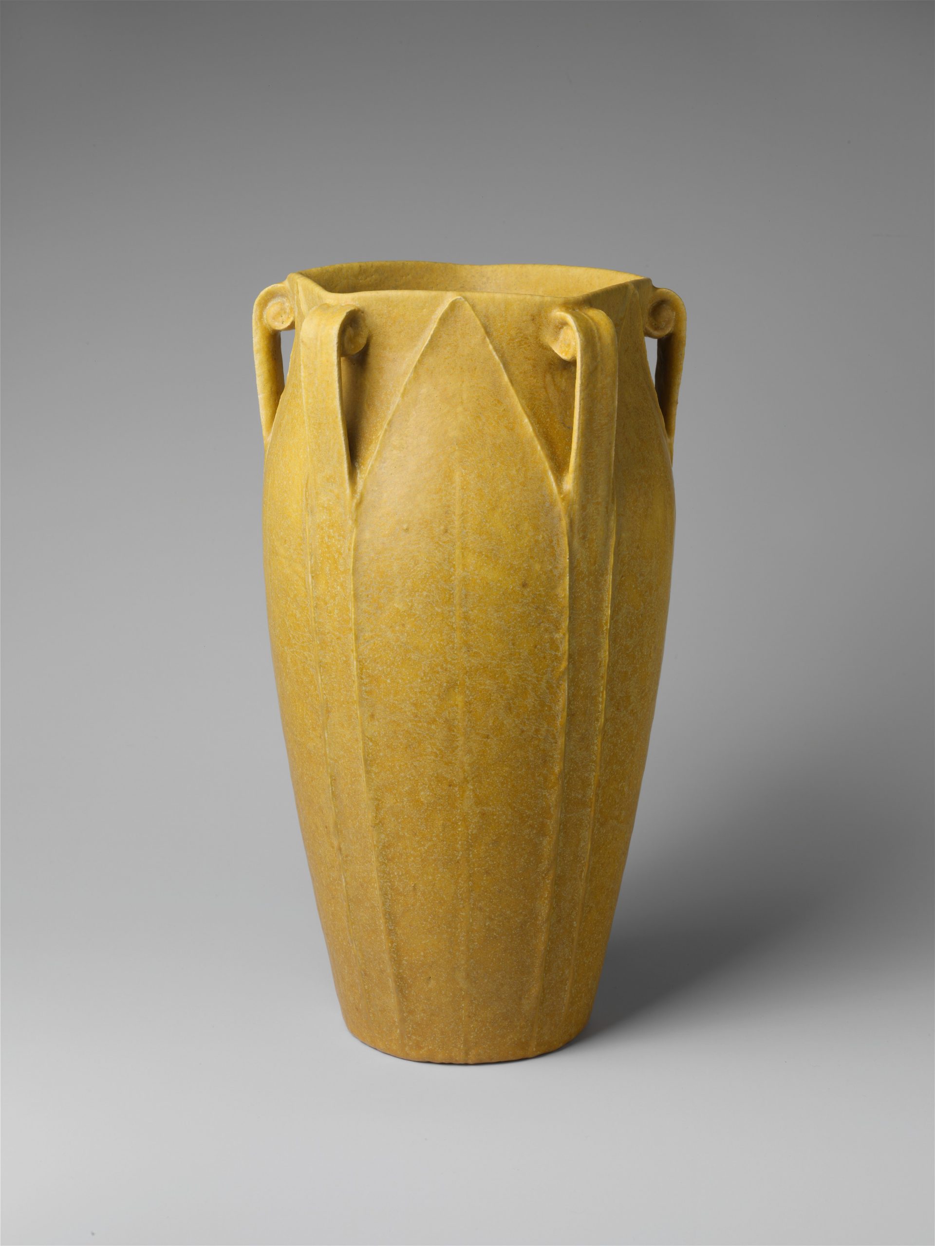
Publications, including The Craftsman, House Beautiful, and Ladies Home Journal, disseminated ideas about design and interiors. The ideal home that emerged had an open-planned interior shaped by a color palette that reflected the natural environment. Articles and illustrations presented decorating suggestions, including the use of colors, type of furniture, and decorative accessories, such as rugs and pottery. Period sources embraced Grueby Pottery for its innovative interpretation of nature and craftsmanship. Founded by William Grueby (1867–1925), the pottery was known for naturally shaped vessels with matte green glaze (69.91.2). In addition to pottery, lighting was also an important element that contributed to the ideal Arts and Crafts interior. The copper electric table lamp (1989.129) was the archetypal object crafted by the Dirk Van Erp Studio. Additionally, a Native American undercurrent developed during the Arts and Crafts movement, as evidenced by fashionable Indian-style baskets and textiles featured in Arts and Crafts exhibitions and publications. Many collected baskets to display in their Indian corners, which may have inspired Louis Comfort Tiffany (1848–1933) to design a hanging shade in an Indian basket motif (69.150).
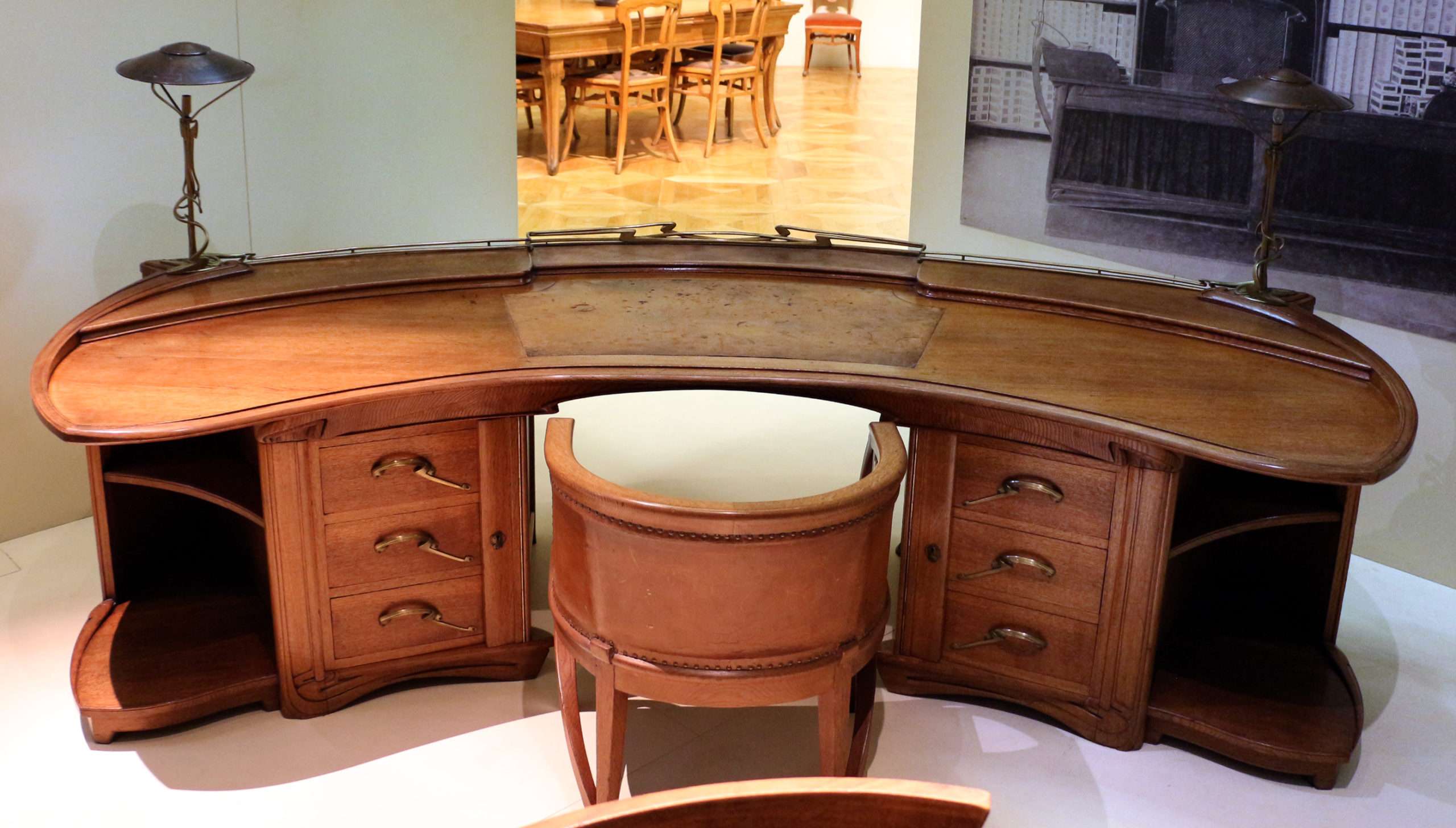
Frank Lloyd Wright (1867–1959) shaped a new way of living through his completely designed environments, encompassing architecture and all elements of interiors. He ushered in a style of architecture that became known as the Prairie School, characterized by low-pitched roofs, open interiors, and horizontal lines that reflected the prairie landscape. This architecture, which utilized natural materials such as wood, clay, and stone, sparked a revolutionary shift in the American interior (1972.60.1). Wright’s “organic” architecture was indebted to nature. However, plain surfaces with minimal decorative embellishments were suited to incorporating the machine, resulting in furniture with intense rectilinearity and natural surfaces. In addition to Wright, popular Prairie School architects William Gray Purcell (1880–1965) and George Grant Elmslie (1871–1952) directed offices in Minneapolis and Chicago. Purcell, Feick and Elmslie (as the firm was known between 1910 and 1913 with the addition of George Feick Jr. [1881–1945]) remodeled the J. G. Cross House in Minneapolis in 1911 (1972.20.2). The firm specialized in residences with artistic interiors (especially for a middle-class clientele, although they certainly worked for wealthy patrons as well) using organic decorative elements. Like Wright and Purcell, Feick and Elmslie, Charles Sumner Greene (1869–1957) and Henry Mather Greene (1870–1954), California architect-designers of the period, were interested in domestic architecture incorporating the interior as a total work of art. The brothers Greene initially worked in all the popular revival styles, but after examining English and American design periodicals and Charles Greene’s formative trip abroad, their style shifted by the early 1900s. They fashioned a distinctive style, heavily influenced by Asian design, that reached its zenith with the bungalow, the quintessential Arts and Crafts architectural form, characterized by broad overhanging eaves, articulated woodwork, and an open plan. For the Blacker House (1907) in Pasadena, Greene and Greene used Japanese design to meticulously craft elements in their comprehensive schemes, inside and out (1986.445; 1992.127).
The rise of urban centers and the inevitability of technology presaged the end of the Arts and Crafts movement. The search for nature and an idealist medieval era was no longer a valid approach to living. By the 1920s, machine-age modernity and the pursuit of a national identity had captured the attention of designers and consumers, bringing an end to the handcrafted nature of the Arts and Crafts movement in America.
Art Nouveau
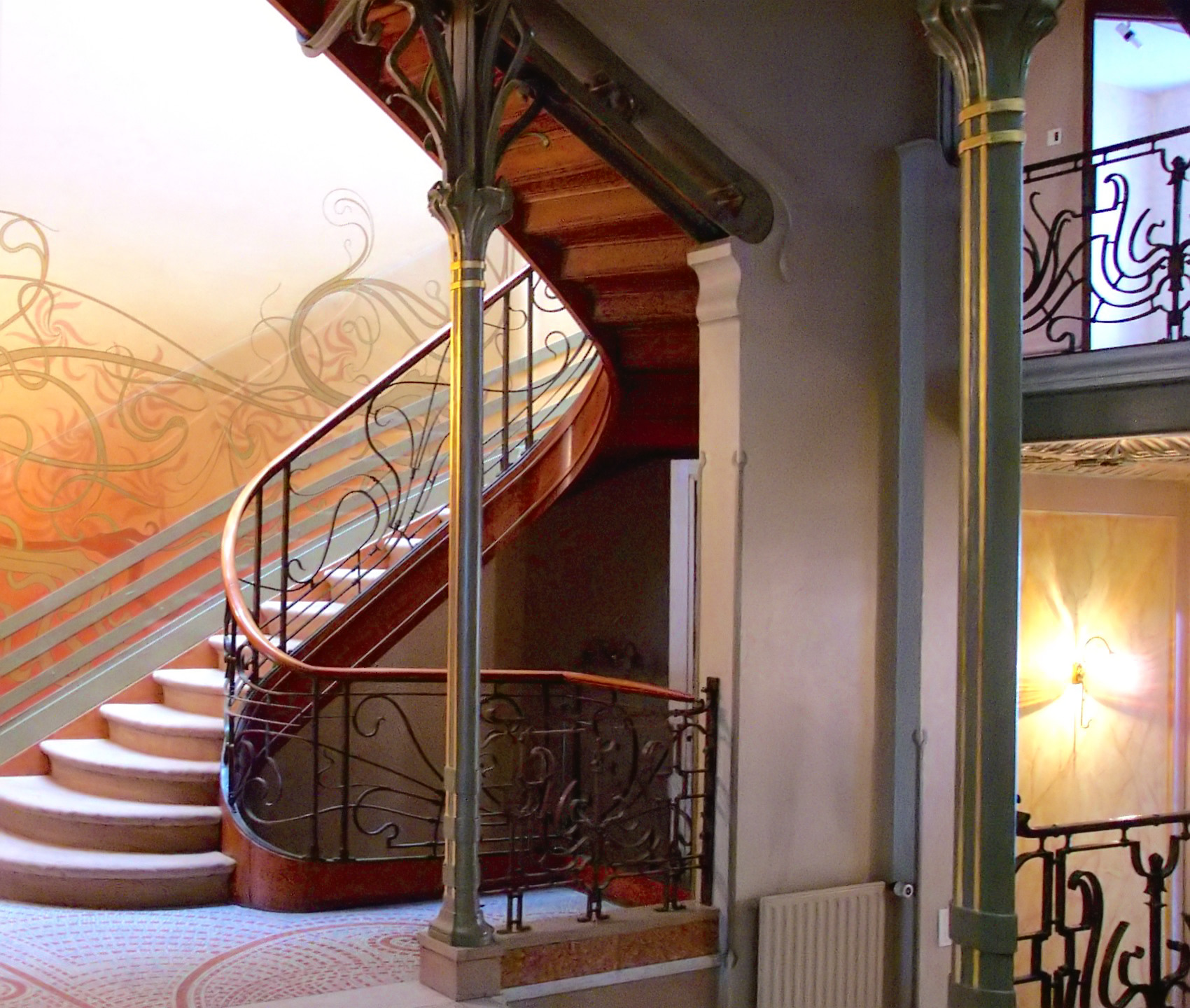
Victor Horta’s Tassel House in Brussels is one of the earliest examples of the Art Nouveau style. Horta designed the building’s architecture and every detail of the interior decoration and furnishings, making the house into a Gesamtkunstwerk, or total art work in multiple media. The repeated use of organically curved, undulating lines — often called whiplash lines — unifies the design, repeating in the floor tiles, wall painting, ironwork, and even in the structure of the spiraling staircase and surging entryways.
A modern style using modern materials
Art Nouveau artists and designers created a completely new style of decoration, rejecting the widespread nineteenth-century practice of copying historical, and especially Classical and Medieval, forms. While each designer invented their own decorative motifs, organic, often plant-based, forms and the whiplash line became hallmarks of Art Nouveau design, appearing in multiple media and contexts.
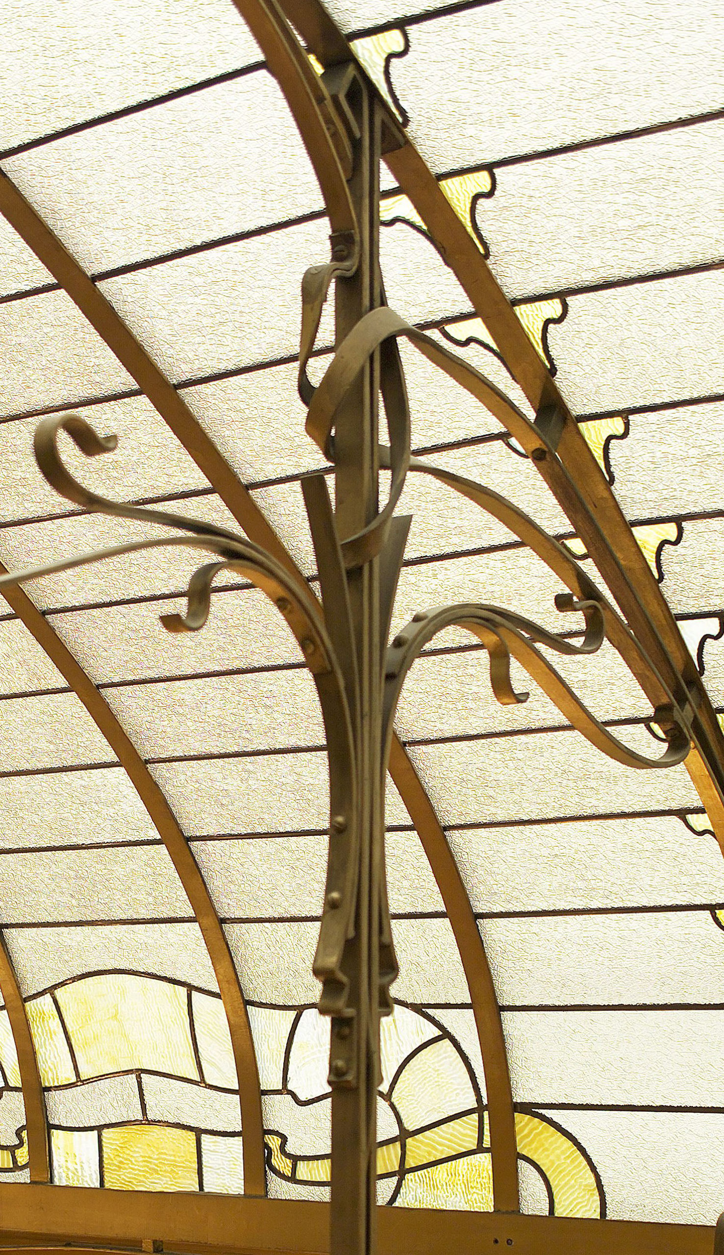
Art Nouveau architects and designers also embraced modern building materials, notably cast iron. Cast iron is both stronger and more flexible than traditional wood or stone and allows for much thinner supports, like the slender columns in Horta’s own house. Iron support structures also made it possible to create curved facades with large windows, which became prominent elements in many Art Nouveau buildings, including Horta’s Maison du Peuple.
An international style
Art Nouveau is only one of many names given to this international fin-de-siècle style, which had many regional variations. The term (French for “New Art”) derives from La Maison de L’Art Nouveau, the Paris art gallery run by Siegfried Bing, who was a major promoter of the new style, as well as of Japonisme and the Nabis. In addition to marketing individual objects, Bing commissioned artists and designers to create model rooms in his gallery to display Art Nouveau ensembles that included furniture, wallpaper, carpets, and paintings.
In addition to Paris, major centers of the modern fin-de-siècle style included Brussels, Glasgow, Munich (where it was known as Jugendstil or Youth Style), and Vienna (where it was called Secession Style). Barcelona’s Catalan Modernism, especially Antoní Gaudí‘s architecture and decorative designs, is also closely related to Art Nouveau.
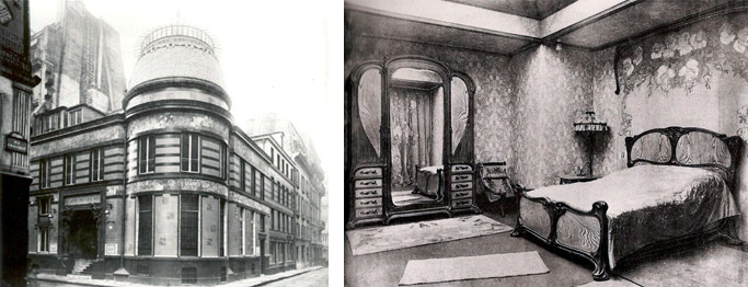
Luxury design for the masses
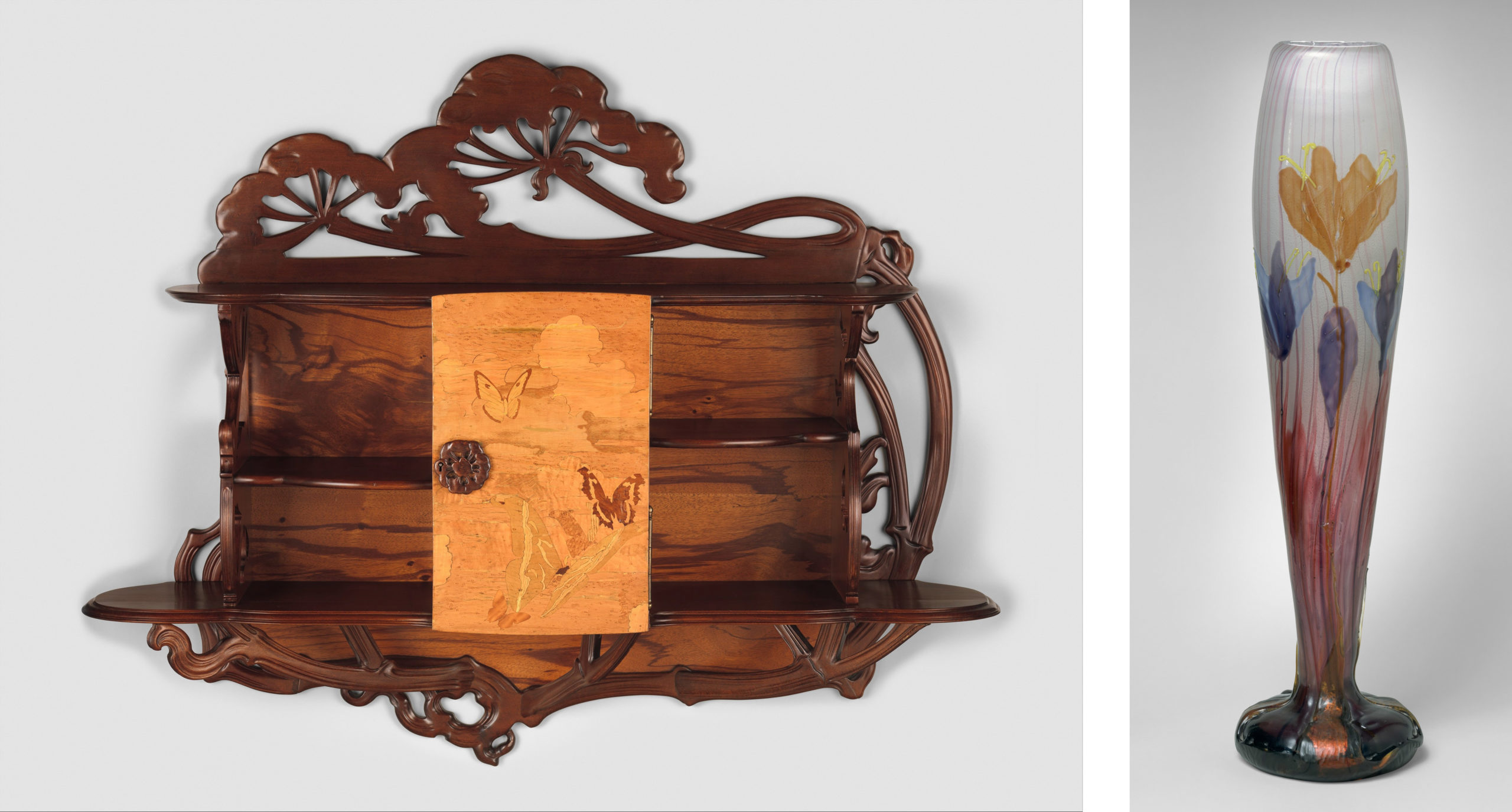
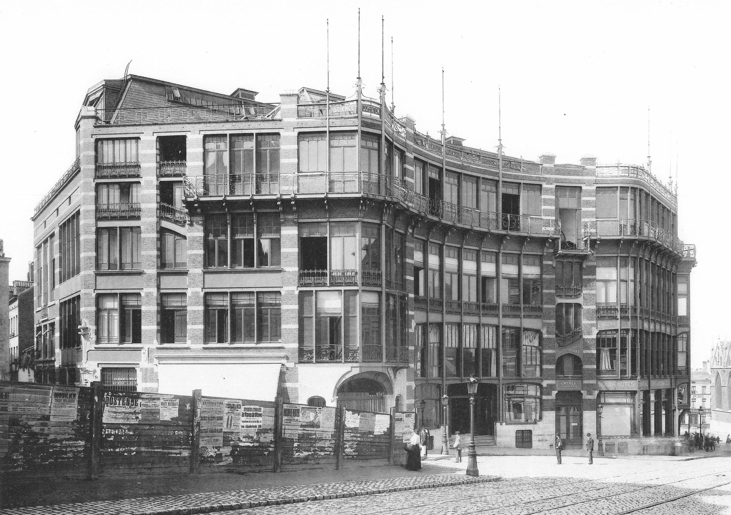
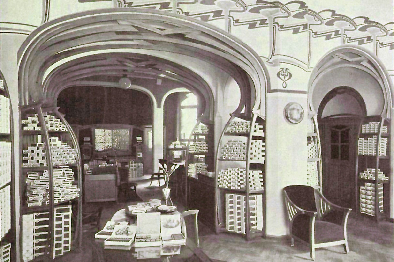
French Art Nouveau was linked to government-supported efforts to expand the decorative arts and associated craft industries. Private residences and luxury objects were the focus for many Art Nouveau designers, including Emile Gallé, who made both decorative glass and furniture. Despite the close association of Art Nouveau with luxury items, the style is also apparent in urban design, public buildings, and art for the masses. Horta’s Maison du Peuple was the center for the socialist Belgian Workers’ Party, and among the most famous examples of Art Nouveau style are Hector Guimard’s entrances to the Paris Metro, the city’s new public transportation system.
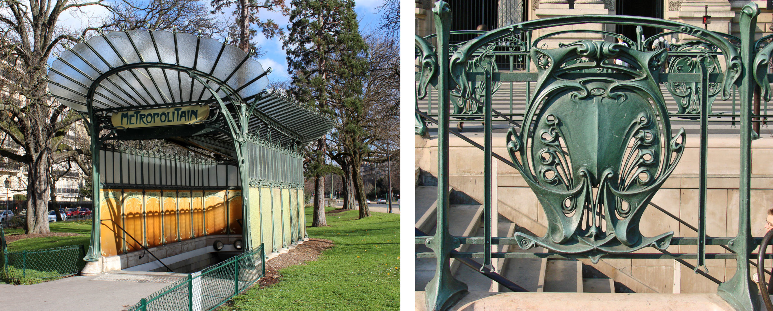
Like Horta’s designs for the Tassel House, Guimard used cast iron and invented stylized motifs based on plant forms. Industrially fabricated in modular units, the cast iron was relatively cheap, but it was painted green to resemble oxidized copper, a much more expensive material that adds a sense of luxury to the elaborate entrances. The use of modules made it possible to individualize each station while maintaining stylistic unity throughout the city.
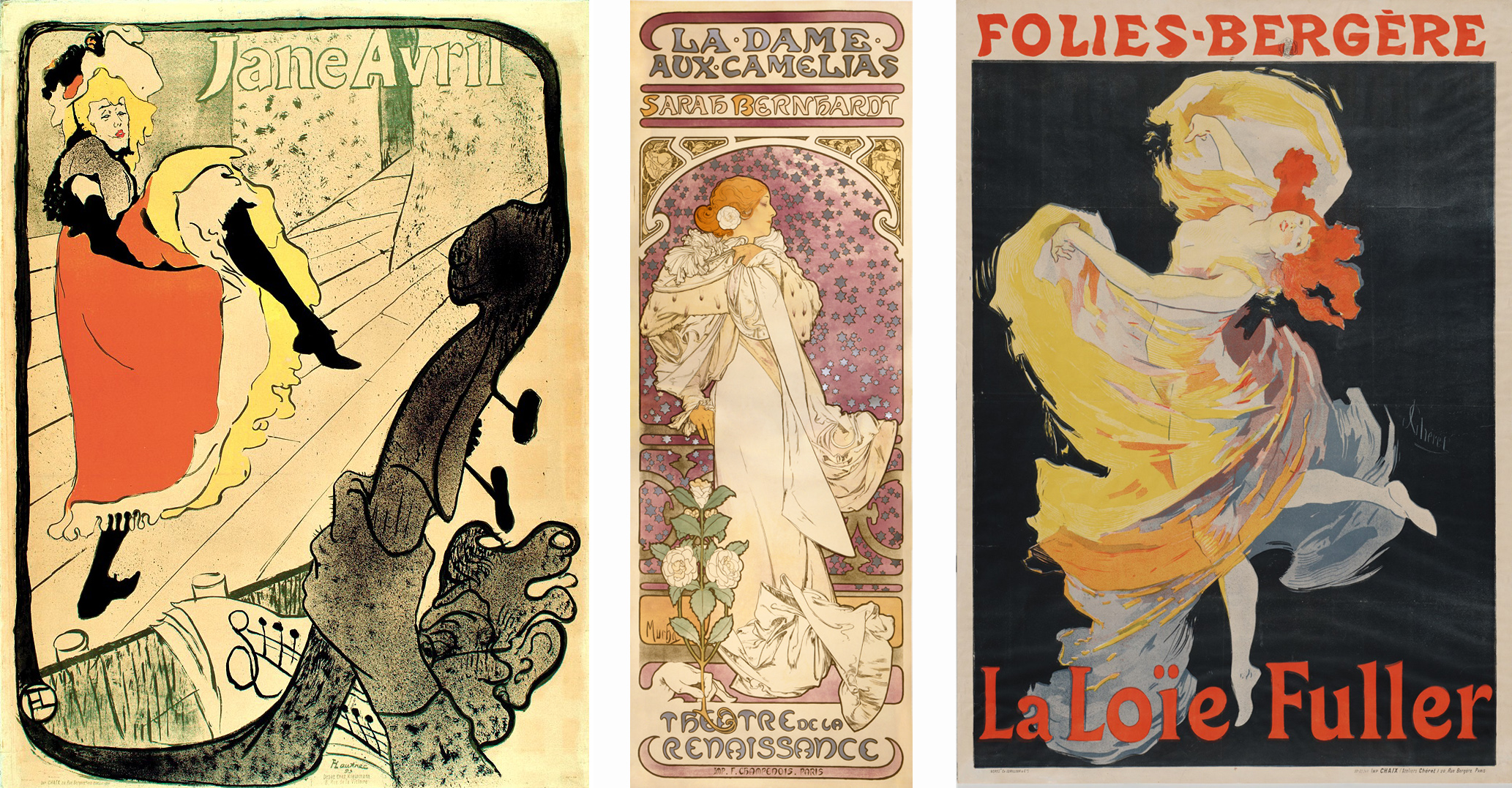
Art Nouveau designs were also widely visible in the advertising posters that decorated Paris. Henri de Toulouse-Lautrec, Alphonse Mucha, and Jules Chéret depicted famous fin-de-siècle performers such as Jane Avril, Sarah Bernhardt, and Loïe Fuller. Their posters stylized the female body and used sinuous whiplash lines, decorative plant forms, and flattened abstract shapes to create vivid decorative images.
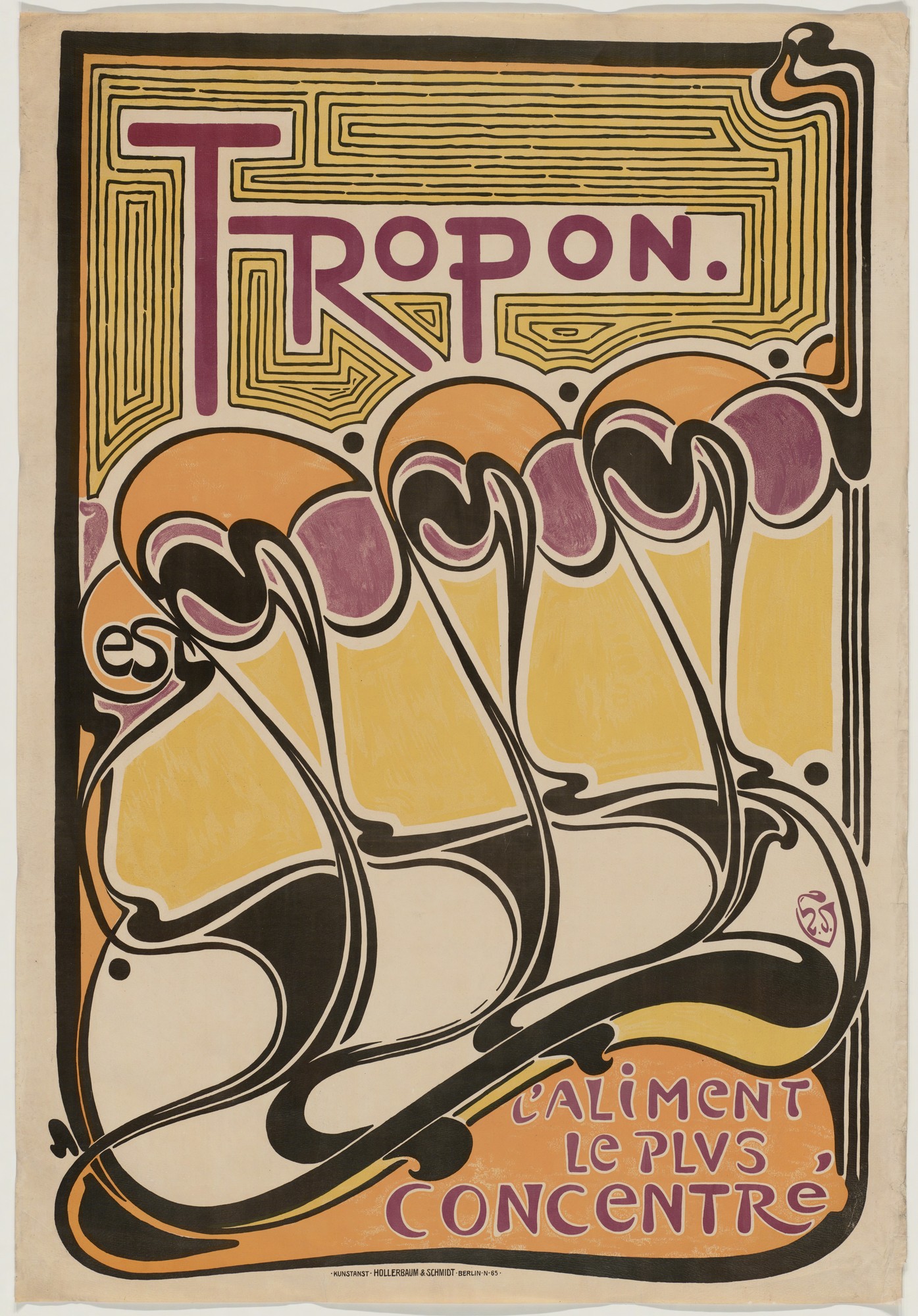
In a poster for the nutritional supplement Tropon, Henry van de Velde explored the decorative and suggestive potential of non-representational forms, using the whiplash line to create an abstract design of organic shapes that suggest both plant-like growth and dancing figures in the rising diagonal of repeated forms.
A holistic approach
Van de Velde worked in many different media, designing buildings, interiors, furniture, and decorative objects as well as posters. In the Continental Havana Company building in Berlin he used sinuous curves to integrate the shelving, doorways, alcoves, furniture, and walls into a unified organic whole.
The English designer William Morris and the English Arts and Crafts Movement that he initiated were a key influence on van de Velde and many other designers associated with Art Nouveau. Morris promoted a holistic approach to interior decoration as well as advocating for the social importance of design and high quality craftwork. In 1907 van de Velde founded the School of Arts and Crafts in Weimar, Germany, which promoted similar values. It later became the famous modern art and design school, the Bauhaus, which maintained the tradition of integrating art, craft, and design for the improvement of society.
Glasgow style
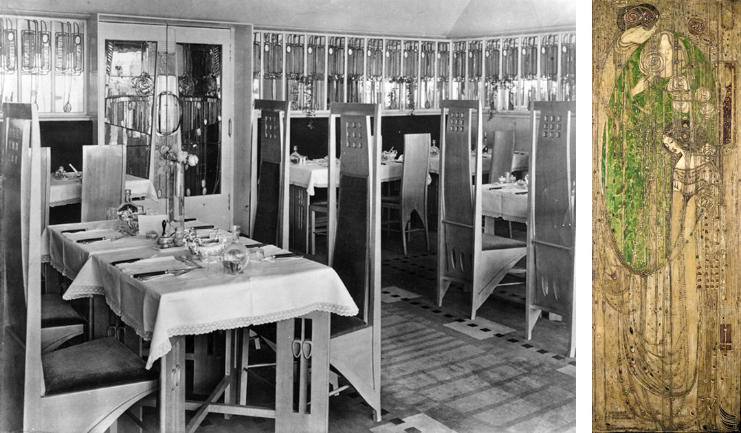
Curving whiplash lines are a common characteristic of French and Belgian Art Nouveau, but architects and artists working in Glasgow developed a more rectilinear style exemplified by the Willow Tea Room. Charles Rennie Mackintosh and Margaret Macdonald designed every component of the tea room, including the architecture, stained glass, decorative panels, furniture, cutlery, and staff uniforms. In keeping with Art Nouveau artists elsewhere they developed original stylized design motifs based on plant forms, but theirs were rigidly contained within elongated rectangles rather than expanding into supple curves.
Vienna Secession style
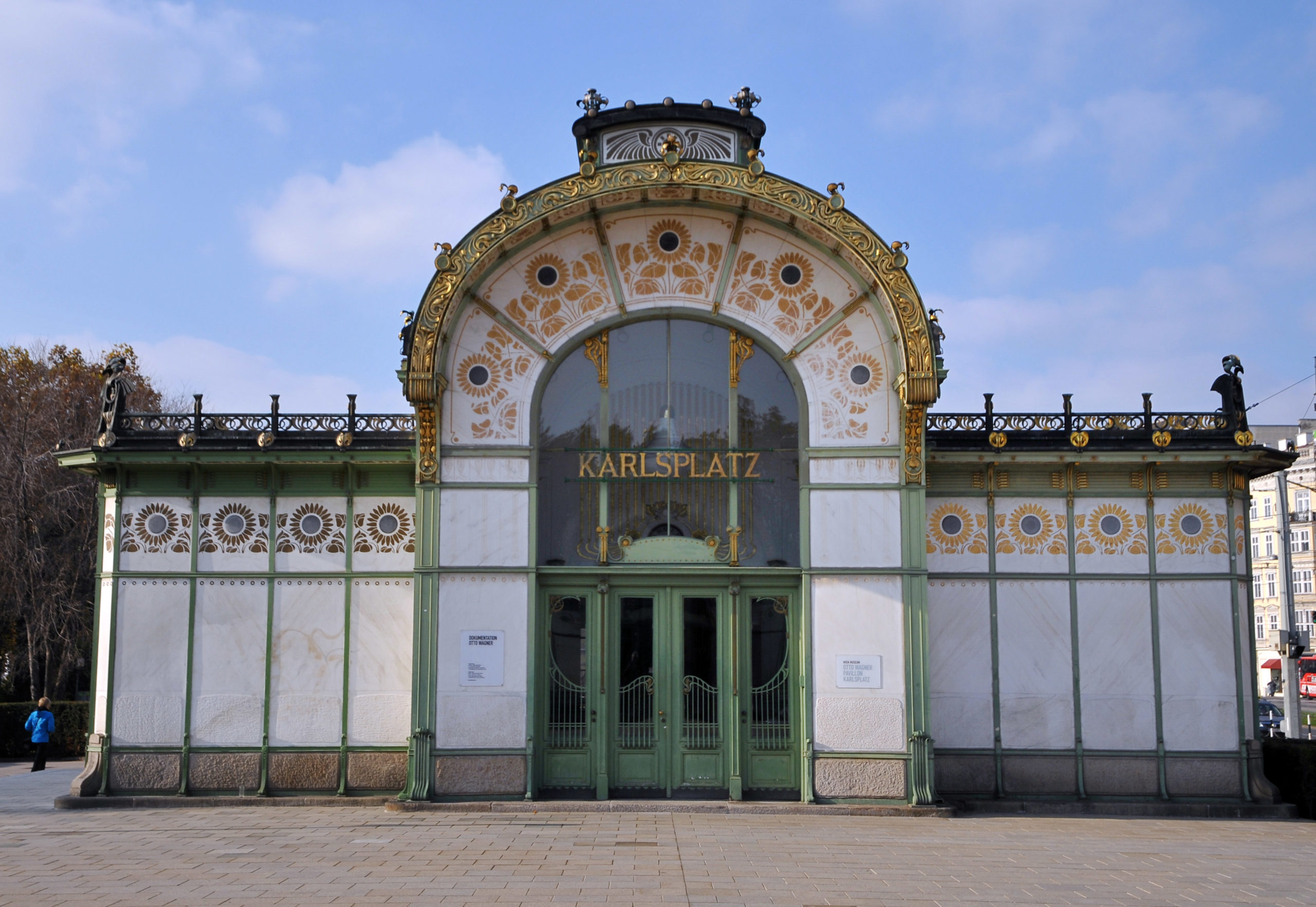
The Viennese Secession style also combined strict geometric forms with stylized organic decoration. Like Guimard’s entrances to the Paris Metro, Otto Wagner’s stations for Vienna’s public transportation system displayed the city’s modernity and wealth in their iron construction and their luxurious gold sunflower-motif decoration.
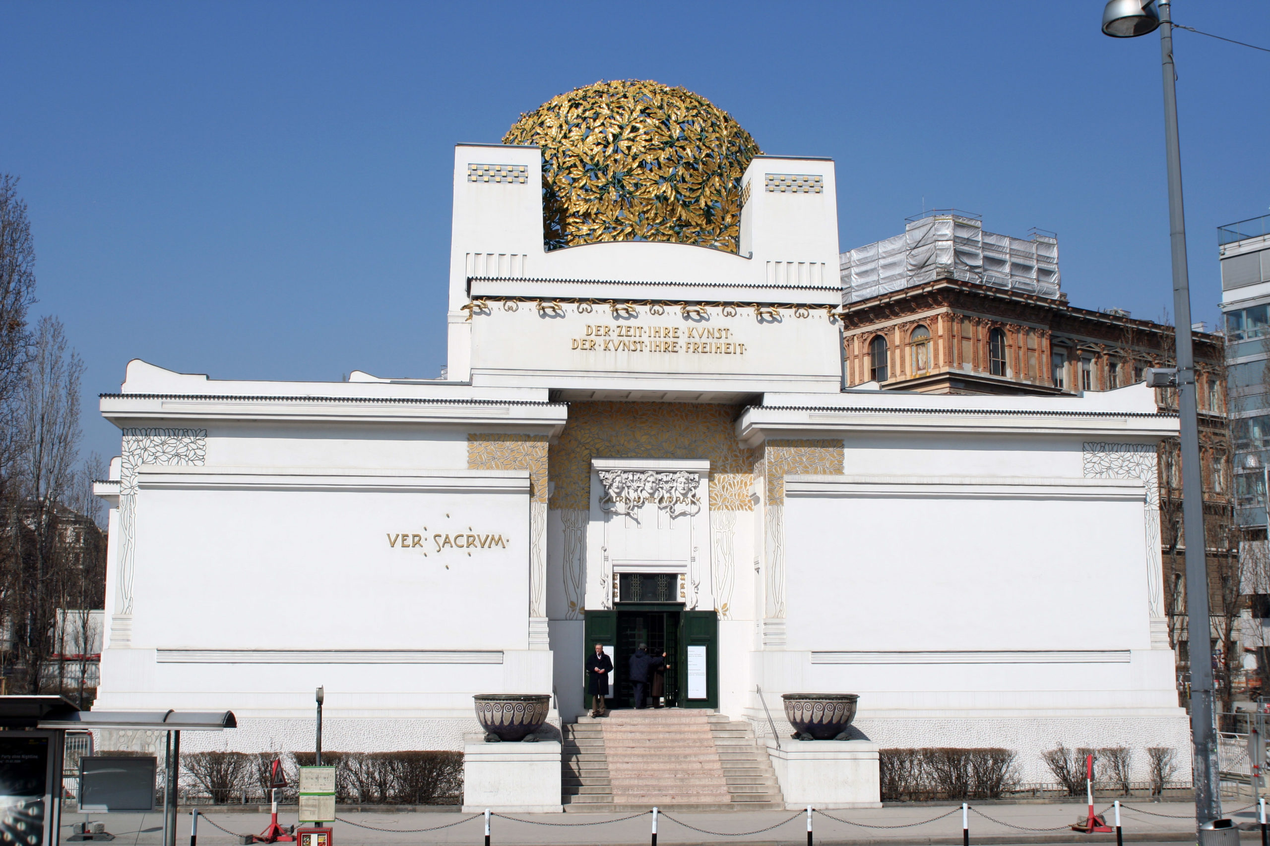
Joseph Maria Olbrich’s Secession Building proclaimed the goals of the rebellious group of artists who seceded from the Austrian art establishment in order to embrace avant-garde modern art. They displayed their work inside Olbrich’s building as well as hosting international exhibitions of modern art. The stylized decoration of the building is based on plant forms, while the structure emphasizes the harmonious balance of basic geometric shapes.
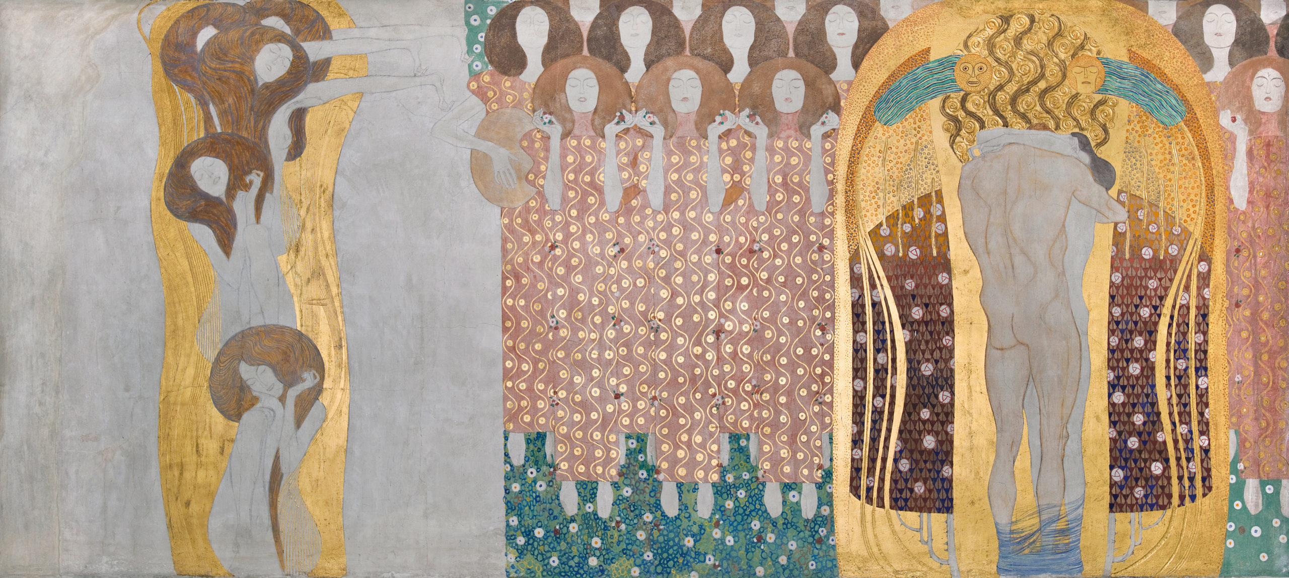
The leader of the Vienna Secession, Gustav Klimt, decorated the interior walls of the main exhibition hall with a long decorative mural dedicated to Ludwig von Beethoven. The Beethoven Frieze combines naturalistic representation of the human body, stylized figures, and complex abstract patterns in a variety of materials. Gold leaf and semi-precious stones enhance the decorative quality of the surface, making it a dramatic union of luxurious ornament and figurative painting.
Art Nouveau was fashionable for only a brief period around the year 1900, but the movement was part of a long-term modern trend that rejected historicism and Academicism and embraced new materials and original forms. In the modern period artists and designers increasingly recognized that the health and well-being of society and all its members were supported and enhanced by well-designed objects, buildings, and spaces. The unified designs of Art Nouveau presaged the innovations of the Bauhaus as well as architects such as Frank Lloyd Wright and Le Corbusier.
Gustav Klimt, The Kiss: A Conversation
by DR. BETH HARRIS and DR. STEVEN ZUCKER
This is the transcript of a conversation held at the Belvedere museum in Vienna. Watch the video: https://www.youtube.com/watch?v=BRUOACBkFRg
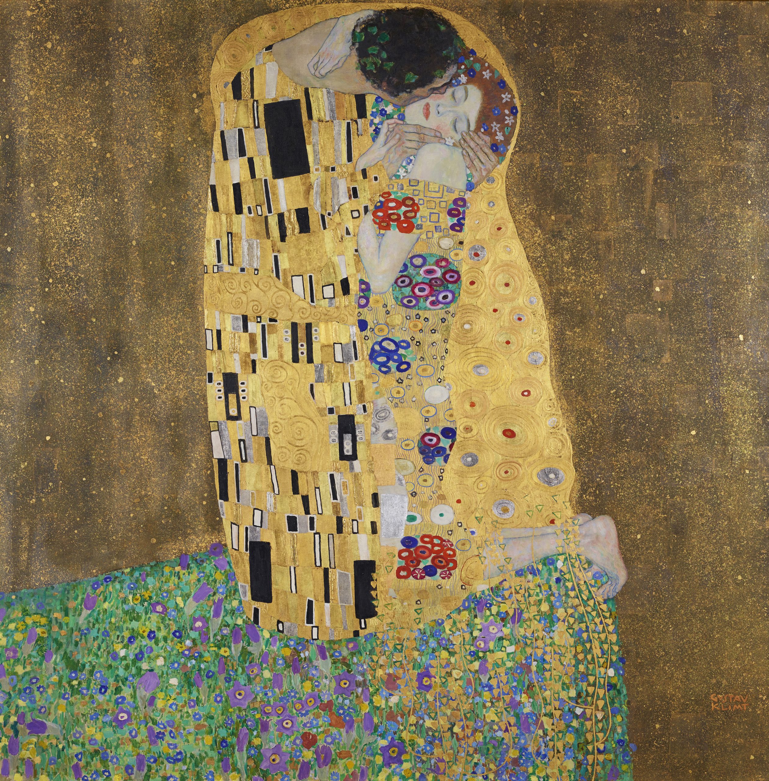
DR. STEVEN ZUCKER: We’re in the Belvedere in Vienna, and we’re looking at Gustav Klimt’s The Kiss from 1908. Probably the most famous Klimt, and actually, I have to admit that I had forgotten that the painting was almost a perfect square, because I’ve seen in so many posters where it’s been cut down and made into a rectangle.
DR: BETH HARRIS: It’s a very large painting and there’s so much gold that it’s hard not to think of a religious icon. And I think in some ways Klimt was trying to create a modern icon– something that suggested a sense of transcendence.
DR. STEVEN ZUCKER: Well there’s no question that the gold here makes you think of the Byzantine tradition, maybe some of the tile work at Ravenna. There is a way that the patterning, especially around the faces, becomes a kind of halo, as well. You have Klimt building up the gold. He’s got those gold circles, they actually rise off the surface of the canvas.
DR: BETH HARRIS: And catch the light, much the way that the gold was tooled in medieval paintings.
DR. STEVEN ZUCKER: There is this sense of the male figure of patterns that are direct of linear in contrast to the curvilinear to the circles and the ovals that we seen in the female form. But the point that you made about the sense of the spiritual is so powerful in this painting. I think we forget that that darker gold ground seems so much as if the figures are somehow being dissipated
into the cosmos, that there are so lost in the intensity, the eternity of that kiss.
DR: BETH HARRIS: And all removed from the everyday world. I mean, we have to remember that this is a time of incredible modernization in Vienna. The city of Vienna has been transformed in the previous 30 years into a modern city. Here Klimt is abstracting a universal experience from the trauma, the difficulties, the anxieties of everyday life. I think it’s also important to see this in relationship to Klimt’s Beethoven Frieze, where the figures confront evil forces– these mythic figures– and in the end, there’s this embrace, this kiss, this emergence from evil into fulfillment and perfection. A minute ago, we were looking at the painting by Egon Schiele called The Embrace, but there there was so much more of a sense of the physicality, of the body’s. The way that the bodies really aren’t present here and are cloaked in these decorative forms, reminds us how much Klimt, although he was exploring this kind of sensuality, was also disguising it, or covering it with a kind of decorative patterning.
DR. STEVEN ZUCKER: And that’s absolutely right, with the exception of the faces. And here, this is where the entire painting changes. The female figure is completely full frontal but horizontal. So that there’s this beautiful sense of here passivity receiving that kiss, but also a kind of deep interior feeling with her eyes closed. Her fingers just delicately touching his as he holds her head and his neck reaches out and round, and you get a sense of his physical power through the strength of that neck, but also the intensity of his desire. And of course, they’re both crowned. As on his head you can see a wreath of leaves, on hers almost as if they were the stars of the heavens.
DR: BETH HARRIS: Schiele gives us an image of a couple that’s electrified by kind of agitated outlines.
DR. STEVEN ZUCKER: Schiele is showing us a kind of truth through the energy of the moment. Whereas Klimt seems to be reaching out to a truth that is for all time, that is so aestheticized it feels as if it has a degree of absolute permanence.
Gustave Moreau, Salome
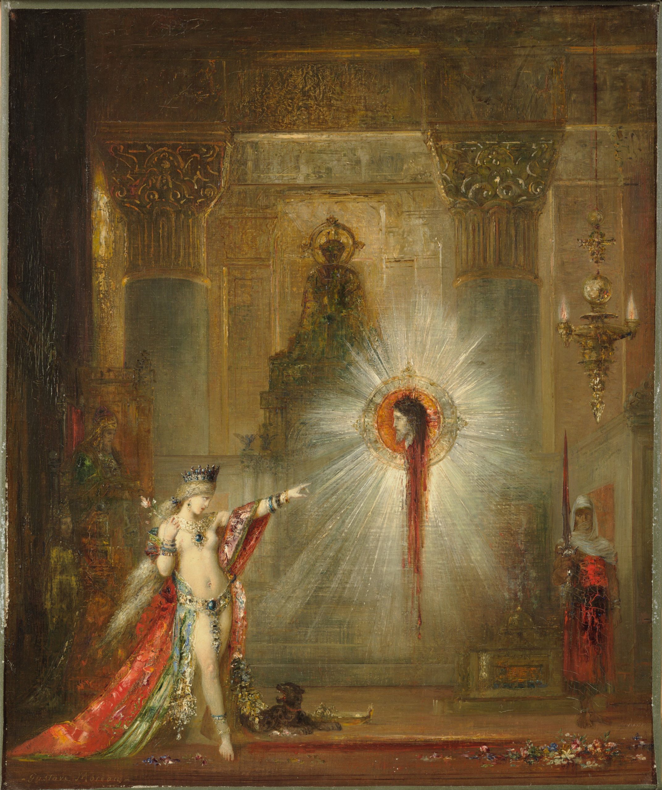
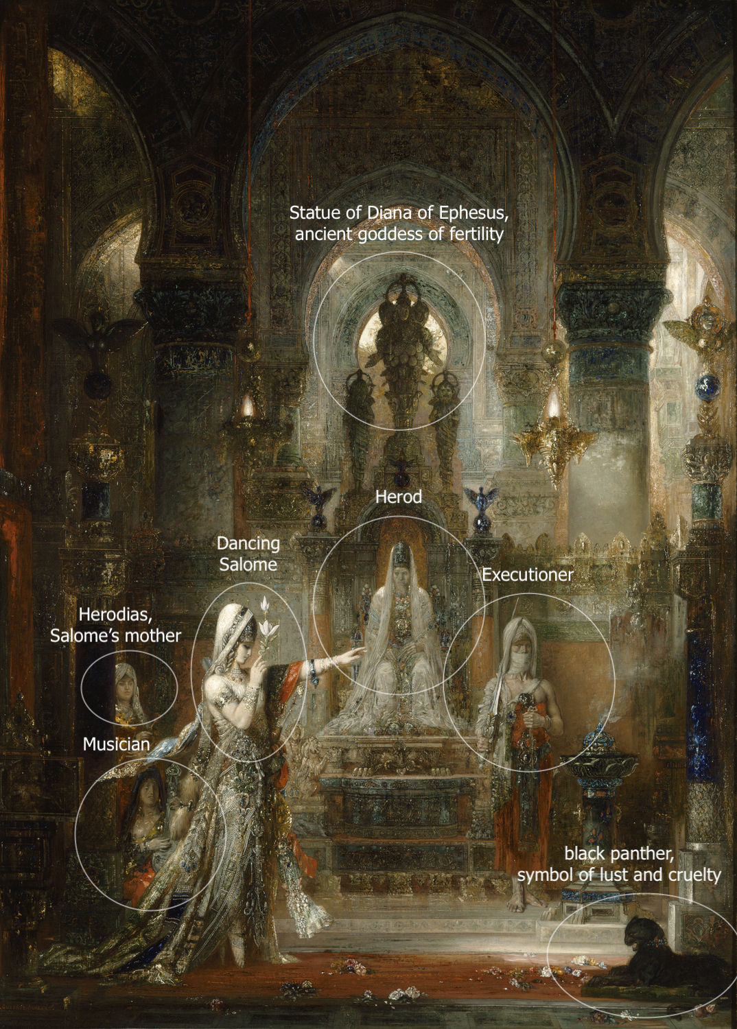
Salome dancing before Herod, with its bewildering subject matter and lush colors, is without a doubt one of the most remarkable paintings of the nineteenth century.
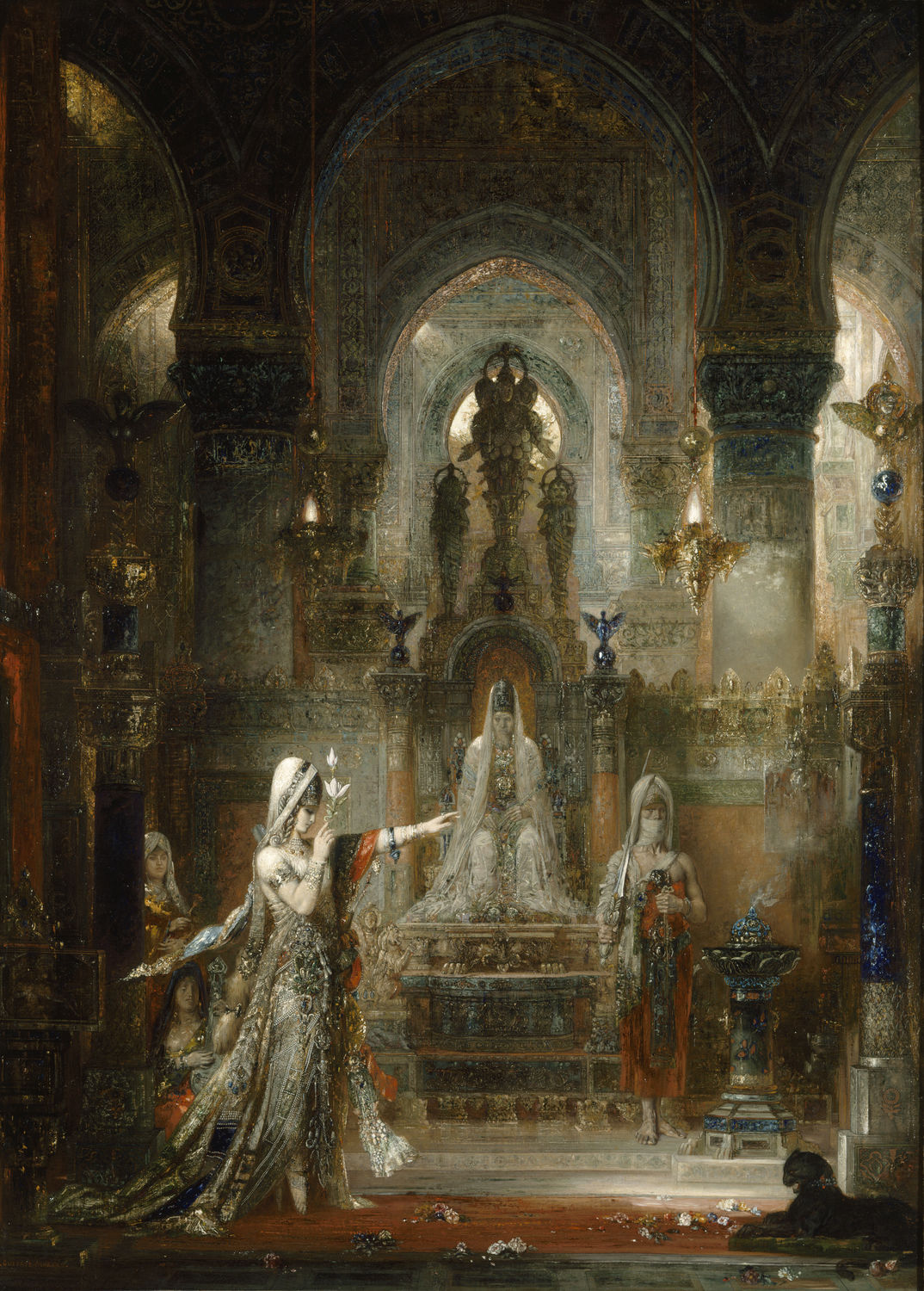
The painting was first exhibited at the 1876 Salon (and shortly thereafter at the 1878 World’s Fair), along with The Apparition, Hercules and the Lernaean Hydra and Saint Sebastian Baptized a Martyr— all works by the French symbolist and history painter Gustave Moreau.
Alongside these other paintings, Salome shows not only Moreau’s preference for religious, literary, and mythological subjects, but also his desire to picture the struggle between “spirit” and “matter”—a subject Moreau pursued his entire career.
The theme of Salome is one that Moreau returned to time and again. The artist explored the subject in more than one hundred sketches and drawings as well as in numerous paintings—ranging from highly elaborate to sketchily rendered—and even in sculpture (both Salome and The Apparition figured in Moreau’s waxworks). Moreau was not alone in his passion for the theme of Salome, as other famous artists — Lucas Cranach, Caravaggio, Titian, Guido Reni, Artemisia Gentileschi, Aubrey Beardsley, and Nabil Kanso, to name just a few — shared this interest. Salome is the woman whose dance led to the demise of John the Baptist.
In the New Testament, both Matthew (14:1-11) and Mark (6:14-29) tell of the famous banquet story in which Herodias, having grown angry at John the Baptist for saying she could not marry her ex-husband’s brother, asks her daughter to request John’s head from her half-uncle as payment for her dance. Although neither of these sources mention Salome by name, we can learn of her from Flavius Josephus’ Jewish Antiquities of the year 93-94 (Book XVIII, Chapter 5, 4).
Given the scarcity of texts, and the fact that Salome seems not to know what to ask her uncle for until instructed by her mother, it is unclear if Salome is truly the evil temptress she is supposed to embody, or just an unwitting instrument in her mother’s hands.
Salome’s complex and ambiguous story offered vast artistic freedom.[1] It is no wonder that Moreau refers to her as “My Salome.”[2] In his writings, Moreau underlines the sacredness of the scene, but also warns of the proverbial power of the femme fatale (a seductive woman who lures men into dangerous situations—a popular subject among Symbolist artists) as one who can be fatal to any man—even saints.[3]Moreau’s contemporaneous viewers also focused on Salome as “femme fatale” (perhaps most famously, the Symbolist novelist and art critic J. K. Huysmans in his novel À rebours).
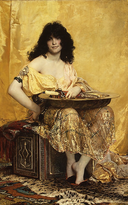
This skewed interpretation shaped painters’ imagination for generations. Moreau makes clear that his goal in turning to Salome as subject, was to reinvigorate high art through beauty and idealism.[4] Of course, not every painter had the same lofty goals, as Henri Regnault’s version makes plain, given its orientalist depiction and lush representation of Salome and her surroundings. Regnault’s 1870 Salome played an important role in Moreau’s decision to tackle the subject, as he wanted to show the world a different rendering of the subject, rooted not in orientalism and the straightforward depiction of a femme fatale, but in mystery, eclecticism, and the “archeology of sentiment and imagination,” which he attributed to Rembrandt.[5]
Given the interest Moreau paid to the Dutch master’s subjects and technique during the 1870s, it is no wonder that much of Remdrandt’s treatment of light and darkness as well as his rich colors find new life in Moreau’s painting.
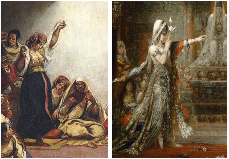
As scholars Peter Cooke and Julius Kaplan pointed out, Moreau had multiple sources from which he could have drawn inspiration, such as Rembrandt’s Christ Driving the Money Changers from the Temple and Ingres’ Antiochus and Stratonice for the architectural structuring of the painting’s composition; Jacques Louis David’s The Oath of the Horatii for Salome’s uncharacteristically theatrical gesture of her left hand; Giovanni Bellini’s San Zaccaria Altarpiece for the character’s self-absorbed pose; and Delacroix’s Jewish Wedding in Morocco, where we encounter a dance pose similar to that of Moreau’s Salome. Anti-theatricality constituted a constant in Moreau’s oeuvre as he preferred immobile, somnolent figures to vividly animated ones.
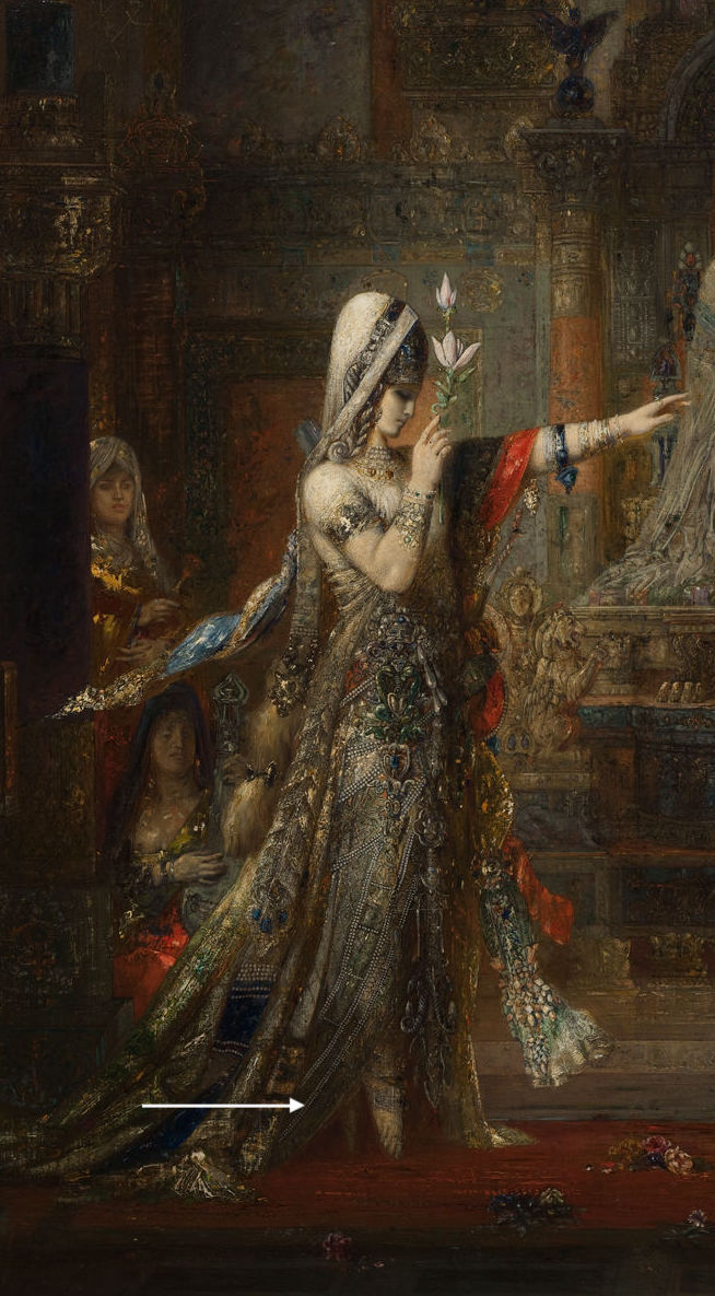
If we look closely, we notice that Salome doesn’t really dance;[6] instead, she appears to hover, as though she belonged to a magical realm. The dissonance between her “inward” gaze and the unnatural position of her arms further enhances this perception, as does the lotus flower she holds upright. Its symbolism is ambiguous. Does it signal lust, or is it a symbol of purity? Moreau’s typically enigmatic approach made him a target for the promoters of Naturalism, most notably Émile Zola, who accused him of retreating into his dreams and offering an artistic response to the challenge posed by science—one that couldn’t possibly have value in the modern age. Such criticism hurt him deeply and only fueled Moreau’s purposeful cultivation of ambiguity.
As viewers, we are aligned to mirror Herod as he sits, seemingly transfixed, his passivity underlined by the majestic statue of Diana of Ephesus—an ancient goddess of fertility —that towers above him. It is not only Herod who mirrors the voyeuristic role of the viewer; the musician on the left, Herodias behind him, glance towards Salome’s face or her upraised left arm. Only the executioner looks elsewhere.
The black panther in the foreground, a symbol of lust and cruelty, looks down forward and implicitly submits to the otherworldly will of the dancing Salome. If Salome the woman dazzles the viewer through her beauty and pose, Moreau’s depiction of Salome does so not only through the glittering colors, but also through the marvelous abundance of detail, that scatter our gaze and prompts us to admire the. wealth of carefully crafted minutia we are offered. Some critics, contemporaneous with Moreau, like Georges Lafenestre, were enchanted and baffled by the sheer abundance of details in his paintings.
Another version of the subject further illustrating Moreau’s love for detail and complexity is the so-called Tattooed Salome.

The viewer here is left wondering whether we are to understand the markings as imprinted on Salome or if they instead form part of a decorative pattern on the canvas that are more apparent against the light tones of her body.
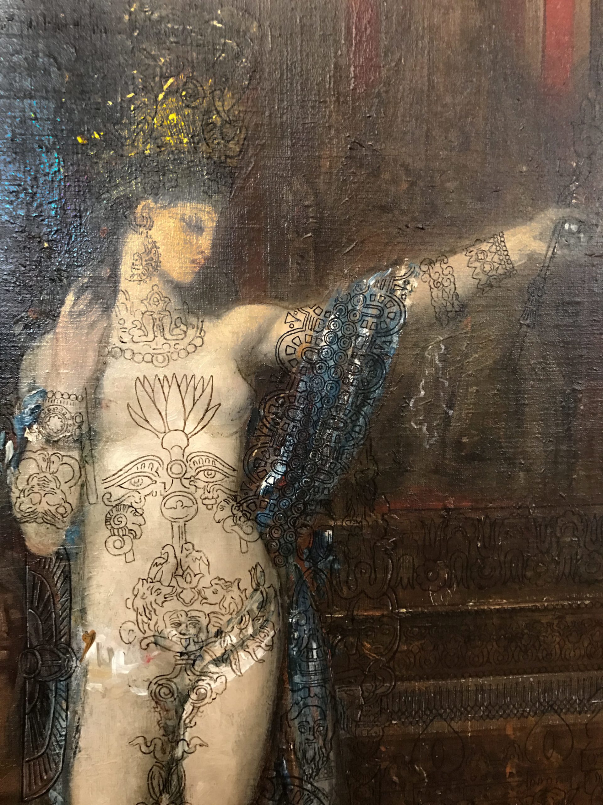
On each side of the lotus “tattoo,” there are two giant eyes staring at the viewer. These “tattooed” eyes, complete with a pair of eyebrow decorations, reveal a mirroring face, whilst Salome’s “real” eyes are lowered. The “tattooed” gaze catch the viewer’s and block him or her, as it were, from exploring the woman’s body, acting as an additional layer of protection against our voyeurism. Further down, we see a “tattooed” Gorgon-like creature, with her tongue sticking out, and reptilian figures undulating around Salome’s inner thighs.
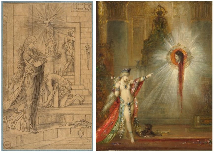
Matter and spirit appear woven together in another image by Moreau, known as Salome Entering the Banquet Hall, in which the temptress raises the platter with Saint John’s head towards the dove symbolizing the Holy Spirit. In this drawing, Salome holds the platter with the saint’s head close to the level of her own, while she peers intently into his eyes. Above them both, but clearly closer to Saint John, the Holy Spirit reigns supreme, while the executioner exists the scene, blade on his shoulder. Another painting by Moreau, Apparition, marks another confrontation of sorts between Salome and the head of Saint John.
Moreau’s long standing interest in the story of Salome and its many interpretations is made apparent through the artist’s varied approaches to the theme and in his desire to transcend to the symbolism Salome traditionally enacts—as a warning against temptation. Instead, Moreau looks to Salome as link between matter and spirit. So intertwined are Moreau’s artistic agenda and Salome’s symbolic content that one could credibly assert that even as Moreau created images of Salome, Salome shaped him.
Antoni Gaudí, Sagrada Família
120 years and counting

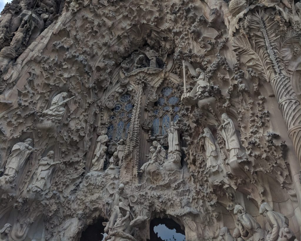
Although Antoni Gaudí was influenced by John Ruskin’s analysis of the Gothic early in his career, he sought an authentic Catalan style at a time, the late 19th century, when this region (currently mostly in northern Spain) was experiencing a resurgence of cultural and political pride. Ruskin, an English critic, rejected ancient classical forms in favor of the Gothic’s expressive, even grotesesque qualities. This interest in the value of medieval architecture resulted in Gaudi being put in charge of the design of Sagrada Família (Sacred Family) shortly after construction had begun.
Gaudí was a deeply religious Catholic whose ecstatic and brilliantly complex fantasies of organic geometry are given concrete form throughout the church. Historians have identified numerous influences especially within the northeast façade, the only part of the church he directly supervised. The remainder of the church, including three of the southwest transept’s four spires, are based on his design but were completed after Gaudí’s death in 1926. These include African mud architecture, Gothic, Expressionist, of course a variant of Art Nouveau that emphasizes marine forms.


The iconographic and structural programs of the church are complex but its plan is based on the traditional basilica cruciform found in nearly all medieval cathedrals. However, unlike many these churches, Sagrada Familia is not built on an east-west axis. Instead, the church follows the diagonal orientation that defines so much of Barcelona, placing the church on a southeast-northwest axis.
The Glory Façade (southeast):
This will eventually be church’s main façade and entrance. As with the transept entrances, it holds a triple portal dedicated to charity, faith, and hope. The façade itself is dedicated to mankind in relation to the divine order.
The Passion Façade (southwest):
Dedicated to the Passion of Christ, its four existing bell towers are between 98 and 112 meters tall and are dedicated to the apostles James the Lesser, Bartholomew, Thomas and Philip (left to right). Josep Maria Subirachs is responsible for the façade sculpture.


The Nativity Façade (northeast):
Depicts the birth of Christ and is the only façade to be completed during Gaudi’s lifetime. Its four existing bell towers are between 98 and 112 meters tall and are dedicated to the saints Barnabas, Jude, Simon and Matthew (left to right).
Ten additional bell towers (98-112 meters high) are planned though these will be overwhelmed by six towers that will be significantly taller. Four of these towers will be dedicated to the Evangelists, one to the Virgin Mary, and the grandest, rising to 170 meters, to Jesus Christ.
Edvard Munch, The Scream

Second only to Leonardo da Vinci’s Mona Lisa, Edvard Munch’s The Scream may be the most iconic human figure in the history of Western art. Its androgynous, skull-shaped head, elongated hands, wide eyes, flaring nostrils and ovoid mouth have been engrained in our collective cultural consciousness; the swirling blue landscape and especially the fiery orange and yellow sky have engendered numerous theories regarding the scene that is depicted. Like the Mona Lisa, The Scream has been the target of dramatic thefts and recoveries, and in 2012 a version created with pastel on cardboard sold to a private collector for nearly $120,000,000 making it the second highest price achieved at that time by a painting at auction.
Conceived as part of Munch’s semi-autobiographical cycle “The Frieze of Life,” The Scream’s composition exists in four forms: the first painting, done in oil, tempera, and pastel on cardboard (1893, National Gallery of Art, Oslo), two pastel examples (1893, Munch Museum, Oslo and 1895, private collection), and a final tempera painting (1910, National Gallery of Art, Oslo). Munch also created a lithographic version in 1895. The various renditions show the artist’s creativity and his interest in experimenting with the possibilities to be obtained across an array of media, while the work’s subject matter fits with Munch’s interest at the time in themes of relationships, life, death, and dread.
For all its notoriety, The Scream is in fact a surprisingly simple work, in which the artist utilized a minimum of forms to achieve maximum expressiveness. It consists of three main areas: the bridge, which extends at a steep angle from the middle distance at the left to fill the foreground; a landscape of shoreline, lake or fjord, and hills; and the sky, which is activated with curving lines in tones of orange, yellow, red, and blue-green. Foreground and background blend into one another, and the lyrical lines of the hills ripple through the sky as well. The human figures are starkly separated from this landscape by the bridge. Its strict linearity provides a contrast with the shapes of the landscape and the sky. The two faceless upright figures in the background belong to the geometric precision of the bridge, while the lines of the foreground figure’s body, hands, and head take up the same curving shapes that dominate the background landscape.
The screaming figure is thus linked through these formal means to the natural realm, which was apparently Munch’s intention. A passage in Munch’s diary dated January 22, 1892, and written in Nice, contains the probable inspiration for this scene as the artist remembered it: “I was walking along the road with two friends—the sun went down—I felt a gust of melancholy—suddenly the sky turned a bloody red. I stopped, leaned against the railing, tired to death—as the flaming skies hung like blood and sword over the blue-black fjord and the city—My friends went on—I stood there trembling with anxiety—and I felt a vast infinite scream [tear] through nature.” The figure on the bridge—who may even be symbolic of Munch himself—feels the cry of nature, a sound that is sensed internally rather than heard with the ears. Yet, how can this sensation be conveyed in visual terms?
Munch’s approach to the experience of synesthesia, or the union of senses (for example the belief that one might taste a color or smell a musical note), results in the visual depiction of sound and emotion. As such, The Scream represents a key work for the Symbolist movement as well as an important inspiration for the Expressionist movement of the early twentieth century. Symbolist artists of diverse international backgrounds confronted questions regarding the nature of subjectivity and its visual depiction. As Munch himself put it succinctly in a notebook entry on subjective vision written in 1889, “It is not the chair which is to be painted but what the human being has felt in relation to it.”
Since The Scream’s first appearance, many critics and scholars have attempted to determine the exact scene depicted, as well as inspirations for the screaming figure. For example, it has been asserted that the unnaturally harsh colors of the sky may have been due to volcanic dust from the eruption of Krakatoa in Indonesia, which produced spectacular sunsets around the world for months afterwards. This event occurred in 1883, ten years before Munch painted the first version of The Scream. However, as Munch’s journal entry—written in the south of France but recalling an evening by Norway’s fjords also demonstrates—The Scream is a work of remembered sensation rather than perceived reality. Art historians have also noted the figure’s resemblance to a Peruvian mummy that had been exhibited at the World’s Fair in Paris in 1889 (an artifact that also inspired the Symbolist painter Paul Gauguin) or to another mummy displayed in Florence. While such events and objects are visually plausible, the work’s effect on the viewer does not depend on one’s familiarity with a precise list of historical, naturalistic, or formal sources. Rather, Munch sought to express internal emotions through external forms and thereby provide a visual image for a universal human experience.
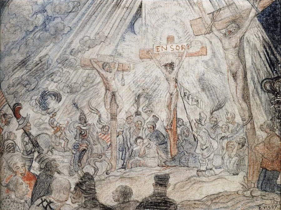
James Ensor, Christ’s Entry into Brussels in 1889
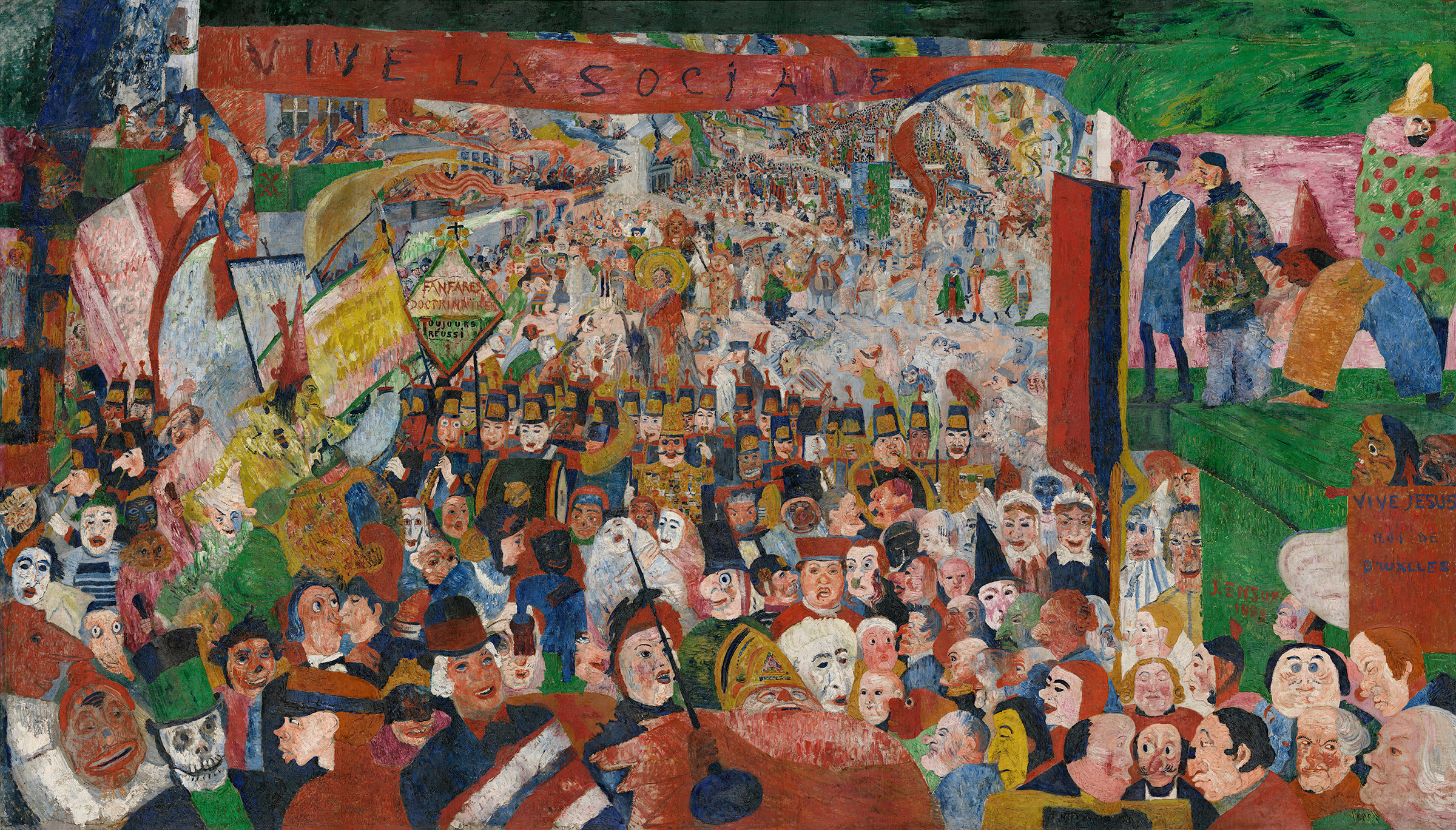
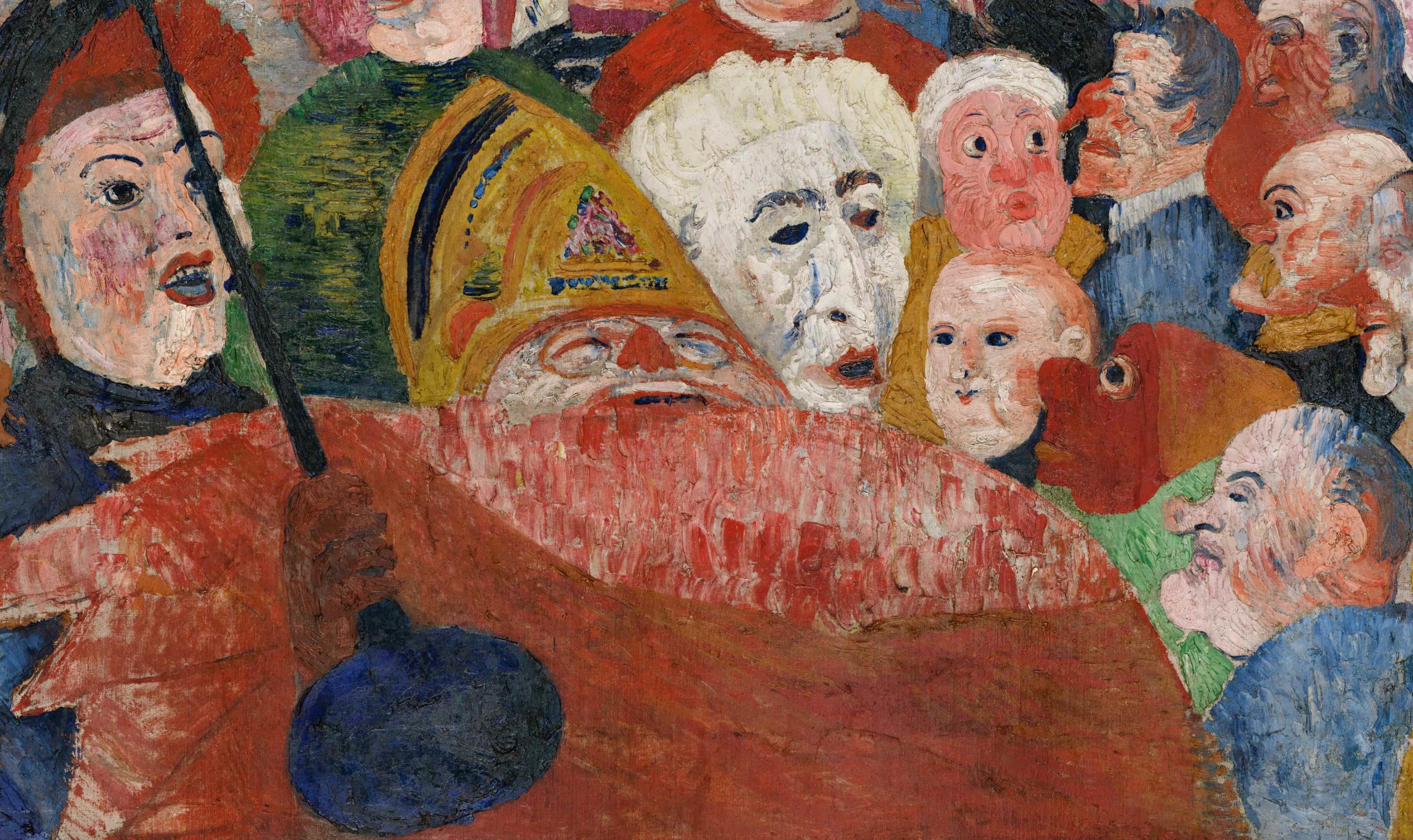
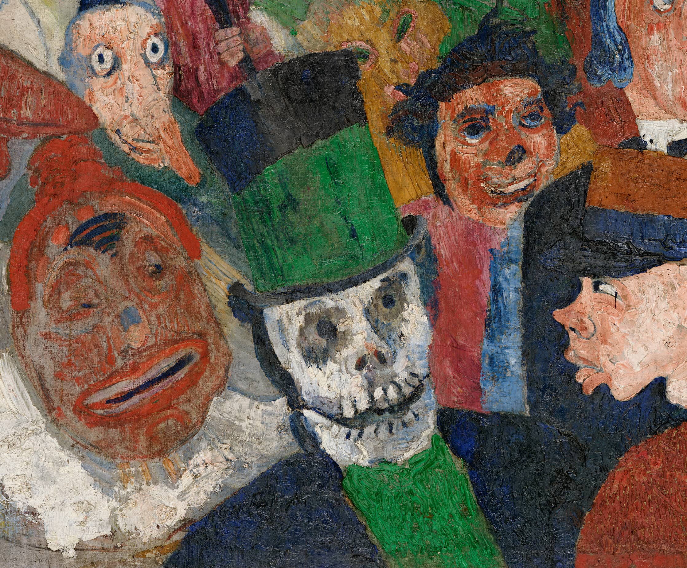
James Ensor’s Christ’s Entry into Brussels in 1889 is one of the largest and most ambitious modern paintings of the late nineteenth and early twentieth centuries. Over eight feet high and fourteen feet wide, it depicts a huge parade flooding down a wide street toward the viewer. The deep central space framed by reviewing stands and balconies suggests the stage of a proscenium theater. The lurid colors used to paint people, signs, and banners clash, and dozens of grotesque theatrical faces in the crowd, many wearing masks, compete for our attention. In the foreground the raucous mob threatens to spill out of the canvas and sweep us up into the chaos.
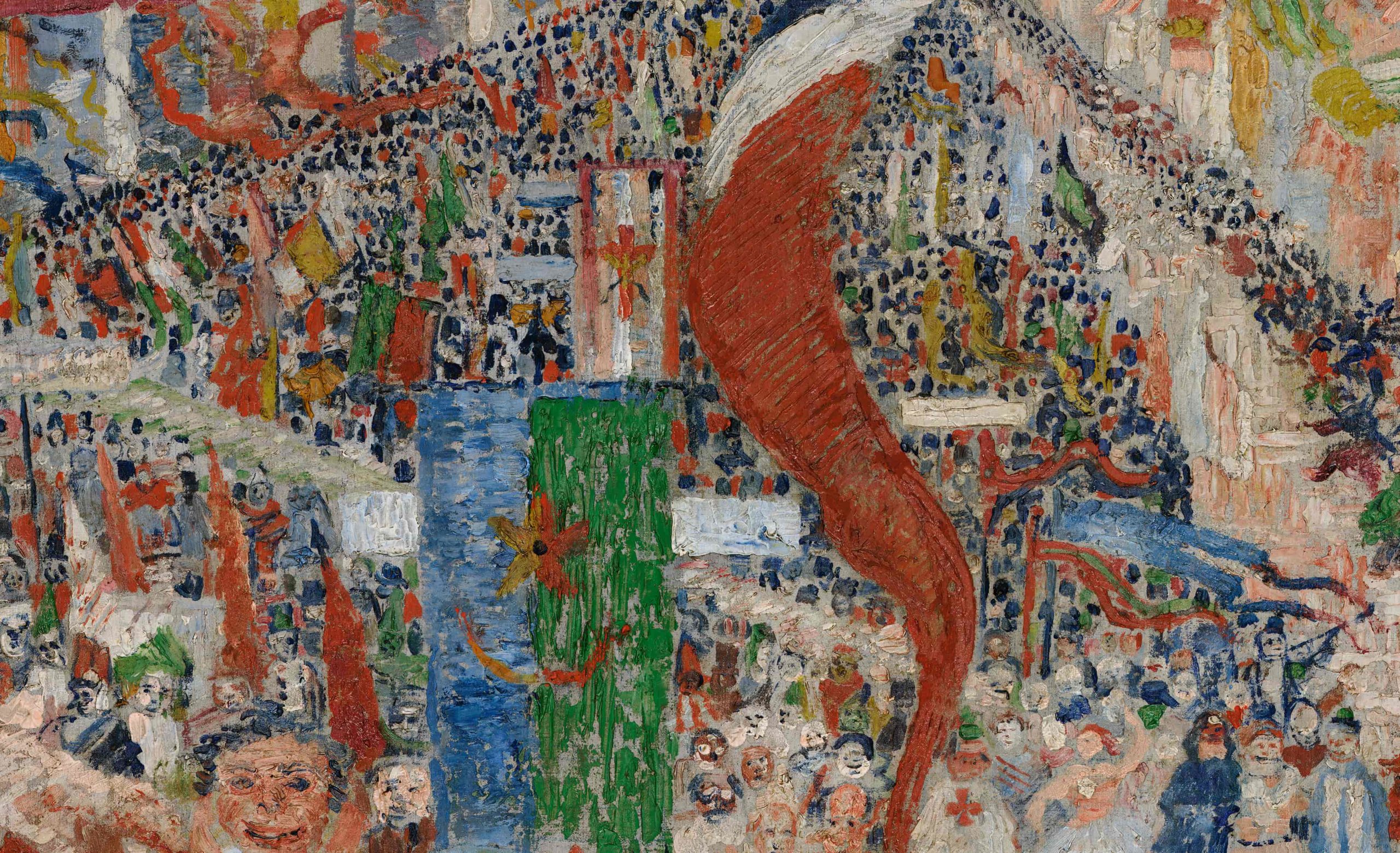
The painting’s style and technique are as aggressive as its subject. The paint is applied in crude heavy strokes and slabs to create a rough, heavily-textured surface. Bright red dominates, and it is accompanied by its complement, green, as well as the other primaries blue and yellow. There is no shading, and the overall effect is flat and poster-like. The colors are brighter and lighter in the background, which sparkles with patterns of dots representing the distant crowds and rays of light that criss-cross the waving banners.
Humanity mocked
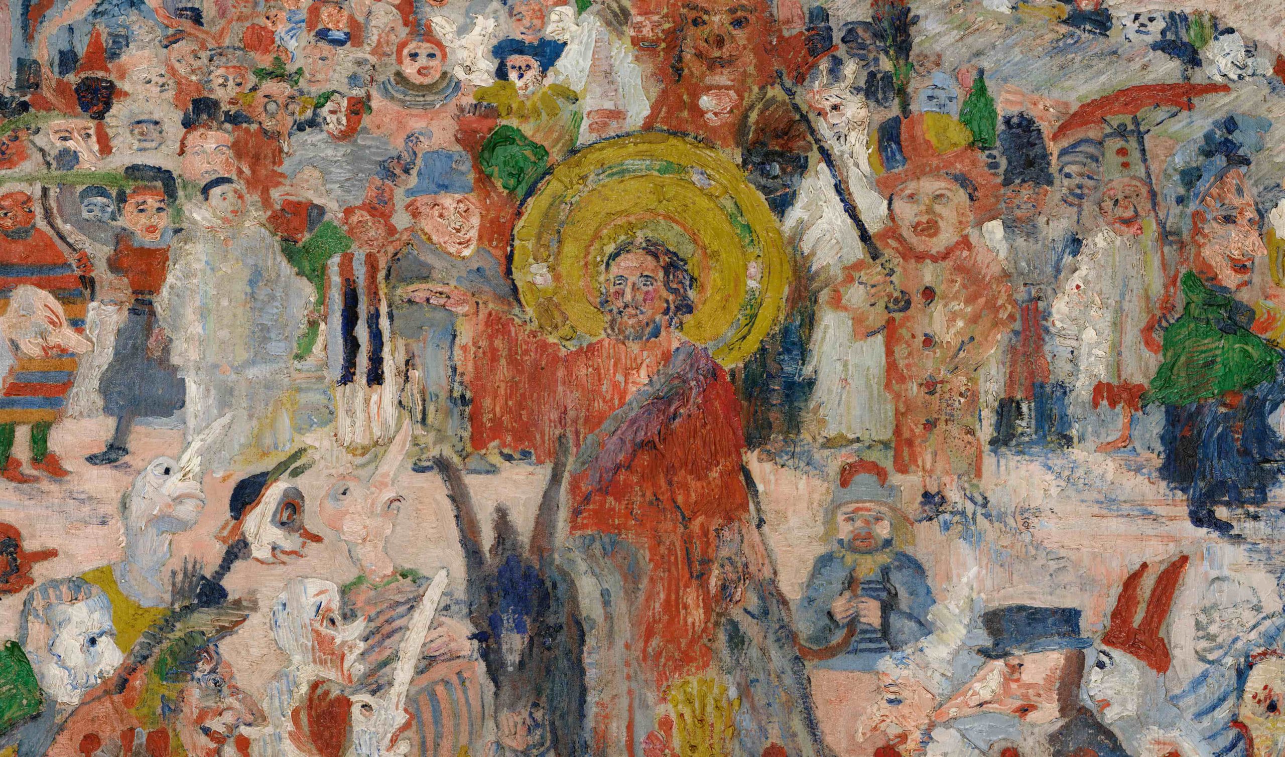
The painting’s title refers to the traditional subject of Christ’s entry into Jerusalem on Palm Sunday, here transposed to contemporary Belgium. The painting is also reminiscent of the carnival parades of Mardi Gras, the Christian festival that precedes Lent. The small gold-haloed figure of Christ rides a donkey in the center of the painting’s upper portion behind the marching band. He is surrounded by a small group of masked figures whose long noses point up at him, and he raises his arm in a gesture of blessing. Most of the crowd, however, pays no attention to Christ.
Christ’s Entry into Brussels is far from being a conventional religious image of Christ as the savior of humanity. The painting mocks humanity, as well as human beliefs and institutions, both civic and religious. The grotesque parade is led by a bishop dressed in red with a gold miter who is marching out of the painting in the middle of the foreground.
The sea of masks and faces behind him includes priests, government officials, soldiers, a military band preceded by a heavily-decorated leader, and caricatures of many types of ordinary citizens. A masked man dressed in the blue coat and white sash of the city’s mayor watches the parade from a reviewing stand on the right, accompanied by a group of elaborately-costumed masked figures. Ensor himself appears in profile as the yellow-clad figure in the tall conical red hat on the left.

Political critique or personal expression?
A red banner inscribed with the slogan “Vive la sociale” or “Long live the social [revolution]” stretches across the top of the painting and refers to contemporary politics and social reformers. Ensor’s sources for the painting included newspaper photos of an enormous socialist demonstration held in Brussels in 1886. The image of Christ had direct political significance as well; socialist politicians and writers in nineteenth-century France and Belgium frequently portrayed Christ as an exemplary social reformer who worked to improve the condition of the impoverished masses. Ensor is known to have been supportive of liberal social reforms and highly critical of powerful conservative institutions in Belgium, but Christ’s Entry into Brussels does not clearly support any particular political position. On the contrary, it seems to be a wholesale condemnation of both humanity and human ideologies.
Ensor created many works depicting scenes from the life of Christ, some of which were images of suffering in which he portrayed himself as Christ. These self-portraits display Ensor’s sense of persecution as an artist. Although he was a recognized leader among the Belgian avant-garde in the 1880s, he felt unfairly treated by critics and fellow artists. Some of his works were refused by Les XX, the Belgian avant-garde exhibition society he helped to found, and his anger and resentment are evident in many works.
In Christ’s Entry into Brussels, a figure vomits on Les XX’s emblem painted in red on the green balcony above Ensor’s self-portrait.. Thus, among the many topics it addresses, the huge painting expresses Ensor’s personal bitterness toward the art world. It is also often interpreted as symbolically portraying the avant-garde artist as a Christ-like prophet misunderstood by the public.

The northern tradition
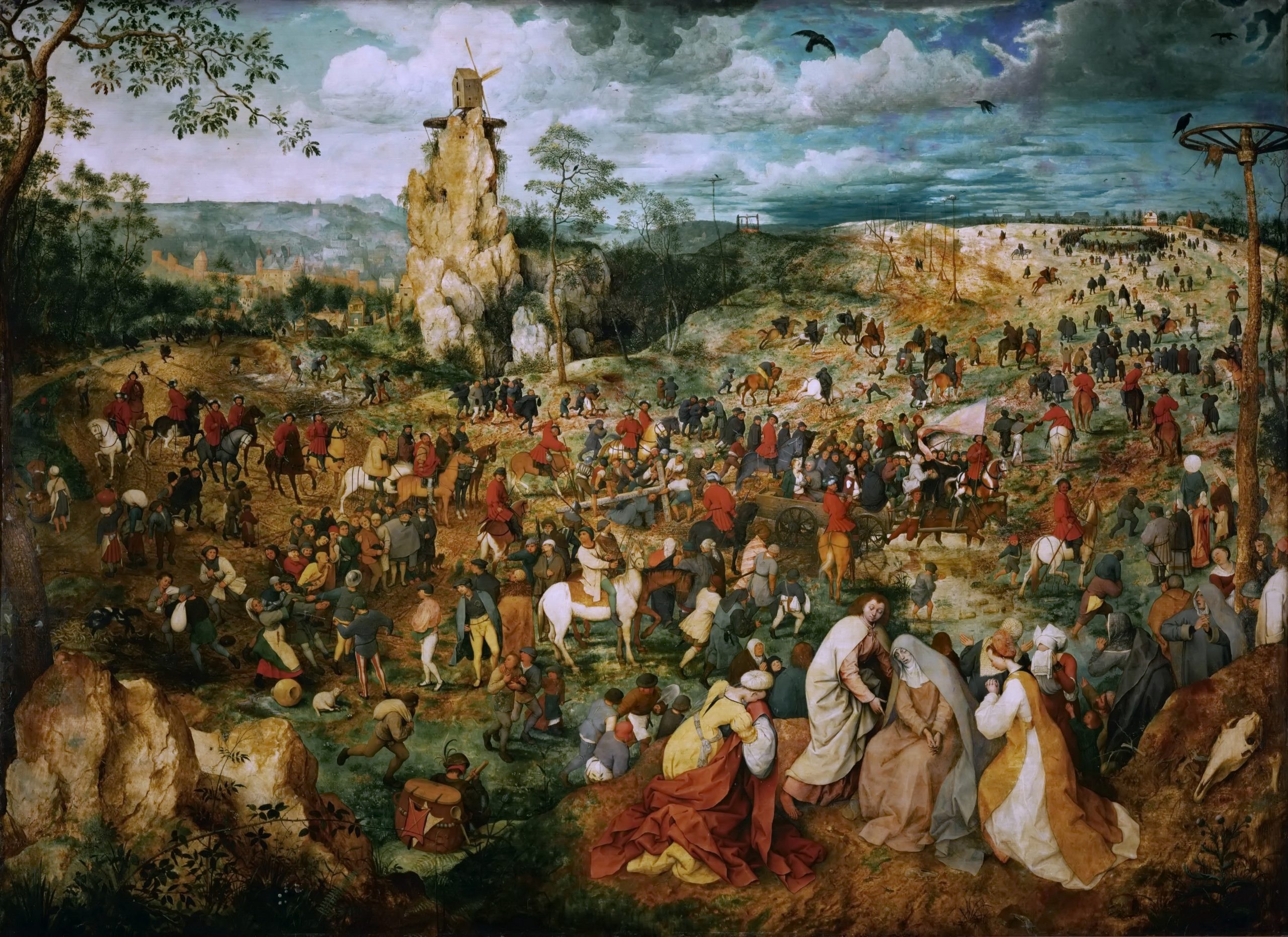
Ensor painted Christ’s Entry into Brussels when he was twenty-eight. His earliest paintings were Realist and Impressionist in style and subject matter, but in the mid-1880s his work became increasingly idiosyncratic. He adopted subjects associated with prominent artists of the Northern Renaissance and Baroque tradition, including Bosch, Bruegel, Rembrandt, and Rubens. Christ’s Entry into Brussels echoes Bruegel’s Procession to Calvary, a painting in which Christ is also lost in a largely oblivious crowd.
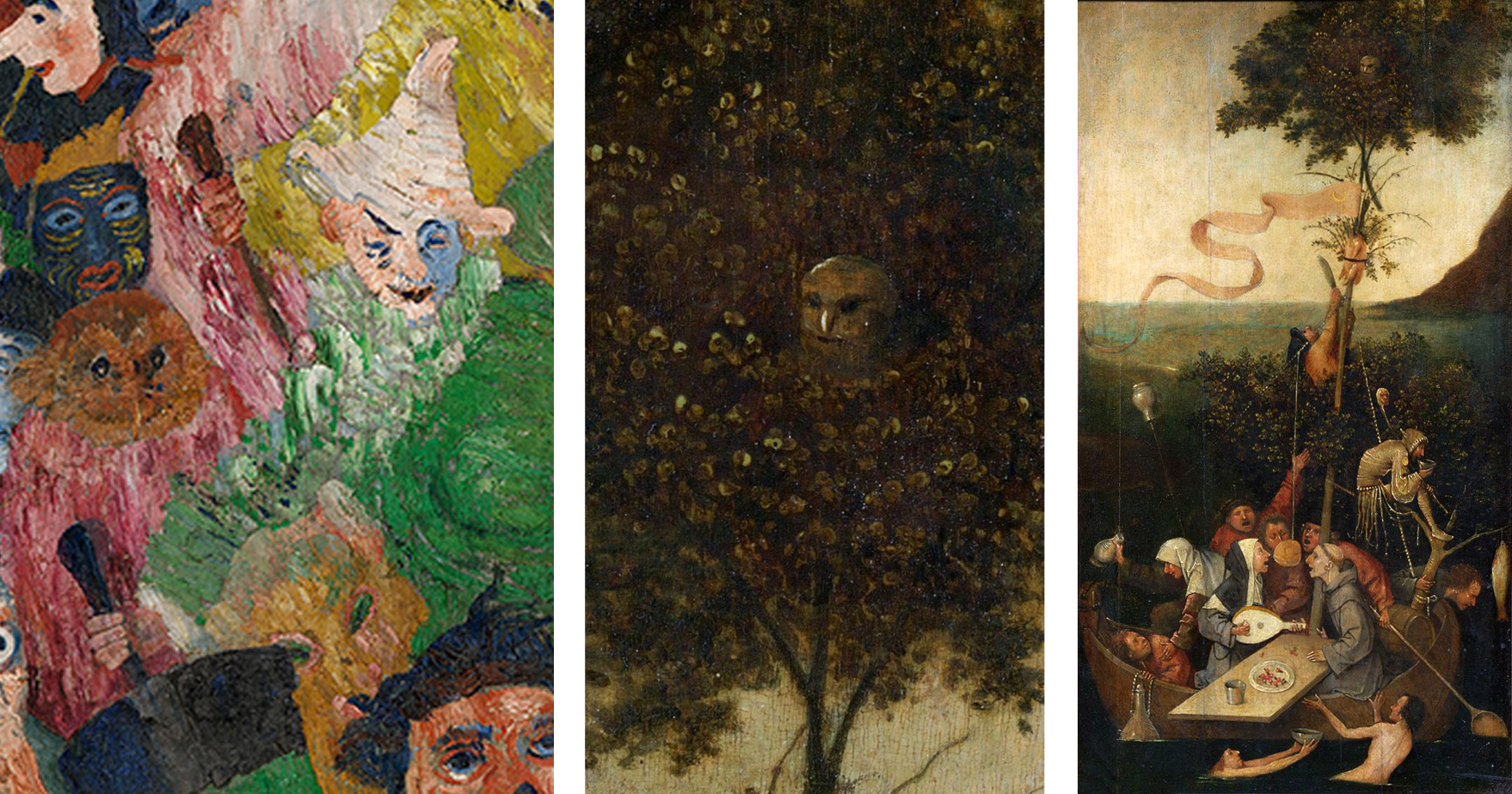
Ensor frequently borrowed fantastic figures and grotesque motifs from Northern Renaissance art, and like Bosch and Bruegel he reveled in the exposure of human folly. In his self-portrait in Christ’s Entry into Brussels Ensor extends his arm down towards the face of an owl, one of many faces in the crowd. While we now associate owls with wisdom, the owl is also a traditional symbol of foolishness. It appears often in this guise in Bosch’s paintings, including his Ship of Fools, where it peers out of the top of the tree.
Masks
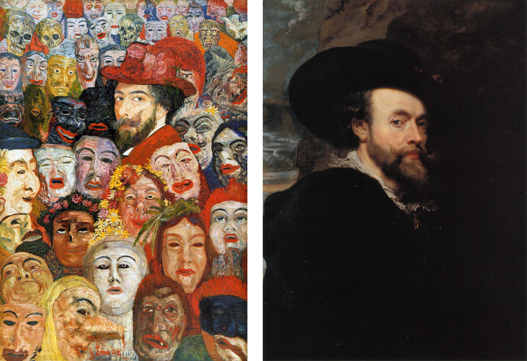
The masks that are so prominent in Christ’s Entry into Brussels became a central subject for Ensor in the 1880s. His family owned a curiosity shop that sold papier-mâché Carnival masks in the seaside town of Ostend, making masks both personal and highly symbolic objects in Ensor’s work. Self Portrait with Masks shows him surrounded by a terrifying array of blindly staring masks, but his own portrait is also a sort of mask; it is directly modeled after self-portraits of the great Flemish Baroque painter Peter-Paul Rubens.
In Christ’s Entry into Brussels even apparently unmasked figures have mask-like, caricatured faces suggesting that everyone wears some sort of mask. Ensor’s masked figures represent humanity as superficial, hypocritical, and grotesque. Masks also confer anonymity and allow people to act outside social laws without fear of being recognized and punished.
In Christ’s Entry into Brussels the theme of personal irresponsibility and freedom is enhanced by the association to a Carnival parade. During Carnival, society’s rules are dropped, and the usual social order is turned upside down; rich and poor switch roles, the beggar becomes king or queen for the day. Carnival is often described as serving as a sort of relief valve for the ordinary pressures of society, as well as a moment when underlying truths are exposed. In Christ’s Entry into Brussels the masks can be understood as revealing rather than hiding the true nature of humanity and human society.
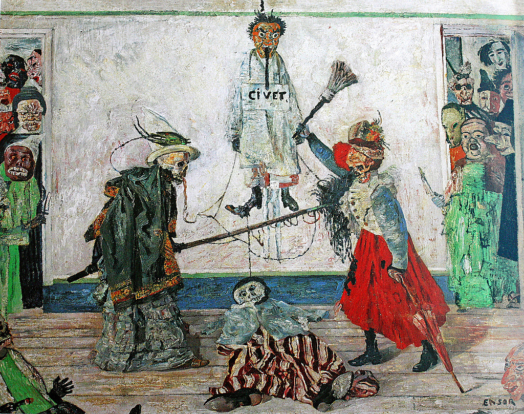
Skeletons
Skeletons were another central subject in Ensor’s art, and a skeleton figure wearing a top hat appears prominently in the lower left of Christ’s Entry into Brussels. It adds a macabre reminder of death’s presence in the midst of life, a traditional artistic theme known as memento mori that was very popular in Northern Baroque painting. In numerous works Ensor portrayed skeletons and masked figures in enigmatic scenes that mock the foolishness and cruelty of human behavior. Ensor’s skeletons frequently represent art critics persecuting him.
In Skeletons Fighting over a Hanged Man two skeletons wearing elaborate costumes duel over mannequins using a mop and broom for weapons. Masked figures carrying knives push through the doorways and seem to menace the duelists on both sides. In the left foreground, a third skeleton watches the combat with paintbrush in hand and a palette on his lap, reminding us that for Ensor his paintbrush was both his weapon and his claim to immortality.
Christ’s Entry into Brussels in 1889 is an ambitious and idiosyncratic painting that enlists multiple historical and contemporary artistic sources to address topics that range from the personal to broad social concerns. It was not publicly exhibited until 1929, but prints of it were widely circulated, and Ensor’s highly individualized art influenced many later modern artists, most notably those associated with Expressionism.
Articles in this chapter:
- Dr. Kristen M. Harkness, “William Morris and Philip Webb, Red House,” in Smarthistory, August 9, 2015
- Monica Obniski, “The Arts and Crafts Movement in America,” in The Metropolitan Museum’s Heilbrunn Timeline of Art History, June 2008
- Dr. Charles Cramer and Dr. Kim Grant, “Art Nouveau,” in Smarthistory, June 14, 2020
- Dr. Vasile-Ovidiu Prejmerean, “Gustave Moreau, Salome,” in Smarthistory, August 23, 2020
- Dr. Beth Harris and Dr. Steven Zucker, “Antoni Gaudí, Sagrada Família,” in Smarthistory, August 9, 2015
- Dr. Steven Zucker and Dr. Beth Harris, “Gustav Klimt, The Kiss,” in Smarthistory, December 5, 2015
- Dr. Noelle Paulson, “Edvard Munch, The Scream,” in Smarthistory, August 9, 2015
- Dr. Charles Cramer and Dr. Kim Grant, “James Ensor, Christ’s Entry into Brussels in 1889,” in Smarthistory, June 28, 2020
- Salome was taken up as a theme numerous times in literature as in the visual arts. If we are to consider the 19th century only, Heine’s Atta Troll, Flaubert’s Three Stories (the third, Hérodias, possibly influenced by Moreau’s painting), Massenet’s Hérodiade and Wilde’s Salome come to mind. Furthermore, it is quite possible that Moreau was acquainted with Flaubert’s 1862 Salammbô and with Mallarmé’s 1864 Hérodiade, which would have influenced his approach. See Julius Kaplan’s “Salome” subchapter in Gustave Moreau. Theory, Style and Content (Ann Arbor, Michigan: UMI, 1982). ↵
- “Thus, in my Salomé, I wanted to depict a figure of a sibyl and religious enchantress having a mysterious character. So then I designed the costume that is like a reliquary.” See Écrits sur l’art par Gustave Moreau. Textes établis, présentés et annotés par Peter Cooke. A Fontfroide, Bibliothèque artistique et littéraire, MMII, p. 99. See also Peter Cooke, Gustave Moreau: History Painting, Spirituality and Symbolism (Yale University Press, New Haven and London, 2014), pp. 81-93. ↵
- “This woman who represents the eternal woman, flimsy bird, often fatal, walking through life with a flower in hand, in search of her vague ideal, often terrible, and always walking, trampling everything under her feet, even geniuses and saints. This dance is executed, this mysterious walk takes place before the death who looks at her incessantly, gaping and attentive, and before the executioner whose sword strikes… A saint, a decapitated head are at the end of her path which will be strewn with flowers. Everything happens in a sanctuary that elevates the spirit towards the gravity and the idea of higher things.” See Écrits, pp. 97-8. ↵
- When speaking of another of his artworks, Jupiter and Europa, Moreau makes his goal clear: “I want, when I address materialist and anti-spiritual youth without respect for art or religion, I want, I’d say, to bring them through the spectacle of the eyes to comprehend the beautiful, which will make them understand the good.” See Écrits, p.79 and Scott C. Allan, “Gustave Moreau and the Afterlife of French History Painting”, PhD thesis, Princeton, pp. 48-54. ↵
- Écrits, p. 344. His eclecticism became proverbial as he used a vast variety of sources — Egyptian, Indian, Roman, Etruscan, Persian, Chinese, Moorish, Turkish, etc. — for the costumes and the architectural settings in his paintings. ↵
- See Peter Cooke, “It isn’t a Dance: Gustave Moreau’s ‘Salome’ and ‘The Apparition’” in Dance Research, vol. 29, no. 2 (winter 2011). ↵
French, "end of the century;" refers to the final years of the 19th century (the late 1800s)
French for "deadly woman," the idea of a woman who attracts and ruins men through her beauty and sexual charms
union of the senses (such as the belief that one might taste a color or smell a musical note)
Latin, "remember that you shall die;" reminders (such as skulls or sputtering candles) that life is impermanent and fleeting

.jpg)