
Popular culture, “popular” art
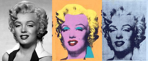
At first glance, Pop Art might seem to glorify popular culture by elevating soup cans, comic strips and hamburgers to the status of fine art on the walls of museums. But, then again, a second look may suggest a critique of the mass marketing practices and consumer culture that emerged in the United States after World War II. Andy Warhol’s Gold Marilyn Monroe (1962) clearly reflects this inherent irony of Pop. The central image on a gold background evokes a religious tradition of painted icons, transforming the Hollywood starlet into a Byzantine Madonna that reflects our obsession with celebrity. Notably, Warhol’s spiritual reference was especially poignant given Monroe’s suicide a few months earlier. Like religious fanatics, the actress’s fans worshipped their idol; yet, Warhol’s sloppy silk-screening calls attention to the artifice of Marilyn’s glamorous façade and places her alongside other mass-marketed commodities like a can of soup or a box of Brillo pads.
Genesis of Pop

In this light, it’s not surprising that the term “Pop Art” first emerged in Great Britain, which suffered great economic hardship after the war. In the late 1940s, artists of the “Independent Group,” first began to appropriate idealized images of the American lifestyle they found in popular magazines as part of their critique of British society. Critic Lawrence Alloway and artist Richard Hamilton are usually credited with coining the term, possibly in the context of Hamilton’s famous collage from 1956, Just what is it that makes today’s home so different, so appealing? Made to announce the Independent Group’s 1956 exhibition “This Is Tomorrow,” in London, the image prominently features a muscular semi-nude man, holding a phallically positioned Tootsie Pop.

Pop Art’s origins, however, can be traced back even further. In 1917, Marcel Duchamp asserted that any object—including his notorious example of a urinal—could be art, as long as the artist intended it as such. Artists of the 1950s built on this notion to challenge boundaries distinguishing art from real life, in disciplines of music and dance, as well as visual art. Robert Rauschenberg’s desire to “work in the gap between art and life,” for example, led him to incorporate such objects as bed pillows, tires and even a stuffed goat in his “combine paintings” that merged features of painting and sculpture. Likewise, Claes Oldenberg created The Store, an installation in a vacant storefront where he sold crudely fashioned sculptures of brand-name consumer goods. These “Proto-pop” artists were, in part, reacting against the rigid critical structure and lofty philosophies surrounding Abstract Expressionism, the dominant art movement of the time; but their work also reflected the numerous social changes taking place around them.
Post-War Consumer Culture Grabs Hold (and Never Lets Go)

The years following World War II saw enormous growth in the American economy, which, combined with innovations in technology and the media, spawned a consumer culture with more leisure time and expendable income than ever before. The manufacturing industry that had expanded during the war now began to mass-produce everything from hairspray and washing machines to shiny new convertibles, which advertisers claimed all would bring ultimate joy to their owners. Significantly, the development of television, as well as changes in print advertising, placed new emphasis on graphic images and recognizable brand logos—something that we now take for granted in our visually saturated world.
It was in this artistic and cultural context that Pop artists developed their distinctive style of the early 1960s. Characterized by clearly rendered images of popular subject matter, it seemed to assault the standards of modern painting, which had embraced abstraction as a reflection of universal truths and individual expression.
Irony and Iron-Ons

In contrast to the dripping paint and slashing brushstrokes of Abstract Expressionism—and even of Proto-Pop art—Pop artists applied their paint to imitate the look of industrial printing techniques. This ironic approach is exemplified by Lichtenstein’s methodically painted Benday dots, a mechanical process used to print pulp comics.
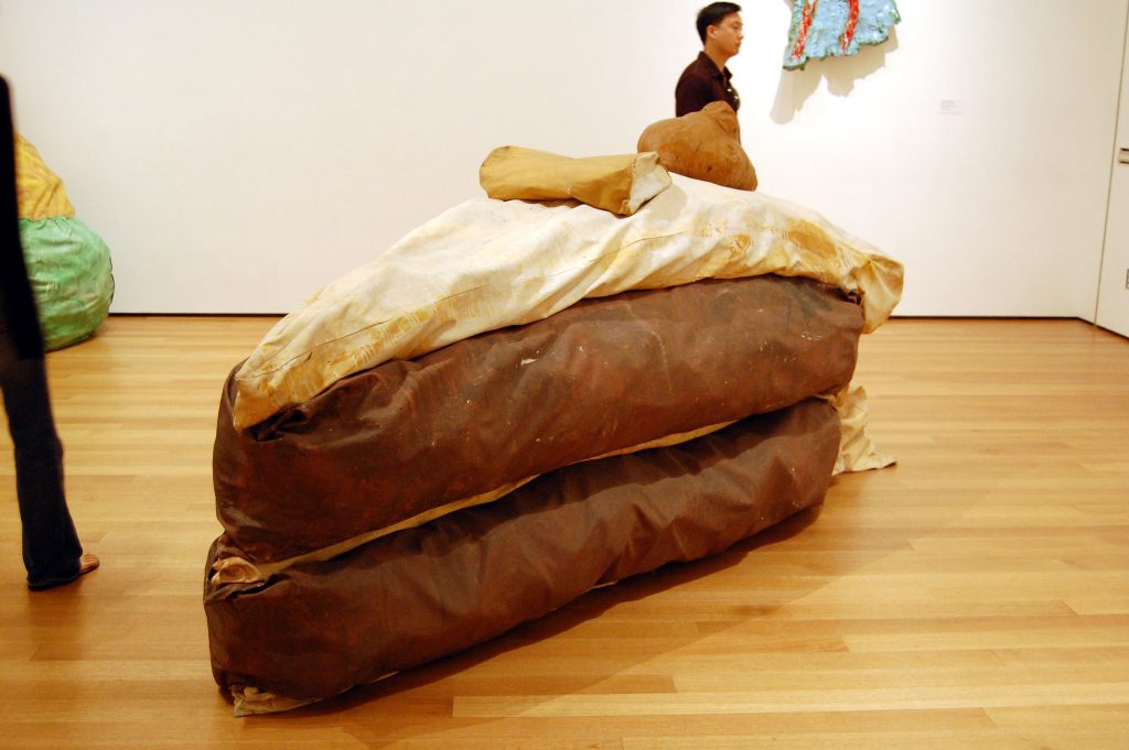
As the decade progressed, artists shifted away from painting towards the use of industrial techniques. Warhol began making silkscreens, before removing himself further from the process by having others do the actual printing in his studio, aptly named “The Factory.” Similarly, Oldenburg abandoned his early installations and performances, to produce the large-scale sculptures of cake slices, lipsticks, and clothespins that he is best known for today.
Robert Rauschenberg, Canyon
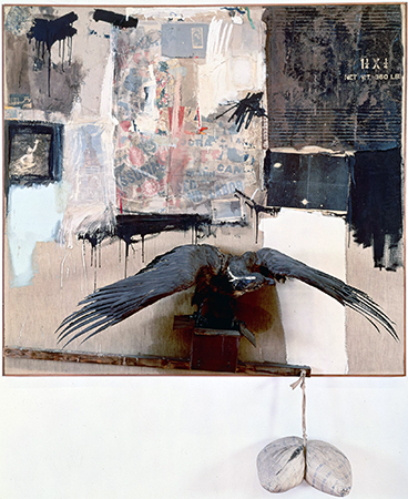
Is Canyon a painting or sculpture? Its upper half is a mass of materials that include bits of a shirt, printed paper, a squashed tube of paint, and photographs all seemingly held in place by broad slashes of house paint, while its lower half consists of a stuffed bald eagle with outstretched wings about to lift off from an opened box. The box seems to balance precariously upon a beam that tilts downward to the right; its end point meets the frame. As if that were not enough, that beams suspends a pillow dangling below the frame and squeezed in half by the cloth string that holds it.
Combines
Canyon belongs to a group of artworks called “Combines,” a term unique to this artist who attached extraneous materials and objects to canvases in the years between 1954 and 1965. What makes Rauschenberg so significant for this period—the postwar years—is how he challenged conventional ways of thinking about advanced modern art; especially the art of “The New York School,” a group of émigré Europeans and like-minded American artists (including Jackson Pollock, Willem de Kooning and their followers), who were praised for their heroic abstraction. Rauschenberg’ s art violated the rules.
While the the word “Combine” has no known origin in an art context, it describes Rauschenberg’s hybrid approach to art making which dismantled the rigid medium-specific categories so dear to modernist culture. In the American art critic Clement Greenberg’s influential theory, so-called true painting was to explore only the properties inherent to painting: gesture, flatness and color. Sculpture was to adhere strictly to the delineation of volume and mass. Both would necessarily be abstract since the truth-to-materials maxim of post-war modernism meant that any kind of illusionism (bronze pretending to be flesh or paint attempting to resemble the thing it represented) was anathema. “Subject matter,” in Greenberg’s infamous declaration, “becomes something to be avoided like a plague.”[1] With Canyon, like any number of Combines the artist created during this period, all of this was put into question. Not only did the artist subvert the distinction between painting and sculpture, he reintroduced subject matter and narrative back into art. The art historian Leo Steinberg declared that Rauschenberg’s Combines “let the world back in again.”[2]

Reading Canyon
Canyon is not an entirely abstract work of art. But what exactly is the subject matter? On the face of it, it seems to be a wryly comic re-telling of the Greek myth in which the god Zeus, disguised as an eagle, abducts a youth named Ganymede. The subject had of course appeared in art before. There are, for example, Greek vases, Roman reliefs and European oil paintings dedicated to this story. Rembrandt’s Abduction of Ganymede, 1636—to which Rauschenberg’s version might readily be compared—paints the story in the lurid richness of oil with a dramatically diagonal arrangement of the figures. Or could it even be a reference to the “scales of Justice” so often found in the art and architecture of Europe and America? It would be a mistake to read Canyon narrowly using only conventional iconography. Although some art historians have sought to “read” Canyon as one would a traditional representional artwork, Rauschenberg’s work seems to resist fixed decoding in favor of a more open-ended play of meaning.

Rauschenberg combined disparate elements in a random fashion perhaps responding to his urban environment (New York City) and a world of ephemera: the flotsam and jetsam of mass culture in the years after the Second World War. Look, for example, at the top right: here is a slab of cardboard with commercial lettering, probably the discarded packaging for a shipment of goods found on the street in his lower Manhattan neighborhood. In this sense he anticipated the later work of Pop artists such as Andy Warhol, Roy Lichtenstein and James Rosenquist who would, a few years later, make such commercial imagery the focus of their art.
Cultural debris
Rauschenberg did know other artists who took a similar approach and challenged the narrow parameters of the formalists wing of the New York School and its rejection of popular culture and illusionism. His immediate circle included the painter Jasper Johns, the choreographer Merce Cunningham and the avant-garde composer John Cage. On the West Coast Edward Keinholz and Wallace Berman were creating artworks that would come to be called “Assemblage”—think collage on a large scale. In Paris, Arman, Jean Tinguley and Jacques de la Villeglé incorporated the debris of the city; junk and cast off commodities incorporated into artworks that became know as Nouveau réalism (New realism).

Canyon is more than an accumulation of debris, however. Note the skeins of paint, brushed, scribbled, clotted, dripping in the style of the abstract expressionists. Rauschenberg was also closely aligned with the New York School—particularly the older abstract expressionists—whose work he admired. But he nevertheless expressed a profound ambivalence towards this group: “There was something about the self-assertion of abstract expressionism that personally always put me off, because at that time my focus was as much in the opposite direction as it could be.”[3]

Rauschenberg’s self-conscious handling of paint intertwined with often-outrageous objects can be construed as parody. In this way, Canyon can be seen as a counter to the overblown rhetoric of abstract expressionism with its stress on heroic individualism and the formal purity of abstract art. The eagle (with its testicular appendage hanging below the frame)—like Jasper Johns’ American flag (see above) from the same period—may be an ironic commentary on heroic masculine identity and even cold-war era American power. As a gay artist during a deeply repressive era that sought to expel both the threat of communism and of homosexuality, Rauschenberg distanced himself from cultural orthodoxy.
Claes Oldenburg, Lipstick (Ascending) on Caterpillar Tracks

A monumental tube of lipstick sprouting from a military vehicle appeared, uninvited, on the campus of Yale University amidst the 1969 student protests against the Vietnam War. While the sculpture may have seemed like a playful, if elaborate artistic joke, Claes Oldenburg’s Lipstick (Ascending) on Caterpillar Tracks was also deeply critical. Oldenburg made the 24-foot-high sculpture in collaboration with architecture students at his alma mater and then surreptitiously delivered it to Yale’s Beinecke Plaza. In Beinecke Plaza, the sculpture overlooked both the office of Yale’s president and a prominent World War I memorial. Lipstick (Ascending) on Caterpillar Tracks claimed a visible space for the anti-war movement while also poking fun at the solemnity of the plaza. The sculpture served as a stage and backdrop for several subsequent student protests.

Oldenburg and the architecture students never intended for the original Lipstick (Ascending) on Caterpillar Tracks sculpture to be permanent. They made the base of plywood, and the red vinyl tip of the lipstick could be comically inflated and deflated—although the balloon mechanism didn’t always work. The original remained in Beinecke Plaza for ten months before Oldenburg removed it in order to remake the form in metal. The resulting sculpture was placed in a less-prominent spot on Yale’s campus, where it remains to this day.
Gender, consumerism, and war
Oldenburg had experimented with lipstick forms earlier in the 1960s, pasting catalog images of lipstick onto postcards of London’s Picadilly Circus. The resulting collages showed lipstick tubes looming like massive pillars over Picadilly’s plaza. In the Yale sculpture, the artist combined the highly “feminine” product with the “masculine” machinery of war. In doing so, he playfully critiqued both the hawkish, hyper-masculine rhetoric of the military and the blatant consumerism of the United States.
In addition to its feminine associations, the large lipstick tube is phallic and bullet-like, making the benign beauty product seem masculine or even violent. The juxtaposition implied that the U.S. obsession with beauty and consumption both fueled and distracted from the ongoing violence in Vietnam.

Going public
Oldenburg had been designing large-scale, vinyl versions of household objects since his Green Gallery exhibition in 1962. He had created collages and drawings that played with the notion of massive domestic objects in public places, but Lipstick was his first large-scale public artwork. Oldenburg went on to make several other public sculptures that enlarged everyday domestic items to monumental dimensions. For example, he rendered a clothespin on the scale of an ancient Egyptian obelisk in a 1976 sculpture for Philadelphia, Pennsylvania (below).
By bringing both domestic and military objects into a public space, Lipstick (Ascending) on Caterpillar Tracks blurred the lines between public and private, and between the war in Vietnam and culture of the United States. In doing so, it upheld Oldenburg’s 1961 declaration that “I am for an art that is political-erotical-mystical, that does something other than sit on its ass in a museum […] I am for an art that imitates the human, that is comic, if necessary, or violent, or whatever is necessary […].”[4]
Claes Oldenburg, Floor Cake
YouTube video: https://youtu.be/N-mt2tiRJ7U
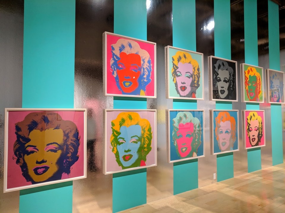
Andy Warhol, Marilyn Diptych

Andy Warhol’s Marilyn Diptych is made of two silver canvases on which the artist silkscreened a photograph of Marilyn Monroe fifty times. At first glance, the work—which explicitly references a form of Christian painting (see below) in its title—invites us to worship the legendary icon, whose image Warhol plucked from popular culture and immortalized as art.

But as in all of Warhol’s early paintings, this image is also a carefully crafted critique of both modern art and contemporary life.
Not only pop culture
With sustained looking, Warhol’s works reveal that he was influenced not only by pop culture, but also by art history—and especially by the art that was then popular in New York. For example, in this painting, we can identify the hallmarks of Abstract Expressionist painters like Jackson Pollock and Willem de Kooning.

As in the work of these older artists, the monumental scale of Marilyn Diptych (more than six feet by nine feet) demands our attention and announces the importance of the subject matter. Furthermore, the seemingly careless handling of the paint and its “allover composition”—the even distribution of form and color across the entire canvas, such that the viewer’s eyes wander without focusing on one spot—are each hallmarks of Abstract Expressionism, as exemplified by Jackson Pollock’s drip paintings. Yet Warhol references these painters only to undermine the supposed expressiveness of their gestures: like Jasper Johns and Robert Rauschenberg, whose work he admired, he uses photographic imagery, the silkscreen process and repetition to make art that is not about his interior life, but rather about the culture in which he lived.
Emotional flatness
Warhol takes as the subject of his painting an impersonal image. Though he was an award-winning illustrator, instead of making his own drawing of Monroe, he appropriates an image that already exists. Furthermore, the image is not some other artist’s drawing, but a photograph made for mass reproduction. Even if we don’t recognize the source (a publicity photo for Monroe’s 1953 film Niagara), we know the image is a photo, not only because of its verisimilitude, but also because of the heightened contrast between the lit and shadowed areas of her face, which we associate with a photographer’s flash.
True to form, the actress looks at us seductively from under heavy-lidded eyes and with parted lips; but her expression is also a bit inscrutable, and the repetition remakes her face into an eerie, inanimate mask. Warhol’s use of the silkscreen technique further “flattens” the star’s face. By screening broad planes of unmodulated color, the artist removes the gradual shading that creates a sense of three-dimensional volume, and suspends the actress in an abstract void. Through these choices, Warhol transforms the literal flatness of the paper-thin publicity photo into an emotional “flatness,” and the actress into a kind of automaton. In this way, the painting suggests that “Marilyn Monroe,” a manufactured star with a made-up name, is merely a one-dimensional (sex) symbol—perhaps not the most appropriate object of our almost religious devotion.
Repetitions
While Warhol’s silkscreened repetitions flatten Monroe’s identity, they also complicate his own identity as the artist of this work. The silkscreen process allowed Warhol (or his assistants) to reproduce the same image over and over again, using multiple colors. Once the screens are manufactured and the colors are chosen, the artist simply spreads inks evenly over the screens using a wide squeegee. Though there are differences from one face to the next, these appear to be the accidental byproducts of a quasi-mechanical process, rather than the product of the artist’s judgment. Warhol’s rote painting technique is echoed by the rigid composition of the work, a five-by-five grid of faces, repeated across the two halves of its surface.
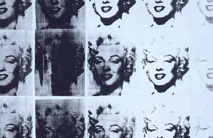
Here, as in many Neo-Dada, minimalist and conceptual works, the grid is like a program that the artist uses to “automate” the process of composing the work, instead of relying on subjective thoughts or feelings to make decisions. In other words, Warhol’s “cool,” detached composition is the opposite of the intimate, soulful encounter with the canvas associated with Abstract Expressionism. But whereas most works that use grids are abstract, here, the the grid repeats a photo of a movie star, causing the painting to resemble a photographer’s contact sheet, or a series of film strips placed side-by-side. These references to mechanical forms of reproduction further prove that for Warhol, painting is no longer an elevated medium distinct from popular culture.
Ghostlysymmetry
Aside from radically changing our notion of painting, Warhol’s choices create a symmetry between the artist and his subject, who each seem to be less than fully human: the artist becomes a machine, just as the actress becomes a mask or a shell. Another word we could use to describe the presence of both the artist and the actress might be ghostly, and in fact, Warhol started making his series of “Marilyn” paintings only after the star had died of an apparent suicide, and eventually collected them with other disturbing paintings under the title “Death in America.” Her death haunts this painting: on the left, her purple, garishly made-up face resembles an embalmed corpse, while the lighter tones of some of the faces on the right make it seem like she is disappearing before our eyes.
Warhol once noted that through repeated exposure to an image, we become de-sensitized to it. In that case, by repeating Monroe’s mask-like face, he not only drains away her life, but also ours as well, by deadening our emotional response to her death. Then again, by making her face so strange and unfamiliar, he might also be trying to re-sensitize us to her image, so that we remember she isn’t just a symbol, but a person whom we might pity. From the perspective of psychoanalytic theory, he may even be forcing us to relive, and therefore work through, the traumatic shock of her death. The painting is more than a mere celebration of Monroe’s iconic status. It is an invitation to consider the consequences of the increasing role of mass media images in our everyday lives.
Op Art
By Deborah Gustlin & Zoe Gustlin
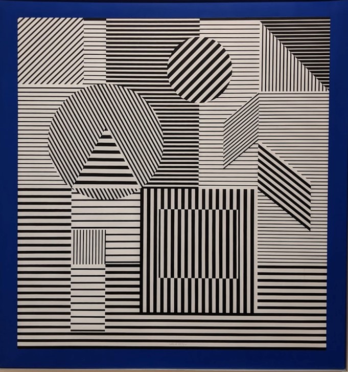
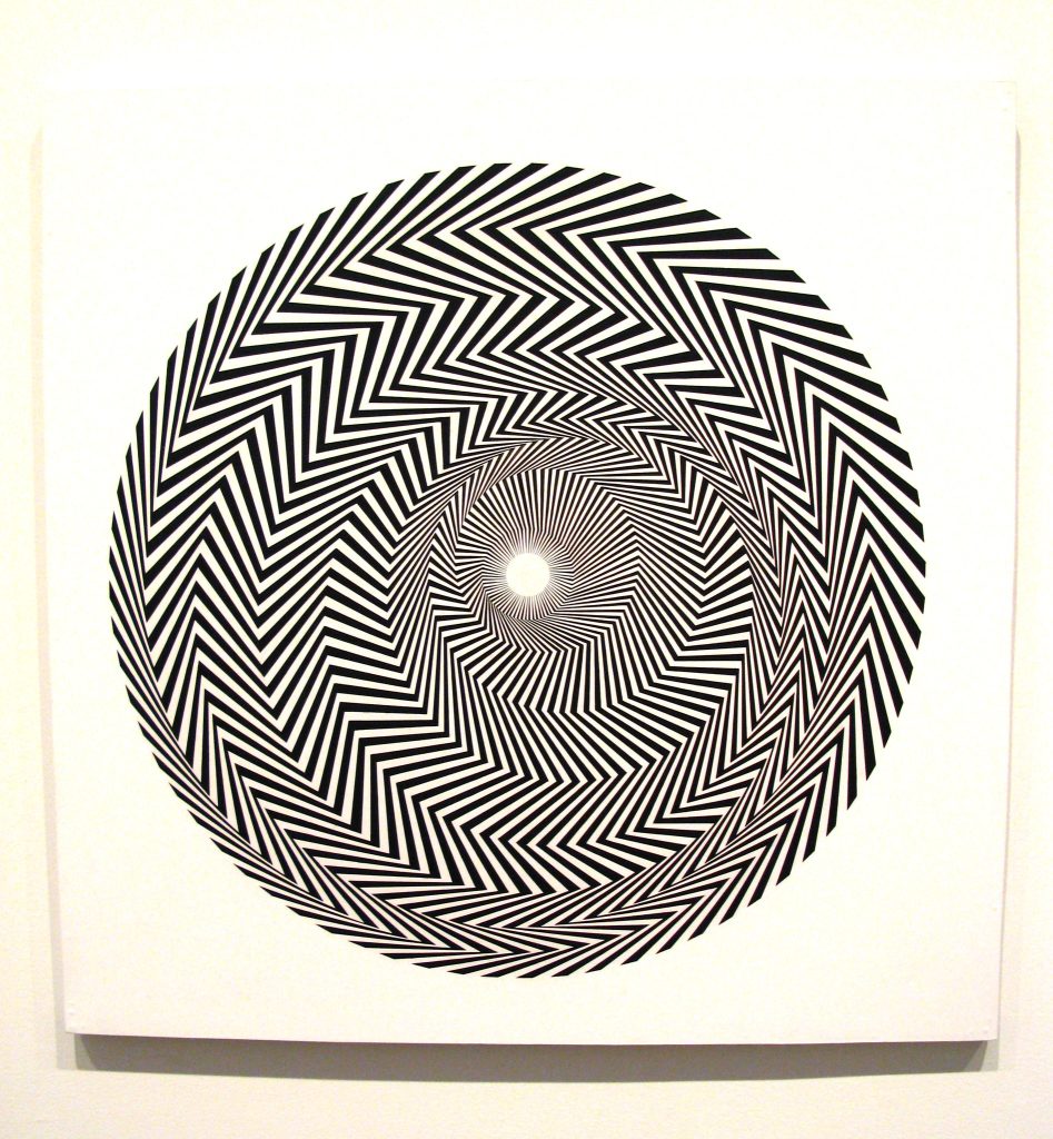
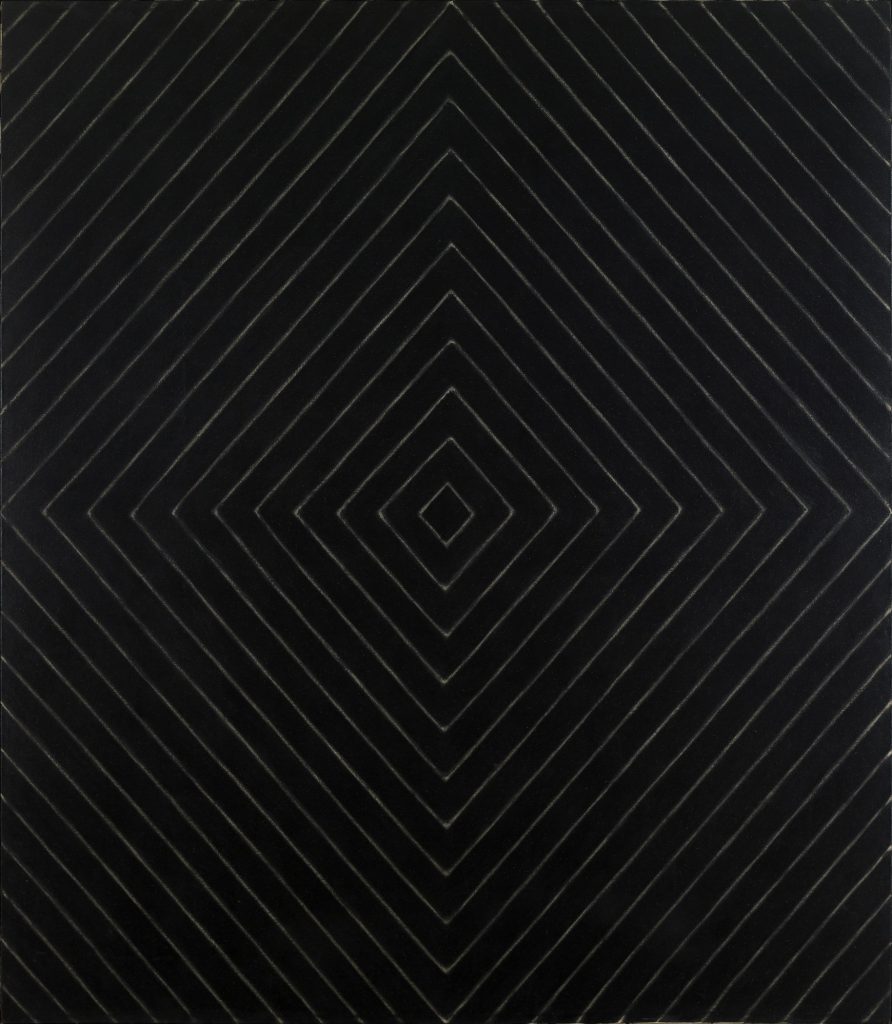
Op art is short for optical art, a style of visual images to create movement on a flat two-dimensional space. The abstracted art was commonly painted with black and white to create a contrast for a vibrating image. Op art is a perceptual experience and is based upon how a viewer’s vision functions. A discordant figure-ground relationship will put two planes together, one from the foreground and one from the background. It creates a tense and contradictory effect with pattern and line with black and white used together.
Victor Vasarely (1906-1997) was a Hungarian-French artist and the leader of the op art movement. Leaving Budapest in 1930, and moving his family to Paris, he began to experiment with geometric forms, contrasting color, and minimal forms. Vasarely found his style in 1951 and began to develop works of art and is considered the grandfather of op art
Bridget Riley (born April 24, 1931) is an English painter who was influenced by the op art movement. Riley primarily worked in black and white colors to achieve high contrast in her paintings. By 1967, she began to experiment with color and repetition. Movement in Squares is a black and white painting of squares that reduce in size as they approach a point on the painting. This optical illusion gives the viewer a sense of depth, like a book that is open. It was Riley’s big breakthrough into abstraction. The striped mural, Bold of Color (14.14), covers and wraps around the long walls of an English hospital.
An introduction to Minimalism

A reductive abstract art
Although many works of art can be described as “minimal,” the name Minimalism refers specifically to a kind of reductive abstract art that emerged during the early 1960s. At the time, some critics preferred names like “ABC,” “Boring,” or “Literal” Art, and even “No-Art Nihilism,” which they believed best summed up the literal presentation and lack of expressive content characterizing this new aesthetic. While scholars have recently argued for a broader definition of Minimalism that would include artists in number of disciplines, the term remains closely linked to sculpture of the period.
Donald Judd’s Untitled (1969) is characteristic in its use of spare geometric forms, repeated to create a unified whole that calls attention to its physical size in relationship to the viewer. Like most Minimalists, Judd used industrial materials and processes to manufacture his work, but his preference for color and shiny surfaces distinguished him among the artists who pioneered the style.
Lack of apparent meaning
What most people find disturbing about Minimalism is its lack of any apparent meaning. Like Pop Art, which emerged simultaneously, Minimalism presented ordinary subject matter in a literal way that lacked expressive features or metaphorical content; likewise, the use of commercial processes smacked of mass production and seemed to reject traditional expectations of skill and originality in art. In these ways, both movements were, in part, a response to the dominance of Abstract Expressionism, which had held that painting conveys profound subjective meaning. However, whereas Pop artists depicted recognizable images from kitsch sources, the Minimalists exhibited their plywood boxes, florescent lights and concrete blocks directly on gallery floors, which seemed even more difficult to distinguish as “Art.” (One well-known story tells of an art dealer, who visited Carl Andre’s studio during the winter and unknowingly burned a sculpture for firewood while the artist was away.) Moreover, when asked to explain his black-striped paintings of 1959, Frank Stella responded, “What you see is what you see.” Stella’s comment implied that, not only was there no meaning, but that none was necessary to demonstrate the object’s artistic value.
Writings
Given these facts, it may seem odd to learn that hundreds of essays and books have been written about Minimalism, many by the artists themselves. It is significant that, although Minimalist art shares similar features, the artists associated with the movement developed their aesthetic ideas from variety of philosophical and artistic influences. Through their writings, Minimalist artists put forth distinctive positions about the work they produced. In addition to his role as a sculptor, Judd was a prominent art critic, and his reviews provide eloquent explanations of his intent—shared by Stella and Dan Flavin—to eliminate the illusionism and “subjective” decision-making of traditional painting. Robert Morris, whose sculpture was influenced by avant-garde dance and performance, published a series of texts, arguing for sculpture to be understood in physical and psychological terms; and, Sol LeWitt introduced the term Conceptual Art to explain the use of seriality and systemic structure in his cubic grid-like forms.
Legacy
In this way, the artists, along with critics and art historians over the past 50 years, have developed a critical discourse that surrounds the art objects, but which is essential to understanding Minimalism itself. Likewise, such artists as Richard Serra, Bernd and Hilla Becher, Maya Lin and Rachel Whiteread, who use Minimalist practice of the early 1960s as a point of departure for their own creative exploration, continue to contribute to the movement’s legacy and our understanding of its significance today.
- Dr. Virginia B. Spivey, “Pop Art,” in Smarthistory, August 9, 2015
- Dr. Thomas Folland, “Robert Rauschenberg, Canyon,” in Smarthistory, August 9, 2015
- Mya Dosch, “Claes Oldenburg, Lipstick (Ascending) on Caterpillar Tracks,” in Smarthistory, August 9, 2015
-
Dr. Beth Harris and Dr. Steven Zucker, “Claes Oldenburg, Floor Cake,” in Smarthistory, November 25, 2015
- Tina Rivers Ryan, “Andy Warhol, Marilyn Diptych,” in Smarthistory, August 9, 2015
- Deborah Gustlin & Zoe Gustlin, “Op Art,” in A World Perspective of Art Appreciation
-
Dr. Virginia B. Spivey, “An introduction to Minimalism,” in Smarthistory, August 9, 2015
