7
Dr. Charles Cramer; Dr. Kim Grant; Dr. Steven Zucker; Dr. Beth Harris; Ben Pollitt; Dr. Noelle Paulson; Metropolitan Museum of Art; and Art Institute of Chicago
In this chapter
- Japonisme, continued
- Introduction to Neo-Impressionism, Part I
- Introduction to Neo-Impressionism, Part II
- Georges Seurat, A Sunday on La Grande Jatte – 1884: A Conversation
- Vincent van Gogh, Self-Portrait with Bandaged Ear
- Vincent van Gogh, The Starry Night
- The Pont-Aven School and Synthetism
- Paul Gauguin, Where do we come from? What are we? Where are we going?
- Paul Cézanne, The Basket of Apples
- Toulouse-Lautrec at the Moulin Rouge
Japonisme, continued
by DR. CHARLES CRAMER and DR. KIM GRANT
Post-Impressionism
Among the Post-Impressionists, van Gogh was especially passionate about Japanese art and traditions, although his understanding of Japanese culture was limited and often more personal fantasy than based on real knowledge. He amassed a collection of hundreds of Japanese prints, and they influenced the development of his style, notably his vivid colors, simplified planar forms, and use of decorative surface patterns. In 1888 he wrote his brother Theo, “All my work is based to some extent on Japanese art….”
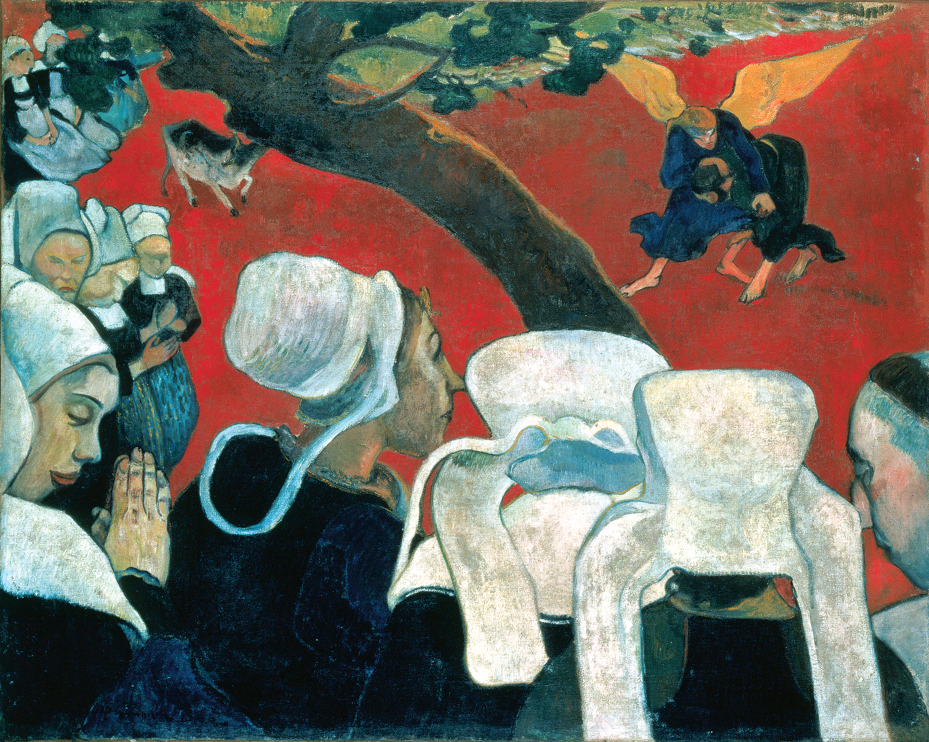
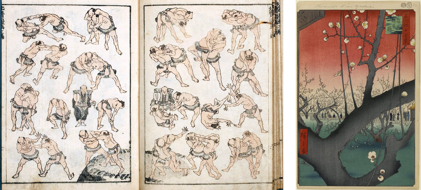
Gauguin borrowed directly from Japanese art early in his eclectic and wide-ranging embrace of non-Western cultures and art forms. The bright colors and flat forms of his cloisonnist paintings were greatly indebted to Japanese prints. In Vision after the Sermon Gauguin used two specific Japanese sources. The figures of Jacob and the angel in the upper right are derived from Hokusai’s prints of sumo wrestlers, while the overall composition with its flat red ground and abruptly arcing tree branch echoes Hiroshige’s woodblock print of a blossoming plum tree, a print van Gogh also copied.
Decorative approaches
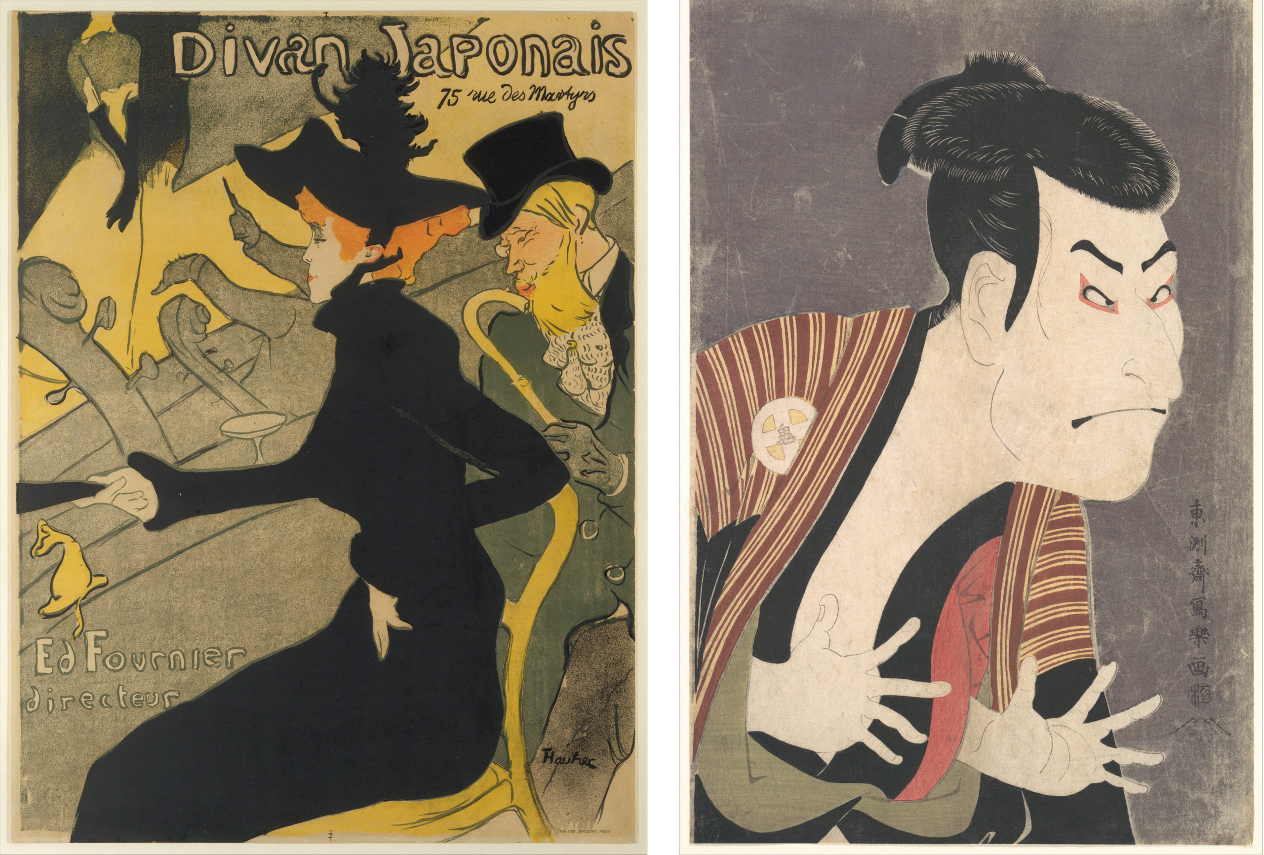
Like many artists associated with Art Nouveau, Henri de Toulouse-Lautrec was greatly affected by Japanese art and design. His posters, such as the one for a café-concert club called Divan Japonais, show the strong influence of Japanese prints of Kabuki actors in their flat forms, powerful contour design, and dramatic use of black shapes. Unlike the paintings we have looked at thus far in this essay, Toulouse-Lautrec’s posters served a similar role to that of the Japanese woodblock prints; they were a cheap, mass-produced form of publicity for the entertainment industry.
The Nabis, a group of French Post-Impressionist artists affiliated with both Pont-Aven and Symbolism, were great admirers of Japanese art. They were dedicated to the decorative arts and closely associated with Siegfried Bing’s gallery Maison de l’Art Nouveau. In addition to creating paintings, they designed many decorative objects including folding screens and stained glass windows.
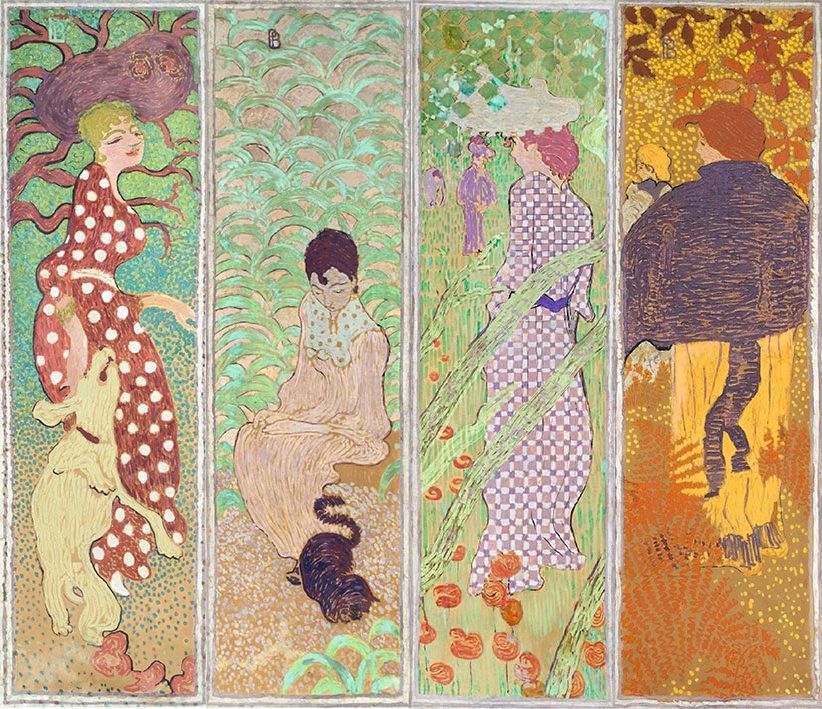
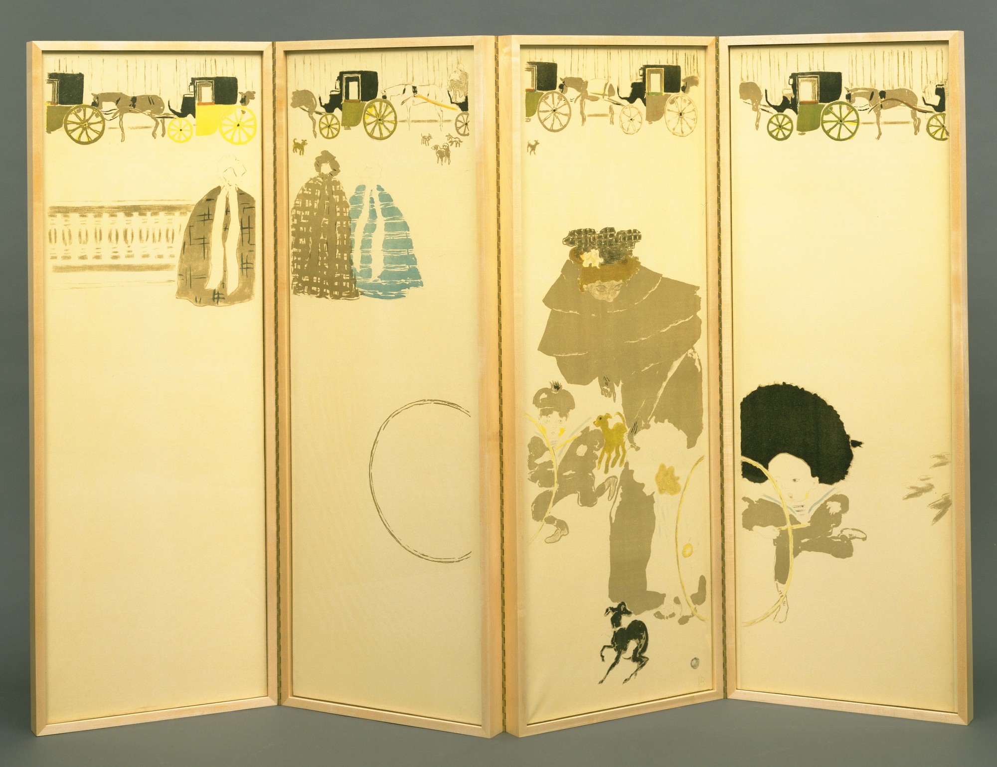
Pierre Bonnard, the most Japanese-influenced of the group, painted a set of four narrow vertical panels, initially intended to be part of a Japanese-style folding screen, showing women in stylized garden settings. The subject as well as the detailed patterns and flat decorative forms were directly inspired by Japanese prints and painted screens. His later paper lithograph screen, Nannies’ Promenade, is even more noticeably influenced by Japanese design in its diagonal composition and its use of a restricted color range and patterned silhouettes on an expanse of white paper.
Japanese art had significant effects on both Western decorative arts and the evolution of new artistic styles associated with Modern art. The distinctive qualities of Japanese art — decorative use of color, surface patterning, and asymmetrical compositions — offered striking new approaches to modern artists developing alternatives to the Western tradition of naturalistic representation.
Introduction to Neo-Impressionism, Part I
Just a dozen years after the debut of Impressionism, the art critic Félix Fénéon christened Georges Seurat as the leader of a new group of “Neo-Impressionists.” He did not mean to suggest the revival of a defunct style — Impressionism was still going strong in the mid-1880s — but rather a significant modification of Impressionist techniques that demanded a new label.
Fénéon identified greater scientific rigor as the key difference between Neo-Impressionism and its predecessor. Where the Impressionists were “arbitrary” in their techniques, the Neo-Impressionists had developed a “conscious and scientific” method through a careful study of contemporary color theorists such as Michel Chevreul and Ogden Rood.[1]
A scientific method
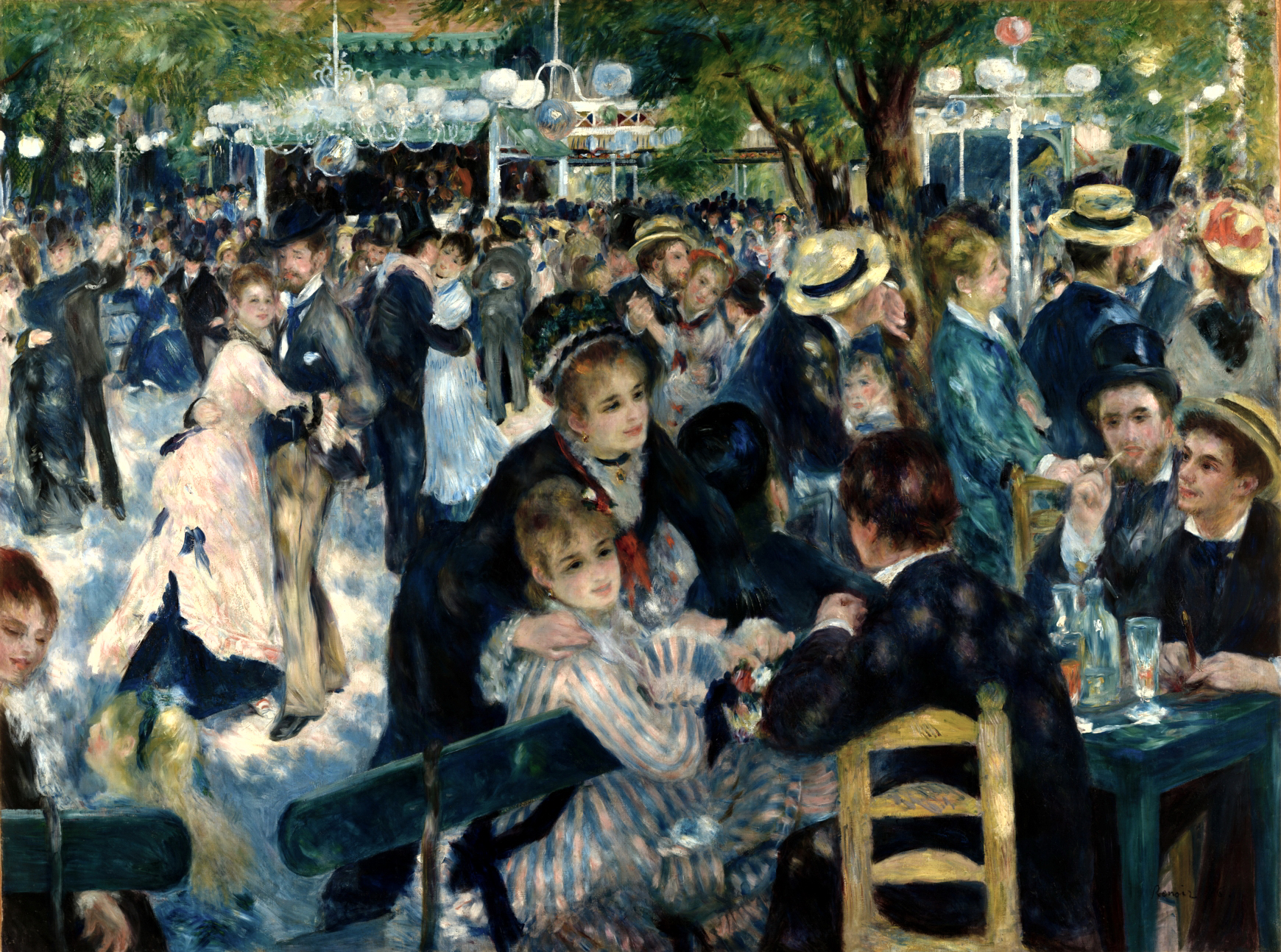
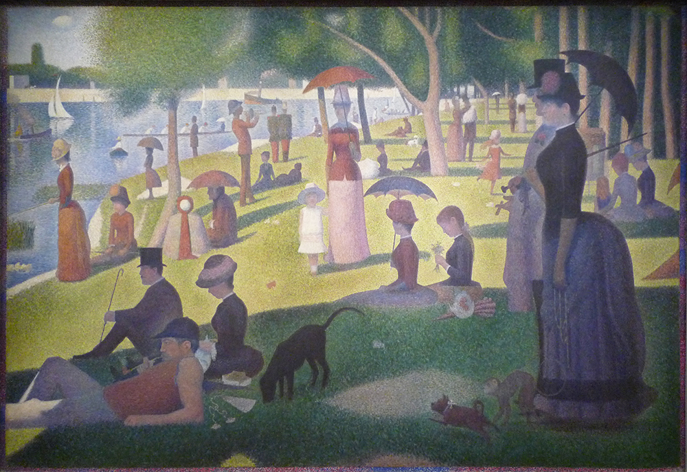
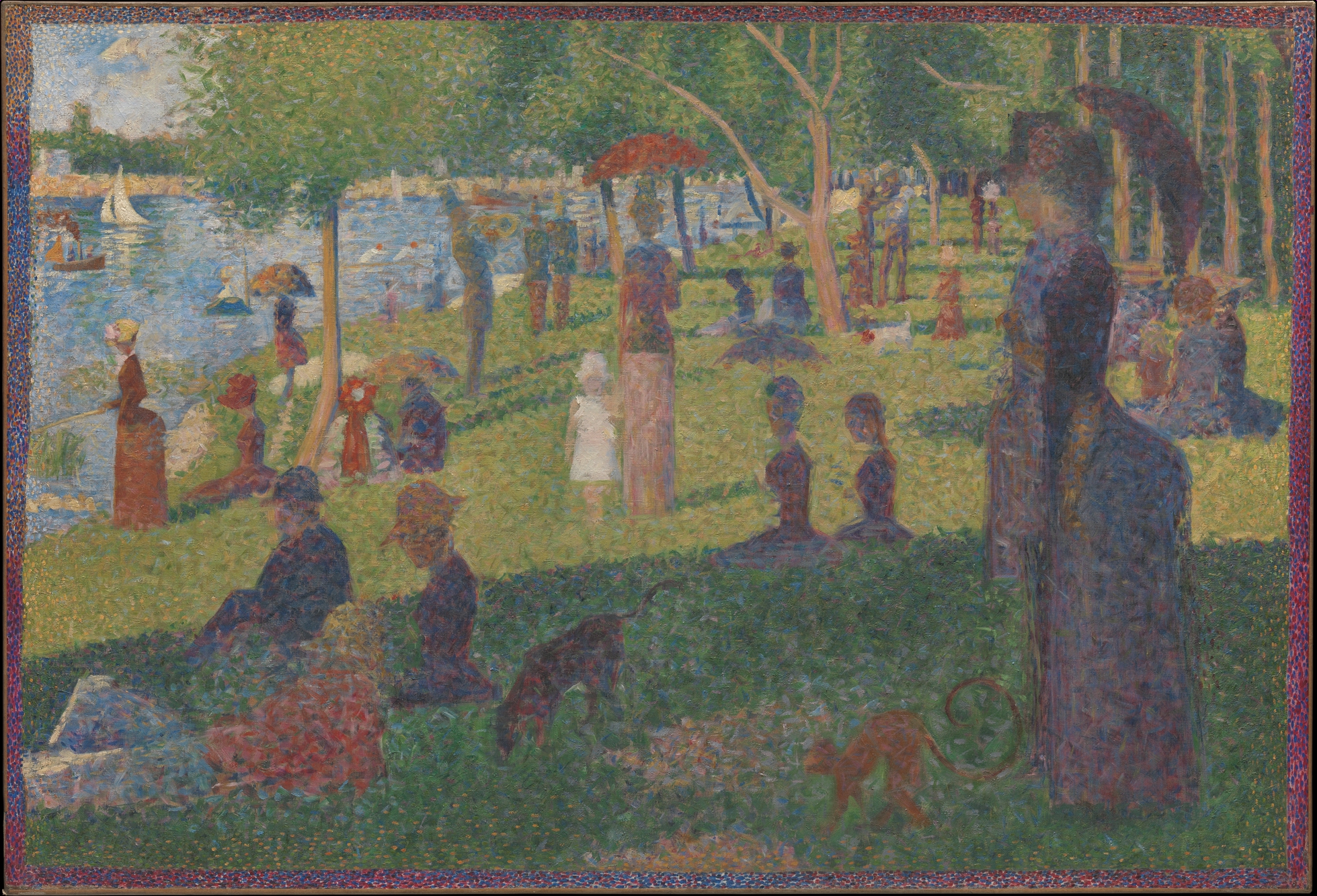
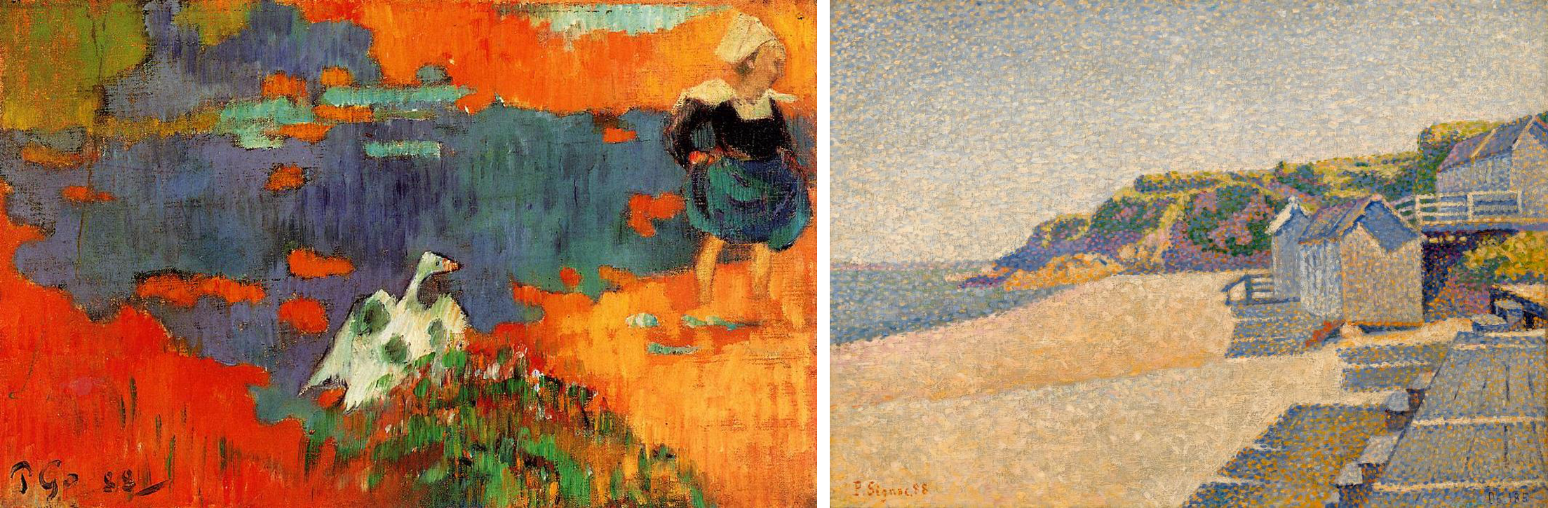
This greater scientific rigor is immediately visible if we compare Seurat’s Neo-Impressionist Grande Jatte with Renoir’s Impressionist Moulin de la Galette. The subject matter is similar: an outdoor scene of people at leisure, lounging in a park by a river or dancing and drinking on a café terrace. The overall goal is similar as well. Both artists are trying to capture the effect of dappled light on a sunny afternoon. However, Renoir’s scene appears to have been composed and painted spontaneously, with the figures captured in mid-gesture. Renoir’s loose, painterly technique reinforces this effect, giving the impression that the scene was painted quickly, before the light changed.
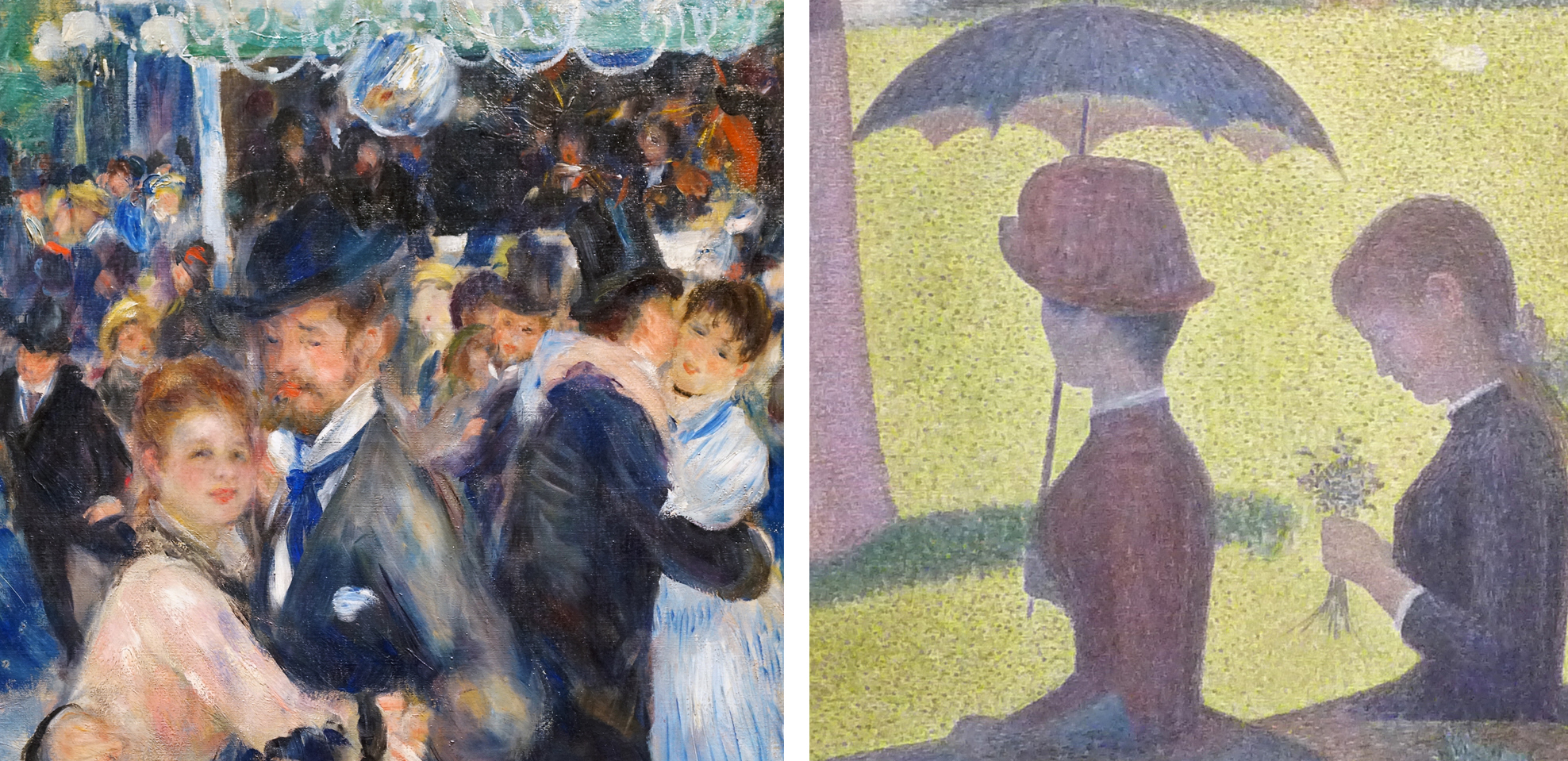
By contrast, the figures in La Grande Jatte are preternaturally still, and the brushwork has also been systematized into a painstaking mosaic of tiny dots and dashes, unlike Renoir’s haphazard strokes and smears. Neo-Impressionist painters employed rules and a method, unlike the Impressionists, who tended to rely on “instinct and the inspiration of the moment.”[2]
Pointillism and optical mixture

One of these rules was to use only the “pure” colors of the spectrum: violet, blue, green, yellow, orange, and red. These colors could be mixed only with white or with a color adjacent on the color wheel (called “analogous colors”), for example to make lighter, yellower greens or darker, redder violets. Above all, the Neo-Impressionists would not mix colors opposite on the color wheel (“complementary colors”), because doing so results in muddy browns and dull grays.
More subtle color variations were produced by “optical mixture” rather than mixing paint on the palette. For example, examine the grass in the sun. Seurat intersperses the overall field of yellow greens with flecks of warm cream, olive greens, and yellow ochre (actually discolored chrome yellow). Viewed from a distance these flecks blend together to help lighten and warm the green, as we would expect when grass is struck by the yellow-orange light of the afternoon sun. It was this technique of painting in tiny dots (“points” in French) that gave Neo-Impressionism the popular nickname “Pointillism” although the artists generally avoided that term since it suggested a stylistic gimmick.
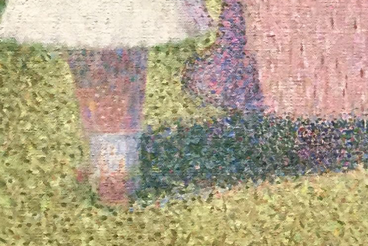
For the grass in the shadows, Seurat uses darker greens intermixed with flecks of pure blue and even some orange and maroon. These are very unexpected colors for grass, but when we stand back the colors blend optically, resulting in a cooler, darker, and duller green in the shadows. This green is, however, more vibrant than if Seurat had mixed those colors on the palette and applied them in a uniform swath.
Similarly, look at the number of colors that make up the little girl’s legs! They include not only the expected pinks and oranges of Caucasian flesh, but also creams, blues, maroons, and even greens. Stand back again, though, and “optical mixture” blends them into a convincing and luminous flesh color, modeled in warm light and shaded by her white dress. (For more technical information on this topic, see Neo-Impressionist color theory).
Compositional rigor
The Neo-Impressionists also applied scientific rigor to composition and design. Seurat’s friend and fellow painter Paul Signac asserted,
The Neo-Impressionist … will not begin a canvas before he has determined the layout … Guided by tradition and science, he will … adopt the lines (directions and angles), the chiaroscuro (tones), [and] the colors (tints) to the expression he wishes to make dominant. Paul Signac, Delacroix to Neo-Impressionism, in Nochlin, ed., p. 121.
Numerous studies for La Grande Jatte testify to how carefully Seurat decided on each figure’s pose and arranged them to create a rhythmic recession into the background. This practice is very different from the Impressionists, who emphasized momentary views (impressions) by creating intentionally haphazard-seeming compositions, such as Renoir’s Moulin de la Galette.
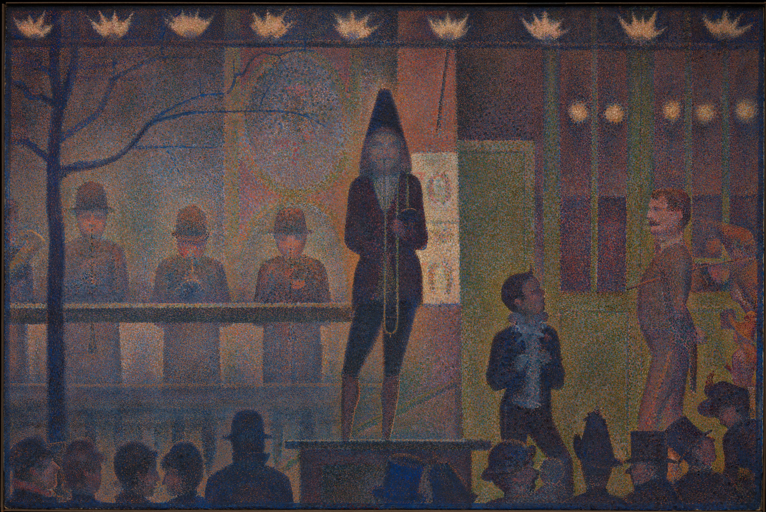
Seurat’s Parade de cirque is even more rigorously geometrical. It is dominated by horizontal and vertical lines, and the just slightly off-rhythmic spacing of the figures and architectural structure creates a syncopated grid. Scholars have debated whether the composition is based on the Golden Section, a geometric ratio that was identified by ancient Greek mathematicians as being inherently harmonious.
Systematized expression
The Neo-Impressionists also attempted to systematize the emotional qualities conveyed by their paintings. Seurat defined three main expressive tools at the painter’s disposal: color (the hues of the spectrum, from warm to cool), tone (the value of those colors, from light to dark), and line (horizontal, vertical, ascending, or descending). Each has a specific emotional effect:
Gaiety of tone is given by the dominance of light; of color, by the dominance of warmth; of line, by lines above the horizontal. Calmness of tone is given by an equivalence of light and dark; of color by an equivalence of warm and cold; and of line, by horizontals. Sadness of tone is given by the dominance of dark; of color, by the dominance of cold colors; and of line, by downward directions. Georges Seurat, Letter to Maurice Beaubourg, August 28, 1890, in Nochlin, ed., p. 114 (translation modified for clarity).
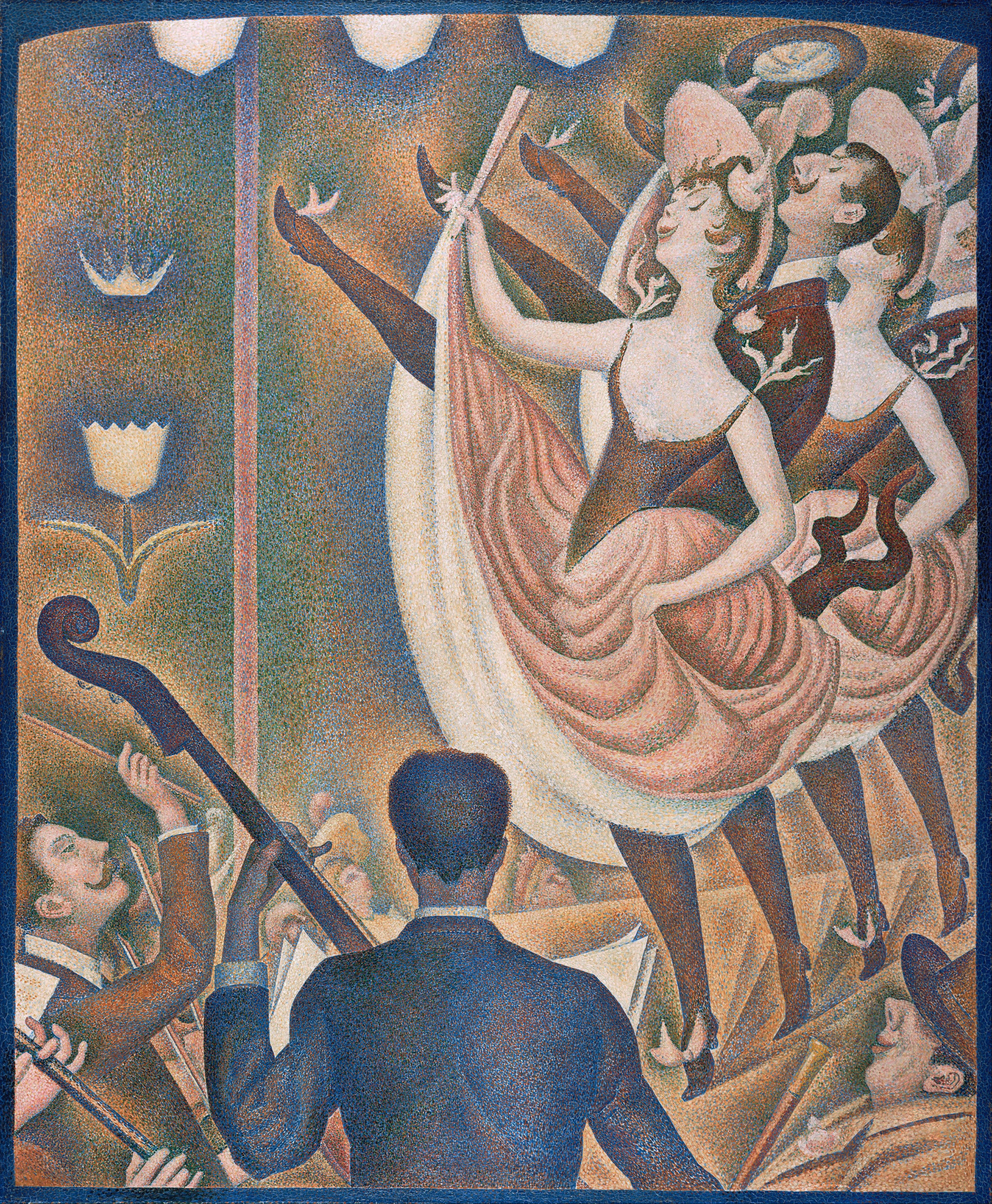
Seurat’s Chahut (Can-Can) seems designed to exemplify these rules, employing mostly warm, light colors and ascending lines to convey a mood of gaiety appropriate to the dance.
The Neo-Impressionist style had a relatively brief heyday; very few artists carried on the project into the 20th century. However, a great many artists experimented with it and took portions of its method into their own practice, from van Gogh to Henri Matisse. More broadly, the Neo-Impressionist desire to conform art-making to universal laws of perception, color, and expression echoes throughout Modernism, in movements as diverse as Symbolism, Purism, De Stijl, and the Bauhaus.
So far we have concentrated on the style of Neo-Impressionism. In the next section (Part 2), we will examine the subject matter favored by the artists, and discuss its relation to the social and political context of the late-nineteenth century.
Introduction to Neo-Impressionism, Part II
In the first section of this introduction to Neo-Impressionism we examined the style of the movement, concentrating on the artists’ attempt to systematize a method for painting according to scientific laws of perception, color, composition, and expression. Here, we will turn to the kind of subject matter typically chosen by the Neo-Impressionists and discuss its relation to late-nineteenth century social and political history.
Scenes of leisure
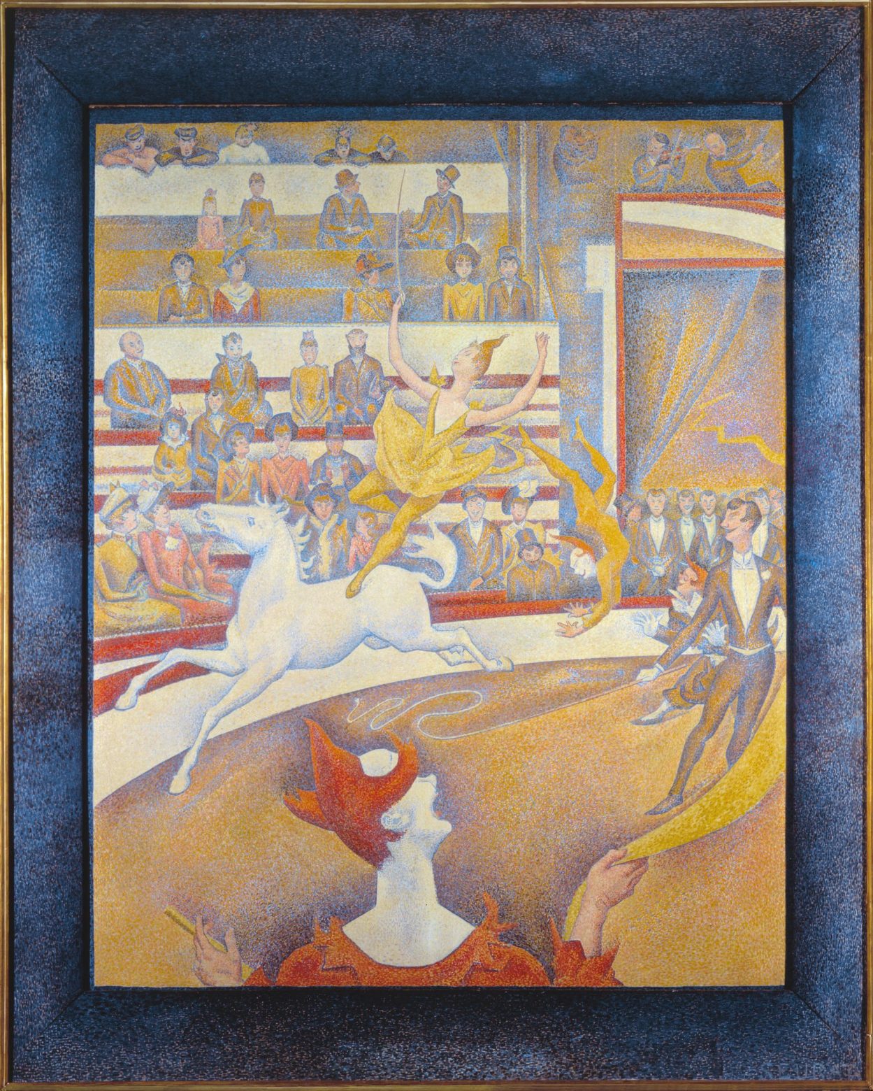
For the most part, the Neo-Impressionists continued to depict the kinds of subjects preferred by the Impressionists: landscapes and leisure scenes. In addition to his famous painting of people lounging in the park on the island of La Grande Jatte, many of Georges Seurat’s paintings portrayed entertainments such as the circuses and music halls that contributed to Paris’s reputation for mass spectacles in the late nineteenth century.
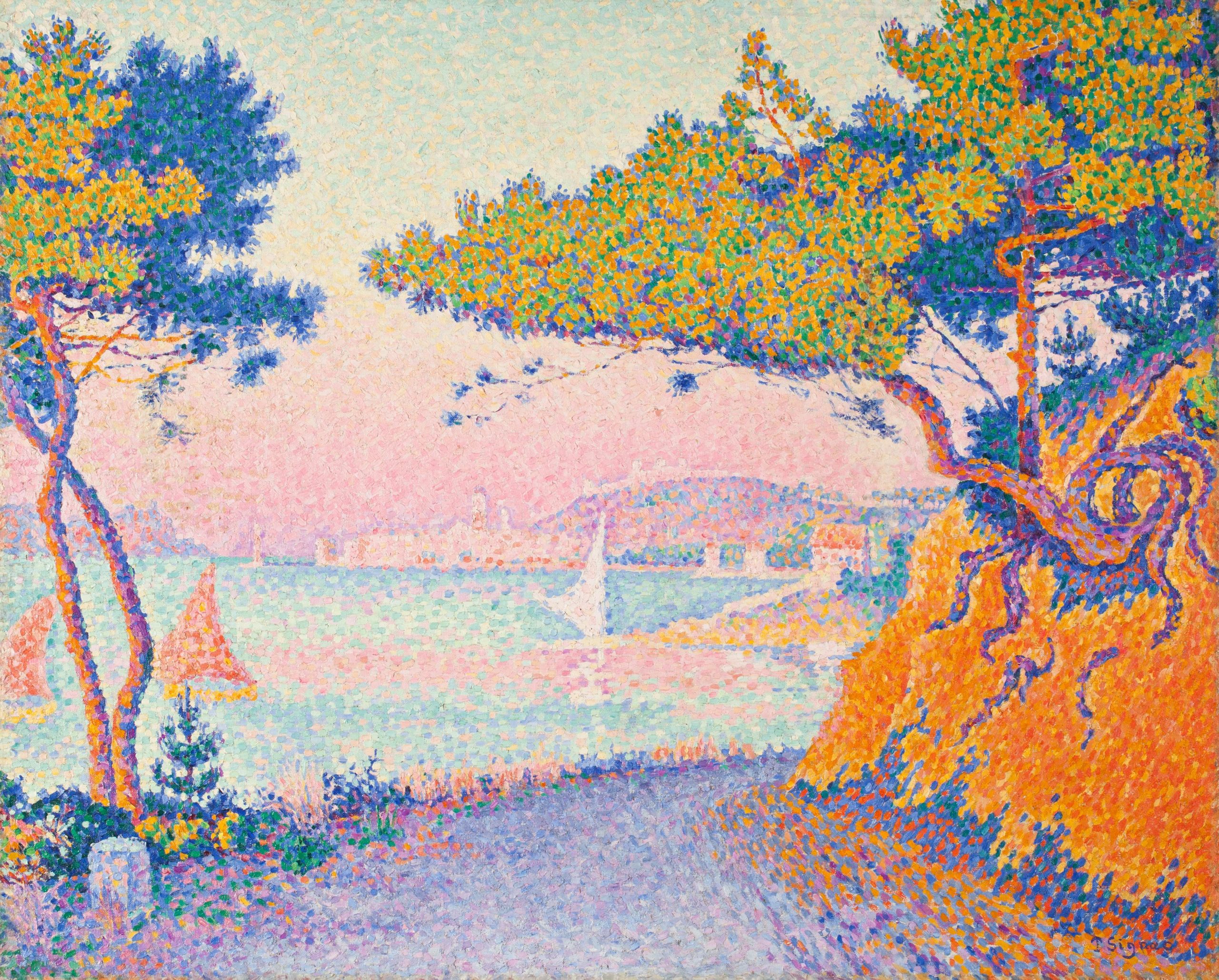
Paul Signac’s landscape paintings similarly reveal a concentration on leisure scenes. A sailor himself, Signac painted dozens of harbor scenes dominated by the sails and masts of small pleasure craft. The Mediterranean coast of France, where Signac spent his summers, had a reputation both for the quality of its light — a key interest of the Neo-Impressionists generally — and for a laid-back, sun-filled lifestyle. In Signac’s canvases, the bright colors favored by the Neo-Impressionists perfectly complement this reputation.
Social inequality
Although these subjects suggest carefree pleasure, there are undertones of social criticism in some Neo-Impressionist paintings. Seurat’s Circus shows the strict class distinctions in Paris both by location, with the wealthier patrons seated in the lower tiers, and by dress and posture, which gets markedly more casual the further the spectators are from ringside.
One contemporary critic also remarked that the rigidity of the poses in Seurat’s La Grande Jatte reminded him of “the stiffness of Parisian leisure, prim and exhausted, where even recreation is a matter of striking poses.”[3] As we examine the characters in La Grande Jatte in detail, there are some surprising inclusions and juxtapositions. In the left foreground, a working-class man in shirtsleeves overlaps a much more formally-dressed middle-class gentleman in a top hat holding a cane. A trumpet player in the middle-ground plays directly into the ears of two soldiers standing at attention in the background. A woman with an ostentatiously eccentric pet monkey on the right and another fishing on the left have been interpreted as prostitutes, one of whom is casting out lures for clients. Between them, a toy lap-dog with a pink ribbon leaps toward a rangy hound whose coat is as black as that of the bourgeois gentleman with the cane.
Despite these provocative juxtapositions and overlaps, very few of the figures actually seem to be interacting with each other; each is lost in their own world. Unlike the mood of convivial good-fellowship between the classes and sexes in Auguste Renoir’s Moulin de la Galette, Seurat’s Grande Jatte sets up a dynamic of alienation and tension.
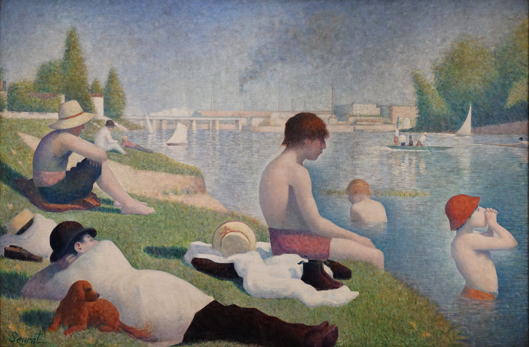
La Grande Jatteforms an implicit pair with an earlier painting of the same size by Seurat, Bathers at Asnières. Asnières was an industrial suburb of Paris, just across the river Seine from La Grande Jatte. Unlike that island’s largely middle-class patrons in their top hats and bustle skirts, here we see more working-class and lower-middle-class figures in shirtsleeves and straw hats or bowlers. In the background the smokestacks of the factories at Clichy serve as a reminder of labor, even during the men’s leisure time.
As in the painting of La Grande Jatte, all of the figures are isolated in their own world, but a sense of implicit tension is raised by their insistent gaze across the river at their wealthier compatriots. A middle-class couple being rowed by a hired oarsman in a boat with a prominent French flag further adds to the class tensions raised by the work.
Political revolutionaries?
Perhaps it was this odd sense of unresolved class tensions that caused Signac to suggest that even Seurat’s paintings of “the pleasures of decadence” are about exposing “the degradation of our era” and bearing witness to “the great social struggle that is now taking place between workers and capital.”[4] Seurat’s own politics were unclear, but Signac was a social anarchist, as were several other Neo-Impressionists, including Camille Pissarro and his son Lucien, as well as Maximilian Luce, Theodore van Rysselberghe, Henri Cross, and the critic Felix Fénéon. Social anarchists reject a strong centralized government in which the state owns the means of production and guides the economy; they believe that social ownership and cooperation will emerge naturally in a stateless society.
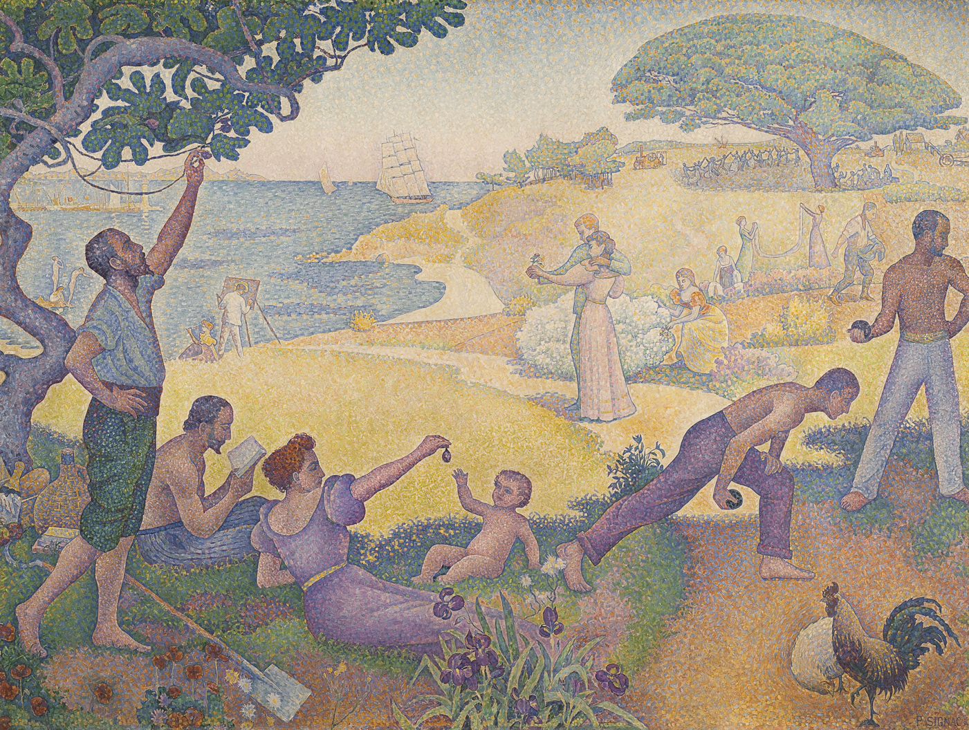
Signac’s In the Time of Harmony was originally titled In the Time of Anarchy, but political controversy forced a change. Between 1892 and 1894 there were eleven bombings in France by anarchists, and a very public trial of suspected anarchists that included Fénéon and Luce.
Signac’s painting was intended to show that, despite its current revolutionary tactics, the aim of anarchism was a peaceful utopia. In the foreground, workers lay down their tools for a picnic of figs and champagne while others play at boules. A couple in the center contemplates a posy, while behind them a man sows and women hang laundry. Although the mood is timeless — with different clothing, this painting could be a Classical pastoral scene — in the distance modern mechanical farm equipment reinforces the painting’s subtitle, “The Golden Age is Not in the Past, it is in the Future.”
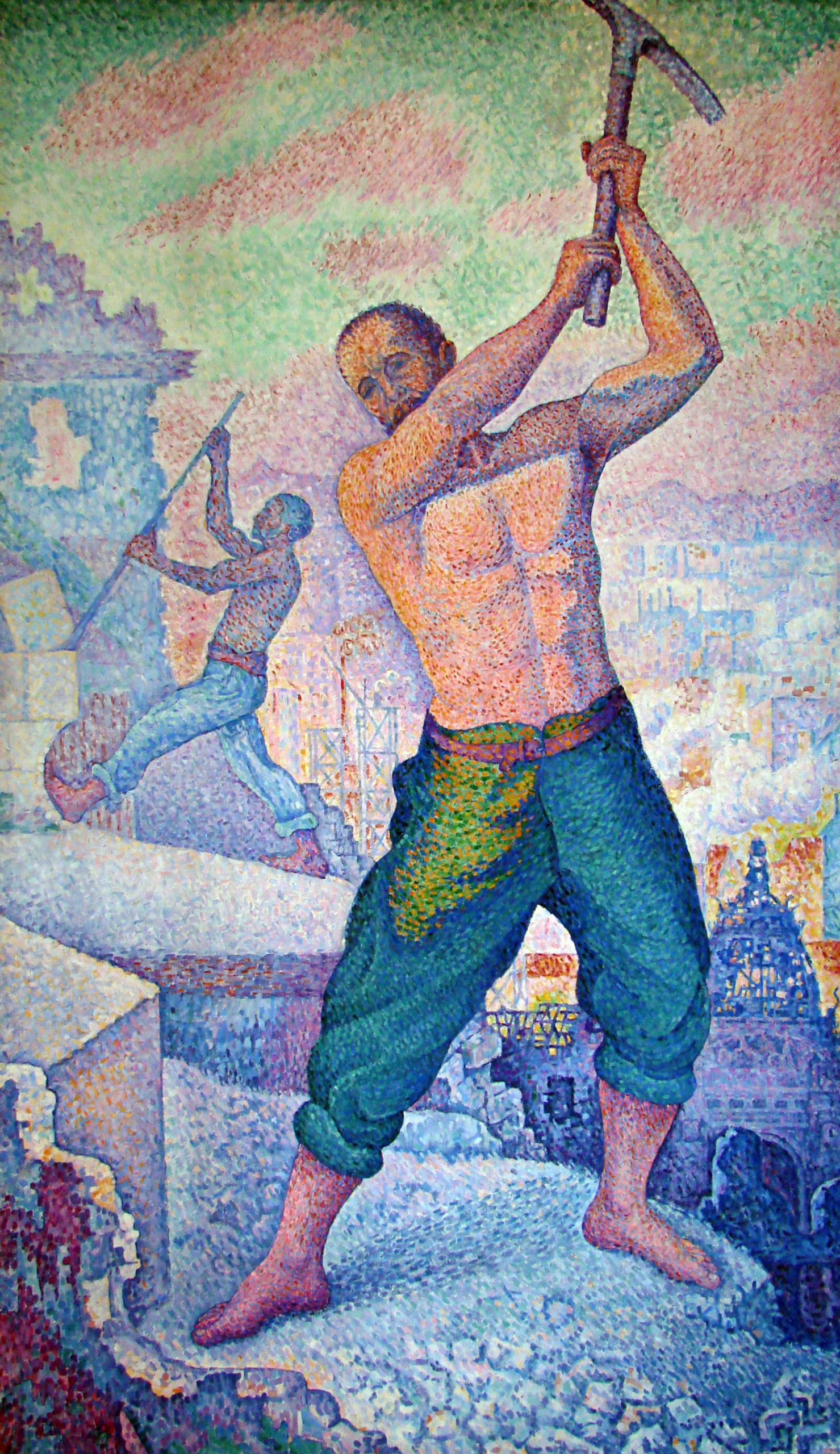
Relatively few Neo-Impressionist paintings are so overtly allegorical and political. Signac argued that it was the Neo-Impressionists’ technique, not any directly socialist or anarchist subject matter, that was most in tune with the political revolutionaries. The Neo-Impressionists’ rigorous appeal to hard science, rather than dead conventions, along with their uncompromising will to “paint what they see, as they feel it,” will help “give a hard blow of the pick-axe to the old social structure” and promote a corresponding social revolution.[5]
Georges Seurat, A Sunday on La Grande Jatte – 1884: A Conversation
Beth: And that was a quote by Seurat, whose ambition was to bring science to the methods of impressionism.
Steven: What’s interesting is that the science that he was thinking about has been, to some extent, overturned and we were left with the poetry.
And if you think back to the Impressionist project, what the Impressionists sought after was to really create a sense of outdoor light. And I think using this divisionist method, this idea of optical mixture, Seurat really did that in the Grande Jatte. We have a real sense of Parisians outside on a sunny day, and a real strong sense of sunlight streaming through the trees.
Beth: There’s much more of an illusion of space, then we would ever get in an Impressionist painting.
Steven: Well, almost going back to the classical tradition of landscape painting of Claude or of Poussin who have alternating shadow and light which steps us back slowly into space.

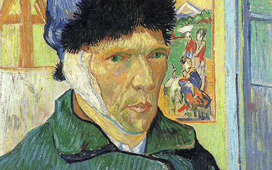
Vincent van Gogh, Self-Portrait with Bandaged Ear
The unfortunate man
The following report appeared in the Arles journal Le Forum Republicain on December 30, 1888:
Last Sunday, at 11:30 in the evening, Vincent Vaugogh [sic], a painter of Dutch origin, called at the Brothel No. 1, asked for a woman called Rachel and handed her … his ear, saying: ‘Guard this object with your life’. Then he disappeared. When informed of the action, which could only be that of a pitiful madman, the police went the next day to his house and discovered him lying on his bed apparently at the point of death. The unfortunate man has been rushed to hospital.
Accounts of what took place that night vary. Whatever the exact circumstances, though, whatever underlying motivations could have compelled van Gogh to do it, the episode effectively put an end to one of the most famous working relationships in the history of art, as Paul Gauguin boarded the train to Paris the next day.
For nine weeks they had lived together sharing lodgings in the Yellow House, just outside the old town walls of Arles in the South of France, spurring each other on as collaborators and as rivals too. The dream had been to set up “a studio in the South,” as van Gogh put it, a community of artists, with himself and Gauguin, the founding fathers, all working in harmony with nature and, as he hoped, with each other.
A brave face?
The painting, completed two weeks after the event, is often read as a farewell to that dream. For Steven Naifeh and Gregory White Smith, the most recent biographers of the artist, however, the portrait was first and foremost a plea to van Gogh’s doctors.

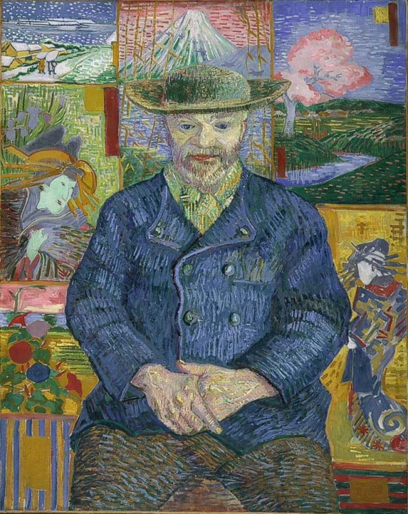
It shows the artist in three-quarter profile standing in a room in the Yellow House wearing a closed coat and a fur cap. His right ear is bandaged. It was in fact his left ear that was bandaged, the painting being a mirror image. To his right is an easel with a canvas on it. Barely visible, a faint outline underneath reveals what looks to be a still-life which appears to have been painted over. The top of the easel has been cropped by the edge of the canvas and the sitter’s hat so as to form a fork-like shape. To his left is a blue framed window, and partly obscured by the gaunt ridge of his cheek, a Japanese woodblock print shows two geishas in a landscape with Mount Fuji in the background.
Naifeh and White Smith argue that van Gogh, following his release from hospital, was anxious to persuade his doctors that he was indeed perfectly fit and able to take care of himself and that, despite his momentary lapse, it would not be necessary for them to have him committed, as had been suggested, to one of the local insane asylums; hence the winter coat and hat, to keep warm as they had advised, and with the window ajar still getting that much-needed fresh air into his system. The bandage too, which would have been soaked in camphor, suggests that he both accepts what has happened and is happy, literally, to take his medicine. The same note of stoic optimism, if one wishes to read the painting this way, is also found in the letters to his brother Theo, in which van Gogh, far from abandoning his dream of a “studio in the South,” talks of continuing the project, expressing the desire for more artists to come to Arles, even proposing that Gauguin and he could “start afresh.”
Yet, of course, whether or not van Gogh was willing to admit to it, the project had most definitely reached its end. And though for a short time he did get to carry on living in the Yellow House, within a few weeks, acting on a petition handed in to the local authorities and signed by 30 of his neighbors, he was forcefully removed and taken to Arles Hospital where he was locked in an isolation cell. In May van Gogh committed himself to the private asylum in Saint-Remy a small town north of Arles and in a little over a year he was dead.
An obsession with Japanese Art
Though Naifeh and White Smith’s argument is convincing, how the artist accounts for himself in his letters and how he expresses himself in paint, are different things. For my own part, what is most interesting about the image is what it reveals about van Gogh’s artistic practice and particularly his obsession with Japanese art: “All my work to some extent is based on Japanese art,” he wrote in July, 1888.
Three years earlier, while in the port city of Antwerp in Belgium, he would wander through the markets there where woodblock prints of the Ukiyo-e school, the so-called “artists of the floating world” were readily available and could be bought for just a few centimes. These first glimpses into the art of Japan came at a pivotal moment in the artist’s career: half way between his native Holland where he had schooled himself in the Realist tradition of artists such as Jozef Israëls, with his dark, earthy palette and sympathy for the rural poor, and Paris where he would encounter the colorful urbanity of the Impressionists.
For van Gogh, the artists of Japan offered the perfect meeting-point of theory and practice. The most famous of them was Hokusai, “the Dickens of Japan,” who shared the Dutchman’s passion for depicting the lives of the poor. It was this compassionate dimension of Japanese art that van Gogh hoped to bring to Impressionism, a movement that—by the time he arrived in Paris in 1886—had already absorbed the visual inventiveness of the Ukiyo-e school.
As time went on, the links went still further. In his two-year sojourn in Paris, the city of strangers, it was fellowship above all else that he yearned for, and so he came to imagine the Impressionists, among whose ranks he claimed to belong, to be as he imagined the Japanese, a united body of artists, sharing the same goals and ideals. It was this that prompted the journey south. On arriving in Arles he wrote to his brother, declaring his hope that “other artists will rise up in this lively country and do for it what the Japanese have done for theirs.” And again, while decorating his new house with paintings of sunflowers, he wrote to Theo: “Come now, isn’t it almost a true religion which the simple Japanese teach us, who live in nature as though they themselves were flowers.”
It was in Arles that he read Pierre Loti’s novel Madame Chrysanthème, best known today as the literary source for Puccini’s opera Madame Butterfly. While its self-sacrificing heroine worked her graceful way into van Gogh Orientalist fantasies, Loti’s description of Buddhist priests inspired his own Self-Portrait (Dedicated to Paul Gauguin), a painting that draws out the direction he hoped the two artists would follow.
How very different Self-Portrait with Bandaged Ear is to this earlier portrait. With its formal setting; the repeated triangles, for example, in the form of his coat, the top of the easel and the view offered of Mount Fuji itself, lending the painting it’s aspirational quality, its upward thrust. And yet the dominant feeling is surely conveyed by the internal frames: the window, the canvas and print, each of which appears condensed and somewhat forced into the painting, as though hemming the sitter in.

The Japanese print as van Gogh painted it in Self-Portrait with Bandaged Ear differs from the original. Comparing them we see how van Gogh shifted the composition to the right, deliberately discarding one of the figures in favour of the heron, whose razor-sharp beak rears up as if to stab at the artist’s ear. Opposite it, the canvas squeezed in to the left with its ghostly imprint of flowers surmounted by the fork of the easel sets up a formally satisfying but psychologically unsettling parallel. Is there a hint in all this, albeit unconsciously expressed, that the dream of an artist’s community in Arles has turned against him?
Perhaps, but then of course there is always van Gogh’s color—the joyous application of pigment onto canvas, the glorious use of impasto, thick and swift; that fabulous hatching technique, in places evoking the textures it depicts, the weave of the coat, the threads of the bandage, the fur of the hat. And note the tonal array of strokes that make up the face: violet, green, red, brown, orange, straw yellow; the blacks centered in those piercing pupils.

A yearning to be proved sane or a heartfelt cry of anguish, whatever we may read in the image about van Gogh the man, from a purely art historical point of view, it is here in his brushwork and in his palette that one discovers the source of André Derain’s “deliberate disharmonies.” How fitting then that it was while on holiday in the South of France, a favorite haunt of that early Modernist movement to which he belonged—the Fauves—that Derain painted his friend and fellow artist Matisse; enough perhaps to say that Van Gogh’s hope and prediction that “other artists will rise up in this lively country” was not so wildly off the mark after all.
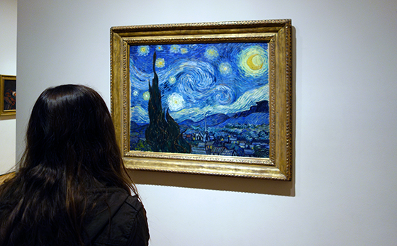
A rare night landscape
The curving, swirling lines of hills, mountains, and sky, the brilliantly contrasting blues and yellows, the large, flame-like cypress trees, and the thickly layered brushstrokes of Vincent van Gogh’s The Starry Night are ingrained in the minds of many as an expression of the artist’s turbulent state-of-mind. Van Gogh’s canvas is indeed an exceptional work of art, not only in terms of its quality but also within the artist’s oeuvre, since in comparison to favored subjects like irises, sunflowers, or wheat fields, night landscapes are rare. Nevertheless, it is surprising that The Starry Night has become so well known. Van Gogh mentioned it briefly in his letters as a simple “study of night” or ”night effect.”
His brother Theo, manager of a Parisian art gallery and a gifted connoisseur of contemporary art, was unimpressed, telling Vincent, “I clearly sense what preoccupies you in the new canvases like the village in the moonlight… but I feel that the search for style takes away the real sentiment of things” (813, 22 October 1889). Although Theo van Gogh felt that the painting ultimately pushed style too far at the expense of true emotive substance, the work has become iconic of individualized expression in modern landscape painting.

Technical challenges

Van Gogh had had the subject of a blue night sky dotted with yellow stars in mind for many months before he painted The Starry Night in late June or early July of 1889. It presented a few technical challenges he wished to confront—namely the use of contrasting color and the complications of painting en plein air (outdoors) at night—and he referenced it repeatedly in letters to family and friends as a promising if problematic theme. “A starry sky, for example, well – it’s a thing that I’d like to try to do,” Van Gogh confessed to the painter Emile Bernard in the spring of 1888, “but how to arrive at that unless I decide to work at home and from the imagination?” (596, 12 April 1888).
As an artist devoted to working whenever possible from prints and illustrations or outside in front of the landscape he was depicting, the idea of painting an invented scene from imagination troubled Van Gogh. When he did paint a first example of the full night sky in Starry Night over the Rhône (1888, oil on canvas, 72.5 x 92 cm, Musée d’Orsay, Paris), an image of the French city of Arles at night, the work was completed outdoors with the help of gas lamplight, but evidence suggests that his second Starry Night was created largely if not exclusively in the studio.
Location
Following the dramatic end to his short-lived collaboration with the painter Paul Gauguin in Arles in 1888 and the infamous breakdown during which he mutilated part of his own ear, Van Gogh was ultimately hospitalized at Saint-Paul-de-Mausole, an asylum and clinic for the mentally ill near the village of Saint-Rémy. During his convalescence there, Van Gogh was encouraged to paint, though he rarely ventured more than a few hundred yards from the asylum’s walls.

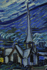
Besides his private room, from which he had a sweeping view of the mountain range of the Alpilles, he was also given a small studio for painting. Since this room did not look out upon the mountains but rather had a view of the asylum’s garden, it is assumed that Van Gogh composed The Starry Night using elements of a few previously completed works still stored in his studio, as well as aspects from imagination and memory. It has even been argued that the church’s spire in the village is somehow more Dutch in character and must have been painted as an amalgamation of several different church spires that van Gogh had depicted years earlier while living in the Netherlands.
Van Gogh also understood the painting to be an exercise in deliberate stylization, telling his brother, “These are exaggerations from the point of view of arrangement, their lines are contorted like those of ancient woodcuts” (805, c. 20 September 1889). Similar to his friends Bernard and Gauguin, van Gogh was experimenting with a style inspired in part by medieval woodcuts, with their thick outlines and simplified forms.
The colors of the night sky
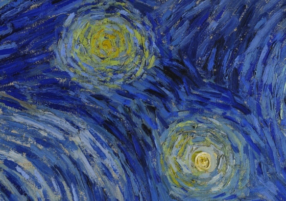
On the other hand, The Starry Night evidences Van Gogh’s extended observation of the night sky. After leaving Paris for more rural areas in southern France, Van Gogh was able to spend hours contemplating the stars without interference from gas or electric city street lights, which were increasingly in use by the late nineteenth century. “This morning I saw the countryside from my window a long time before sunrise, with nothing but the morning star, which looked very big” 777, c. 31 May – 6 June 1889). As he wrote to his sister Willemien van Gogh from Arles,
It often seems to me that the night is even more richly colored than the day, colored with the most intense violets, blues and greens. If you look carefully, you’ll see that some stars are lemony, others have a pink, green, forget-me-not blue glow. And without laboring the point, it’s clear to paint a starry sky it’s not nearly enough to put white spots on blue-black. (678, 14 September 1888)
Van Gogh followed his own advice, and his canvas demonstrates the wide variety of colors he perceived on clear nights.
Invention, remembrance and observation

Arguably, it is this rich mixture of invention, remembrance, and observation combined with Van Gogh’s use of simplified forms, thick impasto, and boldly contrasting colors that has made the work so compelling to subsequent generations of viewers as well as to other artists. Inspiring and encouraging others is precisely what Van Gogh sought to achieve with his night scenes. When Starry Night over the Rhône was exhibited at the Salon des Indépendants, an important and influential venue for vanguard artists in Paris, in 1889, Vincent told Theo he hoped that it “might give others the idea of doing night effects better than I do.” The Starry Night, his own subsequent “night effect,” became a foundational image for Expressionism as well as perhaps the most famous painting in Van Gogh’s oeuvre.
The Pont-Aven School and Synthetism
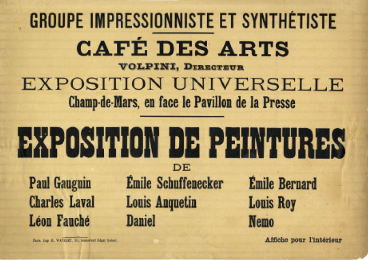
 When the mirrors intended to decorate the walls of the Café des Arts in Paris did not arrive in time for its opening in 1889, the owner agreed to an improvised art exhibition instead. The artists, including Paul Gauguin, Emile Bernard, Charles Laval, and Emile Schuffenecker, called themselves the “Groupe Impressioniste et Synthétiste,” but they are better known today as the Pont-Aven School, after a town in the French province of Brittany where many of the artists painted.
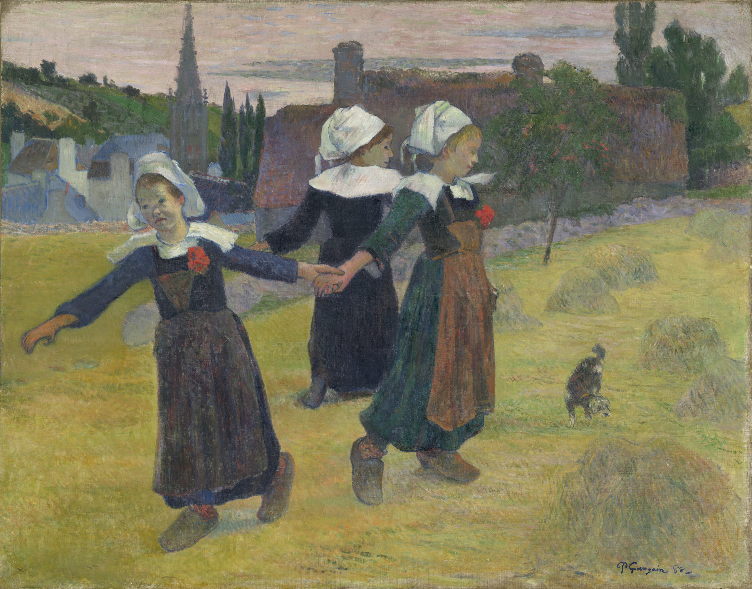
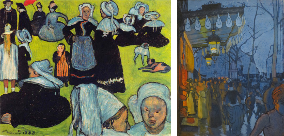
At the exhibition Gauguin showed a painting of three Breton girls dancing in a meadow outside of Pont-Aven, with the steeple of St. Joseph’s church in the background. This painting exhibits two key characteristics of the Pont-Aven School: “primitivist” themes featuring rural and peasant subject matter, and a “synthetist” style consisting of simplified drawing, clearly-defined contours, intensified colors, and flattened space.
“The land of the painter”
Brittany had been a popular destination for tourists since the first railway line from Paris was completed in the 1860s. It was famous not only for its rugged landscape but also for its picturesque inhabitants, especially the Breton peasant women in their starched white caps. A popular English guidebook of the time titled Breton Folk described Brittany as “the land of the painter,” and it commended the region’s particular attraction for artists “in search of picturesque costume and scenes of pastoral life.”[6]
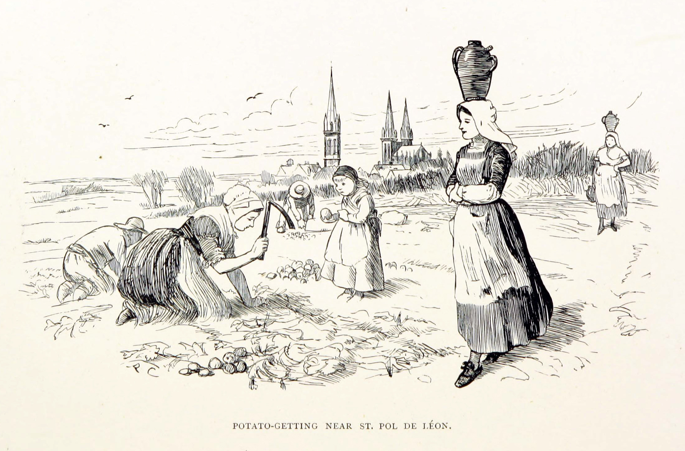
Rustic and peasant subjects were popular with French artists and patrons starting with the Barbizon School and French Realist painters of the mid-nineteenth century. Such “timeless” rural scenes offered a reassuring sense of tradition and continuity during a time marked by rapid industrialization and urbanization.
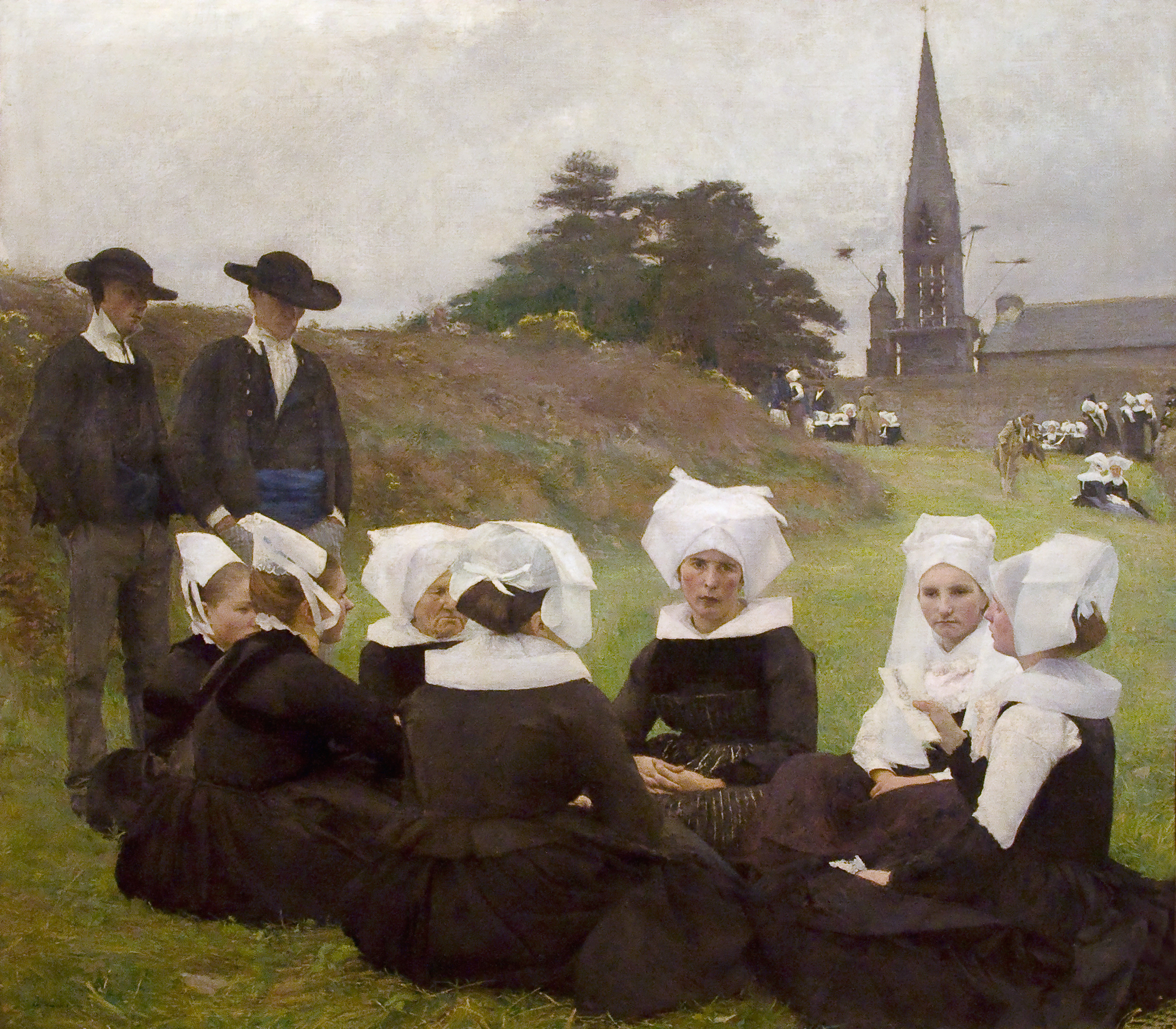
Pascal Dagnan-Bouveret’s Breton Women at a Pardon, shown in the French Salon of 1889, demonstrates the popularity of Breton subjects in a conventional Academic style. It shows a group of Breton peasants gathered in the foreground listening to a woman read. The background depicts a characteristic Breton ritual called a Pardon, in which penitents process barefoot or on their knees around the church to earn absolution for their sins. To a middle-class urban viewer, the Breton peasants would have seemed quaint and old-fashioned, but also admirable for their piety and authenticity.
Synthetism
Like Dagnan-Bouveret’s painting of the previous year, Gauguin’s famous Vision after the Sermon also depicts the profound religious faith of the Breton people. A group of women in the foreground file out of church, having just heard a sermon on Jacob wrestling an angel (Genesis 32:24-32). So great is their faith that they literally “see” the Biblical scene in front of the church, right next to a prosaically grazing cow.
The style of the two works is very different, however. Gauguin’s color is bright and unnatural compared to Dagnan-Bouveret’s muted grays and earth tones, and next to the Academic artist’s meticulous naturalism Gauguin’s technique appears downright incompetent. The drawing is crude, the anatomy of the women’s faces is almost childish, the flat planes of their clothing utterly fail to convey a sense of the bodies underneath, and the red ground stands up like a wall rather than receding into space.
Far from incompetent, however, Gauguin’s simplified, even somewhat crude, technique was a conscious choice. A young artist named Paul Sérusier who studied with Gauguin recounted the older artist’s advice while they were out painting together on the bank of a river near Pont-Aven:
How do you see these trees? They’re yellow; so put some yellow. This shadow, it’s rather blue, paint it with pure ultramarine. Those red leaves? Put vermillion.[7]
Gauguin tells Sérusier to both simplify and intensify what he is seeing. Rather than seeking subtle nuances of color and tone within the yellowish autumn leaves, Sérusier paints them in pure, unmodulated yellow. The cool gray trunks of the trees are similarly rendered as strokes of ultramarine mixed with white, against a background of vermilion red. Each color is intensified, and the drawing and composition are simplified into a flat pattern. Elsewhere, Gauguin advised artists to paint from memory rather than directly from nature, because memory automatically discards extraneous detail and distills perceptions down to their essence.
This process of distilling multiple, complex elements into a simplified whole is what the group meant when they called themselves “Synthetists” at the Café des Arts exhibition. Insisting on the process of synthesis was a deliberate contrast to the highly scientific and analytic process of Neo-Impressionism. The two paintings above were executed in the same year just a few miles apart in Brittany. Whereas the Neo-Impressionists worked to analyze or carefully break down all the separate components that make up complex color sensations and then rendered them in innumerable tiny dots, the Synthetists distilled them into broad areas of pure color.
The Synthetist style was sometimes called “Cloisonnism,” after the cloisonné technique used to decorate objects by melting colored enamel between wire outlines. It also has similarities to Japanese prints, which were popular at the time, as well as Medieval colored woodcuts and stained glass. Synthetism was somewhat antithetically associated with both sensual/decorative qualities and religious/spiritual qualities, but whatever its genesis or purpose, it forms a sharp contrast to both the Academic naturalist style of Dagnan-Bouveret and the Neo-Impressionist style of Signac.
Primitivism
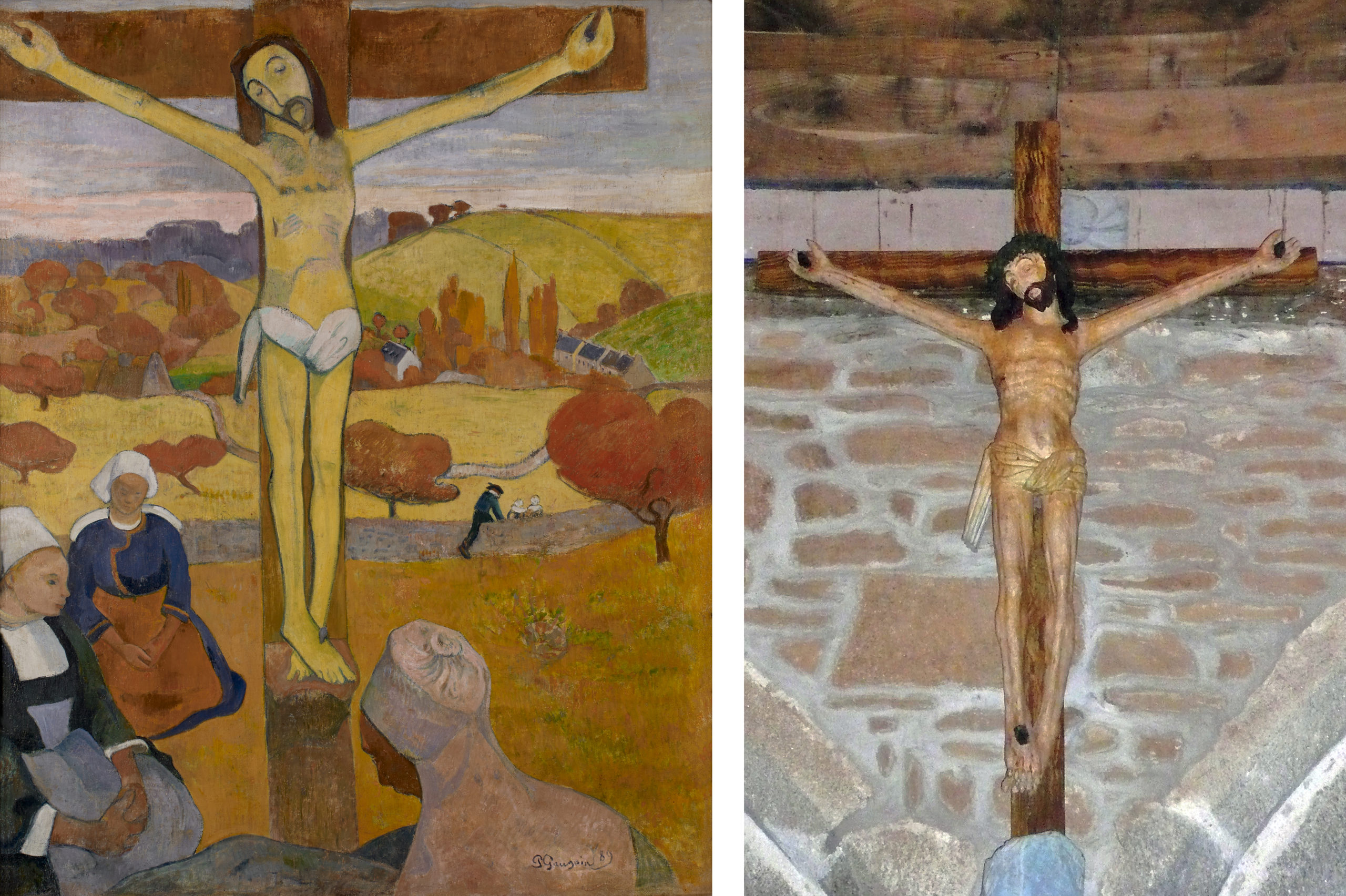
There is a logic in depicting peasant life with this simplified style. The bright colors and crude drawing of Synthetism have much in common with rural folk art. Gauguin implicitly acknowledges this similarity of style in his painting The Yellow Christ of 1889, which shows a group of Breton women kneeling in prayer around a wooden crucifix in a field. The crucifix is a representation of one by an anonymous seventeenth-century artist that Gauguin saw a small chapel set in the fields outside of Pont-Aven. Although the work’s crude carving and stiff anatomy do not demonstrate technical facility, they seem to guarantee the simple and sincere faith of the anonymous sculptor who created it.
Instead of setting the crucifix in the chapel, Gauguin transports it into a field to further connect Christ’s life to the timeless cycles of nature that drive the traditional lives of Breton peasants. The light in the sky marks the time as early evening, and the color of the foliage denotes fall. Both suggest an ending, but an ending that holds promise of a new beginning. Christ, just like the sun and the fall harvest grains, will rise again.
Both the simplified folk style and the peasant subject matter exemplify primitivism, a turning backwards to an earlier way of life (pre-industrial, pre-scientific, and pre-urban) as a way of seeking greater authenticity and a higher purpose in life. Gauguin wrote in a letter to his friend Emile Schuffenecker, “I love Brittany. I find a certain wildness and primitiveness here. When my clogs resound on this granite soil, I hear the dull, matte, powerful tone I seek in my painting.”[8] Unlike Dagnan-Bouveret, who represented Breton folk life with the sophisticated technique and scientific eye of a thoroughly modern Parisian, Gauguin aspired to “go primitive,” as exemplified by his adoption of peasant clogs (sabots) as well as the simple folk-art style of his paintings.
Authenticity or fantasy?
It is easy to romanticize the Pont-Aven School’s project of celebrating the simple rural life and folk traditions of the Breton peasants. Many tellings of Gauguin’s biography eulogize his act of giving up a career as a stockbroker, along with all of the pleasures and conveniences of modern life, in order to live as poor painter among the peasants of Brittany and later on the South Sea island of Tahiti.
More recent scholarship has problematized both that biography and that project, however. The vision of Pont-Aven in Gauguin’s paintings is largely a romantic fantasy. Brittany was rapidly modernizing, and the folk traditions and costumes that Gauguin admired were vanishing or put on display only for holidays and tourists. The 1880 guidebook already notes that
In the shops and on the promenades [of Brittany] the majority of women are dressed as in Paris … Every year more white caps are thrown aside … and each year the markets of St. Malo and St. Servan have less individuality of costume.[9]
Gauguin’s paintings of Brittany are, in the end, more fantasies than accurate images of an authentic peasant culture.
It is also worth asking why the main protagonists of Gauguin’s paintings are women, both in Brittany and later in Tahiti. In Vision after the Sermon as in The Yellow Christ and The Green Christ, it is women whose quaint costumes provide the antithesis to modern fashionability, women whose profound religious faith provides the antidote to modern science and skepticism, and women whose adherence to tradition provides a respite from the constant, disruptive innovations of modern life. While this does elevate women to a place of honor, it also reinforces commonplace stereotypes, suggesting that women preserve the faith and folk traditions simply because they are less suited than men to the new world of science, technology, and constant change.
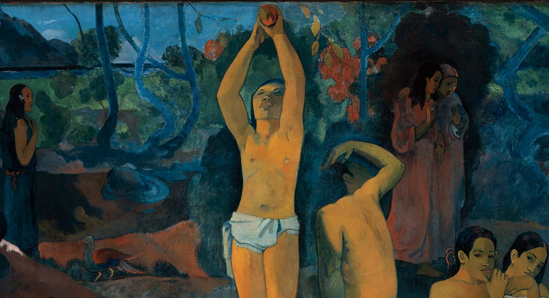
Paul Gauguin, Where do we come from? What are we? Where are we going?

Where do we come from? What are we? Where are we going? is a huge, brilliantly colored but enigmatic work painted on rough, heavy sackcloth. It contains numerous human, animal, and symbolic figures arranged across an island landscape. The sea and Tahiti’s volcanic mountains are visible in the background. It is Paul Gauguin’s largest painting, and he understood it to be his finest work.
Where are we going? represents the artist’s painted manifesto created while he was living on the island of Tahiti. The French artist transitioned from being a “Sunday painter” (someone who paints for his or her own enjoyment) to becoming a professional after his career as a stockbroker failed in the early 1880s. He visited the Pacific island Tahiti in French Polynesia staying from 1891 to 1893. He then returned to Polynesia in 1895, painted this massive canvas there in 1897, and eventually died in 1903, on Hiva Oa in the Marquesas islands.
Gauguin wrote to his friend Daniel de Monfried, who managed Gauguin’s career in Paris while the artist remained in the South Pacific, “I believe that this canvas not only surpasses all my preceding ones, but [also] that I shall never do anything better, or even like it.” Gauguin completed Where are we going? at a feverish rate, allegedly within one month’s time, and even claimed to de Monfried that he went into the mountains to attempt suicide after the work was finished. Gauguin—ever the master of self-promotion and highly conscious of his image as a vanguard artist—may or may not have actually poisoned himself with arsenic as he alleged, but this legend was quite pointedly in line with the painting’s themes of life, death, poetry, and symbolic meaning.

Gauguin himself provided a telling description of the painting’s esoteric imagery in the same letter to de Monfried, written in February 1898:
It is a canvas four meters fifty in width, by one meter seventy in height. The two upper corners are chrome yellow, with an inscription on the left and my name on the right, like a fresco whose corners are spoiled with age, and which is appliquéd upon a golden wall. To the right at the lower end, a sleeping child and three crouching women. Two figures dressed in purple confide their thoughts to one another. An enormous crouching figure, out of all proportion and intentionally so, raises its arms and stares in astonishment upon these two, who dare to think of their destiny. A figure in the center is picking fruit. Two cats near a child. A white goat. An idol, its arms mysteriously raised in a sort of rhythm, seems to indicate the Beyond. Then lastly, an old woman nearing death appears to accept everything, to resign herself to her thoughts. She completes the story! At her feet a strange white bird, holding a lizard in its claws, represents the futility of words….So I have finished a philosophical work on a theme comparable to that of the Gospel.[10]
Not only does Gauguin’s text clarify some of the painting’s abstruse, idiosyncratic iconography, it also invites us to “read” the image. Gauguin suggests that the figures have mysterious symbolic meanings and that they might answer the questions posed by the work’s title. And, in the manner of a sacred scroll written in an ancient language, the painting is to be read from right to left: from the sleeping infant—where we come from—to the standing figure in the middle—what we are—and ending at the left with the crouching old woman—where we are going.

Stylistically, the composition is designed and painted to recall frescoes or icons painted on a gold ground. The upper corners have been painted with a bright yellow to contribute to this effect, and the figures appear out of proportion to one another—“deliberately so” as Gauguin wrote—as if they were floating in space rather than resting firmly upon the earth.

These stylistic features, along with Gauguin’s enigmatic subject contribute to the painting’s “philosophical” quality. And as is common with other Symbolist works of this period, precise, complete interpretations of Where do we come from? remain out of reach. The painting is a deliberate mixture of universal meaning—the questions asked in the title are fundamental ones that address the very root of human existence—and esoteric mystery. Although Where do we come from? is painted on a large scale similar to the decorative public panels created by the French artist Pierre Puvis de Chavannes (an artist Gauguin admired), Where do we come from? is essentially a private work whose meaning was likely known only to Gauguin himself.
A few months after completing the painting, Gauguin sent it to Paris along with several other works of art, intending that they should be exhibited together in a gallery or an artist’s studio. He sent de Monfried careful instructions about how Where do we come from? should be framed (“a plain strip of wood, 10 centimeters wide, and white-washed to resemble a mural”) and who should be invited to the exhibition (“in this way, instead of crowds one can have whom one wants, and thus gain connections that cannot harm you.”) The concern Gauguin reveals in the details indicates his continued awareness of the Parisian art market, which remained a central focus even as he exiled himself on a small tropical island on the other side of the globe.

In November and December 1898, the group of Tahitian paintings was displayed at the gallery of Ambroise Vollard, a former law student turned art dealer who specialized in vanguard artists. Vollard seems to have had difficulty selling the “large picture,” as Gauguin called it. Efforts by the artist’s Parisian friends to collectively acquire the painting and donate it to the French state were never realized. Where do we come from?shuttled between galleries and private collections in France and Norway until the Museum of Fine Arts, Boston, purchased it in 1936.
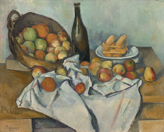
Paul Cézanne, The Basket of Apples
In David’s Neo-Classical era, still life was considered the least important subject type. Only minor artists bothered with what was then seen as the most purely decorative and trivial of painting subjects. The hierarchy of subjects went roughly from the most important—historical and religious themes (often very large in scale); to important—portraiture (usually of moderate scale); less important—landscape & genre (themes of common life, usually of modest scale); to least important— still life (generally small canvases).

A hopeless subject
There had been one significant historical exception. In the 17th century in Northern Europe and particularly in the Netherlands, still life blossomed. But this period was brief and had little impact in France other than in the work of Chardin. So why would Cézanne turn so often to this discredited subject?
It was the very fact that still life was so neglected that seems to have attracted Cézanne to it. So outmoded was the iconography (symbolic forms and references) in still life that this rather hopeless subject was freed of virtually all convention. Here was a subject that offered extraordinary freedom, a blank slate that gave Cézanne the opportunity to invent meaning unfettered by tradition. And Cézanne would almost single-handedly revive the subject of still life making it an important subject for Picasso, Matisse, and others in the 20th century.

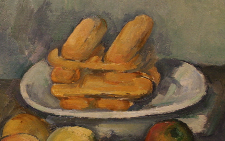
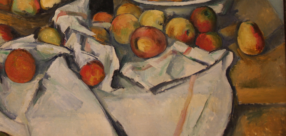
The image at the top of this page looks simple enough, a wine bottle, a basket tipped up to expose a bounty of fruit inside, a plate of what are perhaps stacked cookies or small rolls, and a tablecloth both gathered and draped. Nothing remarkable, at least not until one begins to notice the odd errors in drawing. Look, for instance, at the lines that represent the close and far edge of the table. I remember an old student of mine remarking to the class, “I would never hire him as a carpenter!” What she had noticed was the odd stepping of a line that we expect to be straight.
Purposeful errors
But that is not all that is wrong. The table seems to be too steeply tipped at the left, so much so that the fruit is in danger of rolling off it. The bottle looks tipsy and the cookies are very odd indeed. The cookies stacked below the top layer seem as if they are viewed from the side, but at the same moment, the two on top seem to pop upward as if we were looking down at them. This is an important key to understanding the questions that we’ve raised about Cézanne’s pictures so far.
Like Edouard Manet, from whom he borrowed so much, Cézanne was prompted to rethink the value of the various illusionistic techniques that he had inherited from the masters of the Renaissance and Baroque eras. This was due in part to the growing impact of photography and its transformation of modern representation. While Degas and Monet borrowed from the camera the fragmenting of time, Cézanne saw this mechanized segmentation of time as artificial and at odds with the perception of the human eye. By Cézanne’s era, the camera did shatter time into fragments as do non-digital cameras that can be set so that the shutter is open to light for only 1/1000 of a second.
Sight and memory
Cézanne pushed this distinction between the vision of the camera and of human vision. He reasoned that the same issues applied to the illusionism of the old masters, of Raphael, Leonardo, Caravaggio, etc. For instance, think about how linear perspective works. Since the Early Renaissance, constructing the illusion of space required that the artist remain frozen in a single point in space in order maintain consistent recession among all receding orthogonals. This frozen vantage point belongs to both the artist and then the viewer. But is it a full description of the the experience of human sight? Cézanne’s still life suggests that it is not.
If a Renaissance painter set out to render Cézanne’s still life objects (not that they would, mind you), that artist would have placed himself in a specific point before the table and taken great pains to render the collection of tabletop objects only from that original perspective. Every orthogonal line would remain consistent (and straight). But this is clearly not what Cézanne had in mind. His perspective seems jumbled. When we first look carefully, it may appear as if he was simply unable to draw, but if you spend more time, it may occur to you that Cézanne is, in fact, drawing carefully, although according to a new set of rules.
Seemingly simple, Cézanne’s concern with representing the true experience of sight had enormous implications for 20th century visual culture. Cézanne realized that unlike the fairly simple and static Renaissance vision of space, people actually see in a fashion that is more complex, we see through both time and space. In other words, we move as we see. In contemporary terms, one might say that human vision is less like the frozen vision of a still camera and more akin to the continuous vision of a video camera except that he worked with oil on canvas which dries and becomes static.
Purposeful destruction
So very tentatively, Cézanne began the purposeful destruction of the unified image. Look again at the cookies, or whatever they are, stacked upon the plate in the upper right. Is it possible that the gentle disagreements that we noted result from the representation of two slightly different view points? These are not large ruptures, but rather, they suggest careful and tentative discovery. It is as if Cézanne had simply depicted the bottom cookies as he looked across at them and then as he looked more slightly down at the top cookies after shifting his weight to his forward leg. Furthermore, I’m not sure that he was all that proud of these breaks that allow for more than a single perspective. Look, for instance, at the points where the table must break to express these multiple perspectives and you will notice that they are each hidden from view. Nevertheless, in doing this, Cézanne changed the direction of painting.
Toulouse-Lautrec at the Moulin Rouge
Moulin Rouge: La Goulue
Text by the Metropolitan Museum of Art, New York
When the brassy dance hall and drinking garden of the Moulin Rouge opened on the boulevard de Clichy in 1889, one of Lautrec’s paintings was displayed near the entrance. He himself became a conspicuous fixture of the place and was commissioned to create the six-foot-tall advertisement that launched his postermaking career and made him famous overnight. He turned a spotlight on the crowded dance floor of the nightclub and its star performers, the “boneless” acrobat Valentin le Désossé and La Goulue, “the glutton,” whose cancan skirts were lifted at the finale of the chahut.
At the Moulin Rouge
Text by the Art Institute of Chicago
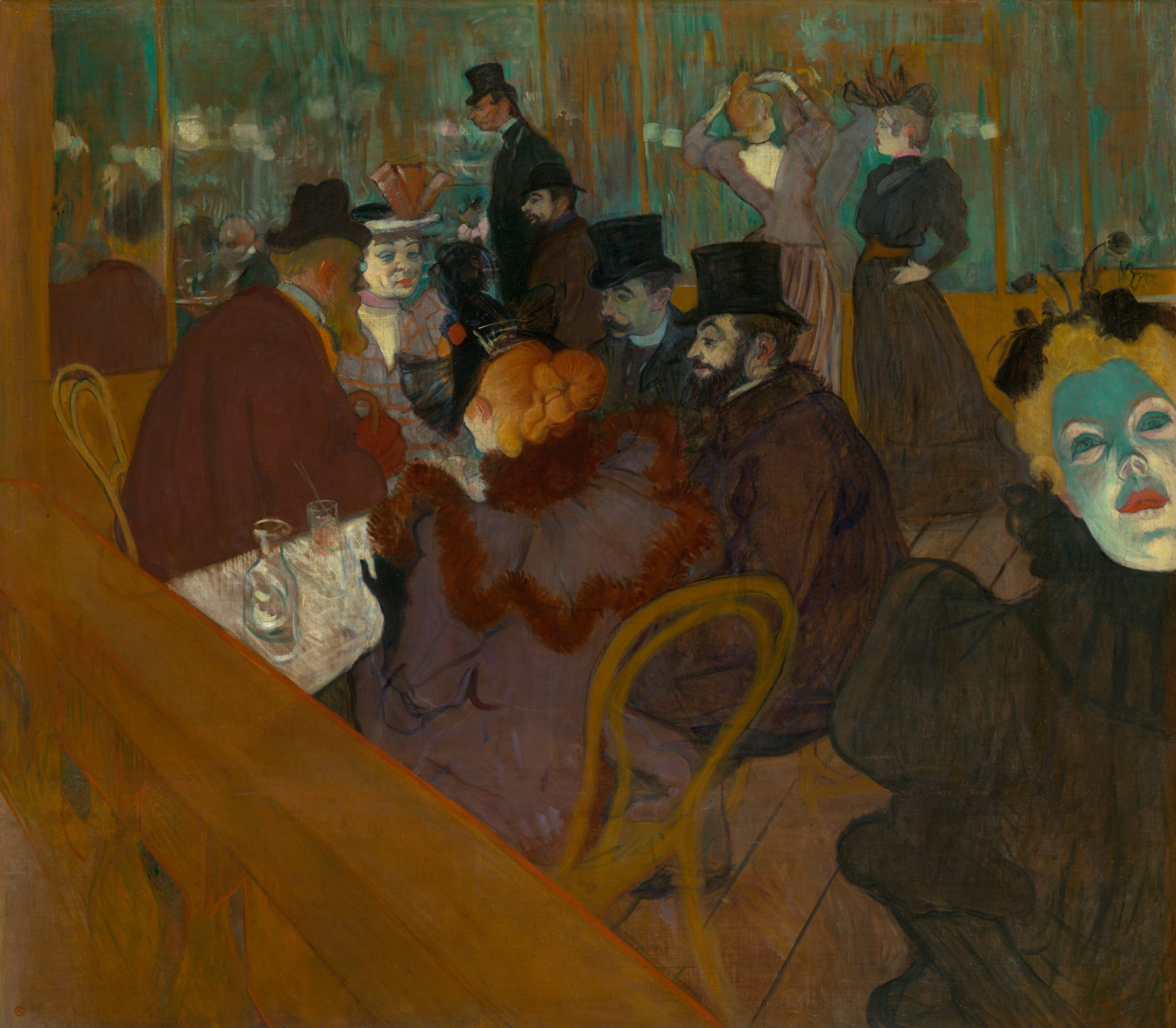
In At the Moulin Rouge Henri de Toulouse-Lautrec memorialized Parisian nightlife at the end of the nineteenth century. The painting is noted for its daring composition, dramatic cropping, and flat planes of strident color.
A regular patron of the Moulin Rouge, one of the most famous cabarets of the Montmartre district, Toulouse-Lautrec here turned his acute powers of observation on the club’s other habitués. The flaming red-orange hair of the entertainer Jane Avril is the focal point of the central seated group. Preening in the greenish mirror in the background is the dancer La Goulue. The stunted figure of the aristocratic artist appears, as it often did in life, next to his devoted, much taller cousin, Dr. Gabriel Tapié de Céleyran.
But it is the frozen, acid-green face of the dancer May Milton that dominates the canvas and haunts the action. The painting comprises two joined parts: a small main canvas and an L-shaped panel to the lower and right edges. The canvas was severed after the artist’s death, perhaps by his dealer (to make the composition less radical and more saleable), and restored sometime before 1914.
- Félix Fénéon, “Les Impressionnistes en 1886,” as translated in Linda Nochlin, ed., Impressionism and Post-Impressionism, 1874-1904: Sources and Documents (Englewood Cliffs, N.J.: Prentice-Hall, 1966), p. 108. ↵
- Paul Signac, From Eugène Delacroix to Neo-Impressionism (1899), as translated in Nochlin, ed., p. 122. ↵
- Henri Fèvre, “L’Exposition des Impressionnistes,” in Étude sur le Salon de 1886 et sur l’exposition des impressionnistes (Paris, 1886), p. 43 (our translation). ↵
- Paul Signac, “Impressionists and Revolutionaries,” La Révolte, June 13-19, 1891, as translated in Nochlin, ed., p. 124. ↵
- ibid., p. 124. ↵
- Henry Blackburn and Randolph Caldecott, Breton Folk: An Artistic Tour in Brittany (Boston, 1881), p. 3. ↵
- Gauguin’s advice to Sérusier was recorded by his friend Maurice Denis, “Paul Sérusier, sa vie, son oeuvre,” in Sérusier, L’ABC de la peinture (Paris: Floury, 1942), p. 42. ↵
- Letter, Gauguin to Schuffenecker, February 1888, in M. Malingue, ed, Lettres de Gauguin à sa femme et à ses amis (Paris, 1946), p. 322 (our translation). ↵
- Blackburn, Breton Folk, p. 10. ↵
- “The Wisdom of Paul Gauguin—Artist,” International Studio, volume 73, number 291, 69. ↵
colors next to one another on the color wheel, which tend to blend together smoothly
colors across the color wheel from each other and that both appear more bold when placed next to each other
artwork (usually paintings or drawings of outside views) made while out of doors
artworks depicting an often carefully-arranged collection of stationary objects—typically flowers, fruit, and/or serving ware
the lines used in the technique of linear perspective that converge at the vanishing point to suggest the illusion of depth
