4
Dr. Charles Cramer; Dr. Kim Grant; Dr. Claire Black McCoy; Dr. Parme Giuntini; Dr. Bryan Zygmont; Sarah C. Shaefer; and Dr. Noelle Paulson
In this chapter
Approaches to Modern Art
- Becoming modern, an introduction
- Modern art and reality
- Expression and modern art
- Formalism: formal harmony
Background: Neoclassicism & Romanticism
Becoming Modern, an introduction
People use the term “modern” in a variety of ways, often very loosely, with a lot of implied associations of new, contemporary, up-to-date, and technological. We know the difference between a modern society and one that remains tied to the past and it usually has less to do with art and more to do with technology and industrial progress, things like indoor plumbing, easy access to consumer goods, freedom of expression, and voting rights. In the 19th century, however, modernity and its connection with art had certain specific associations that people began recognizing and using as barometers to distinguish themselves and their culture from earlier nineteenth century ways and attitudes.

Chronologically, Modernism refers to the period from 1850 to 1960. It begins with the Realist movement and ends with Abstract Expressionism. That’s just a little over one hundred years. During that period the western world experienced some significant changes that transformed Europe and the United States from traditional societies that were agriculturally based into modern ones with cities and factories and mass transportation.
Here are some important features that all modern societies share.
Capitalism
Capitalism replaced landed fortunes and became the economic system of modernity in which people exchanged labor for a fixed wage and used their wages to buy ever more consumer items rather than produce such items themselves. This economic change dramatically affected class relations because it offered opportunities for great wealth through individual initiative, industrialization and technology—somewhat like the technological and dot.com explosion of the late 20th and early 21st century. The industrial revolution which began in England in the late 18th century and rapidly swept across Europe (hit the U.S. immediately following the Civil War) transformed economic and social relationships, offered an ever increasing number of cheaper consumer goods, and changed notions of education. Who needed the classics when a commercial/technically oriented education was the key to financial success? The industrial revolution also fostered a sense of competition and progress that continues to influence us today.
Urban culture

Urban culture replaced agrarian culture as industrialization and cities grew. Cities were the sites of new wealth and opportunity with their factories and manufacturing potential. People moving from small farms, towns to large cities helped to breakdown traditional culture and values. There were also new complications such as growing urban crime, prostitution, alienation, and depersonalization.
In a small town you probably knew the cobbler who made your shoes and such a personal relationship often expanded into everyday economics—you might be able to barter food or labor for a new pair of shoes or delay payments. These kinds of accommodations that formed a substructure to agrarian life were swept away with urbanization. City dwellers bought shoes that were manufactured, transported by railroads, displayed in shop windows, and purchased only for cash. Assembly lines, anonymous labor, and advertising created more consumer items but also a growing sense of depersonalization. The gap between the “haves” and the “have nots” increased and were more visible in the city.
Technology

Technological advances such as industrialization, railroads, gas lighting, streetcars, factory systems, indoor plumbing, appliances, and scientific advances were rapidly made and these changes dramatically affected the way people lived and thought about themselves. One consequence was that people in industrialized areas thought of themselves as progressive and modern and considered undeveloped cultures in undeveloped countries as primitive and backward.
Secularism
Modernity is characterized by increasing secularism and diminished religious authority. People did not abandon religion but they paid less attention to it. Organized religions were increasingly less able to dictate standards, values, and subject matter. Fine art moved from representing human experience and its relationship to God’s creation, to a focus on personal emotions and individual spiritual experiences that were not based in any organized and institutionalized religion.
Optimism

The modern world was extremely optimistic—people saw these changes as positive. They welcomed innovation and championed progress. Change became a signifier of modernity. Anything that was traditional and static signaled outmoded, old-fashioned, conservative and was to be avoided by the new modern public. Modern Europe and the U.S. internalized these positions and used modernity as a way of determining and validating their superiority. The nineteenth century was also a period of tremendous colonial growth and expansion, in the name of progress and social benefit and all of these activities were spearheaded by newly industrialized western countries.
Many artists closely identified with modernity and embraced the new techniques and innovations, the spirit of progress, invention, discovery, creativity and change. They wanted to participate in creating the modern world and they were anxious to try out new ideas rather than following the more conservative guidelines of Academic art. This is not to say that these mid-nineteenth century artists were the first to challenge an older generation or set of ideas. Many academic artists had argued over formal issues, styles and subject matter but this was much like a good natured agreement within a club; everyone in the group agreed to disagree.
A middle-class audience
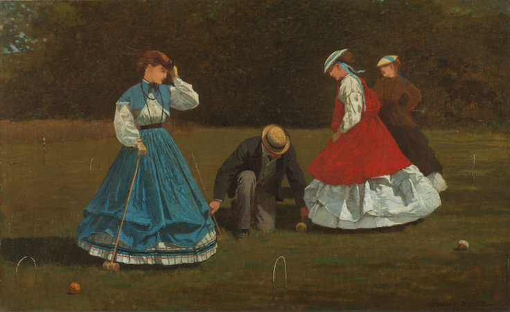
By the mid-1850’s polite academic disagreements were being taken out of the Academy and onto the street. Artists were looking increasingly to the private sector for patronage, tapping into that growing group of bourgeois or middle class collectors with money to spend and houses to fill with paintings. This new middle class audience that made its money through industrialization and manufacturing had lots of “disposable income”, and they wanted pictures that they could understand, that were easy to look at, fit into their homes, addressed subjects they liked. Not for them the historical cycles of gods, saints and heroes with their complex intellectual associations and references; instead, they wanted landscapes, genre scenes, and still life. They were not less educated than earlier buyers, but educated with a different focus and set of priorities. Reality was here and now, progress was inevitable, and the new hero of modern life was the modern man.
Modernity is then a composite of contexts: a time, a space, and an attitude. What makes a place or an object “modern” depends on these conditions.
The avant garde
Throughout the 19th century there were artists who produced pictures that we do not label “modern art” generally because the techniques or subjects were associated with the conservative academic styles, techniques and approaches. On the other hand, modern artists were often called the “avant garde.” This was originally a military term that described the point man (the first soldier out)—the one to take the most risk. The French socialist Henri de Saint-Simon first used the term in the early 1820’s to describe an artist whose work would serve the needs of the people, of a socialist society rather than the ruling classes.

The avant garde is also used to identify artists whose painting subjects and techniques were radical, marking them off from the more traditional or academic styles, but not with any particular political ideology in mind. Avant garde became a kind of generic term for a number of art movements centered on the idea of artistic autonomy and independence. In some cases the avant garde was closely associated with political activism, especially socialist or communist movements; in other cases, the avant garde was pointedly removed from politics and focused primarily on aesthetics. The avant garde was never a cohesive group of artists and what was avant garde in one nation was not necessarily the same in others.
Finally, although modern artists were working throughout many countries in Europe and the United States, most 19th art and much 20th century modern art is centered in France and produced by French artists. Unlike England which was politically stable in the 19th century, France went through a variety of governments and insurrections all of which provided a unique political and cultural environment that fostered what we know as modern art.
Modern art and reality
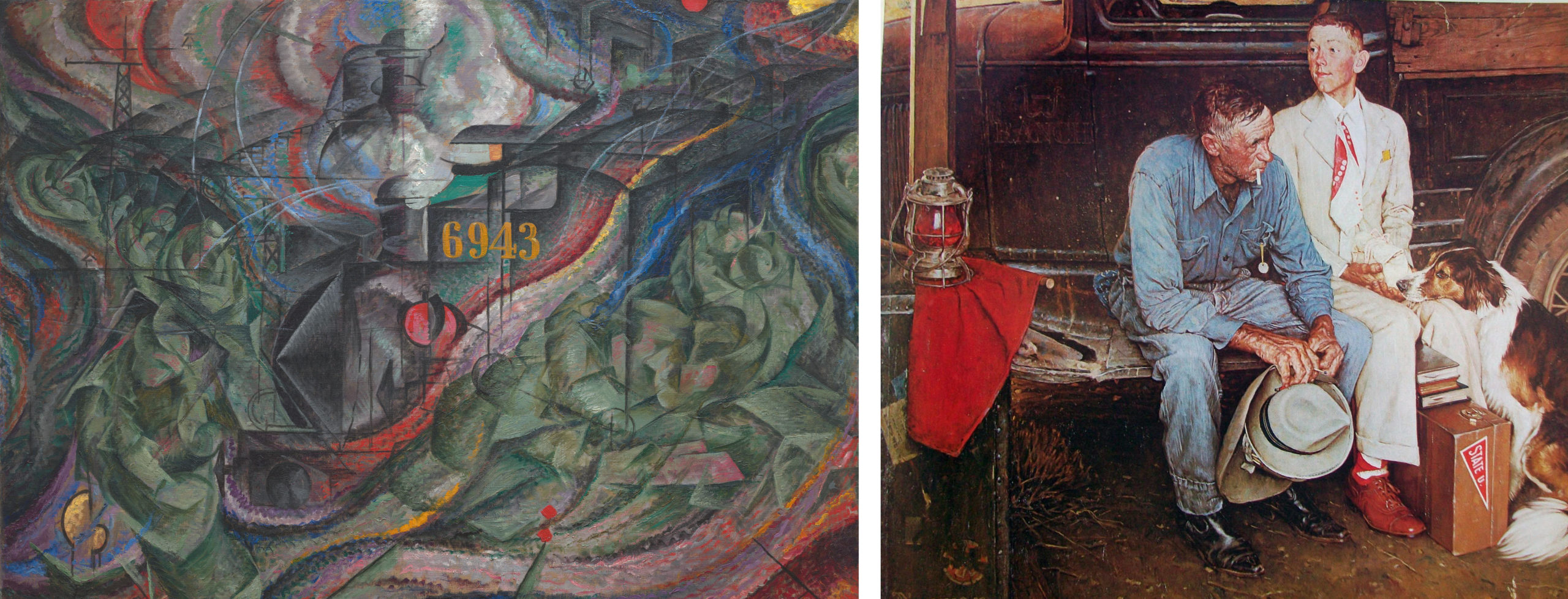
If asked, most people would probably say that modern art is not true to reality. Indeed, modern art is practically defined by its bizarre distortions of reality; this is one reason why Norman Rockwell, whose work is more recent than Umberto Boccioni’s, is not considered a modern artist. But looking like reality — what art historians call “naturalism” — is only one way of being true to reality. As we shall see, the attempt to create art that was more true to reality than traditional naturalism was the motivation for some of the most radical modern art, even including Boccioni’s States of Mind: The Farewells.
Impressionism and optical realism
When the Impressionist style first appeared on the art scene of the 1870s, many hostile viewers dismissed it as art by “lunatics” whose color perception was questionable and who did not have the technical skills to properly finish their paintings. Some critics claimed, however, that Impressionist paintings were more accurate than traditional naturalistic representations. Their argument was that the Impressionists represented their perception of objects rather than the objects themselves, and that the colors we perceive are often not identical to an object’s actual or “local” color.
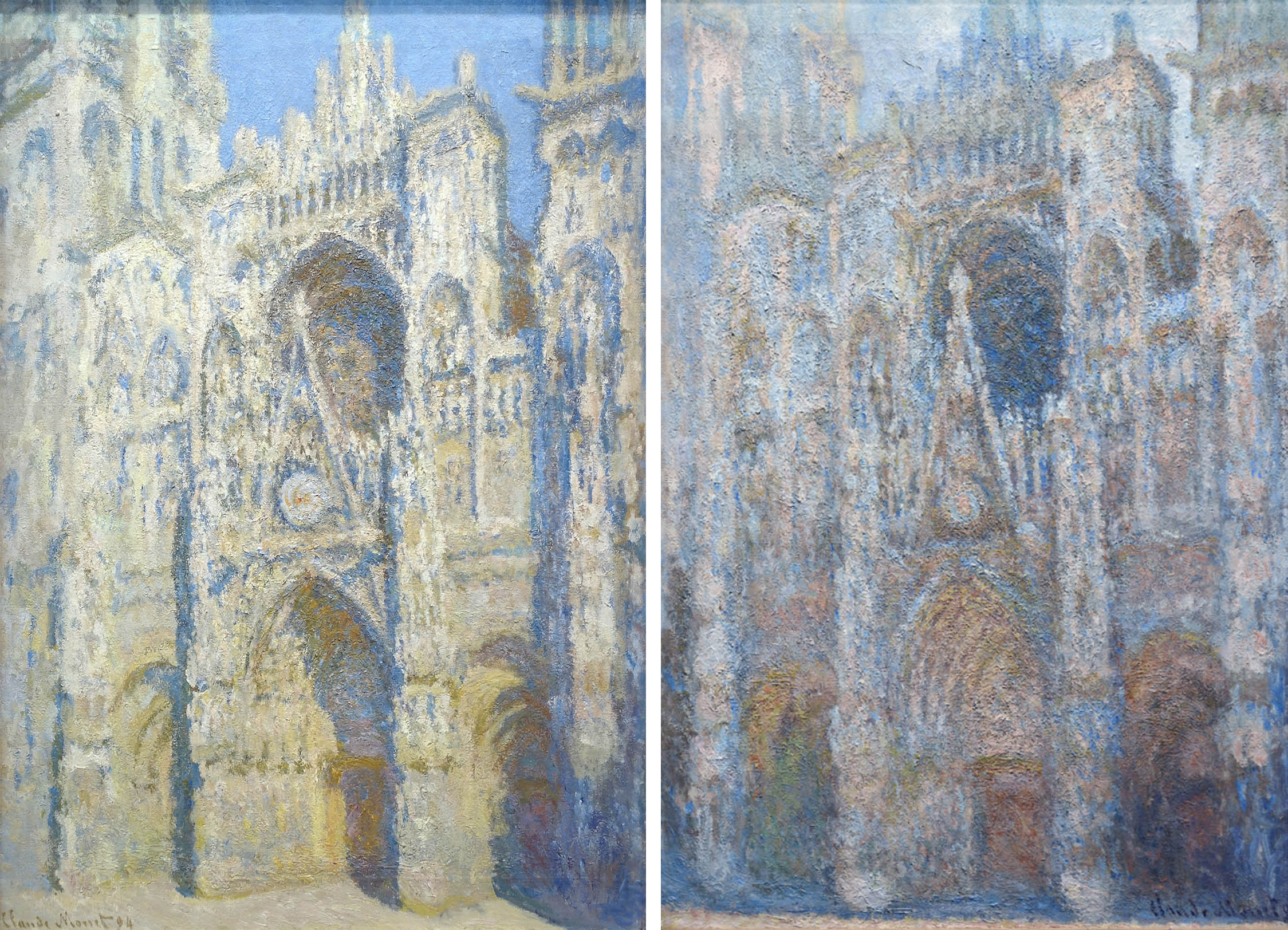
In the 1890s, Monet created dozens of paintings of Rouen Cathedral at different times of day and in different weather. At dawn, the cathedral was tinged with blue light; in the late-afternoon, it was radiant with oranges and yellows; while on cloudy days it was a duller grayish tan. By recording how the appearances of objects are affected by different lighting conditions, the Impressionists argued that their paintings were more accurate representations of the way we see the world. What appears at first sight to be a radically unrealistic style is in fact more true to the way things actually look.
Discarding artificial conventions
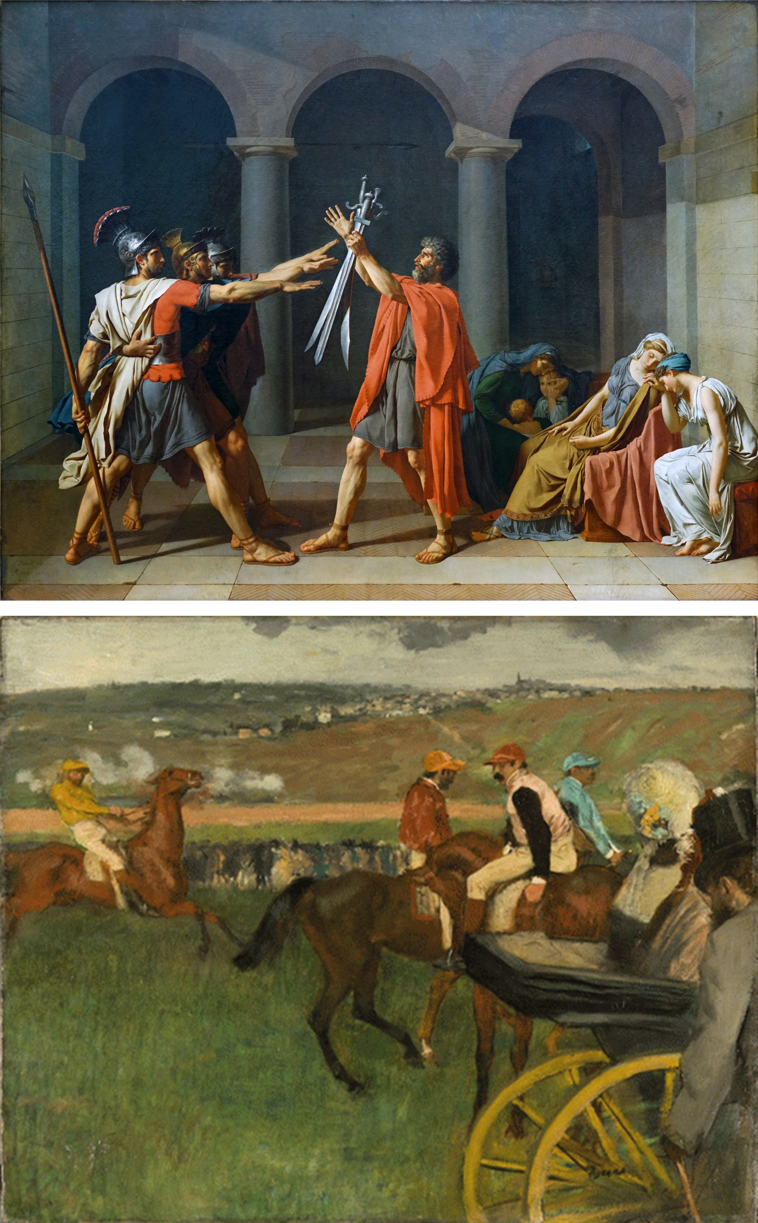
The Impressionists recognized that much traditional art was accepted as true to reality only because it was familiar, not because it was accurate. For example, methods of composition taught in Academies tended to emphasize a central focus, equal balance on both sides, and a clear depiction of spatial recession, as in David’s Oath of the Horatii. Such compositions are, in fact, very artificially staged. When we move through the world, we are more likely to encounter scenes like the one represented in Degas’s The Race Track: awkwardly unbalanced, abruptly cropped, and spatially ambiguous. Critics who supported the Impressionists argued that artists like Degas were correcting artificial conventions and making art more true to reality.
Although the Impressionist style was new, this form of argument was not. In the sixteenth century artists and critics tried to draw a distinction between a true naturalism and a false naturalism (often derogatorily called “Mannerism“). False naturalism involved copying the work of other artists, and thus understanding nature only at second hand. The solution, some felt, was to discard the conventions of art and return to a more careful study of the original source, nature itself, just as the Impressionists did.
Is naturalism true to nature?
Impressionist artists sought greater truth to nature through more careful observation, but there is a sense in which our eyes inevitably distort the objects they perceive. Three ways they do so are embodied in the artistic techniques of linear perspective, diminution, and foreshortening.
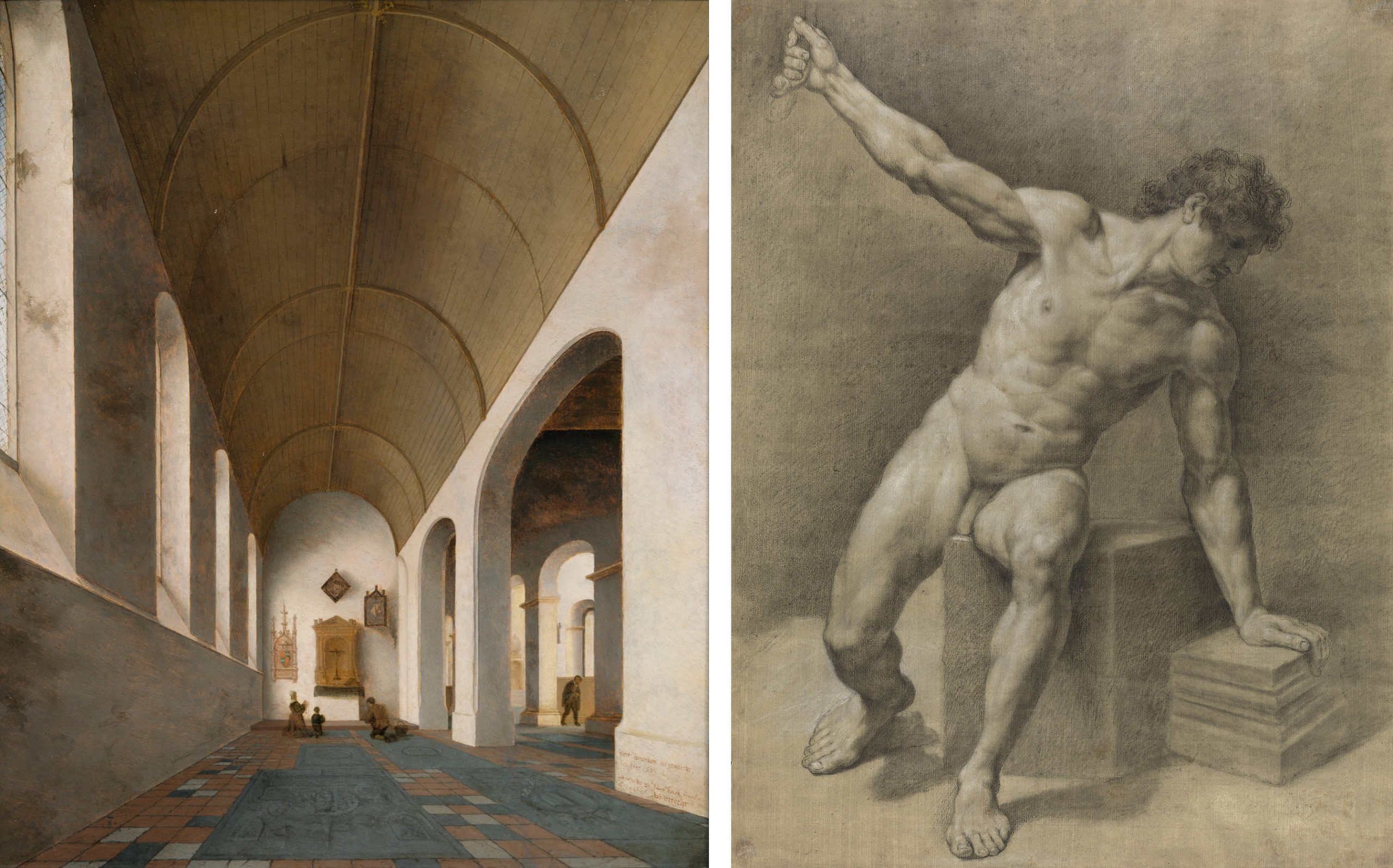
In linear perspective, what are actually parallel lines in real life (such as railroad tracks or the edges of floor tiles) converge in the representation. This effect, seen above in the Saenredam painting of a church interior, is integral to what is popularly considered a realistic style, but it is obviously not true to reality. Each of the tiles on the floor is in fact square. Similarly, with diminution, objects appear to get smaller the farther away they are, but this is just an optical trick; each of those windows is in reality the same size.
Foreshortening occurs when we view an object from an angle at which it recedes away from us, so that the object appears to be contracted, shorter than its actual length. In the Academic figure study above on the right, the two thighs appear to be of different lengths and shapes simply because one is viewed parallel to the picture plane while the other is receding sharply away from it. In actual reality, of course, both thighs are very similar (mirror images) in length and shape.
Correcting for perceptual distortion
The style we colloquially call “realistic” is not literally true to reality, then. It is only a record of our perception of reality, from one angle, at one distance, at one moment in time, and in one kind of light, and all of these factors can distort the object. Some Modern art movements sought a representational system that would be more accurate to the true shapes of objects, rather than representing them deformed by perception.
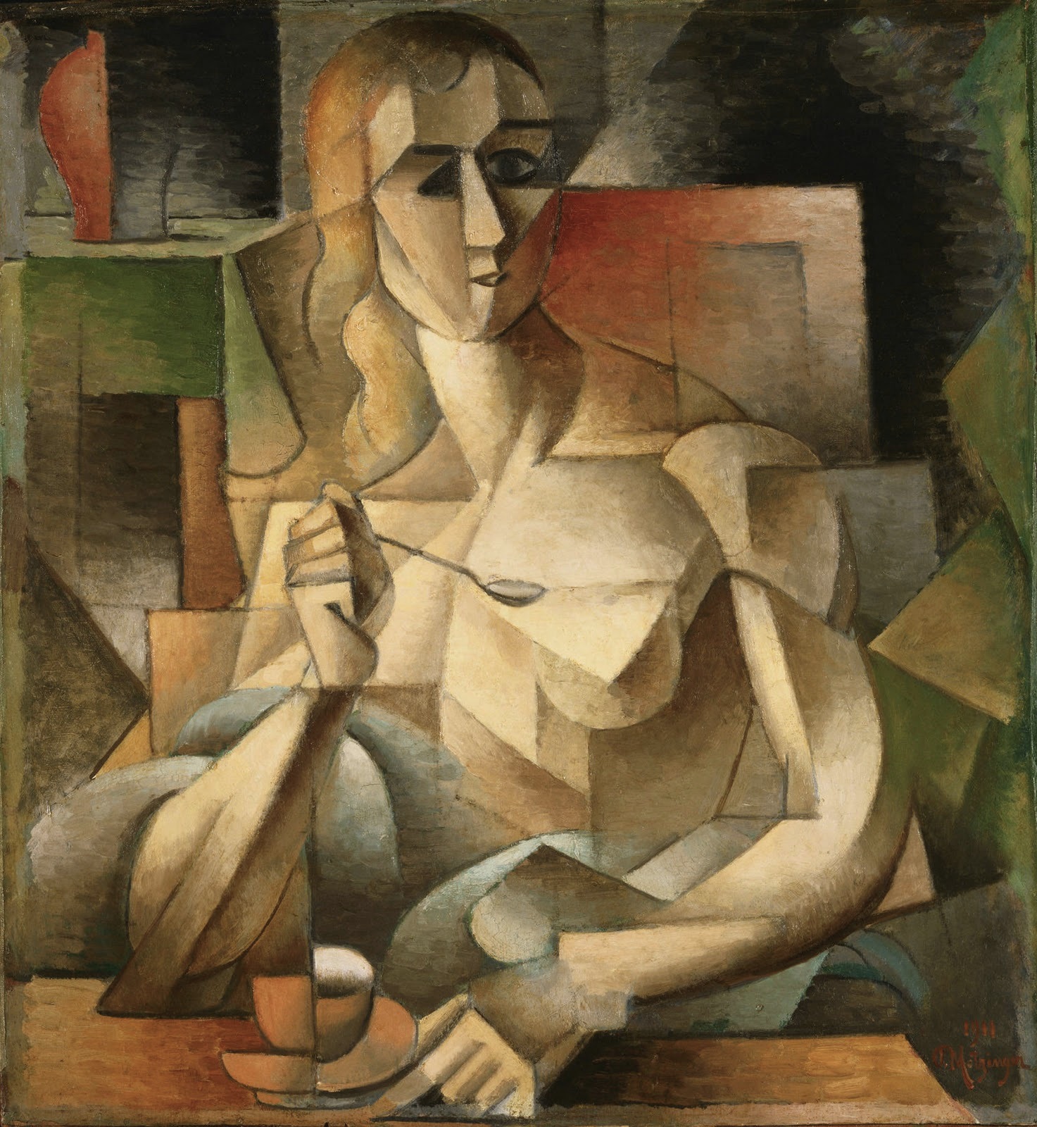
Cubist paintings seem at first sight to be even more bizarrely distorted and unrealistic than Impressionist paintings. In the Salon Cubist Jean Metzinger’s Le Goûter, objects appear to be twisted and broken up, but this is done in order to correct the distortions of perspective and foreshortening. Metzinger shows things from multiple perspectives so we can better understand their true shapes. The left side of the tea cup on the table is seen from the side at eye level, but from that angle you wouldn’t be able to tell that the cup has a round opening, so the right side is seen from above to complete our understanding of the round lip and concave shape of the cup. Similarly, one of the woman’s eyes is viewed in profile, while the other is seen facing us, and her left shoulder is seen from above, while the right is more straight on. Cubism doesn’t “distort” objects; it shows them from multiple angles in order to give us more information about their true shapes than would be visible in traditional naturalistic representation.
Modernism and science
Another way of justifying the apparent distortions of modern art came in the form of appeals to science. Modern science provided a stream of new images that sparked artists’ imaginations, as well as new theories that radically altered people’s understanding of reality.
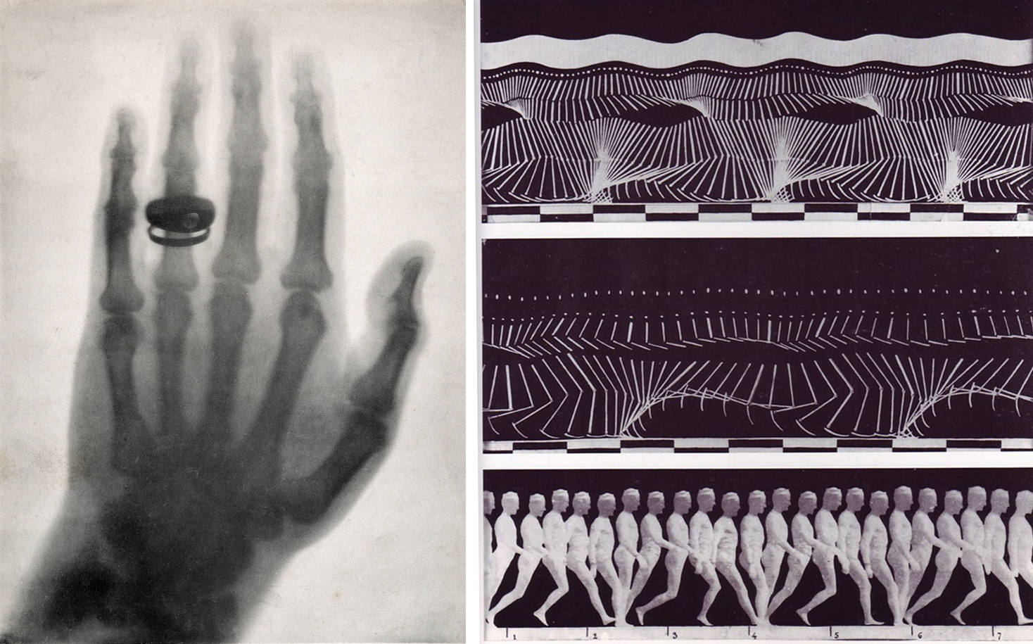
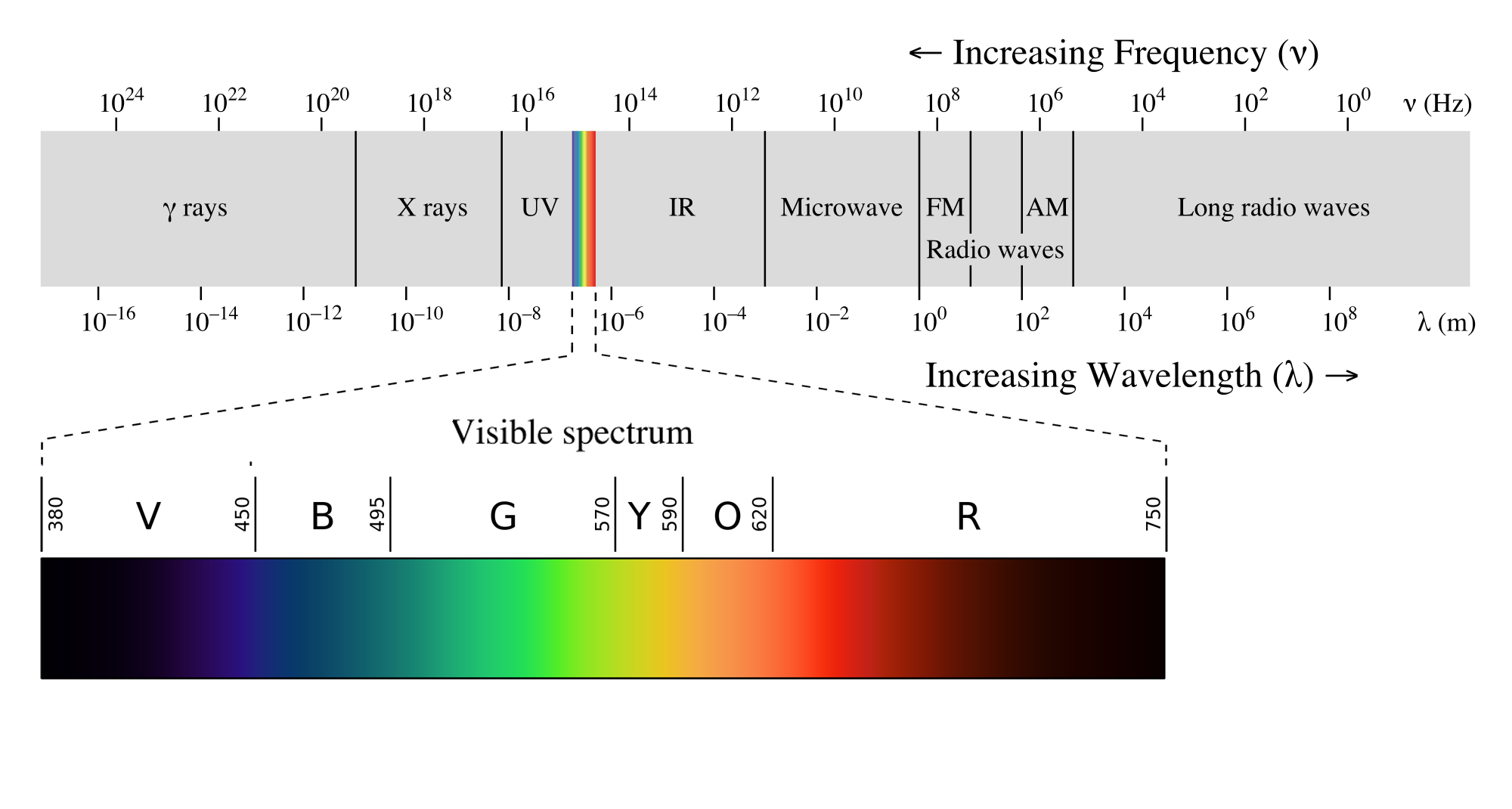
Beginning in the seventeenth century, new technologies based on the use of optical lenses provided evidence of microscopic and macroscopic worlds hitherto unsuspected. The discovery of wavelengths beyond the visible spectrum, including infrared and ultraviolet light as well as x-rays, gamma rays, and radio waves, made it clear that the human senses are very limited instruments for understanding the objective world. The visual culture of modern science provided new ways of representing and understanding reality. Stop-motion photography made rapid actions visible for study, and x-ray photography allowed peeks into the interior of solid forms, resulting in visions of reality beyond traditional naturalism.
One work that attempted to represent this new super-sensory reality was Italian Futurist Umberto Boccioni’s States of Mind: The Farewells (1911). The only clearly legible feature in the painting is the number 6943 stenciled on what we gradually discern is the engine of a dark-gray train engine spewing steam in a station. The train is represented, Cubist-fashion, from multiple perspectives. The nose cone is in profile, while the body of the train recedes in a zig-zag toward the upper right then upper center of the canvas. In front of the train in green are a series of a couples saying goodbye (their two heads and embracing arms are clearest in the lower left) — or perhaps they are one couple, viewed multiple times in the manner of stop-action photography in order to show motion through time.
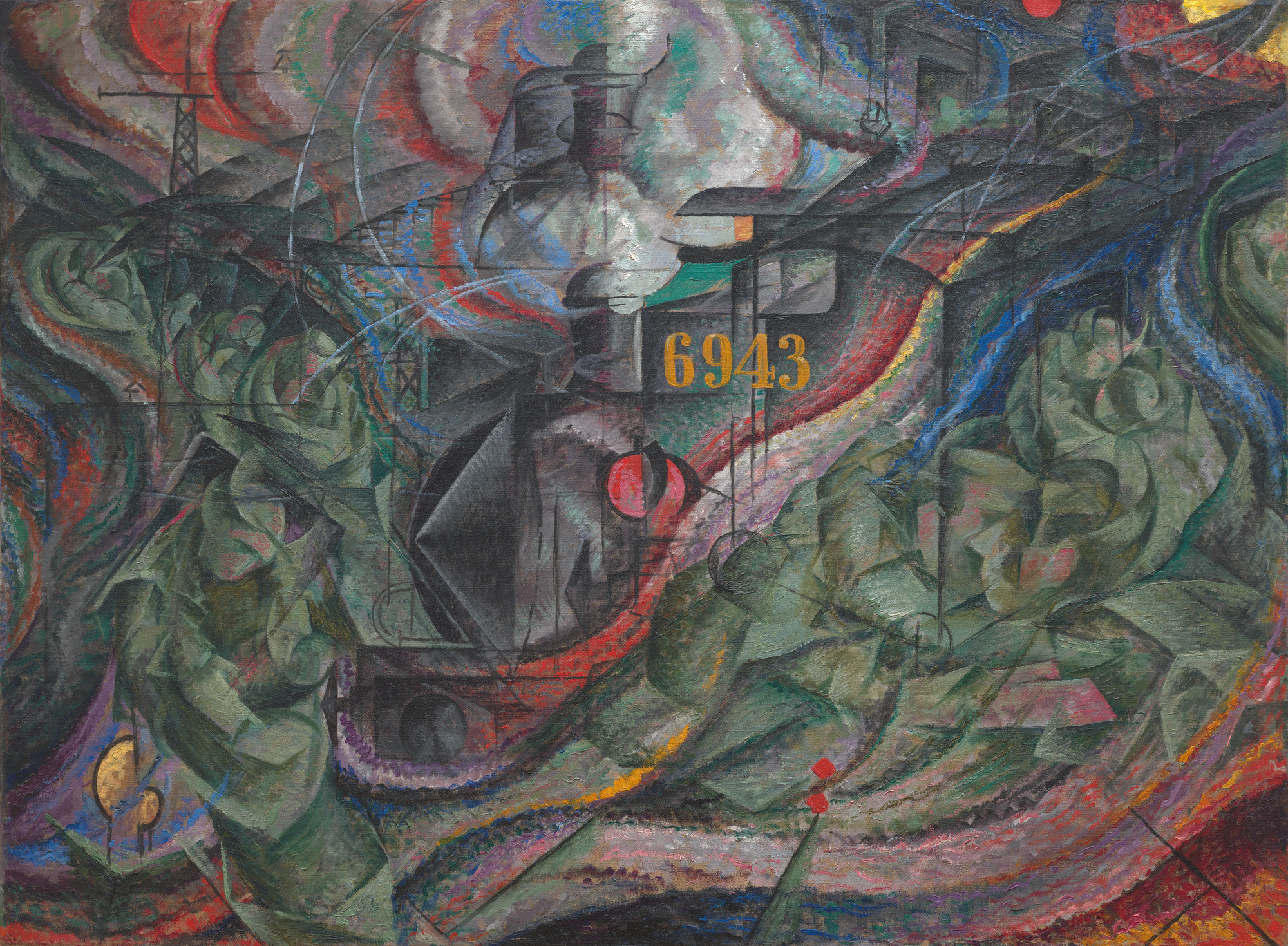
Two truss structures on the left suggest the radio towers that were constructed across Europe in the first decades of the twentieth century after the Italian Guglielmo Marconi harnessed radio waves for wireless communication. Correspondingly, the remainder of the composition is permeated with wave-forms in bright colors to suggest their high energy. Many forms of electromagnetic energy such as radio waves are invisible to the eye, but nonetheless permeate the world. Altogether, the work makes visible the new understanding of nature achieved by modern physics and presents a glimpse of reality beyond the limitations of the human senses.
Modernism and spiritualism
Modern artists’ quest for truth to realities beyond human perception was also influenced by the explicitly non-scientific approaches of spiritualism. Although spiritual visions and discoveries are often seen as subjective, many modern artists saw them as revealing objective truths. They claimed their depictions of these discoveries were glimpses of a higher reality than that available to the human senses.

The Swedish artist Hilma af Klint painted a series of works called The Paintings for the Temple between 1905 and 1915 based in part on mystical visions she received from a spiritual guide. Around the same time, the Dutch artist Piet Mondrian undertook a close study of nature to eventually discover what he felt were the basic “building blocks” of all natural and artistic form: the primary colors red, yellow, and blue; the primary values black and white, and horizontal and vertical lines. Although both of these artists produced some artworks that are entirely non-representational in the sense that they do not look like nature, both argued that their spiritual quest revealed a higher reality than that available to the senses.
These artists all remind us that what is popularly considered ”realistic” in art is in fact only based on sense perceptions, which are inevitably partial, and which in many cases distort reality. By observing nature more closely, discarding artificial conventions, correcting for perceptual distortions, absorbing new scientific theories, and engaging in spiritual investigations, many modern artists rejected traditional naturalism in order to seek higher truths.
Expression and modern art
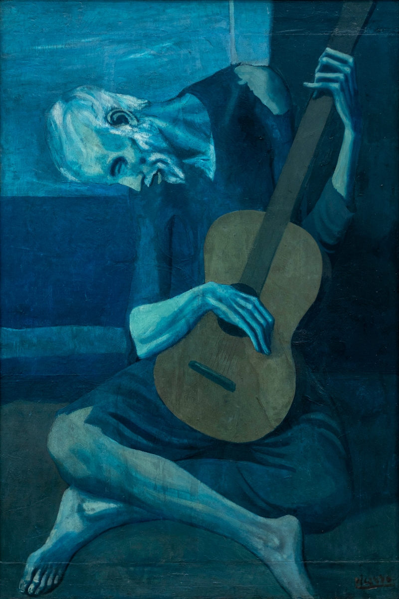
In his painting The Old Guitarist, Picasso made a series of choices to evoke feelings of pity. The guitarist is an old man, with gray hair. The fact that he is seated on the ground suggests that he is playing on the street for spare change. His emaciated state, torn clothes, and dejected posture show poverty and depression.
Furthermore, Picasso does not simply paint the old guitarist exactly as he would appear in real life; he deliberately distorts or exaggerates certain aspects of the scene in order to further intensify his intended expression. Most obviously, the entire work—except for the guitar—is in blue monochrome. This is clearly unrealistic, but it capitalizes on the melancholy emotional quality associated with that color.
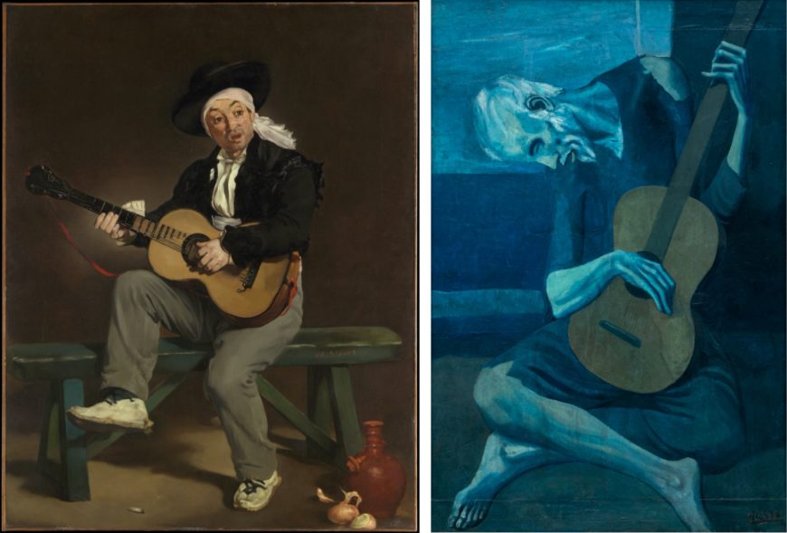
When we compare Picasso’s painting to one of a very similar subject by Edouard Manet, we can see other strategic formal distortions. Picasso’s guitarist is in an improbable (if not impossible) pose that is cramped on all sides by the frame. He looks caged or trapped, where Manet’s guitarist, already in a more dynamic pose with his energy thrusting upward, has room to move within the frame. Also, where the form of Manet’s guitarist flows through organic, rounded curves, Picasso has exaggerated the hard angularity of his guitarist, who appears to be all jutting elbows, ankles, and tendons.
These two works exemplify the difference between naturalism and expression as artistic goals. One of Manet’s primary goals was an accurate depiction of the appearance of the guitarist, what art historians call naturalism. As to how to feel about him, we are left largely on our own: it is equally probable that a viewer could pity his evident poverty (examine his worn shoes, five o’clock shadow, and simple meal), or admire his bohemian freedom. Picasso, by contrast, paints his guitarist in an expressive manner, explicitly directing our feelings through his stylistic choices.
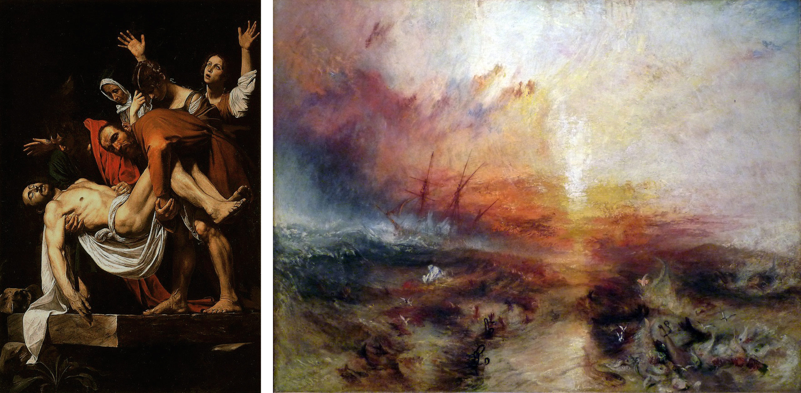
Picasso’s willingness to sacrifice naturalism in order to enhance the emotional impact of The Old Guitarist is what makes the painting exemplary of modern expression. Between the Renaissance and the nineteenth century (with some notable exceptions, such as El Greco), artists would primarily evoke emotions in ways consistent with naturalism.
In his Deposition, the Baroque artist Caravaggio uses spotlighting, gritty earth colors, and body language to help express the emotional drama of the moment Christ’s body is laid in the tomb, but nothing is too distorted. The work remains naturalistic; you could see such a scene in real life. Romantic artist J. M. W. Turner pushes the boundaries more in his Slave Ship, with obviously painterly brushwork and very intense color, but the painting still looks plausibly like a storm at sea, with the whipping spray and blowing clouds backlit by the setting sun. The Baroque and Romantic periods both emphasized expression as an artistic goal, but both also largely stayed within the confines of naturalistic representation.
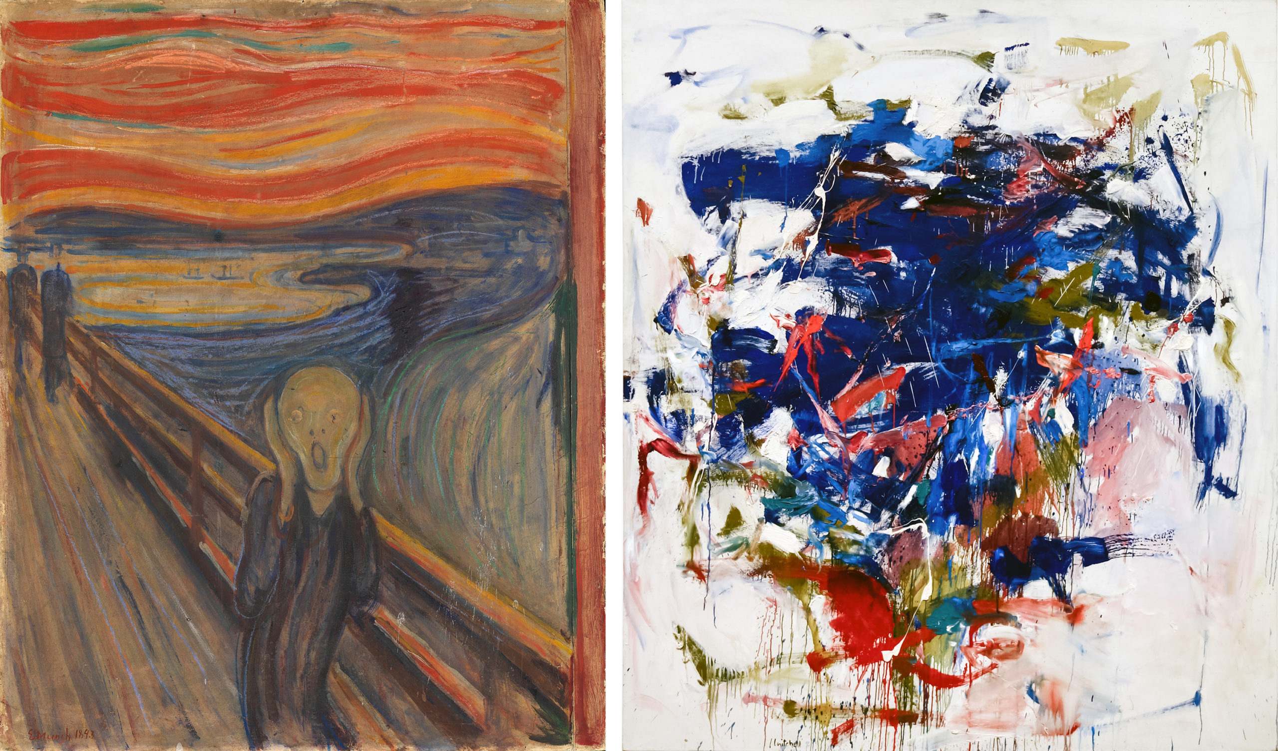
Starting in the later nineteenth century, the expressionist art movements of the Modern period were increasingly willing to sacrifice naturalism in pursuit of more powerful expressive effects. Although Edvard Munch’s The Scream does include expressive body language in the foreground figure, the painting’s emotional charge is largely carried by its formal distortions. We react first of all to the expressive power of the work’s acrid color, vertiginous recession, and nauseatingly undulating composition, which have been exaggerated to the point where the depicted scene is no longer plausible. Expression has superseded naturalism as the main aesthetic goal. The Modern period saw an increasing recognition of the expressive power of form — color, line, shape, composition, and so on. It is no great conceptual leap from Munch to Joan Mitchell, for whom pure form conveys pure expression, as the name of the Abstract Expressionist movement suggests.
Ex-pression as non-rational
The prefix “ex” means “out,” so to ex-press literally means to push out, reconfirming the distinction between expression and representation or naturalism. In the latter, the motive for the work is out in the world, part of nature, and the artist just re-presents it. With ex-pression, the motive for the work is inside the artist, a mental or emotional state, and must be pushed out.
Expression in art history is generally associated with non-rational states of mind. It is not used to describe works that convey objective facts or for ideas arrived at through rational thought processes. In addition to emotions, the term expression is also used for works that convey spiritual content, such as Vasily Kandinsky’s apocalyptic paintings of the 1910s, and subconscious content, such as the Surrealist André Masson’s automatic drawings of the 1920s.
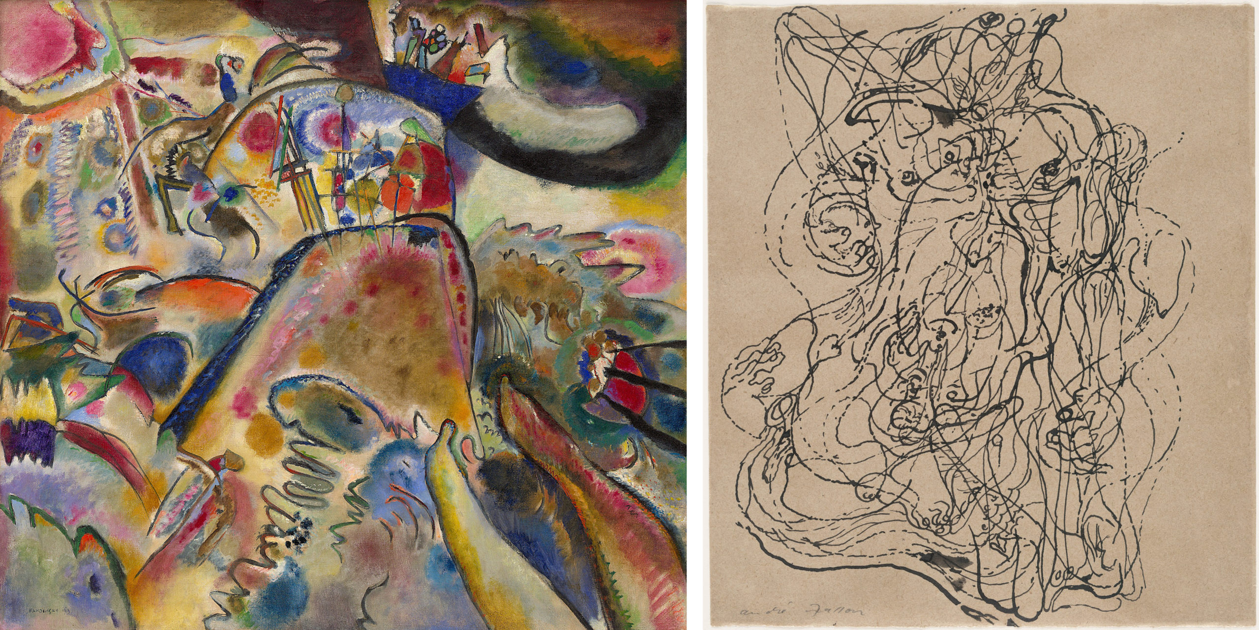
Because it pertains to non-rational states of mind, expression is often associated with spontaneous or even involuntary creative processes, both mental and manual. While naturalistic art is generally acknowledged to require intensive training, the skills associated with expressionist art are often said to be innate. Correspondingly, rapid or unrefined execution is frequently taken as a sign of expressive intensity, as though the artist’s hand were responding in automatic synchronization with the outpourings of the emotions or unconscious. This is not a universal stylistic characteristic of modern expressionist art, but it is common, as the examples above of Turner, Munch, Mitchell, Masson, and Kandinsky all demonstrate.
The stereotype of the expressionist artist
There is a stereotype of the expressionist artist that — not coincidentally — matches the qualities associated with expressionist art: almost pathologically irrational, careless of social conventions, and spontaneous to the point of being out of control. It seems that in order to express intensely, the artist has to live intensely. Many analyses of The Old Guitarist begin with the story of Picasso’s own adversities at the time, when he was living in poverty in Paris and had just lost a close friend to suicide. Similar stories of the Post-Impressionist Vincent van Gogh’s madness, the German Expressionist Ernst Ludwig Kirchner’s wartime trauma, and the American Neo-Expressionist Jean-Michel Basquiat’s life on the streets are often used to validate the expressive authenticity of their art.
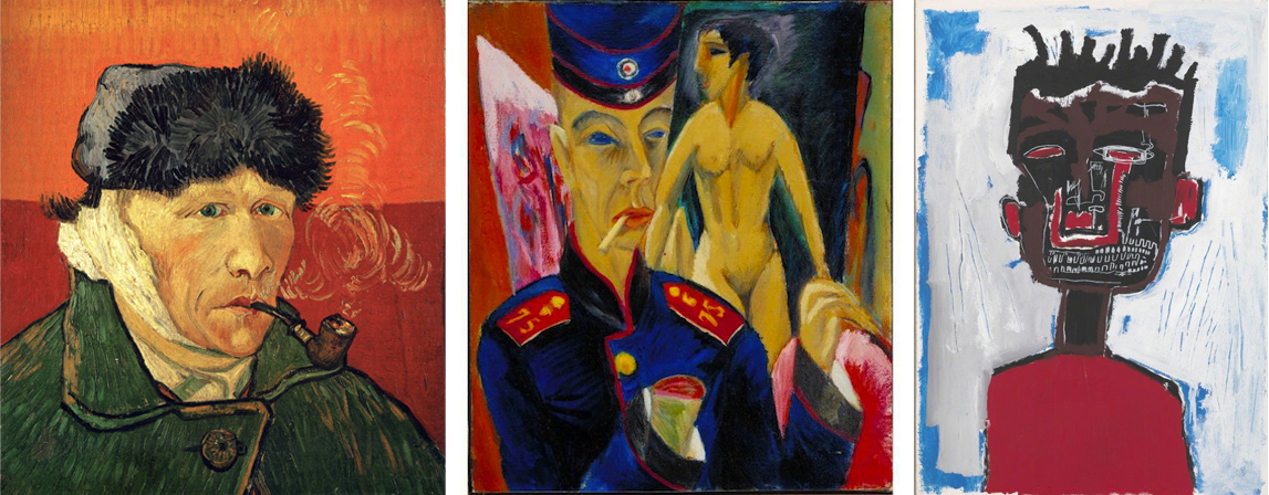
We need to maintain a distinction between expression and self-expression, however. The term self-expression is reserved for works whose primary intent is to communicate something about the artist him- or herself. Most modern expressionist art had a broader goal than this. Even when modern artists drew from their own experiences, the intent was to create works that express something about the society or culture of their time, or about the wider human condition. Truly self-expressive works are of limited relevance to outside viewers; this is why art historians typically try to relate works to issues beyond the personal biography of the artists who created them.
Not all modern art is about expression
The concept of expression and the stereotype of the expressionist artist are probably the most commonly evoked justifications for modern art in the popular understanding. If the work does not look like reality, many people assume that it is because the artist was trying to express something, rather than depict something. However, expression of non-rational mental states is only one potential goal of art, and although it was a particularly prominent goal during the modern period, it is not the only motive for non-naturalistic art.
Formalism: Formal Harmony
Art as formal beauty
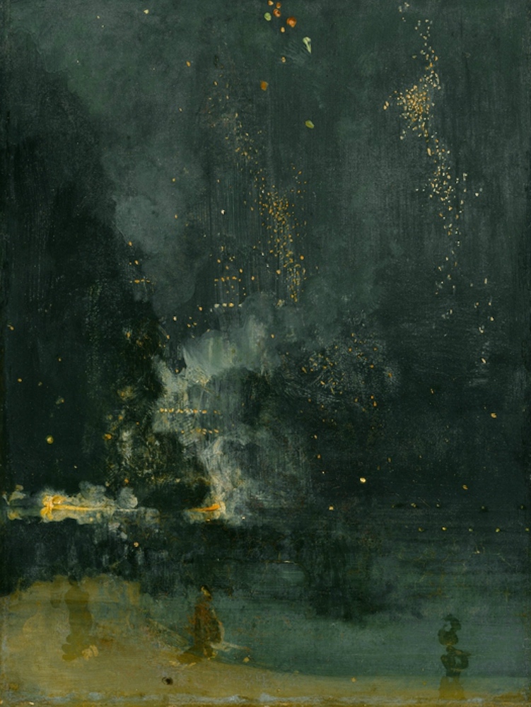
Whistler’s defense was that art is about beauty. Not the beauty of certain kinds of things — a swan, an idealized nude, or a picturesque landscape — but the beauty of certain color combinations in certain patterns: formal beauty. Denying that his Nocturne was an attempt to show an accurate view of a place, Whistler called it an “artistic arrangement,” and said that his “whole schemewas only to bring about a certain harmony of color.” [1] What we are intended to appreciate, then, is not the painting’s likeness to a scene in nature (which happens to be a firework display over a river), but instead the asymmetric balance of the composition, the calligraphic quality of the painterly marks, and the way the orange flecks sparkle against the dark blue-greens.
Whistler frequently gave his paintings titles typical of musical compositions, such as symphony, harmony, arrangement, or nocturne, and listed their dominant color combinations as though they were the equivalent of a musical key. This analogy with music helps to divert our attention away from the subject matter of the painting to its form. When we hear a piece of instrumental music we do not expect it to imitate sounds from the real world. Instead, we just appreciate the way the sounds create pleasing harmonies. Why should visual art not be appreciated in the same way?
Art for art’s sake
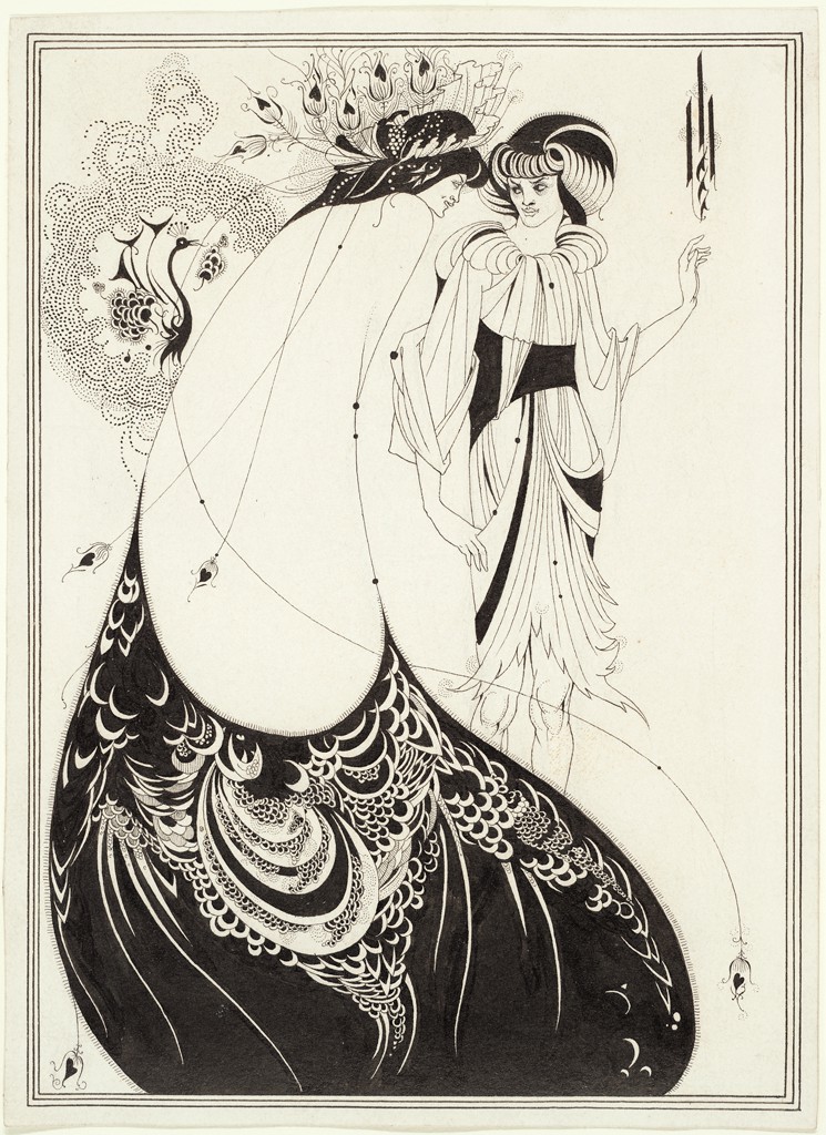
This theory of art was promoted by a late-nineteenth century literary and artistic movement called “Aestheticism,” which included Walter Pater, Oscar Wilde, and Aubrey Beardsley, as well as Whistler. Their motto, “art for art’s sake,” implicitly rejected the non-aesthetic goals commonly assigned to art, such as imitation of nature, moral instruction, spiritual exaltation, and emotional expression.
This idea of art was not entirely novel to the nineteenth century. The ancient Greeks had theorized that aesthetic harmony in both music and visual art resided in certain mathematical proportions. What is new here is the prominence that the Aesthetes granted this idea. For them, formal beauty was not just one of many potential goals for art; it was the pre-eminent and perhaps only quality the artist should strive for.
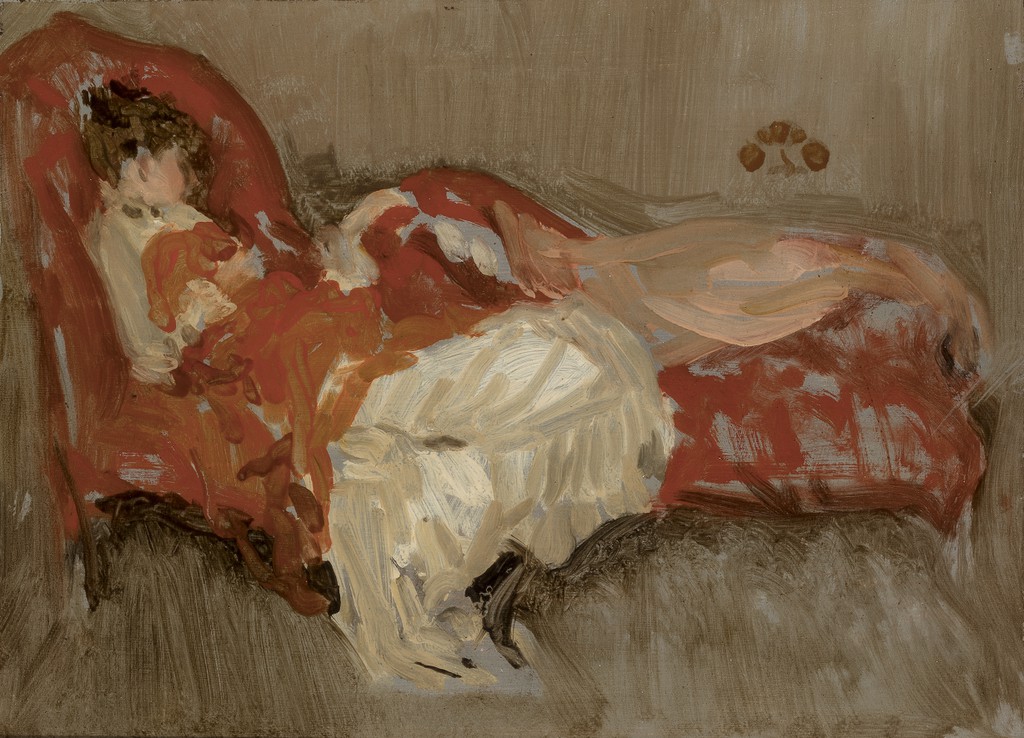
It was particularly shocking to Ruskin and Victorian England that the Aesthetes denied art’s role in improving public morality. Whistler scorned people who look “not at a picture, but through it,” to consider whether it will “better their mental or moral state.” [2] He believed that art is not a vehicle for public reform any more than it is a means to reproduce the appearances of nature. We shouldn’t keep looking outside the painting for its purpose, but rather enjoy it for what it in fact is: a surface covered with harmonious arrangements of color.
Theories of art that concentrate on the sensory or material qualities of the work itself are called “formalist.” Note that formalism is not a historical style or movement like Impressionism or Cubism. Rather, it should be considered a basic theory that tries to explain what art is or should be.
Formalism and modern art
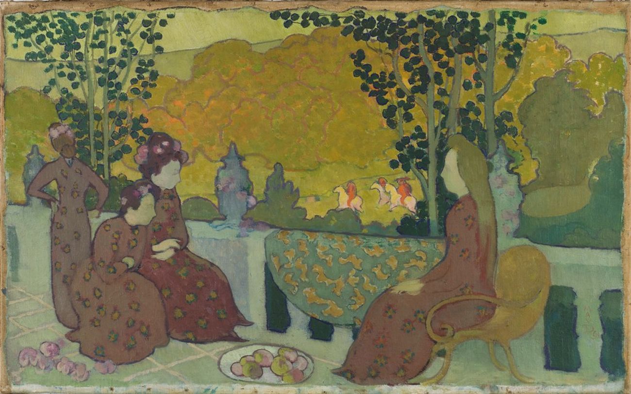
A number of modern movements emphasized the purely aesthetic qualities of art. In 1890 the Symbolist artist Maurice Denis famously asserted, “A painting — before being a battle horse, a nude woman, or some anecdote — is essentially a flat surface covered with colors arranged in a certain order.” [3] Correspondingly, Denis’s paintings read as surface patterns as much as (or even more than) representations of real-world spaces and objects.
In another famous statement, the Fauve artist Henri Matisse confessed in his Notes of a Painter (1909), “my ambition is limited, and does not go beyond the purely visual satisfaction such as can be obtained from looking at a picture.” [4]
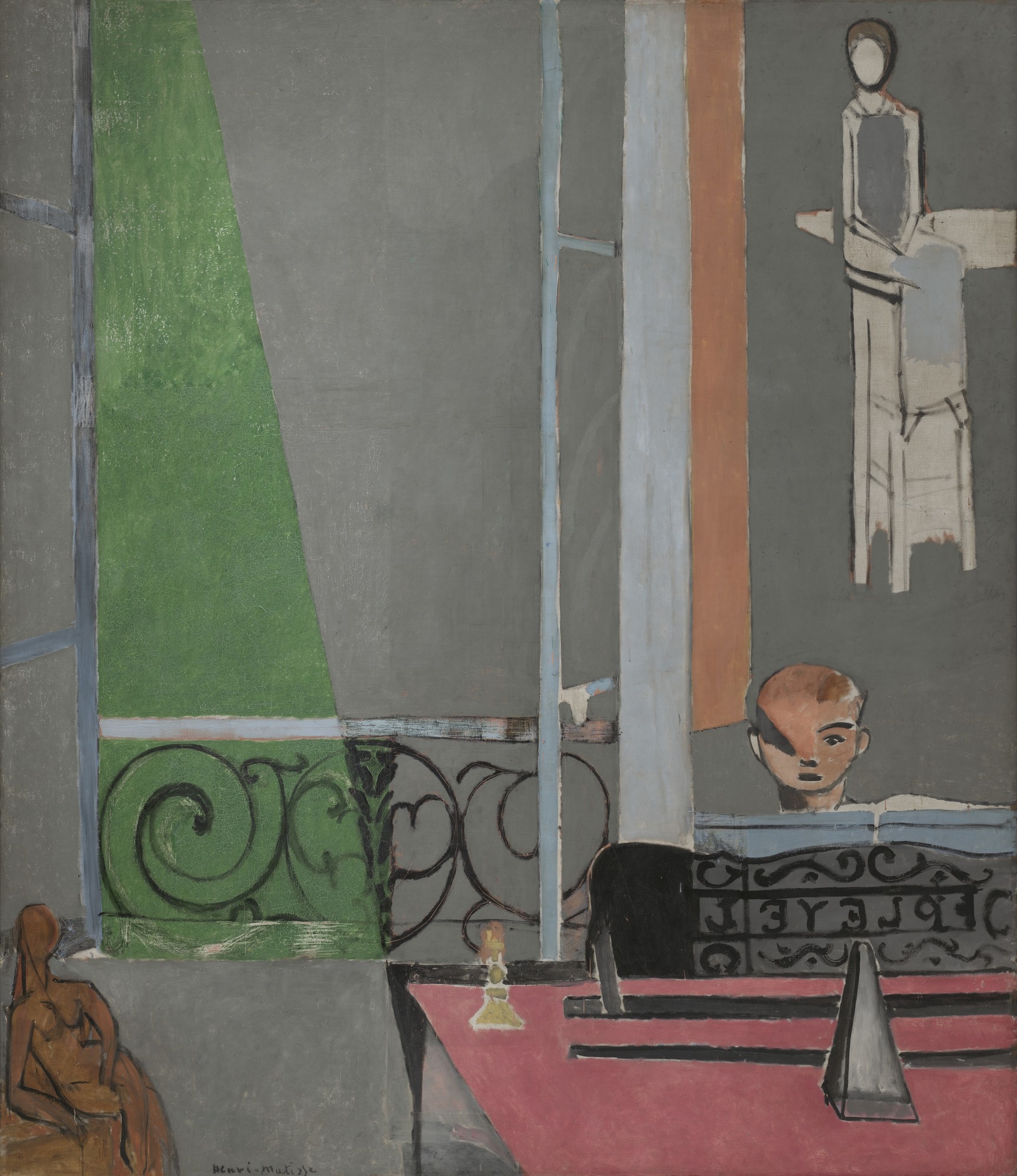
Like Whistler, Matisse sought harmony in his works. He conveyed aesthetic pleasure not only through his choice of sensual and tranquil subjects — lounging nudes, picnics, dances, quiet domestic interiors — but also through form. In The Piano Lesson the painting’s nominal subject of a boy practicing the piano is just a pretext for showcasing a complex pattern of vivid colors against cool gray, and for contrasting rectilinear shapes with the swirling black tracery of the balcony railing and music stand.
Clive Bell and “Significant Form”
For many modern artists (including Matisse and Denis), a concern with formal harmony was paired with other goals, such as emotional expression, spirituality, and social agency. Formalist art theory was therefore mostly developed by art critics, rather than by artists themselves.
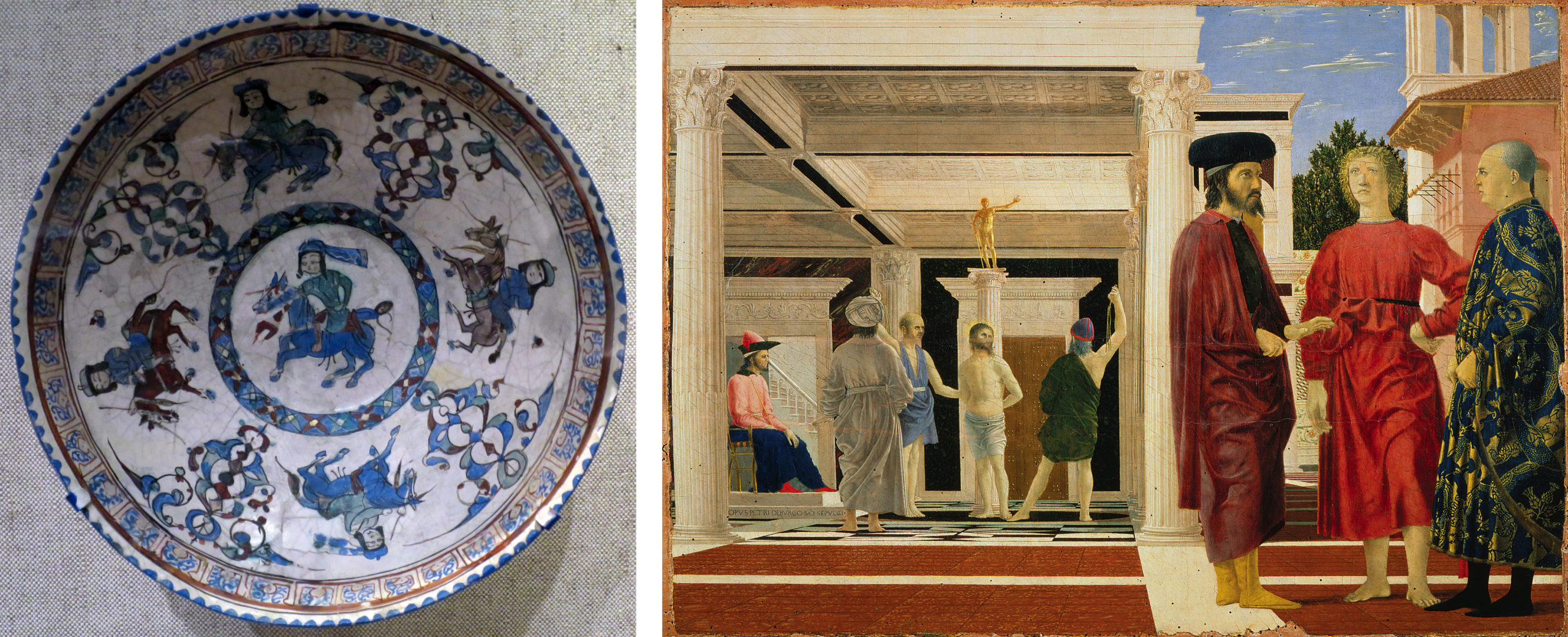
The English art critic Clive Bell articulated a formalist theory of art in his 1914 book Art. He claimed that the purpose of art is to evoke a particular kind of feeling that he called “aesthetic emotion.” This feeling is not caused by the subject, but by the form of the artwork:
What quality is shared by all objects that provoke our aesthetic emotions? What quality is common to Sta. Sophia and the windows at Chartres, Mexican sculpture, a Persian bowl, Chinese carpets, Giotto’s frescoes at Padua, and the masterpieces of Poussin, Piero della Francesca, and Cézanne? Only one answer seems possible — significant form. In each, lines and colours combined in a particular way, certain forms and relations of forms, stir our aesthetic emotions. —Clive Bell, Art, (New York: Frederick A. Stokes, 1913), p. 8.
Note that Bell’s examples include architecture and craft as well as paintings and sculptures: any made object can be art if it exhibits significant form.
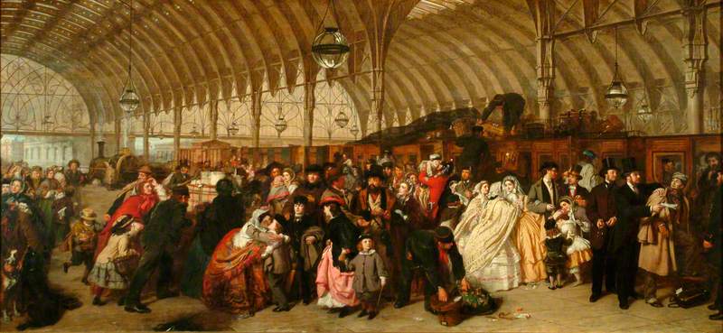
By the same token, not all paintings and sculptures qualify as art, according to Bell. In a painting such as William Powell Frith’s The Railway Station, the goal is accurate depiction. Certain anecdotes depicted in the work may arouse emotions, such as the mother embracing her child, but these are everyday emotions, not aesthetic emotions. The detail of the work may excite our admiration of the artist’s skill, but for Bell that skill was misdirected: true artists are dedicated to evoking aesthetic emotion through significant form.
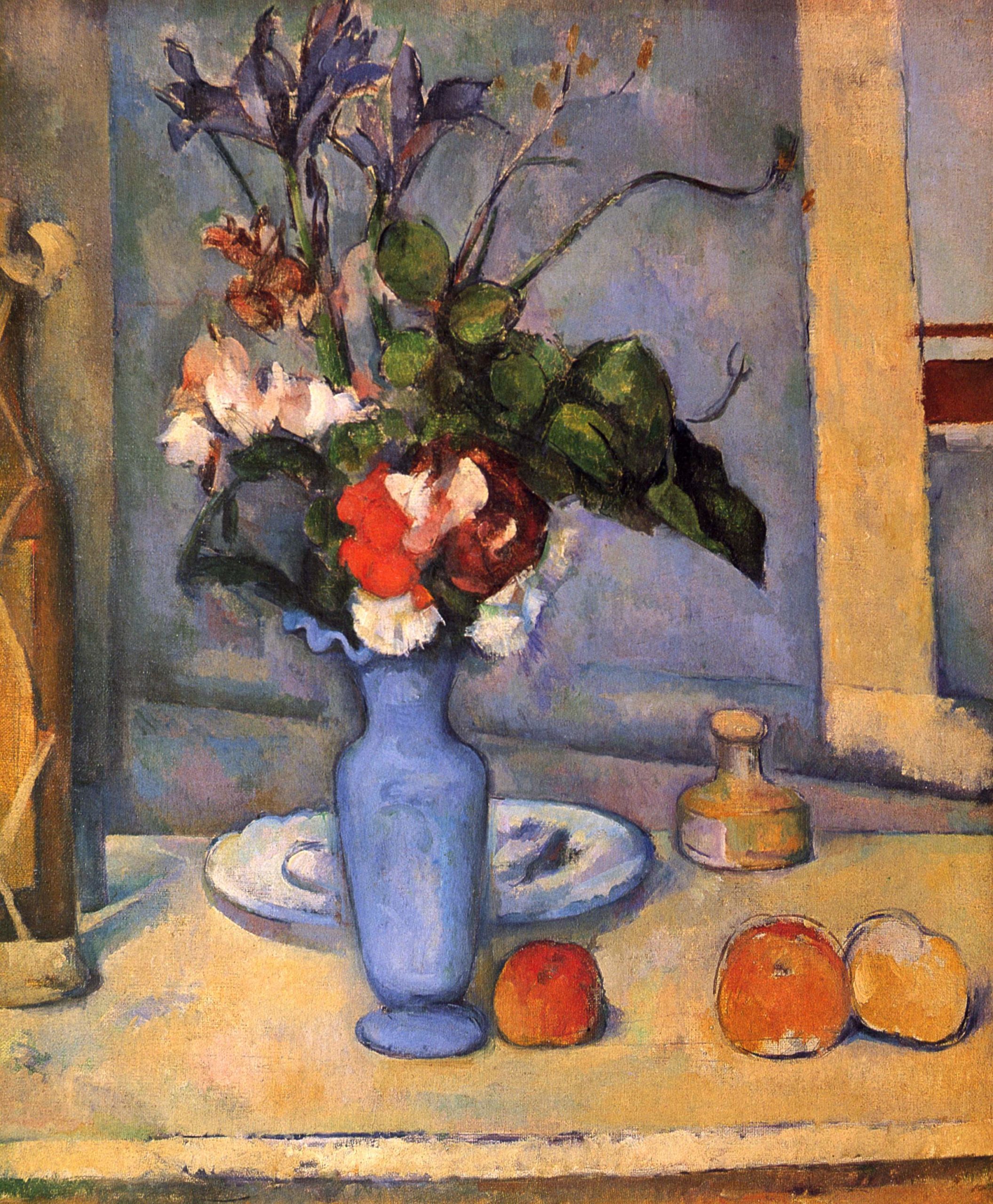
Bell admired works by non-Western and pre-Renaissance artists, whose lack of concern with representational accuracy freed them to use line, shape, and color to create significant form. In Bell’s view, certain recent artists such as Paul Cézanne had rediscovered art’s true purpose as evoking aesthetic emotions, rather than merely copying the appearances of nature.
The autonomy of art
One of the hallmarks of formalist art theory is the idea that the work of art should be experienced in itself, and not in relation to anything else. We should not compare the work with nature to judge how true-to-life it is. It makes no difference whether the work is a portrait of a king or pure abstraction, and we need not inquire about the social context in which the work of art was produced, whether it was second-century Rome, eighteenth-century Japan, or twenty-first century America. Everything we need to know about a painting is contained within the four edges of its frame. As Bell put it:
To appreciate a work of art, we need bring nothing from life, no knowledge of its ideas and affairs, no familiarity with its emotions. Art transports us from the world of man’s activity to a world of aesthetic exaltation… —Clive Bell, Art, (New York: Frederick A. Stokes, 1913), p. 25.
For its proponents, the formalist theory of art has the benefit of elevating art and the artist above everyday utilitarian and social concerns. For its opponents, however, art is and has always been part of life, and abstracting it from life’s concerns impoverishes its richness and diminishes its important social roles.
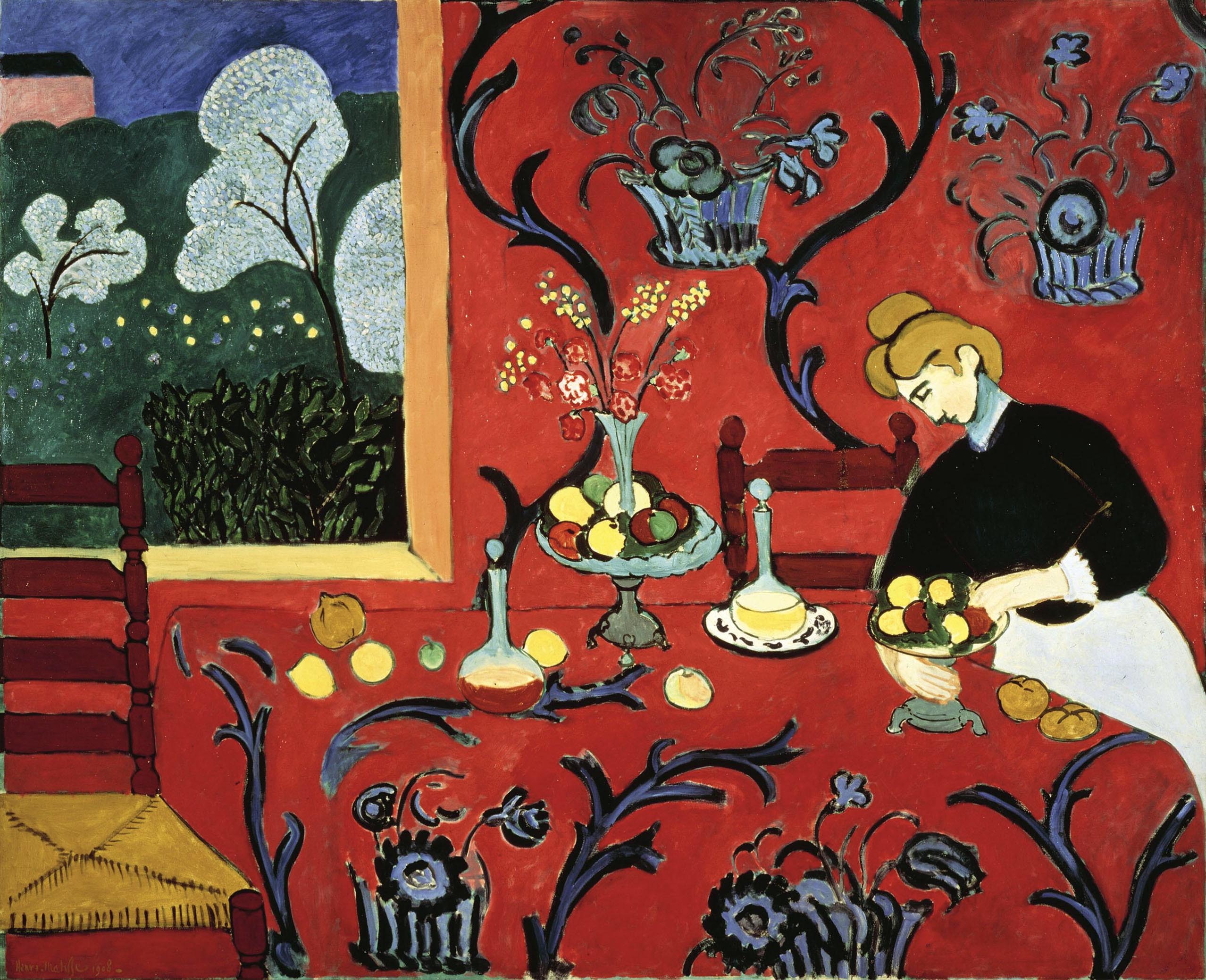
Thus, while it is certainly possible to analyze and appreciate this Matisse painting solely in terms of its formal qualities, to do so would require overlooking significant questions about gender roles, social class, consumption, and domesticity that are also raised by the work. In recent decades, these broader social concerns have dominated the approaches of most artists, critics, and historians, and purely aesthetic concerns have become less important.
Jacques-Louis David, Oath of the Horatii
No one had seen a painting like it
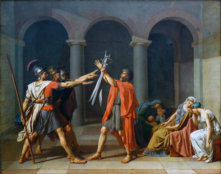
In 1785 visitors to the Paris Salon were transfixed by one painting, Jacques-Louis David’s Oath of the Horatii. It depicts three men, brothers, saluting toward three swords held up by their father as the women behind him grieve—no one had ever seen a painting like it. Similar subjects had always been seen in the Salons before but the physicality and intense emotion of the painting was new and undeniable. The revolutionary painting changed French art but was David also calling for another kind of revolution—a real one?
Conquer or die
The story of Oath of the Horatii came from a Roman legend first recounted by the Roman historian Livy involving a conflict between the Romans and a rival group from nearby Alba. Rather than continue a full-scale war, they elect representative combatants to settle their dispute. The Romans select the Horatii and the Albans choose another trio of brothers, the Curatii. In the painting we witness the Horatii taking an oath to defend Rome.
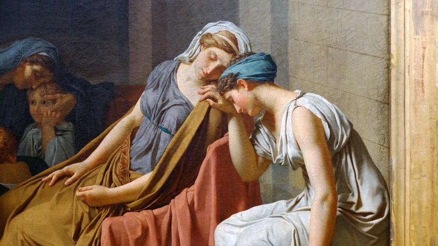
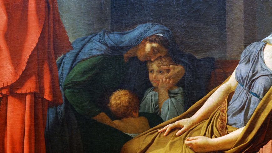
The women know that they will also bear the consequence of the battle because the two families are united by marriage. One of the wives in the painting is a daughter of the Curatii and the other, Camilla, is engaged to one of the Curatii brothers. At the end of the legend the sole surviving Horatii brother kills Camilla, who condemned his murder of her beloved, accusing Camilla of putting her sentiment above her duty to Rome. The moment David chose to represent was, in his reported words, “the moment which must have preceded the battle, when the elder Horatius, gathering his sons in their family home, makes them swear to conquer or die.”
A rigorously organized painting
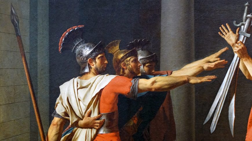
To tell the story of the oath, David created a rigorously organized painting with a scene set in what might be a Roman atrium dominated by three arches at the back that keep our attention focused on the main action in the foreground. There we see a group of three young men framed by the first arch, the Horatii brothers, bound together with their muscled arms raised in a rigid salute toward their father framed by the central arch. He holds three swords aloft in his left hand and raises his right hand signifying a promise or sacrifice. The male figures create tense, geometric forms that contrast markedly with the softly curved, flowing poses of the women seated behind the father. David lit the figures with a stark, clinical light that contrasts sharply with the heightened drama of the scene as if he were requiring the viewer to respond to the scene with a mixture of passion and rationality.
An example of Neoclassicism
In beginning art history courses, the painting is typically presented as a prime example of Neoclassical history painting. It tells a story derived from the Classical world that provides an example of virtuous behavior (exemplum vertutis). The dramatic, rhetorical gestures of the male figures easily convey the idea of oath-taking and the clear, even light makes every aspect of the story legible. Instead of creating an illusionistic extension of space into a deep background, David radically cuts off the space with the arches and pushes the action to the foreground in the manner of Roman relief sculpture.

Before Oath of the Horatii, French history paintings in a more Rococo style such as Jean-François-Pierre Peyron’s Death of Alcestis (1785) involved the viewer by appealing to sentiment and presenting softly modeled graceful figures. David acknowledged that old approach in the figures of the women in Oath of the Horatii, but challenged it with the starkly athletic figures and resolute poses of the men.
Going back to Poussin

Before composing Oath of the Horatii, David went to see Poussin’s Rape of the Sabine Women and employed the lictor, the caped man, on the far left as the basis for the Horatii and he directly quoted other figures from Poussin as well. Even though Poussin was his model, David knew that he was creating a new type of painting and wrote, “I do not know whether I shall ever paint another like it,” as he developed the austere composition and powerful physiques.
Personal sacrifice for an ideal
Today the painting is typically interpreted in the context of the French Revolution and David’s own direct involvement as a revolutionary. The exact source of the scene that inspired David is in doubt but it is important to art historians because it can offer clues as to David’s intentions for the picture.
In the nineteenth century a former student of David identified the source as the 1640 play Les Horaces by Corneille that David had seen in Paris in 1782. The difficulty is that no scene of an oath occurs in Corneille’s script. However, toward the end of the play, a minor character comes on stage bearing the three swords of the defeated Curatii. This stage direction as well as other contemporary productions and images related to the story of Horatii in particular—and oath-taking in general—may provide the background for David’s decision to paint the moment when the brothers take their oath to defend Rome—an act of personal sacrifice for a political ideal.
Revolutionary or not?
With this in mind, we can understand how one might read Oath of the Horatii as a painting designed to rally republicans (those who believed in the ideals of a republic, and not a monarchy, for France) by telling them that their cause will require the dedication and sacrifice of the Horatii. Those who support this view cite some of the rousing lines from Corneille’s tragedy such as, “Before I am yours, I belong to my country,” as well as the response of contemporary left-wing writers who praised David’s republican sentiments. Those who disagree with this interpretation argue that David was enmeshed in the system of royal patronage, that the painting was accepted into the Salon with no negative response from official quarters and later royal commissions followed.
In the succeeding decades French painters responded again and again to David’s transformative painting. Paintings such as Gros’ Napoleon Bonaparte Visiting the Plague-Stricken (1804), Gericault’s Raft of the Medusa (1819), Delacroix’s Liberty Leading the People (1830), and even Courbet’s Burial at Ornans (1849) confront the Oath of Horatii as they embrace or reject David’s aesthetic and, perhaps, political revolution.
Between Neoclassicism and Romanticism: Ingres, La Grande Odalisque

A quick study

Jean-Auguste-Dominique Ingres was an artist of immense importance during the first half of the nineteenth century. His father, Jean-Marie-Joseph Ingres was a decorative artist of only minor influence who instructed his young son in the basics of drawing by allowing him to copy the family’s extensive print collection that included reproductions from artists such as Boucher, Correggio, Raphael, and Rubens. In 1791, at just 11 years of age, Ingres the Younger began his formal artistic education at the Académie Royale de Peinture, Sculpture et Architecture in Toulouse, just 35 miles from his hometown of Montauban.
Ingres was a quick study. In 1797—at the tender age of 16 years—he won the Académie’s first prize in drawing. Clearly destined for great things, Ingres packed his trunks less than six months later and moved to Paris to begin his instruction in the studio of Jacques-Louis David, the most strident representative of the Neoclassical style. David stressed to those he instructed the importance of drawing and studying from the nude model. In the years that followed, Ingres not only benefitted from David’s instruction—and the prestige and caché that such an honor bestowed—but also learned from many of David’s past students who frequented their former teacher’s studio. These artists comprise a “who’s who” of late-eighteenth-century French neoclassical art and include painters such as Jean-Germain Droais, Anne-Louis Girodet, and Antoine Jean-Gros.
The Rome Prize—a bright future

The Prix de Rome—the Rome Prize—was the most prestigious fellowship that the French government awarded to a student at the Paris École des Beaux-Arts (School of Fine Arts), the leading art school in France from its founding in 1663 until it was finally dissolved in 1968. The recipient of the Prix de Rome was provided with a living stipend, studio space at the French Academy in Rome, and the opportunity to immerse themselves in Rome’s classical ruins and the works of Renaissance and Baroque masters. It promised to be a great five years for any aspiring artist. Joseph-Marie Vien, David’s own teacher, had won the award in 1743. David won the award in 1774—after four unsuccessful attempts. Ingres was formally admitted to the painting department of the École des Beaux-Arts in October 1799. The following year—in only his first attempt—Ingres tied for second place. In 1801, his painting of The Ambassadors of Agamemnon in the Tent of Achilles won him the Prix de Rome. He turned 21 years old that August. Ingres had a bright future indeed.
Hierarchy of subjects
The Prix de Rome—to say nothing of the instruction Ingres received within David’s studio and at the École des Beaux-Arts—reinforced the hierarchy of the subjects of painting that had been a foundational element of French art instruction for more than a century. Artists with the greatest skill aspired to complete grand manner history paintings. These were immense compositions often depicting narratives from the classical past or from the Jewish and Christian Bibles. In addition to being large—and expensive—these works allowed the most accomplished and intellectually engaged artists to provide the art-viewing public with an important moral message—an exemplum virtutis (an example of virtue). David’s 1784 masterwork Oath of the Horatii is one such example.

The nude (and not the classical past)
Due to the financial woes of the French government in the first years of the nineteenth century, Ingres’s Prix de Rome—which he won in 1801—was delayed until 1806. Two years later, Ingres sent to the École three compositions—intended to demonstrate his artistic growth while studying at the French Academy in Rome. Interestingly, all three of these works—The Valpinçon Bather, the so-called Sleeper of Naples, and Oedipus and the Sphinx—depict elements of the female nude (to be fair, however, the sphinx is not human). The first two, however, do not depict a story from the classical past. Instead, nearly the entire focus of each composition is on the female form. While Ingres has retained the formal elements that were so much a part of his Neoclassical training—extreme linearity and a cool, “licked’ surface” (where brushwork is nearly invisible)—he had begun to reject neoclassical subject matter and the idea that art should be morally instructive. Indeed, by 1808, Ingres was beginning to walk on both sides of the neoclassical/romantic divide. In few works is a Neoclassical style fused with a romantic subject matter more clearly than in Ingres’s 1814 painting La Grande Odalisque.
Ingres completed his time at the French Academy in Rome in 1810. Rather than immediately return to Paris however, he remained in the Eternal City and completed several large-scale history paintings. In 1814 he traveled to Naples and was employed by Caroline Murat, the Queen of Naples (who also happened to be Napoleon Bonaparte’s sister). She commissioned La Grande Odalisque, a composition that was intended to be a pendant to his earlier composition, Sleeper of Naples.
At first glance, Ingres’s subject matter is of the most traditional sort. Certainly, the reclining female nude had been a common subject matter for centuries. Ingres was working within a visual tradition that included artists such as Giorgione (Sleeping Venus, 1510), Titian (Venus of Urbino, 1538) and Velazquez (Rokeby Venus, 1647-51). But the titles for all three of those paintings have one word in common: Venus. Indeed, it was common to cloak paintings of the female nude in the disguise of classical mythology.

Ingres (and Goya, who was working within a similar vein with his La Maja Desnuda—see below) refused to disguise who and what his female figure was. She was not the Roman goddess of love and beauty. Instead, she was an odalisque, a concubine who lived in a harem and existed for the sexual pleasure of the sultan.

In his painting La Grande Odalisque, Ingres transports the viewer to the Orient, a far-away land for a Parisian audience in the second decade of the nineteenth century (in this context, “Orient” means Near East more so than the Far East). The woman—who wears nothing other than jewelry and a turban—lies on a divan, her back to the viewer. She seemingly peeks over her shoulder, as if to look at someone who has just entered her room, a space that is luxuriously appointed with fine damask and satin fabrics. She wears what appears to be a ruby and pearl encrusted broach in her hair and a gold bracelet on her right wrist. In her right hand she holds a peacock fan, another symbol of affluence, and another piece of metalwork—a facedown bejeweled mirror, perhaps?—can be seen along the lower left edge of the painting.

Along the right side of the composition we see a hookah, a kind of pipe that was used for smoking tobacco, hashish and opium. All of these Oriental elements—fabric, turban, fan, hookah—did the same thing for Ingres’s odalisque as Titian’s Venetian courtesan being labeled “Venus”—that is, it provided a distance that allowed the (male) viewer to safely gaze at the female nude who primarily existed for his enjoyment.

And what a nude it is. When glancing at the painting, one can immediately see the linearity that was so important to David in particular, and the French neoclassical style more broadly. But when looking at the odalisque’s body, the same viewer can also immediately notice how far Ingres has strayed from David’s particular style of rendering the human form—look for instance at her elongated back and right arm. David was largely interested in idealizing the human body, rendering it not as it existed, but as he wished it did, in an anatomically perfect state. David’s commitment to the idealizing the human form can clearly be seen in his preparatory drawings for his never completed Oath of the Tennis Court. There can be no doubt that this is how David taught Ingres to render the body.
Students often stray from their teacher’s instruction, however. In La Grande Odalisque, Ingres rendered the female body in an exaggerated, almost unbelievable way. Much like the Mannerists centuries earlier—Parmigianino’s Madonna of the Long Neck (c. 1535) immediately comes to mind—Ingres distorted the female form in order to make her body more sinuous and elegant. Her back seems to have two or three more vertebrae than are necessary, and it is anatomically unlikely that her lower left leg could meet with the knee in the middle of the painting, or that her left thigh attached to this knee could reach her hip. Clearly, this is not the female body as it really exists. It is the female body, perhaps, as Ingres wished it to be, at least for the composition of this painting. And in this regard, David and his student Ingres have attempted to achieve the same end—idealization of the human form—though each strove to do so in markedly different ways.
A brief comparison between teacher and student makes clear how far Ingres had strayed from the neoclassical path David had laid. In some ways, La Grande Odalisque is based upon David’s 1800 Portrait of Madame Récamier.

Both images show a recumbent woman who peers over her shoulder to look at the viewer. David and Ingres utilize line in a similar way. However, David depicts Récamier at the height of neoclassical fashion, wearing an Empire waistline dress and an à la grecque hairstyle. One gets the sense that there is real a body underneath that dress. In contrast, Ingres’s odalisque is a naked “other” from the Orient, and no clothing could disguise the elongations and anatomical inaccuracies of her body. David remained a committed neoclassicist, while his former student retained his neoclassical line to embrace, in this case, a geographically distant and romantic subject. This tension between Neoclassicism and Romanticism will continue throughout the first half of the nineteenth century as painters will tend to side with either Ingres and his precise linearity or the painterly style of the younger painter Eugène Delacroix.
Francisco Goya, The Sleep of Reason Produces Monsters

A dark vision
In this ominous image, we see the dark vision of humanity that characterizes Goya’s work for the rest of his life.
A man sleeps, apparently peacefully, even as bats and owls threaten from all sides and a lynx lays quiet, but wide-eyed and alert. Another creature sits at the center of the composition, staring not at the sleeping figure, but at us. Goya forces the viewer to become an active participant in the image––the monsters of his dreams even threaten us.
Los Caprichos
On 6 February 1799, Francisco Goya put an advertisement in the Diario de Madrid. “A Collection of Prints of Capricious Subjects,” he tells the reader, “Invented and Etched by Don Francisco Goya,” is available through subscription. We know this series of eighty prints as Los Caprichos (caprices, or follies).
Los Caprichos was a significant departure from the subjects that had occupied Goya up to that point––tapestry cartoons for the Spanish royal residences, portraits of monarchs and aristocrats, and a few commissions for church ceilings and altars.
Many of the prints in the Caprichos series express disdain for the pre-Enlightenment practices still popular in Spain at the end of the Eighteenth century (a powerful clergy, arranged marriages, superstition, etc.). Goya uses the series to critique contemporary Spanish society. As he explained in the advertisement, he chose subjects “from the multitude of follies and blunders common in every civil society, as well as from the vulgar prejudices and lies authorized by custom, ignorance or interest, those that he has thought most suitable matter for ridicule.”
The Caprichos was Goya’s most biting critique to date, and would eventually be censored. Of the eighty aquatints, number 43, “The Sleep of Reason Produces Monsters,” can essentially be seen as Goya’s manifesto and it should be noted that many observers believe he intended it as a self-portrait.
Imagination united with reason
In the image, an artist, asleep at his drawing table, is besieged by creatures associated in Spanish folk tradition with mystery and evil. The title of the print, emblazoned on the front of the desk, is often read as a proclamation of Goya’s adherence to the values of the Enlightenment—without Reason, evil and corruption prevail.
However, Goya wrote a caption for the print that complicates its message, “Imagination abandoned by reason produces impossible monsters; united with her, she is the mother of the arts and source of their wonders.”
In other words, Goya believed that imagination should never be completely renounced in favor of the strictly rational. For Goya, art is the child of reason in combination with imagination.

The beginnings of Romanticism
With this print, Goya is revealed as a transitional figure between the end of the Enlightenment and the emergence of Romanticism. The artist had spent the early part of his career working in the court of King Carlos III who adhered to many of the principles of the Enlightenment that were then spreading across Europe––social reform, the advancement of knowledge and science, and the creation of secular states. In Spain, Carlos reduced the power of the clergy and established strong support for the arts and sciences.
However, by the time Goya published the Caprichos, the promise of the Enlightenment had dimmed. Carlos III was dead and his less respected brother assumed the throne. Even in France, the political revolution inspired by the Enlightenment had devolved into violence during an episode known as the Reign of Terror. Soon after, Napoleon became Emperor of France.
Goya’s caption for “The Sleep of Reason,” warns that we should not be governed by reason alone—an idea central to Romanticism’s reaction against Enlightenment doctrine. Romantic artists and writers valued nature which was closely associated with emotion and imagination in opposition to the rationalism of Enlightenment philosophy. But “The Sleep of Reason” also anticipates the dark and haunting art Goya later created in reaction to the atrocities he witnessed—and carried out by the standard-bearers of the Enlightenment—the Napoleonic Guard.
Goya brilliantly exploited the atmospheric quality of aquatint to create this fantastical image. This printing process creates the grainy, dream-like tonality visible in the background of “The Sleep of Reason.”
Aquatint

Although the aquatint process was invented in 17th century by the Dutch printmaker, Jan van de Velde, many consider the Caprichos to be the first prints to fully exploit this process.
Aquatint is a variation of etching. Like etching, it uses a metal plate (often copper or zinc) that is covered with a waxy, acid-resistant resin. The artist draws an image directly into the resin with a needle so that the wax is removed exposing the metal plate below. When the scratch drawing is complete, the plate is submerged in an acid bath. The acid eats into the metal where lines have been etched. When the acid has bitten deeply enough, the plate is removed, rinsed and heated so that the remaining resin can be wiped away.
Aquatint requires an additional process, the artist sprinkles layers of powdery resin on the surface of the plate, heats it to harden the powder and dips it in an acid bath.
The acid eats around the resin powder creating a rich and varied surface. Ink is then pressed into the pits and linear recesses created by the acid and the flat surface of the plate is once again wiped clean. Finally, a piece of paper is pressed firmly against the inked plate and then pulled away, resulting in the finished image.
Henry Fuseli, The Nightmare

Shocked, titillated, and frightened
Working during the height of the Enlightenment, the so-called “Age of Reason,” the Swiss-English painter Henry Fuseli (born Johann Heinrich Füssli) instead chose to depict darker, irrational forces in his famous painting The Nightmare. In Fuseli’s startling composition, a woman bathed in white light stretches across a bed, her arms, neck, and head hanging off the end of the mattress. An apelike figure crouches on her chest while a horse with glowing eyes and flared nostrils emerges from the shadowy background.
The painting was first displayed at the annual Royal Academy exhibition in London in 1782, where it shocked, titillated, and frightened exhibition visitors and critics. Unlike many of the paintings that were then popular and successful at the Royal Academy exhibitions, Fuseli’s The Nightmare has no moralizing subject. The scene is an invented one, a product of Fuseli’s imagination. It certainly has a literary character and the various figures demonstrate Fuseli’s broad knowledge of art history, but The Nightmare’s subject is not drawn from history, the Bible, or literature. The painting has yielded many interpretations and is seen as prefiguring late nineteenth-century psychoanalytic theories regarding dreams and the unconscious (Sigmund Freud allegedly kept a reproduction of the painting on the wall of his apartment in Vienna).
Incubus or mara
The figure that sits upon the woman’s chest is often described as an imp or an incubus, a type of spirit said to lie atop people in their sleep or even to have sexual intercourse with sleeping women. Fuseli’s painting is suggestive but not explicit, leaving open the possibility that the woman is simply dreaming. Yet, her dream appears to take frightening, physical form in the shapes of the incubus and the horse. According to Fuseli’s friend and biographer John Knowles, who saw the first drawing Fuseli made for the composition in 1781, the horse was not present in the drawing but added to the painting later.

Although it is tempting to understand the painting’s title as a punning reference to the horse, the word “nightmare” does not refer to horses. Rather, in the now obsolete definition of the term, a mare is an evil spirit that tortures humans while they sleep. As Samuel Johnson’s A Dictionary of the English Language (1755) defined it, a mare or “mara, [is] a spirit that, in heathen mythology, was related to torment or to suffocate sleepers. A morbid oppression in the night resembling the pressure of weight upon the breast.” Thus, Fuseli’s painting may in fact be understood as embodying the physical experience of chest pressure felt during a dream-state.
Dark themes
Through his use of composition and chiaroscuro—the strategic juxtaposition of sharply contrasting light and shadow—Fuseli heightened the drama and uncertainty of his scene. However, unlike the slightly earlier painting by Joseph Wright of Derby, A Philosopher Lecturing on the Orrery, which utilized chiaroscuro to symbolize the enlightening power of rational observation, Fuseli’s The Nightmare instead shows the futility of light to penetrate or explain the darker realms of the unconscious.

In The Nightmare, the single light source coming in from the right, the curtains and tassels in the background, and the shortened, stage-like foreground also add to the work’s theatricality. The red drapery falling off the edge of the bed even suggests a river of blood as it might be symbolically enacted on stage in a play or an opera, adding morbid undertones to the painting’s already dark themes. Throughout his career, Fuseli painted and illustrated scenes from Shakespeare and Milton, and his art has a consistent sense of literary, at times even erudite drama that reveals his classical education (after completing his studies, Fuseli had been ordained as a pastor in the Swiss Evangelical Reformed Church before his political activities in Zürich effectively forced him into exile in 1761).

The Nightmare’s stark mixture of horror, sexuality, and morbidity has insured its enduring notoriety. In January 1783, The Nightmare was engraved by Thomas Burke and distributed by the publisher John Raphael Smith. The relatively low price of this reproduction following on the heels of the attention the work received at the Royal Academy helped to distribute the image to a wider audience. Fuseli later painted at least three more variations with the same title and subject.
The Nightmare became an icon of Romanticism and a defining image of Gothic horror, inspiring the poet Erasmus Darwin (Charles Darwin’s grandfather) and the writers Mary Shelley and Edgar Allan Poe among many others. From the start, caricaturists also adopted Fuseli’s composition, and political figures from Napoleon Bonaparte to President George W. Bush and German Chancellor Angela Merkel have all been lampooned in satirical versions of Fuseli’s painting.
Articles in this chapter:
- Dr. Parme Giuntini, “Becoming Modern, an introduction,” in Smarthistory, August 8, 2015
- Dr. Charles Cramer and Dr. Kim Grant, “Modern art and reality,” in Smarthistory, June 16, 2020
- Dr. Charles Cramer and Dr. Kim Grant, “Expression and modern art,” in Smarthistory, June 16, 2020
- Dr. Charles Cramer and Dr. Kim Grant, “Formalism I: Formal Harmony,” in Smarthistory, April 3, 2020
- Dr. Claire Black McCoy, “Jacques-Louis David, Oath of the Horatii,” in Smarthistory, January 7, 2016
- Dr. Bryan Zygmont, “Between Neoclassicism and Romanticism: Ingres, La Grande Odalisque,” in Smarthistory, November 12, 2015
- Sarah C. Schaefer, “Francisco Goya, The Sleep of Reason Produces Monsters,” in Smarthistory, August 9, 2015
- Dr. Noelle Paulson, “Henry Fuseli, The Nightmare,” in Smarthistory, August 9, 2015
- “The Action,” in James Abbot McNeill Whistler, The Gentle Art of Making Enemies (1892; reprint New York: Dover Publications, 1967), pp. 3, 8. ↵
- "Mr Whistler’s ‘Ten O’Clock’” (1885), in The Gentle Art of Making Enemies, p. 138. ↵
- Maurice Denis, “Definition of neo-traditionism” (1890), in Jean-Paul Bouillon, ed., Le ciel et l’arcadie (Paris: Hermann, 1993), p. 5 (authors’ translation). ↵
- Matisse, “Notes of a Painter,” sixth paragraph. ↵
the overarching label for art produced between 1850 and 1960, and embracing an avant garde, non-traditional approach
an economic system in which workers exchange labor for a fixed wage and use their wages to buy consumer items
art focusing on natural scenes, sometimes with human-made structures and/or people, but focusing on the environment itself
scenes of everyday life
artworks depicting an often carefully-arranged collection of stationary objects—typically flowers, fruit, and/or serving ware
from the French, forward guard, a term borrowed from the military to describe risk-takers, those leading the charge culturally
a style of representation that seeks to recreate the visible world or nature
relating to how the eye perceives the world
consisting of just one color
skilled application of paint, focusing on texture over line and often reflecting visible brushtrokes
a modern theory of art that concentrates on the sensory and material qualities of the work itself
from the Greek calli- (beautiful) + graphy (writing), beautiful or ornamented writing
visually beautiful; also (usually plural) referring to the branch of philosophy concerned with beauty, especially absent of personal meaning or usefulness
an artwork depicting a specific individual
artwork whose subject matter focuses on scenes from the real or mythological past, often with a moral message and dramatic staging
original works of art on paper, resulting from the printmaking process; often individually numbered and signed by the artist
a philosophical movement begun in France in the 17th and 18th centuries which advanced rationality and science over received ideas about society, religion, and politics
a strong public statement declaring the beliefs and mission of an individual or group
a type of printmaking process that combines etching with the ability to create middle tones
an intaglio printmaking technique in which an artist draws onto a prepared plate lines which, when the plates is bathed in acid, become incised and hold ink applied in the printing process.
a type of spirit said to lie atop people in their sleep and even have sexual intercourse with sleeping women
from the Latin chiaro (light) + scuro (dark), the artistic technique of combining light and shadow to create the illusion of three-dimensional form
a representation that exaggerates physical features or scenarios, often for comedic or political effect
