11
Dr. Kim Grant and Dr. Charles Cramer
In this chapter
The Cubist City – Robert Delaunay and Fernand Léger
by DR. CHARLES CRAMER and DR. KIM GRANT
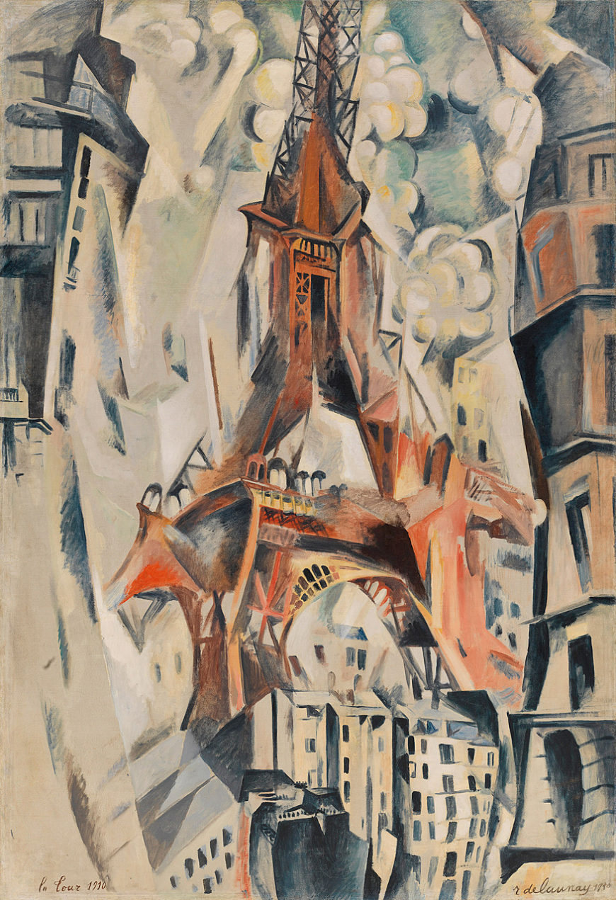
Robert Delaunay’s Eiffel Tower seems to slash up through the canvas, bending and distorting the surrounding city as it climbs into a fractured sky. This is one of many paintings in which Delaunay attempted to convey the dominating and disorienting presence of the famous nineteenth-century Paris monument — a product of modern engineering and a symbol of modernity.
In this painting we see the tower from different angles, looking simultaneously up at the supporting legs and arch, and down at the central portions of the tower. Some sections seem to dissolve, while others morph into extra supports and towers as if a different side view has been attached to the main form.
Although the details of the structure are often confused, the overall triangle formed by the central tower projecting from its splay-legged base is clear and shapes everything that surrounds it. The tall buildings on the sides of the painting curve and sway as if responding to the tower’s contours. The sky shatters into crystalline angles, and clusters of round shapes — suggesting trees or clouds or smoke — solidify the space around the tower into a cacophony of shifting planes.
Modern style for a modern subject
This is a vision of the modern city in the most modern painting style of the day, Cubism. Delaunay exhibited with many other Cubist painters in the Paris Salons, where his work was notable for its focus on Paris as a subject.
Although the group of Cubists with whom Delaunay was associated, the Salon Cubists, were dedicated to modern artistic techniques, their subjects were often not especially modern. Delaunay was unusual in his devotion to representing the experience of the modern city, and he was particularly drawn to the Eiffel Tower as a symbol of modern Paris.
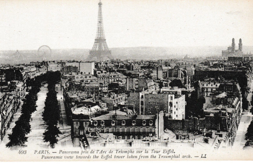
Constructed as a temporary monument for the 1889 Universal Exposition, the Eiffel Tower was intended to display advanced structural engineering. It was, and remains, completely out of scale with the surrounding buildings. It is also remarkably different in kind from the city’s buildings; it has no external walls and no solid form. Although massive in scale, it seems light and airy because of its open structure, through which the sky is visible. In the early twentieth century, it was a center for modern communications and scientific technology, serving as a telegraph relay station as well as a post for studying weather and aerodynamics.
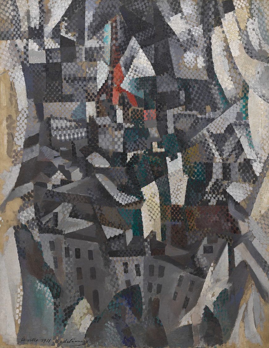
Delaunay often depicted Paris and the Eiffel Tower as viewed through a window. In The City, curtains are visible on the sides as light, curved forms framing the central scene. The dark shadowed buildings and rooftops of the city rise up from below and stretch into the distance, where the red and black silhouette of the Eiffel Tower can just be seen surging up into the faceted sky. In addition to the Cubist fracturing of forms and space, Delaunay here used a Neo-Impressionist-like technique of small brushstrokes to create the effect of shimmering highlights on the surface of the canvas. The following year he would devote himself to an analysis of color and light partly derived from Neo-Impressionism that would lead him to non-representational painting.
Unanimist spectacles
Delaunay’s depictions of the Eiffel Tower as a conjunction of fragmented and discontinuous views have been linked to the French philosopher Henri Bergson’s early twentieth-century theories about the way memory informs perception to combine past and present experiences. The unification of different views of the tower in a single image has also been connected to the contemporary French literary movement Unanimism, which celebrated the collective soul of individuals united by group experiences.
In Delaunay’s paintings, the Eiffel Tower becomes a focus for all of the city’s inhabitants. The simultaneous depiction of different viewing angles can be understood as a way of representing the union of all the different people’s viewpoints, and perhaps even the people’s spiritual unification, as they look at the tower.
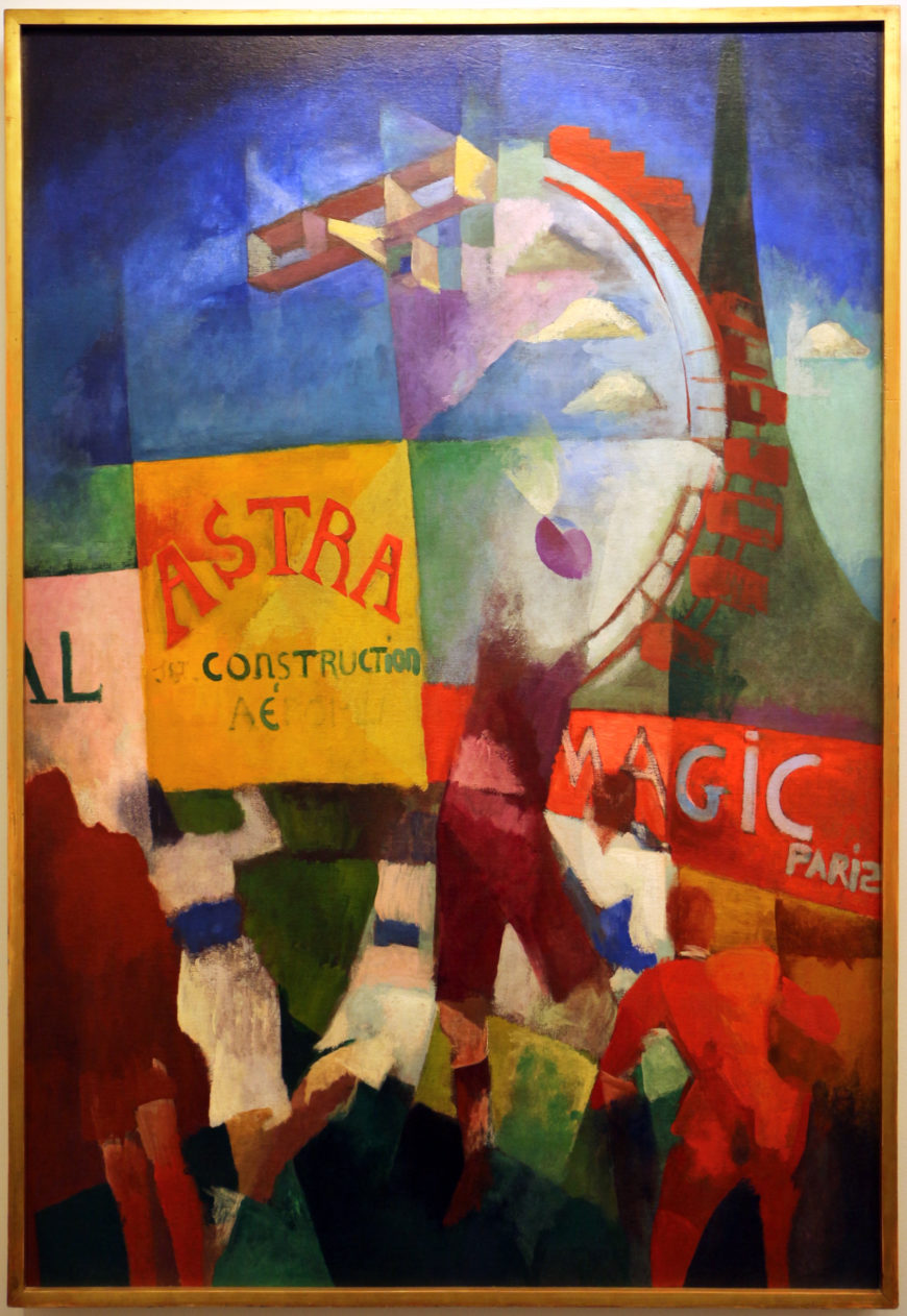
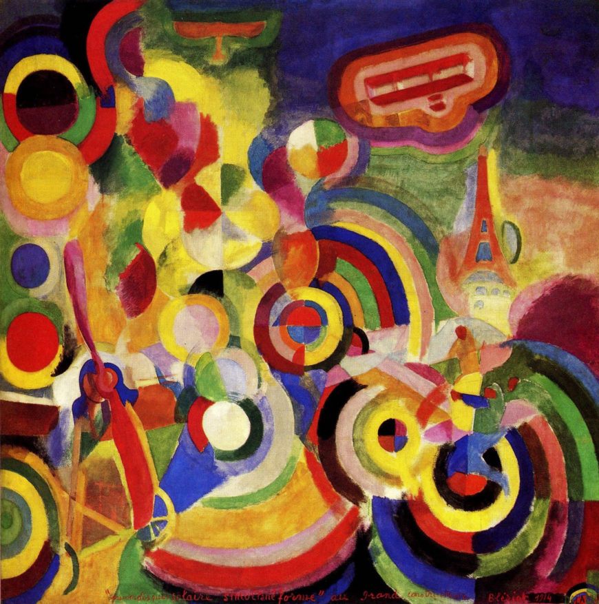
In The Cardiff Team the Eiffel Tower form is joined by two other aggressively modern subjects, a biplane and the enormous Paris Ferris wheel, which hover over the ball players and billboards in the lower half of the canvas. The title refers to a recent Paris-Cardiff rugby match, and the active figures in the foreground are based on a contemporary newspaper photo. The spectacle of modern team sports is an example of a popular group activity that created a Unanimist experience of collectivity.
The painting’s billboards advertise Astra, an airplane construction company, and “Magic Paris.” (In another version of the painting “Magic Paris” is replaced by “Delaunay,” indicating how closely the painter identified with the Eiffel Tower rising above the sign.) The contrasting planes of brilliant colors that structure the painting reflect Delaunay’s contemporary exploration of abstract color relationships, but this work is clearly a representation of Paris as a modern urban spectacle.
The Urban Experience
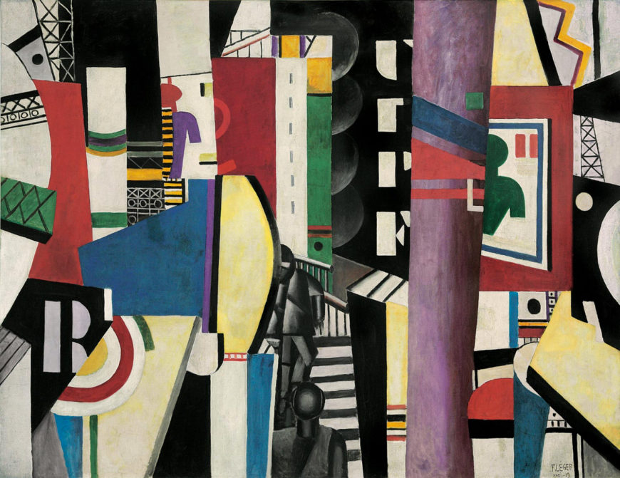
Delaunay’s friend and fellow Salon Cubist, Fernand Léger, also painted the modern city in a modern style. His huge painting The City, painted after World War I, is an amalgam of the chaotic visual experience of the twentieth-century urban environment. A cacophony of brightly colored geometric shapes and letters compete for attention. Vertical rectangles create a rhythm across the surface of the canvas, while depth is suggested by layering and diagonal planes jutting into the painting from the lower corners.
In the upper half of the painting there are two simplified shapes of a human head and torso, one green and one purple and red. These immediately recognizable human silhouettes are figures in advertising posters, similar to those in Delaunay’s The Cardiff Team, a nod to another aspect of modern life—the increasing presence and stridency of commercialism.
While most Cubist painters tended to depict traditional subjects, both Delaunay and Léger found the flat, hard-edged geometric style of Cubism an appropriate vehicle for representing the modern world of machines and mass production. Léger’s highly abstract style contrasts with the more legible, painterly, and nuanced representation of the city in Delaunay’s The Cardiff Team, but there are nevertheless important similarities.
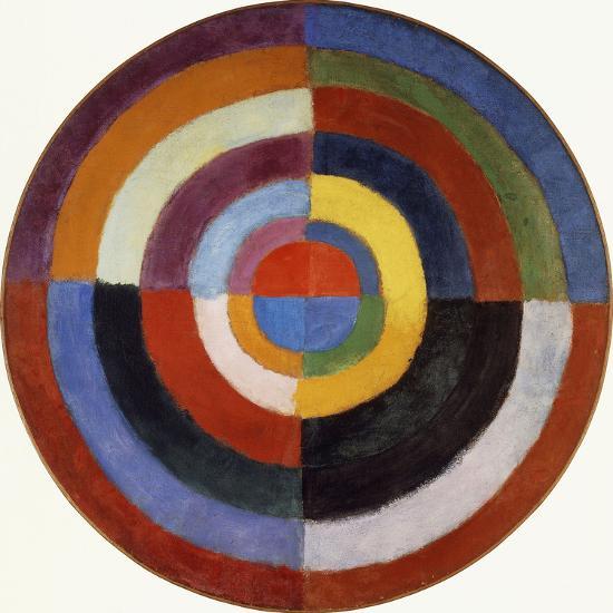
Both artists represent the modern city by combining disparate elements, including letters and billboards, in complex abstract compositions based on ambiguous spatial relationships and color patterns. Léger’s painting builds on Delaunay’s earlier work and even has a coded homage to his fellow artist in the form of the initial R on the left paired with the bisected target shape, which forms a D. These are surrounded by open ironwork scaffolding that suggests fragments of the Eiffel Tower. The target shape also echoes Delaunay’s investigations of color in disc-shaped abstract paintings.
Transforming people
A striking aspect of these paintings of the city is the treatment of the human figure, which is starkly impersonal. The rugby players in The Cardiff Team are part of the modern spectacle. They have no faces, and in the case of the main central figure, no head at all.
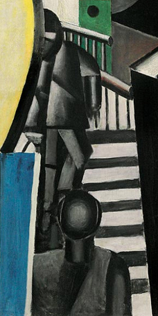
Similarly, in the lower center of The City are two charcoal-gray figures. The featureless face of one confronts us at the bottom of the canvas, while the other is on a dark-gray and white staircase in the background.
The anonymous, geometric rendering of these figures shows that Léger, like Delaunay, had no interest in depicting human beings as individuals. It may even suggest that modernity is transforming not only the environment, but also humankind, to match its own mechanical rationality.
Delaunay and Léger used Cubism’s abstract language of fractured forms and spatial dislocations to express the unique qualities of the modern urban experience. Their paintings focused on the distinctively modern aspects of Paris and depicted the way in which people are absorbed into and perhaps even transformed by modernity. Neither artist saw this as a bad thing; their paintings celebrate the union of modern humans and their new environment.
Simultanism: Robert Delaunay
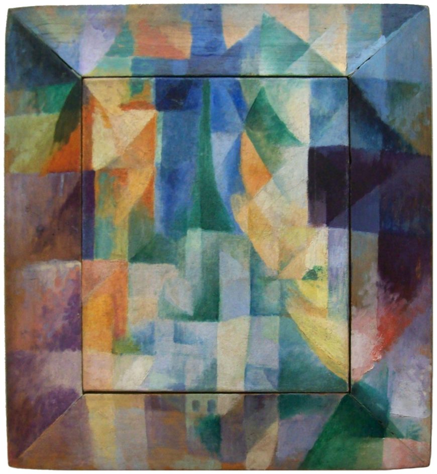
Robert Delaunay’s Simultaneous Windows on the City is enigmatic. Where is the city? Where are the windows? At first (and possibly second and third) glance what we see is a fractured pattern of mostly rectangular planes painted in the colors of the spectrum over both a canvas and its wooden frame. If we consider the post-Renaissance Western conception of a painting as being like a window, then we might interpret the painted frame as a window frame and the canvas inside as representing the city, but this does little to help us see a city depicted in the painting.
Cubist composition
Looking at the painting in Cubist terms is more successful. Delaunay exhibited with the Salon Cubists, and this painting was made as Delaunay’s artistic interests shifted from the Cubists’ analysis of form to an investigation of color and light.
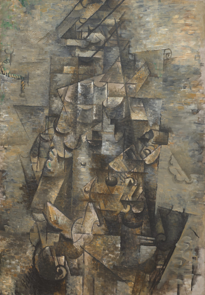
Despite its intense color, Simultaneous Windows on the City remains Cubist in overall composition. Like Braque’s roughly contemporary Cubist composition Man with a Guitar, Delaunay’s painting is a complex grid of dark and light-toned planes and ambiguous forms in which the viewer can find vestigial signs of the subject.
The most recognizable form in Delaunay’s painting is the green Eiffel Tower in the center, rising up from its triangular base to a point toward the top of the canvas. Below the tower are suggestions of rectangular buildings with dark blue windows. Some of these are painted directly on the wooden frame, indicating that it cannot be literally equated with a window’s frame.
The side bars of the frame are, however, darker than the canvas area, and their diagonal edges at the top and bottom create the illusion of a casement window opening into the viewer’s space. The bright yellows and oranges on the canvas convey an impression of warm outdoor light, while the intense blues in the rectangle surrounding the Eiffel Tower suggest sky. The color contrasts also create a sense of spatial depth as the cool blues appear to recede next to the vivid warmth of the yellows and oranges.
An established subject
Delaunay painted many depictions of both the Eiffel Tower and Paris as seen from a window, and this painting is a more abstract version of what was an established subject for him.
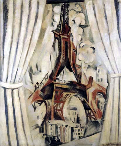
Knowledge of his earlier paintings makes it easier to see the representational forms in this one. The orange shapes, for example, are like the curtains in the windows that frame the tower in previous paintings. Here, however, their color also plays a crucial role, suggesting sunlight and creating a chromatic contrast with the blue that intensifies both colors.
Simultanism and Orphism
The use of chromatic contrast is a primary interest in Simultaneous Windows on the City, and became a central concern of Delaunay’s art. He studied the science of vision and color theory, particularly the writings of M. E. Chevreul and Ogden Rood, which had influenced the Neo-Impressionists in the 19th century.
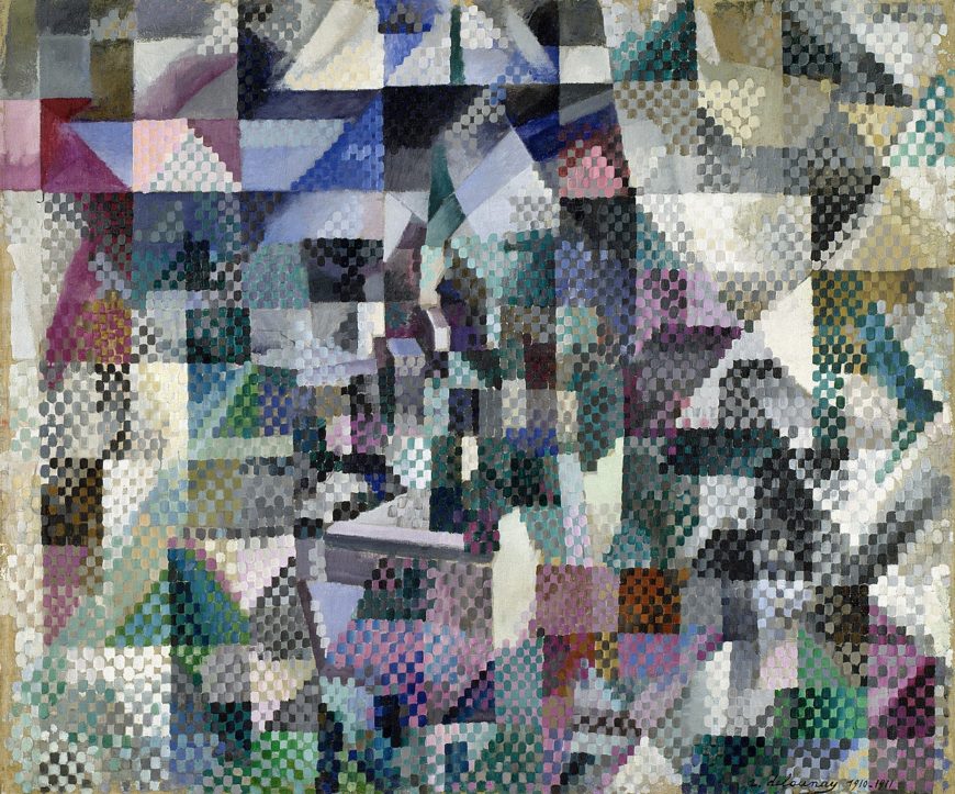
Delaunay used the Neo-Impressionists’ divisionist technique to create a visible mosaic of colored brushstrokes in paintings like Window on the City no. 3, but he soon shifted to using larger planes of color. In 1912 he and his wife Sonia developed an approach to painting light by means of color that they called Simultanism.
The Delaunays were not alone in using the term Simultanism in relation to art. Simultaneity was a popular term with broad significance among avant-garde artists and writers of the time. Generally, it alluded to new concepts of space and time described by early-20th century physicists, such as Einstein, and philosophers, notably Henri Bergson. More specifically, it referred to techniques used by Cubists and Futurists to combine different vantage points into a single “simultaneous” image. Such images were considered a synthesis of memory and perception, and sometimes also a synthesis of many different people’s views.
The Delaunays’ friend, the writer Guillaume Apollinaire, labelled their work “Orphism” or “Orphic Cubism,” and linked it with the work of other artists who were also developing post-cubist styles. Despite Apollinaire’s confusing combination of very different artistic styles and approaches into a single category, the term Orphism has endured. It is sometimes used as a synonym for Simultanism or, more generally, to refer to abstract painting that uses color in a manner comparable to the use of sound and rhythm in music.
The complexity of vision
As we look closely at Simultaneous Windows on the City we experience the complexity of vision. The fractured planes of different colors mimic the way light reflects off glass and how when we look out a window we can often simultaneously see the view outside and reflections of objects inside. Perhaps the curved orange and yellow planes on the right are not a curtain but the reflection of a head and neck with an ear jutting out next to the Eiffel Tower.
The longer you look at the painting the more possible readings of the suggestive forms you are likely to discover. Delaunay’s painting is not only about vision, it is also about painting itself and the way its colored shapes and relationships structure vision. We are led to realize this because the lack of clear representational imagery constantly reminds that we are looking at colors painted on the flat surface of the canvas.
Between abstraction and representation
The Delaunays’ Simultanist paintings explore the potential of color contrasts to create form and depth.
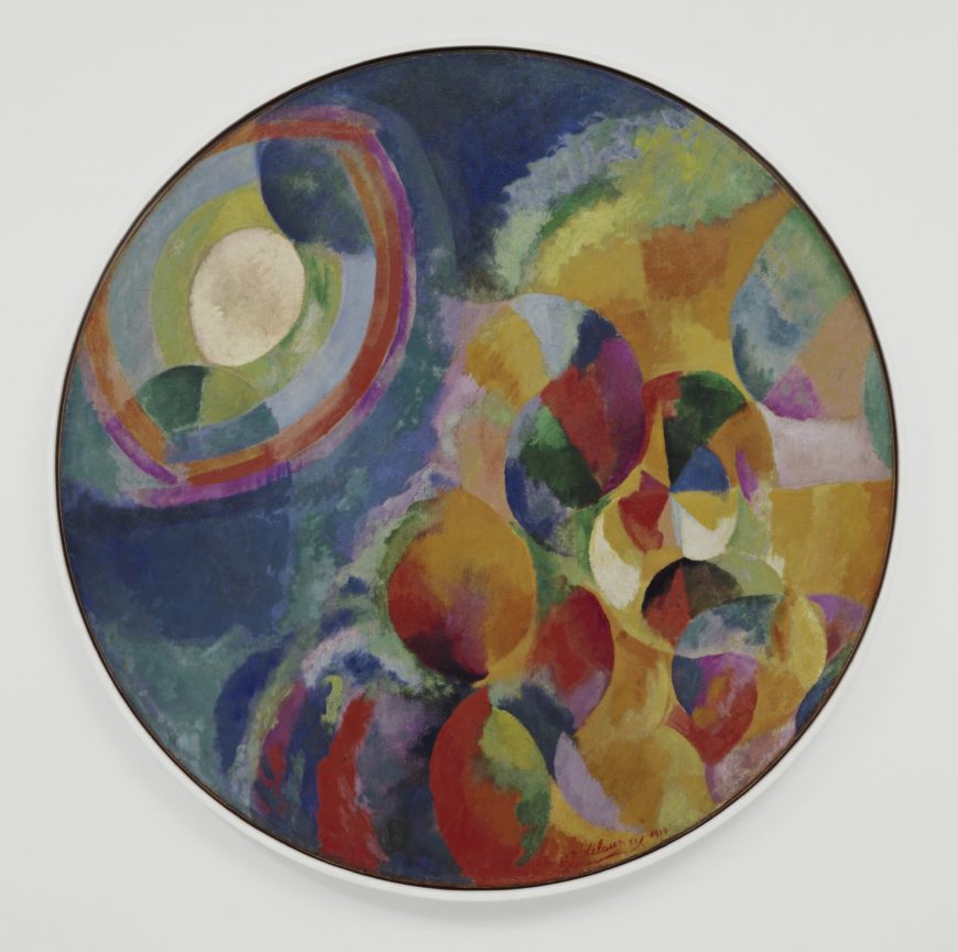
They often hover ambiguously between pure abstraction and representation, particularly the paintings that take the light of celestial objects as their subjects, such as Robert’s Simultaneous Contrasts: Sun and Moon. A few are clearly non-representational, while others depict specific subjects, ranging from street lamps to dance halls and airplanes.
The modern experience
In adopting the term Simultanism to describe their paintings, the Delaunays combined reference to a famous text on color theory with recent philosophical and scientific explorations of perception and memory. The art they produced reflected this combination in its synthesis of formal concerns and modern subject matter.
Sonia Delaunay

Almost eleven feet wide, Sonia Delaunay’s Bal Bullier creates an overwhelming impression of brilliant color and movement. The composition juxtaposes rectangular geometric forms and circles with more fluid curved shapes, loosely structured across the canvas in a rhythmic pattern of dark and light verticals.
A modern dance hall
The Bal Bullier was a dance hall in Paris that Delaunay frequently visited with her husband, Robert. Her painting shows a scene of modern urban life comparable to those painted by the Impressionists in the late 19th century, such as Auguste Renoir’s Moulin de la Galette.
If you look closely at the dark shapes in the center you will see the abstracted forms of couples dancing the tango. The dance, which originated in sailors’ bars in Argentina, was very popular in Paris in the early 20th century. It is renowned for its erotic intensity and requires a very tight embrace between partners, which Delaunay represents in the interlocking curves of the figures.
The Delaunays were committed to developing Simultanism as a post-Cubist style of modern painting focused on color relationships, and to the depiction of modern subjects. In addition to the dance hall, Sonia painted the new electric street lights in Paris, and Robert painted the Eiffel Tower, rugby matches, and airplanes.
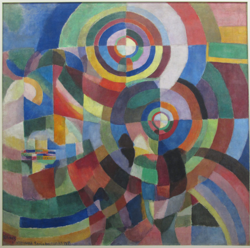
Sonia’s Electrical Prisms is both a display of color relationships and an abstracted depiction of her first experience of electric streetlights on a Paris boulevard. The streetlights become discs of radiating color that permeate the entire canvas, but there are also suggestions of solid forms. A tall kiosk with books or magazines is on the left, and parts of some shadowy figures appear in the lower half of the painting, almost completely absorbed into the brilliant colors of the electric light.
Intuition vs. intellect
While Robert studied scientific color theory, they both described Sonia’s approach to their new style as intuitive. This is a cliché of traditional Western gender roles—the male as rational and intellectually inclined, the female as naturally gifted and intuitive—but it is a cliché that they both embraced.
Interestingly, in Western art theory color is thought to appeal directly to the senses, in contrast to drawing’s supposed appeal to the intellect; thus, Sonia’s purportedly intuitive approach to color was aligned with traditional Western conceptions of color’s role in art. It should be noted, however, that Sonia formally studied art for several years in a German academy and an art school in Paris, while Robert’s formal artistic training was limited to a two-year apprenticeship with a theatrical designer in Paris.
The influence of craft
Sonia’s use of color was also sometimes explained by another cliché of the early 20th century, the influence of peasant crafts on her work. Since the late 19th century, modern artists such as Gauguin had admired, and appropriated, the purportedly naïve, untutored styles of peasant art, which were often vividly colored and non-naturalistic.
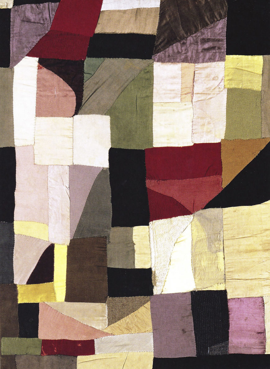
Sonia herself claimed that the patchwork blanket she made for her son in 1911 was inspired by peasant blankets she remembered seeing in Russia as a child. Its irregular grid of largely rectangular geometric forms was also similar to contemporary Cubist painting. Sonia saw her blanket as an important influence on her and Robert’s subsequent development of Simultanist paintings.
Abstraction and decoration
Sonia’s blanket and its influence raises a key issue for modern abstract art—its relationship to crafts and the decorative arts. The use of non-representational forms and patterns has a long history in Western crafts and decorative arts; it was the so-called fine arts of painting and sculpture that traditionally relied on representational subject matter. When modern painters began to use non-naturalistic colors and abstract forms in the early 20th century, one of their primary concerns was to prove that their paintings were not “mere” decoration. This is one reason why many of the first modern artists to embrace pure abstraction took so long do so and wrote extensive justifications, often claiming exalted spiritual motivations for their abstraction.
Abstraction and representation
Unlike many of their contemporaries who developed abstract painting styles that progressed from representation to pure abstraction, the Delaunays painted representational and non-representational Simultanist works at the same time. Modern objects such as the Eiffel Tower and airplanes as well as scenes of dance halls and rugby games were enveloped in the prismatic color planes of Simultanism. Like the Italian Futurists, the Delaunays created a post-Cubist style appropriate to the modern city, and Sonia expanded her art beyond the limits of the easel painting to engage with everyday life.
Going beyond painting
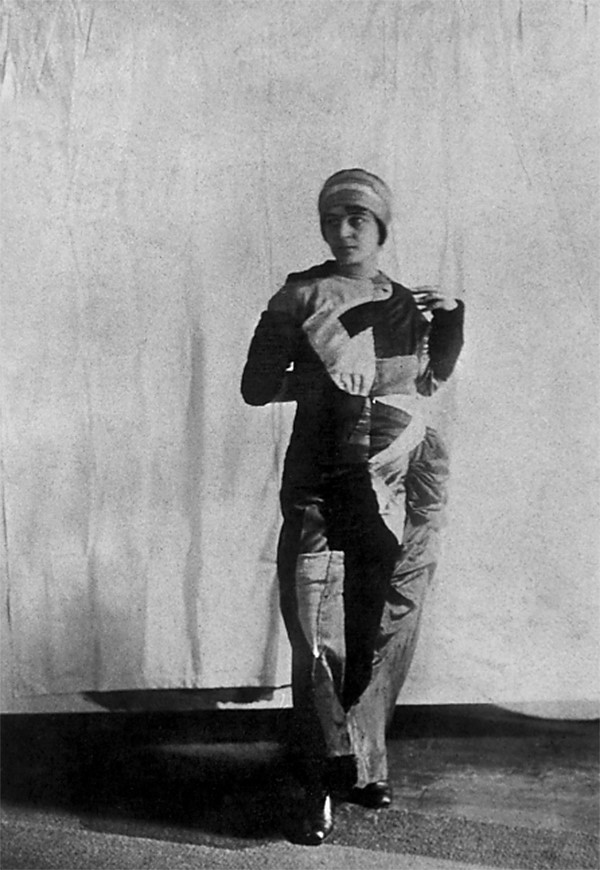
The same year that she painted Bal Bullier Sonia made herself a Simultaneous Dress. Like her earlier blanket, it was a colorful patchwork of geometric shapes, but the dress was made to be seen in public. She wore it to the dance hall with Robert, who also wore clothes in vivid contrasting colors. By attiring themselves in the colors and forms of their painting they became living, moving artworks, Simultanist human beings.
Sonia dreamed of transforming everything around her, and she created and exhibited bookbindings, home furnishings, and posters in the Simultanist style in 1913. After World War I, she became a very successful designer of clothing and interior furnishings, and colorful contrasts of geometric forms remained characteristic of her work.
A Simultanist book

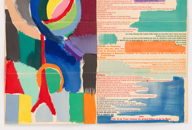
One of Sonia’s most famous early creations is the Simultanist book she designed in collaboration with the poet Blaise Cendrars titled La Prose du Transsibérien et de la Petite Jehanne de France.
Unfolded, the book is six feet long. Delaunay and Cendrars initially intended to publish 150 copies, which opened together in a line would have equaled the height of the Eiffel Tower. The text of Cendrars’ poem is printed in multiple colors and varied fonts on the right, while Delaunay’s largely abstract Simultanist designs parallel it on the left, with panels of lighter colors also interspersed throughout the text.
The poem combines disjointed thoughts, repeated refrains, and references to a trip on the Trans-Siberian railroad, of which there is a map at the top. Time and place shift throughout the text, with Paris as a constant presence. Sonia’s colorful abstract forms swirl down the long sheet, looping into circles that visually echo the poem’s evocation of the train’s rolling motion.
The poem ends with a Paris scene next to the only clear representational form in the design – a red Eiffel Tower accompanied by a circle reminiscent of the giant Paris Ferris wheel.
When fully unfolded, the designs on the left side seem to ascend like clouds of brightly colored smoke from the Eiffel Tower to the beginning of the poem at the top, where the viewer is led to read the poem down the right side. Thus, the open book creates a continuous circuit with the tower standing like an anchor at the bottom.
Simultanism was developed in a collaboration between Sonia and Robert Delaunay, but it extended well beyond that initial relationship. It became an approach to modern art and style that worked to bridge the distances between the visual arts and literature, the fine and decorative arts, and the art and spectacles of the modern urban world.
Russian Neo-Primitivism: Natalia Goncharova and Mikhail Larionov
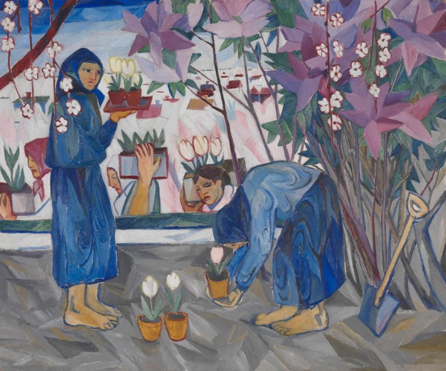
Natalia Goncharova’s Gardening is an example of the contradictions of early-twentieth century Russian modernism. It simultaneously faces outward and inward, forward and backward — outward and forward to engage with some of the most radical trends of European modern art, and inward and backward to reflect on traditional Russian subjects and themes.
Looking forward
In terms of style, Gardening is aggressively modern. With its flat colors and decorative patterning created by the flowers and distant houses, the painting reflects the deliberately simplified style initially developed by the Post-Impressionists in the late nineteenth century. At the same time, the crudely rendered forms of the figures and spatial dislocations suggest contemporaneous painting techniques associated with Fauvism and German Expressionism.
During the first decade of the twentieth century Goncharova and other Russian artists worked hard to assimilate the new styles and attitudes of modern European art. They were able to see many examples of modern art in traveling exhibitions and reproductions in books and magazines. The extensive collections of Ivan Morozov and Sergei Shchukin in Moscow also provided Russian artists with opportunities to view many works by prominent European modernists.
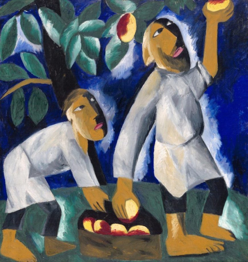
Goncharova was a remarkably prolific and eclectic painter who produced an enormous number of works that show her immersion in contemporary European styles and techniques. Peasants Picking Apples, created a few years after Gardening, depicts a similar subject, but the painting’s forms are flatter and more simplified, now reflecting Goncharova’s assimilation of the formal innovations of early Cubism. This is particularly evident in the simultaneous profile and frontal view of the peasants’ faces and in the hard, angular facets of their bodies.
Peasant life and Russian nationalism
Goncharova’s subjects were at odds with her aggressively international and forward-leaning style. Peasant labor was a popular subject for many Russian modern artists between 1910 and 1913, especially for those associated with Neo-Primitivism, which included Goncharova and her partner Mikhail Larionov, as well as Kasimir Malevich and Aleksandr Shevchenko. Although they were deeply engaged with the developments of European art, Russian modernists were also committed to explicitly Russian themes and subjects — and peasants were a particularly significant subject for them.
Belief in a specifically Russian identity had deep historical roots in Russian culture, which had defined itself since the 18th century in ambivalent relation to Western European culture. Russian modernists maintained this long-standing ambivalence. They embraced many of the ideas and formal innovations of European modernism, but they insisted on interpreting and developing them in distinctively Russian ways.
Peasants who had worked the land for centuries were widely considered to embody the Russian national identity and soul. To assert their difference from Europe, Russian intellectuals described Russian peasants and the land itself as Eastern and Asian or Oriental. Russian peasants were often portrayed as true primitives, uncorrupted by European civilization. Ironically, by embracing the primitive Russian peasant, Russian modern artists were following European precedents, most famously that of Paul Gauguin, who admired and painted the primitive lifestyle of the French peasants in Brittany before he moved to the Pacific Islands.
Embracing Russian folk traditions
Russian Neo-Primitivist artists did not just depict Russian peasants, they also often modeled their styles on traditional Russian folk art, particularly popular woodcuts called luboks, as well as shop signs, embroidery, hand-made toys, and religious icons. Paintings by Mikhail Larionov display varied styles associated with traditional folk art.
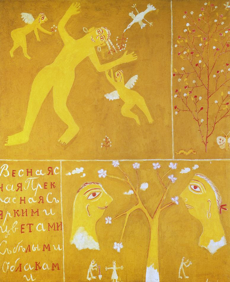
In Spring, instead of depicting peasants performing seasonal labor, Larionov adopted folk art forms to create whimsical panels in bright yellow, red, gold, and white that represent the season of fertility and new growth through symbolic imagery and text. A bird and flying cupids bring flowering branches to a smiling nude woman, a stick figure holds a shovel at the base of one flowering tree, while another flowering tree is flanked by a caterpillar and a butterfly. The style is highly decorative and abstracted in the manner of traditional folk embroidery and painted furniture designs.
Children’s art
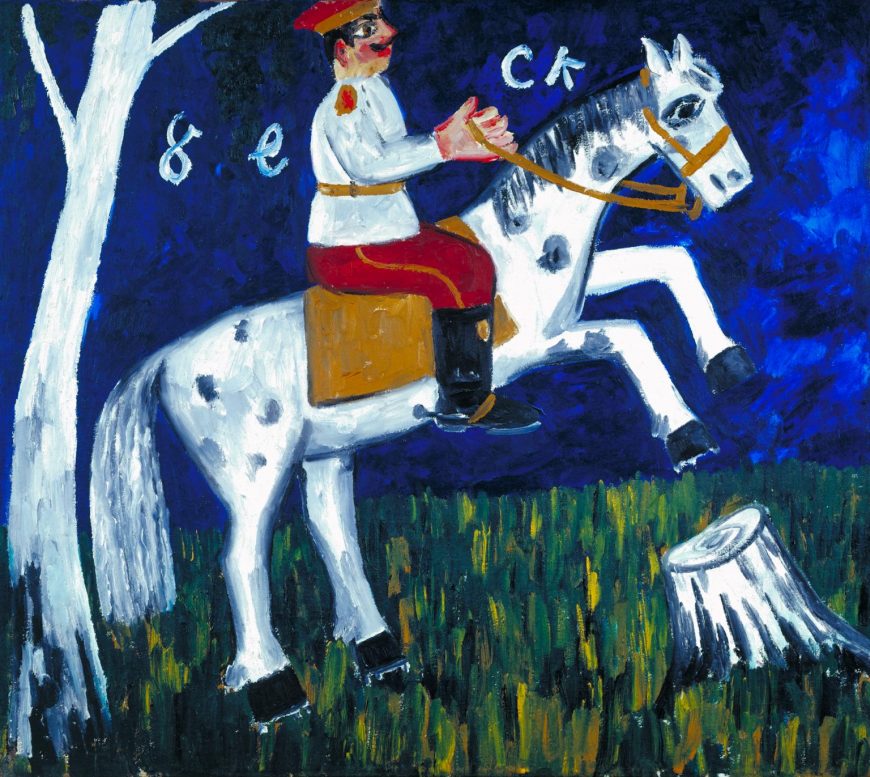
Larionov also employed styles associated with children’s art and graffiti, which were considered contemporary manifestations of primitive artistic expression. With its limited palette of vivid primary colors and flat simplified forms, his Soldier on a Horse is reminiscent of crude sign painting and children’s art.
Although it lacks the sophisticated techniques of naturalistic representation, the subject is clearly legible, and the painting effectively conveys the excitement of the rearing horse and the pride of the erect soldier, a nationalistic subject. To emphasize their connection with popular Russian art, Neo-Primitivist artists included the work of children and sign painters alongside their own paintings in the 1913 Target exhibition in Moscow.
Russia’s ancient Scythian roots
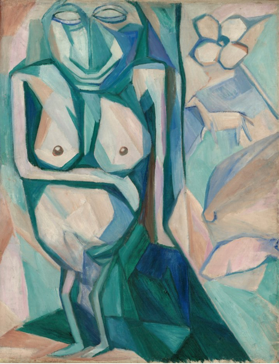
Russia’s prehistoric past was also the subject of some Neo-Primitive paintings. Goncharova’s God of Fertility depicts a type of stone funerary sculpture thought to have originated with ancient Scythians (nomadic tribes who roamed Siberia in the first millennium B.C.E.). These mysterious carved stones remained objects of folk superstition and ritual into modern times. Scythian myths and prehistoric pagan rituals were popular subjects for late-nineteenth and early-twentieth century avant-garde Russian music and dance as well. The most famous example is Igor Stravinsky’s The Rite of Spring, whose primitive rhythms, dissonances and anti-classical choreography caused a scandal at its first performance in Paris in 1913.
In God of Fertility Goncharova again joins a primitive subject to a modern artistic style, using a Cubist technique of faceting to create a non-naturalistic, depthless space in which various symbolic objects associated with fertility float. These include a flower and a horse, the latter referring to the importance of horses in Scythian culture. Abstract geometric forms describe the basic shapes of the ancient sculpture and also suggest that it exists in a space beyond that of the transitory material world.
Promoting Russian modernist primitivism
Neo-Primitivism was an important trend in early Russian modern art, pioneered in large part by Goncharova and Larionov. In addition to producing their own works of modern art, they were organizers of the Jack of Diamonds exhibiting group, which mounted a series of shows of modern European and Russian art in Moscow between 1910 and 1917. The first Jack of Diamonds exhibition showed the French Cubist painters Albert Gleizes and Henri Le Fauconnier alongside Russian artists working in Munich such as Vassily Kandinsky and Alexei von Jawlensky, as well as Russian artists working in Moscow.
In 1912, however, Goncharova and Larionov left the Jack of Diamonds group because they felt it had become too European in its orientation. They mounted The Donkey’s Tail exhibition devoted exclusively to Russian modern art and largely focused on Neo-Primitivism. The artworks nevertheless remained an amalgam of modern and primitive, European and Russian influences. That year, Alexander Schevchenko’s essay “Neo-Primitivism” acknowledged this fundamental contradiction by defining Russian modern art as a hybrid form that had assimilated French avant-garde painting and combined it with the traditional decorative forms of Russian folk art and icons.
Kasimir Malevich and Cubo-Futurism
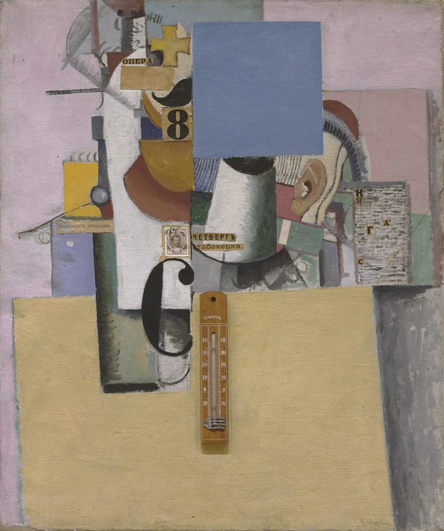
Kasimir Malevich created Reservist of the First Division (1914) in the first year of World War I. The title refers to a member of the reserve army waiting to be called up for military service, and it had personal significance as Malevich was himself a reservist (although not in the First Division). He was anxious about going to war, but the painting does not convey any obvious emotion or even a clear message. It is a combination of oil paint and collage in a style related to the Synthetic Cubism of Picasso and Braque. At the time Malevich was part of a group of Russian modern artists known as Cubo-Futurists, who used pictorial techniques initially developed by modern artists in Western Europe.
Combining representations
Like Synthetic Cubist paintings, Malevich’s Reservist of the First Division combines different systems of representation. Several objects are depicted using naturalistic techniques—a white cylinder projecting towards the viewer in the middle of the painting and a green cylinder on the left cast shadows and have traditional chiaroscuro shading to indicate their curved shapes. On the right a human ear is clearly depicted. There are also two immediately recognizable schematic objects—a gold cross just to the left of center at the top, and below it half of a black handlebar mustache on a peachy flesh-colored ground; both are symbolic references to a Russian military man.
These identifiable objects and symbols are detached elements in an abstract geometric design of colored shapes, varied textures, and painted lines that includes paper collages with printed words, letters, the number 8, a postage stamp depicting the Czar, and a real thermometer. The collaged words are: opera (at the top), Thursday and tobacconist (in the middle), and (to the left) the name of a traditional academic painter, A. Vasnetzov, who had rejected Malevich’s paintings from exhibition. The words, like the represented forms, refer to things without clearly relating them to the other elements of the painting.
Zaum Realism
Reservist of the First Division uses fragments of objects, shapes, and words to communicate by non-rational means. This was a central technique of Russian Futurist writers that they called zaum, a neologism usually translated as “transrational.” Zaum entailed using non-referential linguistic forms—simple phonemes, letters, and nonsense words—to bypass rational understanding and communicate emotion directly. The Futurists believed that through zaum they were able to access a higher reality that transcended the limitations of rationality and the material world.
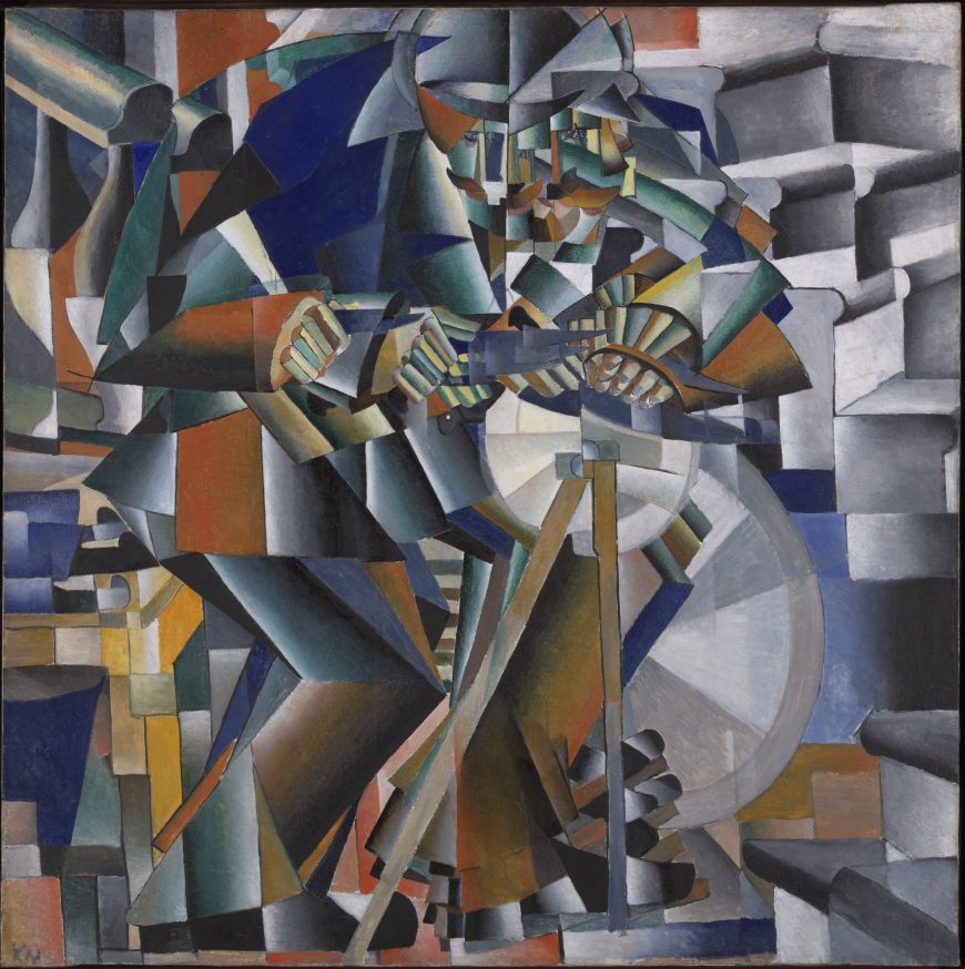
Malevich collaborated with the Futurist writers on several projects, the most important of which was the radically innovative opera Victory over the Sun (1913). Like the Futurists, he tried to use the formal elements of painting (line color, shape, composition, etc.) as direct means to communicate feeling independent of representation or obvious reference. He described many of his paintings, including Morning in the Village after Snowstorm (1912-13) and The Knife Grinder (1912-13), as “zaum realism.”
Russian Subjects
Although Malevich explicitly linked these two paintings to zaum’s direct emotional non-rational communication through basic formal units, they are less abstract and easier to decipher than the slightly later work Reservist of the First Division. Figures and space are simplified into geometric shapes and arranged to create repeating abstract patterns. The Knife Grinder depicts a man pumping a sharpening wheel as he works. His foot, hand, and knife appear in multiple positions to convey motion in time. Malevich derived the faceting of space and figure from techniques popular among many well-known Western European Cubists and Futurists whose works were reproduced in art magazines and exhibited in Russia.
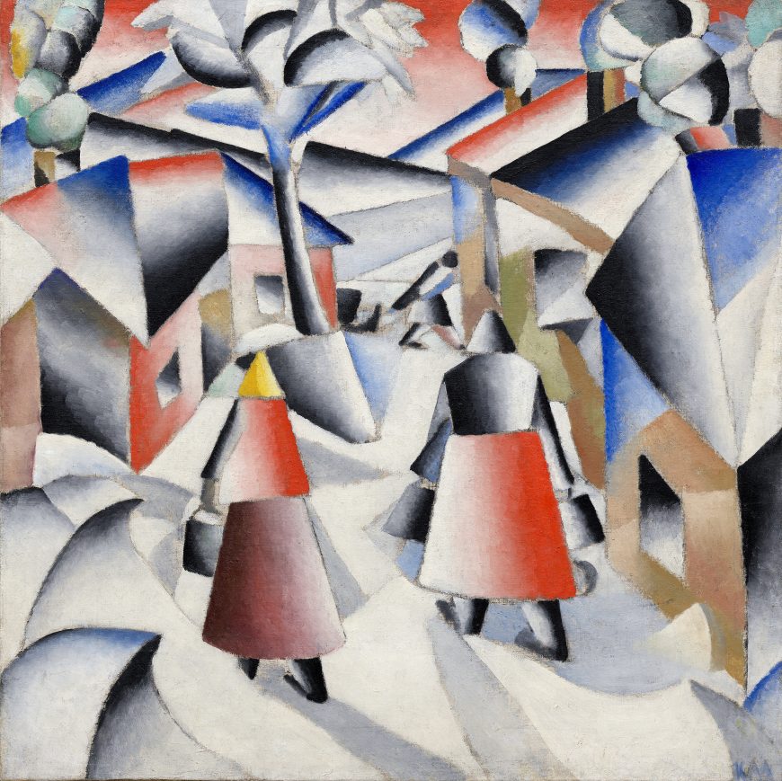
The Italian Futurists often used modern representational techniques to depict conspicuously modern subjects. Malevich, by contrast, used an avant-garde formal vocabulary to represent traditional (even self-consciously “primitive”) subjects. Such subjects were popular among Russian avant-garde painters such as Natalia Goncharova and Mikhail Larionov, who promoted a specifically Russian approach to modernism by embracing Russian subjects and traditional art forms. Morning in the Village after Snowstorm shows Russian peasants carrying buckets and pulling a sled through a snowy village scene. The Knife Grinder uses his foot to pump a simple wheel and pulley mechanism, a marked contrast to the Italian Futurists’ passion for depicting electricity and powerful, sometimes violent, modern machines such as automobiles, trains, and machine guns.
Combining Media and Styles
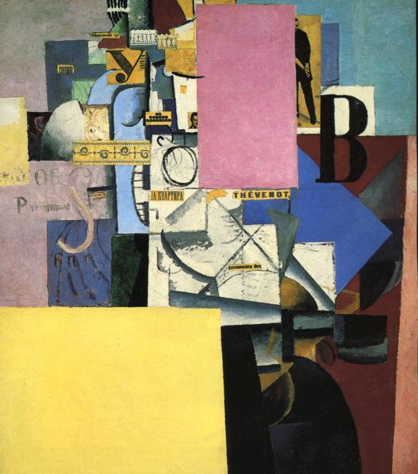
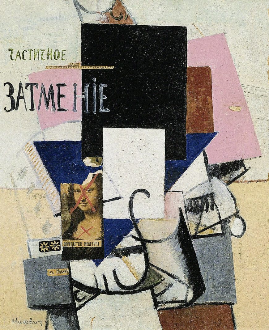
Malevich combined geometric abstraction, Cubist systems of representation, and collage in an unprecedented manner in Reservist of the First Division and related works such as Woman at a Poster Column (1914) and Composition with Mona Lisa (1914). With these works the zaum techniques of non-rational communication using basic formal units are more fully realized and developed to include recognizable images and objects detached from their usual context.
All three use large flat planes of color as a structuring device. These planes seem to hover in front of the picture plane, creating complex layers of space markedly different from the shallow, fractured pictorial space of most Cubist paintings. The inclusion of photographs and objects, such as the thermometer in Reservist of the First Division and the strips of lace in Woman at a Poster Column, was also an innovative zaum pictorial strategy that foreshadowed the Dada artists’ embrace of the illogical in their strategically disruptive use of collage.
Replacing Conventions
Composition with Mona Lisa combines a collaged reproduction of Leonardo da Vinci’s Mona Lisa with colored planes and suggestions of cylinders and other objects rendered in a Cubist style. The painted Russian text translates as “partial eclipse,” and the collaged newspaper text directly under the Mona Lisa reproduction declares “apartment for rent,” while the text collaged on the painted cube below reads, “in Moscow.” Two red ‘X’s have been painted on the Mona Lisa’s face and chest, and the top of her head is torn off. The work seems to thematize as well as embody the fact that the conventions of naturalistic representation, which had dominated Western art since the Renaissance, have been cancelled out. New replacements are available in Moscow, and Malevich puts himself at the forefront of the avant-garde.
Malevich’s intense engagement with Cubist and Futurist styles exemplified the Russian avant-garde’s adaptation of European modernist techniques to serve their own distinctive artistic aims — most notably the depiction of specifically Russian subjects. With his later collage works, Malevich ventured into new territory, combining abstract planes with representational elements. In the following year he would break away completely from representation and create a new art movement, Suprematism.
Suprematism: Kasimir Malevich
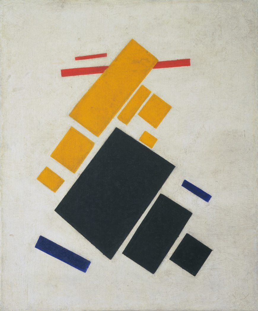
Kasimir Malevich’s Airplane Flying: Suprematist Composition does not depict an airplane. Instead, it was intended to convey the sensation of mechanical flight using thirteen rectangles in black, yellow, red, and blue placed in dynamic relationships on a white ground. Movement is created by the diagonal orientation of the rectangles in relation to the edges of the canvas. Groups of individual colors suggest distinct objects shown at varying distances as they increase or diminish in scale. Ascension is implied by the point of the yellow rectangle centered at the top of the composition, while the bright yellow and red rectangles float above the heavier dark blue and black rectangles.
The Last Futurist Exhibition
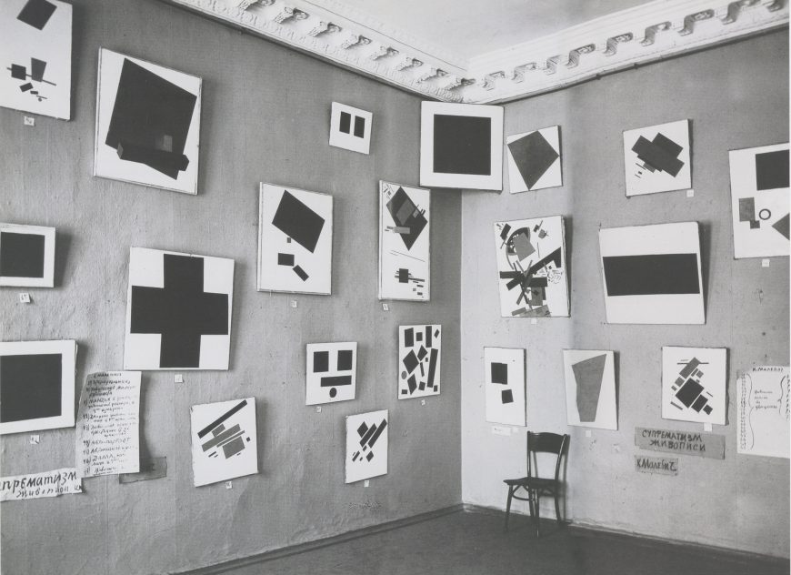
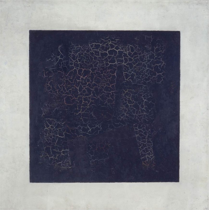
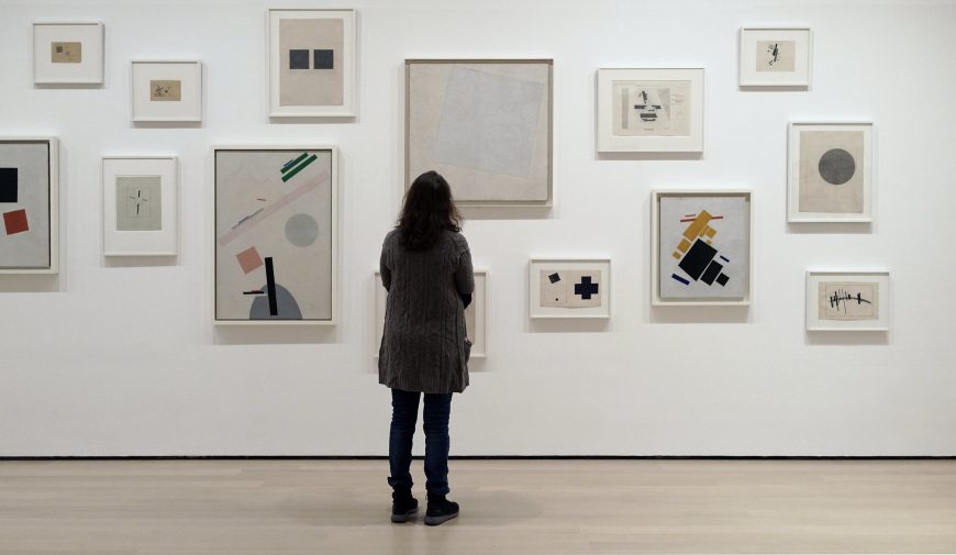
Airplane Flying: Suprematist Composition was first shown in 1915 at “The Last Futurist Exhibition of Paintings 0.10” in St. Petersburg, Russia. It was not the most important painting in this first display of Malevich’s Suprematist paintings. That was Black Square, which was hung in a position of honor up by the ceiling in the corner of the room, the traditional location of a Christian icon in a Russian peasant’s house. In keeping with this exalted placement Malevich described Black Square as ”the first step of pure creation in art”[1] and “the embryo of all potentials.”[2] The 38 other paintings of geometric forms, including Airplane Flying, were implicitly generated from this basic form.
Suprematism as a new realism
Malevich declared Suprematism was a new “realism” in painting, a statement that may seem puzzling given that the paintings are all basic geometric forms on a white background. By making this claim Malevich rejected the conventional understanding of realism in painting as the representation of the world we see.
There are two different ways to understand Malevich’s alternative conception of realism. The first is formal: the painter’s basic formal elements of surface, color, shape, and texture are real things in themselves. They are not signs referring to anything else or images representing real things outside the painting. Black Square is a black square of paint on canvas, nothing more, nothing less. It makes no reference to any other object; it is a real thing in itself.
This formalist approach is a defining aspect of modernist art and literature, and it was a major concern of the Russian Futurist poets with whom Malevich often collaborated. They invented zaum, a “transrational” language that used linguistic forms—phonetic sounds, letters, syllables and words divorced from referential meaning—to communicate directly by means of feeling. Reduction to basic forms of verbal or visual language was intended to liberate the writer or artist from the conventions of the past and the limitations of the world as it exists. Zaum would pave the way to a new world and a new mode of being.
The second way to understand Suprematism as a “new realism” is in relation to a reality beyond the one we normally experience. Mystical traditions and theories of multi-dimensional, non-Euclidean space were popular within artistic and literary circles in the early 20th century. Malevich was particularly interested in the mystical geometry of Peter Ouspensky, who believed artists were able to see beyond material reality and communicate their visions to others. In a pamphlet written for The Last Futurist Exhibition, Malevich echoes this conception of the artist:
I transformed myself in the zero of form . . . I destroyed the ring of the horizon and escaped from the circle of things, from the horizon-ring that confines the artist and the forms of nature.[3]
This is a description of the artist as a superior being who leads the way to a new consciousness. Suprematism was the result, a non-objective art of “pure feeling,” unconcerned with representation of the visible world.
Kasimir Malevich as a pioneer of abstraction
Malevich has long been considered, with Kandinsky and Mondrian, one of the pioneers of non-representational painting in the early twentieth century. A number of other artists also developed non-representational painting in this period, but for varying reasons their work was not widely known. Malevich, Kandinsky and Mondrian were prominent and active participants in the world of modern avant-garde art and published multiple texts explaining their theories. This greatly increased their visibility and influence.
All three were committed to the notion of the artist as a spiritual leader who perceives a greater metaphysical reality and whose art guides society towards its realization. They also all believed that they could communicate this spiritual reality using the basic formal means of painting.
Malevich’s approach was, however, different from the multi-year, carefully reasoned progression from naturalistic representation to non-objective painting undertaken (separately) by Kandinsky and Mondrian. Malevich leaped from a style closely related to Synthetic Cubism to Suprematism within a few months, and his explanatory texts were written afterwards to support what was largely an intuitive discovery.
Suprematism’s beginnings
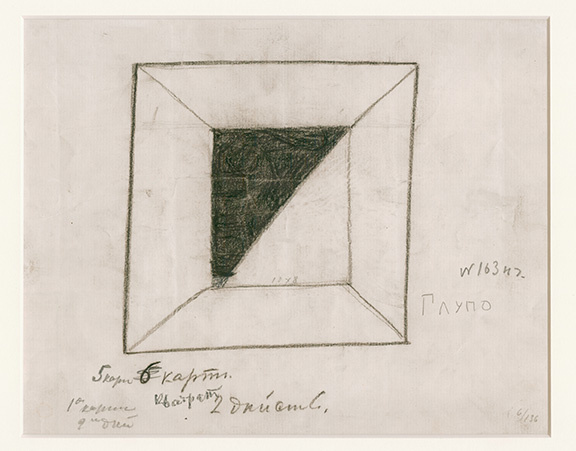
Malevich retrospectively located the origin of Black Square in the basic geometric shapes of the stage designs he made in 1913 for the Cubo-Futurist opera, Victory over the Sun. This opera, created in collaboration with the Futurist poets Velimir Khlebnikov and Aleksei Kruchenykh, told a story of time travelers overcoming old concepts of time and gravity. The theme of space travel and the character of the Aviator are directly relevant to Suprematist painting, which also reflects forms in aerial photographs widely reproduced in Russian newspapers during the early years of World War I.
The title of Airplane Flying: Suprematist Composition makes direct reference to this subject, but all Suprematist paintings depict geometric forms on a white ground in a manner that suggests abstracted objects floating in space. Malevich related this white ground to the cosmic infinite and the void that represents transformed consciousness. Combining mystic spiritualism with modern technology was common practice among Cubists and Futurists in Europe as well as Russia.
What’s in a name?
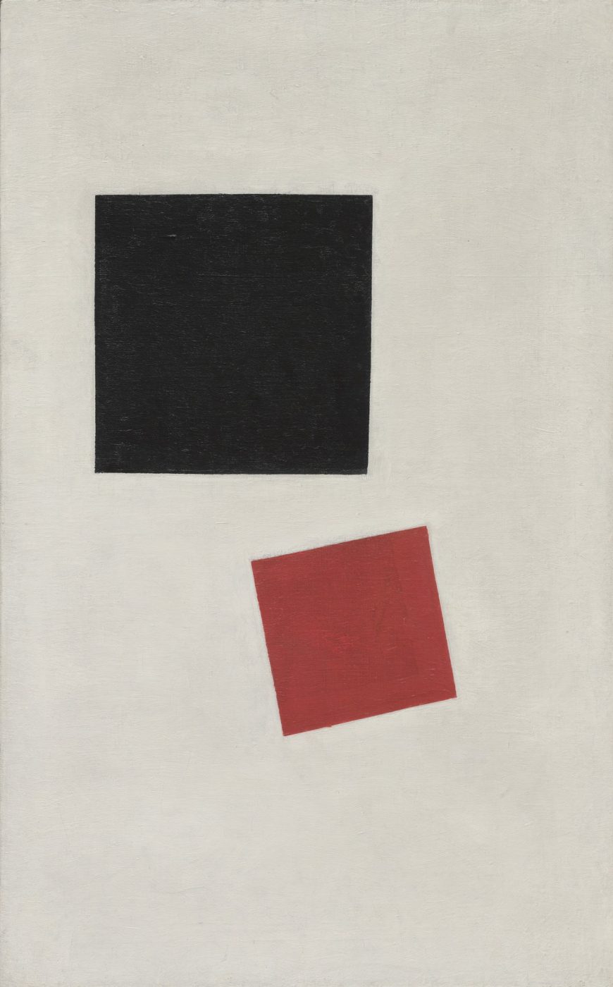
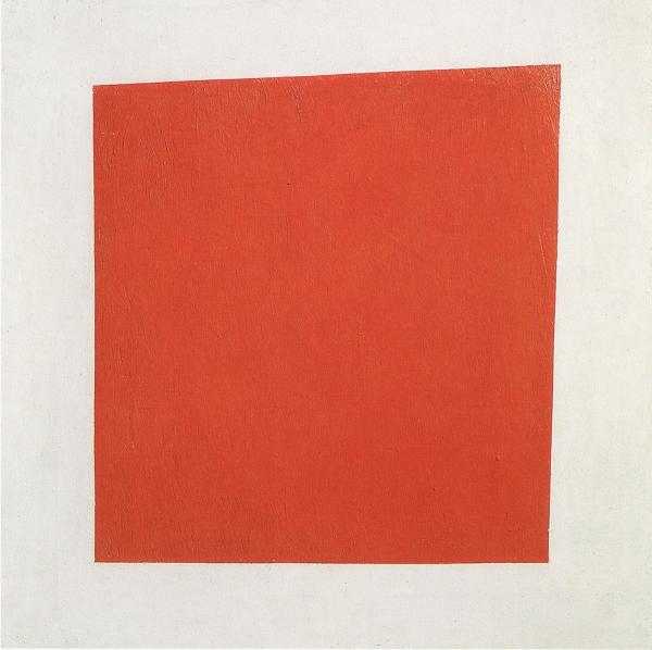
The titles of Malevich’s paintings in The Last Futurist Exhibition indicated that Suprematism was not a carefully refined and consistent theory of non-objective painting. Some works had non-referential titles such as Quadrilateral, while others referred to specific objects or people as in Painterly Realism of a Peasant Woman in Two Dimensions. Whether a painting received a referential title or not often seems random: Quadrilateral is the original title of Black Square, while Painterly Realism of a Peasant Woman is a similar painting of a red square.
The referential titles in Malevich’s early Suprematist paintings contradict his initial claim to have escaped the world of material things and reached a world of pure non-objective form. Although the works are non-representational, Suprematist paintings often refer to feelings provoked by specific material things. We have seen how non-representational forms may convey the sensation of flight in Airplane Flying: Suprematist Composition at the beginning of this essay. What sensations do the forms of Malevich’s Painterly Realism of a Boy with a Knapsack. Color Masses in the Fourth Dimension provoke in you?
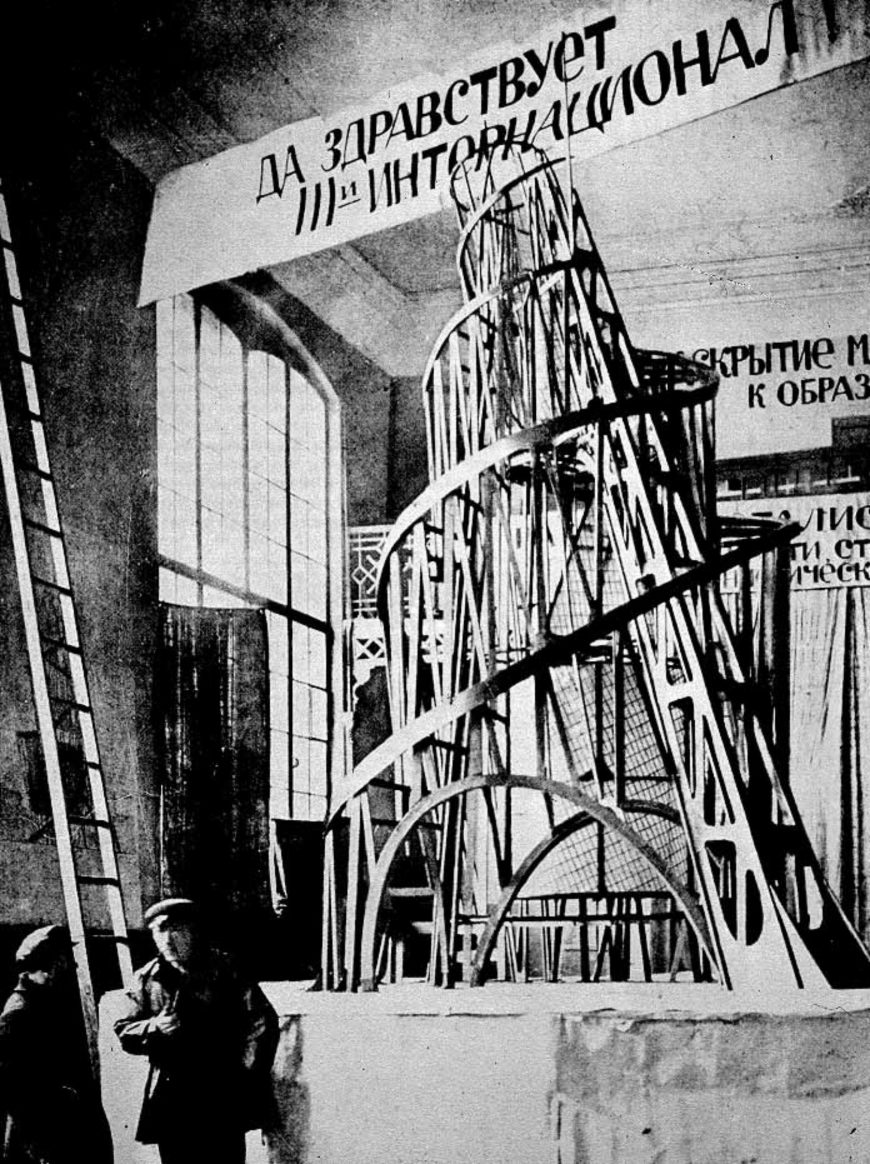
Vladimir Tatlin’s Monument to the Third International, commonly referred to as Tatlin’s Tower, is an iconic work of Russian modern art from the early Soviet era. It is a symbol of the utopian aspirations of the communist leaders of Russia’s 1917 October Revolution, and of the brief period when those aspirations were allied with the futuristic visions of modern artists. The original Monument has not survived and is known only from photographs, but it was never intended to be a durable object.
An ambitious plan for a sculptural structure
It was a 20-foot-tall wooden model for an enormous structure that was never constructed, in part because the material and technological resources required to build it successfully were unavailable in post-revolutionary Russia. Tatlin’s Monument thus has historical significance that goes beyond its original purpose and meaning. It is both a symbol of exalted utopian goals and an ironic monument to the economic and technological limitations of the early Soviet state.
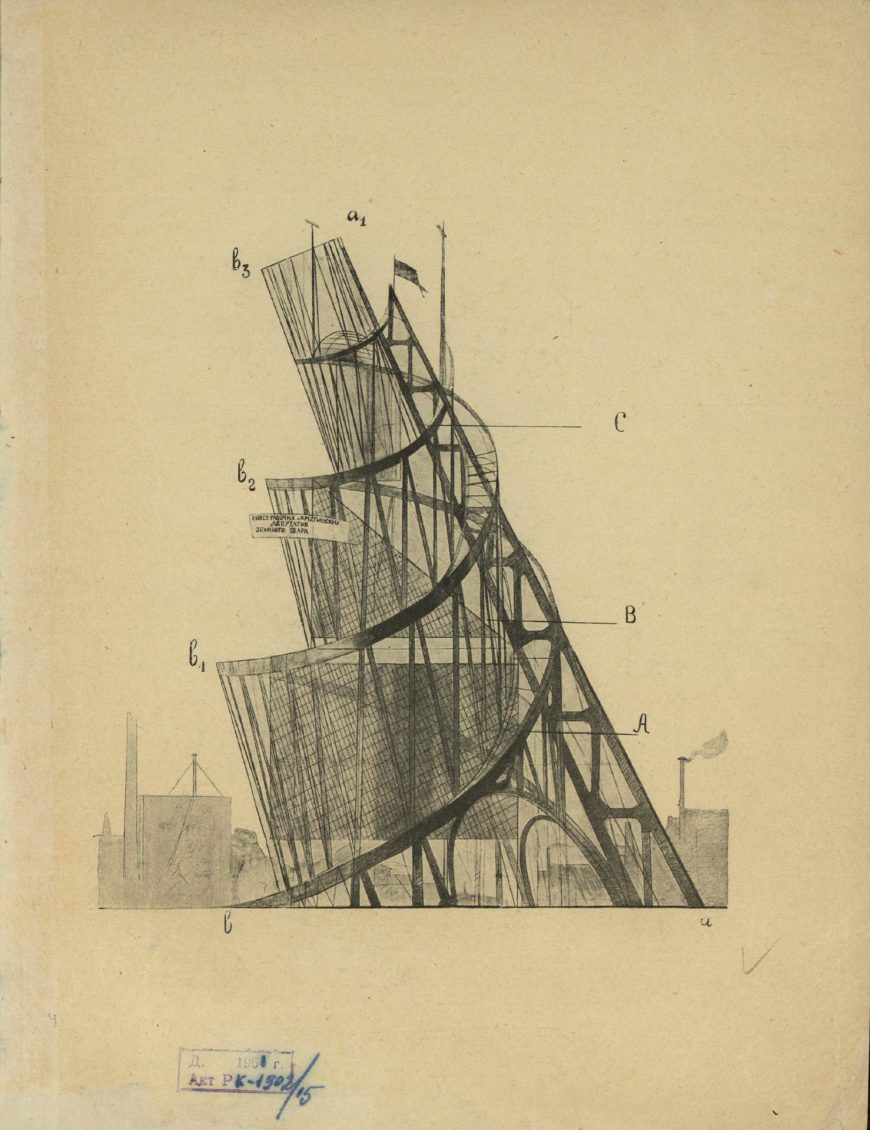
As part of a large-scale program to replace old czarist monuments with monuments to the revolution, the huge structure was both a symbolic sculpture and functional architecture. Designed to straddle the Neva river in St Petersburg, the 1300 foot (400 meter) iron and glass Monument would surpass Paris’s Eiffel Tower in both scale and complexity. Its design consists of a contracting double helix that spirals upward, supported by a huge diagonal girder. Inside this external metal structure are four geometric volumes that were intended to revolve at different speeds.
As planned, the geometric volumes would be made of glass and serve both practical and symbolic functions. The largest and lowest was a cube, making one revolution per year, that would house meetings of the legislature of the Third International or Comintern, the international communist organization working for world revolution. The next volume up was a pyramid, making one revolution per month, that would host the Comintern executive. Above that was a cylinder, making a full revolution every day, to house the Comintern propaganda services, including the press, poster and pamphlet designers, etc.; and on top was a half sphere that revolved hourly and housed the Comintern radio station.
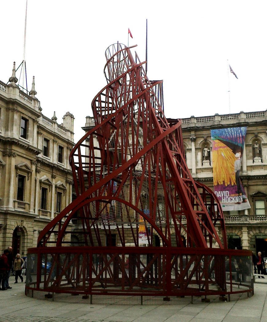
A Symbol of the Future
Tatlin’s design for the Monument conveyed meaning in multiple ways. The rising spirals, diagonal girder, and rotating internal volumes give symbolic form to the aspirations and dynamic forces of the world communist revolution. The planned materials of metal and glass were associated with modern engineering and construction technology, and signified the advanced, even futuristic, goals of communist society. This was further emphasized in the plan to have the interior volumes revolve mechanically, which symbolized the alignment of communist world revolution with the astronomical movement of the sun, earth, and moon, and also likened the new government to an efficient modern machine.
The Monument stressed the Comintern’s transparency to the people in its fully visible support structure and the glass interior volumes housing its various functions. The importance given to disseminating information and propaganda to the masses is also integral to the design and acknowledges the crucial role played by mass communication technologies in modern society and their power to promote world revolution.
Although Tatlin’s Monument was never built, models of it were made and displayed at political meetings, demonstrations, and parades through the 1920s. Its most important historic role, however, was its influence on Russian Soviet modern artists, particularly the ConstructivistsConstructivism, who were conceptualizing new aesthetic practices aligned with the goals and values of the new communist society. For these artists Tatlin’s combination of modern materials, rational structure, and utilitarian forms was an important example of how artists could synthesize the historically disparate roles and forms of art, craft, and engineering to contribute to the formation of a new world.
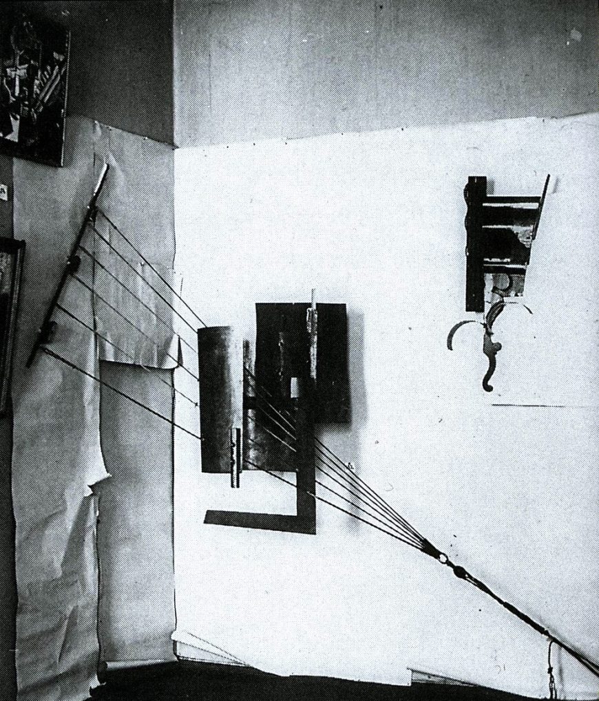
Tatlin had established his reputation as a cutting-edge modern artist in Moscow before the 1917 revolution. He participated in The Last Futurist Exhibition of Paintings 0.10 in 1915, where his rival Kasimir Malevich first presented Suprematist works. There, Tatlin exhibited a group of sculptures he called “counter-reliefs” and “corner counter-reliefs.” These were complex assemblages of various found non-art materials (scraps of wood, metal, glass, cardboard, wire, and rope) suspended from walls.
These counter-reliefs are often associated with Picasso’s early Cubist sculptures, which Tatlin saw in Paris in 1913. Both artists rejected the Western tradition of sculpture as a unified mass made from a single material (traditionally marble or bronze), and instead created assemblages—sculptures that combine heterogeneous materials in novel ways.
Picasso’s Cubist sculptures represented objects such as guitars, glasses, and bottles, and explored the formal and spatial ambiguities previously developed in Cubist painting. Tatlin’s approach was markedly different and often completely non-representational. He was more interested in the forms, textures and physical potential of the materials themselves than in exploring the ambiguities of representation, and his works were also more radical in their relationship to space than Picasso’s.
A New Type of Sculpture
Tatlin’s earliest counter-reliefs were in a rectangular format and hung on the wall. They were composed of separate but interdependent components, and emphasized the contrasts between different textures and materials.
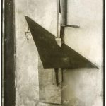
The relief reproduced here was part of a group of works titled Selection of Materials. It is an abstract composition made of scraps of wood, metal, and glass attached to a chipped and cracked stucco surface. Each material displays its texture rather than being cleaned and polished to suggest pure abstract forms. The materiality of the object and its constituent parts is fundamental to the effect of the work.
This work and others like it engage with a prominent concern of early 20th-century modern artists and writers: how non-representational form could communicate feeling directly. Faktura was a key concept in Russian debates on modern art that was connected to the artist’s use of the physical qualities of materials. Tatlin’s reliefs were understood as displays of faktura, meaning their interest was fundamentally formal and concerned with the visual and tactile properties of their material components. They had no representational content and (unlike the work of many of Tatlin’s contemporaries) no spiritual significance.
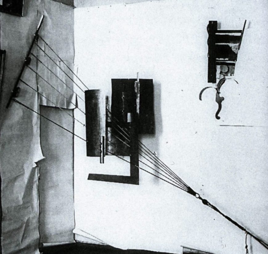
Corner counter-reliefs
The corner counter-reliefs added another dimension to Tatlin’s work. They broke out of the limiting rectangle and created a new kind of spatially-ambiguous sculpture with indefinite boundaries. These were not self-supporting objects that could be easily moved; their form depended on the walls from which they were hung. This made their sculptural identity as independent objects even more ambiguous. The walls were part of the sculpture, and were sometimes covered with paper to emphasize their integral role in the work.
One of the most noticeable and innovative aspects of Tatlin’s corner counter-reliefs is the way they incorporate literal dynamic tension in the form of supporting ropes and wires. These allow the planes of various textures and materials to be suspended in space, and they also make physical tension a manifest part of the work’s composition.
We don’t just see the flat planes, curved forms, and bars hovering juxtaposition to each other, we see how the entire sculpture is put together. The structural relationships are laid bare. It was this literal incorporation of structure that came to be seen as an early stage in the development of Constructivism—the dominant modern art movement in Soviet Russia after 1920.
- Kasimir Malevich, From Cubism and Futurism to Suprematism: The New Realism in Painting. (Moscow, 1916). ↵
- Letter to Mikhail Matyushin (1915) quoted in John Milner, Kazimir Malevich and the Art of Geometry (New Haven, 1996), p. 127. ↵
- T. Anderson, ed. K. S. Malevich: Essays on Art 1915-1933, vol. 1 (Copenhagen, 1969), p. 19. ↵
the amount of variation between the highest and lowest values in a work
an art movement using Cubist and Futurist techniques to combine different vantage points into a single "simultaneous" image
sometimes used as a synonym for Simultanism, or to refer more generally to abstract painting that uses color in a manner comparable to the use of sound and rhythm in music
a Russian art movement that united European developments like Cubism and Futurism with explicitly Russian themes and subjects
the (often problematic) belief that, lacking the corrupting influence of European civilization, non-western peoples were more in tune with the primal elements of nature
Russian folk art woodcuts
nomadic tribes who roamed Siberia in the first millennium BCE
from the French coller, "to stick," an artwork that includes pasted pieces of material: paper, cloth, clippings from newspapers or magazines, etc.
the second phase of Braque and Picasso's Cubist investigations, involving more color than Analytic Cubism and often featuring collage
from the Latin chiaro (light) + scuro (dark), the artistic technique of combining light and shadow to create the illusion of three-dimensional form
a word made up by the Russian Futurists, usually translated as "transrational," meaning using non-referential linguistic forms to communicate emotion directly, allowing access to a higher reality
a small religious painting for personal devotion
analysis of a work of art based on its form rather than its subject matter or historical context
a Russian art movement characterized by non-objective art of "pure feeling"
a Russian art movement of the 1920s emphasizing technology and engineering
a type of sculpture created by Vladimir Tatlin, complex assemblages of various found non-art materials suspended from walls
sculpture assembled from pre-existing pieces or found objects
the surface quality of a painting, showing the touch of the artist's hand. Faktura, the Russian equivalent of this French word, refers to the physical qualities of the materials used
