YouTube Video: https://youtu.be/Mbvaz0EPK_g
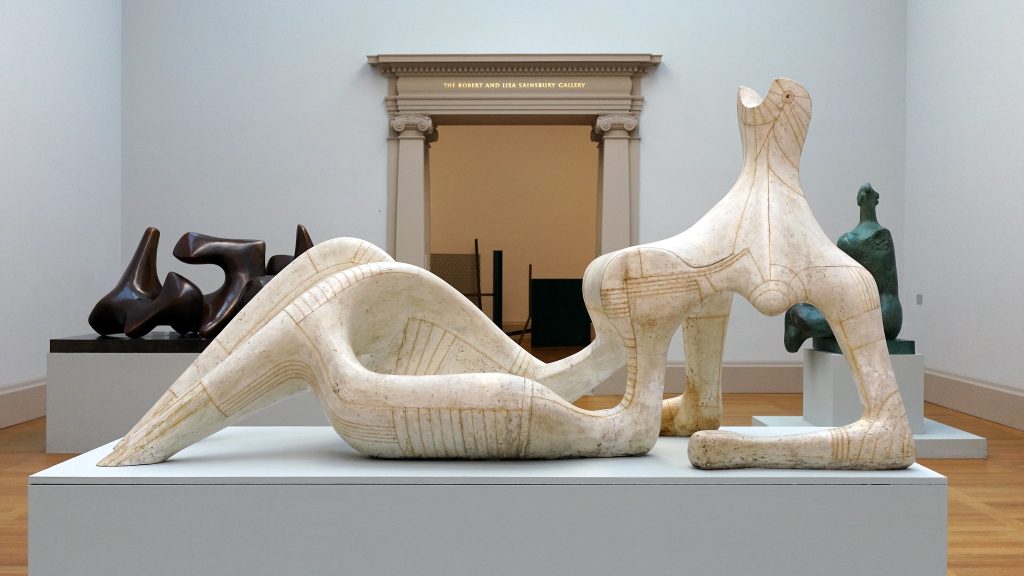
Describing what you see: Sculpture, Henry Moore’s Reclining Figure, 1951, plaster and string, 105.4 x 227.3 x 89.2 cm (Tate Britain) © The Henry Moore Foundation.
This plaster was the result of a commission from the Arts Council of Great Britain for the Festival of Britain. A single bronze was cast from it.
Anselm Kiefer, Shulamite

Black milk of morning we drink you at night
we drink you at noontime Death is a gang-boss aus Deutschland
we drink you at dusktime and dawntime
we drink and drink Death is a gang-boss aus Deutschland his eye is blue
he shoots you with leaden bullets his aim is true
there’s a man in this house your golden hair Margareta
he sets his dogs on our trail he gives us a grave in the sky
he cultivates snakes and he dreams Death is a gang-boss aus Deutschland
your golden hair Margareta
your ashen hair Shulamite
—the final lines of Paul Celan’s poem, “Death Fugue,” published 1947 (trans. Jerome Rothenberg)
Breaking postwar silence
Born in Germany just months shy of the end of World War II, Anselm Kiefer came of age in the late 1960s when the silence surrounding the crimes of the Nazi regime was ruptured by a vocal younger generation horrified by their collective German “past,” struggling to reconcile such shame and redefine what it meant to be German in a post-Nazi world.
For Kiefer, who had studied with the artists Peter Dreher in Karlsruhe and Joseph Beuys in Dusseldorf, painting became the arena to vocalize and elucidate his contempt for the Nazis and their reprehensible legacy, instilling every brush stroke with palpable rage, grief, and shame. In the 1970s, Kiefer developed a signature style that was influenced in part by the Neo-expressionist style of Georg Baselitz, but also by his teacher Beuys, particularly Beuys’s tendency to use commonplace materials, such as fat and felt within his artistic practice. Kiefer augmented his thick layers of impasto with lead, glass, straw, wood, dried flowers, and more, yielding highly textured, viscous surfaces. As his list of materials grew, so too did the scale of his canvases, which though large and formidable, felt ephemeral and fragile as a result of the materials he utilized.
A thick impasto
All of the canonical elements of Kiefer’s work are present in Shulamite—a thick impasto resulting from a hardened mixture of oil, acrylic, emulsion, and shellac; a brittle, textured surface infused with commonplace materials (in this case, straw and ash); mythological or biblical references (Shulamite refers to the heroine in the Song of Solomon); a literary reference (Celan’s “Death Fugue”); and a historical subject or location (a Nazi Memorial Hall in Berlin).

Kiefer’s hall is not a memorial to great men with patriotic flags waving boldly, but a gateway to damnation, a dark and foreboding road to hell, enclosed by low arches and paved with massive stones —the whole mise-en-scène (a stage set that tells a story) suggestive of an oven (immediately bringing to mind the hyperactivity of the crematoria at the Nazi death camps). Sulamith, is inscribed in the upper left hand corner, a graffiti-like testament in white paint upon the stone, to Celan’s brave young Jewish girl consumed by this living hell, who came to her death in a chamber such as this because she had not the golden hair of Aryan Margarete but the dark “ashen hair” of Shulamite. Kiefer transformed architecture meant to honor Nazi heros into a memorial for their victims.
Emotional honesty
Comparisons to Jackson Pollock in terms of both scale and expressive, gestural style are understandable, but for me Kiefer’s paint handling is even more reminiscent of Vincent van Gogh, in terms of raw beauty and emotional honesty. Just as van Gogh’s paint can transport me into the Dutch or French countryside and fill my nose with the smell of fresh sunflowers or irises, so too can Kiefer transport me to another place in time and space—but rather than a hayfield in Holland it is the dark abyss of a concentration camp with the stomach-churning smell of burning flesh sullying the air.
Special thanks to Sandy Heller, The Heller Group, LLC
Bacon and Freud’s Self-Portraits or the Remains of the Self
By Frédérique Amselle
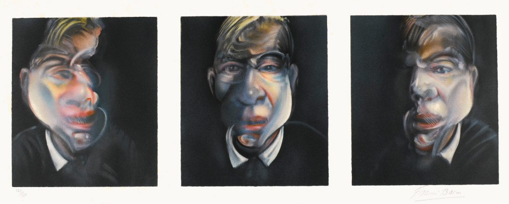
One single self-portrait, alone, shows the painter at a precise moment, at a certain age, a specific moment in his life. Young, sad, quiet, alone, exhausted, old, sick or with an injured eye. The accumulation of self-portraits, such as Francis Bacon and Lucian Freud have achieved, especially when seen all together, creates both a vertiginous and a voyeuristic effect. Before their beauty, before anything, what strikes first is their quantity and what it implies. Not that they tell a story of the self, as an autobiography would, but they reveal images—snapshots—of the painter at various moments of his life, as a diary would do—each self-portrait operating as a diary entry (Ginsberg 422). Self-portraits do not tell a story (Bacon particularly hated narrative or descriptive painting) but catch a ‘moment of being’ (Woolf 1985a)—or ‘states of beings’, as Bacon would say (Domino 95), a moment where the painter looks at himself face to face, eye to I. It means hours of confrontation between the artist and his model. The collection of self-representations also shows the evolution and the transformation of the body over time. By coming back to the same subject again and again, Bacon and Freud do not only show the work of time on themselves, but also the evolution of self-representation over the years, thus revealing ‘un écart du temps dans le temps’ (Lacroix 11). The result of this profusion of images of oneself is a dialogue with time and death. The paint on the canvas shows the effects of time and deterioration, what remains of oneself once all the layers of clothes and skin have been ripped off. It shows that ‘we are the ruin of that self we might have been, the leftover self of the self that has not been’ (Ginsberg 415).
Even if Francis Bacon and Lucian Freud represent themselves with violence and crudity, they follow the rules of the genre, thus inscribing themselves in the tradition of self-portraits with all the contradictions this entails. Despite the fact that they play with the paradoxes of the genre, they do not wreck the self, contrary to what may first appear. They desacralize it, they even seem to test it and to submit it to punishment; they strip it and reveal the ruined bodies, the naked faces, only to show that a ‘sense of the self’ emerges, even if it has the appearance of a ruined shell or decaying flesh. Bacon and Freud stand in a tense face to face with themselves to fix their images in an ambiguous position: etiam periere ruinae (even the ruins perish).
Self-Portrait and Self-Effacement
The amount of self-portraits painted by Bacon and Freud generates an emotion that comes from the representation of the self over time. It can almost be seen as a ‘ruin in progress’, a form of auto-memento mori that reveals a tension between the representation of the self and its effacement.

‘When I paint my own portrait, I am my own subject, my own object’. This thought has long been taboo in the history of arts as the painters were artisans, craftsmen. They were commissioned (to paint religious subjects, royal families, etc.) and it is only gradually that the painters introduced their own images (as Benozzo Gozzoli in the middle of the crowd, 1459; or Durer, alone, in 1512; Titian, 1565; Rembrandt, 1650) to achieve self-portraits where they often represented themselves with the characteristic attributes of the painter: easel, canvas, palette, brushes, etc. This is what Freud does in two self-portraits: Painter Working, Reflection (Self-Portrait), 1993 and The Painter Surprised by a Naked Admirer, 2005 (Calmejane, Rebel). We can say that Francis Bacon and Lucian Freud are in line with their predecessors, even if they try to go further in the examination of the self. However cruel and merciless their investigation is, the mere fact of representing oneself acknowledges the equation ‘I am my own subject’ therefore ‘I am worth being a model’.
Bacon immediately contradicts me—or so it seems, as we are allowed to doubt—when he says:
‘I loathe my own face, and I’ve done self-portraits because I’ve had nobody else to do. But now I shall give up doing self-portraits’ [Bacon told Sylvester in an interview in 1975]. The impetus for Bacon’s self-portraits began with that fascinating image-making machine, the automatic photo booth. The artist kept entire strips of such photographs, in which he cultivated a total lack of expression, adopting improbable poses that appear to have been largely dictated by the wish to avoid looking at himself. The strange format of the Four Studies for a Self-Portrait, 1967, is reminiscent of the photographic strip. (Domino 52)
By painting this fourfold vertical self-portrait, Francis Bacon plays with the codes of the genre as well as with the notion of instantaneity in what could be called a ‘slow art’. If this method is first and foremost a simple and practical way of reaching a representation of one’s face under various angles, it can also be seen as an assertion of the painter’s multifaceted identity. Bacon tries to bring unity to the fragmented self: this tension between continuity and discontinuity meets the definition of the ruin as ‘the irreparable remains of a human construction that, by a destructive act or process, no longer dwells in the unity of the original, but may have its own unities that we can enjoy’ (Ginsberg xvii).
Paradoxical as it may seem, we can almost say that because he used photographs, Bacon painted his self-portraits in absentia (Russell 86), as if he was at the same time in the presence and in the absence of himself. This form of voluntary self-effacement within the self-portrait illustrates the paradox of the ruin, that is to say that ‘the ruin is like a no man’s land between being and non-being, always on the verge of self-effacement, but always present in this very absence’ (Lacroix 17). Obviously, there is often a form of apology in painting oneself: Francis Bacon explains that he had no other model at that time and Lucian Freud appears as a ‘reflection’ in a mirror where his image is only secondary (or so it seems). Sometimes the only self-referential element is a fragment of Freud’s body behind a plant, through a looking glass, or simply the reflection of his boots in a mirror in Naked Portrait with Reflection. Those techniques reveal that it might not be an easy decision to be the only subject matter under focus. Like the ruins, they disclose a play between what we see and what we do not see.
Self-Vanitas: ‘A Feeling of Mortality’
Though at the centre, though omnipresent, the self seems to become more and more elusive. In ‘A Difficulty in the Path of Psychoanalysis’ (1917), Sigmund Freud recalls the three humiliations humanity has experienced (Copernicus, Darwin, psychoanalysis) and after which self-portraits cannot be painted as they were before those changes, for ‘the ego is not master in his own house’ anymore (Sigmund Freud 138) and the house is falling into ruins.
In addition to those elements that definitively changed the perception and representation of human beings, the intense sense of collapse after the two World Wars cannot be left aside. Francis Bacon recalls the trauma of a generation who has known too many wars. In an interview with Michel Archimbaud, Bacon said: ‘I was born in 1909, you know. There have been dozens of wars and conflicts all over the world, to begin with the events in Ireland and the 1st World War, shortly after my birth. I have the impression that people of my generation cannot really imagine humanity without any war going on. . . . War has always been here for these people’ (Bacon 1996, my translation).
The experience of war has tinted his vision of life with distress, melancholy and roughness, but also with the thrill of being alive. ‘It’s concerned with my kind of psyche, it’s concerned with my kind of—I’m putting it in a very pleasant way—exhilarated despair’ (Graham Dixon). ‘I a feeling of mortality all the time’, Francis Bacon also told the art critic David Sylvester. ‘Because, if life excites you, its opposite, like a shadow, death, must excite you. Perhaps not excite you, but you are aware of it in the same way as you are aware of life, you’re aware of it like the turn of a coin between life and death. And I’m very aware of that about people, and about myself too, after all. I’m always surprised when I wake up in the morning’ (Domino 82). Bacon seems to be contemplating a world in ruins, and he is part of it—to the extent that we could almost say that he is a ruin. In Mémoires d’aveugle, L’autoportrait et autres ruines, Derrida argues that the man who portrays himself and who tries to catch his own reflection only sees his own disappearance. He sees himself but blindly for he is already gone, already ruined. The ruin is at the origin of the portrait; the self that is shown—the other—has never been present: it is a spectre (Derrida 72–74). This is maybe one of the reasons why Bacon and Freud’s contemporary, Frank Auerbach, only made five self-portraits and clearly described the difficulty of self-portraiture as ‘chasing one’s own shadow’. Narcissism is not what it used to be, one could almost say.
Considering the self as a ruin is precisely what Ginsberg does in The Aesthetics of Ruins, in an impressive echo to Bacon’s statement:
The body is meant to die. So intimately are we attached to it, that we regard our body as fixed and secure, the continuity of ourselves. Each morning, when we gaze in the mirror, that same body assures us of our selfhood. But the body is decaying from moment to moment, advancing on its way to dissolution. . . . The organism has built-in obsolescence. Guaranteed to fall apart. Inferior design. Who put that useless appendix in there? Lifetime victims of consumer fraud, we are long-lived only by accident. Life, you will be the death of me! (Ginsberg 419)
We may then wonder how it is possible for a painter to represent himself, and thus solve this internal contradiction? Or to borrow Auerbach’s words: how do I ‘chase my own shadow’? I have no direct access to myself but only through an intermediary, a medium or a tool (whether a mirror or a photograph). In Roland Barthes par Roland Barthes, Barthes notes ‘you can only look at yourself through an image, you never see your own eyes, you only see them when they are dulled by the look they cast on the mirror or the camera: when its your own body, you’re condemned to imagination’ (Barthes 42).
In painting themselves, Bacon and Freud are condemning themselves to vertiginous hours of close scrutiny, for they are faced with themselves twice: as painters and as sitters. It seems that they are caught between continuity and breach, and this position is a form of sentence: you cannot escape from yourself! But your own image, your own face is masked, even to yourself. Something resists. And something escapes you. As Derrida says, ‘this face is another face, that each spectator can interpret’ (Derrida 74). The self-portrait is then the place of a tension between an attempt at destroying the ego and an effort to resist this self-destructive movement. Derrida writes that the painter who makes his self-portrait tries to seize himself, but he only captures his own ruins, his spectre. His portrait is thus a hetero-portrait. Between him (the spectacle) and him (the spectator), there is a dissymmetry (Derrida 75–76).
Jailer and Prisoner: Capturing One’s Own Ruins

Lucian Freud, by asking his sitters to stay for impressively long hours in his studio seemed to be almost condemning them to a long sentence. ‘Freud works slowly and depending on size and other variables, his paintings can take between three and eighteen months’ (Smee 7). With time stretching almost to the extreme, Freud wanted to obtain some results from the sitter and from himself as a painter. A model explains: ‘to model for a painting was to witness the involuntary disclosure of myself, to observe within me the resistance to stillness (pulse, breathing, blinking, etc.) by which life goes on’ (Smee 90). Freud paints what remains of the body after it has abdicated. He gives shape to the out of shape, shapes the shapeless, builds up the ruins. This idea seems even more pregnant in Freud’s paintings of himself. In the paintings of other people, the sitters sometimes seem to have ‘regressed to a mute and animal form of existence. They stand, heavy-footed, as patient as cattle; they slump in chairs, overcome by tedium; they sprawl on beds and sofas, hopeless prisoners of the studio’ (Graham Dixon). Conversely, Lucian Freud by Lucian Freud shows a resistance if not a defiance. Hours of self-confrontation in this vertiginous tête-à-tête. A voluntary prisoner.
In The Painter Surprised by a Naked Admirer ‘in which a young woman—‘‘muse or nuisance, maybe both’’—clamps on to the artist’s leg in a perhaps supplicatory pose’, we can note the walls in the background (and on the canvas on the easel): ‘One of the things you can’t get in reproductions is the sense that the surface of the wall in the painting is exactly like the surface of the wall in his studio; it’s as if that accumulation of paint has been transferred. It’s very live and livid’ (Higgins 2005). A second skin for the painter who is both dressed and standing, when his ‘admirer’ is naked and sitting. Still, the painter is barer than it seems as those walls give the impression of vomiting painting; they are the testimony of creation, the leftovers of previous paintings, the unshaped and rough remains of art. Like a second skin, said I, because they show—more than the mirror device—the condition of the painter. Though those walls are standing, they are a symbol of ruination, the result of past creation. But the decaying walls here are also alive: the layers of old paint cover and veil and, at the same time, unveil and reveal.
‘The portrait is, in effect, a painting of a mirror image of a painting being painted—although, in fact, Lucian Freud has also added another smudged easel in the painting-within-a-painting: making it a painting of a mirror image of a painting of a painting being painted’ (Higgins 2005). This device makes it impossible to avoid his image. Jailer and prisoner, painter and model, he is trapped between those symbolic walls.
Francis Bacon would proceed differently, as he never painted in the presence of another human being. As explained in the first part, Bacon would proceed in absentia, using pictures from the photo booth rather than a mirror image. Thus, he would get pictures of himself under several angles and at different moments, echoing Barthes’s reflection on the impossibility of capturing one’s own image. Catch myself if I can—to coin a phrase. John Russell expresses the inherent contradictions of this position: ‘Bacon is as a self-committed prisoner in a room, doubling both jailer and prisoner, condemned man and prosecutor, hermit and fugitive’ (Russell 73). What contributes to this impression is the perception of space in the paintings. We have seen that Lucian Freud almost extended his representation to the walls of his studio in one of his self-portraits, The Painter Surprised by a Naked Admirer, whereas Francis Bacon seems rather caught in an inescapable non-space. The art critic continues: ‘He is sensitive to every kind of enclosed indoor space. He sees interiors in his paintings as a way of enhancing the human form’ (Russell 75). This leads to several trends, one of them being the monochromatic background with a centred figure. The grounds and walls seem to join into a (non) space—even if it is hard to say if it is gaping or filling—to the point of defying the laws of gravitational attraction, both enhancing the figure and subverting it at the same time. ‘As at the circus, or at a stadium, the scene opens out towards the spectator. . . . There is a sense of enclosure and confinement’ (Domino 70). The pictorial struggle of the painter is turned against himself and the painting which emerges is a surviving one. The human being has little chance of escaping. And indeed he seems actually caught in an ‘interior non-place’ even if in some self-portraits, as in Self-Portrait (1973), Bacon introduces more descriptive elements, such as a door, a switch and a chair. They do not anchor the figure in a present—even if a yellow watch stands out on his left arm—but act almost as menacing features. The painter does not represent himself with the usual attributes of the painter, contrary to what Lucian Freud does. The few attributes he uses in this 1973 self-portrait are a watch and a blind . . . They are more than a symbol of the passing of time: like an echo to the Derridean dialectic, these attributes may say more about the painter’s questioning of his ability to ‘switch’ from blindness to vision, from concealment to revelation.
The walls in Francis Bacon’s paintings close on the Figure, but in the majority of the self-portraits, the heads are seen from very near, in a close-up. The head of the artist seems to fill the whole painting. It escapes the lines of the walls, only framed by the limits of the canvas. When the prisoner and the jailer are fused into one movement, what remains is the head, the faceless head which seems to blow the canvas up (Deleuze 19–22). It has often been thought that, with Bacon’s paintings, the spectator was the witness of a tragic violence exerted against the figures, which thereby became the symbols of our solitude. But Michel Leiris makes it very clear that Bacon’s approach is less about expressing isolation intensely through a figure, than to isolate this figure so as to express it more intensely: isolation would then be a means (of expression) and not the subject itself (Leiris 44–45). The result is a human being shown in total isolation, only to enhance the violence of being human.
Bacon is not painting about the horrors of his century—even if he is was born in 1909, and thus was the contemporary of two world wars, dead camps and Hiroshima, as Michel Leiris reminds us. Behind appearances, horror is omnipresent but it is not the subject of his paintings. ‘He didn’t succeed in painting a bullfight because he thought the image itself was already too dramatic. He disliked some of his paintings because they seemed to him too explicit, too near conventions of narrative paintings’ (Russell 75). It becomes quite clear that his paintings suggest how we, human beings, must go on dancing on the burning ruins till we die, as Virginia Woolf would say (Woolf 1985b, 63) but do not show the tragedy which wrecked the world into the ruins.
Brushwork, texture, colours, distortions: the very materiality of Bacon’s self-portraits translate a state of disorder. And yet Bacon’s portraits reveal chaos, accidents and, always, a control of the forms. The accident (the drop of paint) is mastered. Nevertheless, because of this struggle between chaos and order, when Kundera reads Bacon’s paintings, he refers to ‘the end of a civilisation’ (Kundera 16). He argues that the ultimate confrontation is not with society, the state or politics but with the physiological materiality of the human being.
A Ruined Body
The realistic materiality of the self is expressed in the representation of a ruined body seen from within. For instance, Bacon and Freud both painted self-portraits with injured eyes—to be more precise Lucian Freud painted a self-portrait with a black eye, and Francis Bacon painted a self-portrait with an injured eye. One could see a reference to surrealist Victor Brauner’s famous Self-Portrait with a Plucked Eye (1931), but I think they are to be perceived rather as a fragment of their decaying body or a threshold. The injured eye as a metaphor of the shattered I? If the ‘ego is not master in its own house’ anymore, Bacon and Freud’s self-portraits reveal the struggle that took place in their bodies, as they seem to be painting themselves ‘from within’. In 1973 Bacon remarked ‘we nearly always live through screens—a screened existence. And I always think, when people say my work looks violent, that perhaps I have from time to time been able to clear away one of those screens or veils’ (Domino 49). Shattering the screens, unveiling the truth, even about oneself. Bacon argues his painting is not violent, but that it is above all straightforward and (a)live (Leiris 45).
For his part Lucian Freud tended to consider that every painting was autobiographical—not only his own self-portraits or portraits, because his sitters were close friends or family—but even the painting of a chair, he would compare to a portrait with an autobiographical dimension! (Smee 23)
‘There is a self-reflexive awareness in his portraits—and (of course) in his self-portraits—that is quite unusual and Freud makes great play with it. Lucian Freud has painted self-portraits continuously since 1939. They are both pitilessly direct and full of irony. In many earlier self-portraits—as Reflections with Two Children (Self-Portrait), 1965, for instance—Freud seems to be spying on himself, as if he were trying to catch his own reflection unawares. His expression is suspicious, challenging, sceptical’. (Smee 73–74)
This is probably why in other self-portraits, ‘his gaze is direct, frontal, unswerving’. Painter Working, Reflection (Self-Portrait), 1993, which shows ‘the naked painter standing in nothing but a pair of laceless boots, holding a palette in one hand’, can be seen as a simple vision of himself: more strata, thicker paint, but the result is a bare and blunt image. We almost want to say that the resulting image is sincere or truthful, direct and unaffected (Smee 74).
The case of Bacon’s self-portraits is even more obvious and impressive than Freud’s, as the painter seems to be painting his face like intestines. Etymologically, the word intestine comes from intus, within. The portraits of his own face look as though he had turned his skin inside out to reveal his most intimate body. Although the viewer can almost always identify the person—without fail it is pretty transparent when it is a self-portrait—it has often been said that it can be hard to distinguish a nose from a chin or to make out the lines of a decaying face. This wrecking of the figurative self-portrait was analysed by Deleuze as the painting of a faceless head:
Bacon’s own head is a piece of flesh haunted by a beautiful gaze emanating from eyes without sockets. . . . Throughout Bacon’s work, the relationship between the head and meat runs through a scale of intensity that renders it increasingly intimate. . . . The mouth acquires this power of delocalization that turns all meat into a head without a face. It is no longer a particular organ, but the hole through which the entire body escapes, and from which the flesh descends . . . (Deleuze 2005, 18–19)
The flesh, the meat and the blood of this faceless head almost echo Deleuze’s concept of the ‘Body without Organs’ (Deleuze 2005, 33; first developed in The Logic of Sense). Here all organs are inside out and upside down, as if they were seen through a furious kaleidoscope. In a different way, Freud, as he developed his technique, was more and more interested in flesh and bone, skin and hair. He introduced odd angles. Naked faces. From the 1970s onwards Freud used Cremnitz white, also known as flake white, ‘to convey more powerfully the texture and solidity of the flesh’ (Smee 55). What he wanted, especially with the nudes, was to ‘show the wear and tear of occupying a body: . . . blemished skin, veins, rashes, pits and protuberances’ (Smee 55).
On the contrary, Bacon, played with more contrasted colours and introduced movements ‘which involve a degree of violence. These movements correspond to different movements in the paint, to sweeping or rubbed effects, to . . . fragmentation and disjunction until the human ‘‘envelope’’ finally tears apart. The effect is a world that is wounded, mutilated, torn in two’ (Domino 90). They punctuate and give a rhythm to the self-representation of his body made up ‘of matter that is at once strange, banal and secret’ (Domino, 90). The heads he paints appear as ‘a creature without story’ (Domino 100), stripped of nerve and bone. Much has already been said about the distortion and the deforming movements that contribute to an aesthetics of fragmentation and blurring, until only the flesh—or the meat—remains. The architecture, the lines of the face are shattered: the map is eroded, but it is still readable. Deleuze writes: ‘Bacon is a painter of the heads, not the faces . . . For the face is a structured, spatial organisation that conceals the head. . . . Bacon pursues a very particular project as a portrait painter: to dismantle the face, to rediscover the head or make it emerge from beneath the face’ (Deleuze 2005, 15).
The face seems to have been eaten away by the deformed eyes, nose, or vivid lips. Bacon explained that he wanted to paint the mouth just like Monet’s sunsets. The mouth becomes the powerful image of the remains of a silent scream on which Bacon casts his half-closed eyes. Surprisingly, despite their poetic, tragic or violent distortions, Bacon’s portraits become ‘more and more ‘like’ with time. The distortions, no matter how extreme, seemed to be working for, and not against, the sitter’ (Russell 172).
What Remains is a ‘Sense of the Self’
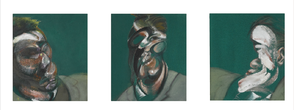
How is it possible that, however distorted and disfigured they may be, we can always identify Bacon’s models? Is it because of the expressions, the energy, the flesh? Are the faceless heads more faithful/faceful than they seem? The observation voiced by John Russell in his study of Francis Bacon’s work (Russell 172) would go against Deleuze’s image (although Deleuze refers to faceless heads, not selfless heads after all). Following this idea, Kundera, who wonders ‘what remains, then’, immediately answers: ‘the face.’ In his remarkable article on Bacon, he explains how surprised he is ‘when he looks at Bacon’s portraits to find that, in spite of their distortion, they all look like their models’. What happens is that ‘his portraits are questioning the limits of the self: How distorted can one be and remain oneself? What is the limit, when does a ‘‘self’’ stops being a ‘‘self’’’? (Kundera 11)
If Paul de Man concludes the chapter ‘Autobiography as De-Facement’ by saying that ‘autobiography veils a defacement of the mind of which it is itself the cause’ (de Man 81), then maybe we could envisage the self portrait as de-facement of the face, not of the self, which it unveils with brushes and knifes. What is most powerful in Bacon’s and Freud’s self-portraits is that they tackle the impermanent and impalpable nature of the self: they face it, scrutinise it and paint it. It may not be pretty, it might even be an enduring, confusing, extreme and violent experience, but, here are their bodies, their flesh, their heads and eyes . . . themselves. Or what remains of it. Modern vanitas.
