30
Yvonne Earnshaw, Andrew A. Tawfik & Matthew Schmidt
Educators and learners are increasingly reliant on digital tools to facilitate learning. However, educators and learners often fail to adopt technology as originally intended (Straub, 2017). For instance, educators may be faced with challenges trying to determine how to assess student learning in their learning management system or they might spend time determining workarounds to administer lesson plans. Learners might experience challenges navigating an interface or finding homework details. When an interface is not easy to use, a user must develop alternative paths to complete a task and thereby accomplish a learning goal. Such challenges are the result of design flaws, which create barriers for effective instruction (Jou, Tennyson, Wang, & Huang, 2016; Rodríguez, Pérez, Cueva, & Torres, 2017).
Understanding how educators and learners interact with learning technologies is key to avoiding and remediating design flaws. An area of research that seeks to understand the interaction between technology and the people who use it is known as human-computer interaction (HCI; Rogers, 2012). HCI considers interaction from many perspectives, two of which are usability and user experience (UX). Usability describes how easily the interfaces are able to be used as intended by the user (Nielsen, 2012). Examples include when an interface is designed in such a way that the user can anticipate errors, support efficiency, and strategically use design cues so that cognitive resources remain focused on learning. UX describes the broader context of usage in terms of “a person’s perceptions and responses that result from the use or anticipated use of a product, system, or service” (International Organization for Standardization [ISO], 2010, Terms and Definitions section, para 2.15). Emphasizing HCI corresponds with a more user-centered approach to design. Such user-centered design (UCD) emphasizes understanding users’ needs and expectations throughout all phases of design (Norman, 1986).
The principles of HCI and UCD have implications for the design of learning environments. While the LIDT field has historically focused on learning theories to guide design (e.g., scaffolding, sociocultural theory, etc.), less emphasis has been placed on HCI and UCD (Okumuş, Lewis, Wiebe, & Hollebrands, 2016). This chapter attempts to address this issue. We begin with a discussion of the learning theories that are foundational to HCI. We then discuss the importance of iteration in the design cycles. We conclude with details of UCD-specific methodologies that allow the designer to approach design from both a pedagogical and UCD perspective.
Theoretical Foundations
Usability and HCI are closely related with established learning theories such as cognitive load theory, distributed cognition, and activity theory. In the following sections, we discuss each theory and how it is important for conceptualizing usability and UX from an instructional design perspective.
Cognitive load theory. Cognitive load theory (CLT) contends that meaningful learning is predicated on effective cognitive processing; however, an individual only has a limited number of resources needed to process the information (Mayer & Moreno, 2003; Paas & Ayres, 2014). The three categories of CLT include: (1) intrinsic load, (2) extraneous load, and (3) germane load (Sweller, van Merriënboer, & Paas, 1998). Intrinsic load describes the active processing or holding of verbal and visual representations within working memory. Extraneous load includes the elements that are not essential for learning, but are still present for learners to process (Korbach, Brünken, & Park, 2017). Germane load describes the relevant load imposed by the effective instructional design of learning materials. Germane cognitive load is relevant to schema construction in long-term memory (Paas, Renkl, & Sweller., 2003; Sweller et al., 1998; van Merriënboer & Ayres, 2005). It is important to note that the elements of CLT are additive, meaning that if learning is to occur, the total load cannot exceed available working memory resources (Paas et al., 2003).
Extraneous load is of particular importance for HCI and usability. Extraneous cognitive load can be directly manipulated by the designer (van Merriënboer & Ayres, 2005). When an interface is not designed with usability in mind, the extraneous cognitive load is increased, which impedes meaningful learning. From an interface design perspective, poor usability might result in extraneous cognitive load in many forms. For instance, a poor navigation structure might require the learner to extend extra effort to click through an interface to find relevant information. Further, when the interface uses unfamiliar terms that do not align with a user’s mental models or the interface is not consistently designed, the user must exert additional effort toward understanding the interface. Another example of extraneous cognitive load is when a learner does not know how to proceed, so the learner is taken out of their learning flow. Although there are many other examples, each depicts how poor usability taxes cognitive resources. After extraneous cognitive load is controlled for, then mental resources can be shifted to focus on germane cognitive load for building schemas (Sweller et al., 1998).
Distributed cognition and activity theory. While cognitive load theory helps describe the individual interaction of a user experience, other theories and models focus on broader conceptualizations of HCI. The most prominent ones include distributed cognition and activity theory, which take into account the broader context of learning and introduce the role of collaboration between various individuals. Distributed cognition postulates that knowledge is present both within the mind of an individual and across artifacts (Hollan, Hutchins, & Kirsh, 2000). The theory emphasizes “understanding the coordination among individuals and artifacts, that is, to understand how individual agents align and share within a distributed process” (Nardi, 1996, p. 39). From a learning technology perspective, tools are deemed important because they help facilitate cognition through communication across various entities; that is, technology facilitates the flow of knowledge in pursuit of a goal (Boland, Tenkasi, & Te’eni, 1994; Vasiliou, Ioannou, & Zaphiris, 2014). In doing so, the unit of analysis is focused on the function of the system within the broader context (Michaelian & Sutton, 2013). Therefore, user experience is defined as much broader and more collaborative when compared with cognitive load theory.
Activity theory is a similar framework to distributed cognition, but focuses on the activity and specific roles within an interconnected system. Activity theory describes workgroup behavior in terms of a goal-directed hierarchy: activities, actions, and operations (Jonassen & Rohrer-Murphy, 1999). Activities describe the top-level objectives and fulfillment of motives (Kaptelinin, Nardi, & Macaulay, 1999). Within a learning context, these are often technology implementations that subgroups must embrace. An example is the integration of a new LMS or new training approach. Actions are the more specific goal-directed processes and smaller tasks that must be completed in order to complete the overarching activity. Operations describe the automatic cognitive processes that group members complete (Engeström, 2000). However, they do not maintain their own goals, but are rather the unconscious adjustment of actions to the situation at hand (Kaptelinin et al., 1999). In terms of HCI, an implemented technology will be designed to support learning contexts on any or all of these levels for a given objective.
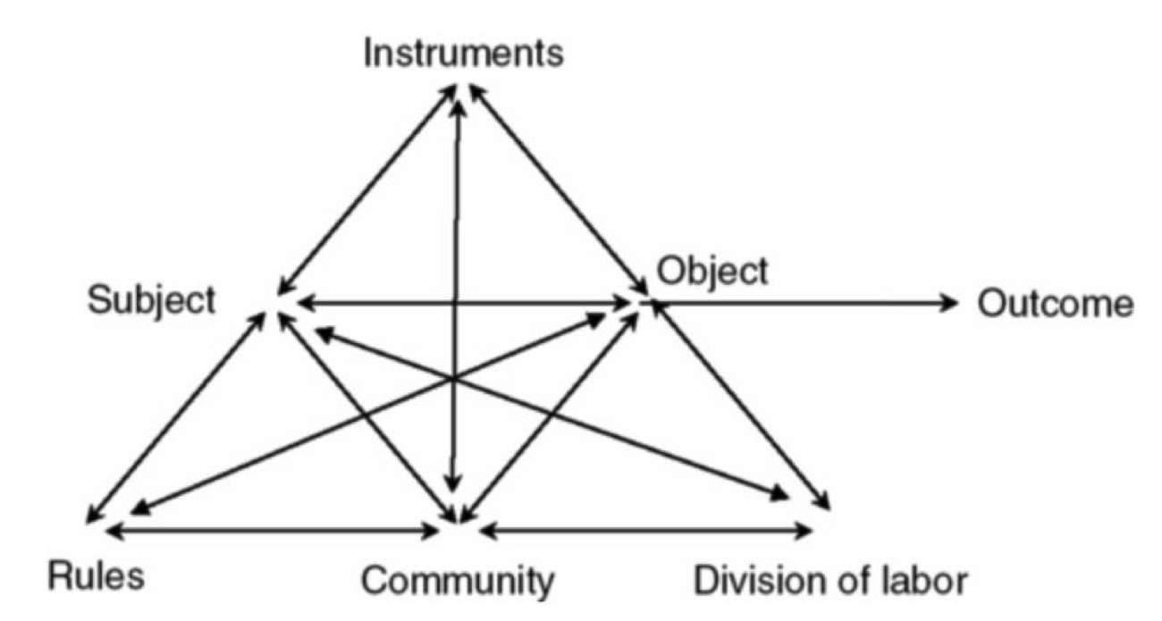 Figure 1. Activity system diagram. Adapted from “Activity Theory as a Framework for Analyzing and Redesigning Work,” by Y. Engeström, 2000, Ergonomics, 43(7), p. 962.
Activity theory is especially helpful for design because it provides a framework to understand how objectives are completed throughout a learning context. Nardi (1996) suggested that a key component of activity theory is the role of mediation of the world through tools. These artifacts are created by individuals to control their own behavior and can manifest in the form of instruments, languages, or technology. Each carries a particular culture and history that stretches across time and space (Kaptelinin et al., 1999) and serves to represent ways in which others have solved similar problems. Activity theory applied to education suggests that tools not only mediate the learning experience, but they are often altered to accommodate the new tools (Jonassen & Rohrer-Murphy, 1999). While the availability of learning management systems or educational video games may be beneficial, they need to be seen within the broader context of social activity necessitated by a school or organization (Ackerman, 2000). Moreover, the technological tools instituted in a workgroup should not radically change work processes, but represent solutions given the constraints and history of the workgroup (Barab, Barnett, Yamagata-Lynch, Squire, & Keating, 2002; Yamagata-Lynch, Cowan, & Luetkehans, 2015). As work is increasingly collaborative through technology, activity theory and distributed cognition can provide important insight into the broader aspects of human-computer interaction.
Acronyms
- HCI: Human-computer interaction
- UX: User experience
- ISO: International Organization for Standardization
- UCD: User-centered design
- CLT: Cognitive load theory
User-Centered Design
Given the theoretical implications of usability and the design of learning environments, the question arises as to how one designs and develops highly usable learning environments. The field of instructional design (ID) has recently begun to shift its focus to more iterative design and user-driven development models, and a number of existing instructional design methods can be used or adapted to fit iterative approaches. Identifying learning needs has long been the focus of front-end analysis. Ideation and prototyping are frequently used methods from UX design and rapid prototyping. Testing in instructional design has a rich history in the form of formative and summative evaluation. By applying these specific methods within iterative processes, instructional designers can advance their designs in such a way that they can focus not only on intended learning outcomes but also on the usability of their designs. In the following sections, UCD is considered with a specific focus on techniques for incorporating UCD into one’s instructional design processes through (1) identifying user needs, (2) requirements gathering, (3) prototyping, and (4) wireframing.
Identifying User Needs
Similarly to the field of instructional design, in which the design process begins with assessing learner needs (Sleezer, Russ-Eft, & Gupta, 2014), UCD processes also begin by identifying user needs. The focus of needs assessment in instructional design often is identification of a gap (the need) between actual performance and optimal performance (Rossett, 1987; Rossett & Sheldon, 2001). Needs and performance can then be further analyzed and instructional interventions designed to address those needs. Assessing user (and learner) needs can yield important information about performance gaps and other problems. However, knowledge of needs alone is insufficient to design highly usable learning environments. Once needs have been identified, the first phase of the UCD process centers around determining the specific context of use for a given artifact. Context is defined by users (who will use the artifact), tasks (what will users do with the artifact), and environment (the local context in which users use the artifact). A variety of methods are used to gain insight into these areas.
Personas. In UCD, a popular approach to understanding learners is to create what is known as personas (Cooper, 2004). Personas provide a detailed description of a fictional user whose characteristics represent a specific user group. They serve as a methodological tool that helps designers approach design based on the perspective of the user rather than (often biased) assumptions. A persona typically includes information about user demographics, goals, needs, typical day, and experiences. In order to create a persona, interviews or observations should take place to gather information from individual users and then place them into specific user categories. Personas should be updated if there are changes to technology, business needs, or other factors. Personas help designers obtain a deep understanding of the types of users for the system. Because personas are developed based on data that have been gathered about users, bias is reduced. An effective way to start creating personas is to use a template; a simple web search will yield many. Table 1 provides an example of a persona that was created by novice designers in an introductory instructional design course using a template.
Table 1. Persona of Website Users
| User Goals: What users are trying to achieve by using your site, such as tasks they want to perform |
|
| Behavior: Online and offline behavior patterns, helping to identify users’ goals |
|
| Attitudes: Relevant attitudes that predict how users will behave |
|
| Motivations: Why users want to achieve these goals |
|
| Design team objectives: What you ideally want users to accomplish in order to ensure your website is successful? |
|
Derived from: http://usabilitybok.org/persona
Identifying Requirements
One potential pitfall of design is when developers create systems based on assumptions of what users want. After designers have begun to understand the user, they begin to identify what capabilities or conditions a system must be able to support to meet the identified user needs. These capabilities or conditions are known as “requirements.” The process a designer undertakes to identify these requirements is known as “requirements gathering.” Generally, requirements gathering involves: (1) gathering user data (e.g., user surveys, focus groups, interviews, etc.), (2) data analysis, and (3) interpretation of user needs. Based on interpretation of user needs, a set of requirements is generated to define what system capabilities must be developed to meet those needs. Requirements are not just obtained for one set of users, but for all user-types and personas that might utilize the system.
Requirements gathering from a UCD perspective helps avoid application of a “ready-made” solution in favor of creating design guidelines that meet an array of various users’ needs. Requirements gathering also outlines the scope of the project given the known context and current understanding of personas. Given the iterative nature of UCD, however, requirements might change as a design evolves. Shifts in requirements vary depending design and associated evaluation methods.
Designing and Developing User Interfaces
Similar to requirements gathering, designing and developing a user interface undergoes an iterative process. Based on personas and identified requirements, an initial prototype of the user interface should be created. Prototypes tend to follow a trajectory of development over time from low fidelity to high fidelity (Walker, Takayama, & Landay, 2002). Fidelity refers to the degree of precision, attention to detail, and functionality of a prototype. Examples range from lower fidelity prototypes, which include the proverbial “sketch on a napkin” and paper prototypes, to higher fidelity prototypes, which include non-functional “dummy” graphical mockups of interfaces and interfaces with limited functionality that allow for evaluation. Typically, lower fidelity prototypes do not take much time to develop and higher fidelity prototypes take longer because prototypes become more difficult to change as more details and features are added.
Rapid prototyping. Rapid prototyping is an approach to design that emerged in the 1980s in engineering fields and began to gain traction in ID in the early 1990s (Desrosier, 2011; Tripp & Bichelmeyer, 1990; Wilson, Jonassen, & Cole, 1993). Instead of traditional ID approaches with lengthy design and development phases, rapid prototyping focuses on fast, or “rapid,” iterations. This allows instructional designers to quickly gather evaluative feedback on their early designs. Considered a feedback-driven approach to ID, rapid prototyping is seen by many as a powerful tool for the early stages of an ID project. The rapid prototyping approach relies on multiple, rapid cycles in which an artifact is designed, developed, tested, and revised. Actual users of the system participate during the testing phase. This cycle repeats until the artifact is deemed to be acceptable to users. An example of rapid prototyping applied in an instructional design context is the successive approximation model, or SAM (Allen, 2014). The SAM (version 2) process model is provided in Figure 2.
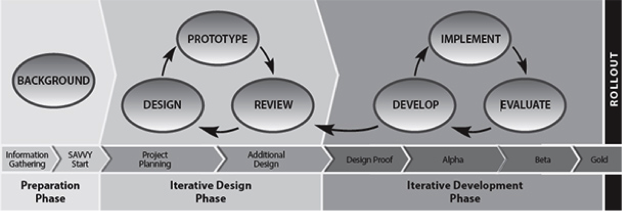 Figure 2. Successive approximation model version 2 (SAM2) process diagram. Adapted from Leaving ADDIE for SAM: An Agile Model for Developing the Best Learning Experience (p. 40), by M. Allen, 2014, Alexandria, VA: American Society for Training and Development. Copyright 2014 by the American Society for Training and Development.
Paper prototyping. A lower fidelity method of prototyping is called paper prototyping. Paper prototyping is used to inform the design and development of many different kinds of interfaces, including web, mobile, and games. The focus of paper prototyping is not on layout or content, but on navigation, workflow, terminology, and functionality. The purpose of creating these prototypes is to communicate designs among the design team, users, and stakeholders, as well as to gather user feedback on designs. A benefit of paper prototyping is that it is rapid and inexpensive – designers put only as much time into developing a design as is absolutely necessary. This makes it a robust tool at the early stages of design. As the name implies, designers use paper to create mockups of an interface. Using pencil and paper is the simplest approach to paper prototyping, but stencils, colored markers, and colored paper can also be used. These paper prototypes can be scanned and further elaborated using digital tools (Figure 3). The simplicity of paper prototyping allows for input from all members of a design team, as well as from users and other stakeholders. The speed of paper prototyping makes it particularly amenable to a rapid prototyping design approach. The process of creating paper prototypes can be individual, in which the designer puts together sketches on his or her own, or collaborative, in which a team provides input on a sketch while one facilitator draws it out. For further information on paper prototyping, refer to Snyder (2003) and UsabilityNet (2012).
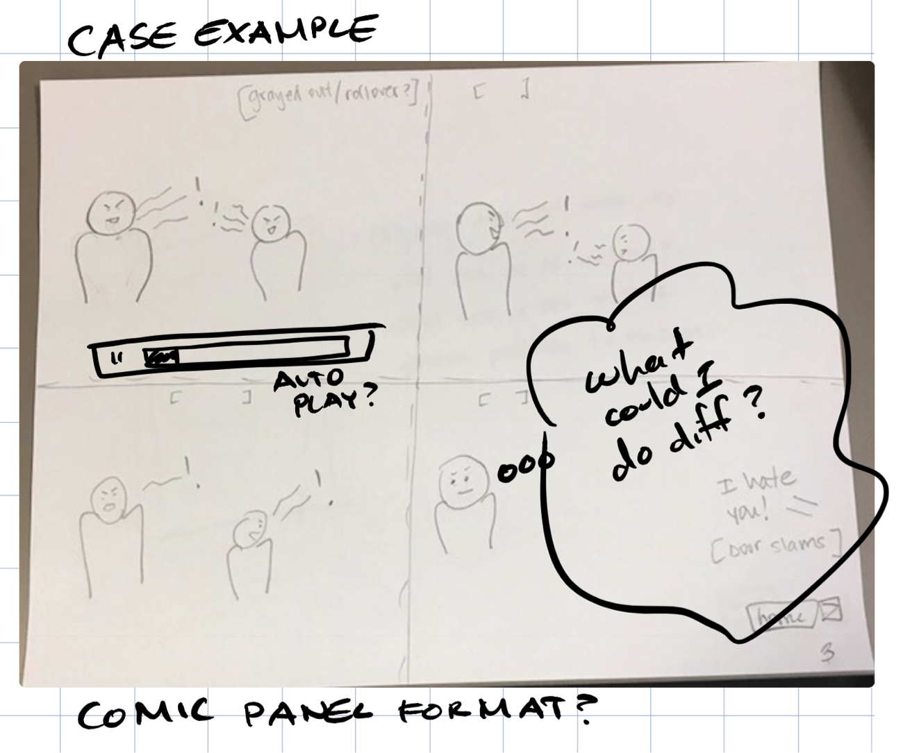 Figure 3. Example of a paper prototype that has been scanned and annotated using digital tools.
Wireframing. Wireframes are representations of interfaces that visually convey their structure (see Figure 4). Wireframing results in prototypes that are of higher fidelity than paper prototyping, but lack the functionality and visual elements of high fidelity prototypes. Wireframing commonly occurs early in the design process after paper prototyping. It allows designers to focus on things that paper prototyping does not, such as layout of content, before more formal visual design and content creation occurs. Wireframing can be seen as an interim step that allows for fast mockups of an interface to be developed, tested, and refined, the results of which are then used to create higher fidelity, functional prototypes.
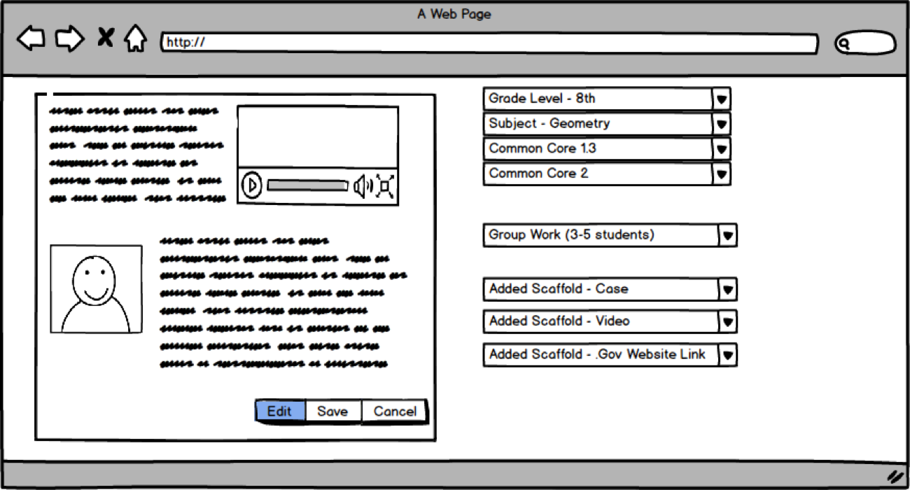 Figure 4. Example of a wireframe.
Wireframes consist of simple representations of an interface, with interface elements displayed as placeholders. Placeholders use a variety of visual conventions to convey their purpose. For example, a box with an “X” or other image might represent a graphic, or a box with horizontal lines might represent textual content. Wireframes can be created using common software such as PowerPoint or Google Drawings or with more specialized software such as OmniGraffle or Balsamiq. Wireframes are particularly amenable to revision, as revisions often consist of simple tweaks, such as moving interface elements, resizing, or removing them. A key benefit of wireframes is that they allow designers to present layouts to stakeholders, generate feedback, and quickly incorporate that feedback into revisions.
Functional prototyping. Functional prototypes are higher-fidelity graphical representations of interfaces that have been visually designed such that they closely resemble the final version of the interface and that incorporate limited functionality. In some cases, content has been added to the prototype. A functional prototype might start out as a wireframe interface with links between screens. A visual design is conceived and added to the wireframe, after which graphical elements and content are added piece-by-piece. Then, simple functionality is added, typically by connecting different sections of the interface using hyperlinks. An advanced functional prototype might look like a real interface but lack full functionality. Functional prototypes can be created using PowerPoint or with more specialized software like InVision and UXPin.
During evaluation, functional prototypes allow for a user to experience a mockup interface in a way that is very similar to the experience of using an actual interface. However, because functionality is limited, development time can be reduced substantially. Functional prototypes provide a powerful way to generate feedback from users in later stages of the design process, allowing for tweaks and refinements to be incorporated before time and effort are expended on development.
To reiterate, the goal of UCD is to approach systems development from the perspective of the end-user. Through tools such as personas and prototypes, the design process becomes iterative and dynamic. Learning designers also use these tools in conjunction with evaluation methods to better align prototype interface designs with users mental models, thereby reducing cognitive load and improving usability.
Evaluation Methodologies for User-Centered Design
While UCD is important for creating usable interfaces, a challenge is knowing when and under what conditions to apply the appropriate evaluation methodology. In the following sections, several user evaluation methodologies are described. These can be applied during various phases across the design process (i.e., front-end analysis, low-fidelity to high-fidelity prototyping). While a case can be made to apply any of the approaches outlined below in a given design phase, some evaluation methodologies are more appropriate to overall user experience, while others focus more specifically on usability. Table 2 provides an overview of methods, in which design phase they can be best implemented, and associated data sources.
Table 2. Evaluation Methodologies, Design Phases, and Data Sources
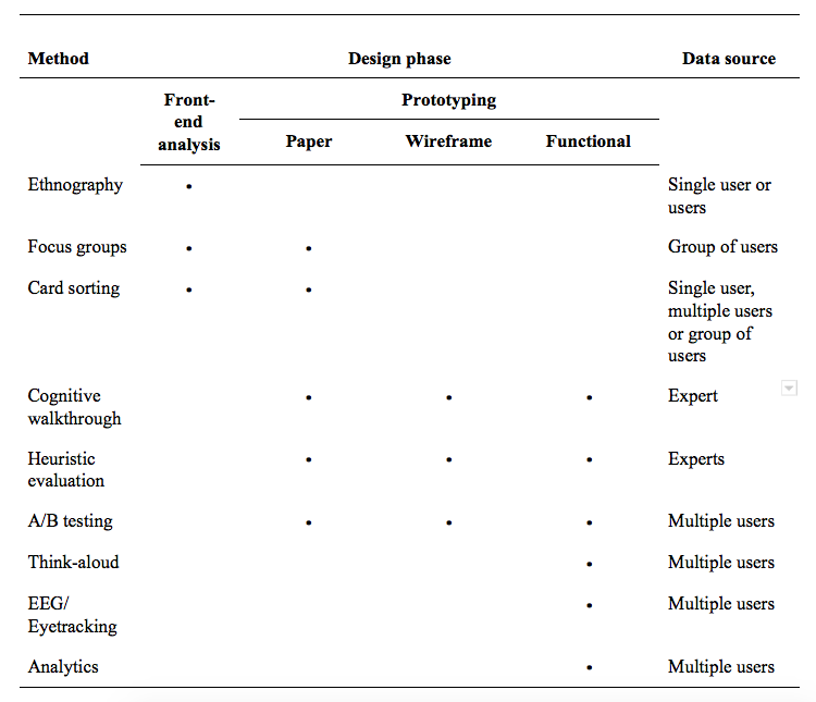
Ethnography. A method that is used early in the front-end analysis phase, especially for requirements gathering, is ethnography. Ethnography is a qualitative research method in which a researcher studies people in their native setting (not in a lab or controlled setting). During data collection, the researcher observes the group, gathers artifacts, records notes, and performs interviews. In this phase, the researcher is focused on unobtrusive observations to fully understand the phenomenon in situ. For example, in an ethnographic interview, the researcher might ask open-ended questions but would ensure that the questions were not leading. The researcher would note the difference between what the user is doing versus what the user is saying and take care not introduce his or her own bias. Although this method has its roots in the field of cultural anthropology, ethnography in UX design can support thinking about design from activity theory and distributed cognition perspectives (Nardi, 1996). It is useful in UX evaluations because the researcher can gather information about the users, their work environment, their culture, and how they interact with the device or website in context (Nardi, 1997). This information is particularly valuable when writing user personas. Ethnography is also useful if the researcher cannot conduct user testing on systems or larger equipment due to size or security restrictions.
Focus groups. Focus groups are often used during the front-end analysis phase. Rather than the researcher going into the field to study a larger group as in ethnography, a small group of participants (5-10) are recruited based on shared characteristics. Focus group sessions are led by a skilled moderator who has a semi-structured set of questions or plan. For instance, a moderator might ask what challenges a user faces in a work context (i.e., actuals vs. optimals gap), suggestions for how to resolve it, and feedback on present technologies. The participants are then asked to discuss their thoughts on products or concepts. The moderator may also present a paper prototype and ask for feedback. The role of the researcher in a focus group is to ensure that no single person dominates the conversation in order to hear everyone’s opinions, preferences, and reactions. This helps to determine what users want and keeps the conversation on track. It is preferred to have multiple focus group sessions to ensure various perspectives are heard in case a conversation gets side-tracked.
Analyzing data from a focus group can be as simple as providing a short summary with a few illustrative quotes for each session. The length of the sessions (typically 1-2 hours) may include some extraneous information, so it is best to keep the report simple.
Card sorting. Aligning designs with users mental models is important for effective UX design. A method used to achieve this is card sorting. Card sorting is used during front-end analysis and paper prototyping. Card sorting is commonly used in psychology to identify how people organize and categorize information (Hudson, 2012). In the early 1980s, card sorting was applied to organizing menuing systems (Tullis, 1985) and information spaces (Nielsen & Sano, 1995).
Card sorting can be conducted physically using tools like index cards and sticky notes or electronically using tools like Lloyd Rieber’s Q Sort (http://lrieber.coe.uga.edu/qsort/index.html). It can involve a single participant or a group of participants. With a single participant, he or she groups content (individual index cards) into categories, allowing the researcher to evaluate the information architecture or navigation structure of a website. For example, a participant might organize “Phone Number” and “Address” cards together. When a set of cards is placed together by multiple participants, this suggests to the designer distinct pages that can be created (e.g., “Contact Us”). When focusing on a group, the same method is employed, but the group negotiates how they will group content into categories. How participants arrange cards provides insight into mental models and how they group content.
In an open card sort, a participant will first group content (menu labels on separate notecards) into piles and then name the category. Participants can also place the notecards in an “I don’t know” pile if the menu label is not clear or may not belong to a designated pile of cards. In a closed card sort, the categories will be pre-defined by the researcher. It is recommended to start with an open card sort and then follow-up with a closed card sort (Wood & Wood, 2008). As the arrangement of participants are compared, the designer iterates the early prototypes so the menu information and other features align with how the participants organize the information within their mind. For card sorting best practices, refer to Righi et al (2013) article.
Cognitive walkthroughs. Cognitive walkthroughs (CW) can be used during all prototyping phases. CW is a hands-on inspection method in which an evaluator (not a user) evaluates the interface by walking through a series of realistic tasks (Lewis & Wharton, 1997). CW is not a user test based on data from users, but instead is based on the evaluator’s judgments.
During a CW, the evaluator evaluates specific tasks and considers the user’s mental processes while completing those tasks. For example, an evaluator might be given the following task: Recently you have been experiencing a technical problem with software on your laptop and you have been unable to find a solution to your problem online. Locate the place where you would go to send a request for assistance to the Customer Service Center. The evaluator identifies the correct paths to complete the task, but does not make a prediction as to what a user will actually do. In order to assist designers, the evaluator also provides reasons for making errors (Wharton, Rieman, Lewis, & Polson, 1994). The feedback received during the course of the CW provides insight into various aspects of the user experience including:
- how easy it is for the user to determine the correct course of action,
- whether the organization of the tools or functions matches the ways that users think of their work,
- how well the application flow matches user expectations,
- whether the terminology used in the application is familiar to users, and
- whether all data needed for a task is present on screen.
For information on how to conduct a CW, view the Interaction Design Foundation’s article, available at https://www.interaction-design.org.
Heuristic evaluation. Heuristic evaluation is an inspection method that does not involve directly working with the user. In a heuristic evaluation, usability experts work independently to review the design of an interface against a pre-determined set of usability principles (heuristics) before communicating their findings. Ideally, each usability expert will work through the interface at least twice: once for an overview of the interface and the second time to focus on specific interface elements (Nielsen, 1994). The experts then meet and reconcile their findings. This method can be used during any phase of the prototyping cycle.
Many heuristic lists exist that are commonly used in heuristic testing. The most well-known heuristic checklist was developed over 25 years ago by Jakob Nielsen and Rolf Molich (1990). This list was later simplified and reduced to 10 heuristics which were derived from 249 identified usability problems (Nielsen, 1994). In the field of instructional design, others have embraced and extended Nielsen’s 10 heuristics to make them more applicable to the evaluation of eLearning systems (Mehlenbacher et al., 2005; Reeves et al., 2002). Not all heuristics are applicable in all evaluation scenarios, so UX designers tend to pull from existing lists to create customized heuristic lists that are most applicable and appropriate to their local context.
Nielsen’s 10 Heuristics
- Visibility of system status
- Match between system and the real world
- User control and freedom
- Consistency and standards
- Error prevention
- Recognition rather than recall
- Flexibility and efficiency of use
- Aesthetic and minimalist design
- Help users recognize, diagnose, and recover from errors
- Help and documentation
An approach that bears similarities with a heuristic review is the expert review. This approach is similar in that an expert usability evaluator reviews a prototype but differs in that the expert does not use a set of heuristics. The review is less formal and the expert typically refers to personas to become informed about the users. Regardless of whether heuristic or expert review is selected as an evaluation method, data from a single expert evaluator is insufficient for making design inferences. Multiple experts should be involved, and data from all experts should be aggregated. Different experts will have different perspectives and will uncover different issues. This helps ensure that problems are not overlooked.
A/B testing. A/B testing or split-testing compares two versions of a user interface and, because of this, all three prototyping phases can employ this method. The different interface versions might vary individual screen elements (such as the color or size of a button), typeface used, placement of a text box, or overall general layout. During A/B testing, it is important that the two versions are tested at the same time by the same user. For instance, Version A can be a control and Version B should only have one variable that is different (e.g., navigation structure). A randomized assignment, in which some participants receive Version A first and then Version B (versus receiving Version B and then Version A), should be used.
Think-aloud user study. Unlike A/B testing, a think-aloud user study is only used during the functional prototyping phase. According to Jakob Nielsen (1993), “thinking aloud may be the single most valuable usability engineering method” (p. 195). In a think-aloud user study, a single participant is tested at any given time. The participant narrates what he or she is doing, feeling, and thinking while looking at a prototype (or fully functional system) or completing a task. This method can seem unnatural for participants, so it is important for the researcher to encourage the participant to continue verbalizing throughout a study session. To view an example of a think-aloud user study, please watch Steve Krug’s “Rocket Surgery Made Easy” video.
A great deal of valuable data can come from a think-aloud user study (Krug, 2010). Sometimes participants will mention things they liked or disliked about a user interface. This is important to capture because it may not be discovered in other methods. However, the researcher needs to also be cautious about changing an interface based on a single comment.
Users do not necessarily have to think aloud while they are using the system. The retrospective think aloud is an alternative approach that allows a participant to review the recorded testing session and talk to the researcher about what he or she was thinking during the process. This approach can provide additional helpful information, although it may be difficult for some participants to remember what they were thinking after some time. Hence, it is important to conduct retrospective think aloud user testing as soon after a recorded testing session as possible.
EEG/Eye-tracking. Similar to the think-aloud user study, electroencephalography (EEG) and eye tracking are evaluation methods that involve the user during the functional prototype phase. EEG and eye-tracking are physiological methods used to measure a participant’s physical responses. Instead of relying on self-reported information from a user, these types of methods look at direct, objective measurements in the form of electrical activity in the brain and gaze behavior. EEG measures a participant’s brain activity. An EEG records changes in the brain’s electrical signals in real-time. A participant wears a skull cap with tiny electrodes attached to it. While viewing a prototype, EEG data can show when a participant is frustrated or confused with the user interface (Romano Bergstrom, Duda, Hawkins & McGill, 2014). Eye-tracking measures saccades, eye movements from one point to another, and fixations, areas where the participant stops to gaze at something. These saccades and fixations can be used to create heat maps and gaze plots, as shown in Figures 5-7, or for more sophisticated statistical analysis.
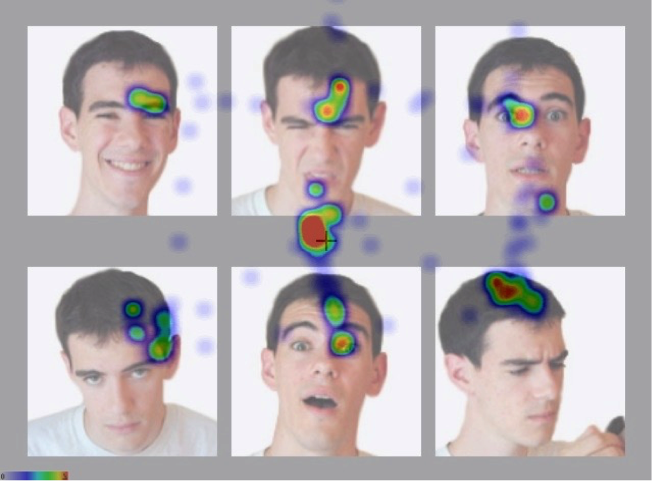 Figure 5. Heat map of an interface in which users with autism must identify facial expressions; here, eye fixations are shown with red indicating longer dwell time and blue indicating shorter dwell time. Adapted from “3D Virtual Worlds: Assessing the Experience and Informing Design,” by S. Goggins, M. Schmidt, J. Guajardo, and J. Moore, 2011, International Journal of Social and Organizational Dynamics in Information Technology, 1(1), p. 41. Reprinted with permission.
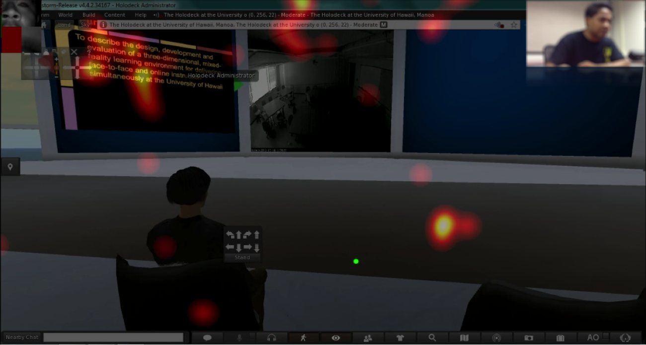 Figure 6. Heat map of a three-dimensional interface showing eye fixations and saccades in real-time, with yellow indicating longer dwell time and red indicating shorter dwell time. Adapted from “The Best Way to Predict the Future is to Create It: Introducing the Holodeck Mixed-Reality Teaching and Learning Environment,” by M. Schmidt, J., Kevan, P. McKimmy, and S. Fabel, 2013, Proceedings of the 2013 International Convention of the Association for Educational Communications and Technology, Anaheim, CA. Reprinted with permission.
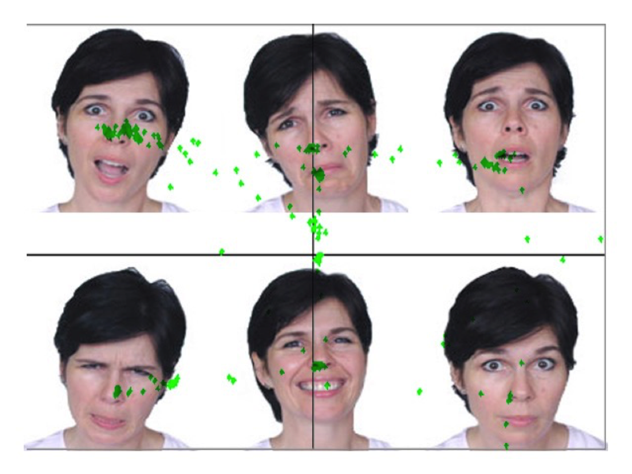 Figure 7. Gaze plot of an interface in which users with autism must identify facial expressions; here, markers plot gaze location every 5 milliseconds. Adapted from “3D Virtual Worlds: Assessing the Experience and Informing Design,” by S. Goggins, M. Schmidt, J. Guajardo, and J. Moore, 2011, International Journal of Social and Organizational Dynamics in Information Technology, 1(1), p. 39. Reprinted with permission.
This type of user testing serves as a way to understand when users find something important or distracting, thereby informing designers of extraneous cognitive load. A disadvantage of this type of data is that it might not be clear why a user was fixated on a particular element on the screen. This is a situation in which a retrospective think-aloud can be beneficial. After the eye-tracking data have been collected, the researcher can sit down with the user and review the eye-tracking data while asking about eye movements and particular focus areas.
Analytics. Another type of evaluation method that focuses on participants’ behavior is analytics, which are typically collected automatically in the background while a user is interfacing with a system and without the participant always being aware of the data collection. An example is a clickstream analysis in which the participants’ clicks are captured while browsing the web or using a software application (see Figure 8). This information can be beneficial because it can show the researcher the path the participant was taking while navigating a system. Typically, these data need to be triangulated with other data sources to paint a broader picture.
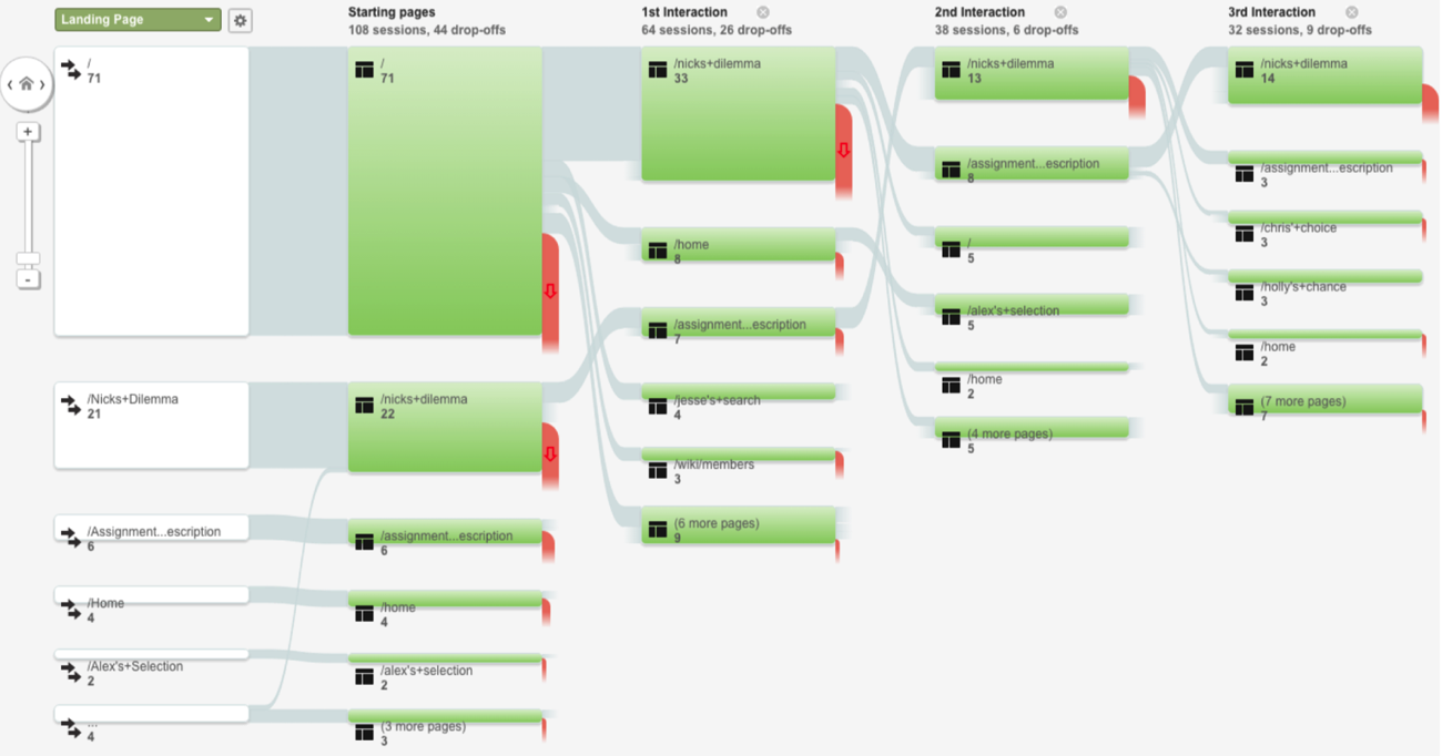 Figure 8. An example of a clickstream, showing users’ paths through a system. Adapted from “Transforming a Problem-Based Case Library Through Learning Analytics and Gaming Principles: An Educational Design Research Project,” by M. Schmidt and A. Tawfik, in press, Interdisciplinary Journal of Problem-Based Learning. Reprinted with permission.
Conclusion
As digital tools have gained in popularity, there is a rich body of literature that has focused on interface design. Indeed, a variety of principles and theories (e.g. cognitive load theory, distributed cognition, activity theory, etc.) have provided valuable insight about the design process. While the design of learning technologies is not new, issues of how users interact with the technology can sometimes become secondary to pedagogical concerns. In this chapter, we have illustrated how the field of HCI intersects with the field of instructional design and explored how to approach interface design from the perspectives of usability, UX, and UCD. Moreover, we have provided examples of iterative design techniques and evaluation methodologies that can be employed to advance usable designs. The concepts of HCI, UX, and UCD provide insight into how learning technologies are used by educators and learners. A design approach approach that balances these principles and learning theories helps ensure that digital tools are designed in a way that best supports learning.
References
Ackerman, M. S. (2000). The intellectual challenge of CSCW: The gap between social requirements and technical feasibility. Human-Computer Interaction, 15, 179–203.
Allen, M. (2014). Leaving ADDIE for SAM: An agile model for developing the best learning experiences. American Society for Training and Development: Alexandria, VA.
Barab, S., Barnett, M., Yamagata-Lynch, L., Squire, K., & Keating, T. (2002). Using activity theory to understand the systemic tensions characterizing a technology-rich introductory astronomy course. Mind, Culture, and Activity, 9(2), 76-107.
Boland, R. J., Tenkasi, R. V., & Te’eni, D. (1994). Designing information technology to support distributed cognition. Organization Science, 5(3), 456–475.
Cooper, A. (2004). The inmates are running the asylum: Why high-tech products drive us crazy and how to restore the sanity. Indianapolis, IN: Sams Publishing.
Desrosier, J. (2011). Rapid prototyping reconsidered. The Journal of Continuing Higher Education, 59, 134-145.
Engeström, Y. (2000). Activity theory as a framework for analyzing and redesigning work. Ergonomics, 43(7), 960–974.
Goggins, S., Schmidt, M., Guajardo, J., & Moore, J. (2011). 3D virtual worlds: Assessing the experience and informing design. International Journal of Social and Organizational Dynamics in Information Technology, 1(1), 30-48.
Hollan, J., Hutchins, E., & Kirsh, D. (2000). Distributed cognition: toward a new foundation for human-computer interaction research. ACM Transactions on Computer Human Interaction, 7(2), 174–196.
Hudson, W. (2012). Card sorting. In M. Soegaard, & R. F. Dam (Eds.), The encyclopedia of human-computer interaction (2nd ed.). Retrieved from https://www.interaction-design.org/literature/book/the-encyclopedia-of-human-computer-interaction-2nd-ed/card-sorting
International Organization for Standardization. (2010). Ergonomics of human-system interaction–Part 210: Human-centred design for interactive systems (ISO Standard No. 9241). Retrieved from https://www.iso.org/standard/52075.html
Jonassen, D., & Rohrer-Murphy, L. (1999). Activity theory as a framework for designing constructivist learning environments. Educational Technology Research and Development, 47(1), 61–79.
Jou, M., Tennyson, R. D., Wang, J., & Huang, S.-Y. (2016). A study on the usability of E-books and APP in engineering courses: A case study on mechanical drawing. Computers & Education, 92(Supplement C), 181–193.
Kaptelinin, V., Nardi, B., & Macaulay, C. (1999). The activity checklist: a tool for representing the “space” of context. Interactions, 6(4), 27–39.
Korbach, A., Brünken, R., & Park, B. (2017). Measurement of cognitive load in multimedia learning: a comparison of different objective measures. Instructional Science, 45(4), 515–536.
Krug, S. (2010). Rocket surgery made easy: The do-it-yourself guide to finding and fixing usability problems. New Riders: Berkeley, CA.
Lewis, C., & Wharton, C. (1997). Cognitive walkthroughs. In M. Helander, T. K. Landauer, & P. Prabhu (Eds.), Handbook of human-computer interaction (2nd ed., pp. 717–732). Amsterdam: Elsevier.
Mayer, R. E., & Moreno, R. (2003). Nine ways to reduce cognitive load in multimedia learning. Educational Psychologist, 38(1), 43–52.
Mehlenbacher, B., Bennett, L., Bird, T., Ivey, I., Lucas, J., Morton, J., & Whitman, L. (2005). Usable e-learning: A conceptual model for evaluation and design. Proceedings of HCI International 2005: 11th International Conference on Human-Computer Interaction, Volume 4 — Theories, Models, and Processes in HCI. Las Vegas, NV.
Michaelian, K., & Sutton, J. (2013). Distributed cognition and memory research: History and current directions. Review of Philosophy and Psychology, 4(1), 1–24.
Nardi, B. A. (1996). Studying context: A comparison of activity theory, situated action models, and distributed cognition. In B. A. Nardi (Ed.), Context and consciousness: Activity theory and human-computer interaction (pp. 69-102). Cambridge, MA: The MIT Press.
Nardi, B. (1997). The use of ethnographic methods in design and evaluation. In M. Helander, T. K. Landauer, & P. Prabhu (Eds.). Handbook of human-computer interaction (2nd ed., pp. 361-366). Amsterdam: Elsevier.
Nielsen, J. (1993). Usability engineering. San Diego, CA: Morgan Kaufmann.
Nielsen, J. (1994). Heuristic evaluation. In J. Nielsen & R. L. Mack (Eds.), Usability inspection
methods (pp. 25-62). New York, NY: John Wiley & Sons.
Nielsen, J. (2012). Usability 101: Introduction to usability. Retrieved from
https://www.nngroup.com/articles/usability-101-introduction-to-usability/
Nielsen, J., & Molich, R. (1990). Heuristics evaluation of user interfaces. Proceedings of ACM CHI’90 Conference. Seattle, WA.
Nielsen, J., & Sano, D. (1995). SunWeb: user interface design for Sun Microsystem’s internal Web. Computer Networks and ISDN Systems, 28(1), 179-188.
Norman, D. A. (1986). Cognitive engineering. In D. A. Norman & S. W. Draper (Eds.). User-centered system design: New perspective on human computer interaction (pp. 31-61).. Hillsdale, NJ: L. Erlbaum Associates.
Okumuş, S., Lewis, L., Wiebe, E., & Hollebrands, K. (2016). Utility and usability as factors influencing teacher decisions about software integration. Educational Technology Research and Development, 64(6), 1227–1249.
Paas, F., & Ayres, P. (2014). Cognitive load theory: A broader view on the role of memory in learning and education. Educational Psychology Review, 26(2), 191–195.
Paas, F., & Renkl, A., & Sweller, J. (2003). Cognitive load theory and instructional design: Recent developments. Educational Psychologist, 38, 1-4.
Reeves, T. C., Benson, L., Elliott, D., Grant, M., Holschuh, D., Kim, B., . . . Loh, S. (2002). Usability and instructional design heuristics for e-learning evaluation. Proceedings of the World Conference on Educational Multimedia, Hypermedia & Telecommunications. Denver, CO.
Righi, C., James, J., Beasley, M., Day, D. L., Fox, J. E., Gieber, J., . . . Ruby, L. (2013). Card sort analysis best practices. Journal of Usability Studies, 8(3), 69-89. Retrieved from http://uxpajournal.org/card-sortanalysis-best-practices-2/
Rodríguez, G., Pérez, J., Cueva, S., & Torres, R. (2017). A framework for improving web accessibility and usability of Open Course Ware sites. Computers & Education, 109(Supplement C), 197–215.
Rogers, Y. (2012). HCI theory: Classical, modern, and contemporary. Synthesis Lectures on Human-Centered Informatics, 5(2), 1-129. doi: 10.2200/S00418ED1V01Y201205HCI014
Romano Bergstrom, J. C., Duda, S., Hawkins, D., & McGill, M. (2014). Physiological response measurements. In J. Romano Bergstrom & A. Schall (Eds.), Eye tracking in user experience design (pp. 81-110). San Francisco, CA: Morgan Kaufmann.
Rossett, A. (1987). Training needs assessment. Englewood Cliffs, NJ: Educational Technology Publications.
Rossett, A., & Sheldon, K. (2001). Beyond the podium: Delivering training and performance to a digital world. San Francisco, CA: Jossey-Bass/Pfeiffer.
Schmidt, M., Kevan, J., McKimmy, P., & Fabel, S. (2013). The best way to predict the future is to create it: Introducing the Holodeck mixed-reality teaching and learning environment. Proceedings of the 2013 International Convention of the Association for Educational Communications and Technology, Anaheim, CA.
Schmidt, M. & Tawfik, A. (in press). Transforming a problem-based case library through learning analytics and gaming principles: An educational design research approach. Interdisciplinary Journal of Problem-Based Learning.
Sleezer, C. M., Russ-Eft, D. F., & Gupta, K. (2014). A practical guide to needs assessment (3rd ed.). San Francisco, CA: Pfeiffer.
Snyder, C. (2003). Paper prototyping: The fast and easy way to design and refine user interfaces. San Francisco, CA: Morgan Kaufmann.
Straub, E. T. (2017). Understanding technology adoption: Theory and future directions for informal learning. Review of Educational Research, 79(2), 625–649.
Sweller, J., van Merriënboer, J. J. G., & Paas, F. G. W. C. (1998). Cognitive architecture and instructional design. Educational Psychology Review, 10, 251-296.
Tripp, S. D., & Bichelmeyer, B. (1990). Rapid prototyping: An alternative instructional design strategy. Educational Technology Research and Development, 38(1), 31-44.
Tullis, T. S. (1985). Designing a menu-based interface to an operating system. In L. Borman and B. Curtis (Eds.). Proceedings of the ACM CHI 85 Human Factors in Computing Systems Conference. San Francisco, CA.
UsabilityNet (2012). Paper prototyping. Retrieved from http://www.usabilitynet.net/tools/prototyping.htm
van Merriënboer, J. J. G., & Ayres, P. (2005). Research on cognitive load theory and its design implications for e-learning. Educational Technology Research and Development, 53(3), 5-13.
Vasiliou, C., Ioannou, A., & Zaphiris, P. (2014). Understanding collaborative learning activities in an information ecology: A distributed cognition account. Computers in Human Behavior, 41(Supplement C), 544–553.
Walker, M., Takayama, L. & Landay, J.A. (2002). High-fidelity or low-fidelity, paper or computer? Choosing attributes when testing web prototypes. Proceedings of the Human Factors and Ergonomics Society 46th Annual Meeting, Baltimore, MD.
Wharton, C., Rieman, J., Lewis, C., & Polson, P. (1994). The cognitive walkthrough method: A practitioner’s guide. In J. Nielsen & R. L. Mack (Eds.), Usability inspection methods (pp. 105-140). New York, NY: John Wiley & Sons.
Wilson, B. G., Jonassen, D. H., & Cole, P. (1993). Cognitive approaches to instructional design. In G. M. Piskurich (Ed.), The ASTD handbook of instructional technology (pp. 11.1-21.22). New York: McGraw-Hill.
Wood, J. R., & Wood, L. E. (2008). Card sorting: Current practice and beyond. Journal of Usability Studies, 4(1), 1-6.
Yamagata-Lynch, L. C., Cowan, J., & Luetkehans, L. M. (2015). Transforming disruptive technology into sustainable technology: understanding the front-end design of an online program at a brick-and-mortar university. The Internet and Higher Education, 26(Supplement C), 10–18.

Yvonne Earnshaw has an extensive background in technical writing, instructional design, and usability consulting and has worked on projects for Wells Fargo Bank, Intel, IBM, Cisco, Quintiles Transnational, Lenovo, ExxonMobil, and Highmark Blue Cross Blue Shield. She has also taught technical writing and design classes at University of North Texas, University of Arkansas, and Texas Tech University.
In addition, Yvonne has a Ph.D. in Educational Psychology and Learning Systems/Instructional Systems, with a specialization in usability and human-computer interaction, from Florida State University. Yvonne obtained her M.A. in Education, specializing in instructional technology, from Virginia Tech and an M.A. in Writing (technical and professional) from Portland State University.
 Andrew A. Tawfik, Ph.D., is an Assistant Professor of Instructional Design & Technology at the University of Memphis. Dr. Tawfik is also serves as the the director of the Instructional Design & Technology studio at the University of Memphis. His research interests include problem-based learning, case- based reasoning, usability, and computer supported collaborative learning.

Matthew Schmidt, Ph.D., is Assistant Professor of Instructional Design & Technology at the University of Cincinnati. His research focuses on educational design research, technology integration, and the design of mobile and gamified learning environments with a specific focus on individuals with disabilities.

