Helping Everyone Access Your Online Learning Resources
Rob Power
| Author’s Note: Originally published via the Power Learning Solutions blog on February 13, 2020) |
 I have posted before on what Digital Accessibility means (Power, 2018), and why it is important for educators and instructional designers to do whatever they can to meet basic digital accessibility standards. This is especially important when technology is used to distribute educational resources, and to mediate the teaching and learning experience (i.e., online or distributed learning).
I’m by no means an expert in all things digital accessibility — but I am learning, because I think that it is vitally important that I do the things that are easy for me to do, which can have a huge impact for all of my potential learners and colleagues. To that end, this post looks at some of the things that I do already, and provides some useful tips and tricks to increase your compliance with basic digital accessibility standards.
Making Documents More Accessible
One of my graduate Education students recently asked for me for advice on how to make her dissertation document more digitally accessible, so I recorded a short video (2020, February 12) that highlights the two things that I find most commonly needed when writing papers, or creating instructional materials using a word processor like Microsoft Word:
- Properly “tagging” headings
- Adding ALT text to images
I should point out — as I do in the video — that it is generally a bad idea to embed text within an image in a document (or on a web page). The text is not machine readable and, thus, will not be read by a digital screen reader application. That makes whatever text you have embedded within the image inaccessible to anyone who relies on a digital screen reader. It also creates difficulties reading the text on different screen sizes, as the text will not “reflow” or resize properly.
Learning Technologies at College of DuPage (2018, July 3) has a good overview of additional tips for Creating Accessible Word Docs. They also have a wealth of additional resources on The Accessibility Cheat Sheet (2018, November 13) page.
Making Web Content More Accessible
 I frequently create web-based content to either host learning resources, or to mediate the teaching and learning experience. Sometimes this content is hosted in a blog post (such as this one), on a public-facing web page, or on a content page within a learning management system (LMS). The three most common things that I find myself doing (and that I recommend to students when creating web-based content) are:
- Properly “tagging” headings
- Adding ALT text to images
- Checking the Color Contrast Ratio
When it comes to properly “tagging” headings, I recommend sticking to the pre-formatting heading tags, which can be found on the toolbar at the top of the content editor. Just like with a Word document or PDF, anyone using a digital screen reader can easily navigate your page using their keyboard, or a digital switch, by “tabbing” through the pre-formatted headings. If you manually format your text, users won’t be able to do this. (Sticking to the pre-formatted headings has an added advantage for you, because it allows site administrators to globally apply updates to organizational styles, including fonts, sizes, and colors, without you needing to update all of your previously created content!)
eLearningBTC (2014) has an excellent video that demonstrates how to properly tag heading levels in the Canvas LMS. While the specific interfaces may look different for the various LMS platforms (such as Brightspace / D2L, Moodle, Blackboard, etc.), the concepts and principles are essentially the same in all of their content editor tools.
Making Images Accessible
![]() Again, I advise against embedding a lot of text within images — and that includes infographics. While infographics can do a great job of communicating concepts in a visually appealing way, they are just that — visually appealing. The text they contain is not digitally accessible.
Again, I advise against embedding a lot of text within images — and that includes infographics. While infographics can do a great job of communicating concepts in a visually appealing way, they are just that — visually appealing. The text they contain is not digitally accessible.
If you are going to embed an infographic — as with any images that you embed — you should include ALT text that describes what the image portrays. You should also provide an alternate means of accessing the key points, such as listing or describing them in paragraph format either immediately before or after the embedded image. On the other hand — sometimes you might embed an image that has no real content value. It is simply decorative (such as the accessibility icon at the top of this blog post). If users do not actually need to access the image to comprehend the content you are creating, many web authoring tools, and many LMSs, will allow you to check a box to “tag” the image as “decorative.” If you do that, digital screen reader applications will skip the image altogether — avoiding frustration for many users.
I recently created a short video (2020, February 3) to show a group of my students how to add ALT text to their images when building a content page in the Canvas LMS.
Color
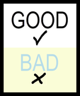
 A simple rule of thumb for both documents and web-based content — do NOT rely on color to tell the story (Comrade, 2015; Giessman, 2018). It seems counter-intuitive, but reliance on color to convey an important message can render your content inaccessible to a lot of users. In a similar vain, make sure that the colors you do use have a sufficient color contrast ratio. That means, it should be easy to distinguish your text against the color of the background. When in doubt, stick to reliable old black and white!
You can use The Paciello Group’s (n.d.) free Color Contrast Analyzer tool to check your content for compliance with basic digital accessibility standards. Also, check out Interaction Design Foundation’s (2018) Web Fonts are Critical to the Online User Experience – Don’t Hurt Your Reader’s Eyes.
Adding Captions to Videos
Video is becoming an increasingly popular platform for sharing instructional content (or for student creation of assignment presentations). Video can be highly effective in this role. But, video is an audio-visual platform. Some users may not be able to hear your narration. Others may prefer to view the content with the volume turned off. For that reason, you should ensure that your videos contain closed captions. (Matheson, 2017)
For my Two Basic Steps to Make Your Documents Digitally Accessible video, I taught myself how to use Screencast-O-Matic‘s (2019) new Captions feature to add closed captions. The following video (Screencast-O-Matic, 2018) shows how to do that yourself:
![]() Now, you may not have access to video editing software such as Screencast-O-Matic. But chances are, if you are working with video content, you will be working with YouTube (Google, 2020) as a hosting platform. YouTube has built-in tools that allow you to automatically add closed captions, to upload your own captions, and to edit them online. VidIQ (2019) has an excellent quick overview of just how to do this:
Now, you may not have access to video editing software such as Screencast-O-Matic. But chances are, if you are working with video content, you will be working with YouTube (Google, 2020) as a hosting platform. YouTube has built-in tools that allow you to automatically add closed captions, to upload your own captions, and to edit them online. VidIQ (2019) has an excellent quick overview of just how to do this:
For more closed captioning resources, check out Described and Captioned Media Program’s (2018) Caption It Yourself website.
A Quick Workaround
If you are not able to add closed captions when creating the video, one quick alternative is to prepare a document with the video’s transcript, and post a link to a PDF of the transcript along with the video. It is not an ideal solution — but for some, it is at least a basic means of providing a machine-readable way to access the content.
Digital Accessibility Cheat Sheet
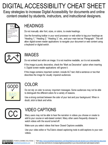
I was inspired to create this blog post when I was asked for some advice from one of my students, and then a colleague asked me if I had any good “cheat sheets” with basic Digital Accessibility tips for students or faculty. So… here is a Digital Accessibility Cheat Sheet that I put together summarizing some of the key points in this post. (Don’t worry — while this image-based version isn’t really accessible, the downloadable PDF version is!)

Download the accessible PDF version of the Digital Accessibility Cheat Sheet
More Detailed Digital Accessibility Cheat Sheets
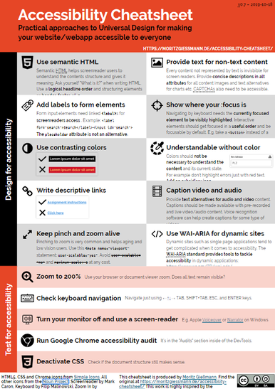
Moritz Giessmann (2019) has posted an infographic-based cheat sheet for creating accessible web-based content (don’t worry — this infographic is HTML-based, not an image file, so it is accessible itself!).

You can find a whole lot more detailed cheat sheets and resources from the following sites:
- Comrade’s AA Compliance Cheat Sheet
- Digital A11Y’s WCAG Cheat Sheets & Checklists
- Learning Technology’s The Accessibility Cheat Sheet
The following sites have even more resources, including full digital accessibility toolkits:
- Accessible Digital Documents and & Websites
- Accessibility in E-Learning
- BCampus Open Education Accessibility Toolkit
References
Comrade (2015). AA Compliance Cheat Sheet. [Web page]. https://comrade.github.io/accessibility/cheatsheet.html
Coolidge, A., Doner, S., & Robertson, T. (2015). BCampus Open Education Accessibility Toolkit. [eBook]. BCampus. https://opentextbc.ca/accessibilitytoolkit/
Council of Ontario Universities (2017a). Accessible Digital Documents & Websites. [Web page]. Accessible Campus. http://www.accessiblecampus.ca/reference-library/accessible-digital-documents-websites/
Council of Ontario Universities (2017b). Accessibility in E-Learning. [Web page]. Accessible Campus. http://www.accessiblecampus.ca/tools-resources/educators-tool-kit/course-planning/accessibility-in-e-learning/
Digital A11Y (2020). WCAG Cheat Sheets & Checklists. [Web page]. https://www.digitala11y.com/wcag-cheat-sheets/
Described and Captioned Media Program (2018). Caption It Yourself. [Web page]. https://dcmp.org/learn/213
eLearningBTC (2014, June 26). Canvas Tip #18: Using Heading tags to improve Accessibility. [YouTube video]. https://youtu.be/EN6M_Ksthms
Giessmann, M. (2019, October 18). Accessibility Cheat Sheet. [Web page]. https://moritzgiessmann.de/accessibility-cheatsheet/
Google (2020). YouTube. [Web page]. https://www.youtube.com/
Interaction Design Foundation (2018). Web Fonts are Critical to the Online User Experience – Don’t Hurt Your Reader’s Eyes. [Web page]. https://www.interaction-design.org/literature/article/web-fonts-are-critical-to-the-online-user-experience-don-t-hurt-your-reader-s-eyes
Learning Technologies (2018, November 13). The Accessibility Cheat Sheet. [Web page]. Learning Technologies at College of DuPage. https://www.codlearningtech.org/2018/11/13/the-accessibility-cheat-sheet/
Learning Technologies (2018, July 3). Accessibility Series: Creating Accessible Word Docs. [Web page]. Learning Technologies at College of DuPage. https://www.codlearningtech.org/2018/07/03/accessibility-series-creating-accessible-word-docs/
Matheson, G. (2017). 5 Reasons You Should Caption Your Videos. [Web blog post]. Access Innovation Media. https://blog.ai-media.tv/blog/5-reasons-you-should-caption-your-videos
The Paciello Group (n.d.). Colour Contrast Analyzer (CCA). [Web page]. https://developer.paciellogroup.com/resources/contrastanalyser/
Power, R. (2018, June 12). Accessibility in Online Teaching and Learning. [Web log post]. Power Learning Solutions. https://www.powerlearningsolutions.com/blog/accessibility-in-online-teaching-and-learning
Power, R. (2020, February 3). Adding ALT text in Canvas. [Video]. https://youtu.be/5wAR9OMWK78
Power, R. (2020, February 12). Two Basic Steps to Make Your Documents Digitally Accessible. [Video]. https://youtu.be/AKzuXghQFnc
Screencast-O-Matic (2018, July 19). Adding Captions on your Screencast-O-Matic Videos. [Video]. https://youtu.be/vMW4qrrFc0g
Screencast-O-Matic (2019). Video Creation for Everyone. [Web page]. https://screencast-o-matic.com/
Slade, Tim (2017, February 26). 250+ Free Stock Photos for eLearning. [Web log post]. Timslade.com. https://timslade.com/blog/stock-photos-for-elearning/
VidIQ (2019, February 1). How to Add Subtitles to YouTube Videos [New Method]. [Video]. https://youtu.be/qfJthDvcZ08
