Roberto Rocco
Abstract
This chapter addresses the roles, relationships and complementarity between text and image. It builds upon work done at the Research into Practice research group at the University of Hertfordshire (UK), which investigates issues of academic research in design-based disciplines. This text challenges the cliché that an image is worth more than a thousand words to argue that there are crucial complementary roles for text and image, in which text communicates aspects that image cannot and vice-versa.
Introduction
How many times have you heard the cliché “An image is worth more than a thousand words”? And how true! Images are powerful conveyors of narratives, and one image can tell a whole story. But somehow the cliché gives us the impression that images are better than words, and that images can somehow express more than words. But is that so? And if an image is so powerful, why do we frequently need to tell the story that images convey using words?
In architecture and planning, images are certainly crucial. Space is much better represented by images: floorplans, city plans, perspectives, elevations, axonometric views, bird eye views, sketches, collages, sections, façade views, renderings. Architects and planners have a whole arsenal of tools to represent space and convey function, aesthetic values, atmosphere and even feelings. But even the best design needs to be explained and often people are really interested in the narrative behind your design: the arguments and steps that led you to some design choices, and not to others.
The role of text and image in argument building
Arguments are very powerful. Arguments are a series of statements about facts or choices which are logically connected, intended to determine the degree of truth of a “final” statement, the conclusion. It is generally accepted that a good argument will lead you to the correct conclusion. Arguments are important because we use them to convince others about our points of view. In fact, we would not be able to live in society if we did not have arguments. This is because to live in society, we need to have shared understandings about reality. These shared understandings are arrived to using logical arguments.
Images can be arguments too! A very powerful argument against the horrors of war is a photograph taken in 1972 by Vietnamese American photographer named Nick Ut during the Vietnam war. The photo shows a group of Vietnamese children running from a cloud of smoke caused by a napalm attack by the South Vietnamese army. Behind the screaming children, are a group of South Vietnamese soldiers. In the forefront is a little boy, his face distorted by terror. Almost in the centre of the photograph we can see a girl running naked, her face also distorted by terror and pain, as she has been severely burned by the chemical agent known as napalm.
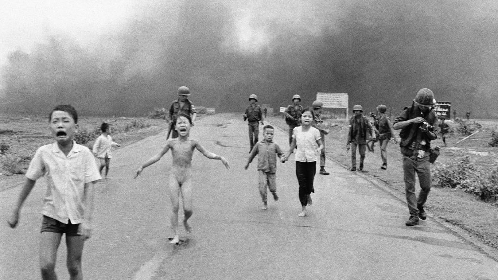
This image was a powerful indictment against the horrors of war, and its dissemination in the press helped change public opinion about the war in Vietnam. The photographer, Nick Ut, won a Pulitzer prize for this image. Today, we know that the name of the screaming naked girl is Phan Thị Kim Phúc, who now lives in Canada, having barely survived the war. But although the image itself was extremely powerful, it was the narrative connected to the image that changed the hearts of Americans, who started to withdraw their support for the Vietnam war, which finally ended with the fall of Saigon in 1975.
The role of context in text and image
Seeing the image is important, but once you see an image, you immediately start to look for the context in which the image was produced. That context will inform you about the narrative connected to the image, and the direction of the argument or narrative that image suggests. In order to find out about the context, you will generally read the caption attached to the image. That caption gives the essential information for you to know what the image is about, who produced it, the date, and generally a brief narrative about the content of the image. What is the reader seeing?
But why does the reader need to be told what they are seeing? The caption is there to eliminate ambiguities. The reader must be reassured that what they are seeing in the picture is indeed correct. Maybe the screaming girl was just angry? How do we know she is Vietnamese? Why was she running and why was she naked? The caption and the story attached to the image are made up of words. Those words are chosen to convey a message, and this message will depend on the point of view, or perspective, adopted by the person telling the story.
Is the image somehow more honest and rawer than the words? Hardly so. Images are also made up of choices and they always represent a perspective or way of looking at something. After all, if Nick Ut chose to do so, he could have focused his camera on something else. He wanted to capture that image and he chose to publish it.
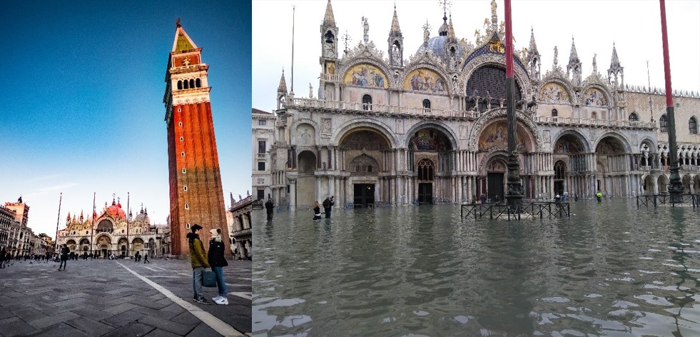
The image on the right tells us the story how the city of Venice faces the consequences of climate change and mass tourism. Photo by All About Venice – Own work, CC BY-SA 4.0, https://commons.wikimedia.org/w/index.php?curid=85827365
The role of text and image in conveying information
In the world of architecture and planning, images are rarely so distressing and sad. Instead, architects and planners need to convey technical information that will inform someone else about the exact spatial characteristics of the design they intend. Often, architects and planners will also use images to convey messages that go beyond the mere technical requirements. They also need to convey atmospheres, feelings, values and other intangible and subjective information attached to what they intend to create as outcomes of the design. As with all images, the images produced by architects and planners also need caption to eliminate ambiguities and tell the reader exactly what she or he is supposed to be looking at. Apart from eliminating ambiguities, captions also need to give information about authorship and other details, like the copyright for example.
Copyrights are exclusive rights given to the author of an image or text. Every time you write a text or produce an image, you are creating a new and original creative work (except when you are copying someone else’s work, of course). As the creator of an original work, you have the right to enjoy the fruits of your work and to have your creativity recognised. That is why it is extremely serious to use someone else’s creative work, be it text or image, without citing the source and the author. This is called plagiarism and is punishable by law in most countries.
Maps and plans are interesting cases. While they show geographical (physical) features that are measurable, they often need a key to be understandable. This is a typical case in which there is complementarity between text and image. The image shows the physical features, and the text explains to the reader what she or he is seeing, attaching a narrative and an explanation to the image. This complementarity is crucial for us. The complementarity between text and image is one of the key features in academic ways of working.
In this way, we discover that an image is worth more than a thousand words. But a thousand words are often necessary to explain the context, give a direction to the argument and let us know things that are impossible to see in the image, like the history or the causality of processes. Text also lets us know background information, such as authorship, source and method. Text and image together are very powerful tools of communication, but they need to be used wisely and in a complementary way. Images show features that text cannot show, and text explains and illuminates aspects that are not always visible in the image.
But now that we have covered the basics of the relationship between text and image, let us shift our attention to the function images and text have in academic research and the pursuit of knowledge in general.
Text and image as representation of the world
In design-based activities, such as architecture and urban design, there is a confusion about the value of the complementarity of text and image. Oftentimes, designers claim that the design “speaks by itself” and does not need, or should not need explanation. In fact, many designers find it difficult to explain their designs. This relates to one of the fundamental questions in artistic activity (Davies, 2005). Should artists explain their art? Or should they let the public interpret the art as they like? This is a key philosophical question that is often debated, and no satisfactory or final answer has ever been given. In our case, Bouwkunde [architecture and planning] is a combination of engineering, social sciences and design in which designers must cater for societal needs or the wishes of clients. In order to do so, they need to converse with stakeholders in order to understand what they want and need. So, in this sense, an architect or urban designer is very different from an artist: you will always have to explain your design choices.
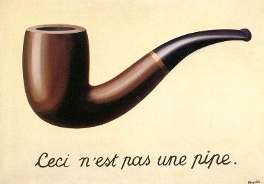
Let us look at the work of Belgian Surrealist artist René Magritte, known as “Ceci n’est pas une pipe” (This is not a pipe) painted in 1929. The real title of this work in French is “la Trahison des Images” (The treachery of images). The painting clearly shows a wooden pipe. Below the image, Magritte wrote “Ceci n’est pas une pipe” (this is not a pipe) in beautiful cursive letters. And indeed, if you think of it, this is true! What you are looking at is NOT a pipe, it is only a representation of a pipe. By the same token, the map is not a city, and the floorplan is not a house. They are only representations of something else, much bigger and much more complex. As representations of something, they are the product of human ingenuity, and therefore, the result of human choice and human expression. And as such, they are part of narratives or queries.
Audience
An important aspect of research is the language you use to communicate it: you need to use text an image complementarily, but you also need to make sure that you are using a language that your audience understands. A large part of our work as architects and designers is to make sure our audience understands the language we are using (be it natural language, graphic language or even computer languages). Understanding who your audience is, is a big step in your work. Once you know who the audience is, you can adapt your language to better communicate with them, be it via text or image or preferably a good combination of both.
Who is your audience in architecture, planning or urban design? You may think your teachers are your main audience, or even your student colleagues. But the truth is that you write and design for a much wider audience. Some images and texts are meant for expert audiences: people who know the trade, and who know the jargon. They are the insiders for whom you need to speak using specific language. But the world is not made only of experts. There are lots of people who look at architectural drawings and read architectural texts who are not architects, and yet they deserve our attention and respect: clients and (future) users, to name just two important ones. That is a delicate line you need to thread between expert and layman’s vocabulary.
Autonomy of images and texts
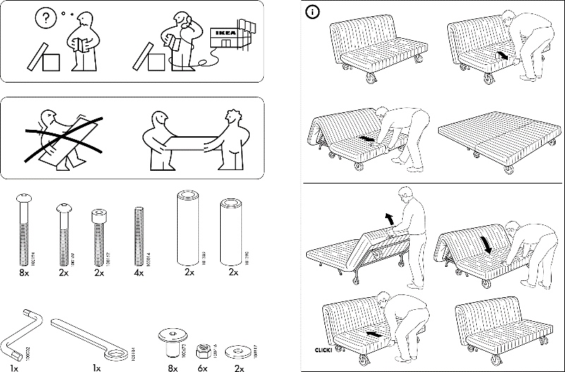
Are there examples of images that speak by themselves? Or are there examples of texts that do not need accompanying images to be understood? Sure, there are! Many people prefer to read novels that are not illustrated, so that they can form their own mental images. Biggs and Buchler (2008) use the example of IKEA furniture assemblage instructions to discuss the relative independence of images in conveying a message. The IKEA style of representation is a success story of how to use images to reach a multicultural audience, without the need to translate instructions in several languages. But it is important to remember that IKEA buyers are relatively homogeneous, insofar they recognise the furniture and the tools used to assemble it. IKEA assumes some cultural uniformity. This cultural uniformity is becoming more and more common, but as we tried to demonstrate before, there are limits to the uniformity of understanding of an image or a text. Maybe a member of an uncontacted indigenous tribe in the Amazon would not be able to understand anything from an IKEA manual, or recognise a pipe!
Text and image in research
One of the most interesting issues of our time is whether we can use images to do academic research at the university. For Biggs and Büchler (2008), academic research is characterised by four crucial attributes: question and answer, knowledge, methods, and audiences. Every academic endeavour starts with a question: what is it that I want to know, unveil or explain? Sometimes, research can be rather exploratory, but there is always a question: an enquiry or an interrogation of some sort, even if it is “what is the problem here?”
Next to this question there is always the issue of knowledge. What is it that I already know about this issue? What have others said about this issue? Can I “stand on the shoulders of giants”? (that is: build upon previous knowledge). What is the gap in knowledge I can contribute to filling? Subsequently, there is the problem of methods: how am I going to answer the question I asked at the outset? What steps will I take and what methods will I use that are able to answer the question properly? What methods will lead me to a convincing answer? Then, we come to the issue of audiences we discussed above: to what audience should I tailor my answer? What language and what kinds of images will they understand? Are they experts or lay people? Should I adjust my language to their repertory?
Understandably, designers are sometimes uncomfortable with this way of thinking. Design is a practical endeavour, where creativity plays a major role. And by the way, there is no one way to answer to a client’s request: the designer is free to explore alternative answers through different forms, colours, and materials. Designers are not always comfortable explaining their approach or methods: design is a cyclic and iterative set of activities in which smaller steps and sub-activities are intertwined in reiterating questions and answers.
But even the best designers know that they need to explain their design choices and justify them. In order to do that, they will frequently make use of research on materials, colours, proportions, construction methods, climate, light and so on. Oftentimes, designers will have to justify their choices presenting some sort of argument, based on knowledge they have acquired through their research. This evidence-informed justification is often made using text and image together, in a complementary way. Alternatively, designers may develop a poetic or idealised narrative in which their design decisions are justified in terms of beliefs and most particularly, in terms of creativity. Other times, designers validate their choices using their values to justify design choices. For instance, you wish to design a school without doors and locks, because you believe education should be open and democratic. Most probably the motivations (technical, artistic or value-based) are presented together, in a narrative. This narrative is made of texts and images, complementing each other.
Advice
In the discussion about research by/for/on design, despite the centrality of image, text has a vital role in all the steps of the design process. In this respect, rather than focusing on the independence of image from text, I encourage you to think of them as complementary and mutually supporting. Additionally, I would like to make a plea for the need for critical thinking, “the intellectually disciplined process of actively and skilfully conceptualizing, applying, analysing, synthesizing, and/or evaluating information gathered from, or generated by, observation, experience, reflection, reasoning, or communication, as a guide to belief and action” (Scriven & Paul, 1987, website). In order to do this, you need to use all the tools at your disposal. Text and image are both elements in this process and the outcomes of it. They work together.
bronnen
Biggs, M., & Büchler, D. (2008). Eight Criteria for practice-based research in the creative and cultural industries. Art, Design and Education in Higher Education, 7(1), 5-18.
Davies, S. (2005). Beardsley and the autonomy of the work of art. The Journal of Aesthetics and Art Criticism, 63(2), 179-183.
EAAE/AEEA (2011). “Research by design: definition.” Available at: http://reseaaerch.wikidot.com/research-by-design. Accessed on 1 March 2020.
Scriven, M., & Paul, R. (1987). Critical Thinking as Defined by the National Council for Excellence in Critical Thinking, A statement by Michael Scriven & Richard Paul at the 8th Annual International Conference on Critical Thinking and Education Reform, Summer 1987. http://www.criticalthinking.org/page.cfm?PageID=766&CategoryID=51
