12.3 Formalist Analysis: Descriptive Summary
A formalist analysis of a visual work is grounded in a descriptive summary of its components. In art, these components are called art elements. The ways in which the art elements interact depends upon how the artist uses the elements, based upon the principles of art. In an art class, you would get an in-depth explanation of art elements and principles; however, for our purposes in Composition class, it is fine to have a general overview.
There are seven art elements
- Line: Line is a point moving in space. It is one-dimensional.
- Shape: Shape is two-dimensional.
- Form: Form is three-dimensional.
- Space: Space refers to how the painting is composed. Space is the amount of canvas that the subjects/objects in the paintings take up, as well as the distance in the areas in-between and around the painting’s subjects/objects as well.
- Texture: In painting, texture is usually created depending upon the size of the brush and brushstrokes.
- Color: Color refers to the hue of the paint.
- Value: Value refers to how light or dark the hue is. Intensity refers to how bright or dull the hue is.
There are six art principles
- Composition: Composition relates to how the artist uses the space of the canvas and where the artist places the subjects/objects in the painting.
- Balance: Balance also relates to the use of space, specifically to symmetry and harmony as far as the subjects being evenly placed in the painting.
- Proportion: Proportion is about the size of the objects, especially in relationship to each other.
- Depth and Gradation: Depth is the illusion of perceived distance from foreground to background. Gradation refers to a shift in color depth.
- Variety vs. Unity or Repetition: This principle can apply to any of the elements. Is that element used consistently or does it vary within the painting itself?
- Movement and Rhythm: Movement is the illusion of action in a painting. Rhythm is created by repetition and variety.
To better understand these elements and principles, let’s apply them to several examples.
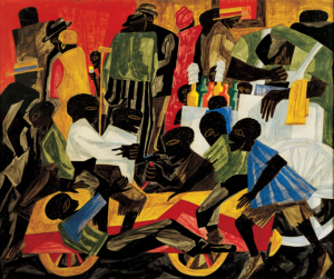
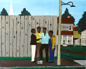
Line, Shape, Form and Movement
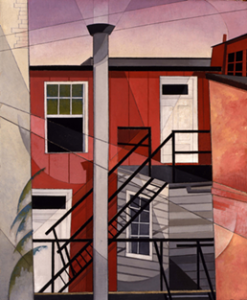
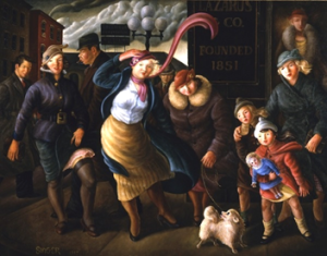
The two photos above are paintings in the Columbus Museum of Art. In many ways, these paintings have the same art elements and their artists were applying the same art principles to their creations. They are both snapshots of Midwestern city life in the 1920s-30s, they both have the same color palette, and both compositions are packed with so many subjects/objects that the canvas frame doesn’t contain them all. However, the sense of movement could not be more opposite.
The reason the art principle of movement is realized so differently in these paintings has to do with art elements of line, shape, and form.
The easiest way to identify the artist’s use of line, shape, and form is to look for T-lines and S-shapes.
Study the images closely. Where do you see “T’s” in the painting on the left? Where do you see “S’s” in the painting on the right?
Generally speaking, T-lines create a sense of stillness and S-shapes create a sense of movement, and that is true of these paintings as well.
Writing about line, shape, and form can be tricky. Most paintings are two-dimensional and static. Any sense of dimensionality, depth, movement and so on are illusions. When we analyze art, though, we want to be aware of how the illusions of dimensionality, depth, and movement are created.
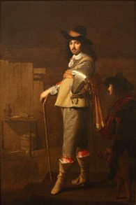
Now that you have had an introduction to writing about line, form, and shape, apply the same analysis to the two paintings below. Both paintings are set in France, both paintings participate in the same color palette (blue, yellow, green, white, black), but there are significant differences when it comes to the use of line and shape.
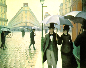
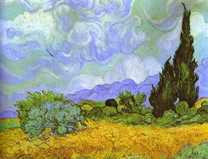
Where do you see “T’s” in the paintings? Where do you see “S’s”? Which of the paintings has more movement? How can it be the case that the Van Gogh painting has more movement than the Caillebotte painting when the Caillebotte painting depicts people walking?
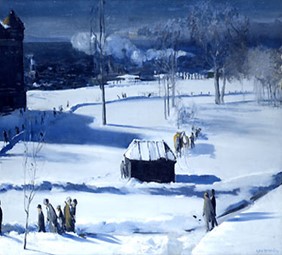
Texture, Movement and Rhythm
Here are two paintings depicting scenes that we are all too familiar with in Northeast Ohio: snowstorms and their after-effects. How is the sense of movement created in Childe Hassam’s painting and, by contrast, how is the sense of stillness created in George Bellows’ painting?
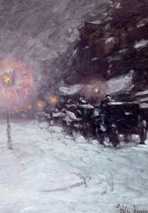
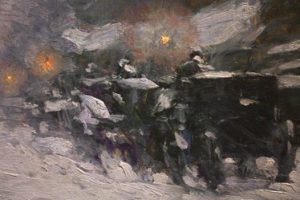
In addition to T-lines and S-shapes, Hassam is using the art element of texture to create the effect of movement and rhythm. A close-up shows you not only Hassam’s wavy S-shapes but also how thick the paint is and how recognizable the brushstrokes are.
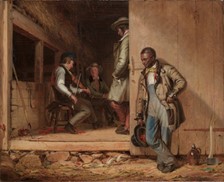
Composition and Balance
Composition refers to where the artist places the subjects/objects on the canvas frame. Balance is the art principle that refers to symmetry or harmony within the composition. Below are two paintings that depict another type of scene we are very familiar with in Northeast Ohio: farms.
To write about these paintings, summarizing the subjects/objects and describing the artist’s treatment of the principles of composition and balance, you would probably think of the space on the canvas as divided horizontally into three sections: center, bottom, and top. You could also divide the composition vertically into halves and analyze the left side and the right side.
In which of the paintings does the composition seem the most balanced? You would probably say the one on the left.
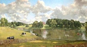
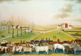
In John Constable’s painting, the cows and the stream are evenly spaced horizontally across the center of the canvas, and the objects in the painting reflect each other spatially: the fluffy clouds at the top of the painting are mirrored in the fluffy trees in the center of the painting, all of which is reflected in the stream. By contrast, in Edward Hicks’s painting, the animals are crowded into the lower third of the painting. The composition of Hicks’s painting is also imbalanced if analyzed horizontally as well: the left side of Hicks’s painting has trees and more structures in contrast to the right side of the painting.
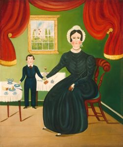
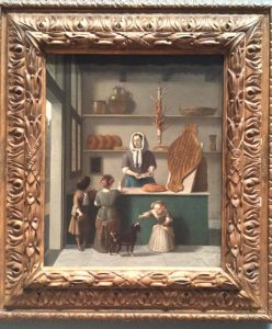
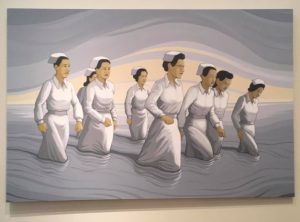
Proportion, Depth, Variety and Unity
Proportion refers to the size of the objects in the painting, relative to each other. In the painting below, the proportion is varied. Not only is the person in the foreground out of proportion with the person behind her, but her hands and feet are out of proportion with her body. The depth is varied as well. The depth of the floor on the right side of the painting is not in unified with the shifting horizon line on the left side of the painting. (What is the center table resting on?). What else do you see as far as proportion and depth being varied rather than unified in this painting?
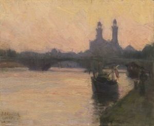
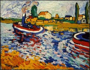
Color and Value
If we did not have the titles of these paintings to point out that they are the identical scene—boats along the Siene River, we would never think of these artworks as similar. Although they are the same color palette, there is such a significant difference in the value and intensity of the colors. What other art elements are different between these two paintings?
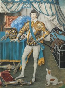
Line, Shape, Form, and Movement
The two paintings below both depict similar scenes, and the color hue and intensity are the same in both paintings—deep yellow, blue, red, white, green, brown, and black, but there are differences in the sense of movement in these paintings. How are the differences created? Using which art elements? What additional differences do you notice between the paintings?

What to Note When Analyzing a Painting
The following checklist can be helpful when preparing to write about a work of art.
- Identify the title, date, medium, and dimensions of the work.
- Identify the artist and the dates of his or her life.
- Identify the literal objects in the painting (e.g. trees, children, river, birds, etc.)
- Describe the artist’s use of various art elements: line, shape, form, space, texture, color, value
- Describe the artist’s use of various art principles: composition, balance, proportion, gradation/depth, variety vs. unity, movement and rhythm
How to Structure Your Descriptive Summary of a Painting
After you have taken key-word notes on the painting you have chosen, when you write out your notes into prose, you should structure your writing in a way that corresponds with the structure of the painting.
That order might be:
- left to right,
- center out,
- foreground to background, or
- bottom to top
Descriptive Summary Exercise
Now that you’ve learned some strategies and techniques for looking closely at a painting, try applying what you’ve learned and write a short descriptive summary of one or two paintings. All major museums have images of their collections online, or your instructor may encourage you to visit a nearby museum. LCCC’s art gallery has multiple exhibits throughout the year.
Here are some useful links:
- Beth K. Stocker Art Gallery at Lorain County Community College
- Allen Memorial Art Museum at Oberlin College
- The Cleveland Museum of Art
- The Columbus Museum of Art
- National Gallery of Art, Washington DC
In addition to the art collections above, here are images of eight paintings, meant to inspire comparison, analysis, and discussion.
Pair #1
Pair #2
Pair #3
Pair#4
Continue Reading: 12.4 Analyzing Advertisements: Descriptive Summary and Rhetorical Analysis
