48 Visual Rhetoric
What is visual rhetoric? To briefly answer this question, let’s first unpack these two terms. Rhetoric, as we defined earlier in this chapter, is the art of persuasion; we use it every day to communicate in ways aimed at convincing other people to go along with our ideas (or at least to consider them). By “visual,” we mean “the cultural practices of seeing and looking, as well as the artifacts produced in diverse communicative forms and mediums” (Olsen et al, p. 3). In other words, “visual” refers not just to what we see (“artifacts” such as cartoons, memes, movies, photographs, posters, fonts, symbols, icons, and colors), but how we see (for example, we may or may not associate red-white-and-blue with the U.S. flag and patriotism, depending on our cultural background and beliefs). By visual rhetoric, then, we mean the many ways imagery is used to communicate, create meaning, and compel us to think, feel, know, and act.
Let’s carry this thought a little further. In the study of visual rhetoric, we acknowledge that “images have power” (Sheffield), and we ask, “How do images act rhetorically upon viewers?” (Helmers and Hill 1). We explore the influence that visuals have on us and our audiences, and we recognize that visuals produce rhetorical effects; they use ethos, logos, and pathos appeals to influence an audience.
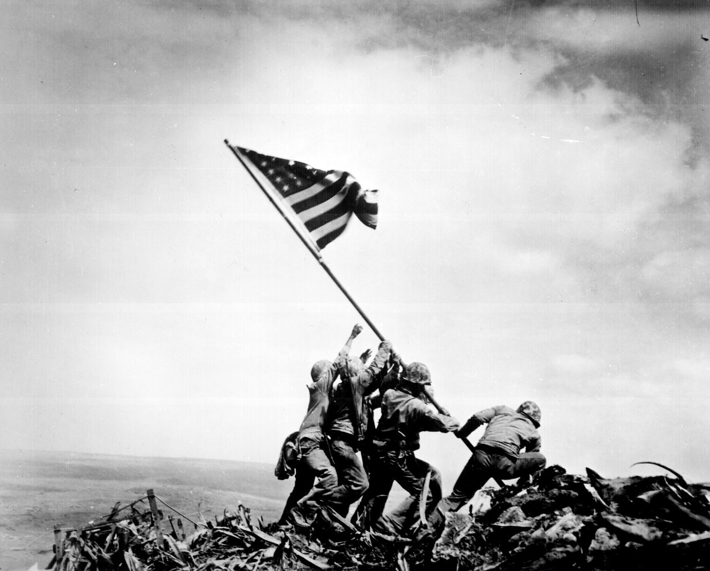
Visual rhetoric scholars Helmers and Hill, for example, mention a wide variety of examples: cave art, Egyptian hieroglyphics, stained-glass windows in churches, World War II posters, editorial cartoons, motion pictures, charts, graphs, and so much more. They point out the power or influence of some of these visuals, like Thomas E. Franklin’s 2001 photo, Firefighters at Ground Zero, taken the day after the World Trade Center collapsed. The photo shows firefighters raising a fallen flag on the rubble-strewn site. Helmers and Hill point out how such visuals communicate to us culturally and intertextually; that is, Franklin’s photo reminded some viewers of a now-iconic photograph and sculpture of the U.S. Marines raising the flag on Iwo Jima during World War II; even if some viewers did not “get” the reference, the centrality of the flag in the photo and the firefighters’ upward gaze communicated what the photographer called “the strength of the American people” (7). That emotional effect, Helmers and Hill explain, was reinforced by widespread distribution of the photo by news media as well as its cultural context (i.e., how many viewers connected it to the war-time, Iwo Jima photo).

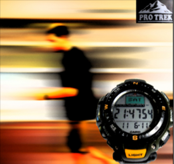
Of course, visual rhetorics draw our attention to more than emotional responses and cultural contexts. In “Breaking Down an Image,” for example, Jenna Pack Sheffield outlines how such elements as fonts, arrangement, colors, and more relate to purpose, audience, and context—the rhetorical situation, in other words. To illustrate, Sheffield displays an advertisement for a men’s watch:

She points out such key visual elements as the arrangement, color, fonts, and scale of images and text in relation to one another. The ad displays a close-up view of the watch in the bottom-right corner, the brand label in the upper-right corner, and, in the background, the blurred image of a man running. Look closely, and you can see the faint outline of a watch on his wrist. Each detail creates meaning and in some way creates an overall impression while also supporting the ultimate purpose (to sell a watch). For example, Sheffield says of the font choice in the company logo:

A “silly or playful font” might be more suitable for a kid’s watch, but such a choice would not support the overall purpose of the ad, its likely adult audience, or the ethos (character) of the company (or at least, the character it is trying to convey by choosing a strong, bolded, ALL-CAPS font); nor would it support the intended pathos (the “strong, serious, font type,” which Sheffield points out, playfully).
Why pay attention to details in visual artifacts? Sheffield explains that by noticing each element and understanding its possible individual and combined effects on the target audience, we can “break down” a visual. That is, we can analyze it. Think back to Chapter 3’s description of an analysis, which aims to describe the content of an artifact, analyze it (identify its key parts), and evaluate it. If we were analyzing the Pro Trek ad for a writing assignment, for example, we would work our way through these steps. We would also ultimately ask critical or evaluative questions such as: What details draw our attention first, and why do we think that is so? Sheffield mentions that in Western cultures, we read left to right, top to bottom; therefore, the order or arrangement of elements makes a significant difference to how we interpret an image.
Other questions we might ask include:
- Does the chosen font communicate something important to the overall purpose?
- What overall effect or effects do the colors create?
- Is it significant that the man’s image is blurred while both the logo and the watch itself are in focus?
- Overall, is the ad effective, and what evidence supports our assessment?
These questions are just a few critical or analytical explorations we might consider. For a full analysis of the ad, we would also likely consider what we know about the company, its products, and its customers. What is the company ethos or character?
By breaking down or analyzing the advertisement in such ways, we move toward synthesis. That is, we start making connections between the visual details, showing how they relate to each other and how they make the advertiser’s case (or not). Communication teacher Steve Covello explains visual rhetoric this way:
Visual rhetoric draws upon the rhetorical traditions found in oral and written rhetoric and operates to achieve the same effect on human perception. [Humans] communicate using a combination of codes, symbols, analogies, and discourse to form a shared reality.
In other words, visual rhetoric helps us consider the meaning behind what we see.
Attributions
“Virtual Communication” (COMM543 – 21ST CENTURY COMMUNICATION), Steve Covello, CC BY-NC 2.0.
“Breaking Down an Image,” Jenna Pack Sheffield, CC BY-NC-ND 4.0, https://writingcommons.org/authors/jenna-pack-sheffield/.
