4
Color Contrast Checklist
|
The first time I learned about color contrast, I was about 5 years old. I was in my dad’s car, the top was down, and it was a beautiful summer day in Massachusetts. We stopped at a light and had a conversation that went something like this:
“Blow out the red for me because this is stop is too long” dad said.
“O.K., Dad. Ahhh phooooo ahhhh phooooo ahhhh phoooooo phooooo”
“Great – look you did it! You turned it green for me! Thanks for being my helper. Did you know I can’t even see the difference between green and red?”
“How do you tell when to go then?” I asked.
“I was taught in drivers ed class that the red is on top, the yellow in the middle and the green on the bottom. I know when the middle light is bright and lit up, I have to slow down because the red is coming. And when the top light goes on, I stop, and when the bottom light goes on, I go.”
Every time after that conversation, when I would again blow out the red color to turn it green, I thought I was helping my dad navigate the world a little bit better. Even then, I was concerned with the abilities of others. Contrasting color is a matter of both aesthetics and accessibility. We can check if two colors have enough contrast on the web by using some websites and digital tools like the chroma palette helper.
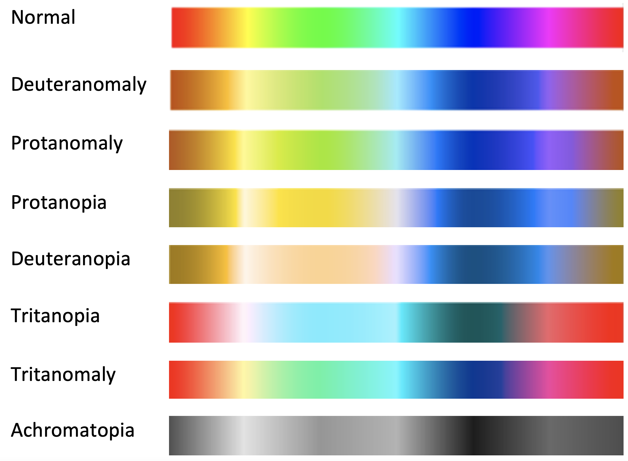
In undergrad, I was trained to see contrast by eye. You can master eye training, but it takes several years, so until then, it’s best to rely on the available resources. I tell my students that one way to visually check their color scheme is to take these two colors and convert them to grayscale and see what happens. If both colors appear close in value, then you will know they do not contrast effectively. Both colors will be grey, but if one is very dark and one is light, you are probably OK. If they are too close, it is not a good solution. Red and green are the same value on the color wheel. Value is the degree of how light or dark a color is. So, while they are complementary colors (opposite on the color wheel), they are not a good match. In the image on the left, the red ornaments are hard to see against the green tree because the value is too close. The full-color image is also problematic for those with color impairment.

There are several types of color impairment, most notably Protanopia, Protanomaly, and Deuteranopia. Red-green color impairment, in which individuals have trouble seeing the differences between red and green, is the most common. An example of how people perceive color, according to what type of color impairment they have, is provided below.
Selecting color can be challenging since what works for one population may not work for another. Color combinations that cause vibrations to occur can trigger migraines and seizures for instance. If customization can be built-in use it to attend to the varying needs of your learners. Adjusting the lightness and darkness on a monitor is one way to adjust color for individual needs. Photosensitive epilepsy, although uncommon can leave learners feeling disoriented, uncomfortable, or unwell. Be careful with patterned effects like white repetitive bars on a black background or red and blue patterns. Excessive use of red and blue light can cause headaches while green is least likely to cause them.
How to decide on what colors to use
How can a course designer make informed decisions on color when there are conflicting needs? How does one prioritize what colors to select to meet the needs of the learners? For one, have a conversation with your subject matter expert and your learners if possible. Test your choices with them and take note of the feedback. Speak with other course designers and read more about the topic. If you are both the subject matter expert and designer and you can’t meet your learners ahead of time, make sure to send a survey on the first day of class as well as the last day of class to gauge the experience of the user. Surveying students is a solid practice in general because it allows us to constantly improve and reiterate while keeping on top of the needs of our learners.
Displaying data
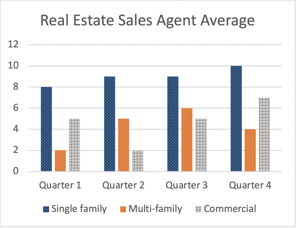
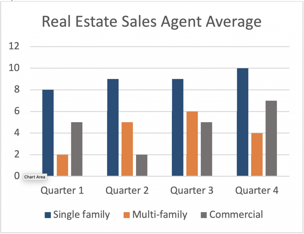
One way instructional designers and data visualization professionals use contrast in color is in the use of charts, graphs, and infographics. We may use different colors to call out a trend we see in some data or to represent a sample in a study. Color contrast in data vis will enable your viewer to differentiate the variability and be able to grasp the concept faster. In the two figures below, you can see the difference between the bars with high contrast versus low contrast. The grey and blue are too close in value, yet the orange is much brighter and can be seen in comparison with the blue or grey which are darker. The second chart uses color and pattern which helps differentiate data and makes it more accessible to the color impaired. The solid-colored bars in the first chart only use color to differentiate data. Color is commonly used in data visualization, but it needs to be used correctly
Hue
The perception of color uses three parameters including hue, chroma/saturation, and tonal value/lightness. Hue is the true color on the color wheel with no tints or shades. Hue is the degree to which a color can be described as red, orange, yellow, green, blue, indigo, or any combination thereof. Hue is the way we describe color in qualitative terms.
Hue can be adjusted to increase contrast. So, in the case of red and green, I always advise never to put red text on a green background. But, if this absolutely must occur, and your client insists you use this terrible combo, you would want to make the green a very dark shade and the red a very light and bright one. Otherwise, the Protan color-impaired person cannot detect the difference in color and cannot read what you typeset.
The program Adobe Color has an interactive color wheel with all the hues, tints, and shades. You can move the handles and create selections with high contrast by selecting a color that is perhaps complementary (opposite sides of the color wheel) or by using the tint or shade of a chosen color. Contrast is our goal, and the greater the contrast, the more accessible it is.
Chroma/Saturation
The second parameter for describing color is chroma/saturation. A photo with no saturation would be in greyscale. Fully saturated images are the most vivid. We can pull out the saturation in one part of the image to contrast it with another. The image below can be seen by everyone and the vividness of the character in the foreground allows the learner to zero in on the scene without being distracted by what is going on in the background.


The image on top feels cluttered and the user doesn’t know where to look first. The hand is placed in a way that leads you in but you can’t help but rest on the other characters after viewing the woman in the foreground. This image on the right highlights the character who is speaking and allows the viewer to peer into a slice of life of the main character who is clearly shown using contrast.
Tonal Value/Lightness
Tonal value/lightness is the third parameter for how we describe color. We can adjust the tone or lightness to add more contrast. I always tell my students that if they are unsure if a color-blind person can see their image, turn it into greyscale and analyze the values. Do you see a big difference in the image between the darker areas and the lighter ones? Or do they seem like a muddy arrangement of similar greys? If it’s the latter, I have them adjust the brightness contrast in the image so that the highlights are lighter and the low lights are darker, thereby creating more contrast. If you look at the same image in full color and then at the one I created with color and black and white, you will see that the reason the chairs are a dark grey (almost black) and the table is almost white in the black-and-white version is because the tonal value/lightness was at the correct level for sufficient contrast. Tonal value can range from 100% black to 100% white, and everything in between. Complementary color combinations are often the best choices, except for red and green, which have a similar tonal value. Purple and yellow are an excellent combination because the two colors have very different values. The yellow is obviously brighter and lighter than the purple and it is a great combination for a variety of reasons, the most important being contrast.
Digital Color Contrast Checkers
Several color contrast checkers are available online. This section outlines some of the most popular checkers at the time of publication.
A11y color contrast checker
- Free color contrast analysis tool for webpages
- Contrast checker to test color pairs
WebAim contrast checker
- Foreground and background color checker
- Normal & Large Text checker
- Graphical Objects and User Interface checker
- Link contrast checker
tpgi
- Compliance indicators for Web Content Accessibility Guidelines 2.1 (WCAG 2.1)
- Multiple ways to select colors: you can manually enter CSS color formats, use an RGB Slider, or opt for the color picker tool
- Color Blindness Simulator
- Support for alpha transparency on foreground colors
WAVE
- Firefox and Chrome extensions are available
- Identifies accessibility and WCAG errors
- Facilitates human evaluation of web content
- Pope Tech accessibility tool for large scale
According to A11y, there should be a minimum ratio of 4.5:1 for any visuals that contain both text and images or text against a background color. Additionally, large text that is 18pt or higher (or bold text that is 14pt text or higher) only requires a contrast ratio of 3:1. According to W3.org, the visual presentation of text and images of text has a contrast ratio of at least 4.5:1, except for the following:
- Large Text: Large-scale text and images of large-scale text have a contrast ratio of at least 3:1;
- Incidental: Text or images of text that are part of an inactive user interface component, that are pure decoration, that are not visible to anyone, or that are part of a picture that contains significant other visual content have no contrast requirement.
- Logotypes: Text that is part of a logo or brand name has no contrast requirement.
Contrast vs Luminance
There is a difference between high contrast and high luminance. Read the below text and visual examples taken from the W3C website and think about how companies can offer choices and customization to provide access to all learners. Some people cannot read the text if there is not sufficient contrast between the text and background: for example, light gray text on a light background. For others, bright colors (high luminance) are not readable; they need low luminance. High contrast (for example, dark text on a light background or bright text on dark background) is required by some people with visual impairments, including many older people who lose contrast sensitivity from aging.
Light grey on white
Yellow on black
Black on white
Beige on black
Black on beige
Light grey on black
While some people need high contrast, for others — including some people with reading disabilities such as dyslexia — bright colors (high luminance) are not readable. They need low luminance.
A word about software
Color contrast can be adjusted in most software programs and Learning Management systems. Below is a shortlist of resources where you can find out more about doing general accessibility checks using, organized by category. This is not a comprehensive list, but a beginner companion to your digital accessibility journey.
Learning Management Systems
- Canvas accessibility checker
- Blackboard ally resource
- Brightspace D2L resources
- Moodle Accessibility Info
Content Management Systems
Word Processing Documents
- Microsoft Word Accessibility
- Google Docs Accessibility Resource
- More Google Resources
- Google Sheets Resource
Spreadsheet documents
Presentation documents
Suggested guided questions/projects to assess your understanding of color contrast:Selecting colors based on contrast alone isn’t always the best strategy. What may be considered high contrast and effective for people with visual impairments may be detrimental to people with cognitive impairments.
Color can affect learners psychologically. Consider how our choices can negatively impact students. Researchers discovered that subjects performed 5-10% better on pattern recognition tests when implemented in color. The study suggested that the use of color improves learning and memory over time but only when it was considered “realistic” versus “random”. When the objects in the pattern recognition test were designed in randomly selected colors there was no improvement of pattern recognition or memory.
|
