2
Before we begin talking about how to improve graphic design, we have to focus on designing inclusively. This means going through the first part of the checklist that focuses on Digital Accessibility, then planning your process for designing your course and e-learning, using the parameters in that section. If you would prefer, select a font that is a standard default accessible font at first.
Unfortunately, there is conflicting literature on accessible fonts. In the typography section, I go over several nuances related to this topic, but the most important thing to keep in mind is to design in context and with and alongside your learners. Test your choices with learners of varying abilities including those that have low vision, color impairment, and dyslexia.
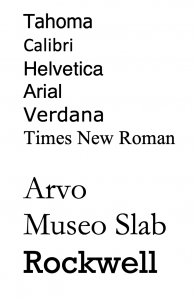
On theU.S. Web Design Standards (USWDS) webpage there are a recommended set of legible open source typeface recommendations which includes Source Sans Pro, Merriweather, Public Sans, and Roboto Mono. Later in the book, I will discuss what makes a font legible and reflect on how to tell if a font is performing well at varying sizes. I will also dive into the ways some fonts have certain letterforms that can be confused with others and discuss how mirroring comes into play as well. Different sources say different things about fonts and accessibility. For example, the website Siteimprove (which is a company that helps identify accessibility errors on websites ) claims that Tahoma, Calibri, Helvetica, Arial, Verdana, and Times New Roman are accessible body copy fonts to use and that Arvo, Museo Slab, and Rockwell are good choices for headings.
This list is not exhaustive, but it is a start. As you comp up your design, select one of these fonts as you focus on putting all the pieces together. As you learn more about typography later on in this book, you may change your selection. For example, there is conflicting research on what font is best for dyslexic students so making sure to design with your learners is key. You can choose to use black-and-white first on all your designs before making decisions about color. When you have your course mapped out and prototyped in this way, and know it is fully accessible to all, then you can read the chapters on graphic design theory and start to be more daring, and bold (but on brand) with your choices. It is easier to make minor changes after we know the content is accessible versus designing for aesthetics first and then going back to make sure we checked all the accessibility boxes. That being said, if you are designing with strong visual theory, it will be more accessible than if you were not, however, there may still be changes to consider.
Typography is a complex topic because to truly understand its magic one must embark on a journey of learning not only the anatomy of type, but also how to identify different font categories, how to combine fonts, the psychology of fonts, kerning, tracking, line length, leadings and more. It may take multiple iterations to get the type right. Just know that graphic designers everywhere sit and tweak and adjust their designs ad nauseam. It’s understandable to be a bit of a perfectionist when it comes to fonts and design in general. You may want to prototype a variety of accessible options to show your client or SME before committing to the typography choices for the rest of the course. Before we begin the next chapter, take a look at the first part of the checklist below. After the first part of the checklist is displayed, you will be able to read more in-depth about the details of each line item below it, which ensures that you become more familiar with the terms and tasks.
Throughout this book, we talk about how to create aesthetically pleasing online courses that reduce cognitive load by using both instructional design and graphic design theory. Part of the reason I became so passionate about instructional design was the need to help improve learning. And I was curious as a professor how I could re-design or develop my online courses so that all my learners became more engaged. There were times I felt that, because of the way the course was designed, the user experience was poor and the user would struggle to get through the materials. When I had a student with disabilities, this phenomenon became more pronounced. I found myself recording extra screencasts and tutorials to help students navigate the classroom and to understand the assignments. The content wasn’t always accessible and I didn’t always know when my students had a disability. Or, if I did, I didn’t know what it was. It made it difficult to reach everyone and I felt the stress and pressure of retention in a system over which I had little control.
When I began adding instructional design capabilities to our business, I was able to apply learning theory, graphic-design theory, and digital accessibility research. That helped me to design courses that were inclusive right up at the front, vs trying to make workarounds within a poorly designed module. Digital accessibility must be at the core of how we design learning experiences for our students. The work we do to make learning accessible is not only good for one: it is good for all.
WebAIM, W3 & A11y
According to the World Wide Web Consortium’s Web content Accessibility Guidelines (WCAG), digital accessibility refers to the inclusive practice of removing barriers that prevent interaction with, or access to websites, digital tools, and technologies, by people with disabilities. The W3C, or World Wide Web Consortium is an international group that sets guidelines to make digital content accessible to everyone of all abilities and disabilities. They produce a technical standard of Web content-accessibility guidelines that help improve accessibility and reduce barriers. According to the World Bank (2021), more than a billion website users are affected by impairments that prevent them from fully gaining access to crucial information posted online – including in the very courses you may be tasked with creating.
Fifteen percent of the world’s population has experienced a disability (World Bank, 2021). This is partly why there are design standards to keep in mind the many ways disability can present itself including vision, hearing, and cognitive disabilities, plus the full spectrum of neurodiversity. Remote learning benefits students with disabilities. Students who are hard of hearing can get captions and transcripts for videos which are preferred over an in-person lecture experience. With online learning, students can get access to all the educational materials they need from the comfort of their home which reduces the hassle for mobile-impaired students. As we design courses, we can make choices that enhance learning and reduce barriers.
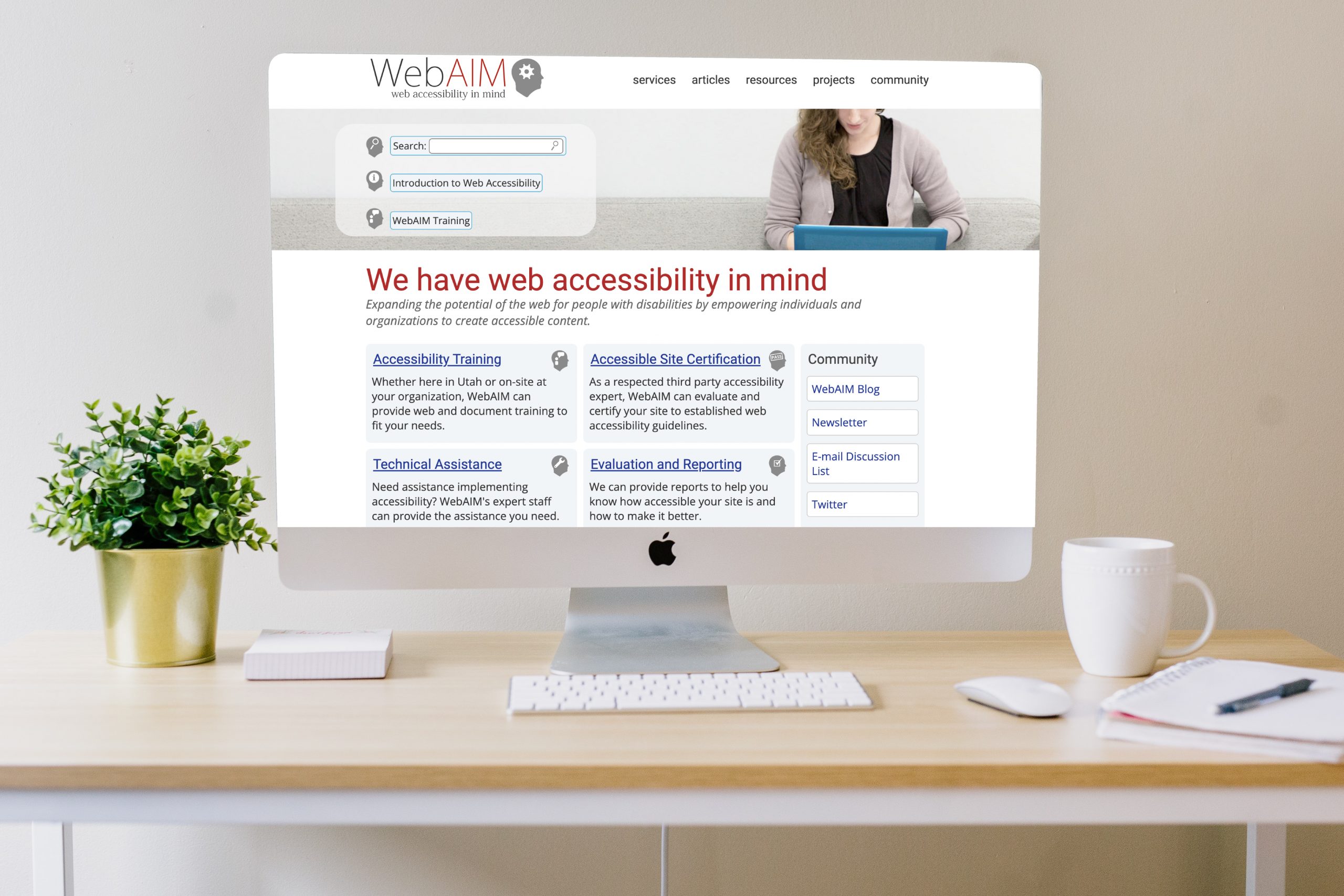
WebAIM (Web Accessibility in Mind) is another useful website to take a deep dive into digital accessibility. WebAIM is a non-profit organization based in Utah that has provided web accessibility solutions since 1999. WebAIM’s mission is to expand the potential of the web for people with disabilities by providing the knowledge, technical skills, tools, organizational leadership strategies, and vision that empower organizations to make their own content accessible to people with disabilities. One of the most helpful tools that WebAIM provides is the Wave Accessibility Tool. This free, online tool provides visual feedback of a page’s accessibility so that if you are analyzing the digital accessibility of a browser-based course or online curricular material, you can do so quickly and effectively.
A third important online resource to look closer at is the A11y website. The A11Y Project is a community-driven effort to make digital accessibility easier. The website explains the various levels of WCAG compliance A, AA, AAA and includes its own detailed checklist to verify compliance and explains in-depth the main areas of accessibility. The A11y website is dynamic, continually adding resources and information on digital accessibility and a great resource while looking to improve access to your courses and materials. The digital accessibility section of the checklist in this book takes some of the most important key items from WebAIM, W3.org, A11Y, and other resources to compile a simple list that relates to graphic design and e-learning specifically. Automated checkers that scan for accessibility issues are available in many programs but they aren’t perfect.
| I would say overreliance on automated checkers and tools that scan for accessibility errors. While they are good – and getting better – they should not be considered a failsafe. They help inform and guide the developer, but only proper training will ensure the content truly meets minimum accessibility standards. Moreover, the error mitigation process may require more than casual proficiency.
|
Be sure to test your content with your learners and don’t be afraid to iterate as you receive feedback. Beta testing is a great tool and way to find out how learners are experiencing your online course. Be sure to include a diverse group of learners in your beta test. What can be good for one group may not be good for another. For example, a font that is better for the visually impaired may be detrimental to people with dyslexia. There is extensive and sometimes conflicting advice about digital accessibility found online so the best advice is to take it slow, consider context, and remember it is near impossible to be 100% accessible to the entire population. Instead, you want to aim to improve accessibility and always design for a wide variety of learners. Later on, in this chapter, I give you some possible learner profiles that could potentially be in your classroom so that you can consider these varying diverse needs when you plan your designs.
Come up with some possible diverse learner profiles to brainstorm ways in which you can improve the lives of all your students. Writing down a list of the types of students you have had in your class could be helpful and speaking with faculty about the types of students they have had will aid in the formation of this list.
You can also consider the range of learners and potential populations in your classroom when you design by analyzing the statistics of adults that live with a disability. The following stats are US-centric but similar data is available in many countries around the globe. The following statistics are taken from the CDC.
61 million adults in the United States live with a disability
- 26 percent (one in 4) of adults in the United States have some type of disability.
- The percentage of people living with disabilities is highest in the South.
Percentage of adults with functional disability types:
- 13.7 percent of people with a disability have a mobility disability with serious difficulty walking or climbing stairs.
- 10.8 percent of people with a disability have a cognition disability with serious difficulty concentrating, remembering, or making decisions.
- 6.8 percent of people with a disability have an independent living disability with difficulty doing errands alone.
- 5.9 percent of people with a disability are deaf or have serious difficulty hearing
- 4.6 percent of people with a disability have a vision disability with blindness or serious difficulty seeing even when wearing glasses.
- 3.6 percent of people with a disability have a self-care disability with difficulty dressing or bathing.
Disability and communities
- 2 in 5 adults age 65 years and older have a disability
- 1 in 4 women has a disability.
- 2 in 5 non-Hispanic American Indians/Alaska Natives have a disability.
One way to build inclusive designs is to research, implement and revise as you go. I am also a fan of building products and tools with full customization options, allowing the user to select what they need to gain access. Things like captions and dark mode and large font settings should be able to be toggled on and off for a fully customizable experience. No matter what your role is currently, if you are new to digital accessibility, start small and slowly build your knowledge and skillset as you go. The next few chapters will offer some guidance and a place to start but it is by no means a comprehensive list of ways to improve the course content. The good news is that even small changes can “cultivate a more inclusive, accessible, and equitable community for everyone” (Accessible U., n.d.).
What are your recommendations for people who are just starting out in their quest to improve digital accessibility?Whether you are new to accessibility or a seasoned practitioner, you likely already know one of the most powerful tools at your disposal: default states. There has been a lot of research recently about the use of “dark patterns” in web and interface design: subtle cues that frame user choices in order to push them toward desired outcomes. The more positive counterparts to dark patterns are what we can call “virtuous requirements.”Most people—learners, instructors, designers, organizational leaders—are uncomfortable with complete freedom in their systems and interactions. Say “here is a completely empty learning-management-system (LMS) shell,” and instructors will turn to frameworks, patterns, and ways of interacting with which they are already familiar. In your work with “empty” spaces like learning management systems, communication software, productivity tools, and the like, make time to create a default structure that is inclusive and accessible. For instance, in your LMS, populate each empty shell with a regular folder-sub-folder-file/tool structure that includes progression indicators, and requires alternative text for image and media elements. Adjust the “normal” template in word-processing software to require a title and heading structure in files. Defaults are subtle cues. Anyone can turn off or modify the defaults you set as a designer, but most people will follow your accessible design choices. “Oh, alt text is required? I’d better put some in.” -Thomas J. Tobin, Ph.D., Teaching, Learning, & Technology Specialist II, University of Wisconsin-Madison |
Suggested guided questions/projects to assess your understanding of Diverse Student Profiles:
- Eric Moore, Ph.D., Director of Learning Technology at Kennedy Krieger Institute created a set of diverse learner student profiles and a list of questions and activities to ponder. Take a look at these below and consider this a very important topic and how your design could affect their potential learner journeys.
- Review the various created learner profiles. Read and review the following personas: Elaine the English Language Learner, Irma the Independent Worker (Introverted), Hannah who is Hard of Hearing, George the Gifted, Larry, the Late Bloomer (Gen Ed Courses), Darrin the Disengaged (Gen Ed Courses), Clara who is Culturally/Linguistically Diverse and Dennis who has Dyslexia.

Scenario One: Starring Hannah with a Hearing Impairment
Hannah is bright and sociable in situations in which she is comfortable, but is self-conscious of her own hearing impairment, and this often causes her to pull back from oral discussions, even though she has good things to say. Though she has transcribers provided from the office of disability services to help her follow along, the reality is that it’s sometimes difficult to connect the text on her screen with who is speaking and she’s always at least 10-20 seconds behind, which means she misses opportunities to speak out and share when prompts are given. This week, to prepare for an assessment, the instructor typically has students work in small groups during class to develop ideas for their group’s topic. If the instructor maintains the status quo, Hannah is obviously going to need some support.

Scenario Two: Starring George the Gifted
George is an exceptionally fast learner. His intellectual giftedness in many settings is equally likely to help him succeed or get him into trouble. Because he finishes work faster than most of his peers, he is often bored or impatient waiting for the instructor to develop the understanding of his classmates. In these times, he is prone to disengagement and thus misses learning opportunities. As a result, ironically, he often underperforms. George is in a medium-sized (30 student) English Literature general education course outside his major. He may not be a lit major, but he understands the concepts well and is able to apply them sometimes days ahead of his peers. He is becoming bored and frustrated.

Scenario Three: Starring Elaine the English Language Learner
Elaine is an English Language Learner who has achieved “intermediate English proficiency.” She can understand most conversational English and with little hesitation can also produce conversational English, and has become moderately sophisticated in her vocabulary, comprehension, and production of academic English. However, coming into an online, asynchronous class, there is a good deal of jargon and subject-specific vocabulary that most of her peers are assumed to know, but which she has not yet had a chance to learn. Writing in English is often cramped for her, as she can—with substantial effort—write what she factually means in proper grammar, she struggles with nuance, ideal word choice, and expressiveness. The instructor of the course has traditionally included long “lectures” in a podcast and/or written essay format. The weekly assessment for the course is usually a text-based discussion board in which students respond to a prompt and then respond to two peers. As is, Elaine is going to need support to have access to learning and fair opportunities to demonstrate her growth.

Scenario Four: Starring Darrin the Disengaged
Darrin is taking this entry statistics class because, in his mind, it’s the “least bad” of bad general education options. He doesn’t have any interest in the subject matter and is thus will struggle to stay focused in lessons and is likely to de-prioritize the class when other things come up. The professor believes in starting off the course by jumping right into the content because there’s so much to cover in so little time. Unfortunately, for Darrin, the first-class only confirms his disengagement as the professor prattles on with formulas and terms that have little or nothing to do with his interest in zoology (or so he thinks). Without support, Darrin is at high risk to underperform in this course.
- Intentionally select students who are similar to those you are expecting in a given course. When thinking about which student you will select consider what kinds of students have you had in the past? Is the course an intro-level freshman class where you are more likely to encounter If you are more likely to encounter students on probationary acceptance? Are you teaching doctoral students with decades of experience brought to the classroom? It would be wise to consider designing for dyslexic students. According to Yale Center for Dyslexia and Creativity (2021), Dyslexia affects 20% of the population and is the most common neuro-cognitive disorder. Select a couple of learner profiles from the list to start.
- Read over their profiles and keep them active in mind when designing/evaluating all aspects of the course from syllabus to final assessment. Pretend that you know for a fact that these students will be in the class.
- Empathetically consider how having a student like Denise and/or Larry and/or George would benefit if a course element (syllabus, material, lesson delivery, assessment…) could be enhanced to better serve them. Also, consider third-party tools (e.g. Read & Write) that could be used to supplement, and consider how these are explicated for students. For evaluation, consider if the way these elements are designed is sufficient or needs more flexibility. This is a great time to draw from the UDL guidelines.
- Consider if such an enhancement would end up benefiting more or all of your students. You may not have had a student who is hard of hearing but captions benefit all students and should be implemented. When thinking about what enhancement to make consider the time it will take to implement it and if you will make the change now or in a future iteration of the course.
