13
Proximity Checklist
|
You know what looks good, but you aren’t sure why. We are inherently attracted to what aesthetically looks good, yet we may not be able to explain why. Graphic design theory builds upon art history and mathematics. The golden ratio is the ratio of 1:1.618. Using the golden ratio makes a composition more attractive and aesthetically pleasing (The golden ratio in art, 2018). In fine art, we can use the golden ratio to position our subjects. Graphic artists use both math and art in their practice and their intentionality with both makes for a precise visual outcome.
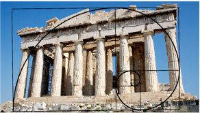
The golden ratio is seen in the architecture of the Parthenon. Famous artists have used it in their paintings. Not only man-made objects follow the golden ratio. In fact, this spiral can be found in nature in multiple places like on snail shells, the proportion of human faces, sunflowers, hurricanes, and the make-up of the Milky Way constellation. The golden ratio is found in the patterns of seeds on a sunflower (Darvas, 2007). The figure below displays some visuals of how the golden ratio is found.

| “Without math, there is no art” – Luca Pacioli. |
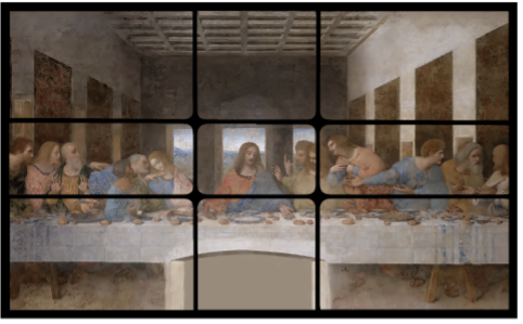
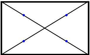
Now you may wonder how do we apply the golden ratio in art and design? This perfect proportion has been used by designers and artists of all kinds to locate aesthetically pleasing areas on the page to place elements and distribute the weight within the composition. In graphic design, we use a grid, which aligns items on the page with precision. We often use the golden ratio to create compositions that are pleasing to the eye by following the rule of thirds, popular in photography, or another tactic to create like the one below. One strategy is to use the four eyes of the rectangle (circles below) on the left side of the figure below to position the graphic elements.

Another option is to segment your page into nine unequal sections using the golden ratio as a grid. Many software programs allow you to use grids, and you can set your graphic elements to snap to grid or show baseline grid so you can be sure both proximity and alignment are precise. Proximity (like all the principles of graphic design) can elevate the look and feel, reduce cognitive load, and improve learning but in my opinion, it is the most difficult principle to master. It takes higher-order thinking skills to properly categorize and organize elements in a way that makes sense cognitively. It is challenging because one can argue why certain design elements do or do not belong in a group of other elements and someone else may feel completely different. Whatever the decision it needs to be intentional and conscious. If the groups of elements are unclear, the design will feel cluttered. If items are not properly aligned and placed in groupings, the learner has a hard time understanding what groupings of information go together (Oppermann, 2020). This, in turn, affects the principle of alignment, proximity, and Mayers principle of Spatial Contiguity.
Mayers Spatial Contiguity Principle
The spatial contiguity principle states that people learn better when corresponding words and pictures are presented near each other rather than far apart on the page or screen. This works hand in hand with the principle of proximity. If you place things close together, they will be perceived as a group. But if you separate them visually, they will feel disparate and unrelated. Modules of information that are related logically to one another should be set intentionally close together to help the learning stick.
If the brain has to work harder to piece together the content on the page like a puzzle, the learner is taking up valuable brainpower that could have been used to learn. Everyone’s cognitive resources are limited. If one has to look at a map, then search for a key that is located far from it, they are less likely to hold both that visual and the key in their working memory, because the effort expelled to try to piece the two together caused an overload of their cognitive resources. Mayer conducted retention tests and found that learners performed better when corresponding text and illustrations or animations were placed close together compared with farther away.
The spatial contiguity principle says we should align words to corresponding graphics. This means, for example, that if the graphic on the slide is a major subject of the text, it shouldn’t be far removed from that text. It also means that if there are a few text boxes, they should be aligned and grouped together, not separated to the far corners of the page. The spatial contiguity principle is especially poignant when it comes to charts and graphs with labels. We want to make sure that we don’t have to go searching for a key and use our eyes and brain to track back and forth from the key to the various parts of the diagram. A better solution is to label parts of the diagram and have those labels aligned closely with the corresponding parts it belongs to.
E-learning developers often violate the contiguity principle by separating text and graphics into distinct pages online to prevent users from having to scroll. For mobile reading and browser-based reading, it is preferable to keep these like items together versus adding more clicks and places to find content. Another way this principle is violated is when feedback on assessments is separated from the questions, which makes it harder for the learner to relate the feedback to the correct question. Web designers and learning designers often violate the contiguity principle when they implement pop-up windows. As a web designer, I have fought against clients who wanted to implement this practice. One of my clients wanted to put a “donate now” pop-up window over the website, thinking it would encourage people to donate if they had to physically remove the barrier to see the content on the page. Sadly, the opposite is true and the pop-up window actually becomes a barrier to fundraising as users become irritated at the invasiveness. Nobody likes pop-up windows. Always make pages like this open up in a new tab. This gives users a choice if they want to explore further. Putting links far away from the instructions also violates this principle. If you ask them to click on the link, don’t put the ask on the top left and the link on the bottom right.
| Tip: Put the directions close to the call to action. |
If you want to get really fancy, there are even apps that can create an overlay to check if your designs are following the golden ratio. Graphic designers are already trained to see and apply the Golden Ratio and align to a grid, but there are tools you can use to assist you with mastery, especially if you are new to design. Grids are an essential part of the design, and a good step to create an e-learning course that has properly positioned page elements.
Golden Ratio/Grid overlay apps and websites
Golden Ratio Generator
Golden Takes
Golden Ratio Camera
Phishot
Proximity and gestalt theory
Gestalt theory is often used in UX design and can help us understand the principle of proximity. Gestalt principles suggest that we perceive elements on the page in their simplest form. So, if two objects are linking, touching, or super close together, we perceive them as one element versus many. Gestalt also suggests that people naturally follow lines and curves and it also says that the mind will attempt to fill in detail that isn’t there.
The Gestalt law of proximity tells us that graphic elements that are close to one another appear to form groups. Even if the shape or the size of the objects are radically different, they will still appear to be part of a group if placed close together. Smaller elements can be grouped together like a series of photos to form a grid, for example. Or a border or shading can be applied to further group items similarly.
It is important to remember that our brains build connections between different elements depending on how close or spread apart they are, or on the law of visual perception. We talked about how we need to group things that belong together. But if we want elements to be perceived as being separate, we need to use white space to create a space between elements.
This book, for example, is separated by paragraphs, chapter headings, and subheadings so that the reader knows when a new thought, idea, or concept is being introduced. The white space tells the reader that a new thought is going to emerge at the start of a new paragraph. Gestalt’s law of proximity helps improve usability and interaction, which helps learners absorb the material.
Principle of Proximity in everyday life
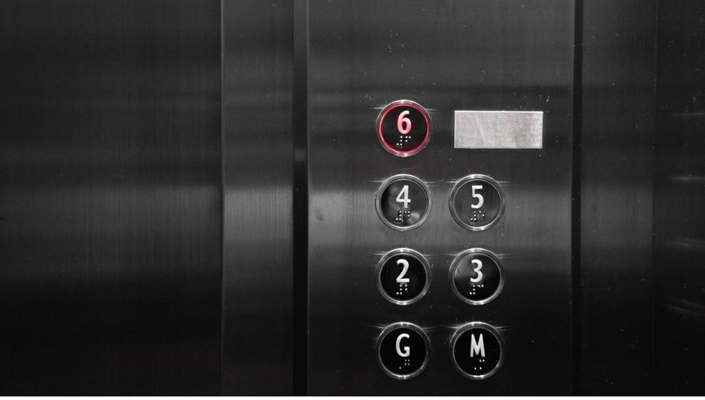
Ever ride in an elevator and notice how all the buttons for the floors are grouped together? What if they were scattered? What would happen then? You wouldn’t be able to easily find the floor you are looking for, and people in the elevator may be annoyed and frustrated as well. What if the floor 1 button was over the door, floor 2 to the left, floor 3 to the right, and floor 4 behind you on the far wall? Buttons are grouped together because of the concept of proximity. If we have a course with a few choices to select like buttons, we don’t want the buttons to be on the far corners of the page or course. They need to be grouped together to reduce cognitive overload.
The key to mastering proximity is to use logic to analyze information to determine what group it does and does not belong to. This isn’t as easy as you think. There could be a couple of possible solutions. Think back to when you were in elementary school and your teacher had one of those giant felt boards and she told a story or taught a lesson with felt objects that clung to the board. Pretend you are sitting in circle time. Your teacher is teaching you basic math by using the story of the three little pigs. Every time the wolf huffs and puffs and blows down a house, she removes one pig from the board and asks you how many are remaining. Chances are, in your mind, you see a grouping of pigs in their homes neatly lined up. The concept becomes clear because there is order and proximity. If she had closed her eyes and haphazardly threw the 3 felt pigs on the board, they may be backward, upside down, at various corners, or astray on top of each other.
If you asked your learners to do basic math in this fashion, their brains would have to work harder to make sense of the activity and get the answer. We can apply this concept to e-learning. For example, we can use an accordion to group FAQs in our course so everything is in close proximity and grouped together. By assembling items close together, the learner can find all the answers to their questions in one place, which lowers frustration and removes barriers.

I struggled with this principle in design school. I would hyper-analyze the content and say to myself, “the website should go with the phone number, but the address should go with the phone number, too. And maybe the website should go with the logo. Oh, wait, maybe the website, the logo, and the address should go with the phone number…The client wants me to stick the logo big and, on the top, should I?” And so on. Every time I designed something, a similar dialogue would occur. Yes, it’s good to analyze and use our brains rather than just go with what appears to look good. But we also have to stop overanalyzing to the point of performance paralysis. One way to overcome this is to offer options.
If I really couldn’t decide what should go where I would offer the client a few layout ideas. Over time you get better at figuring out what goes where. But the key to learning this principle faster is to remember that our brains like information that is grouped, and the fewer places we have to look on the screen the better. Less friction, less cognitive load. Make the information easy to find and don’t style it in 100 different ways with no alignment or thought to placement.
Learners need to focus on the learning and not use their brains to decipher what the heck is going on in the layout. We want our learners to expend their energy on the learning task, not dissecting a horrible, cheesy layout. Graphic design should exist in the background, and visually communicate writing in an appealing and accessible way. The design supports the writing, but it doesn’t take over the show. Imagine that you are grocery shopping online. Think of how the website or app looks and how you can browse items to add to your cart. What if the items you looked up didn’t have the prices associated with them placed beneath the image, but instead the prices were placed on the sidebar and the images in the middle? What would your experience of buying food online be in that case? Even if the design included strong typography, excellent color theory, and was beautifully designed, the lack of proximity would create a poor user experience for the shopper. Form over function every time.
Proximity tips
| Tip: Do not be afraid of white space. |
Even small mistakes with proximity can inhibit learning. We can more easily notice groupings when there is plenty of white space. We need to fight the urge to fill up every bit of white space with an image or textbox. Proximity is a funny concept in real life. We may love a hug from our kids or our partner and snuggling with our family pet is just the best. However, we are uncomfortable when strangers stand too close to us, pat our pregnant stomach, or peer too closely in our baby’s face.
When we crowd things together in a cramped fashion, it makes learners feel uncomfortable. When we look at a design and see text crashing into images, we have a hard time reading the text. This causes excessive cognitive load. And the opposite is also true. When learners see items that are not grouped together logically, it causes cognitive overload, too. If an image caption is randomly placed off to the side, instead of directly under the photo, not only is this ugly, but it slows down the learner as they try to put the pieces together and make sense of the page. We don’t want them to have to put together a puzzle, but rather align-items and group them in a way that makes sense logically and visually while allowing the white space to let the content breathe.
Grouping items reduces clutter and makes the information clear, organized, and concise. Think about your desk at home, the office, or wherever it is your work. Do you have papers haphazardly all around? Thumbtacks willy-nilly, pens and pencils rolling off the desk and under your chair? Is your monitor far from your keyboard and your printer on another floor? No, of course not. If that was the case, you would have a hard time working, learning, or being productive at all. Proximity helps us locate objects faster so we can do our jobs. We want to preserve brainpower so people can use it on the learning we design for them, not expend it on trying to make sense of what we are asking them to do.
The author Robin Williams in her book The Non-Designer’s Design Book, explains how the purpose of proximity is to organize. When information is organized well it is more likely to be remembered and we want to create experiences that are remembered. If our learners have a hard time getting through the content due to poor graphic design (like a lack of proximity), they won’t read what the writer spent so long to craft. If they don’t read the content, they certainly won’t remember it.
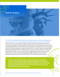
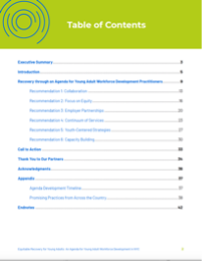
In the figure below, you can see that items that belong together are grouped together visually. The cover of the report closely groups the heading with the subhead and separates the logo. In the table of contents, the header is separate with bold contrast while the content listing is grouped together with repeated spaces between line items. In the headers and call-out boxes on the subsequent page, you can see how proximity helps us determine hierarchy and reduces cognitive load so that we know how to navigate the page and where to find what we are looking for.
| Tip: Squint your eyes slightly and count the number of visual elements on the page by counting the number of times your eyes stop. If there are more than 3-5 items on a page, see if you can group separate items by bringing them closer together into one visual unit. |
Always aim for minimalism; ask yourself what is on this page, slide, video, webpage, or whatever it is you are designing and does every single thing need to be here? Can something be moved to another slide, or page, or omitted altogether? We want to simplify and distill information into its essence. Remember, slides are free, and its only 1 concept per page.
The best tips for proximity are to reduce the number of separate elements on a page and to group items if there are more than 3-5 elements. White space is your friend. Negative space is equally as important as positive space. Make it obvious. Remember contrast? We want to clearly delineate headlines from body copy and images. This means do not group them together with a font that is too close in size. We want to establish hierarchy and contrast and use proximity to group only items that belong together. Do not create relationships between two elements that don’t logically belong together. The phone number doesn’t belong next to the headline and the photo caption doesn’t belong next to the website. Think carefully about your arrangement of elements and be intentional in your learning design.
Suggested guided questions/projects to assess your understanding of proximity:
|
