16
Minimalism Checklist
|
Minimalism is more a principle than a movement. It is the idea that one can communicate the most important information with the least amount of moving parts. In other words when looking at a design, what are the things you can remove and it will still be clear? A novice designer (and more clients than I care to admit) believes that a blank page should be filled to the brim with as much information as possible. Crowded e-learning is confusing and takes a long time to wade through. The old adage of one thought per page is relevant in advertising as much as it is in e-learning. Slides are free. Minimalist designs have graced several fields, including UX, interior design, video game design, film, and e-learning. “A minimalist design is a design that only uses the most essential elements, including basic shapes and limited color palettes, to create something that’s very simple yet memorable. (Film School and Acting School Of New York Film Academy, 2016).
Minimalist designs will make your portfolio stand out and communicate to hiring managers that you have the skills to create a polished-looking course. The best minimalist websites only use the most basic elements needed to communicate only the necessary bits of information. This means doing away with seductive details that only cause distraction and confusion. Too many elements make the usability and readability poor. Keeping things simple is not only a good mantra but one that lowers the cognitive load and improves learning. With a minimalist layout, you can better direct the learners’ attention to the main idea.

This little owl may work as a character in a scene, but if he is just there for decoration, he will not help aid instruction in any way and in fact may confuse both the sighted and visually impaired. One may wonder why a random owl is present in the learning.
Minimalist designs use limited layouts. If you are using PowerPoint, you would use only a few of those templates versus recreating a new layout for every single slide in your presentation. Minimalists also use a limited color palette and although this isn’t a hard and fast rule, 2-3 colors for a design is best. On a rare occasion, we may use 3 main colors and 2-3 accent colors, should the client insist on this particular array, but we usually try to encourage a more limited palette because doing this helps give visual cues to the user and they come to look for a particular color to have a specific meaning. For example, green when correct or red when incorrect, or yellow for try again. As discussed in the color chapter of this book, always be sure to use more than color to differentiate important buttons and directions so you are ensuring more learners can still gain access.
White Space
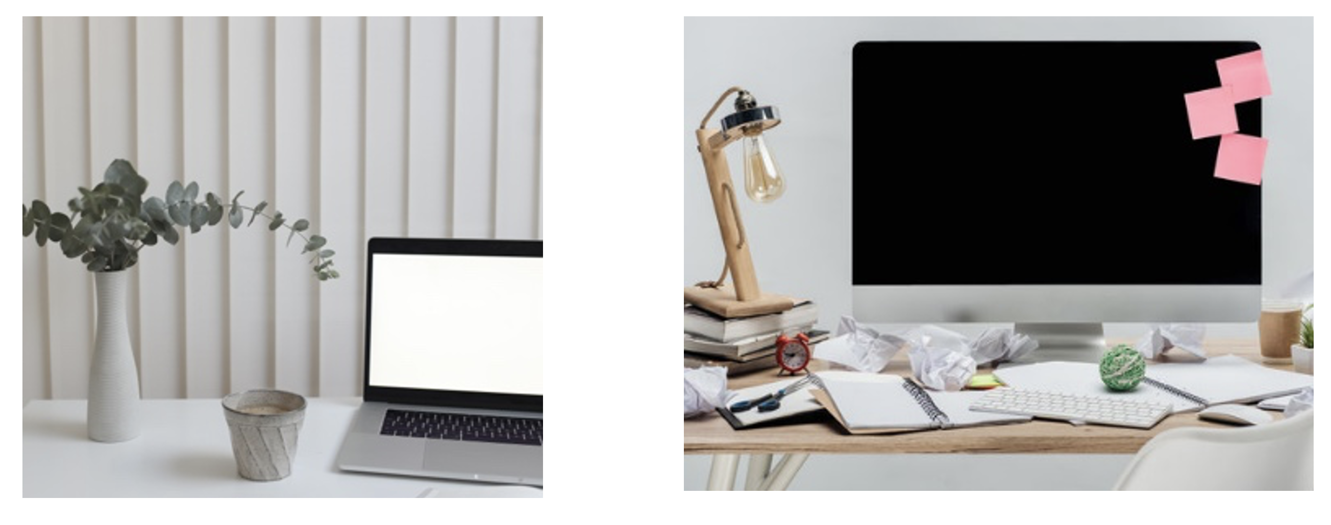
White space means using limited layouts and color palettes while still making available only the most useful tools, such as intuitive and easy-to-find navigational elements. White space is often called negative space. It is the space around the positive elements on the page. It is the area without images or text and you want a lot of it. A novice tries to fill it up, an expert looks to find what they can eliminate further. Choose your graphic elements carefully. A cluttered page will cause a cluttered mind. Which office space would you prefer in the below figure?
Minimalism also means deciding on only a few colors that work well for the course. When choosing which color scheme to use, think about accessibility and also what you want to communicate emotionally. A minimalist approach with color lends itself well to accessibility because it allows you to use extreme contrast to create eye-catching elements with a strong hierarchy. In other words, if you are using grey, red, black, and white, the red can be used to call attention to the most important part of the course. Perhaps the header title, for example. When there are a lot of different colors being used, a high contrast strategy isn’t as easy to implement. Using a color scheme with only a few colors helps the usability of the course.
Mastering typography will help you achieve a minimalist approach in your e-learning as well. I highly recommend learning more about type. Type designers have mastered the art of using type to design a page that can create not only a beautiful piece of graphic art but one that communicates the message in the emotion you want to achieve. Most will agree that fonts that are clean, simple, and easy to read are preferred over the latest trendy typefaces. That being said, typography is an art and there are many creative ways to display it. You don’t have to stick to an entire website of Open Sans and can in fact even incorporate different font categories if you know how to adjust them for superior readability.
In a well-designed course, you may choose a large font for the header since it is the most important information and you want to make it more obvious and memorable. Also, remember you can vary the heading sizes and design with a mix of different font sizes to visually communicate hierarchal information and to add visual interest on a page that may have very few other elements. Typography alone can be beautiful if set correctly. This doesn’t mean the entire module should be a wall of text set in only 12pt Roman type. Using a mix of type sizes prevents it from becoming boring, and the text itself will take up some space, add visual interest and prevent a cluttered page, slide, or course. Mix it up, make it beautiful, study, and look at beautiful type every place you can. It is on package design, logos, billboards, apparel, movie screens, wedding stationery, and mobile apps, and it can be in your courses as well. The figure below has some examples of minimalist designs with plenty of white space.

Suggested guided questions/ projects to assess your understanding of minimalism:
|
