14
Color Theory Checklist
|
Recently, we redid a bathroom in our house. We replaced the vanity and the fixtures and we realized we also needed to repaint. I looked at the color on the wall and said to myself, oh that is Colorado Grey by Benjamin Moore. I like to think I have all Pantone colors and the entire Benjamin Moore color palette memorized, like my ability to detect fonts. It turns out I don’t. I went to the paint store, got a can of Colorado Grey, and proceeded to touch up the areas where we replaced the fixture and realized the color was much darker than what was already placed there. At first, I thought, hmm, the paint is just wet but then once it dried, it was embarrassingly wrong.
Every time I would go into the bathroom, my eyes would fixate on this one spot and it would bug the heck out of me. I couldn’t stop looking at it, it wouldn’t blend in with the background, and I became obsessed with fixing it. I ended up having to paint the entire bathroom, Colorado Grey. But to this day, I am still not happy with this selection because it’s just far too dark for the room and it communicates a different emotion than I was going for. Color is funny like that. The point is that we need to be intentional about color selection, and we need to make sure we are using the same exact color, not a slightly different variation when designing projects. Consistency is key with all these principles of graphic design. And if we don’t use the same exact color for the headline of our course as we do in all the slides, our learners’ brains will notice just like I noticed the tiny patch of color.
Always think about what choice you want to make before making it. This chapter will help you to make wise color choices, give your ideas on color schemes, and help you to understand the psychology of color. You will learn about how our different target audiences or learner personas perceive color – so we can design intentionally and thoughtfully while helping our learners enjoy and retain learning. When color is used incorrectly or inconsistently, it can cause accessibility issues, excessive cognitive load, and general distaste. But, with a few simple tips, we can use color to transform our moods, our learning, and our lives.
Color Accessibility
Color accessibility has already been discussed in part 1 of this book, but it is mentioned again in this chapter because it is a skill worth mastering. When you use accessible color choices, you promote inclusive classrooms and cultures. It shows that you care about access and want your content to be available to all learners. Color is not perceived the same way for everyone and, with 5% of the population being color blind, we must remember to design in a way that is accessible to all. Be sure you check for color contrast before reviewing this chapter.
Setting up Tints and Shades
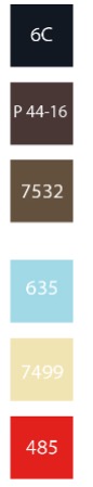
You can set up tints and shades in PowerPoint, Adobe InDesign, Illustrator, PhotoShop, Coolers.co, and Adobe.color to give you a full range of color spectrum for designing. When you start creating a color palette, you start with a single base color. You can then broaden the range of that color with tints and shades. Tints are made by adding white to the base color. The more white you add, the lighter you make your base. Shades are created by adding black to your base color. The more black you add, the darker your base.
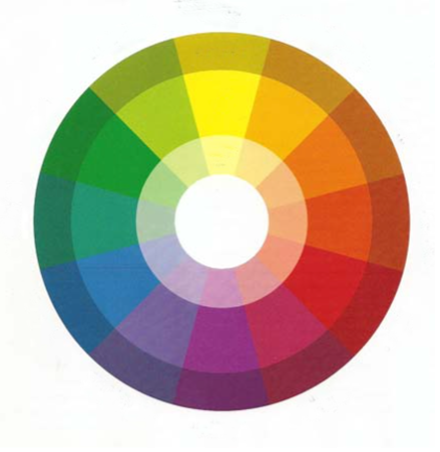
If you observe the figure to the left you will notice the ring of colors in the middle are the hues ROYGBIV, the ring on the inside are the tints, and the ring on the outside is the shades.
Color Combinations
It is not easy to balance using color in an accessible way while still creating color combinations that are appealing to the eye, and that aesthetically do not cause irritating vibrations or visual tension. The key to achieving this is to use tonal variation as well as hue to contrast. In my example with red and green, we can use this combination only if we adjust the tone of each hue. Otherwise, we cause eye strain and we create a combination of colors that cannot be read at all by 5% of the population. Red and green are unique because they are a complementary color combination with the same tonal variety. Both turn the same shade of grey when converted to greyscale and when mixed as paint, they neutralize each other and turn into a muddy hue. Other complementary color combinations such as purple and yellow and orange and blue have one color that is bright and light and one that is dark – this makes for both a solid color combination for both aesthetics and accessibility. Complimentary color combinations usually work because they have the highest degree of hue contrast and, when paired, they emphasize each other.
If we want to add in a third color, a split complementary triad is usually a good choice. You can select a complementary triad by looking at a color wheel and the complementary pairs. But, instead of selecting the color directly opposite of the other, you select the two colors that lie on both sides of that color. For example, if you knew you wanted red, instead of choosing green you would choose blue-green, and yellow-green. The combination would be red, blue-green, and yellow-green. Or red, blue, and yellow.
| Tip: You can also adjust the tints and shades of the hue to add more contrast and interest. |
Not everyone perceives color the same way because individual perceptions of hue and saturation can vary. Tonal contrast has the least variance in human perception of color, which is why designers should focus on providing enough tonal contrast to make the page as accessible as possible. Additionally, adequate tonal contrast can eradicate that irritating color vibration that can occur with poor color choices and ensure that anyone with color vision deficiencies can see the course components clearly. Besides turning your designs to greyscale to check for tonal contrast, you can also use settings software or online accessibility checkers to quickly examine your selections. Another quick way to check for tonal contrast is to print your image on a black and white printer to see if there is enough gradation between darks and lights.
Analogous Color Combinations
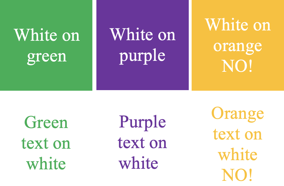
Choose color combinations with care. Some color combinations make it easy to read text while others color strain our eyes. Below is a simple table set with colors that may look good together, but don’t always read well.
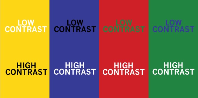
The red background with green text has the same tonal value (which makes it hard to read for the red, green color impaired), and also causes color vibration or eye strain. The blue on the green is also the same value and has very little contrast. Blue and green are close to each other on the color wheel, so when we select colors to use in a brand, a logo, or a design, we know colors that are close together on the color wheel always look good, but when text is concerned, we need to be careful.
Colors located next to each other on the color wheel are called analogous. These may include red, orange, and yellow or blue, green, and purple, or blue-green, green, yellow-green. There are no rules saying you can’t use these combinations, but when you are using them in typography, you need to make sure the values are appropriate for strong contrast.
Yellow background with blue text works and vice versa because yellow is lighter and brighter and blue is deeper and darker. You can also adjust the shade to get a better combination of colors. For example, the violet on the hot pink doesn’t work because it’s too close in value and causes eye strain. But, if we really need to combine a purple hue and a pink hue, we could perhaps make the pink a pale pinkish lavender on a dark eggplant color.
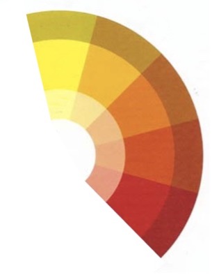
In the figure on the left, there are reds, oranges, and yellows which are considered analogous because they are close to each other on the color wheel. Any combination of 2-3 swatches close together on the color wheel would be considered analogous. To make the combination accessible you need to be aware of tints and shades. Dark red and bright yellow contrast effectively but orange-yellow and orange-red do not.
Primary and secondary colors
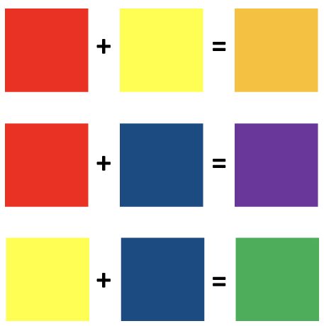
The primary colors are red, yellow, and blue. Every child has a memory of mixing these paint colors to make an assortment of other colors in the rainbow. If we are talking about paint or ink, red and yellow make orange, yellow and blue make green, and red and blue make purple.
If we were to mix any two of these secondary paint colors together, however, we would get brown because they neutralize each other, just like if we were to combine complementary paint colors.

Red and yellow alone are used often in graphic design and so are yellow and blue. But it is rare you will see a red, yellow, and blue color combination unless we are designing something for primary school or very young children. Psychologically, we associate this combination with children and for this reason, we want to avoid using the three of them together.

We can use secondary colors – green, purple, and orange – and know this combination will also look good together.
Secondary colors are equally spaced on the color wheel and create a visually appealing aesthetic. We do have to be careful with using certain color combinations with our type choices. The thickness of the type of font we select can also make a difference in readability. Secondary colors are hard to read against a white background but using color blocking and a thick bold font can work well for accessibility.
Many of the templated designs you see out there have a sans serif font on a color swatch. This is an accessible way to design if the contrast is high. But, keep in mind, that if you never break from the template mold, the designs can start to look common and boring. Also, keep in mind, not all color blocking is accessible and some fonts can be hard to read in certain colors.
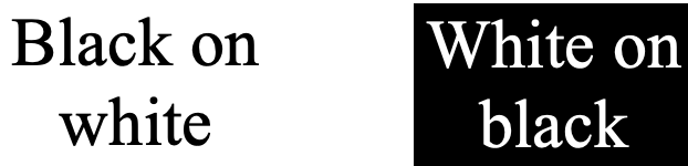
Green text can be too hard to read on white and orange doesn’t have enough contrast, but purple, if it is dark enough, has sufficient contrast and no color vibration. The blue text should be avoided as users will mistake it for a link. If the color block is dark, white text is best, but if there isn’t a color block behind the text block, dark grey or black is best for text color since the contrast ratio is the highest.
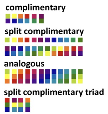
In the figure to the left, there are some common color combinations that are derived from the hues of the color wheel. To increase contrast, you can always add a tint or shade to one of the colors. Visually the swatches look good together and you can’t go wrong if you use these combinations as a base while modifying tone and value (when needed) for accessibility and contrast.
Psychology of Color
Color is a powerful element of graphic design and has the power to evoke an emotion, grab attention, encourage click-throughs, and even change purchasing behavior. Specific colors are correlated psychologically to certain attributes. When a logo is designed for a Fortune 500 company, the designer doesn’t just randomly select a color on a digital color wheel. It isn’t Russian Roulette. We need to be intentional with color selection. Our minds are triggered by certain colors and combinations of colors. We correlate experiences with color much in the way that we use the sense of smell to conjure a memory. The most famous example is the use of red and yellow in fast food advertising. These two colors when used congruently cause a response in the brain that makes us hungry (Urie, 2018).
Next time you drive by your local fast-food joint, pay attention to the color scheme. Burger King, McDonald’s, El Pollo Loco, Checkers, Hardees, In and Out Burger, and Carl Jr. all use red and yellow in their logos. There are dozens of examples of how we can attract our audience, engage their interest, and carry them through a learning experience through the use of carefully chosen colors.
| Tip: Color Matters, (formerly called the Institute for Color Research) has done some extensive research on color and found that color can improve learning from 55% to 78% and boost comprehension by 73%. Additionally, colored images are recalled more than black and white images, which helps improve memory and long-term retention. |
Color can also evoke emotions in e-learning by giving our brains signals to the endocrine system. Our brains release certain hormones upon seeing color. Cool colors have a calming effect with a release of dopamine and serotonin, while warm colors can evoke excitement or stress and with it, cortisol, and adrenaline. We want to use color to establish an emotional connection to the learning and induce the desire to achieve.
Red
The color red is associated with passion, love, danger, and excitement. It is a warm color and it is attention-grabbing and energetic in nature. Since red is the most intense color on the spectrum, it is often used in call-to-action buttons on websites. It stands out among other colors and is also a common choice to indicate that there is a sale. Red should be used sparingly since it can trigger strong emotions such as anger. Red is a popular choice among companies for logos. Red is used in Target, Legos, Rolling Stones, Nintendo, Ace Hardware, Coca-Cola, and YouTube among others. As mentioned, red can cause hunger so it is often a good choice in the fast food and beverage industries like Coca-Cola. Coca-Cola’s brand voice is exciting and happy and their messaging, ads, and package designs use language that demonstrates these emotions. YouTube uses its red icon to create excitement around watching videos. The play button icon invites the user to click play on their videos. You can use red in e-learning to attract attention and inspire excitement to follow through on the call to action.
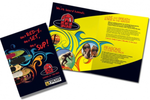
The figure to the left is an educational sales sheet we did for a Stand Up Paddle Board company that offered lessons, excursions and was also a reseller of paddleboards. The logo was red to express the passion and excitement of the sport and the red was repeated for emphasis in the piece for emphasis.
Orange
Orange represents optimism, energy, creativity, enthusiasm, adventure, and success. Orange is a vibrant color often used as an accent or for a call to action. Another reason it is a great choice for design is that its bright hue contrasts and combines well with black. Orange is not as commanding of our attention as red, and it doesn’t have any negative connotations as red does. Examples of logos that use orange are Home Depot, Nickelodeon, Fanta orange soda, Amazon, and Harley Davidson. Home Depot represents creativity with do-it-yourself projects and Nickelodeon communicates enthusiasm and plays since it is a children’s Television channel. Fanta orange soda was a staple at birthday parties in the 1990s and although recent trends point to a decline in sodas for children, many adults recall a bit of nostalgia when spotting it in the store.
Amazon cleverly uses a hint of orange in its iconic smile logo. They know the excitement of an Amazon box being placed on your doorstep can cause an adrenaline rush and it goes without saying that Harley Davidson customers enjoy a bit of fun and excitement in their lives. Orange brightens our lives and enhances our designs. We need to be careful not to go overboard with it, as the neurodiverse can be sensitive to an overload of bright colors. For example, I wouldn’t recommend that orange be used for the entire background of a course or slide.
Orange works well as an accent color or a call to action, but if we style everything in orange, nothing will stand out. Additionally, due to its light and bright hue, it is not a good choice for font color unless it is on a darker background like black. The figure above is a logo we did for Brighter Higher Ed and includes a strong accent of orange.
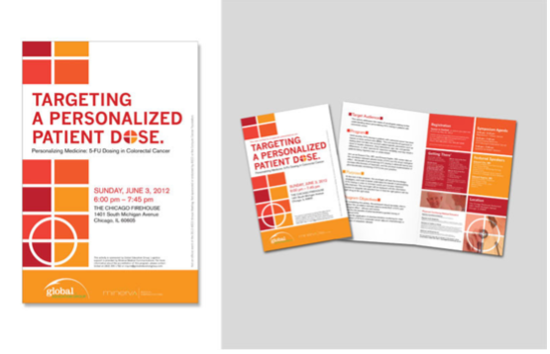
In the figure to the left, an orange-infused job aid is displayed for a continuing medical education conference (CME). The topic of the conference was about targeting a specialized cancer medication dose and so it portrays orange and red as a sense of urgency along with the target-like graphic elements.
Yellow
Like red and orange, yellow is a warm color. It is close to red and orange on the color wheel. One half of the color wheel contains warm colors – red, orange, and yellow (and red-orange and yellow-orange) and the other side of the color wheel contains cool colors – green, blue, and violet (and green-blue and blue-violet). Designers will often pair a color on one side with a color on the other to get the most contrast while creating a pair that looks aesthetically pleasing together. Yellow is similar to orange in that it acts as an accent color but it cannot be used alone in a design due to readability. We cannot set text in yellow unless it’s knocked out on a dark-colored background.
Yellow represents happiness and sunshine and radiates positivity. Think of a bright and cheerful summer sun or shining buttercup. However, yellow is used frequently in signage to demonstrate a warning. Think about the yield signs on the highway, or the police ribbons at a crime scene, or the yellow in a stoplight that warns us to slow down. Since yellow is attention-grabbing, you can use it as a call to action in your e-learning or as a way to encourage folks to purchase something on your website. Often, we see “free shipping” set in yellow and black.
One of the most iconic logos uses yellow in a grandiose way: McDonald’s. The golden arches are meant to attract children and communicate fun, luring them in with a promise of tasty food and a surprise in the Happy Meal. Ikea also uses yellow in its logo and branding. Going to IKEA is an experience filled with bright light, an open floor plan, and interesting products displayed in creative layouts. Its stores often have multiple floors with a food court, a daycare, and a friendly staff. The audience is first-time home buyers, people moving out of their parent’s house for the first time or graduating college. It is a time of optimism for the future and is a great choice for the target audience. Other yellow logos are National Geographic with its yellow rectangle and black text, a perfect golden ratio that suggests living in an adventure and seeing the world through your unique lens. Ferrari is also yellow because driving a Ferrari is the epitome of fun and it’s exciting, and yellow is a perfect color to communicate that.

The Next Step curriculum guide we designed for the Young Adult Literacy Program had a bright yellow stripe that complimented the warm color of the blue background and communicated positivity in learning, which made it a perfect accent color.
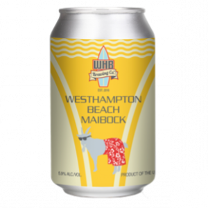
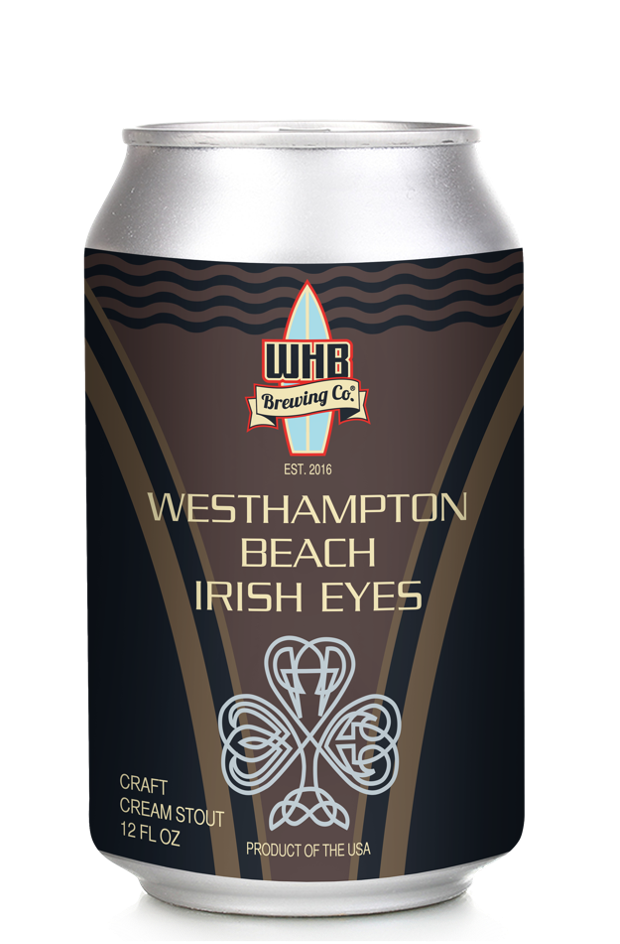
We designed the Westhampton Beach Brewing Company logo and their entire line of flavors including the Maibock. The yellow Maibock beer can and the yellow is clearly used to demonstrate fun and whimsical. The goat in board shorts adds an extra layer of fun to the motif.
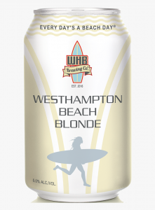
In the Beach Blonde you can see a paler version of yellow to demonstrate the pale ale flavor. Although more subdued, the yellow is still seen as a fun on brand choice for the design. Each can contains a signature metallic icon, in this case, a female surfer running to the shore with a surfboard.
Pink
Pink is a warm color close to red on the color wheel. It is not a popular color for logos because many still associate it with a feminine audience. So, unless you want to narrow your audience and only attract people who identify as female, you generally want to avoid using this hue as the main color in designs. In psychology, pink means femininity, frivolity, playfulness, youth, idealism, and unconditional love. Pink is a good choice for product packaging for girls’ toys. In fact, Lego has only in the last couple of decades purposely marketed to girls. By changing the color scheme to include pink in some of its packagings, it has created a larger market share among young girls. Victoria’s Secret has an entire line called Pink and capitalizes on the femininity of the color to sell to women. Barbie is another product that uses pink in its website, package design, and marketing. Hot pink is often used in navigation bars, a call-to-action button, or to call out a specific area of the page. Pink has a high contrast ratio with black and is a technically accessible choice, however, it is not always an emotionally accessible one.
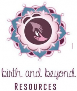
The figure to the left is an example of a logo we created for an organization whose mission is to change pregnancy, birth, and postpartum including doula services and birth education. Purple and pink is the perfect color scheme directed at women to make them feel like royalty, pampered, and cared for during the pregnancy and postpartum period. Birth and Beyond Resources supports families in pregnancy, labor, birth, and postpartum. They are dedicated to helping the birth and postpartum community.
Green
The psychology of the color green signifies nature and wealth. Green can mean growth and fertility, like the plants on a new spring day. Green can also represent health and generosity. Companies that want to be perceived as promoting wealth and financial wellness will use green, like H&R Block, Fidelity, and TD Bank. Green can have one negative connotation: envy. Green is often added to goods and services to convince people they are selling something healthy. For this reason, you will often see green in the health and fitness world. The farming industry has also been using green for half a century. Take the iconic green John Deere logo on tractors and lawnmowers. That unique color is instantly recognizable to mean high-quality lawn and farming equipment. Green has become a popular color in both logos and marketing in recent years. Companies wishing to appear eco-conscious and healthy will use green. Animal Planet, Whole Foods, Starbucks are an example of this. In e-learning, it is a popular choice, especially for the pharma, health, and medical industries, and for good reason. Green is considered a cool color and is calming in nature.

The figure on the left is the E3 Smart Build Training Center logo we designed which is part of the housing division of the United Way of Long Island. According to the website, the E3 SmartBuild Training Center is a state-of-the-art lab where students can come to learn building science, energy efficiency, and green construction. A partnership between United Way of Long Island and the New York State Energy Research and Development Authority (NYSERDA), the E3 SmartBuild Training Center is a tool that United Way of Long Island uses to offer expanded career opportunities to residents and local businesses in the green construction and energy efficiency industry. With this lab, United Way of Long Island is providing tomorrow’s workforce with the skills needed to build a Long Island Community of the future that leaves a lighter footprint on the environment.


The before and after of the Suffolk County Junior Tennis League website above and logo rebrand is shown to clearly demonstrate a cleaner, user-friendly site with tennis ball green being used as an accent color. The limited color palette creates a more professional look and feel.
Blue
Blue is a cool color as well. It is the most popular color for logos because it stands for stability, calm, peace, and trust. It is linked to the sky and sea. The only negative meaning blue has is that it can be linked to depression and its hue can be a bit cold and stoic. Blue is used often in website navigation to ensure trust. The Better Business Bureau icon is blue to demonstrate a sense of trust and security. Technology and pharmaceutical brands often use blue in their marketing to ensure safety, reliability, and trust. Some examples are Facebook, BestBuy, Twitter and Zoom for tech and Oral-B, Pfizer, Roche, and Bristol Myers Squibb for healthcare and pharma. Chances are, your local hospital and dentist uses blue because they want their patients to feel calm versus anxious when they arrive. Blue can make people feel sleepy, so if you want to energize your learner, you want to avoid an excess of blue.
 The figure to the left is an example of a poster we designed for a CME conference for Myriad Genetic Laboratories along with a presentation deck, signage, conference, and curricular materials. The blue represents stability, and trust and the cool color is common in the healthcare industry.

On the left is an orange wall with a dentist in red scrubs which may produce anxiety in patients. On the right is a cool, white medical office that feels sterile and calm. Which one would you prefer to be in?

Blue demonstrates stability, calm and cool. Cool colors make us feel trusting and they can have a calming effect. A nightclub shouldn’t be painted blue since it is a place of high energy. A dental office or doctor’s office is often painted in blue as they care about calming the patients inside. In the photos below you can see examples of warm and cool colors in a medical environment. Pay attention to the way each makes you feel when you imagine yourself in the role of the patient.
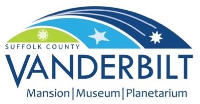
The Vanderbilt Museum logo rebrand we did above, uses blues and greens to communicate the three-part destination: the mansion/estate, the planetarium/sky, and the Hall of Fishes Museum/water. The Vanderbilt Museum is set on acres of rolling hills along the shores of Northport harbor. The stars in the logo represent the celestial star of the sky, the sea star from the sea, and the iron metalwork star repeated throughout the mansion.
Purple/Violet
Purple is another cool color that signifies royalty. This is because centuries ago, peasants couldn’t afford to dye their clothes and were usually adorned in natural colors of brown and tan; royalty and the upper class were able to have access to the dyes that create a deep color. Purple is one of the darkest hues in the rainbow and required a lot of dye to achieve the result. Purple is also connected to power, luxury, and nobility for this reason. It has also been associated with intuition, spirituality, and wisdom. Purple is often used with gold or yellow since they are complementary and the combination can look very royal and sophisticated. Purple can come off as arrogant, however, especially if it is on a product with a high price point. Using purple can communicate high quality that often comes at a higher price point. For educational institutions, if you want to attract a higher-income demographic and make them feel like they are interacting with a sophisticated high-quality course, purple is a good choice. Some popular purple logos are College of the Holy Cross, Louisiana State University, Hallmark, Yahoo, and Cadbury.
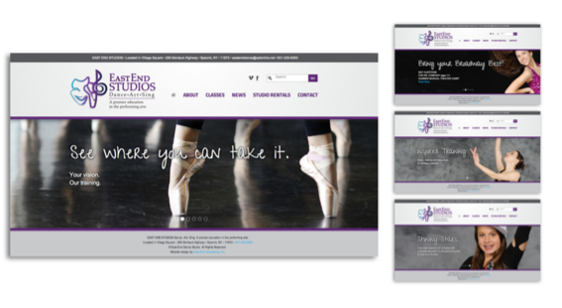
We designed a corporate identity system, website, brochure, and more for a dance studio that was rebranding itself to include more offerings in the performing arts. Located on the East End of Long Island, it was considered a high-income area, and the quality needed to come across, hence the purple.
White
Using white in design has been associated with cleanliness and innocence. In some parts of the world, white can mean something else. For example, in China, people wear white to funerals, but in America, doctors wear white to signify sterility and cleanliness: two very different meanings from the same color. All-white kitchens are popular and it is a common occurrence to see a home with white walls, white backsplash, white cabinets, and white countertops. This is a trend that people currently prefer for kitchens because of their sterile and clean appearance. It doesn’t always feel inviting, however; white can feel cold, sterile, and stoic, and too much of it lacks warmth.
In e-learning, white is often used as a background with black text on top because this is the easiest combination to read as far as a contrast ratio. When showing off products in a gallery or e-commerce website, you want to use a white background to highlight the product and let it shine through. Some logos that use white along with another color (since white-on-white logos cannot be seen) are Adidas, Nike, Dove soap, World Wildlife Federation, and Apple. The figure below is an example of the generous use of white space in a course. The white space around the text takes center stage, while the header image pulls the viewer in and the button encourages learners to peer inside the course. A white background is used to create high contrast against black text and allows for a more sterile/corporate look and feel.

In the workforce development report below, you can see the strong use of white space/negative space around the icon, logo, and title. There is just enough graphics to pull you in and help you understand the material, but not so many that you don’t know where to look first.
Black
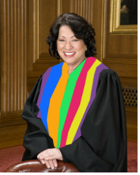
Black is a very popular color in course design since it has high contrast against white. The contrast ratio makes it a good choice and allows for the text to be read easily. The psychology of the color black is symbolic of power, elegance, sophistication, and mystery. It can also have negative connotations of rage, depression, or sadness. Black is one of the most popular colors in fashion and it is seen in logos like DKNY, Chanel, Gucci, Kate Spade, Kenneth Cole, and Calvin Klein. High-end brands love black because it is the deepest, darkest color, and the most sophisticated. Think about the last black-tie event you attended. The men probably wore black tuxedos or suits, and the event was probably formal and sophisticated, perhaps a wedding. The color also conveys power and prestige. Have you ever noticed that judges wear black robes? If judges wore pink or yellow or multi-color robes, their authority would be questioned. Black represents authority and boldness, two character traits that judges need in their job. Other people in authority who wear black are clergy, politicians, and businesspeople. When someone goes on an interview, their choice in a suit is often black. Wearing black demonstrates competence and professionalism.
 In e-learning, we often deliver prototypes in black and white until designs are finalized. This avoids color aversion from clients. If a client sees a good concept and prototype designed with a color they dislike, they may eliminate the choice altogether. By designing in black first, you focus on nailing the design and then offer a color exploratory to select an appropriate palette.
With the Black History & Culture Academy logo, you can see the use of black communicating power. Elizabeth Leiba designed this logo, but we helped her tweak it slightly.
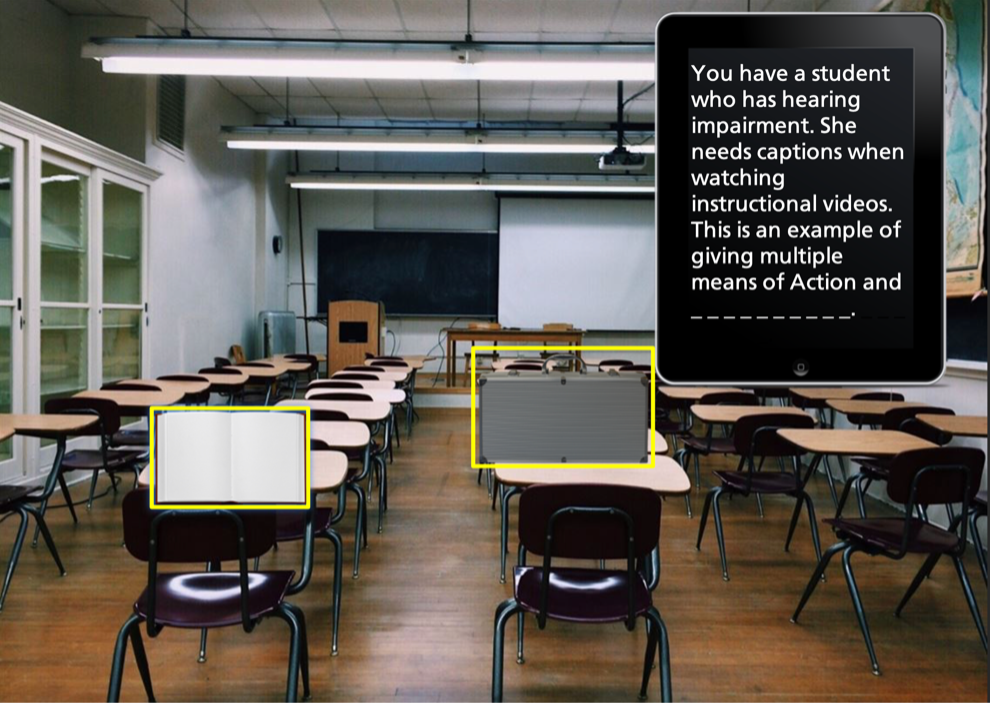
In the mock-up of an e-learning escape room on Universal Design for Learning, you can see the black tablet is used as a backdrop for white text. Black is often used in the tech industry since it is powerful, smooth, and sleek and in this case, it makes for a strong contrast ratio.
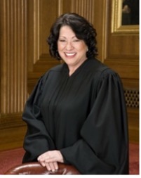
Would you trust a judge in a black robe or one in a multicolored robe? It is hard to think of the one in bright stripes as in a position of power and authority. Judges adorn black for a reason.
Brown
Brown is an earth tone, the color of soil, dirt, sand, wood, and stone. It represents all-natural and is often used in the packaging of natural consumer goods, such as a brown bag of organic coffee or the tags of an organic cotton clothing company. It represents security and comfort and down-to-earth nature. It is not as much of a commanding presence as black or purple, but it is a practical, no-nonsense color that communicates reliability. Think about the brown Amazon packages that arrive on your doorstep. They came on time in one piece. UPS has a brown logo, uniform, and truck for this very reason. They want to communicate reliability, trust, and dependability. As far as application to e-learning or graphic design, we want to apply brown as text over a white background or as a brown background with white text. We can also use color to dress it up and decrease its dull factor. A good choice would be green or yellow since together they represent nature, earth, and growth. Brown and green psychologically complement each other. Just be careful layering them together with text. Green text is never readable, no matter what background color you have. Brown text can be read, but make sure it has a darker tone to contrast effectively against a light background.
<img class="alignnone wp-image-665 size-medium" title="Photo by freestocks on Unsplash ” src=”https://pressbooks.pub/app/uploads/sites/3057/2022/02/freestocks-PxM8aeJbzvk-unsplash-300×200-1.jpg” alt=”Brighter colored wrapping ” width=”300″ height=”200″>

Brown is predictable, stable, and reliable but would you want to open a pile of brown boxes on your birthday or brightly wrapped ones?
The brown is chosen to represent the dark color of a signature stout.
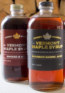
For Dorset Maple Syrup we designed their logo (found in the label) and some package design/label designs for their products. The brown color of the syrup shows through intentionally and the fall color scheme with browns, orange, golds psychologically communicate high quality, bourbon barrel, homegrown Vermont maple syrup. The sheen adds to the sophistication and is in line with the price point – a reflection of quality.
Grey
Grey is considered a neutral color and is the shade between black and white. In color psychology, grey represents neutrality and balance. It has a cold, cool, and stark feeling to it, much like white and it can sometimes represent dullness or depression. It can also be used effectively with black and white to communicate sophistication and high tech. It is a common choice for technology companies. Dark grey is often used instead of black for text to soften the look of the design. This is a stylistic choice and it depends on how commanding you want your voice to look. If using grey for text in your e-learning, make sure it has a strong contrast ratio.
One of the most appealing qualities of grey is that it can be used to appeal to a large audience due to its neutrality. You will notice many Apple products come in grey or silver. This is because their minimalist high-end, high-tech brand is meant to also communicate accessibility and clean design. Additionally, using grey appears gender-neutral in tone and brand. Apple appeals to both the engineer and the designer and avoids appearing too masculine or feminine. Grey is a strong choice when you want to select one other color to pop against it – a tactic that can be used with black as well.
Grey pairs well with any color and can be darkened or lightened to create sufficient tonal contrast with other elements in the design. The next figure shows how a grey course homepage can benefit from a mustard-hued pop of color. Grey is an excellent canvas against which to contrast a strong color against.

In the image of the chair in the corner, your eye is drawn to the mustard-hued pillow in an otherwise neutral room.

In the course homepage mockup (above), the mustard color is used as an accent to pull in the reader and entice them to select a course offering. High contrast is used for easy readability.
Branding with Color
While this book focuses on e-learning and course design, it is important to discuss brand and tone as it relates to graphic design. Branding affects the psychology of your course and the perception of the organization that is delivering it. Although you may not have a choice in the colors used for the logo, website, or marketing, you can often make color selections in your course that align with the brand and clearly communicate and attract the learner in an accessible way. When deciding colors in a course, it may be beneficial to learn more about the current trends in color and the psychology and meaning behind them. Color selection can be challenging as we want to first design intentionally and ensure our learners can read the text and course elements. Then, secondly, we want them to fall in love with the brand, connect to it in an emotional way and engage easily with the content. People fall in love with brands; they recognize them from afar, they display them on their shirts and hats, they become loyal customers for life. When we design our courses, we want our learners to feel that same connection, and color can help us to achieve that.

An analysis of United States Patent and Trademark Office data concluded that red and blue were the most popular colors in logos. The next most popular colors, in order, were green, yellow, orange, brown, gold, and lastly, violet. Further research shows the breakdown by industry, which tells a very different story. For beverages, the most popular color by far is red, then blue. Chemical logos had blue as the most popular as well. Hospitality is red, and insurance is blue. Medical companies were mostly blue, pharma mostly had blue, and so did telecom. This doesn’t mean you have to follow suit. But, when designing a logo or course, it is important to research the current product/service category to make sure your design doesn’t come out of left field. It should feel a part of the product or service category. Occasionally, you can make an exception, and I only advise this when your client is a Fortune 500 or large company with the budget to introduce its product through multiple marketing channels. An example of a successful company that strayed from the usual color scheme of a service category was TD Bank. TD Bank was successful in using green in its logo, and prior to its launch, most banks had not been so bold to do so. It makes sense to use green to communicate wealth, but blue recently had been the more stable, conservative color. In fact, you often would see blue logos with serif fonts years ago. Since then, banks have been rebranding with bold sans serif fonts and bright colors.
Overall, color choices should match your client. They should feel like they belong to the product or service category. When you design courses, you must think about the learner experience, and how the colors will make them feel about the content and brand.
In the Simfit logo, a calm cool color is paired with a warm color to make the logo pop.
Color choices can transform the learning experience
Color choice can reduce cognitive load, increase memory, and direct attention. Use color to help create transformative e-learning. A well-chosen color scheme can reduce cognitive load because learners will spend less time trying to access and understand the content and use their brainpower on the learning itself. For example, too many bright colors can cause eye strain or make the learner feel agitated compared with a cool color scheme with strong contrast so that learners can focus on the information/content on screen.
Color Stats according to elearninginfographics.com
- Colors can improve learning from 55% to 78%
- Color can enhance clarity and readability by up to 40%
- Color can help improve comprehension by 73%
- Highlighting text with a high contrast color can incite action. This tactic is used in the billing industry and when invoices were highlighted they were paid 2 weeks earlier on average.
- Green can encourage creativity
- A red chromatic learning environment can help increase concentration
- An indigo/blue chromatic learning environment can stimulate intuition
- Warm color schemes promote productivity in an office setting
Colors help learners to memorize information by increasing focus on the material. Warm colors are attention-grabbing and can be used to call out select pieces of content in e-learning. This draws the attention of the learner and helps them remember key facts like what to do or not to do, data, illustrations, and examples. Colors can also improve readability on the screen and give more clarity to the learner.
Color is a nuanced part of graphic design in which many factors need to be considered. It is not a matter of randomly selecting one, but being intentional in your choice, which allows for accessibility, tone, and aesthetics. It will take some practice but by studying other designs, getting feedback on your work, and using accessibility checkers, you can in fact use color to reduce cognitive load and create a better learning environment.
Suggested guided questions/projects to assess your understanding of color psychology:Go to the website Adobe.Color. Hit Explore. Type in keywords for a course you are designing or thinking of designing. Now check it using a digital contrast ratio to see if it is accessible. Think about how you can apply the colors in the theme and still enhance readability. Perhaps you don’t have to create colored text, but maybe you use the colors for buttons or background shades. Play with the tints and shades until you find an emotionally accessible psychologically sound color combination that is also technically accessible.
|
