6
Links Checklist
|
Links are one of the most common elements in any course, email, or webpage on the internet. Microsoft Word documents and offline software sometimes have links in the form of URLs or page bookmarks, popping users from one area of a document to another. Learning how to create and write links will improve the digital experience for all learners and help with usability and accessibility. Screen readers need to be able to recognize and read links to users that make sense and improve navigation.
We need to write concise but descriptive text to help users make meaning. The visually impaired can hear a list of all the links on a page at once, so proper wording is imperative. Well-written links are crucial but it is also important to know where to place links. Making sure links are easy to find on the page and using the right color and stylization can help every learner find them.
Best practices in creating links
Write as you normally would, then highlight the text you want to make into a link and insert the link. The link should say where the destination should be in a logical way. If you are directing someone to email, you just type out the email and link the email address. For long websites, it would be frustrating for visually impaired learners to have to listen to every character of the website called aloud. Although there is no maximum character limit, keeping things concise while providing just enough information to know what you are clicking on is best.
What are the biggest design blunders you see in the ID/LXD/L&D field?Personally, the design blunder that annoys me the most is seeing underlined text on a screen that is NOT a link. That is so confusing for students. They will either think a link is broken or become conditioned not to expect a link. Also, online “courses” that are really information repositories. I’ve seen this approach in different LMSs over the years, where you log in and the home page is a long list of links to PowerPoints, PDFs, videos, etc. in a completely online course, this is an approach that has a big (negative) impact on the learning experience. -Parm Gill, Learning Designer, University of British Columbia |
Make sure your link phrases have meaning and can exist inside and outside of the context of the material on your document. For example, avoid link phrases like “click here,” “hear more,” or “read more.” One of the biggest mistakes I see is writing “click here” next to the link. As a sighted person, I am wary of clicking on undescriptive links; most visually impaired learners would be frustrated due to the way the screen reader reads the link. Another reason not to write “click here” is because touch screens do not click.
Instead of saying “click here to listen to the podcast,” consider saying “The Graphic Design for the Course Designer Podcast” and just linking that phrase. Describe clearly and succinctly where the link leads, or what its function is on the page. It can be more descriptively clear to use nouns within link text. Think carefully about the relationship between the link and its context and try to prioritize using specific nouns in link names. In other words, be descriptive and clearly communicate where you will take users.
Poor link labels hurt your search engine ranking (McCloskey, 2014). Search engines use the anchored text (what you write as a link description) to give the web clues as to what the article is about. Writing clear but concise descriptions will help usability, accessibility, and SEO.
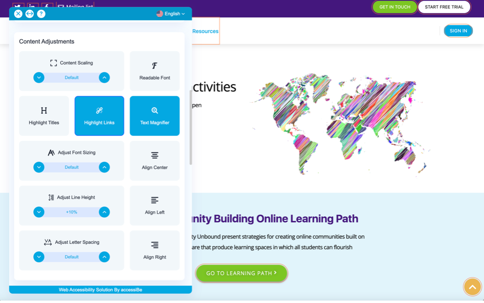
A good example of well-written link descriptions is on the ONEHE webpage. The links are clear and descriptive and the organization uses a web accessibility solution (accessibe.com) to create customized settings on their website. Another mistake I see frequently is when instructors and designers leave broken links in courses. Make sure to update your course materials and be sure all links are live. The web is a fluid construct where pages can change, move, or go down completely. It is wise to make sure everything is still relevant, live and working. Several LMS and software programs have accessibility checkers that will check for broken links but a manual review is never a bad idea.
Link Styling
There should never be blue text on the web unless it is a link. Users may get frustrated if they try to click on textual phrases or graphics that look like links but are not. With link styling, as with many aspects of web-interface design, you can aid comprehension by capitalizing on convention. By default, browsers style unvisited links with a #0000EE blue and visited links with a #551A8B purple (Harvard University Digital Accessibility, n.d.). These colors will be the easiest identifiers at your disposal.
Guideline 1.4.1 “Use of Color” from WCAG 2.1 Color is not used as the sole method of conveying content or distinguishing visual elements. In other words, color alone is not used to distinguish links from surrounding text unless the contrast ratio between the link and the surrounding text is at least 3:1 and an additional distinction (e.g., it becomes underlined) is provided when the link is hovered over and receives focus.
Buttons, shapes, icons, or images as links
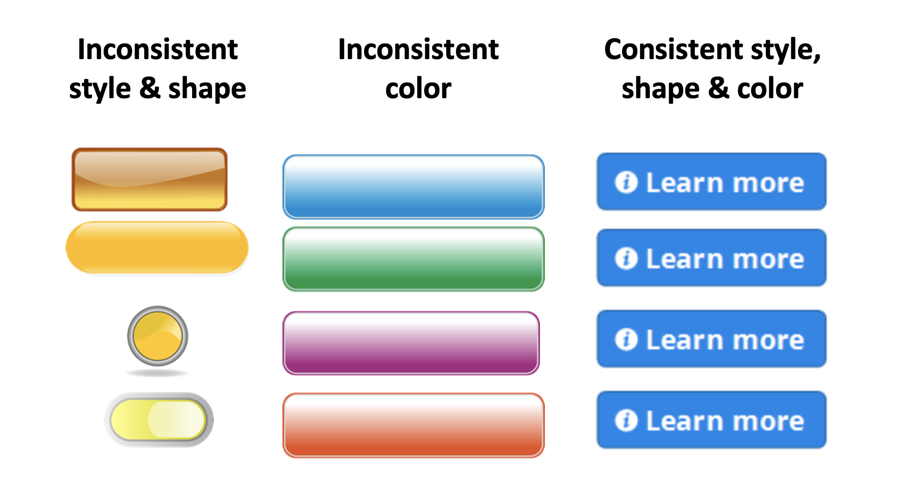
Placing design elements like screen titles, text boxes, and buttons in the same location on each slide will help with usability, but consistent placement is especially important when those elements are a link. When buttons have the same visual states and are in the same place on every slide, it decreases the cognitive load of the learner. When you don’t have to expend brainpower trying to decipher and decode graphic elements and their purpose, you can concentrate more effectively on the learning. If you were to put the “continue” button in a different color in a different part of the page on every slide, it would cause confusion and frustration. Remember to also include consistent states (all buttons look the same way when hovered over, and selected for example), consistent fonts, and naming styles.
Suggested guided questions/projects to assess your understanding of links:
|
