12
Repetition Checklist
|
Did you ever take an online training where when you clicked inside one of the dropdowns in the navigation bar and it took you to a page that looks nothing like the rest? Perhaps the font was different, or the colors and placement. You may have gotten disoriented, especially if you couldn’t find where to get to the home page again. This makes people feel uneasy and unsafe online, and they will likely leave the site altogether. Think about the experience of shopping online, for example. Shoppers need to feel secure and they look for signs that the site is safe. If they go to add in their credit card information and the page design suddenly changes its look and feel, it can be jarring. I know I prefer to pay with PayPal whenever possible and when I select it, I know this opens a new trusted site away from the e-commerce one where I’m shopping. This is different from entering your credit card on a website you are unfamiliar with and which appears shady due to its inconsistent nature. Repetition makes us feel safe.
What is repetition anyway? Repetition is the act of taking a single graphic element (line, color, shape, bullet-style, margin, font) and replicating it in the design. Our brain likes order and it likes repetition. Think about how many repeated behaviors you do in a day. You probably drink your coffee at the same time every day, and if you have a small child, you may go through a bedtime routine the same way every night. If you are on a website, you probably want the same navigation bar to look the same way no matter what page you hop onto. Repetition calms us, brings us order, and helps us feel safe.
Repetition is great, but it is important to note that it can be overdone. A bulleted list of 10 items looks worse than a bulleted list of 5. Too many bullets are monotonous and cluttered. We want to be careful to strike a balance in the amount of repetition we use. Too much and our learner becomes bored and complacent. Too little and our learner becomes disoriented, confused, or apathetic. Instead of placing all the text on one slide, we can place each category on its own slide. Slides are free; use as many as you need. One thought/idea per slide. Use the white space. It is much easier to get through the content when there are different slides versus one with 15 bullet points.
When we see a repetition of elements in our e-learning, we are calmed, our memory is jogged, and we have fewer barriers to our success – because we know repeating elements tie together our designs in a cohesive way, helping learners to focus on what they do best: learn. Repetition is an important concept whether we are talking about the distribution of learning activities or the design of a presentation.
I recently designed an online professional development course meant to train high school educators to implement a specific curriculum in their own courses. The training used workshopping to demonstrate the kinds of activities that would be delivered to their face-to-face students so we had to reimagine how that would look in an online environment. One module was designed to go through a series of narrated stories. In the face-to-face version of the training, there were videos, people talking, and conversations taking place that broke up the stories.
In the online course, I animated and did voiceover work for several videos in an asynchronous environment. When we beta-tested this module using the Community Based Participatory Research Method (CBPR) participants found the sheer number of videos was too much. They were overwhelming, and although they were short, participants felt there was too much to wade through. The repetition was overkill. We needed to offer some variety in the way these stories were presented. We redesigned the module to incorporate both written text, video, and audio to mix it up and to be more in line with universal design for learning principles.
Repetition of images – Image sets
We can repeat many things in our courses, including images. This doesn’t mean we want to repeat the same exact image. That would be boring. Instead, we want to repeat image sets so they look like they are of a similar genre or like they were taken on the same day by the same photographer. We can’t always find that, but the lighting should be similar and if it isn’t we can use software to adjust it. You can use digital tools to adjust the lighting, brightness, contrast, and color – making it warmer or cooler, to create a cohesive set of images.
Another option is to make them all black and white, so you can avoid having images with drastically different color schemes. Another mistake I see often in e-learning is using photos of people that are made at different sizes and cropped differently, on the same page. If you do this intentionally to add contrast, that is one thing. But if you have one giant cropped head, and another full-body, and another cropped to shoulders on the same page, the result looks inconsistent and doesn’t make sense in terms of depth.
In a course I helped design and develop for ONEHE on UDL and Technology with Dr. Thomas J. Tobin, I tried to use photographs from the same source. I looked for photos taken by the same photographer from the same photoshoot in which the lighting is the same. When I couldn’t find that, I at least used images that were all taken indoors in an office setting to achieve a sense of consistency.
On my walls in my home, I have a series of photos along my hall and they have a consistent look and feel. You can see a select few below. They were taken outside at the same time of day at the same location, and the people in the photo are wearing the same colors. This brings a sense of order and professionalism. These photos were taken with a simple iPhone. But because of this attention to detail, they appear as if a professional took them.
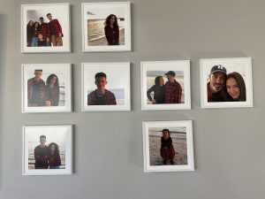 They were all taken at the local beach at sundown, so they have a similar look and feel. Ideally, when designing, you want your photos to have something that ties them together. When images appear cluttered and random, they become confusing and, according to the Mayers principle of coherence, we know extraneous graphic elements add to the cognitive load (Walsh, 2021). If the image doesn’t support the learning it becomes an eyesore, visual tension is created and the learner cannot focus effectively on the material.
When selecting icons, I use icon sets, versus just randomly finding icons, because chances are, they differ stylistically. Using icon sets will ensure the weight, color, effects, and other attributes look more cohesive. When you download an icon set it means all the icons in the variety pack are designed by the same artist. Stylistically, this will achieve a sense of repetition and consistency. I often download icon sets and if there the set has no icons I need, I can modify one of those in the set to contain the attributes I want. That at least allows me to achieve a sense of consistency in terms of style.
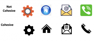 I also design my own icons when needed, so I can control a variety of factors. There are several websites where you can find free or inexpensive icon sets. It may be worth looking into a subscription for photos, illustrations, and icon sets since this is often the least expensive and less time-consuming way to find assets. The figure on the left shows two columns. The column on the top has icons taken from different places online, designed by different artists and they appear like they don’t belong together. The column on the bottom has several icons from Microsoft Word. Because they came from the same place, they have the same stroke width, the same heaviness, color, and style.
Font Repetition
Repeating fonts is a good practice. In fact, the rule is to limit your font choices. If you have more than three, the page becomes too cluttered and hard for the reader to get through. If the page looks unpolished or unprofessional, it will turn off your clients, employers, and your learners. Too many different fonts create excess cognitive load because the act of deciphering text, styles, and headings takes significant processing power, which becomes a barrier to learning. It is important to pay close attention to the nuances of repeating text.
Most importantly, make sure the headline H1 header is the same throughout the module. The line spacing, the word spacing, and the spacing between where the headline is located and the edge of the frame should be consistent when possible. We also want to repeat the same body copy fonts throughout and the same subheads. This doesn’t mean we make every bit of text the same font and the same font treatment. If everything was set in Times New Roman 12-point text and double-spaced, the course would feel more like an essay. Images and headers act as visual signposts to break up walls of text.
Differentiating headers need to be present to break up and chunk text. A course needs to be broken into bite-sized pieces so that the reader can absorb the content more easily. A best practice in course design is to use contrasting fonts to draw in the reader and then to repeat those stylized headers throughout. An example would be to use Helvetica Neu Bold Condensed H1 – 32pt for headings and Helvetica Neu Roman 12pt for body copy and repeat those options throughout.
To be more accessible, you should always use the HTML headers in courses. (H1, H2 etc.) If you just randomly decide how to style it, the content becomes less accessible. If you want to adjust the set style guides, you can use CSS (cascading style sheets) in your program to edit the chosen headers and body copy. Then you can apply the new font choices in a consistent way that will be picked up correctly with screen readers.
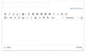
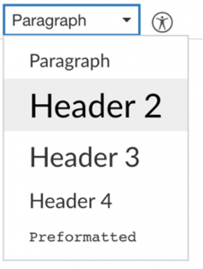
In the images above there is a screenshot of the Canvas HTML editor. When changing the font sizes select the paragraph dropdown menu and select Header 2 through Header 4. The Title input field is Header 1, so all pages already have a Header 1 tag. Structure your Canvas content, starting with Header 2, making sure to properly nest any additional headers. You can customize the font size, style, and color after you apply the proper header.
| It is critical that people seek to use built-in formatting tools. Use header styles, don’t manually format text to look like a header. Use template slides in PowerPoint.
– Eric Moore, PhD, Director of Learning Technology at Kennedy Krieger Institute |
Repeating color
Color can communicate feelings and reinforce the brand or client. I have been working in advertising and graphic design since the 2000s and anytime I worked on a Fortune 500 company project, we would have to use brand and design style guides. I became highly interested in these style guides and would pour over them to study the color swatches, font choices, logo lockup instructions, general tone of voice, and composition suggestions for ads, websites, and the like.
When I started my own company, I took on corporate identity projects and often created branding/design style guides for them. We became known for launching and rebranding companies with a highly polished look and feel, along with helping them to design future projects with a design-standards document that gave them a set of instructions for keeping consistent with what we created.
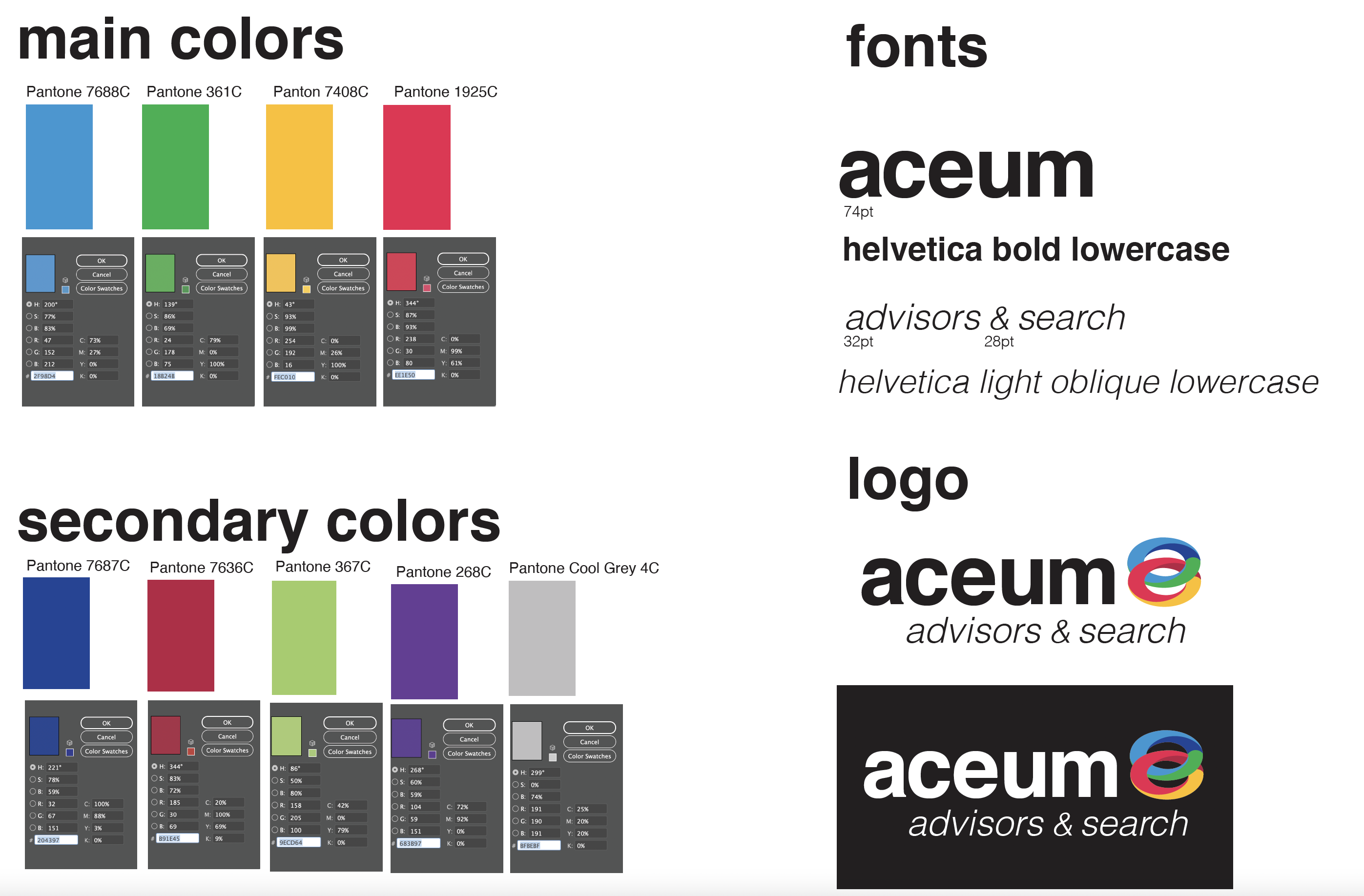
In a design-standard guide, we create a set of swatches set in RGB, Hexadecimal, CMYK, and Pantone. RGB stands for Red, Green, Blue which are the three hues that can be mixed together to get a variety of colors intended for the screen. RGB is considered an additive model versus a subtractive one meaning when 100% of red, green, and blue are mixed together you get white. When 0% of R, G, B is added together you get black. This is the opposite of the CMYK model.

R 0, G 75, B 133
Above is an example of a color breakdown for the blue swatch in RGB.
Hexadecimal color or otherwise known as the Hex code is a 6 digit combination of colors that when combined create a digital color just for the screen. The values of a hexadecimal digit can be 0, 1, 2, 3, 4, 5, 6, 7, 8, 9, A, B, C, D, E, F.
The same color in a hex breakdown is as follows: Hex# 004b85
CMYK stands for Cyan, Magenta, Yellow, and Black. They are the four ink colors that are mixed together to get a particular color for print application only. CMYK is considered subtractive. In other words, when mixing them together the colors get darker. When blending 100% of each, you get black. C 100, M 56, Y 0, K 4
We usually select 2-3 primary colors and 2-3 secondary colors for most of our clients. Too many colors and it looks like a circus or a kindergarten classroom. You will notice most logos are set in no more than 2-3 colors.
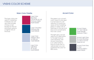

The images above include screenshots taken from the design standards guide we designed for Visiting Nurse Service and Hospice of Suffolk. For our client, we used a neutral Wedgewood blue and a pink/magenta-toned red for an accent color. This choice was determined by the location of the center; it needed to fit in with the historic colonial look within an upscale town. Their original logo had a bright color scheme, the excess lines were overkill, and the fonts were forcibly stretched. Our small changes made a big impact, especially the color tweaks.


The extra lines in the old logo cause visual clutter and confusion. The minimalist logo is streamlined and simplified while keeping the brand equity of the original. The colors are also subdued and reflect a warmer, less alarming feel.
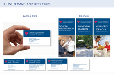
We also included dark grey (for all body copy vs. black) and an accent color of green. This style guide set up the client to produce designs that were consistent. We created several job aids for the nurses and home health care aids, on-site signage for the hospice, and annual reports, fundraising materials, a set of sympathy cards, brochures, and more – all within this new style and always using the same exact colors, fonts, and image style treatment. By doing this, we create an instantly recognizable brand that looks trustworthy and consistent and, most importantly, guides people to get the help they need. Good design allows the reader to determine if the service or product is for them. Good design doesn’t need giant arrows, starbursts, or tricky effects to get their reader to click through the course.
| Tip: Good design is consistent, intuitive, and accessible. |
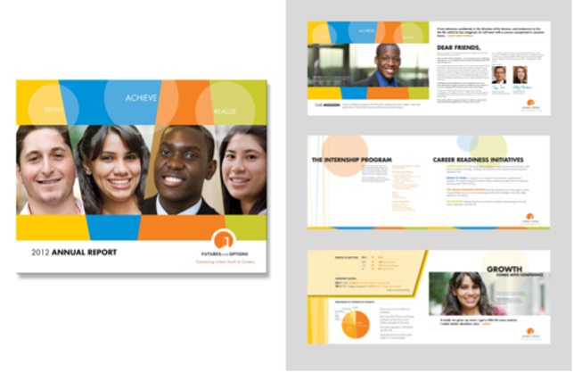
The below figure provides another example of a design standards guide that we created when rebranding the organization. These colors informed the website, business card, and all marketing collateral.
Different projects still need brand consistency
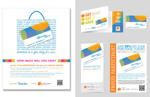
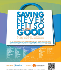
These Futures and Options pieces in the below figure look like they come from the same organization. Different deliverables related to workforce development and education for young adults yet the look and feel is consistent because of the concentric color scheme. If you create two curriculum guides or job aids with slightly different purposes for two organizations, they should have a similar look and feel. In the example, there is an annual report, a fully integrated fundraising campaign run in Real Simple magazine, Time magazine, and across the country with a focus on Madison avenue shops. I chose these examples to brand consistency among project variety.
Repeating shape
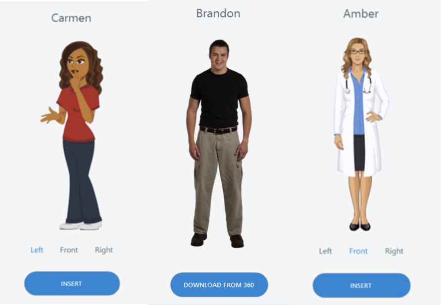
Have you ever noticed that in a yearbook, the headshots of the students in the book are all in the same shape? You may notice that they are lined up in a grid, and inside a picture box that is a vertical rectangle. In fact, chances are you may even see the golden ratio there. It would look odd if a handful of students were inside an oval picture box. There should be a consistent picture-box shape unless you want to call out a focal point. In an e-learning course, you don’t want to mix and match too many elements. If you have illustrated characters, you don’t want to also have photographic ones. If you have rounded buttons, you don’t also want to have square ones. If you have black text in your headers, you don’t also want to have red. Too many choices look random and unprofessional. We want to find unity, balance, and calm to allow our learners to get through the material with less friction, fewer obstacles, and less visual tension. All of this translates to reduced cognitive load and better learning. In the figure below taken from the Articulate Storyline character selection panel, you can see how inconsistent and unprofessional the first set of characters look. This character set creates confusion due to the different photo and illustrative styles. The rule is to use all illustrations or all photographs, do not combine the two. The second set in the figure below is the better choice in these examples.
Cohesive
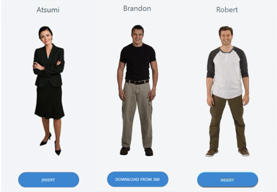
Not cohesive
Suggested guided questions/projects to assess your understanding of repetition:
|
