10
Design Contrast Checklist
|
In the digital accessibility section of this book, I wrote about color contrast but in graphic design theory, contrast expands beyond just color. In graphic design, contrast is defined as two or more elements that are visually different from each other in a composition. The more difference detected, the greater the contrast between the elements. Contrast is useful for creating a focal point that visually draws your eyes to it first. Contrast helps establish hierarchy and can be used to visually balance elements on a page by giving weight, size, color, shape, or direction. Contrast creates better visual design and it also helps promote accessibility. Poor contrast means low accessibility.
I’ll never forget the night that I really understood the importance of contrast. It was one of those nights, dark with heavy rain that randomly fell in buckets. I was having a hard time seeing. It was Mother’s Day. I was 19 and driving home from my grandmother’s house. I was turning at an intersection and although I had been down that road many times before, it was one of the first times I was driving and not a passenger. I had to watch for the signs to make sure I didn’t get lost. Well, that night I got into a car accident, partly because I hadn’t seen the car coming head-on. Thank goodness we were both O.K., but it’s odd the things that flash through your mind in an accident. As the car skidded in the night, I thought about graphic design. I saw the green street sign as I pulled to the side and it made me realize how much thought and intention went into designing street signs, and how the contrast of green background with white text that you see on so many road signs are such a good combination.
The road conditions were poor that night, but the one thing I saw clearly was the street signs. It made me want to do more research. I later found out who designed the signs, why they were designed that way, and all about the accessibility of certain fonts and colors. Don Meeker is a famous sign designer who developed the font Clearview, often found on highway signs across the country. He did extensive research on the legibility of this font and the contrast it makes with the green background. His designs are also found at several National Parks across the United States. Sign designers are often called environmental designers because they help wayfinding.
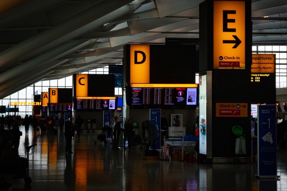
Environmental designers create signage for parks, highways, museums, office buildings, hospitals, airports. Think about the last time you were at an airport. The design of airport signs both inside and outside the buildings must quickly direct traffic by foot, car, and plane by keeping accessibility in mind. Designers use font, color, and icons to communicate clearly to a diverse audience. Most importantly, they design with very high contrast.
Signs need to be read and understood from far away and up close. Another place you see high-contrast signs is at National Parks. In order to follow trailhead signs and internal markers, visitors need high-contrast visual cues so they can stay on the path. Without wayfinding, we would be constantly lost. Our GPS apps are not useful if we can’t see the street signs or the highway marker to make the turn. Contrast shows up frequently in the environment: the bright, large sign that alerts you of the gap between the platform and the train; the dark elevator buttons lit up with bright lights that also contain braille for the visually impaired. Instructional designers can learn a great deal about contrast, accessibility, and usability from environmental designers.
How to use contrast in e-learning
Contrasting elements in an e-learning course can differentiate between elements such as headers, subheads, body copy, images, icons, and buttons. The greater the difference between elements, the greater the contrast. The author of the book The Non-Designers Design Book Robin Williams coined the term “Don’t be a Wimp” because when it comes to contrast, the greater the difference, the greater the contrast. You cannot contrast text that is 14-points with text that is 18 points. You cannot contrast dark red with red. You cannot contrast a 1-inch photo with a 1.5-inch photo.

One solution to increase contrast is to make the headline H1 header much larger and bolder, as you can see in the example above. The word “contrast” is probably the first thing you looked at when you turned the page. Contrasting size is an easy way to add difference and help draw the reader in.
Contrast size

We can contrast the size of two elements on a page to add interest and use hierarchy to establish order, balance, and a strong composition. Choose to contrast two characters in a scene by using size and depth to demonstrate importance. Try having more of a dramatic scene played out just from contrasting the size of the characters. If we contrast the size of the character, we know we are going to be focused on the larger one versus the one set in the background.
Contrast Weight
Contrasting weight can add drama to the objects we see on the screen. Objects that are larger, thicker, bolder, or darker appear heavier compared to other elements on a page. Adding visual weight makes graphic elements look heavier than others on a page. Your job as a learning designer with graphic design skills is to make people notice the things that matter most and avoid distracting the user with anything that could make them stray from the goal of finishing the course. When you add visual weight to parts of your layout, you increase the chance that the learner will see those parts in order of their importance.
When designing a page, prioritize key elements by giving them heavier visual weight. Some things you might consider giving heavier visual weights to may include a call-to-action button or photo, illustration, or catchy headline/header. You can even manually adjust a photo to highlight a subject in the image. There are several ways to give a graphic element more visual weight and I outlined just a few below.

Change color to make it visually heavier in weight. Even a darker grey over a lighter grey makes a difference.

Move an object away from the group to make it visually heavier and makes us focus on it.
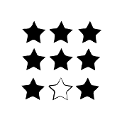
Make it look different by varying the stroke, fill, or pattern of the element. You can also apply an effect or style to the element to make it pop.

Making the key element larger will give it more weight.
Contrast type
When we contrast type, we choose fonts that look very different from each other. Remember, the rule, in contrast, is “don’t be a wimp.” We want to make a big difference between our headings and our body copy and we can do that in several ways. For example, a font that is extra bold condensed can be contrasted with a font that is set in a lighter version of the same font and much smaller.
When we contrast a large, heavy rule on the top of a course as a knockout – (meaning the black background is contrasting with the white text overlay) with the body copy set in roman/regular type, we are contrasting effectively. You can contrast with various font combinations as well as contrasting boldness, size, and color.
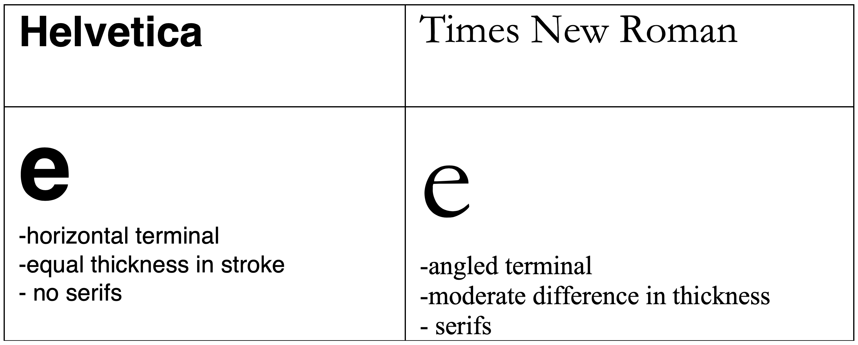
Typography can appear heavier in weight than the other items on the page based on the weight of the letterforms in the chosen font. For example, if you look at Helvetica condensed bold, the lowercase ‘e’ is distinctive enough to make it identifiable by the eye. The terminal is perfectly horizontal and the weight is equally distributed in the letter.
If you look at Times New Roman up closely, you will see a variation between the thickness and thinness of the letterform. Look at the lowercase “e,” for example, and you will see there are thicker and thinner parts of this letter, making the overall impression of the Times New Roman font lighter and the Helvetica font heavier. We can further contrast this, of course, with size and by adding bold attributes to the bulkier font Helvetica.
Contrast Shape
One example of contrasting shapes is to create a grid of photo squares and then create a focal point within the grid by making one photo circular in nature. If you want the reader to focus on that photo first, you can change its picture box shape. Another way to do the same thing is to take a group photo of characters and then create a circular halo around the one character you would like to focus on.
Another trick designers use is to create a grid of text on the page but have a text wrap around an image that takes up the central focus. The image boundary can be organic in nature, meaning it doesn’t have clean straight lines that would break up the super aligned copy. By formatting a clipping path around an object in the image, it will become the element that stands out the most. The image will be the only object in the composition that breaks from the grid so your eye will go there first.
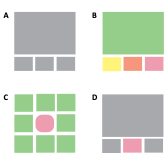
Look at the four grids to the left. In grid A, there is minimum contrast. Not very dynamic. In grid B there are too many different colors the user doesn’t know which is the most important and there is zero hierarchy. In grid C the center shape takes precedence, the user knows what the most important part of the layout is as not only is it a different color but also a different shape. Grid D is also a good choice but not as strong as C. Contrasting weight, shape, and color is a good way to add a dynamic look and feel to your page.
Suggested guided questions/projects to assess your understanding of contrast:
|
