5
Headings Checklist
|
According to W3.org, HTML defines six levels of headings. A heading element implies all the font changes, paragraph breaks before and after, and any white space necessary to render the heading. The heading elements are H1, H2, H3, H4, H5, and H6, with H1 being the highest (or most important) level and H6 the least. Screen readers read headings to the visually impaired to help them differentiate between sections of the document, webpage, or course.
Headings create a structural hierarchy of information, which benefits all learners. They help chunk material that is long or complex with a semantic order. Headings will help assistive technology chunk long passages of text into more bite-size pieces. Headings and subheads can act as navigation and signposts for the visually impaired. Using formatted HTML Headings can benefit the neuro-diverse who may struggle with confusing walls of text or unorganized page structures. Using headings can in fact benefit all learners.
How to use headings
Using style sheets or built-in headings is better than creating subheads from scratch because just visually changing the look and feel of a subhead doesn’t mean it will be picked up by a screen reader unless a heading level is properly selected. When a heading level is selected, it is tagged, which will trigger a visually different look and feel. If you don’t like the heading styles, they can usually be adjusted in the headings panel, depending on the software.
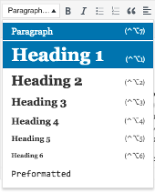
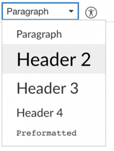
If you do decide to change the fonts in the headings, make sure you are using a font that has several attributes available versus force bolding or force italicizing it. Open sans, for example, is one of the most downloaded web fonts because it has multiple versions of the font including roman, bold, italic, light italic, semi-bold, extra bold, and more. The images below display the Microsoft Word and Canvas heading drop downs so you know what to look for when selecting appropriate headings. Microsoft Word Heading Style Ribbon above and the Canvas Rich Content Editor on the bottom.
Best practices in applying headings in your documents
It is a good idea to use short headings of seven words or less since lengthy headings are harder to read and listen to. Always group related paragraphs and clearly label and describe the sections. Think of headings as a way to provide an outline of the content. A rule of thumb is if the paragraph is longer than three to four sentences, it should contain a subhead to break up the information and help learners jump to certain sections of the page. A page should be organized into sections, and further subdivided with semantic headings (W3.org, n.d).
These headings should describe the relevant topic or purpose of each subsection. By using headings, you help to chunk material into smaller pieces with semantic and ordered hierarchal heading styles. Using headings to group information also reduces cognitive load by creating consistency across the course.
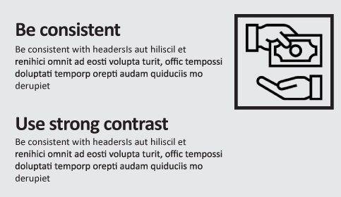
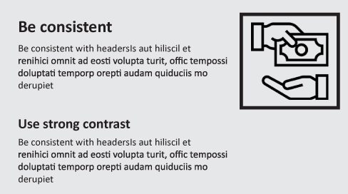
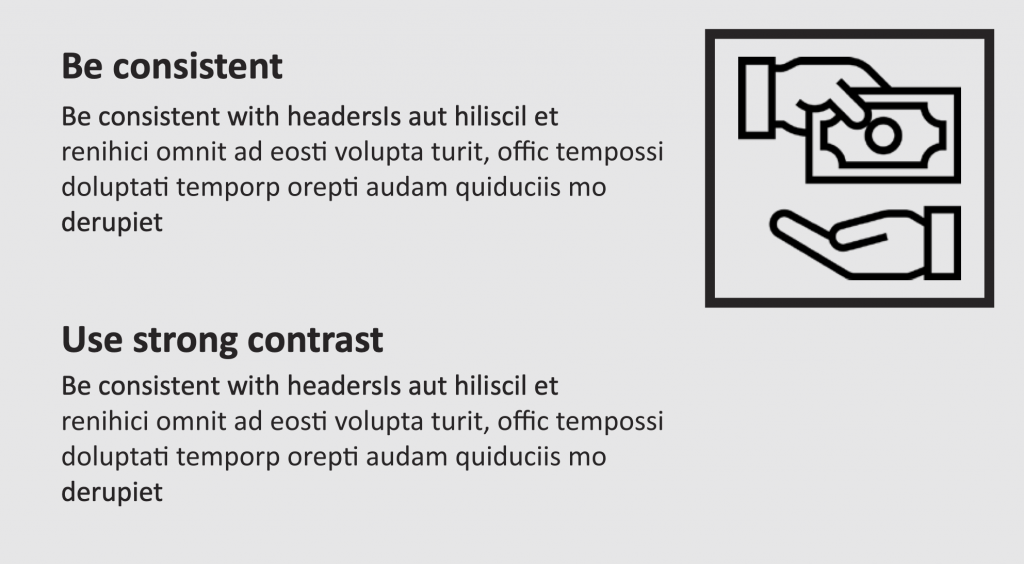
Headings are one way to create and improve the accessibility of curricular materials. Headings, when done correctly, help the organization, navigation, and order of anything from Microsoft PowerPoint files to Canvas courses and more. Below are three examples of using headers in e-learning. The top option is considered to have a strong graphic design because it has a consistent, cohesive look with solid contrast.
Suggested guided questions/projects to assess your understanding of color Headings:
|
