15
Typography Checklist
|
The practice of arranging type well is one of the biggest predictors that readers will engage with the text. Typography is a nuanced art that many spend years perfecting. However, one can greatly improve their abilities with a few basic concepts, more awareness, and some practice. The typeface you choose makes a big difference in determining whether a design is considered good or bad. Legibility, readability, and human behavior all play a part in font selection and groupings.
I took several semester-long classes in typography, yet I still didn’t consider myself a master and in fact, I was reminded of this embarrassingly on one of my first interviews. I vaguely recall sitting in the office of the Chief Creative Officer as he flipped through my book. (Yes, years ago, we used a leather-bound zipped-up binder with plastic sleeves to showcase our work.)

Anyway, the slow act of a creative director turning the pages of my portfolio was enough to give me heart palpitations.
I literally watched him mentally tear it apart, all my vulnerabilities out in plain view for the world to see. As I watched the creative director turn the page, I saw him smiling. We conversed about my projects and work until he stopped at a page, frowned, and then shut the binder, zipped it up, and handed it back to me. I looked at him, waited for some sort of response or feedback. When I got none, I mustered enough courage to kindly ask what the next steps were in the interview process.
He responded, “I am done. There is nothing else I need to see. In fact, when I got to your highway billboard example, I realized you weren’t putting in the level of detail we need at this firm. You see, your lowercase ‘a’ is too far away from the capital ‘W’, which means you let the default setting do the job and didn’t take the time to kern the letters in a space where every letterform counts.”
Wow. He opened up the portfolio again and pointed to the example. I thanked him for the detailed feedback and his time, and quietly left the office. This lesson isn’t about kerning per se, but knowing how to apply graphic design theory and being intentional with your choices sets you apart from the competition. Those small details make a huge difference. Do you want to be a high-quality designer or a “meh” one? Which do you think earns higher pay? Which do you think gets to work on more known products or bigger clients? Which do you think will stop a hiring manager in its tracks in a positive way?
Typography, like color, is a complex and nuanced subject. For this book, we discuss the psychology of typography, how to select fonts, font categories, combining fonts, and how to set type in a more accessible way. By being intentional with typography we can work to reduce cognitive load. Typography can be beautiful when done well. Typography exists to make the writing easier to read. It is not meant to be a decorative element to adorn the page. Type makes the experience of navigating the learning easier and more enjoyable for the student. Typography communicates visually and works with the elements on the page to transmit messages, inform, and inspire.
Font categories
Fonts come in a few different categories. It is good to learn them all and to understand when and where to use them, and how to identify them. Once you learn how to identify the font category, you can become more successful at combining fonts. There are several different font categories including serif, sans serif, decorative, and script. The font in this book is set purposely with an old-style serif. I wouldn’t have it any other way. I am a voracious reader of books, journal articles, and all sorts of long-form content. Serifs are the best for this use case because they help lead the eye from one letterform to the next, and from one word to the next just by their inherent design. Serif means feet, and if you zoom in and look at the letterforms you will see there are little – “feet” on the bottom of some of the letters like r, m, n, l, s, d, h, I, l, x, z, u, a. Serif fonts, like the one in this book, tend to be traditional and have been used for centuries, dating as far back as Gutenberg.
Old Style Fonts
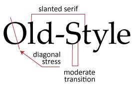
The font set in this book is Times New Roman. It is a serif font that is part of a category called Old Style fonts. You can tell this because of the moderate variability between the thickness and thinness of the letterforms. You can also tell by the slight axis of the letters. If you look closely at the O, for example, and examine the spots where the letterform is most thin and draw a line through those two spots, you will see the entire letterform is on a slight axis. There is also a slight curve to the serifs, as they are wedge-shaped and slightly angled. Old Style fonts have just enough sturdiness because their variability doesn’t cause eye strain over time. It also saves ink if you were to print something compared with using a heavier, thicker font. Old-style fonts are a classic, and will most likely be set in books, newspapers, and magazines for as long as print is still around. Some examples of Old-Style fonts are Times New Roman, Adobe Jenson, Garamond, and Goudy Old Style.
Chances are, you have a few old-style fonts in your font library. These fonts are in fact old, so old that they were created between the 15th and 18th centuries. You can identify the font by curved strokes with left inclined axes and a little contrast between thick and thins. Serifs are almost always bracketed in old-style designs, and head serifs are often angled. The lowercase “e” in some versions features a diagonal cross stroke. When you study these characteristics over time, you will be able to develop a superhuman ability to identify fonts, their history, and their place in this world. The figure below is a diagram of some common identifiers of old-style fonts. An example is Adobe Caslon.
Slab Serif
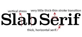
Slab serif is a font that has thick heavy feet/serifs. They are not quite as dainty as an Old Style. Fonts set in a slab serif are often found in children’s books set in a very large point size since their exaggerated serifs help young readers get from one letter to another. It is not a wise choice when set in very small fonts (like in a novel) as the slabs can appear a bit clunky, almost bumping into each other. Slab serifs work well for headlines and in large sizes. Some examples of Slab Serif fonts are Clarendon, American Typewriter, Rockwell, and Courier. They do not have much variability in letterform thickness and tend to be uniform without any slants. Slab serifs that look like a typewriter font can be used in a decorative way, again set large maybe as a title of a book. Slab serifs pair well with sans serifs. The figure below has a diagram of a slab serif, in this case, it is Super Clarendon.
Modern Fonts
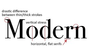
Modern fonts are a type of serif font and they are used very selectively. When I say modern, this doesn’t mean recent. Modern fonts are a category of typography. You often see them as a title in a fashion magazine or a billboard for a movie or event. You can tell a Modern font by the large variability of the thickness of the letterform and the lack of an axis.
The letters stand very straight and tall and were quite popular around the 1920s when the Golden age and the style of Art Deco seemed to permeate all forms of design with the same tall thin shapes. Modern fonts became a symbol of aristocracy, which is still associated with the font category today. Even though we may want to use typography to create this feeling of high-end luxury, we want to remember to use this font in moderation. It is not the easiest to read and is best used when set in 5 words or fewer. Some examples of Modern fonts are Modern, Billboard, Bodoni, Didot, and Didone. Figure X contains a diagram of a modern-style font.
Sans Serif
Sans serif fonts do not have serifs. They also have very little variation in stroke width and tend to appear rounded and upright. They convey simplicity. The Swiss Dot movement, which was all about minimalism and clean lines, helped to catapult the popularity of the Sans Serif. Helvetica for example permeated society and still does. You can see Helvetica on government forms, signage, posters, ads, e-learning, college campuses, and pretty much everywhere. Sans serif fonts are the most popular typefaces in e-learning because they are the most suitable for short bursts of text. This is why it is the go-to category for all social media, most websites, blogs, and apps. Some examples of popular sans serif fonts are Helvetica, Calibri, Lato, Arial, Century Gothic, Avenir, Avant Guard Pro, Montserrat, and Franklin Gothic.
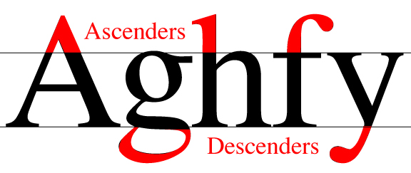
Some Sans Serif fonts are more readable than others, and one way to examine this is to look at the “x” height of the lowercase letters. If you notice the lowercase ‘a” reaches almost as high as the ascender of the lowercase “d,” your font has an especially high x-height. This can cause barriers and make it harder for learners to read the content. To review what an ascender is take a peek at the figure below.
The font Hobo is considered decorative but it is a sans serif font as well and a terrible one to use in e-learning. Why? Because there are no ascenders or descenders, and the x-height is too high, which confuses learners when they try to decipher words. The “a” and the “d” are too similar, and the “n” and the “h” are often confused as well. Readability is an important issue, not only for the visually impaired but also for the neurodiverse.

Another font to avoid is Papyrus. Papyrus is overdone and seen on so many Mediterranean restaurants, spas, nail salons, thrift stores, you name it. Papyrus is also extremely hard to read. The letterform is purposely decomposed and degenerative and the strokes can be hard to decipher from each other when set at small sizes.

Conflicting Studies on Comic Sans
If you ask any graphic designer what they think of Comic Sans, they will likely commiserate on the perils of using this font. Usually, they will state their dislike of the font, and explain their rationale. If you Google Comic Sans you will find apparel, posters, and websites devoted to hating on the font. Comic Sans was developed for comic books many years ago and resultantly, it works best for very short bursts of text. K-12 educators later adopted the font because of its handwritten primary-looking appearance and now it is known for these two things. Fortune 500 companies wouldn’t be caught dead donning Comic Sans in their branding, because their digital appearance would immediately be devoid of professionalism.

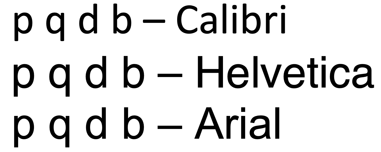
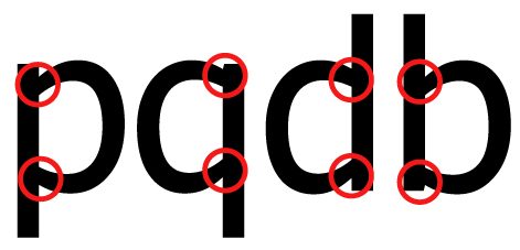
Comic sans has been evaluated for readability, legibility, and retention by reading researchers. The results of these studies are conflicting. The irregular shapes of the individual letterforms have helped some dyslexic learners focus on the individual parts of words. In contrast, Helvetica arguably is constructed of repeated sections of the font so that the p is actually just rotated to make a q and d and b. This can be problematic. Comic Sans uses very few repeated shapes which creates unique original letters. British Dyslexia Association and Dyslexia Association of Ireland list Comic Sans as one of the few recommended fonts. Keep in mind that although this font allows some with dyslexia to read easier, it doesn’t mean people can read it faster. In fact, many learners will read much slower when the font is set in Comic Sans, which can be frustrating and cause the user to drop off the course or website. It can also cause eye strain. Unfortunately, what works for one does not work for all, so I fully support educational technology products to develop customization options so that users can create their own choices that make learning easier and more accessible for them. Luckily, Comic Sans is readily available because they are included in the default settings on many operating systems and programs and Comic Sans is also considered web-safe.
| Tip: To outright say Comic Sans is evil is ableist and elitist. |
Comic Sans has a time and place, and no, it shouldn’t be used for logos on places and products that communicate sophistication and corporate appeal; however, it should in fact be an option on the websites of these same companies when communicating content to the masses. Allowing Comic Sans to be displayed as reading text helps make it accessible for those with dyslexia.
Font designers have created fonts specifically for dyslexic people. They are crucial in helping some learners read curricular materials. Three free specially designed fonts for dyslexic learners are:

Here is where it gets confusing
In a study by Rello and Bazea-Yates (2013), they found the opposite is true and that the best fonts for readability for people with dyslexia are Helvetica, Courier, Arial, and Verdana. The study analyzed reading performance and subjective preferences. They analyzed the use of fonts made specifically for dyslexia in this study as well as the ones mentioned above.
In another article, researchers studied fonts in a web-based voting application for people with dyslexia and found similar insights. The participants strongly preferred Helvetica over the two fonts that were specifically designed for dyslexic individuals. In fact, the participants found that the fonts decreased legibility for them. This study is fascinating and analyzes several factors of legibility. You can read more about the study by searching for “GTRI Dyslexia fonts 2013”
When mirroring is factored in (letters that are identical when flipped) Tahoma is preferable over Helvetica, Arial, and Calibri for dyslexic learners due to the mirror effect of the following letters p q d b.
Fonts that mirror
Fonts that don’t mirror

| The bottom line: Make choices WITH your audience, beta test your courses, and allow customizability as much as you can and if you can’t advocate on an organizational level to procure technology that allows customization. |
Choose fonts intentionally and test them with your user. Design for accessibility and for those with various disabilities versus testing at the end. Our words take time to be written in a way that conveys meaning and that makes sense. When we set the type in our courses, we want to be sure those words are easy to read and understand. We want to avoid slowing down our readers. This can cause apathy and frustration. Learning designers seek to create access, not decorate the page. Omit anything that is getting in the way of clear visual communication.
Decorative/Display fonts
Decorative fonts are those meant to adorn the page. They are like the junk drawer of fonts. They are the category we put stuff in when we know the font is not super readable but could be considered fun or festive. An early example in history would be a drop cap font like the kind you may have seen in Canterbury Tales or the Gutenberg Bible. They are adorned with illustrations. An example of this is in the figure below.

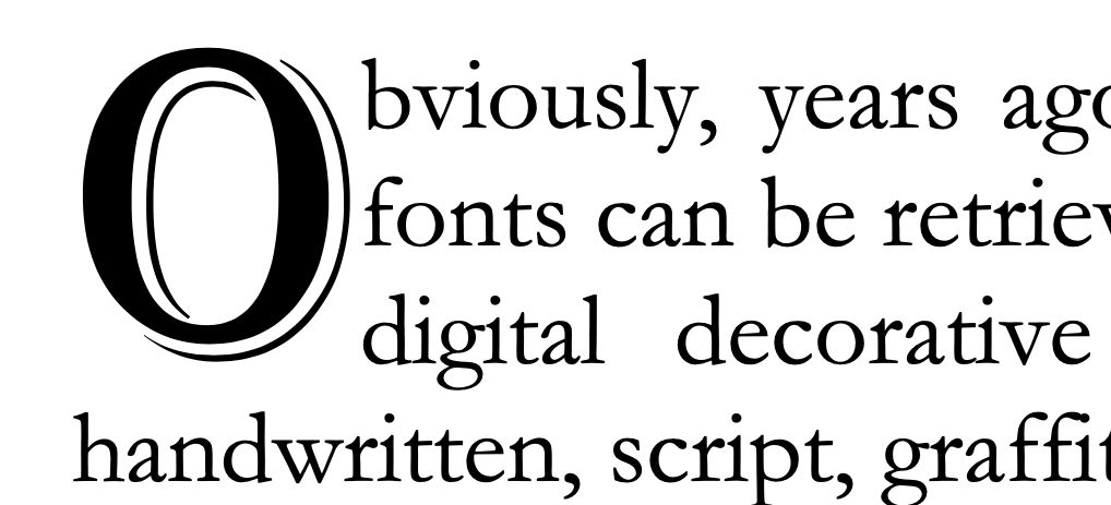
Obviously, years ago, we didn’t have computers, but now decorative fonts can be retrieved from our systems with ease. Some examples of digital decorative fonts are typefaces that appear hand-drawn, handwritten, script, graffiti, illustrated styles, decorative drop caps, high-tech looking fonts, and even abstract 3-D ones. The font Algerian was just used in the figure above this paragraph as a drop cap, meaning it is a decorative font spanning more than one line vertically. Book and magazine designers use this effect frequently to create a focal point, especially at the beginning of chapter headings.
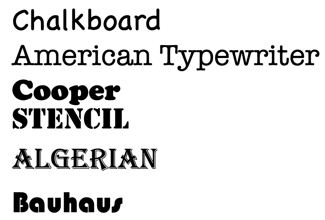
Any font that doesn’t fit into the other category is considered a display font. Some people put script or handwriting fonts all in their own category. But, for the purpose of this book, I want you to think of those fonts as included in the category that doesn’t do very well typeset in long stretches of text. A decorative font, much like a script, cannot be read unless it is only a sentence or two. A few words work just fine. Some decorative fonts are Chalkboard, American Typewriter, Stencil, Cooper, Bauhaus, Alex Brush, and Algerian. Decorative fonts are often used interchangeably with the term Display fonts.
Combining fonts
The rule for combining fonts is to not use two of the same font categories, and don’t use more than 3 fonts total in your course. The same font category rule is because you want to use font contrast and if you use two sans serifs they will not contrast, but conflict. Your learner will say, “Are these the same or are they different?” And we don’t want them using brainpower to stop and assess font irregularities.
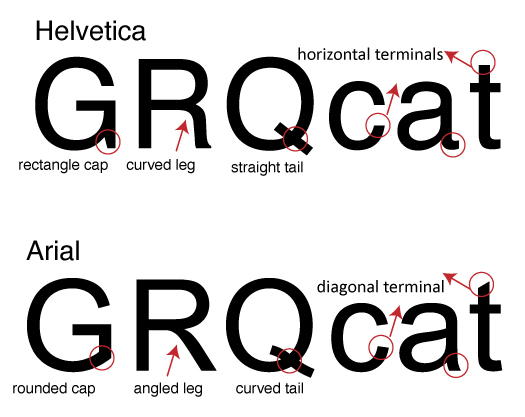
When there is consistency across the board, we lower cognitive load and improve learning. This is why using contrasting fonts that look extremely different is key. If they look too similar, it causes visual tension and confusion; our brains link the consistent elements as part of a group. So, if you have something that isn’t clearly different or exactly the same, we have to use our brainpower to figure out if they logically go together or not. A classic example of how two fonts from the same font category can cause visual tension is when people combine fonts like Helvetica and Arial together. Helvetica and Arial have many similarities but they also have differences in the nuances of the letterforms.
If you use Helvetica on a headline in one place and Arial in another place, it creates an inconsistent look and feel and makes your work look unprofessional. It also hinders the learner. You can see the lowercase “a” in the examples below are quite different, but not different enough to be considered contrast. The combination creates conflict. Other differences are in the terminals, the counters, and the general shape of the letterform. The figure below is a diagram of the main differences in form between Helvetica and Arial. I am team Helvetica and although some may advise using an alternative, I appreciate the history of this font and recommend watching the film Helvetica to learn more about its presence, history, and meaning in the world.
You want to differentiate text in your title, subtitle, and body. Match the main content ideas with the same typographic styling and size, remembering to use hierarchy to establish dominance and order. Try using a very large all caps sans serif font for a heading that has only a few words and a sans serif for body copy set in a font size that is drastically smaller. Make sure the font selection is readable and consistent and that the letterforms aren’t too close to each other or crashing into each other because this will make it harder for dyslexic learners to read it. In fact, all caps are tricky to implement and should only be used in short bursts. Once you have mastered type theory you will know which fonts are more suitable for all caps stylization.
If you want your text to be accessible to more learners, don’t let your font size never goes below 10pt. Although some may argue 12pt is a minimum, the point size of one font can look different than the point size of another. The height of the x-heights can make a difference in how readable a certain sized font is as well. The term ‘font size’ is misleading since we don’t define the size of the font when setting the point value in InDesign, Word, or other applications, but rather we specify the body height.
| “In manual typesetting, the body height is defined by the height of the lead type or metal sort on which the actual font face, the printing surface of the type, is molded. It is surrounded by blank or empty portions of the letterform, the so-called counters (Korthaus, 2021).” |
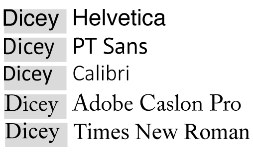
Think of fonts as being cut away from a block with the negative space surrounding the glyphs/letterforms. The negative space is the same for all 12pt fonts but the letterforms within that block take up the positive space in different shapes and sizes. In the figure below you can see a variety of different fonts set all at the same point size but the actual size of the letterform inside that “block” varies substantially. Helvetica is substantially bigger than Adobe Caslon, even if they are both set to 12pt; so Helvetica wouldn’t need to be set as large in your course and if it is set too large, it could take up too much real estate on the page.
Try not to make your headline font so large that it goes onto 3 lines. You have to think of how your course will look on a mobile device and test how your fonts and images look on a phone using multiple browsers and devices. My business partner and I test websites out on Android, Google Pixel phones, Apple phones, iPad, Android tablets, and various sized mac and PC desktops. Sometimes just moving the browser window will give you an idea of how responsive something is but testing it on actual different browsers and devices is an even better way to check for consistency.

One of the best strategies for combining fonts is to choose two that are very different. A classic example is a serif with a sans serif: for example, an old-style font with a blocky rounded sans serif. You also want to combine thick, bold, condensed sans serifs with the same typeface but set in a thin, extended version. It is wise to purchase and download several categories of fonts, but one of the key things to look for is fonts that have a variety of options within them.
For example, Helvetica Neu Regular, Helvetica Neu light, Helvetica Neu Italic, Helvetica Neu Semi-Bold, Helvetica Neu Bold, Helvetica Neu Condensed, Helvetica Neu Condensed Bold, Helvetica Neu Extended, etc. When we force our fonts to be bolded or italicized, the design doesn’t look as polished as if we had a font with that option already. We can do it, but just because you can, doesn’t mean you should. The best practice is to use the bold version of a font versus force bolding it in the software.
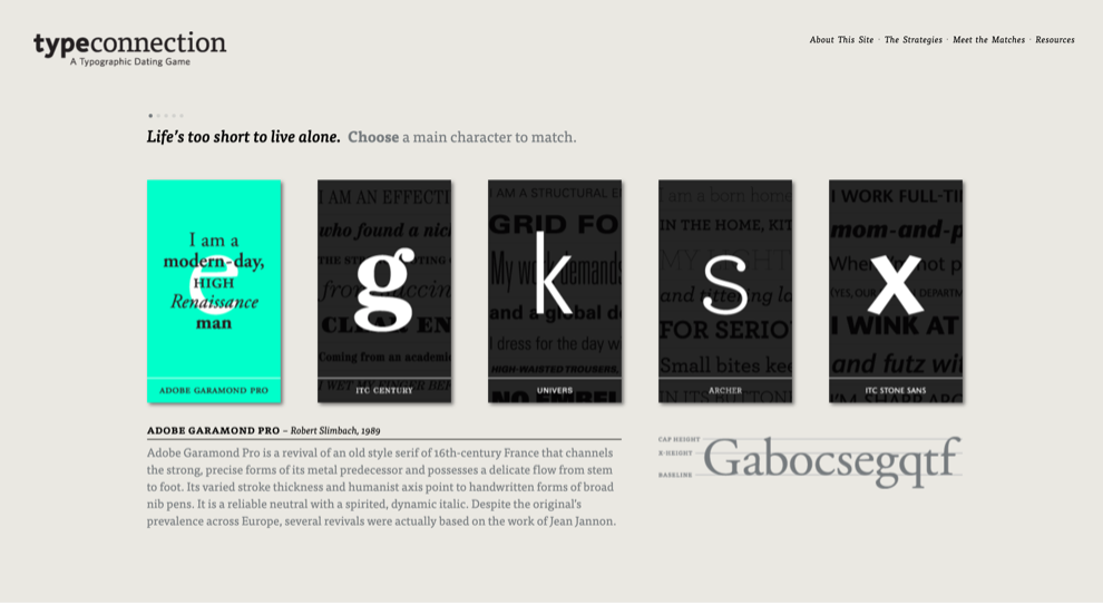
When I taught typography, I would have my students play a typographic dating game called the Type Connection. This game is a fun hands-on experiential digital game that teaches students to combine fonts by playing a dating game with them. Even when making the wrong match the game is still fun and you learn from both your mistakes and the right answers. In the figure below Adobe Garamond (the font for this book) is displayed as a choice card to the left with a description of the history and stroke architecture below it. A witty saying adorns each font card to help the matchmaker make a good pair.
Psychology of fonts
Fonts have the power to evoke certain emotions. We can psychologically feel a certain way about the e-learning course. Old-style fonts are more sophisticated, for example, but they may feel stuffy or too formal. Sans serif fonts are hipper, younger, and feel more vibrant, but they can appear too common or default as if the designer didn’t really put much thought into its selection. Additionally, the way we style our fonts, the type of treatment we use (bold, italic, large, small, colored text, or text on a background) can drastically change the emotion of the user.
Times New Roman may make people feel like they are writing a term paper, but Comic Sans will appear unprofessional and juvenile. You have to think about your product or service and your learner persona when selecting a font. If you are creating a poster for a children’s clothing store, you may choose something whimsical for the headline font versus a font that looks like it belongs on a Broadway playbill. However, a font like Broadway or Modern would look perfect on the cover of a fashion magazine or in an ad for high-end jewelry. A script on a wedding invitation is used to communicate the level of formality of the occasion and it would make sense to use it for a black-tie affair. The font helps the writer communicate in the appropriate tone of voice. Choosing the wrong font will have a detrimental effect on your e-learning course, which is why we need to be intentional with our selections.
Font psychology allows you to select the right font for the job and affects the way your learner perceives the content. For example, if your learner was in the K-12 space, a more whimsical-looking font may convey the emotion you want compared to a higher ed space where conservative and sophisticated fonts are more commonplace. When you design with type, you are looking for a very specific reaction from your audience; depending on the seriousness of the course, the subject matter, stakeholders, and audience, that reaction may differ. Understanding font psychology will put you in control of that reaction versus your learner having an undesirable reaction due to the wrong font choices. Avoiding the wrong fonts is just as important as selecting the right ones.
Psychology of Serif fonts
Serif fonts are considered classic and traditional. They convey a feeling of respect, formality, trust, and authority. They are perfect for industries that need to convey these emotions: law firms, financial institutions, insurance, dental or medical offices. Some organizations that use Serif fonts are Gap, Time Magazine, Sony, and Volvo. There is a reason why all the Ivy League schools use serif fonts, including Penn, Columbia, Harvard, Dartmouth, Yale, Cornell, Brown, and Princeton.

In 2018, Dartmouth did a rebrand, which created a more modern, future-forward, younger feeling logo. The font is still serif, although designed specifically for the university. It has a cleaner icon while still maintaining the same Pantone color. Dartmouth stands out among the rest of the Ivy League logos as a bolder corporate identity system. The wrong font can completely change the look and feel of your course and may turn learners away. Imagine a graduate-level Canvas course set entirely in Comic Sans. What learner would take that seriously? Brand perception is important and first impressions matter. When you are looking to meet a goal, remember font psychology drives results. We may not think of our task as course designers to sell courses but the more visually appealing, they are, the more likely they will be completed. Poor font choices slow down learning, so the right font and font combination can make or break a course. Each font category has its own set of distinct features and psychology, which I have broken down for you in the next few pages.
Psychology of sans serif fonts
Sans serif fonts are considered more modern and are perceived as being sleeker and often are considered more cutting-edge, techy, and less formal. The sans serif is often used in technology, fashion, and startup companies. They are viewed as innovative, future-forward, and bold. Numerous companies use sans serif fonts. But the ones I think particularly communicate cutting-edge and tech-driven are Dell, Hewlett Packard, Facebook, Samsung, PayPal, Microsoft, Oracle, and Amazon.

The screenshot above, the Delfino Insulation website is displayed which used a clean minimalist look and feel and only san serif fonts to communicate a more corporate, efficient, and clean company.
Psychology of Script fonts
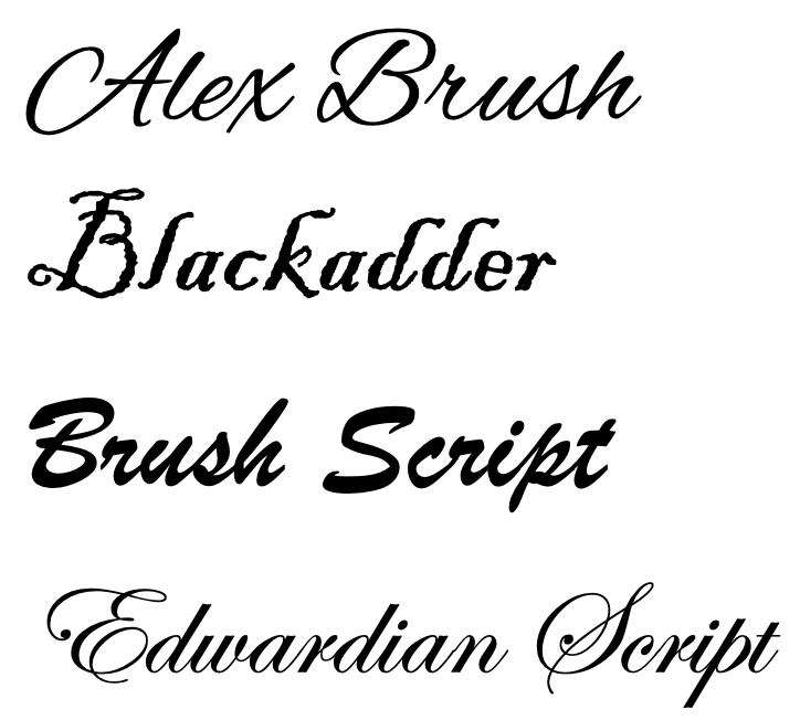
Script fonts can be varied, as you have more formal styles that look like the kind of font on a wedding invitation. Or, you may have a font that looks more like handwriting. Scripts are elaborate in detail but can be hard to read, so you need to be careful and not use them in body copy. You can create either a grassroots, personalized look and feel or a more formal, elegant look and feel, depending on the script font. There is a new trend to use a handwritten font in direct mail so that it appears as if someone wrote you a customized message, when in fact the designer just selected a handwritten style script font. Research shows that direct mail written in a handwritten/script typeface is more likely to be opened! Being a type geek, I am happy to admit I have never been fooled, but I have been impressed by the level of effort direct marketers use to lure me into opening their solicitations, especially when they look like a lovely invitation to a wedding. Who doesn’t enjoy the feel and experience of opening those?

It does appear more personalized and often people will even use a script font to sign something digitally to avoid the hassle of having to print out a paper to sign it. Script fonts have a special look and can feel more fun and whimsical or even old-fashioned. Some of the emotional responses evoked are elegant, creative, sophisticated, whimsical, personalized, or extravagant. Common places you may see a script font being used would be for food, beverage, or children’s brands. Some examples of brands that use script fonts are Disney, Cartier, Kellogg’s, Sharpie, and Ford. Some examples of script fonts include Lobster, Alex Brush, Pacifico, Shelly, Marker Felt, and Blessed Day.
| Tip: Apple Chancery is an extremely hard font to read due to the way the ascenders and descenders extend far and at an angle. Any script font is hard to read beyond a short burst of text but Apple Chancery is particularly difficult. |


The Forever Bella logo design we created for a local makeup company uses a script. The font is feminine and ornate.

Westhampton Beach Brewing Company logo contains a script font called Lobster feels nautical and fun, much like the brand.
Target audience and fonts
If you are trying to convey messages to your learner, think about their demographics. Who are they? What is your learner persona like? Are they age 45 and older making $100k+ or are they 18-24 and just starting out in their careers? Think up a learner profile for your course. Who is the ideal student? What do they do in their day-to-day lives? What do they wear? What music do they listen to? What products do they buy? Where do they live? What are their hobbies? Advertising companies create focus groups consisting of people who are defined as the target audience. Detailed insight emerges from those meetings and helps formulate the way a brand looks, feels, tastes, and is designed. Product and service testing occurs using the demographic that would purchase it. In e-learning, you want to make sure to design with your learner and have them beta-test the course, if possible when it is finished.
Beta testers can tell you if the look and feel appeals to them, if the content made sense, if the navigation was clear, and if the materials were accessible. They can provide insight into their preferences for design and learning and, as instructional designers, you can customize the experience to fit their needs. This is not always possible, but creating a representation of a learner (otherwise known as a learner profile) can assist you in looking at the course through the lens of the student and help you to detect and flag any areas that need improvement.
One thing you may detect is the need to change your style guides including the fonts in headers, subheads, and body copy. The font you choose may look different depending on several variables. It is also important to think about the organization for which you are designing the e-learning. Are they a traditional university, a MOOC, a pharmaceutical organization, a bank? Fonts should reflect the nature of the organization. Color and font psychology are imperative to consider when designing and when you nail both you greatly improve the emotional connection of the user to the brand and course.
Line length, Paragraph size, & Column widths
Leading is the space between lines in a paragraph. The word originated years ago during letterpress days when tiny strips of lead were placed between lines of wood and lead blocks of text to transfer ink onto a page. When someone says double or single-spaced, they are referring to the leading. Most software will set a default leading of 120% of the font size, so if the font was set in 10pt text, the leading would automatically be set to 12pt. Some fonts are not accessible at this leading and adjustment is needed.
For people with visual impairments, we want to be between 125-150% of the font size, although this rule can change depending on typeface characteristics. Often, we need to use optical eye-trained techniques in design, rather than mechanical, mathematical solutions. Eye training takes practice, much like a musician who eventually learns to play with ear training. Some pick it up faster than others.
With practice and attention to good design, you can learn from the masters. The key is being able to see the difference in these small nuances and being diligent enough to make the changes to your own work. Adjusting small design details not only helps students engage in the learning but also improves the quality of your portfolio. This will land you higher-paying clients and help to establish you as an expert designer with visual aesthetics, technical expertise, and theoretical knowledge. A triple threat in the field of instructional design.
![]()
Make sure you know the following three terms well. Leading (the space between lines), Tracking (the length of the line of text), and Kerning (the space between letters).
Besides leading adjustments, paragraphs need some adjusting, too. Always be sure there is some white space between paragraphs. You need about 50% more space between paragraphs than between lines. It is more accessible to use paragraph breaks with spaces versus an indentation. If you must use an indentation, avoid an indent that’s too large or too small. I generally set my indents to about .25 inches (1.5 picas or 216 pixels) by using the tab feature or paragraph menu in whatever program I am using. If you are using columns, make sure the space between the columns is similar to the space between paragraphs. You want the white space to work for you, but don’t space the columns so far apart the text looks like separate entities.
The space between columns is called the gutter and should be about the same width as the paragraph indent. If you are creating a printed piece, you want to account for the gutter between pages and the space around the edges. If you print in-house on an inkjet or personal laser printer, there will be a white border around the edges of the document. You won’t be able to print a full-bleed image. Full bleed means there is no border around the edge. For designing on the web, make sure your designs are mobile-responsive and test them on various desktop and laptop sizes as well as on phones and tablets. You want your course to be accessible to users no matter what device they are using to take it.
The line lengths – meaning the number of characters that go across the page–shouldn’t span the entire width of the browser. When you read a book in your hand, chances are your book is 8.5 inches wide or less, whereas on a browser it is often larger than 12 inches in width. Making the eye track all the way across the screen from left to right without a break can cause one to lose their place, which creates a barrier to learning. Your user is spending brainpower to track the text rather than reading seamlessly. Looking back and forth across a browser could also lead to neck issues, as only the eyes should have to track words across the screen. Line lengths longer than 100 characters should be split into two columns, but too many columns can impede accessibility due to the way the screen reader reads text on a page. One way to avoid columns is to use wider margins and use more scrolling but be careful not to go overboard with scrolling and excessively long text. Consider moving text onto a new module or page if it extends too far down.
The ideal line length should be between 45-90 characters including spaces. Anyone who has posted on social media is familiar with character limitations. When you set your type, you should pretend you have a limit to how many characters can go on a line. Line lengths that are too short or too long will reduce text readability (Dyson and Haselgrove, 2001). Line lengths have a significant effect on reading speed. Readers read the fastest with 95 characters per line (CPL). If your reader has to track text with their eyes a dozen times just to get through one paragraph, it can cause frustration and inhibit the absorption of the material. Line lengths that are too short increase cognitive load because people have to jump too often from line to line which slows them down.
Of course, reading quickly without solid comprehension is not beneficial so we must optimize our text for both comprehension and speed. According to Dyson and Haselgrove (2001), reading text with margins helps increase comprehension more than text without margins. Users also preferred margins since there was overall less eye strain. Fixed width layouts allow you to constrain the margins and line lengths and are one tactic you can use to help improve reading speed and comprehension in your online course. Besides leading adjustments, paragraphs need some adjusting, too. Always be sure there is some white space between paragraphs. You need about 50% more space between paragraphs than between lines. It is more accessible to use paragraph breaks with spaces versus an indentation. If you must use an indentation, avoid an indent that’s too large or too small. I generally set my indents to about .25 inches (1.5 picas or 216 pixels) by using the tab feature or paragraph menu in whatever program I am using. If you are using columns, make sure the space between the columns is similar to the space between paragraphs. You want the white space to work for you, but don’t space the columns so far apart the text looks like separate entities.
The space between columns is called the gutter and should be about the same width as the paragraph indent. If you are creating a printed piece, you want to account for the gutter between pages and the space around the edges. If you print in-house on an inkjet or personal laser printer, there will be a white border around the edges of the document. You won’t be able to print a full-bleed image. Full bleed means there is no border around the edge. For designing on the web, make sure your designs are mobile-responsive and test them on various desktop and laptop sizes as well as on phones and tablets. You want your course to be accessible to users no matter what device they are using to take it.
The line lengths – meaning the number of characters that go across the page–shouldn’t span the entire width of the browser. When you read a book in your hand, chances are your book is 8.5 inches wide or less, whereas on a browser it is often larger than 12 inches in width. Making the eye track all the way across the screen from left to right without a break can cause one to lose their place, which creates a barrier to learning. Your user is spending brainpower to track the text rather than reading seamlessly. Looking back and forth across a browser could also lead to neck issues, as only the eyes should have to track words across the screen. Line lengths longer than 100 characters should be split into two columns, but too many columns can impede accessibility due to the way the screen reader reads text on a page. One way to avoid columns is to use wider margins and use more scrolling but be careful not to go overboard with scrolling and excessively long text. Consider moving text onto a new module or page if it extends too far down.
The ideal line length should be between 45-90 characters including spaces. Anyone who has posted on social media is familiar with character limitations. When you set your type, you should pretend you have a limit to how many characters can go on a line. Line lengths that are too short or too long will reduce text readability (Dyson and Haselgrove, 2001). Line lengths have a significant effect on reading speed. Readers read the fastest with 95 characters per line (CPL). If your reader has to track text with their eyes a dozen times just to get through one paragraph, it can cause frustration and inhibit the absorption of the material. Line lengths that are too short increase cognitive load because people have to jump too often from line to line which slows them down. Fixed width layouts allow you to constrain the margins and line lengths and are one tactic you can use to help improve reading speed and comprehension in your online course.
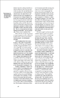
Play with columns and white space to allow for some breathing room and visual interest along the margins, columns, and gutters of text.
Additionally, when a paragraph has short line lengths, the rag left or rag right edges appear more pronounced and produce visual speed bumps that interfere with smooth reading. The term rag left or rag right refers to text that is aligned on one side of the column but not the other. This makes for a sharp alignment on one side (justified left, rag right, for example) and a ragged, jagged appearance on the other. Generally, the text is either ragged or justified. Justified text only works in narrow columns with small font sizes and generally is not accessible on-screen, where text size is usually set larger than in print. Additionally, justified text can create odd gaps between words called rivers and cause other areas of text to be condensed too tightly. What you gain by losing the ragged edge, you lose in overall readability. If you do choose full justification, be intentional with your choice and fix problem areas. It is possible to expand letterforms of certain words in a line and not others by using kerning or line spacing.
Flush left is the preferred way to align text and is easier to read than centered-aligned or right-aligned. Headings are the exception and centered headers are fairly common, producing a nice contrast to left-align body copy if you choose to set it that way. Whatever you select, be sure to be consistent. If the body copy is left-aligned and headings centered, make sure you are consistent across the whole course. If both body copy and headings are left-aligned, all modules in the course should replicate this style. Use cascading style sheets when you can, make sure to set fonts using H1, H2, H3, etc., and if you don’t like the built-in options, change them the right way and do it across the board. CSS can be edited. If you just change text willy-nilly, say in an LMS, people who use screen readers won’t know what makes a heading versus a subhead or body copy. H1 styles help screen readers alert the visually impaired that a new topic, idea, or module is about to be read to them.
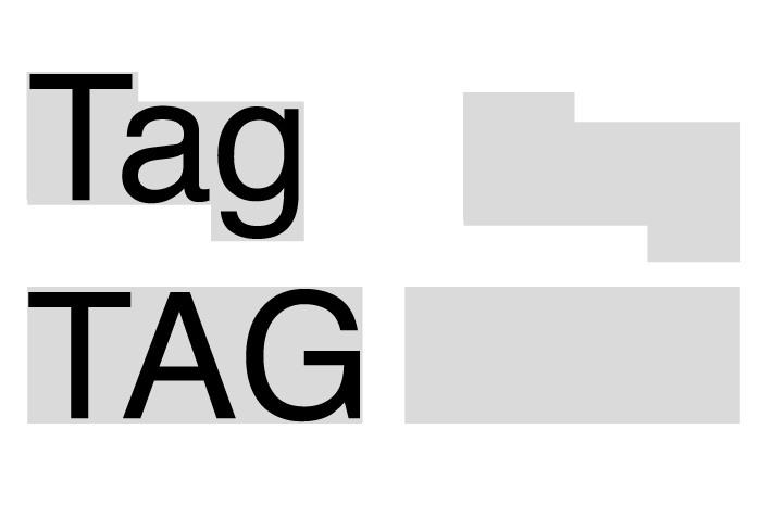
Be careful about using all caps (capitalization). When people learn to read, they use a combination of phonetics and sight words to recognize the letterforms that make up simple words. For example, TAG is harder to read than tag. The shape of the word helps us read faster, but when you create in all caps, it slows the reader down. All caps can be used for emphasis, but the general rule is to make sure it is only used for 7 words or fewer. Headings are fine in all caps, but body copy is much too difficult to read this way, and even subheads that extend over 2 lines can be difficult to manage for some folks. All caps are hard to read, especially with long bursts of text because when we learn to read as children, we not only sound out the words but we recognize the words from the shape it makes. Decades of cognitive psychology have proved this to be true (Microsoft, 2021). In fact, sight words are a way to recognize complete patterns of letterforms. In the figure below you can see that the shape of words is easier to recognize if set in lowercase versus all caps.
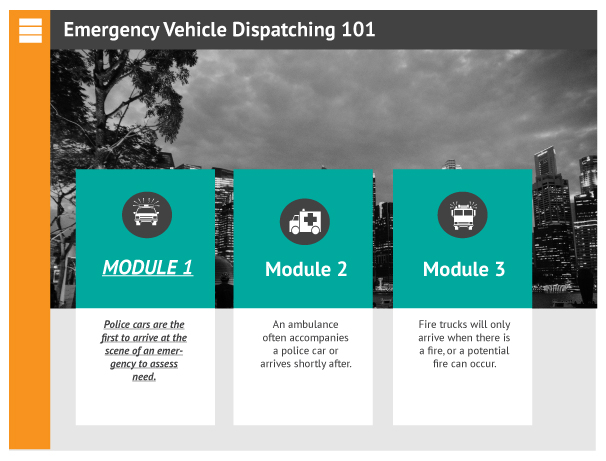
Formatting like bold, italic, and underlining should be used with caution. When you emphasize too many elements, nothing is emphasized. When available, use a font that has a large variety of type styles within the foundry. For example, use Helvetica which also has the bold, italic, and roman version versus just the roman that you force bold or italicize. Also, never bold and italicize. This is overkill and will create visual tension and increased cognitive load. One or the other, but never both. Underlining should be avoided unless you are creating a hyperlink. Never underline otherwise.
In the next figure Module 1 looks hokey and overemphasized. The module is set in all caps, bolded, and italicized and the body copy is bolded and italicized. It looks unprofessional, messy, and confusing compared with the way Module 2 and 3 are designed.
If you can turn off hyphenation in your program, do it. Otherwise, look closely at the typeset text and move words to the next line or tighten the space between words to avoid awkward breaks. In hyphenation, words are broken into two and parts of them carry over to another line. An excess of hyphens creates cognitive load and slows readers. The rule of thumb is to eliminate excess characters to make reading smoother. This includes things like using periods and spaces when referencing time. If you must use perfect APA standard formatting you have no choice but 3 pm looks better and is easier to read than 3:00 p.m. When typesetting using sans serif contact info, avoid tiny vertical lines to separate information because they may get mistaken as letterforms, such as a lowercase l or capital I. A design professor once told us to never set text over an image. Of course, I tried every which way to do it anyway because I felt like I was being caged in, forced to design a certain way, follow rules, and not express myself. Of course, I was naïve and knew nothing about accessibility, and didn’t really think about my audience at the time. I cared selfishly about my art and creating something original. It took some time to shift my thinking and perspective and to realize commercial art is not created for oneself but for others. I rarely put text on an image these days, and if I do, I make sure the contrast is extremely high. I also make sure to have an outlet to create for the sake of creating and keep that separate from my work in the field. Instead of being bitter that I can’t make money creating art, I am grateful I can make money being creative and that my work helps transform lives through learning. Not only do I get to design great learning experiences, but I also get to design marketing for organizations that I care deeply about. I am not sure where you are in your journey, but if you ever have the experience of seeing a lightbulb go on after a student has engaged in something you designed, you know just how addicting our work can be. Through practice, you will be able to apply the principles of graphic design and learning theory to create transformative experiences that are beautiful, engaging, and last a lifetime.
Suggested guided questions/projects to assess your understanding of typography:
|
