13.4 Seven Quality Tools
Transitioning from the exploration of lean techniques that operationalize lean philosophy in manufacturing and service industries, we now turn our attention to the instruments that further enhance our capability to ensure quality and continuous improvement. These instruments, known as the Seven Quality Tools, serve as essential mechanisms for identifying, analyzing, and resolving quality-related issues. Whether aiming to minimize waste, streamline processes, or enhance product and service quality, these tools offer a systematic approach to tackling challenges and fostering a culture of excellence. In this section, we delve into each of these tools, elucidating their functions and applications in the continuous quest for quality enhancement.
1. Cause-and-Effect Diagram (Ishikawa or Fishbone Diagram)

The Cause-and-Effect Diagram, also known as the Ishikawa or Fishbone Diagram, is used to identify the root causes of a problem. The diagram visually maps out the main causes and their sub-causes that contribute to an issue, resembling the skeleton of a fish. This tool is particularly useful in brainstorming sessions to categorize potential causes of problems and identify areas for further investigation.
2. Check Sheet (Tally Sheet)

The Check Sheet is a simple, yet effective, tool for collecting and analyzing data. It’s a structured, prepared form for collecting and recording data in real time at the location where the data is generated. This tool helps in gathering quantitative or qualitative data to identify patterns, frequencies, or problems within a process.
3. Control Chart

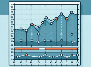
Control Charts are used to monitor processes to determine whether they are in a state of statistical control. By plotting the values of a process over time and comparing them to predetermined control limits, organizations can identify trends, shifts, or any variation that might indicate a problem. Control charts are essential for maintaining and improving process stability.
4. Histogram

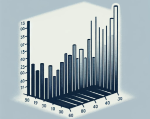
A Histogram is a graphical representation of the distribution of numerical data. It is an estimate of the probability distribution of a continuous variable and is used to visualize the frequency of data points within specified ranges. Histograms are useful for identifying the shape of the distribution, which can indicate whether a process is behaving as expected.
5. Pareto Chart

The Pareto Chart is a bar graph that represents the frequency or impact of problems or causes in a process. The chart is based on the Pareto Principle, which states that a small number of causes are often responsible for a large portion of the effect. It helps in identifying the most significant factors contributing to a problem and prioritizing efforts to tackle them.
6. Scatter Diagram

The Scatter Diagram, or scatter plot, is used to identify the possible relationship between two variables. By plotting pairs of numerical data, with one variable on each axis, one can visually see if a correlation exists between them. This tool is invaluable for hypothesis testing and for determining if changes in one variable might be causing changes in another.
7. Flowchart

A Flowchart is a graphical representation of a process, showing the steps as boxes of various kinds, and their order by connecting them with arrows. This tool is used to understand a process thoroughly by identifying sequences, decision points, and potential bottlenecks. Flowcharts are essential for process analysis, redesign, and for making processes clearer to understand for all stakeholders.
