T1.2 Summarizing data (testing hypotheses) using Array Formulas and Charts
Learning Objectives
This is the second tutorial related to the Crain’s report. In this tutorial, you will learn how to use array formulas to summarize data and how to create some more advanced charts to visualize data. In particular, we are going to test few of your hypotheses
- Do mark-up rates vary by disease severity?
- Do total costs vary by severity?
- Do length of stay affects total cost?
- Is age (activities) related to cost and mark-ups?
Using Array Formula to explore the relationship between Mark-up rates and Severity of the Disease.
We would expect patients with high severity will have higher costs and charges, but do hospitals make a larger profit on these patients? We will use Array Formulas to do a conditional median of cost, charge, and cost-to-charge by disease severity (minor, moderate, major, extreme).
An array formula is a formula that can perform multiple calculations on one or more of the items in an array, and an array is just another name for a data table. The array can be just a row of values, a column of values, or a combination of rows and columns of values. In this exercise we are going to combine an IF function with the MEDIAN function (You can also follow the procedure in the video tutorial).
- Open the File that you used for Tutorial 1 and rename the worksheet with SPARCS data “Data.” Create a new worksheet. Name this worksheet “Cost and Mark-up by Severity,” and make the following blank table. Make sure that you enter the severity categories with that exact capitalization without blank spaces.
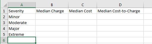
- To calculate the median charge for minor severity (cell B2), you will enter the formula =MEDIAN(IF(Data!M:M=A2,Data!Q:Q))
(HINT: You do not need to type all the formula, select the values by clicking in the columns and cells in the formulaThe formula looks too complex because of the reference to the data sheet Data!, but you can think about the formula in simpler terms =MEDIAN(IF(M:M=A2,Q:Q))We are using two Excel functions in the table, calculating the median of column Q (Total Charge), but only IF the value in column M (APR Severity of Illness Description) is equal to the value in A2 (Minor). In other words, we are telling Excel to calculate the MEDIAN for cells where our condition holds.Instead of hitting “Enter,” use “Control + Shift + Enter” – that tells Excel this is an array formula. After you hit “CTRL + Shift + Enter” Excel will automatically add {brackets} - Add $ sign to the column M and the column A in the formula to make them absolute references ($M:$M=$A2), and hit again “Control + Shift + Enter”. Now you should be able to copy the array formula to all the table by dragging the formula throughout the rest of the table. Format the values and add borders to the table to make it look like the following.
| Question | Your Answer |
| What is the intuition?
Why are we only fixing columns M and A? Why are we not fixing row 2 (A2) or column Q? |
|
| Inspect the formulas
How did they change? |
|
| Do mark-up rates vary by disease severity?
What can you conclude from this? |
|
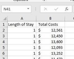
Exploring the relationship between Length of Stay and Total Cost
To explore this relationship, let’s create a scatterplot of Length of Stay X Total Cost (you can also follow the video tutorial).
- Copy columns “Length of Stay” and “Total Costs” into a new sheet, called “LOS x Cost,” and sort by Length of Stay
- Look at the end of the table and notice the cells with the value “120+” These value is called “top code,” and it is used in some datasets where values above the top code are considered outliers (very rare). Change the values into “120.”Create new sheet and name it “Analysis Notes.” Write down this analytic decision, together with a rationale & possible bias.

| Question | Your Answer |
| What are potential bias of our decision? |
|
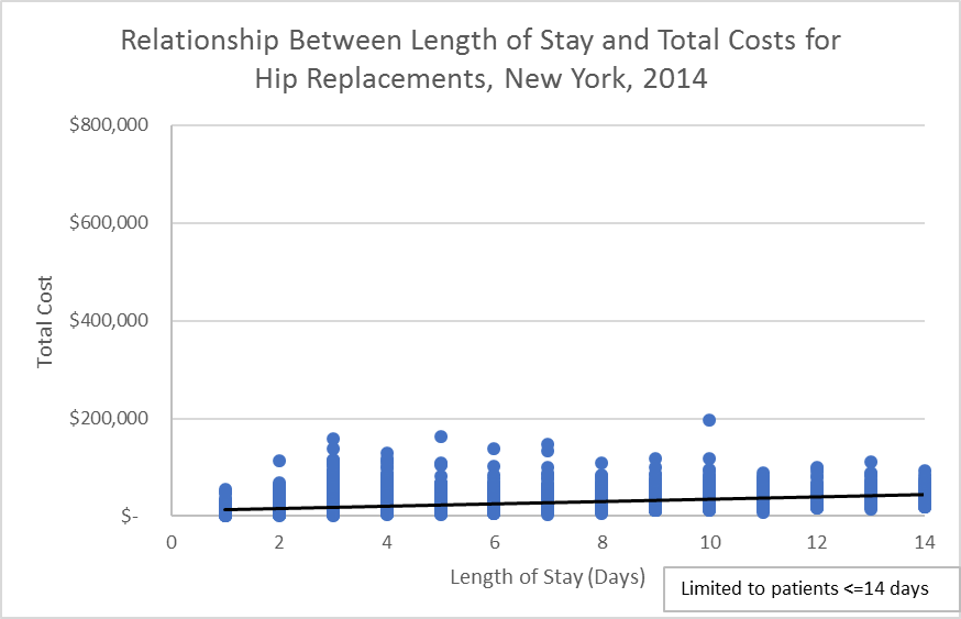
- Highlight data series (both columns) and insert scatterplot. Add title, axes, etc. Add linear trend line, and make your chart look like this one
NOTE: We have >31,000 observations. Excel does not usually have problems making charts, but be patient because it keeps recalculating, and it can take some time. Be patient. - Copy and paste your chart twice. Fix the X-axis to limit to individuals with length of stay of 60 and 14 days maximum. Insert a text box to add a note on this decision. Your graphs will look like these ones

| Question | Your Answer |
| How do these graphs tell different stories?
|
|
| Which is the best graph to present and why? |
|
Using Array Formulas and Charts to explore the relationship between Age and Length of Stay.
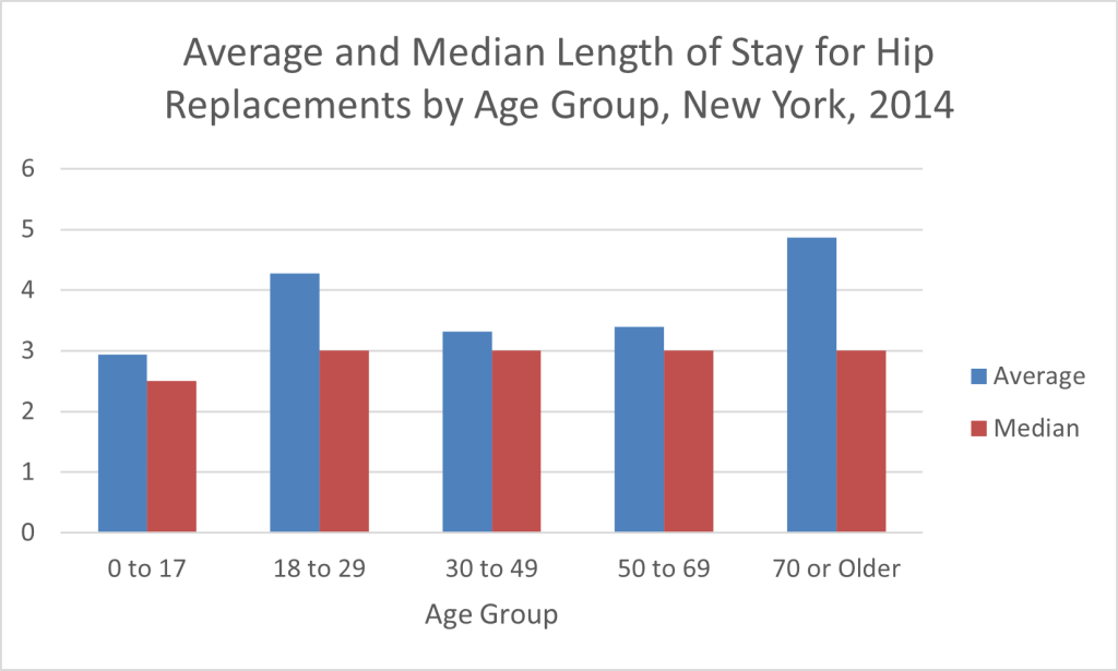
A potential hypothesis or potential explanation of the differences involves the idea that age might be related to cost, given that some age groups may be engaging on more risky activities than others, or some age groups may heal faster than others (Young kids are faster to heal than any other age group). In this way, we are going to create a bar chart that shows the median length of stay, with whiskers that will help to see variation in the age group. The final chart will look like this.

Let’s do it
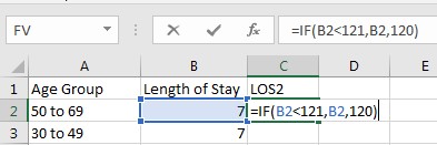
- Copy columns “Age Group” and “Length of Stay” into a new sheet, called “LOS x AgeGroup” (make sure that you copy these columns from the original tab of Data). Use an “IF” statement to adjust the top-coded value for Length of Stay (HINT: Create new variable, LOS2 and enter the formula =IF(B2<121,B2,120)
- Write a note about this recode in your Analysis Notes worksheet. Sort by Length of Stay to verify this worked correctly (make sure that you select all columns to sort them together). How else could you have verified this worked? (NOTE: Another good rule is to always check that your edits to the data worked out according to your goal.

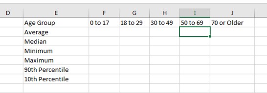
- Create an empty Table Shell to get the median Length of Stay per Age Group (make sure that you copy all data exactly as it is in the data cells “0 to 17” without extra or missing spaces and using lowercase letters.
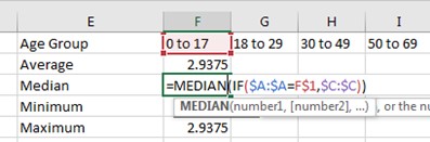
- Use an array formula to compute the conditional values (average, median, minimum, etc.) in the table. NOTES: Fix columns A (age group) and C (length of stay) so we can drag formulas to the right; fix row 1 so we can drag formulas down, remember to use “Control + Shift + Enter” to let Excel know that this is an array formula. You may want to change the names in the first column before you copy them to the rest of the table. See figures below.Enter formula and add absolute references

Copy all first column and change function names
 The percentile requires to add 0.90 for the 90th percentile and 0.10 for the 10th percentile as a second parameter
 Fill all the table
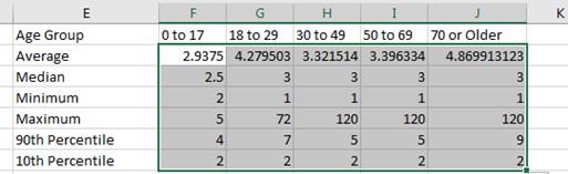
- Finally, change the number format to 1 decimal place.

- Let’s start by creating the column chart. Highlight first three rows (age group, average, median). Insert -> Column Chart. Use the features in Chart Tools to add a title, change Y-axis to 0 significant digits (no decimal places), add axis titles, etc. (Tip: will need to change number format for Y axis to no decimal places… it adds the decimal places because the “average” data series is a continuous variable with decimal places).
| Question | Your Answer |
| Which is better, average or median?
|
|
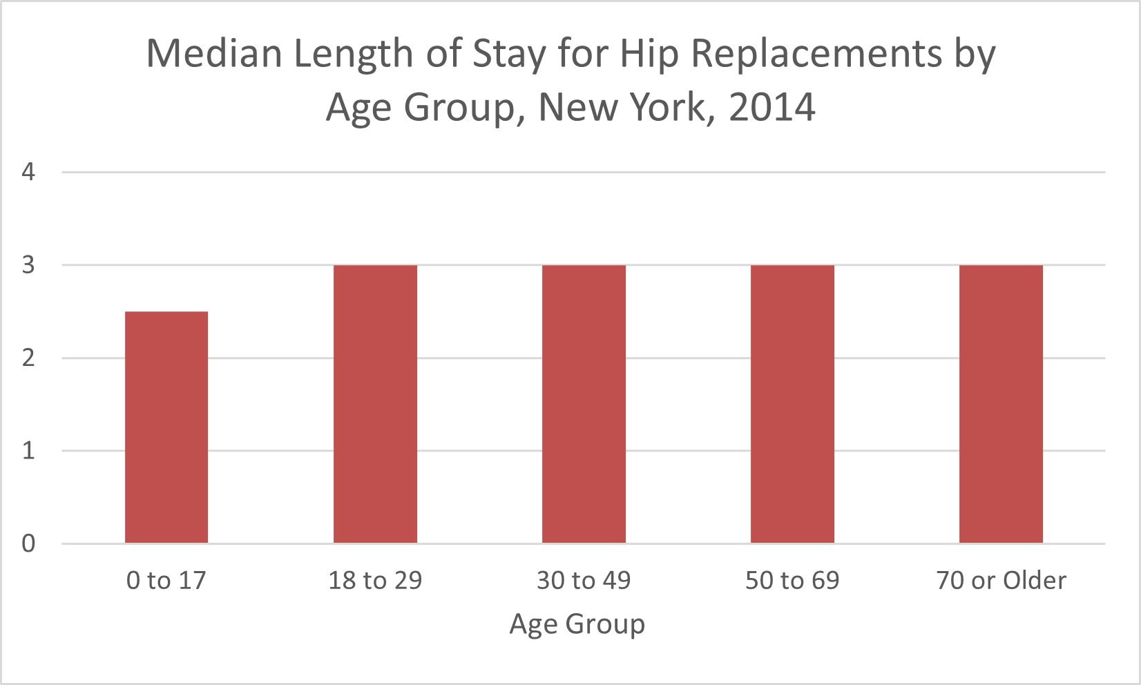
- Delete the “average” data series, using the option “Select Data.”

- Change the title and delete the legend (Why delete the legend on this chart?).
- We will use custom error bars (also called “whiskers”) to convey information about the range. In this way, we need to specify “positive” and “negative” values (how far each whisker goes up and down). Add these values to our table using the formulas: Positive = 90 percentile – median // Negative = median – 10 percentile

- Add error bars by clicking in the “plus” sign at the side of the chart

- Set “Both” direction, “Cap” end style, use the “Custom” option to specify the error amount. You will be prompted to select the data series- highlight the cells from the table “Positive” and “Negative” values that we just created. NOTE: the location of error bars may vary across Excel versions! Each version typically has the same features, but Microsoft likes to change the location of its tools when updating versions.
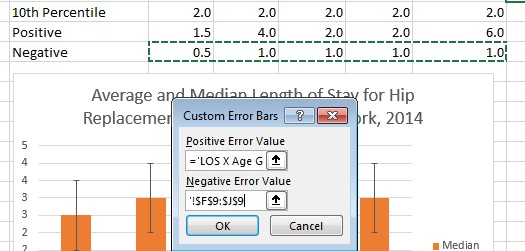
- Add a textbox to explain what the error bars represent
| Question | Your Answer |
| What is the main message of this chart? What do you learn about Hip Replacements
|
|
| Can you create a chart just like this one that includes cost by severity? |
|
Attribution
By Erika Martin and Luis F. Luna-Reyes, and licensed under CC BY-NC-SA 4.0.
