T1.3 Summarizing data using Pivot Tables
Learning Objectives
This is the last tutorial related to the Crain’s report. In this tutorial, you will learn how to use pivot tables, and a little bit more complex array formulas to summarize data to reproduce the Crain’s report. In this way, in this tutorial you will
- Use Pivot Tables to summarize data
- Experiment with Pivot Charts
- Use conditional Medians to reproduce the Crain’s Report
Using Pivot Tables to Summarize Data.
Pivot tables are interactive tables to explore relationships among two or more variables. They are very dynamics and help you and me to see data summarized in many different ways. They include several built-in functions allowing you to: (a) Display counts, average, sums, etc. within categories, (b) Quickly filter data, (c) Create attractive formatted tables, and (d) Easily update tables when underlying data are refreshed.
We will create a PivotTable that include the number of procedures performed by each facility, as well as the average cost, average charge, and average percent markup by facility. As always, there is also available a Video version of these tutorial.
- Open the file that we have been using for the previous tutorials and create new worksheet, “PivotTableData.” Copy and paste the following columns to your new worksheet
- Facility Name
- Total Charges
- Total Costs
- Create a new “Markup Rate” variable in column D by calculating (Total Charges – Total Costs) / Total Costs and change the format to “%” with 0 decimal places

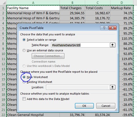
- Go to “PivotTableData” worksheet. Highlight the 4 columns of data, Insert —> Place PivotTable report in “New Worksheet.” Relabel new worksheet as “PivotTable”
- The new Worksheet will look like this
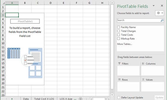
- Drag “Facility Name” field to Rows, and drag “Facility Name,” “Total Charges,” “Total Costs,” and “Markup Rate” fields to Values

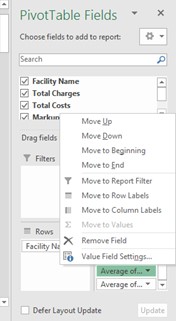
- Edit Value settings using PivotTable menu or by right-clicking on column names in PivotTable field
- Facility Name —> Summarize value field as “Count”
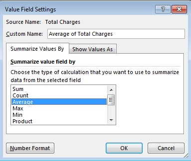
- Total Charges —> Summarize value field as “Average,” change number format to currency and no decimal places
- Total Costs —> Summarize value field as “Average,” change number format to currency and no decimal places
- Markup Rate —> Summarize value field as “Average,” change format to % and 0 decimal places
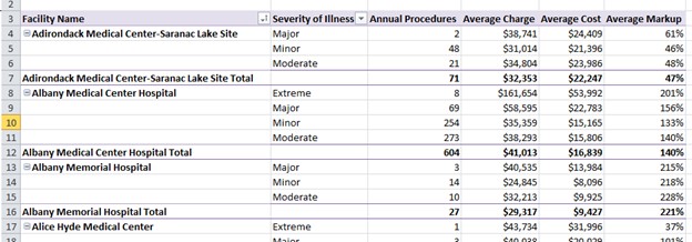
- Type more descriptive column names into top row of PivotTable. Your PivotTable should look like this… Look at these results. These are conditional counts (annual procedures) and averages (charge, cost, markup).

| Question | Your Answer |
| How does this relate to the formulas we have already used in class or on problem sets? |
|
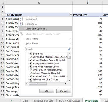
- Click on down arrow in the cell “Facility Name” —> and choose “More Sort Options” to sort by the different fields (annual procedures, average charge, average cost, average markup). Identify the 5 facilities with the highest and lowest average charge. Compare your findings to the Crains’ Report
| Question | Your Answer |
| Do the numbers match? Identify differences between your PivotTable findings and the Crains’ Report |
|
| Why are the results inconsistent? Who is wrong? |
|
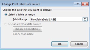
- Copy and paste “APR Severity of Illness” column to “PivotTableData” worksheet (place in column E). Go back to our “PivotTable” worksheet. Choose PivotTable Options —> and Change Source Data. Change table range from PivotTableData!$A:$D to PivotTableData!$A:$E

- Add “APR Severity of Illness Description” as a new Report Filter. Filter data by “Moderate” severity only. Sort by average charge.

| Question | Your Answer |
| How do results change? Are the new results more consistent with the Crains’ Report? |
|
- By adding the Report Filter (disease severity), we were able to look at summary statistics (counts, averages) for two conditions: (1) disease severity, (2) hospital. Should we get the same results if we used severity of illness as the Row Label, and facility name as our Report Filter? Try it as well as other configurations in your Pivot Table
- Make your layout similar to this… Try Pivot Charts…
| Question | Your Answer |
| What did you learn? |
|
Back to Array Formulas to Calculate the Median and reproduce the Crain’s Report
Our PivotTable gave us a nice initial summary but let’s tackle some other things… Let’s Generate median cost, charge, and markup among patients with moderate disease severity. We will use these functions to rank hospitals, and then evaluate whether the Crains’ Report calculation for % Markup is mathematically correct (you can also follow the video tutorial).
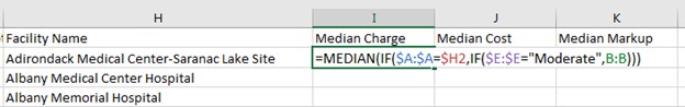
- Now we want to calculate the median charge, cost, and % markup, by facility, among moderately severe patients. We have two conditions: facility and severity, which requires two IF statements. We will produce a table analogous to our PivotTable, when we added disease severity as a Report Filter. Switch your Pivot Table to the more simple format and sort by Facility Name, and copy and paste Facility Name into column H of the “PivotTableData” worksheet. Add columns for Median Charge, Median Cost, and Median Markup.

- Enter the Formula for median charge among moderately severe patients at Adirondack Medical Center, using a double IF statement=MEDIAN(IF($A:$A=$H2,IF($E:$E=”Moderate”,B:B)))[1] (Be careful if you copy and paste this formula because the quotation marks can change to “smart” quotation marks giving an error as a result)
Control + Shift + Enter for the array
| Question | Your Answer |
| Why are we fixing those specific columns?
Why are we not fixing row 2 or column B? |
|
- Drag formulas to the right and format cells. Drag formulas down to populate the rest of the table. Be patient with Excel. This may take some time (In my laptop, it took a couple of minutes). Format the numbers as currency and percentage. Your table should look like this:
| Question | Your Answer |
| Inspect the results of our calculations
Which facilities give us an error message? Why did we get those error messages? |
|
- Highlight cells corresponding to those facilities and delete
- Highlight —> Delete —> Shift Cells Up
- SAVE your work… Excel can freeze with so many calculations on a large dataset
- Reorder the Table and find the most expensive facilities or the ones that have the highest markup.
| Question | Your Answer |
| Anything surprising? |
|
- Add two new columns:
- “Crains Markup”
= (Median Charge-Median Cost)/Median Cost
=(I2-J2)/J2 —> Format as a % - “Delta”
=Median Markup – Crains Markup
=K2-O2
- “Crains Markup”
| Question | Your Answer |
| Do these methods yield the same values? Why? |
|
- Create your own story with the SPARCS hip data. Develop ONE chart that best illustrates variation in hospital charges. What are the important factors? What additional summary measures should you create? What is the best way to present the data (e.g. pie chart, bar chart, …)?
[1] Let’s deconstruct what this means… In the general “IF” syntax with MEDIAN, we can understand the array formula as =MEDIAN(IF({this condition holds},{then include these observations in your median calculation})). The first condition is IF A:A = H2, which means, If the facility name (column A) = the facility listed in column H, check the second condition… The second condition is IF E:E = “Moderate.” If the disease severity (column E) is moderate, then, include this observation in your median calculation.
Attribution
By Erika Martin and Luis F. Luna-Reyes, and licensed under CC BY-NC-SA 4.0.
