7.10 Getting Creative with Responsive Tables
When working with tables in HTML, you want to make sure your tables are responsive, meaning that your table data is visible and accessible on different screens. It might sound straightforward, but often, this is easier said than done.
Unfortunately, there’s no one best practice that everyone should always follow. The good news is, there are a number of ways to make your tables more responsive. Which one you choose depends on your purpose and your data.
 |
 |
In her LinkedIn Learning video HTML: Tables, Jen Kramer talks about a couple different options, including adding the option to have a table scroll horizontally, in order to view all the columns on a narrow screen, such as that of a mobile phone. Another option she mentions is to re-format the table entirely – using CSS to change how the data displays: from 7 horizontally-scrolling columns to one long vertically-scrolling column whose headers are hidden on mobile. For this, she uses some more advanced CSS, and things get pretty complicated. Kramer herself admits that ‘this is not very sustainable,’ and ‘there are definitely better ways to handle this type of thing.’
 |
 |
 |
Chris Coyier is the founder of CSS-Tricks and the co-founder of CodePen. In an article on his site, Coyier quotes another developer who tweeted “Data tables don’t do so well with responsive design.” But that doesn’t mean we should throw in the towel just yet. Back in 2011, Coyier wrote an article for CSS-Tricks (updated in 2018) pointing out the limits of both the horizontal scroll property and shrinking the table data to microscopic size in order to fit the view window. In “Responsive Data Tables,” he seems to come to the same conclusion as Kramer: he uses a “media query” and CSS to style the table into one long column of data once the window gets below a certain width.
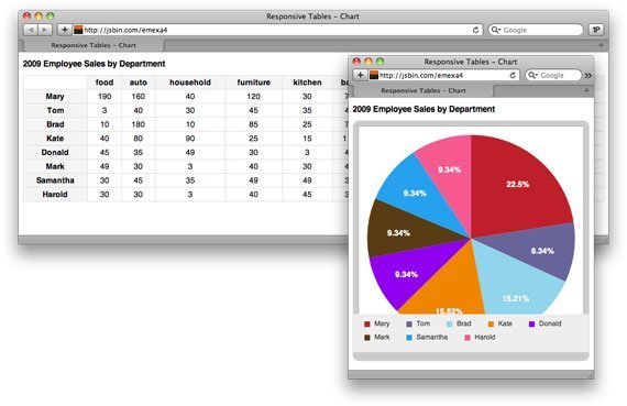
But the really useful article was his follow-up to this one, the “Responsive Data Table Roundup,” where he showcases other solutions to the problem of responsive table data. One developer had the idea to translate his data into a pie chart, which could be displayed on smaller screens as it was much thinner than the original data. Another decided to just hide some of the less important columns at smaller sizes. A third solution did away with cells almost completely and just smashed all the data to the left side of the screen, using color-coding to mark data that would normally be in the same ‘column.’
Of course, the solutions above are not necessarily any easier to incorporate than Kramer’s. And no single technique will be right every time. But it’s still important to think creatively about potential solutions for responsive design. Of the responsive tables above, which do you think is the most successful?
This chapter is a revised version of a blog post titled “Getting Creative with Responsive Tables” on Writing References.
