5.11 Use CSS to Enhance Your Images with Special Effects
Feel like your images are missing something? That they do not match the style of the webpage you’re creating? Try enhancing them by adding special effects. They can alter and improve the mood of your images to just what you are looking for.
Don’t Know Where to Start
I recommend reading Ayodele Samuel’s article “Creating cool CSS image effects & animations the easy way” which was published on ImageKit on January 13, 2022. This article begins by quickly explaining the importance of having images on websites and then listing what image effects and animations he discusses. Samuel goes over how to add a filter effect such as grayscale and blur, shadow effect, rounded corners, rotation and vibration animation with CSS transform, and thumbnails. For every section, he goes over the necessary tags required to perform the desired outcome, any additional properties and values, and an example of how to implement the CSS. Toward the end, ImageKit is introduced as a no-coder tool that readers can use to optimize, resize, crop, and other transformations made to images without needing to write any CSS. Samuel then explains how to use ImageKit to show how easy it is to achieve some of the same effects he already discussed in the article.
Samuel explains how to create key CSS image effects, as mentioned above, with simple techniques. If you like to learn more about special effects that focus on trimming an image to fit within a geometric shape and how to rotate an image, similar to how Samuel covers the topic, then I recommend watching J. David Eisenberg’s May 9, 2018, LinkedIn Learning course “HTML: Images and Figures.” Eisenberg is an author, programmer, and instructor with over 40 years of experience. In this course, he also teaches the different image formats, including GIF, PNG, and JPEG, the principles of responsive design, and how to use the figure and figcaption elements. Even though he teaches how to adjust and style images using CSS, including special effects, he focuses on different effects than what Samuel covers in his article.
I will be focusing on how to create a grayscale image, a shadow effect, and vibration animation.
Implement an image in HTML
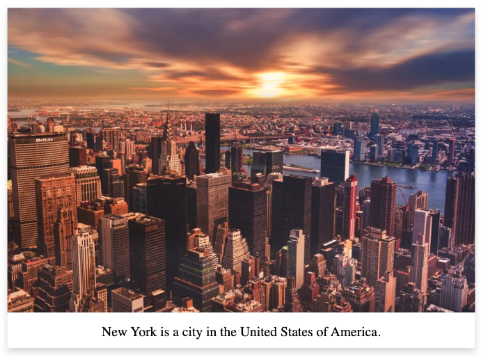
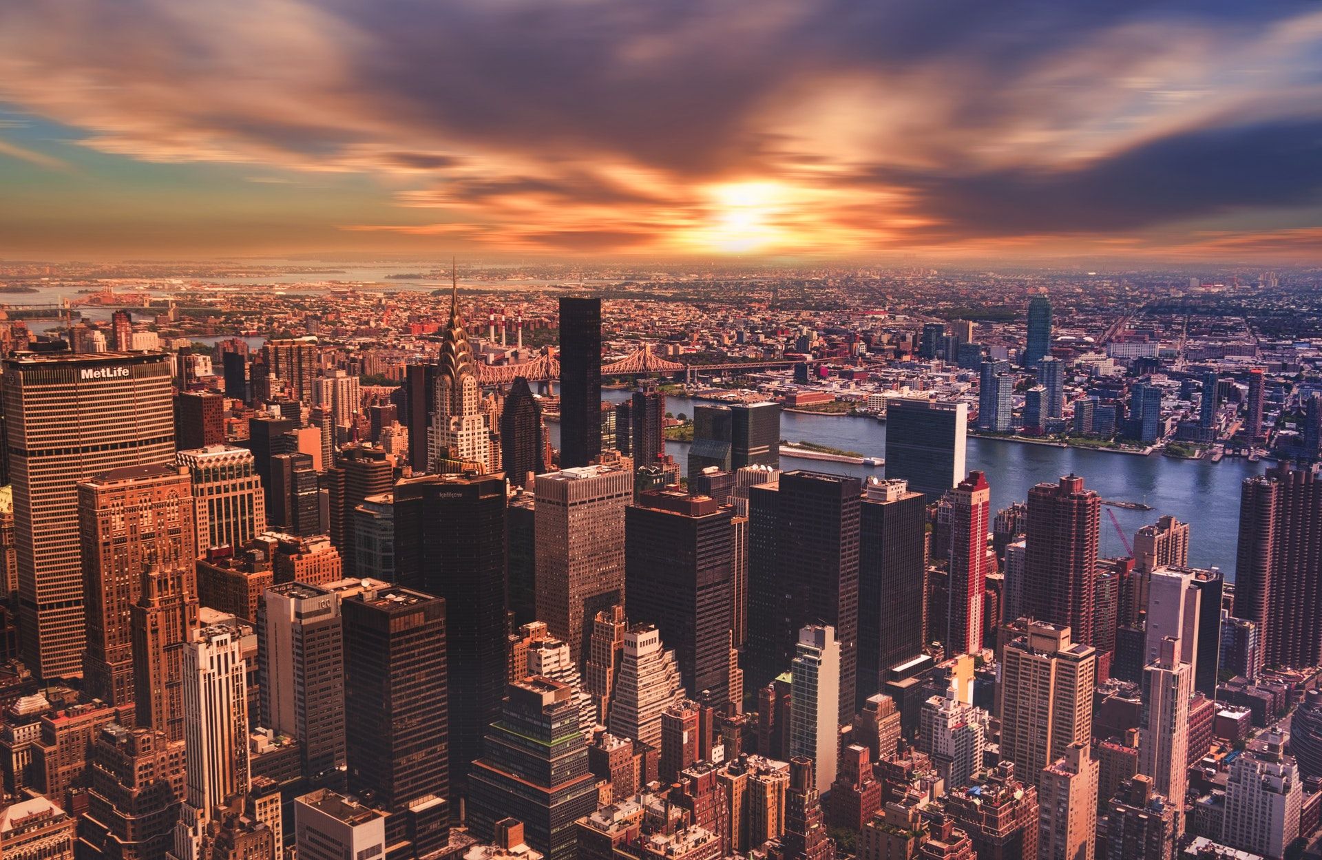
In an HTML document, he adds the <img> tag to add images, followed by the src attribute specifying the URL or location of the image source. For his examples, the same image is used with an ImageKit URL, as shown below.
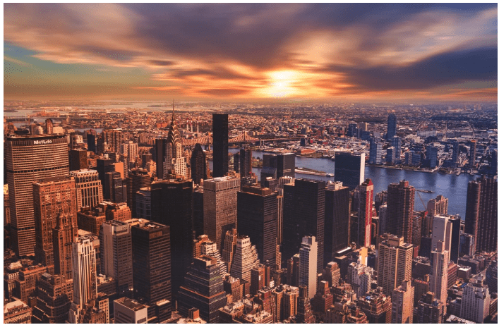
<img src="https://ik.imagekit.io/ikmedia/css-image-effects/new-york_lbAbZZKZG.jpg" alt="new york">
Image Filter Effect
A CSS filter property lets a filter effect take place to allow several functions to apply graphical effects like blur, saturation, or color shift to an element.
Image Grayscale Effect
The grayscale() function is used to convert an image to grayscale using a percentage number as input to determine the intensity of the conversion. You can adjust the percentage value of the grayscale() function to the desired black and white effect. A value of 100% will result in the image being a completely grayscale image of black and white, while a value of 0% will have no effect on the image.
His Example
The CSS sample below shows how the grayscale() filter can be applied to an image.
img {
  -webkit-filter: grayscale(100%); /* Safari 6.0 - 9.0 */
  filter: grayscale(100%);
}
The Result
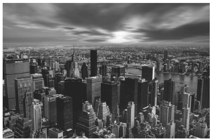
Image Shadow Effect
The box-shadow property allows the user to create a shadow around an HTML element. It is described by X and Y offsets relative to the element, blur and spread radius, and color.
His Example
A shadow is added to a card created with his image using the box-shadow property.
HTML to create a card
CSS to add shadow to the card
The Result
Creating a vibration animation with CSS transform effect
The transform property will be used to create a vibration effect working with clockwise and anti-clockwise rotations when hovered over the image.
Implementing CSS Keyframes is needed to create a vibration animation as this defines the state of an element during an animation.
His Example
For his example, the image will use small rotations in fixed intervals of 10% of the animation duration. The keyframe will be named vibrate to match the type of animation we want the image to have.
@keyframes vibrate {
  0% { transform: rotate(0deg); }
  10% { transform: rotate(-1deg); }
  20% { transform: rotate(1deg); }
  30% { transform: rotate(0deg); }
  40% { transform: rotate(1deg); }
  50% { transform: rotate(-1deg); }
  60% { transform: rotate(0deg); }
  70% { transform: rotate(-1deg); }
  80% { transform: rotate(1deg); }
  90% { transform: rotate(0deg); }
  100% { transform: rotate(-1deg); }
}
Now the vibrate keyframe can apply to the image when it is hovered by the cursor, and the animation-iteration-count property will specify the number of times an animation sequence should continue to play before stopping. Both properties can be seen in the image below.
img:hover {
  /* Start the vibrate animation with duration 0.5 seconds */
  animation: vibrate 0.5s;

  /* When the animation is finished, start again */
  animation-iteration-count: infinite;
}
The Result
My Thoughts
Samuel explains well how to implement these special effects into an image. However, I think there should have been more explanations as to why he had to implement certain properties and what they meant under the grayscale effect section and the vibration animation section. Under the grayscale effect, he implemented -webkit-filter: and the filter property is attached to -webkit-, which is used to render content for Safari and Chrome browsers. In his explanation of creating a vibration animation to have the image vibrate when the cursor hovers over it, you need to add :hover selector to your img element and the animation property is necessary to allow animation for HTML elements. Another suggestion I would add is to keep including an HTML snippet under the section’s grayscale effect and create a vibration animation. Even though it is the same image used for every example, it is good to remind the reader of needing to implement the <img> tag in their HTML document and its necessary parts, especially for people who are still new to coding.
It was fun to try these special effects in my own images. I was surprised to learn that the value input for the grayscale effect does not have to be all or nothing. The image doesn’t have to be completely black and white or no filter effect at all. It was interesting to see the impact of the filter using different value inputs, especially with the colored portions of the image changing the intent of the portrayal of the image to fit into a desired mood and feeling.
Overall to try to use these special effects and animations readers would need to have a basic understanding of both CSS and HTML to achieve the best-desired outcome and not be left feeling discouraged. Do not worry if you cannot get it to work right away. It may take some time and patience.
What special effects or animations would you like to try?
This chapter is a revised version of a blog post titled “Use CSS to Enhance Your Images with Special Effects” on Informative Trails on the Web.
