7.11 How to Design an Efficient Table for Your Website
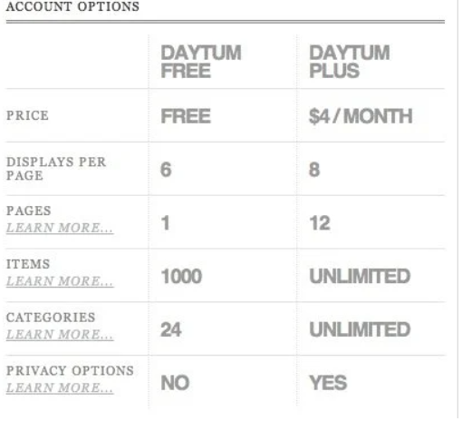
Tables are important to add to a website because it is important information that is being shared in a convenient way. But what type of table would be the best for one to decide on? There are very many different types of tables discussed in the blog by Nate McGuire, 15 Tips for Designing Terrific Tables. Tables are personalized and are made to suit the website that they are created for. His tips are helpful in deciding what exactly one could do to spice up their website or if they want to keep it clean and minimal. The following are just a few of the tips he gave to help those that are looking for design ideas.
- Decide if the table should be vertical or horizontal. It really just depends on personal preference.
- Make the Information Sortable: a table with a lot of information is best viewed when there is a sorting button to make it easier for users to find what they are looking for. .
- Use Icons: Reduce the unnecessary reading by only putting the most important information that will take only a glance to understand. But make sure that it is enough information for them to understand and not so little to where the readers are being left confused.
- Add Zebra Stripe: This keeps the reader focused on a row at a time. Using different colors for each row allows the readers to follow and connect the information given.
- Go Minimal: One could go either way depending on their preference but less can sometimes be more. Make it minimal and make it clean. All the information will be displayed as necessary.
- Don’t Overload the Table with Redundancies: This goes with the go minimal section as well. There is no need to constantly repeat the same information. There are other ways to make the table simple with just the right information for the people looking over the information.

To view the rest of his tips you can go over to his blog to check them out. Overall, adding tables to a website is all about personal preference but one does have to keep in mind about what type of information they are trying to convey and what is the most efficient way to get it across so the readers do not get overloaded with too much information or confused by not enough.
Note: This chapter is a revised version of a blog post titled, “How to Design an Efficient Table for your Website,”on Production for the Net.
