7.15 Tips to Make Accessible Tables
Tables present information in a grid or matrix with rows and columns that show the information’s meaning and visual relationships. It’s easy for sighted users to scan tables and pick up on visual relationships between the data and its corresponding row and header, but are tables navigable to users who can’t see them or who use screen readers? Yes, with proper markup.
Webaim.org’s 2017 article “Creating Accessible Tables” states that with proper HTML markup, screen readers will help users navigate through the table one cell at a time and read the row and column headers. The article also provides several tips on how to code HTML tables to make them accessible. I will not be delving into all of the tips here, but I will be discussing the ones that stuck out to me.
Use Table Captions
Like images, tables generally have a brief written description of their content either before or after the table. This text can be associated with its corresponding table using the <caption> element. However, the <caption> element must be the first thing written after the initial <table> tag as in the example below.
<table>
<caption> Table Caption </caption>
...
Every table doesn’t always need need a caption, but they are very helpful for sighted users and users that use screen readers alike.
Identify Your Row and Column Headers
WebAIM writes that, “Table headers should never be empty.” Why? As previously stated, screen readers help users navigate through the table one cell at a time and read the row and column headers. If a row or table header is empty, then it can’t be read by the screen reader, and while a sighted user might be able to create a visual connection between information in one column or row without a header, users that use screen readers cannot create that visual relationship.
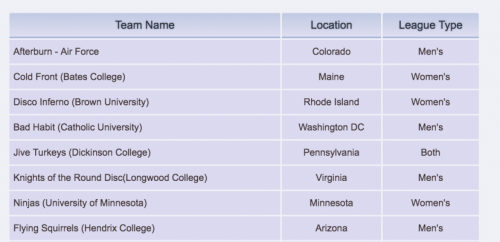
In HTML markup, table data cells use the <td> element and table header cells use the <th> element. In the following screenshot of a table I coded two years ago, Team Name, Location, and League Type are the column headers.

Use Proportional Sizing
Instead of determining the width of the table yourself, let the browser window do the heavy lifting to eliminate the amount of horizontal scrolling users with low vision will have to do. If you need to define cell width, don’t use pixel values. Try using relative values like percentages, em, or rem. You shouldn’t use defined cell heights either to make sure that when a user makes text larger, the cell will expand downward to accommodate the content of the cell.
Closing Thoughts
It’s rare for me to use tables in my web designs, but I found WebAim’s article to be an invaluable resource. That being said, I know that some web designers use table elements to create layouts in unconventional ways. Does that render layouts that use table elements inaccessible? Should tables be reserved solely for creating data tables? Yes.
Note: This chapter is a revised version of a blog post titled, “Tips to Make Accessible Tables” on Digital Media Miscellany.
